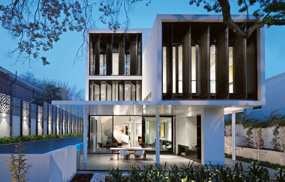
Above: The living areas are framed by garden views and a lap pool. With a built-in fireplace, the large terrace functions as an outdoor room.
Melbourne is recognised for its leafy streets and gardens, a feature that was not lost on both the architect and owners of this house in Toorak. “The house was designed around a 60-year-old Pin Oak. We were extremely careful not to damage its root system,” says architect Rob Mills.
This palatial new house not only benefits from views of the tree, but also has glimpses of tennis courts directly opposite. “Even a slow game of tennis animates the vista,” says Mills.
Designed for a couple with two young children, the new house replaced a 1930s clinker brick home. “Originally, our clients were looking to renovate a house in the area. I asked them if they’d consider building,” says Mills, who was surprised to hear from them three days later with news they had purchased an old house on a 9,000m2 site.
Rather than present Mills with an endless wish list the clients simply said, ‘You know what to do, just go ahead,’ recalls Mills. “The only thing specified was the number of bedrooms,” he says.
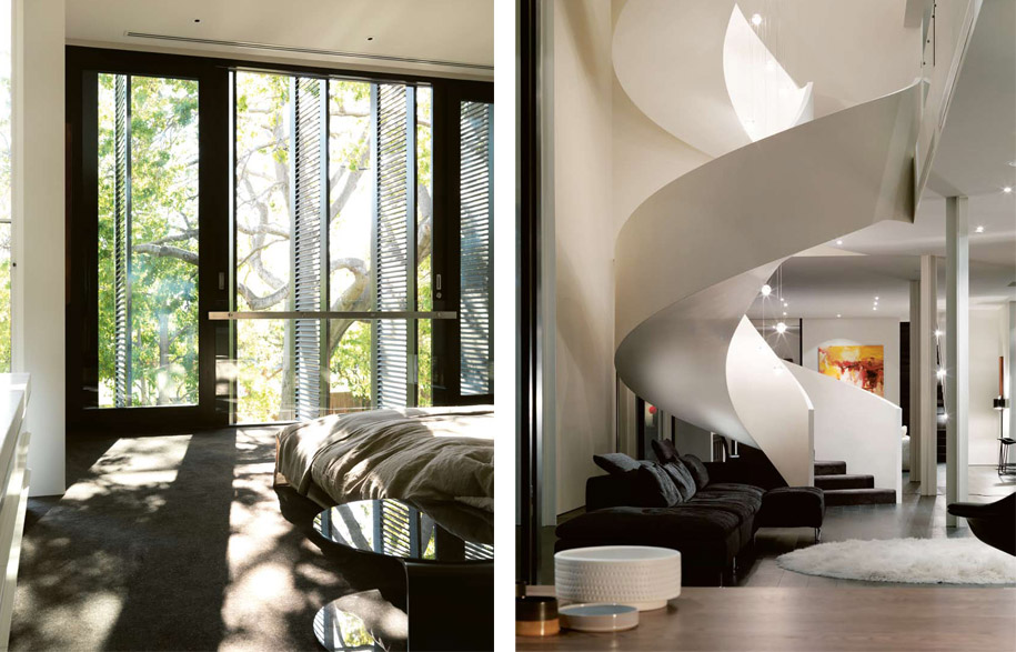
Left: The main bedroom, oriented to the west, features external shutters that diffuse the afternoon light. (Photo: Trevor Mein)
Right: The curvaceous staircase provides a contrast to Mills’ rectilinear design.
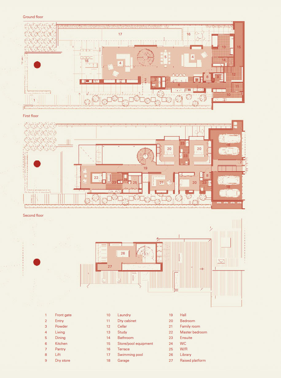
Constructed in concrete and rendered brick with lightweight upper levels, the house is loosely based on a warehouse model. “I wanted to break down the walls of a traditional house verdant avenue house — VIC, australia and create one grand open living area,” says Mills. One of the few divisions on the ground floor is a graphic circular steel staircase that links three levels within the home. Completely detached from surrounding walls, this staircase has a force of its own. “I was fortunate to find an elderly German steel maker to create this form,” says Mills, of the staircase that stands in a nine-metre high void.
The staircase not only animates the interior, it also separates the formal living areas from the informal areas. White painted steel columns in the living areas also create a subtle delineation of spaces within the home. “I didn’t want to carve up these areas, but I also wanted each area to be enveloping,” says Mills.
The kitchen, located to one side of the informal living area, is of a similar scale to other areas within the home. Loosely defined by a honed black granite bench with American Oak cupboards, the kitchen joinery was treated as furniture. “I didn’t want the kitchen to dominate the living areas,” says Mills, who included at the rear of the kitchen, two walk-in pantries, an area for wine storage, and a laundry.
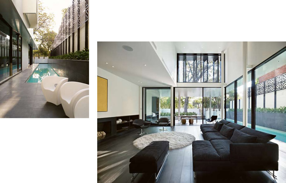
Left: Laser cut screen along the lap pool will eventually be covered in ivy.
Right: The double height space in the living area accentuates the grand proportions of this home.
Also important for Mills was the link between the house and the garden. Large glass sliding doors open to a western terrace on one side of the living area and to a 25-metre lap pool on the other side. Given his clients’ propensity for outdoor dining, Mills included a sophisticated arrangement of cooking appliances on the terrace, as well as an outdoor fireplace. “Our clients wanted a garden they could enjoy rather than spend time mowing lawns,” says Mills. “This screen [a contemporary Moroccan steel screen framing the pool] will eventually be covered with vines and creepers.”
The scale of the first floor is as vast as that of the ground floor. At one end are two children’s bedrooms, together with a guest bedroom. The children’s wing also includes a television area. At the other end of the floor plate, separated by a large pivotal door, is the parents’ retreat.
“The main bedroom was modelled on a hotel suite. Instead of a traditional bedhead, there’s a limestone-clad nook offering views of the ensuite bathroom, also finished in limestone.” To reduce glare from the western sun, Mills designed a series of operable steel shutters across the home’s façade.
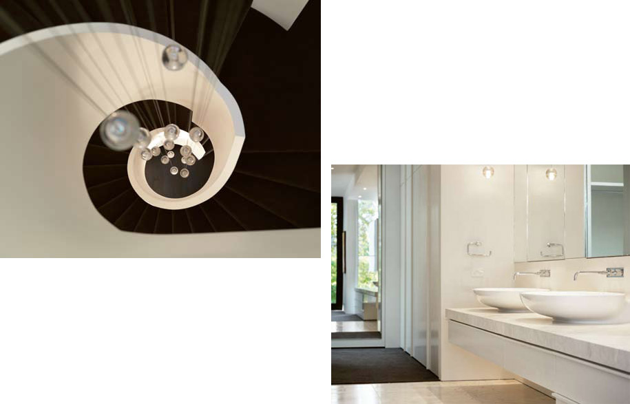
Left: Looking down the staircase from the top floor.
Right: The ensuite features extensive built-ins.
Some of the features in this Toorak house have been developed by Mills over a number of years. Sliding doors in the bedrooms, for example, feature a second layer of toughened glass that functions as a balustrade. Water is both visually and audibly integral to many of Mills’ designs, including this one, as is the inclusion of two staircases. “The children can run in after school, get changed and jump in the pool. They don’t have to cross paths with parents and can make as much noise as they like,” says Mills.
“This is not a static house,” says Mills. “It responds to the elements as well as providing the level of privacy required.”
Photography: John Wheatley
uacreative.com/portfolios/john-wheatley/bio/
Architect
Robert Mills
robmills.com.au
Landscaper
Jack Merlo Design
Builder
VCON
Artwork
Living room painting by George Tjungurrayi from Cross Cultural Art Exchange, ccae. com.au. Sitting room painting by Ningura Naparrula from Sotheby’s, sothebys.com, and Sweetheart by Todd Hunter from Scott Livesey Galleries, scottliveseygalleries.com. Dining room Untitled by Boxer Milner Tjampitjin, and painting by George Tjungurrayi from Utopia Art Sydney, utopiaartsydney. com.au. Study painting by Patrick Olodoodi Tjungurrayi from Scott Livesey Galleries.
Furniture
Furniture supplied by Hub Furniture, hubfurniture.com.au. Rugs Flower Rug in theatre by Moroso, moroso.it, Mongolian goat Leon Rug in living room by Redaelli. Armchairs Hi-cove armchair in living room by Molteni & C, molteni.it, all others by Moroso. Sofas in living room by Moroso, all others by Molteni & C. Dining chairs Bloomy Chair by Moroso, Glove Chair by Molteni. Dining table by Lowe, lowefurniture.com. Side tables by Moroso. Bed by Molteni.
Finishes
Exterior rendered in Irving by Toscano Roman Render, toscanoromanrender.com.au. Cladding aluminium in Castle White by Alpolic, alpolic.com, and motorised louvres by Reflex Shading Systems, shadingsystems. com. Interior walls finished in White Sand paint by Porters Paints, porterspaints. com.au, in study stucco-finished in Fresco Finish paint also by Porters Paints. Veneer Oak in study and living room from Briggs Veneers, briggs.com. au. Stone in bathroom Bianca Perla marble from Artedomus, artedomus.com. Floor in living room Brown Black American Oak by Harper & Sandilands, harper-sandilands.com.au, in study honed Zimbabwe black granite from City Stone, citystonevic. com.au. Carpet Torcido Negra from Velieris, velieris. onlinegalleries.com.au.
Lighting
Lighting from Hub Furniture. Floor light in dining Alfa by Anta, anta.de. Table lights Post Krisi by Catellani & Smith, catellanismith.com, Half Moon by Karboxx, karboxx.com, and Eclipse by Objekto, objekto.fr. Pendants in Stairwell by Bocci, bocci.ca.
Fixtures/Fittings
Bath by KOS, kositalia.com. Vola Bath spout, vola.dk. Basins from Parisi, parisi.com. au. Other sanitary fittings from Rogerseller, rogerseller.com.au.
