Aesop is a brand that has achieved the impossible – global saturation while maintaining a sense of bespoke locality. That’s the dream, right? And how is it that they manage to pull this off? By investing heavily in design; local designers and high-end materials.
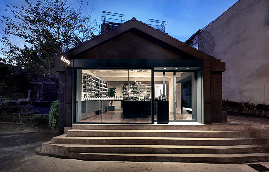
The luxury skincare brand’s insistence on investing in design has taken ‘materiality’ from an elite luxury to a mainstream necessity; hence, the ‘Aesop Effect’. The most recent example of this philosophy in action is the brand’s ninth Seoul location, Aesop Samcheong by Torafu Architects.
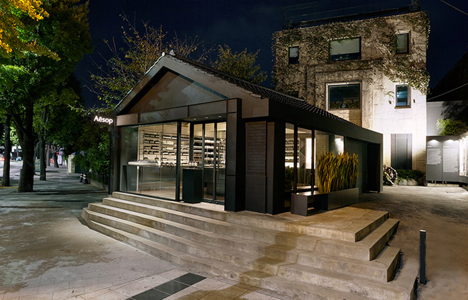
Located in a cute single-storey street front building, Aesop wanted to inhibit the cultural vibe and intensity of the area’s lively Gyeongbokgung city palace.
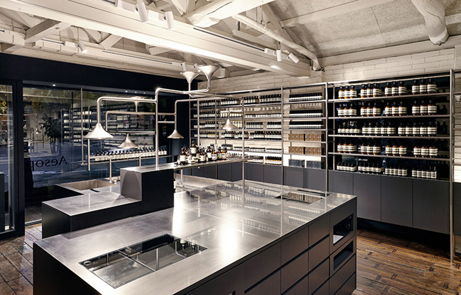
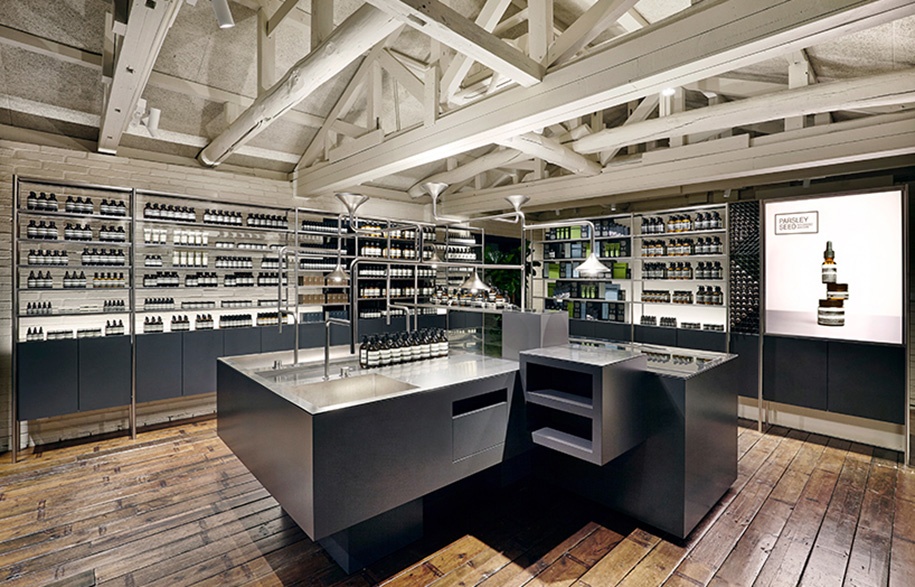
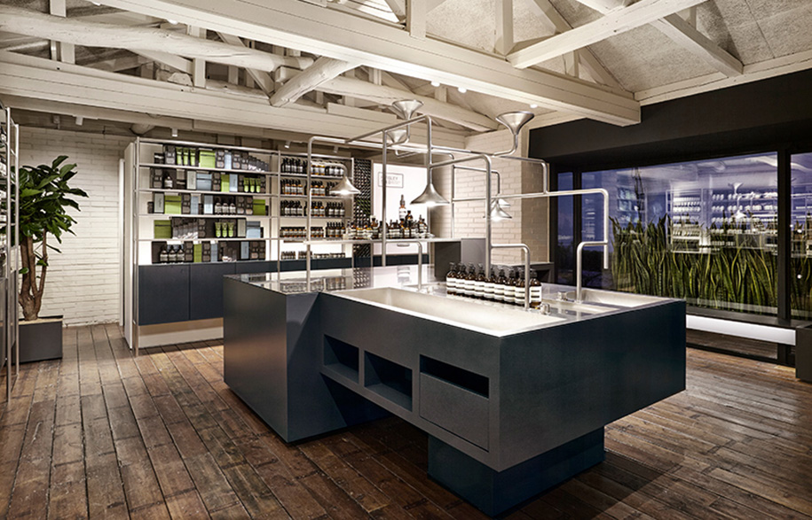
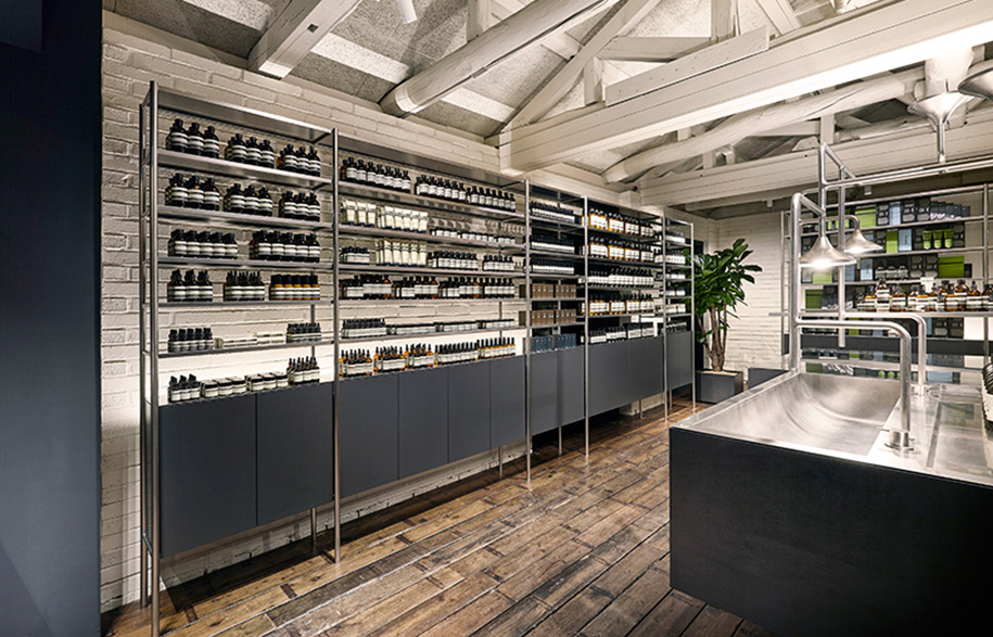
The largest and most obvious example of this brief was the architect’s decision to retain the original ceiling, making a strong feature of its wooden truss. The building itself had undergone a number of renovations over its many years, and had accumulated a strange collection of incompatible materials, and while wanted Torafu to maintain this haphazard vibe, they also sought to find a consistent design element to tie it all together.
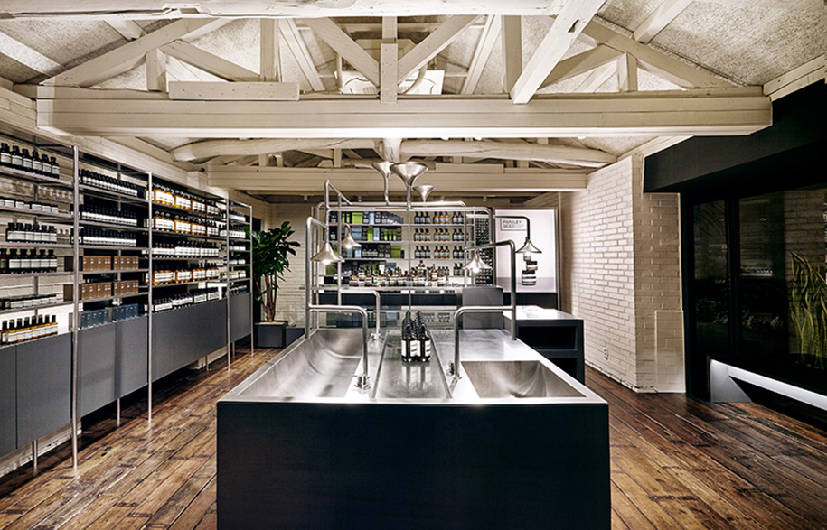
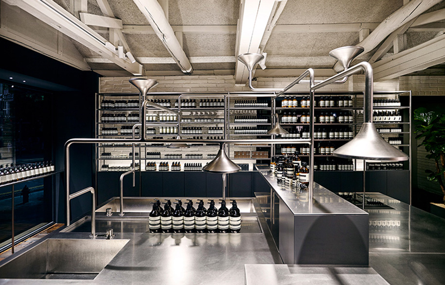
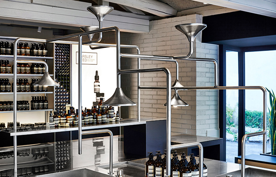
Consequently, the internal fixtures and fittings are stainless steel, with surfaces and tables taking on the same deep blue color as the building’s exterior. Sinks for consultations have been united with point-of-sale counters within a single unit found at the center of the store. A sprawling network of pipes above the table provides the water supply and lighting for the sink area, while simultaneously highlighting a striking piece of furniture.
The Aesop Effect means that materiality is no longer a ‘nice-to-have’ for our smaller scale clients, but is now a key necessity for their future growth and success. And we as an industry have a big responsibility in fulfilling this high level of expectation.
Aesop
aesop.com
Torafu Architects
torafu.com
Words by Sophia Watson.
