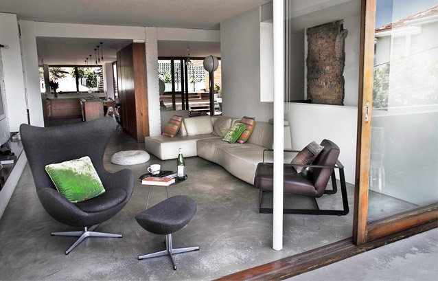
Built in a decade of questionable aesthetic sensibility, the original structure architect Marika Järv was faced with sported many hallmarks of its era – blond brick walls, vermiculite ceilings and dark, compartmentalized layout. Thankfully her client had seen beyond these attributes when purchasing the property, and was keen to radically change the structure.
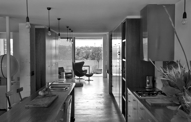
“The brief was to create a large open plan living/entertaining area, and to provide the most seamless connection to the outside rear pool area” explains Järv, “In terms of aesthetics, the client was well travelled and an avid surfer, so it was essential the house conveyed a relaxed beach-side quality, yet had international appeal, specifically reflecting time spent in New York.”
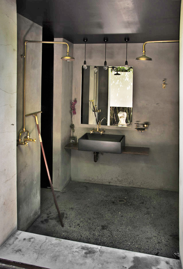
Thus began a collaborative, experimental and occasionally spontaneous design process. The client’s open-mindedness allowed Järv to push her creative limits and incorporate materials and details that more conventional residents would shy away from. This included exposed brass taps and plumbing in the bathrooms, black ceramic basins and cement rendering on all the walls (including the shower spaces) instead of the more traditional finish of tiles. “At one stage we were considering using copper sheet for the kitchen benchtops (which would have been amazing!), but unfortunately budget constraints wouldn’t permit”, she adds.
The client’s participation also produced some successful features, most notably a ribbon of exposed brick left by the demolition of a wall – when he saw the effect of the raw brick next to the white render he asked the builders to leave it.
Adapting to the pre-existing structure, floors are an assortment of a polished topping (encouraged to craze in certain areas) where there was concrete and spotted gum for the deck, dining, guest bedrooms and hallway.
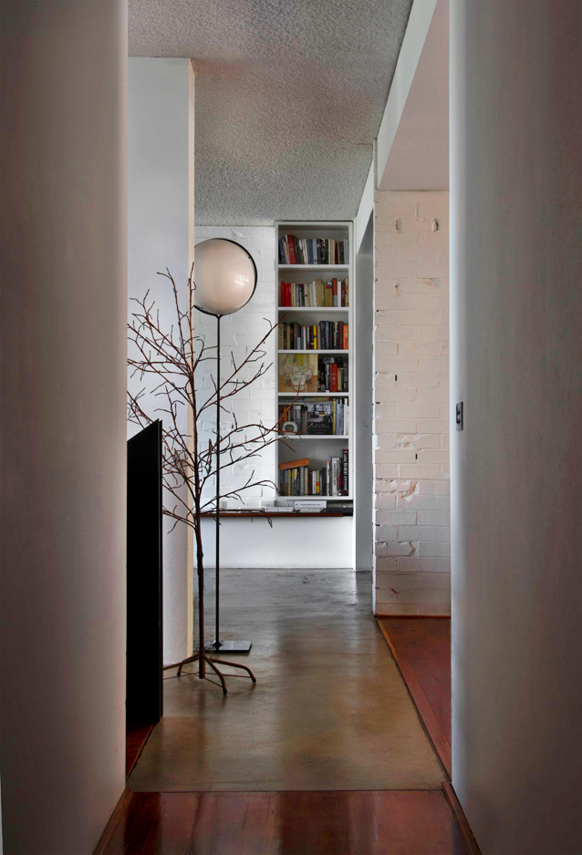
And whilst the blond brick shell was retained (creating an initially jarring but progressively more reconciled effect in the modern renovation), doors and windows were replaced with generous, sliding cedar framed glass panes that open fully and create complete continuity between interior and exterior spaces.
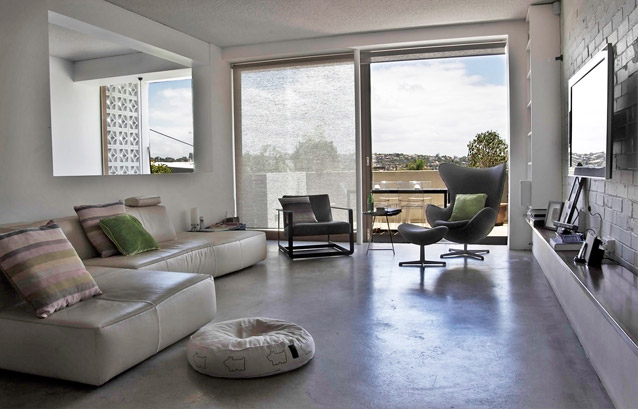
The net result is a remarkable transformation, giving Järv a “sense of fulfillment gained from transforming a rather mundane and ill-conceived building into a series of well considered and thoughtfully designed spaces”.
Photograhy: Jesus del Toro Garcia – Misframed
