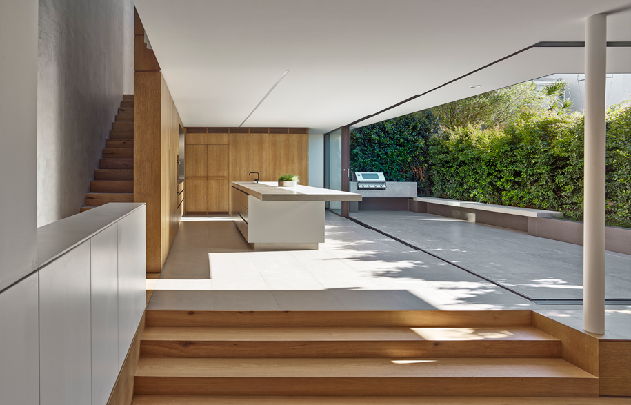
The rationale for the Birchgrove House design was to improve the house through simplification and a maximisaton of the outdoor experience on the tight site.
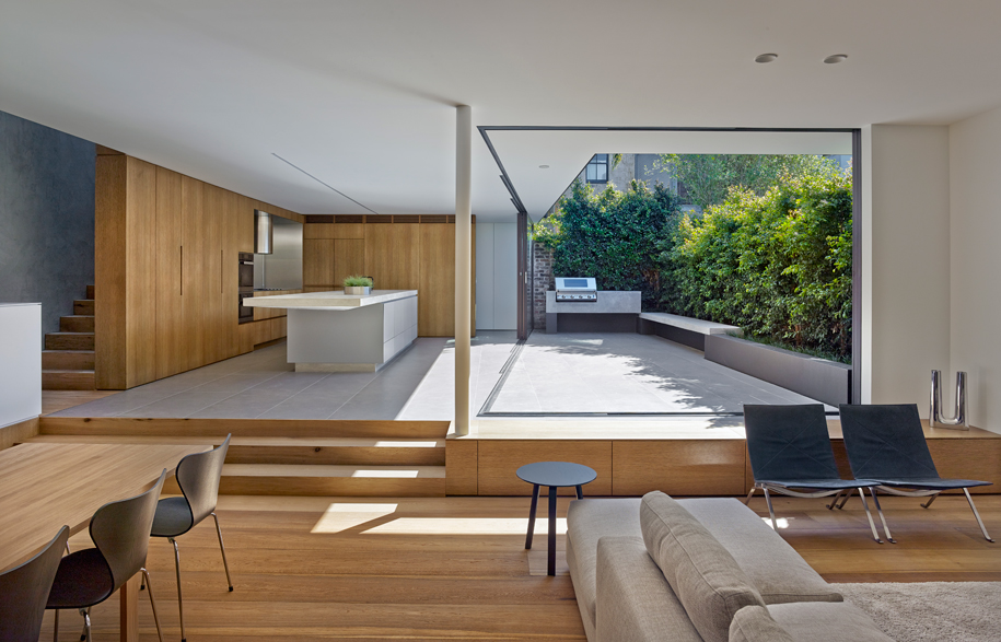
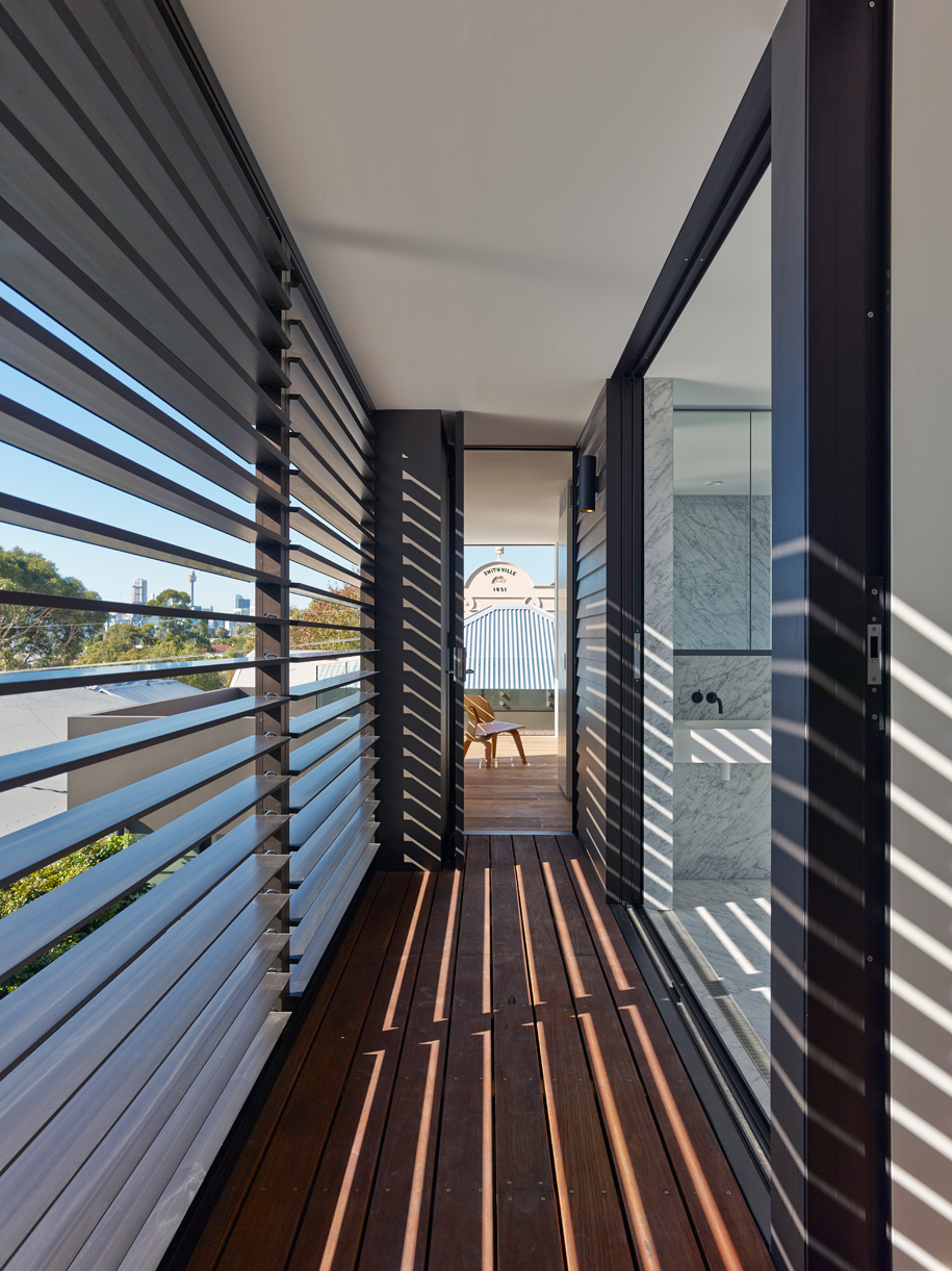
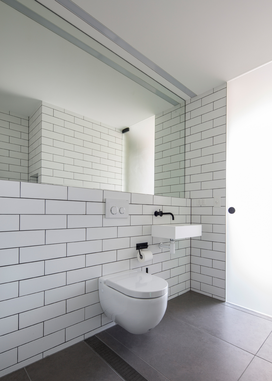
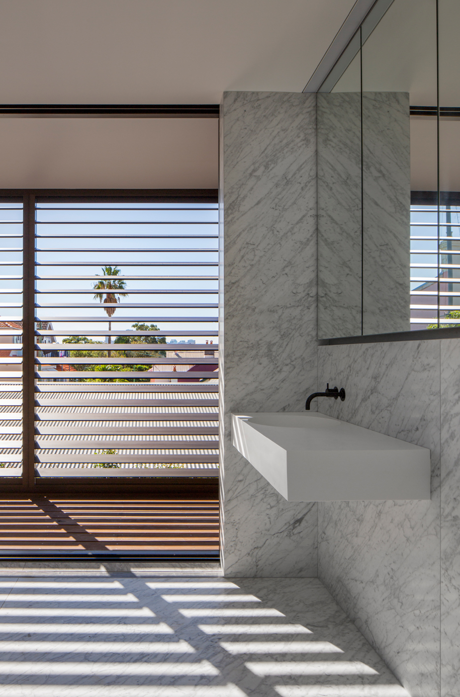
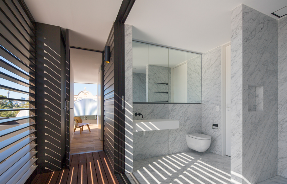
One solution to the tight size of the space was to replace all upper level external walls to the courtyard with a fully operable façade. The main bathroom sprawls out onto the upper balcony, the doors completely retreating within the wall cavity, creating a private outdoor bathroom experience.
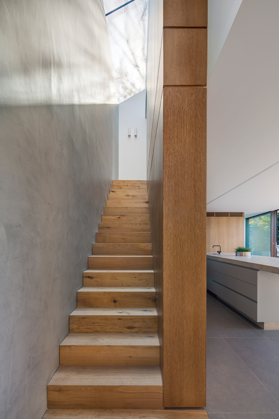
The stairs in the Birchgrove House have been replaced with a new elongated stair spine along the southern boundary connecting the three levels. Joinery wraps under and over the stair filling the cavities provides much needed storage in the small space, without compromising aesthetic charm.
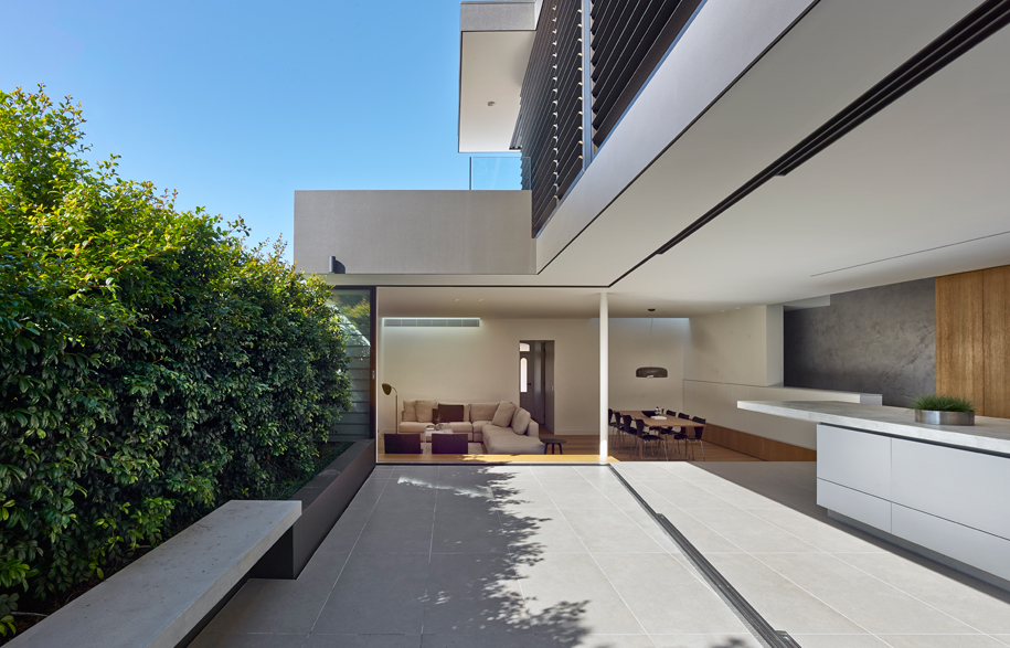
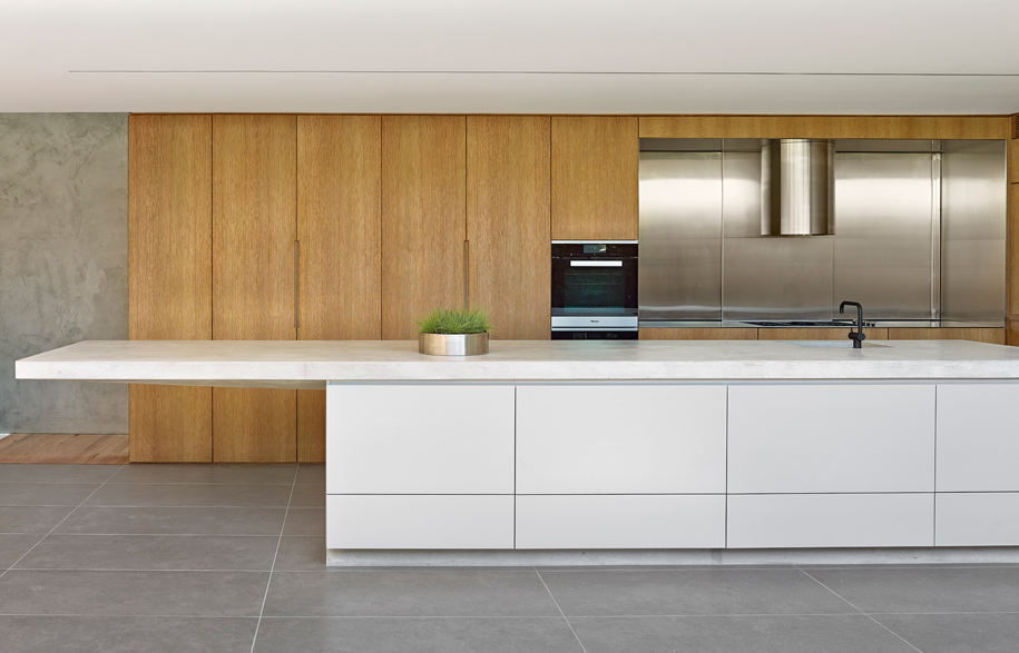
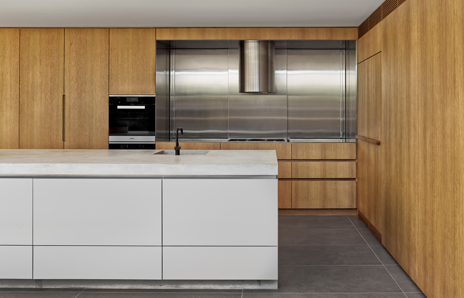
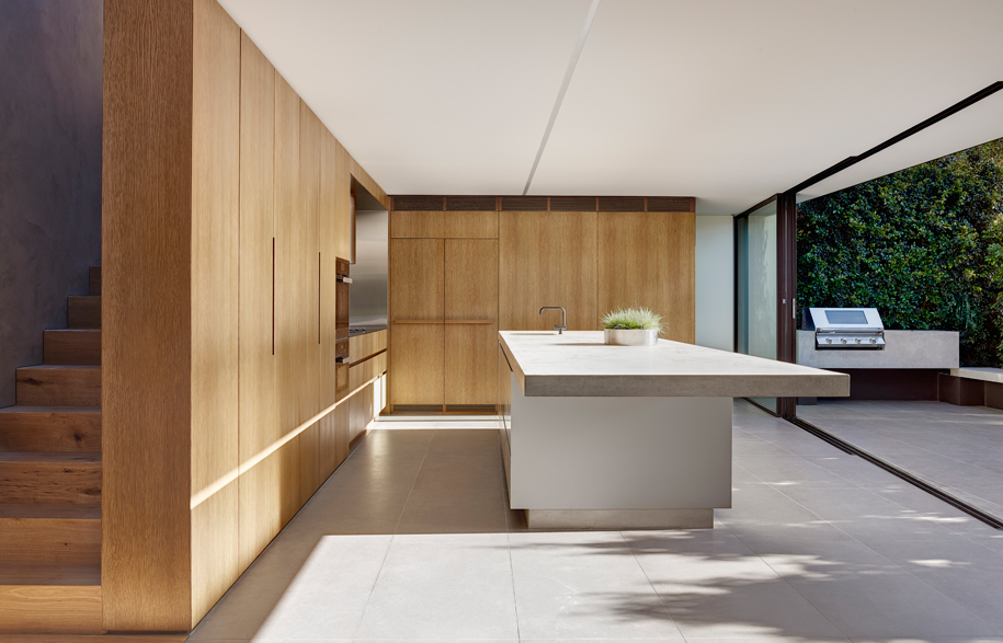
Nobbs Radford’s approach to materials was to develop a palette that was reflective of the site and origins. Concrete references the strength and solidity of the sandstone footings and boundary retaining walls. The juxtaposed use of timber reinforces the primary structural and cladding material of the cottage, reinforcing the essence of the cottages’ materiality.
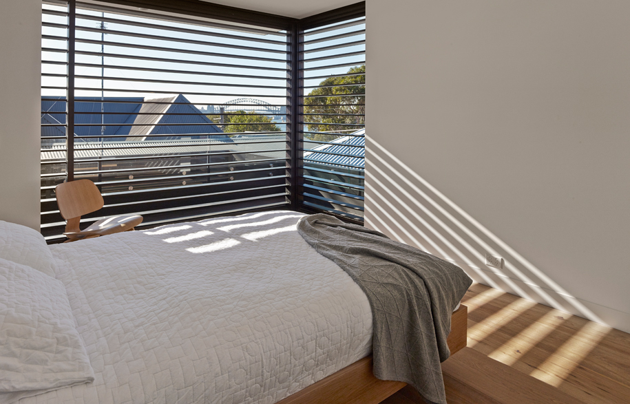
The original front two bedrooms remain intact, while the reminder of the house has been reorganised to focus on the courtyard and increase the perception of space. On the upper level windows have been expanded to appreciate the outlook across the harbour to the iconc Sydney Harbour Bridge.
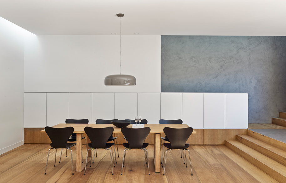
The relationship from the living room to the courtyard is slightly sunken, with a joinery unit edging this transition, which doubles as a bench seat on grade with the courtyard. The dining room joinery reinforces this charm through a change in material creating a horizontal split.
This reinvention of the Birchgrove House creates a generous new spatial experience of the home, and takes advantage of its unique location.
Photography: Murray Fredericks
Nobbs Radford Architects
nobbsradford.com.au
