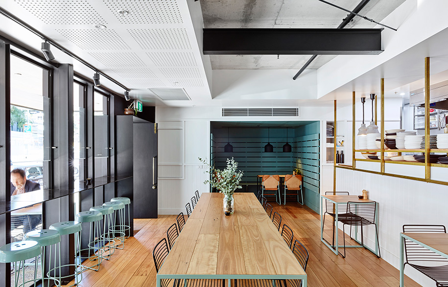
South Brisbane eatery Gauge is picking up accolades all over the place, from high commendations for its interior design to the Restaurant of the Year gong at the Brisbane Times 2017 Good Food Guide awards. The restaurant’s recent recognition across multiple sectors serves to reinforce the current expectations of new hospitality venues to not just serve nice food, but to offer holistic dining experiences.
Unsurprisingly, architect Matthew Eagle had a collaborative working relationship with Gauge owner Jeremy Batten and his resulting concept responds effectively to a clear-cut brief. “Jeremy wanted a functional and flexible space that strongly reinforces a commitment to quality service, local ingredients and innovative food all in an urban setting,” says the founder of Burleigh Heads-based ME Architects.
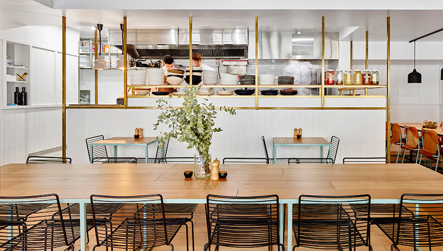
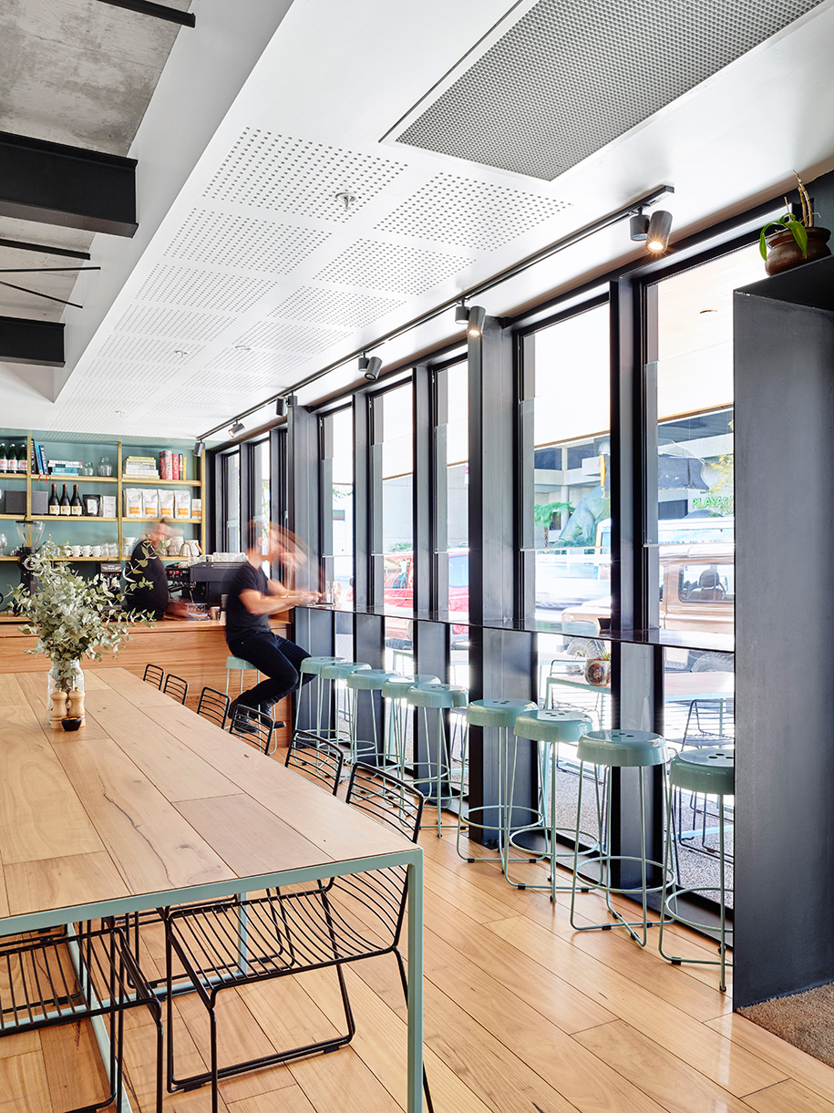
Generating a sense of place meant connecting the 72sqm restaurant with busy Grey Street and the nearby Queensland Museum. Eagle achieves this by opening up the facade with full-length windows and outdoor seating, making for a bright and airy interior. The fit-out still stands in stark contrast to the outdoor environment however, by providing patrons with a visually subdued sanctuary. As Eagle explains, “The idea was to also create a space that was inviting, familiar and warm.”
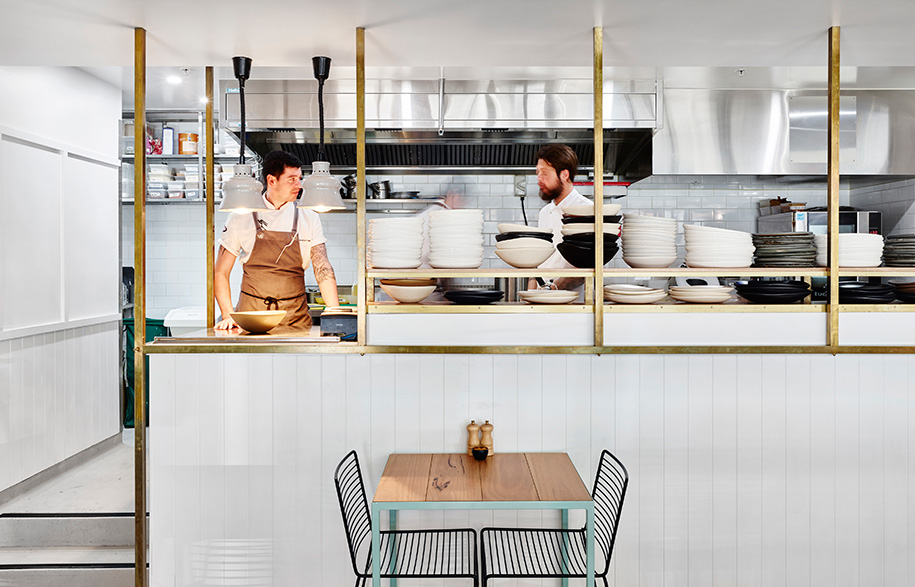
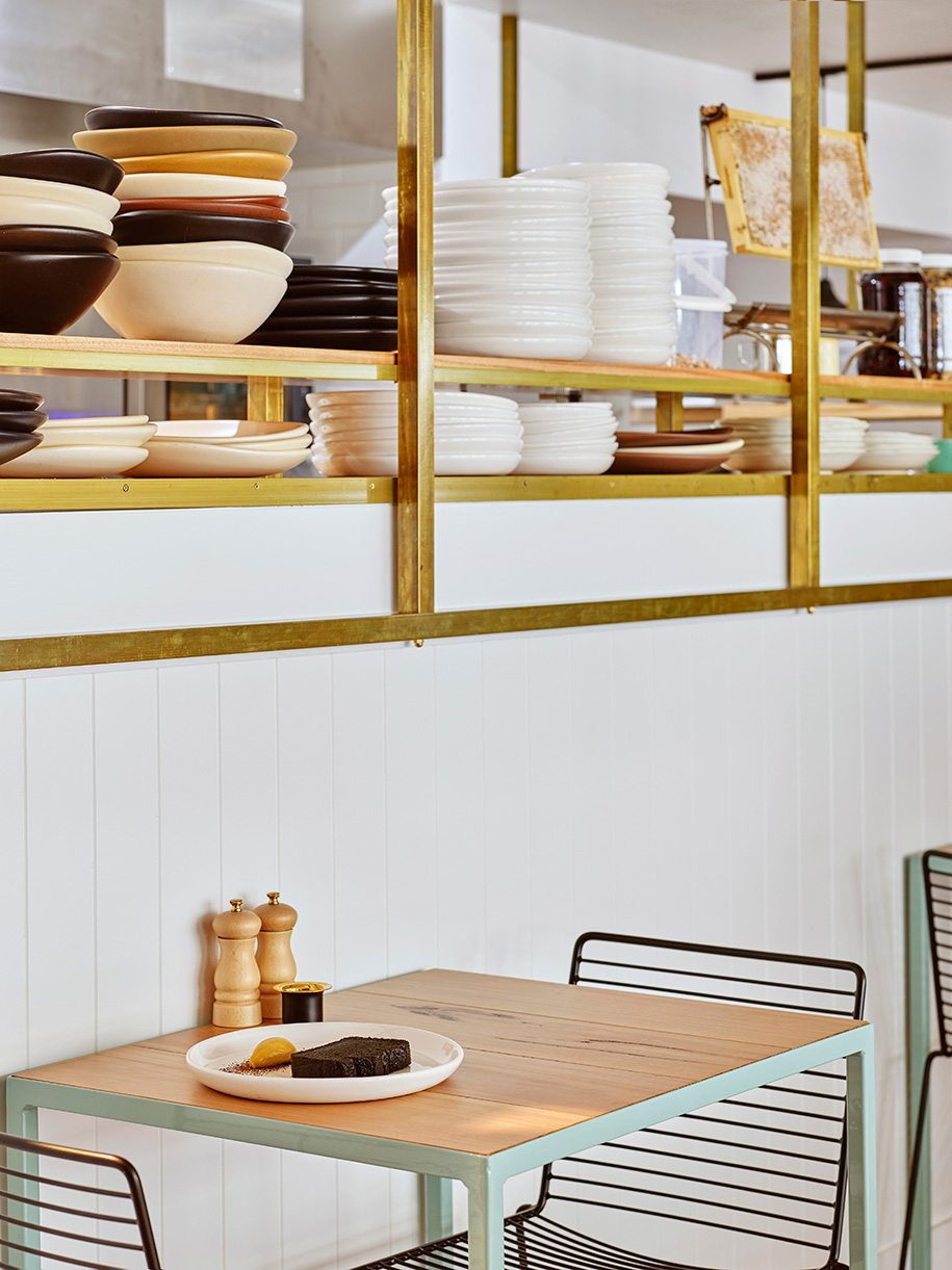
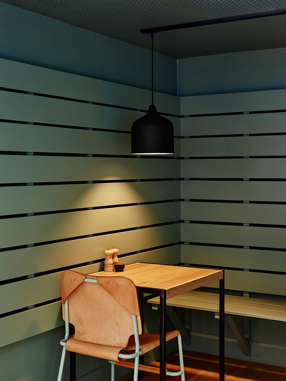
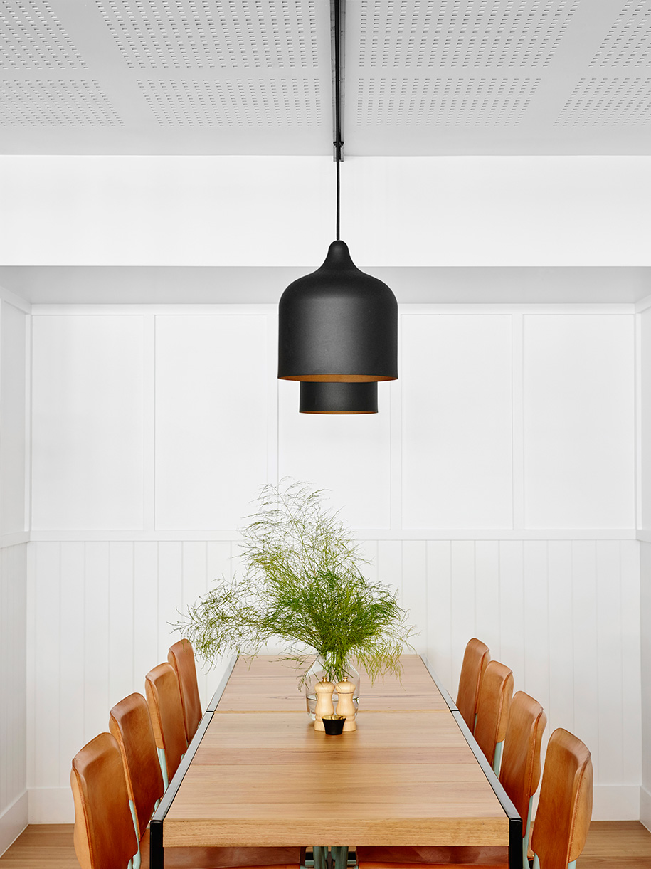
Loosely dividing the dining area into three zones (window seating, communal table and intimate alcove) allows patrons to choose how they want to experience Gauge. But it’s the boldly domestic scale of the overall scheme that ultimately resonates, lending the interior a welcoming ambience. This is heightened by the honey-coloured blackbutt floorboards and tabletops, which compliment the open kitchen’s brass detailing. Eagle minimises the hard edges of the full-length blackened steel window frames by judiciously incorporating select dark pieces into the scheme, namely Lab De Stu’s elegant Popper pendant light and Hay’s wire chair.
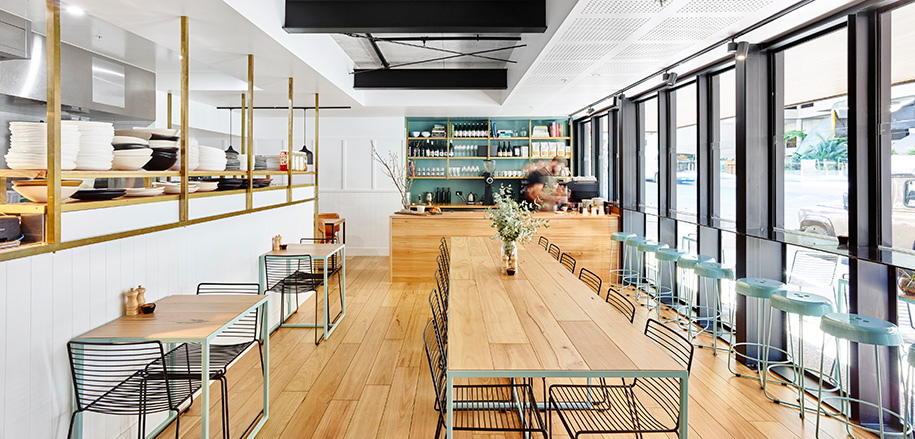
The crisp white walls and ceiling are the perfect canvas upon which to introduce a colour accent and Eagle does so effectively. “We wanted a colour that complemented the blackened steel, brass and timber,” he says. “But it also had to reinforce the natural, calm qualities of the space.” His choice of aqua for the custom tables’ legs, Thimble counter stools (also by Lab De Stu) and alcove is bold yet elegant, an effortless feature that isn’t laboured.
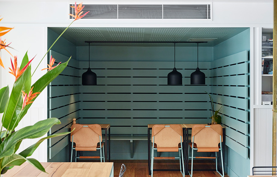
Eagle’s cleverly sly yet subtle references to the local architectural vernacular, in particular his use of VJ boards and cover strip mouldings, further adds to the fit-out’s clean, stylish appeal. These unexpected elements of discreet craftsmanship coupled with the minimalist furnishings makes for a sophisticated aesthetic, while the dining experience remains refreshingly unpretentious.
ME Architects
mearchitect.com.au
Photography by Toby Scott
