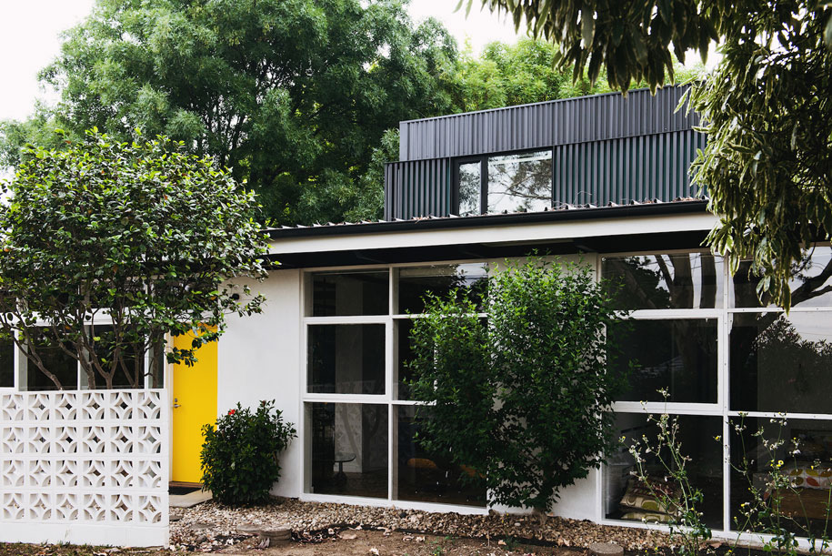
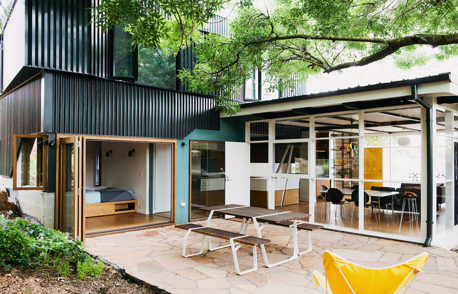
The process of renovating a house is all about looking at a space from a new perspective. And that is certainly what Emilio Fuscaldo and Imogen Pullar of Nest Architects did for the alteration and addition of this mid-century modern house. “It retains the essence and intent of the original house while bringing the benefits of twenty-first century amenity and living,” say homeowners Rebecca and Scott.
Rebecca and Scott moved to Rosanna, Melbourne, with their heart set on living in a 1950s/60s modern house. “Well-considered modernist houses are a joy to live in,” says Scott. “They’re open, airy and considerate of contemporary living.” Attracted to this house for its natural light (floor to ceiling glazing), well-established garden and cultural provenance (built by Alistair Knox in 1956), the couple approached Nest with the brief to keep as much of the existing house and it’s redeeming features as possible, but enlarge it for a growing family.
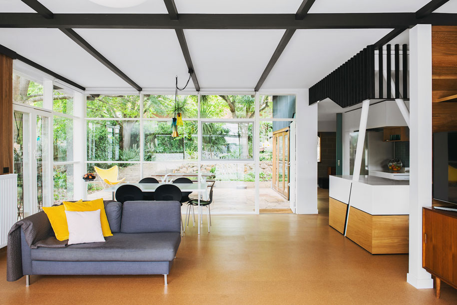
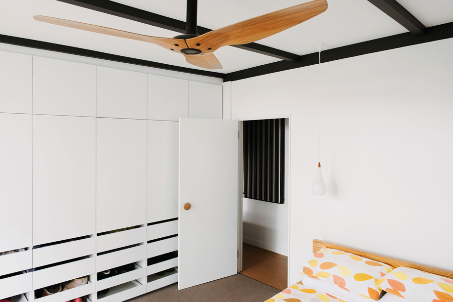
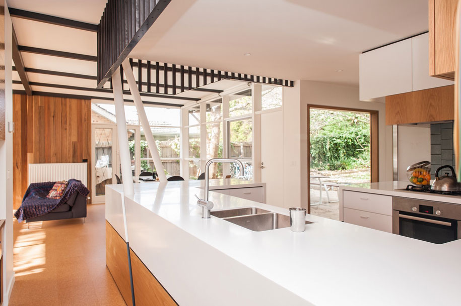
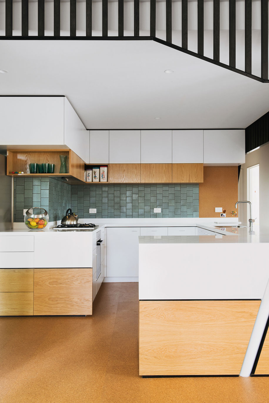
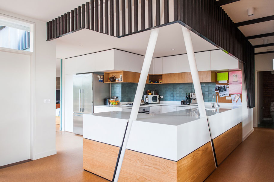
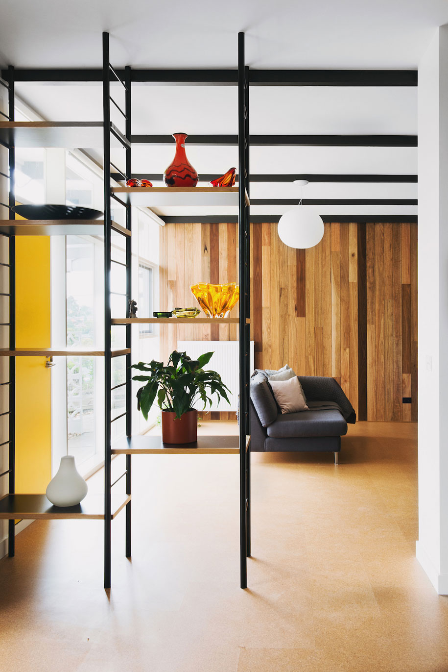
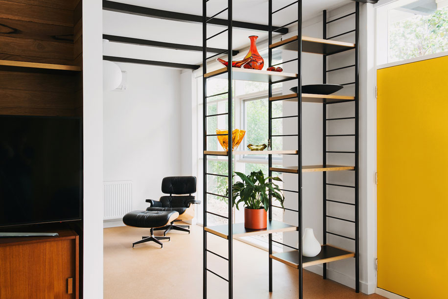
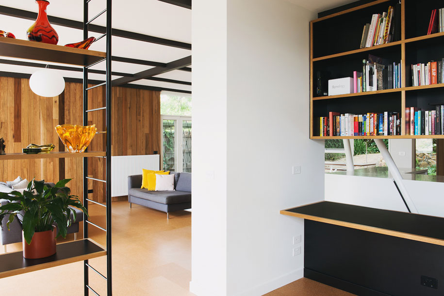
Taking inspiration from the Case Study House program, Emilio and Imogen incorporated characteristic features of the prototype homes. Subtle divisions in the open living space offer discrete views in and out of different areas; the material palette – cork floors, timber lining boards and veneered joinery – is simple, understated and indicative of the era; the original breezeblock wall, exposed roof beams and glazing have been retained; the interior framework is highlighted in black to emphasise the horizontal and vertical lines of the house. In contrast, two angled columns at one corner of the kitchen functionally support the second storey, and visually “offer countless new perspectives and views into and out of the kitchen,” Emilio explains.
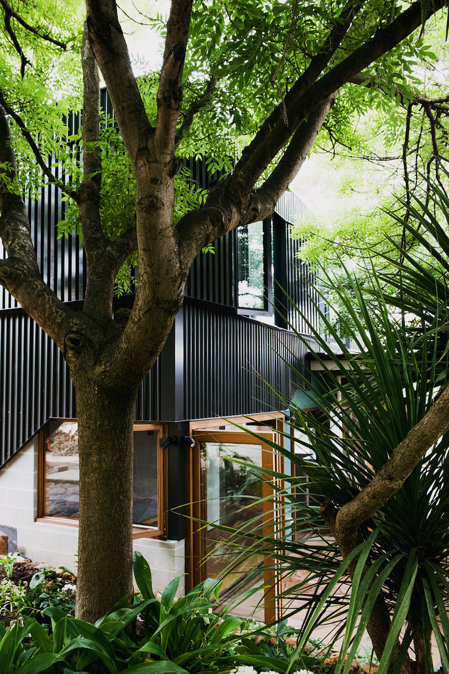
The façade has also been designed to offer an ever-changing aspect. It’s painted deep sea-green and clad with undulating aluminium screens “to offer new perspectives of the building when viewed at different times of the day under different lighting conditions and from different angles,” Emilio says. “It heightens the feeling that there is more to this simple building than first thought.”
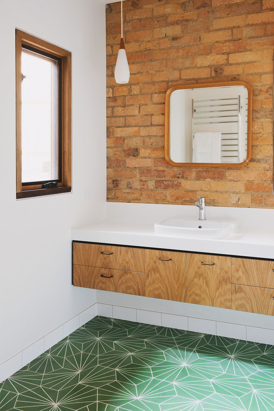
Colour-wise, Rebecca and Scott “were determined to have a bit of fun,” they say. “We added bright and vibrant splashes of colour that are inspired (but not enslaved) by mid-century design.” The luminescent yellow door recalls its original stripped-back colour. “It’s bright and uplifting and a clue that something more than meets the eye is going on.” The bathrooms feature green Pikralada tiles with a geometric pattern that harks back to a mid-century style.
While attention to detail has certainly not been lost on this mid-century modern update, Emilio describes the atmosphere of the home as a direct reflection of the residents: “casual, open, friendly, not fussy.” And as Rebecca said to Scott once they’d moved back in, “Everything is better. Life is better.”
Nest Architects
nestarchitects.com.au
Photos by Lauren Bamford
