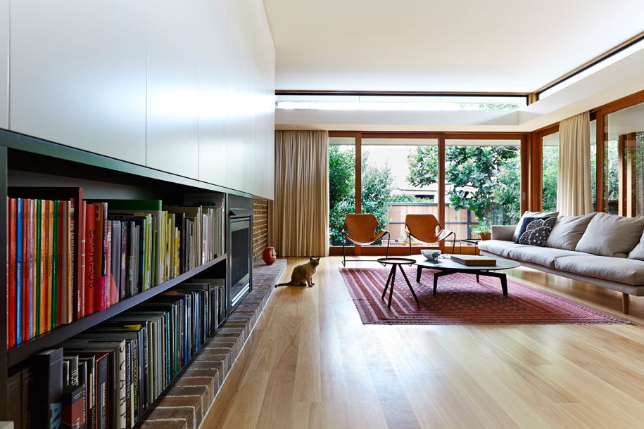
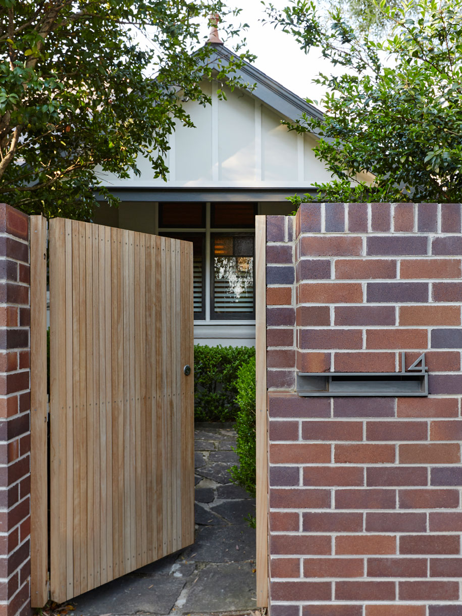
As their first build and personal family home, the project was a chance for Catherine and Daniel to embody some of their architecture ideas. While the original house floated off the ground, making no connection with the surrounding gardens, they’ve pulled it back down to ground level, turning the rental property in need of much love into a home that embraces its surroundings but also tucks away for times of rest and refuge.
“We wanted the house to open up like a big veranda or close down when we were feeling a bit more introverted.”
“Cats instinctively know sunlight and thermal comfort”
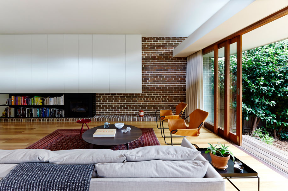
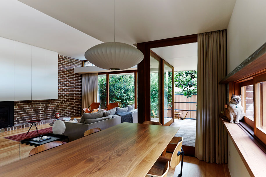
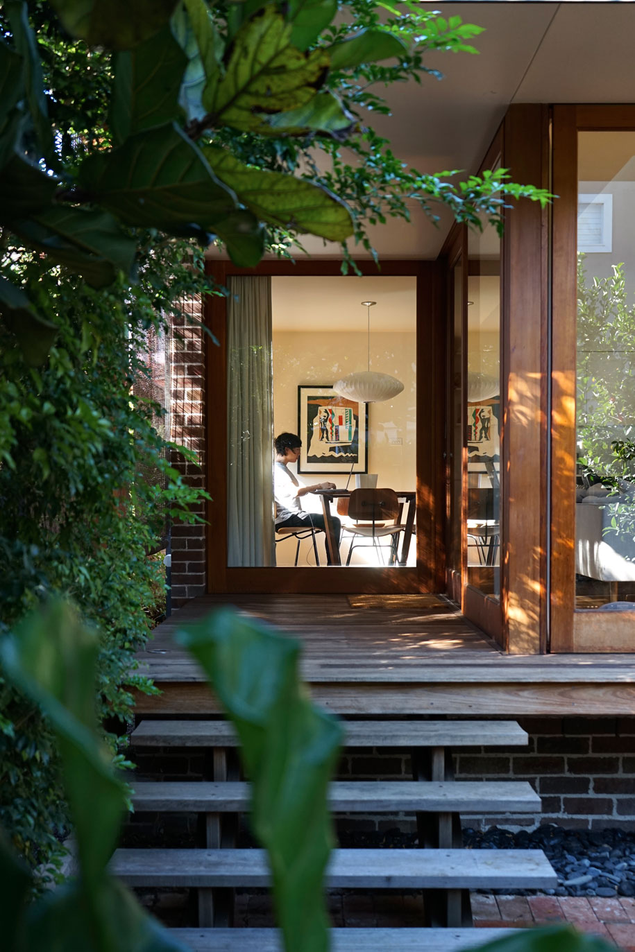
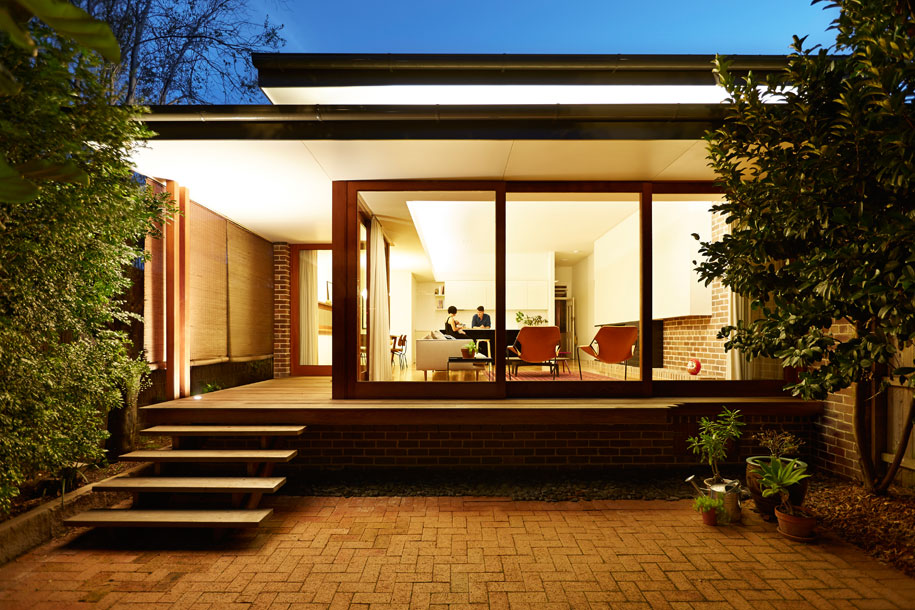
Taking inspiration from cats and Japan, the final design does just that. The timber house is grounded, captures its “precious outdoor spaces by virtue of its planning and careful curation of its openings”, and has ample spots for rest in the sun.
“We imagined our cat padding around the house. Where would he like to sit? Where might he curl up to sleep? Cats instinctively know sunlight and thermal comfort,” they say.
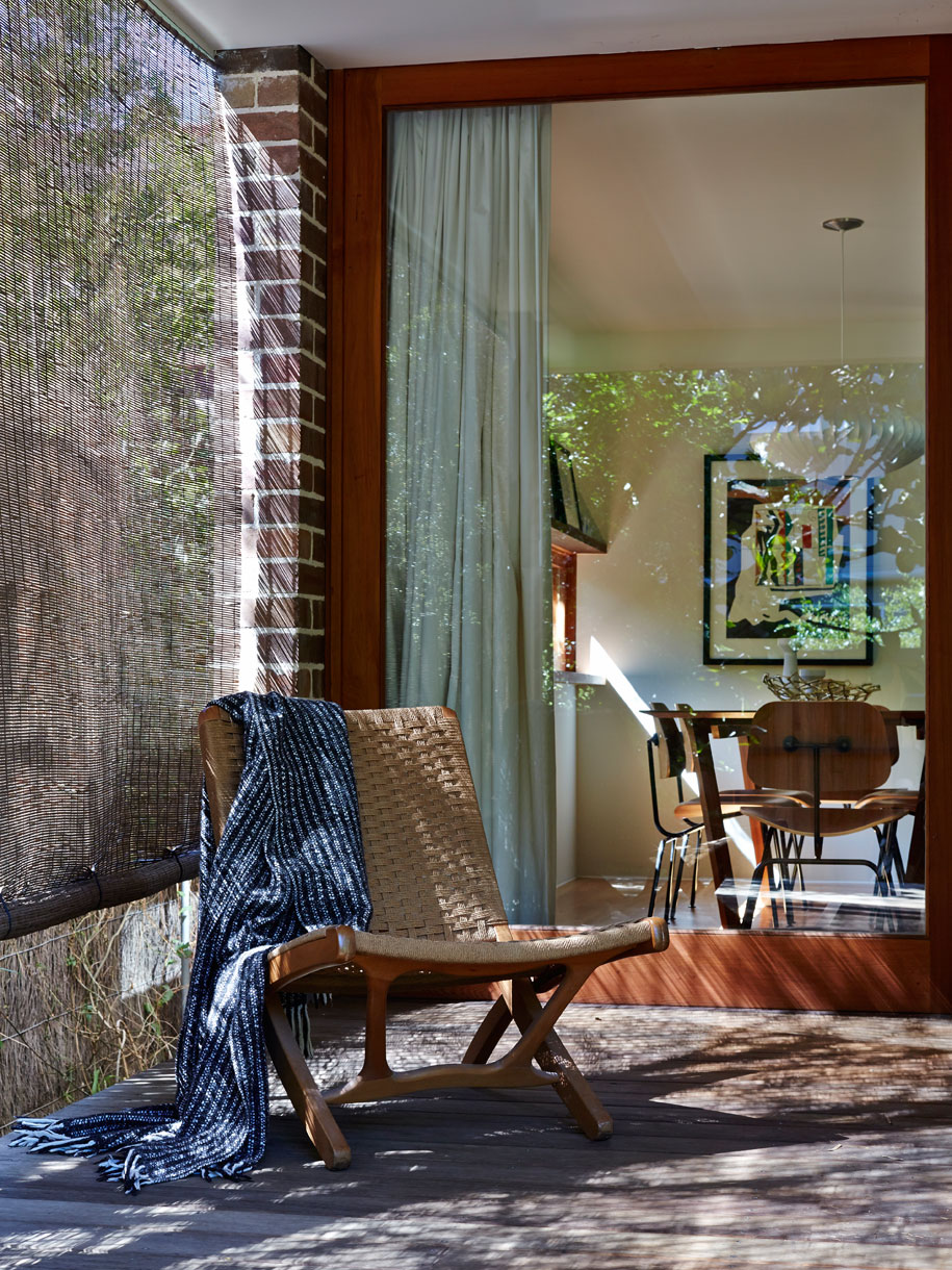
The angular forms come as a result of their time in Japan, “studying the amazing timber houses in cities like Takayama. Japanese courtyards, diagonal views across grids and proportional relationships were quite influential.”
By opening up the house to the diagonal, the house is surprisingly open while retaining that level of privacy they wanted – a “delicate balancing act in a dense urban environment”.
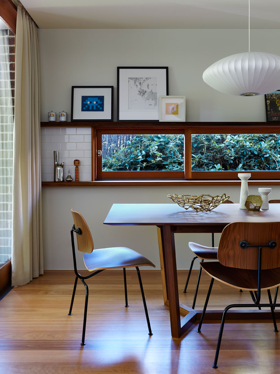
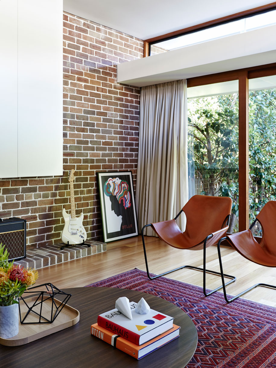
“There’s a lot of play with prospect and refuge. We love sitting in the dining nook and being on the periphery of the building and site.”
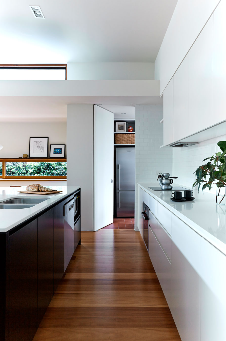
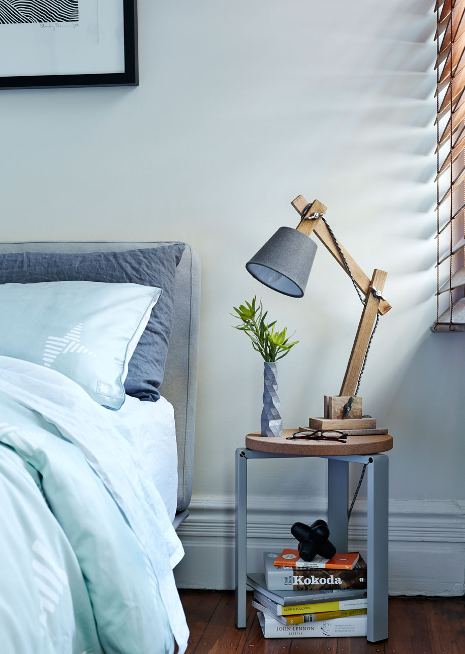
“We experimented with some simple ideas and thankfully they work,” says Catherine. “There’s a lot of play with prospect and refuge. We love sitting in the dining nook and being on the periphery of the building and site; there is the opportunity to watch the passing of the day almost unnoticed. It’s the same for sitting on the edge of the deck or having a shower in the Ensuite, you are occupying the very fringe of the building, yet you feel completely sheltered and protected by the house.”
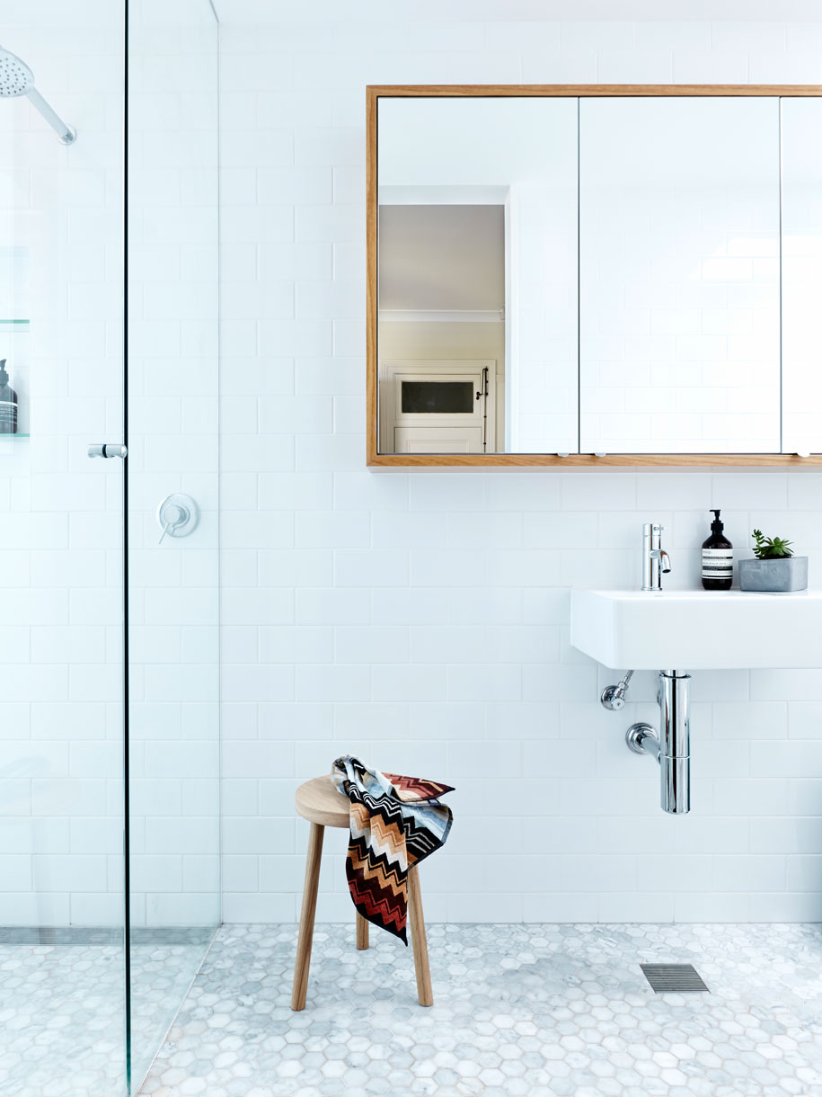
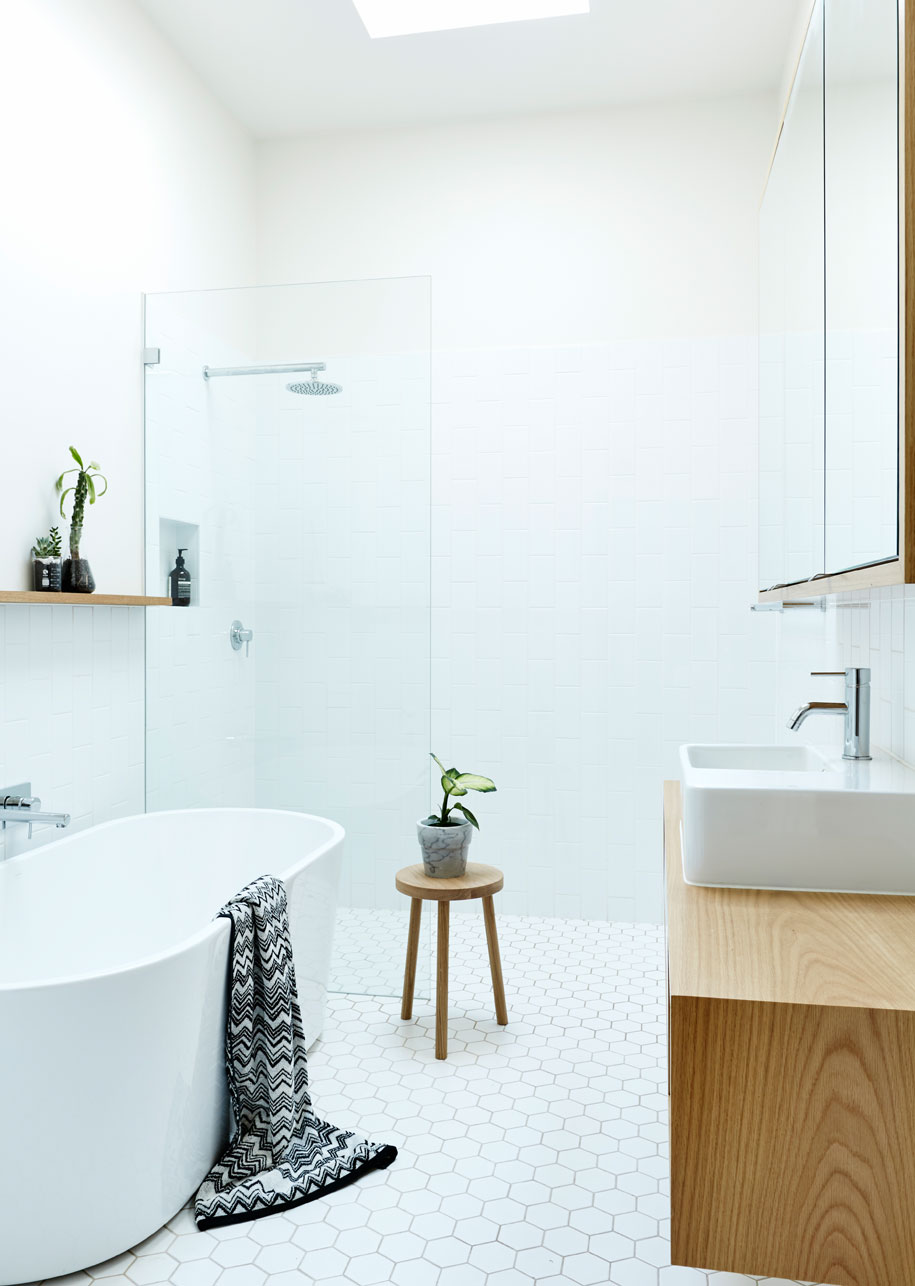
And as their own, as architects, it’s a constant learning environment. Just as the house ended up giving them ‘clues’ as to how to approach the design, it continues to teach them,
“By living in our first project, we get to constantly reflect on what we did and what we could do better – it taught us a huge amount in the process of designing and building, and continues to teach us more every day.”
Photography by Felipe Neves
DROPBOX
Architect/design firm: Downie North Architects
Kind of project: Rear addition to (approx. 80m2) and renovation of semi-detached residence
Location: Neutral Bay, NSW
Parameters of project: 3 bed, 2 bath, 150 m2
Final cost of the project: $275 000
Date of project completion (month and year): Dec, 2013
Stylist: K-A Jones
Assistant Stylist: Corina Koch
Downie North Architects
downienorth.com
