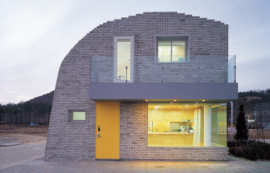
This house is for a young family with two children. They are very interested in the larger community and plan on sharing their exterior spaces with the community. They intend to create a day care for neighbourhood children. The site is perfectly matched with the client’s intentions; it is the last house in a row of houses.
It is the point of rupture between the clearly defined front and back yard spaces; the point at which the continuous façade of the row ends. The public and private territories are not as clear as on other sites within the row.
While the public and private territories are ambiguous, the end condition is where the relationship between the building and the landscape is clearest. The entire row of houses can be read as an object/ field relationship between building and landscape.
This opposition between formal clarity and territorial ambiguity requires a very different strategy than with the infill condition, particularly because the client is interested in further breaking down the public private opposition.
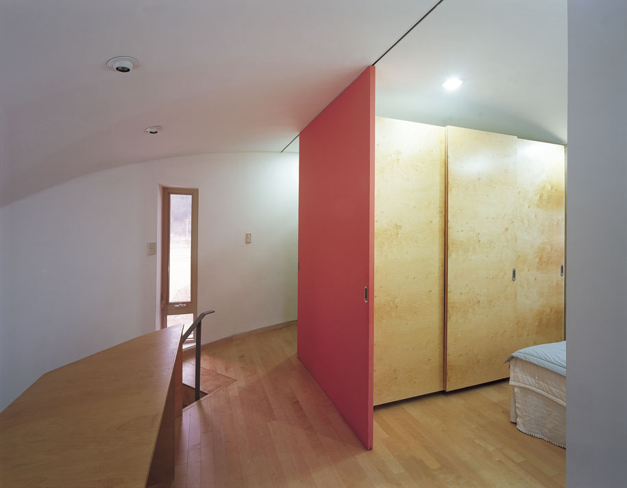
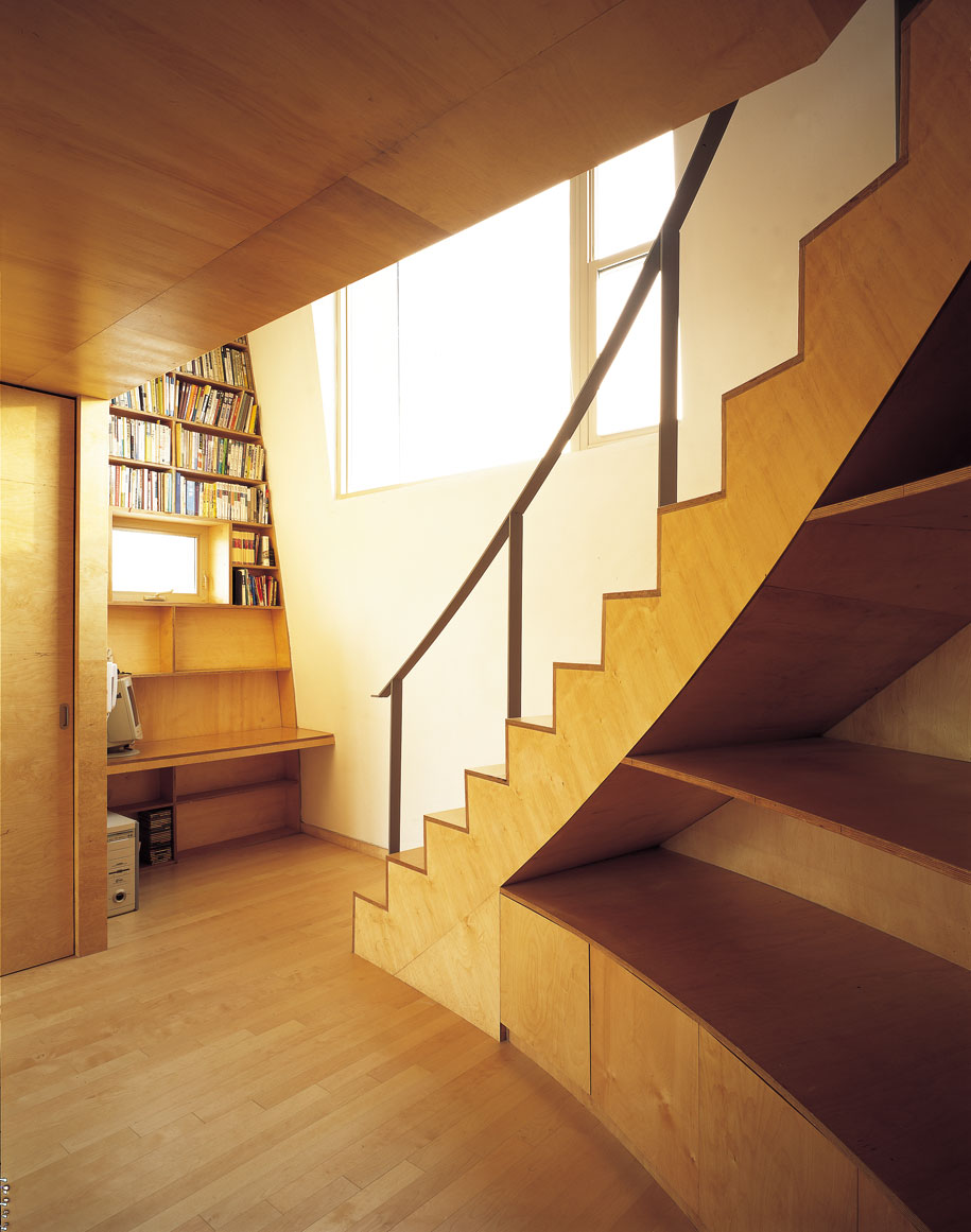
We chose to break the row into fragments rather than just extending the row “wall” to the end of the site. Placing the main house at the western end of the site allows passage between the front and back yards and creates an outdoor space open to the street within the depth of the row house.
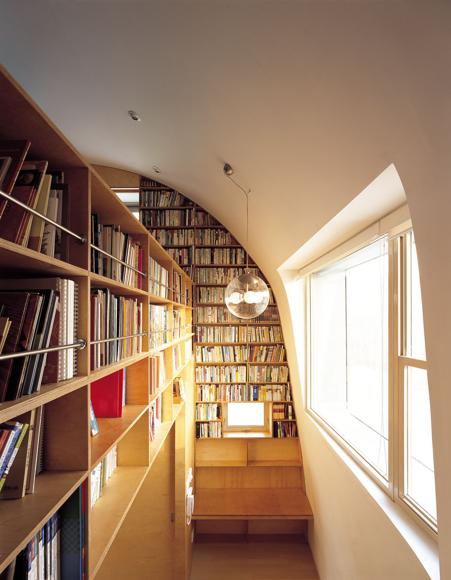
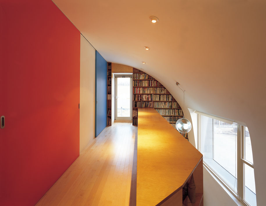
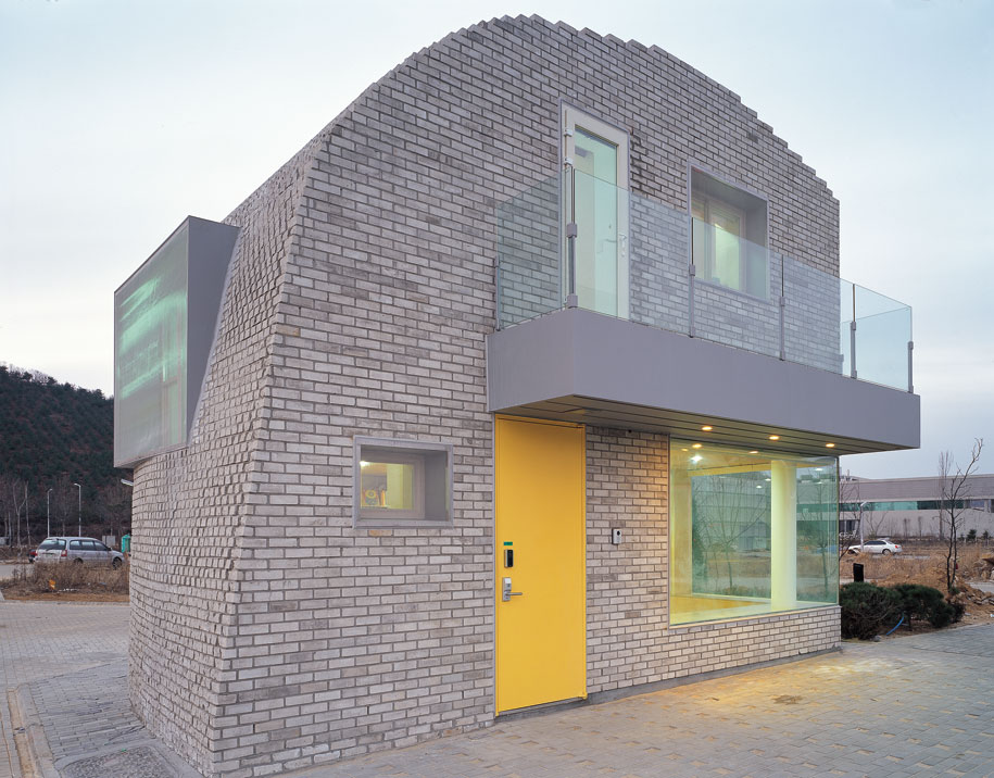
Separating the main house volume allows us to play with the relationship between landscape and building. Softened and rounded to be somewhere between the rigid orthogonal geometry of the row and the smooth contours of the landscape, the main volume is difficult to categorise.
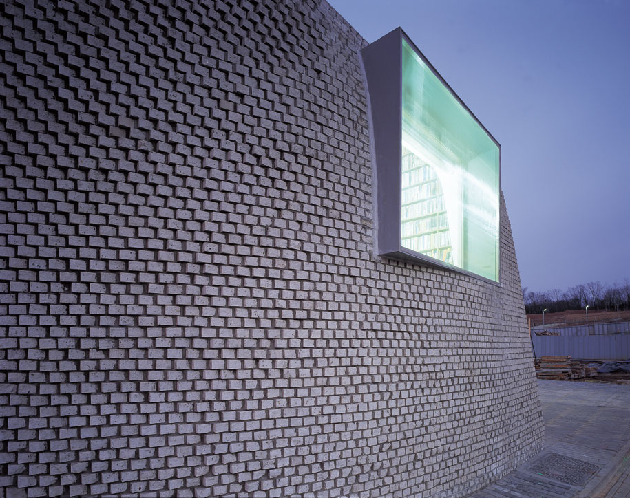
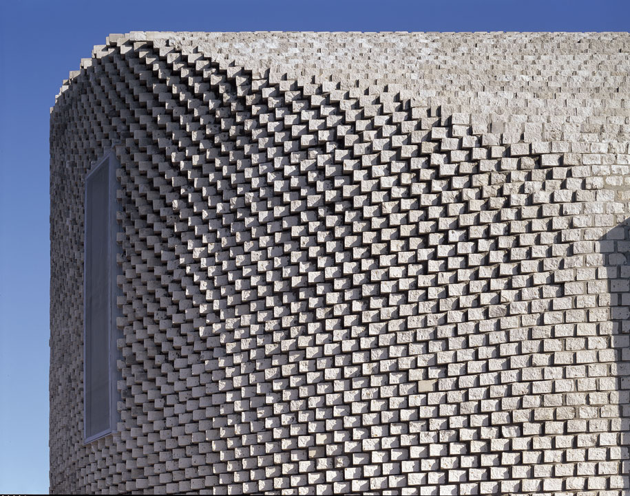
Is it a rock or a building?
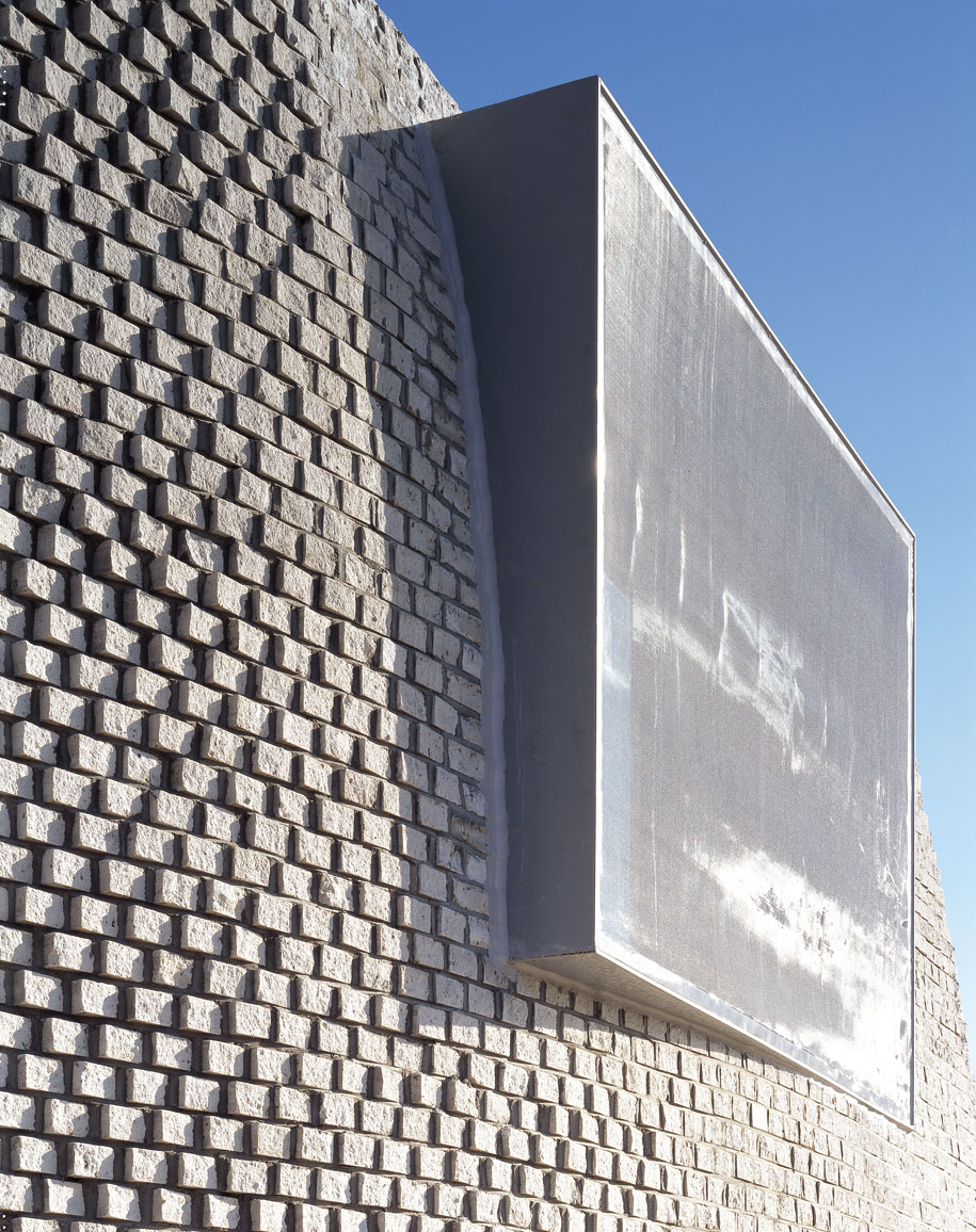
At a micro scale this tension between the contoured natural condition and the orthogonal master plan condition is further developed in the choice of materials. By using a simple orthogonal bricks, the smooth shape is digitized into discrete units.
This tectonic tension between the larger smooth form and the individual bricks parallels the tension between the individual house and the row and between the buildings, as described by the master plan, and the hilly landscape.
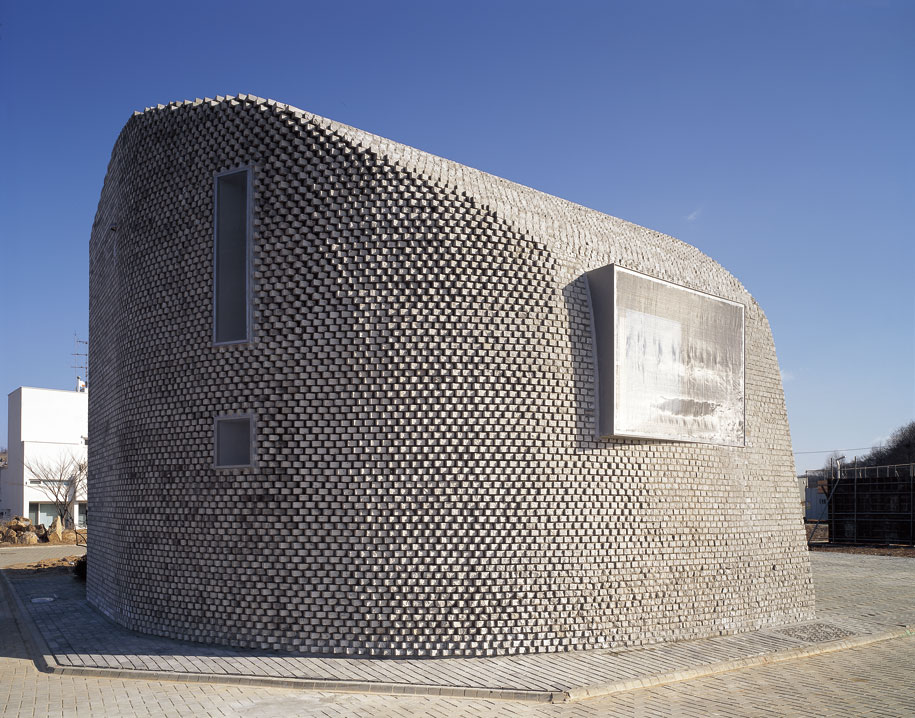
The bricks also provide a very tangible sense of scale and of the making, the process of turning the abstract into the real, manifest in the grain and the inability to “zoom” in beyond a certain scale. The number of pixels determines the smoothness of a digital image; the smoothness of this house is determined by the brick module- the result is a 9,675 Pixel house (1 Pixel = 1 Brick).
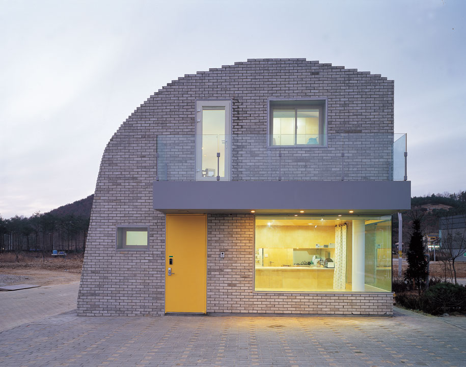
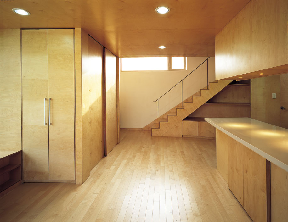
The middle piece of the house, phase two, occupies the back yard as defined in the master plan. By placing it in this zone this piece of the building occupies the semi-private backyard but is accessible directly from the front yard. It invites the community to share this space by taking it out of the housing row.
The owner plans to use this space as a community center during the day and as part of the private living space at nights and weekends. Taking advantage of the opposite cycles between educational and residential uses the space performs double duties.
Photography by Yong-Kwan Kim
DROPBOX
Architects:
Mass Studies: Minsuk Cho, Kisu Park, Joungwon Lee, Soonbok Choi, Junkoo Kang, Sungpil Won
Slade Architecture: James Slade, Illya Korolev, Oliver Spreckelsen
Parameters: 1,200 SF
Type of build: new construction
Location: Heyri, South Korea
Date of completion: 2001
Structural Engineer: Youngho Lee
MEP Engineer: Samjung Engineers, Jinsan Engineers
Construction: Hanwool Construction
Client: Younghyo Jin, Sookhee Chang
Slade Architecture
sladearch.com
Mass Studies
massstudies.com
