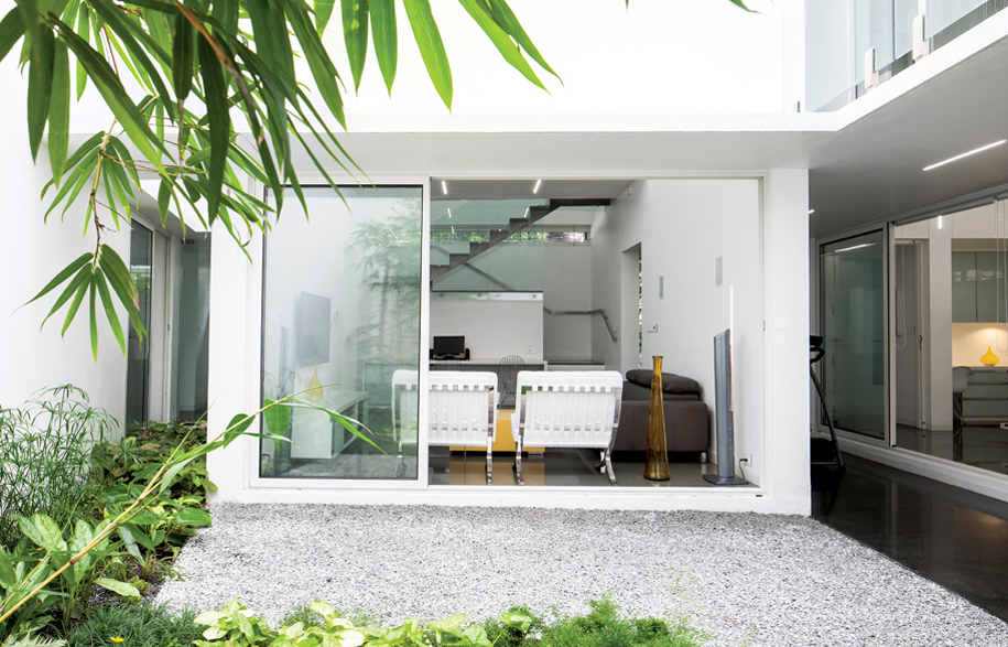
Designed by architects, Lijo Jos and Reny Lijo of LIJO.RENY.architects, Skewed House carries a well-defined aesthetic sensibility that weaves through spaces. Simple clean lines, volumetric variations, refined colour schemes and the considered integration of interiors and exteriors, all combine to create a joyous living space.
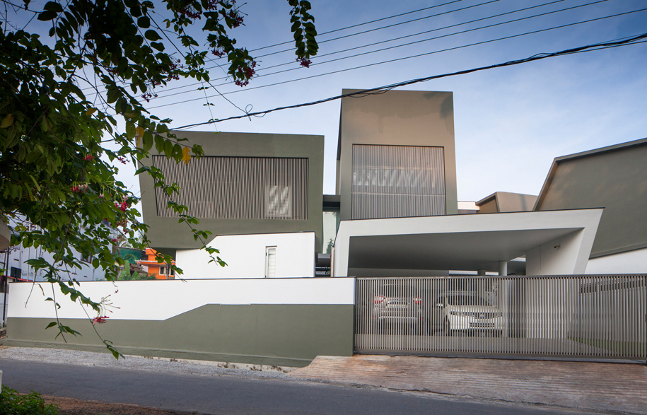
The home of two doctors and their two kids, the Skewed House is set on a skewed plot in a tight residential fabric in Palakkad, India – which is known for the strong winds blowing across the opening in the Western Ghats and year-round blistering dry heat. The house is deliberately introverted as a response to the need for privacy in a dense neighbourhood fabric, and also to provide refuge from nature’s elements.
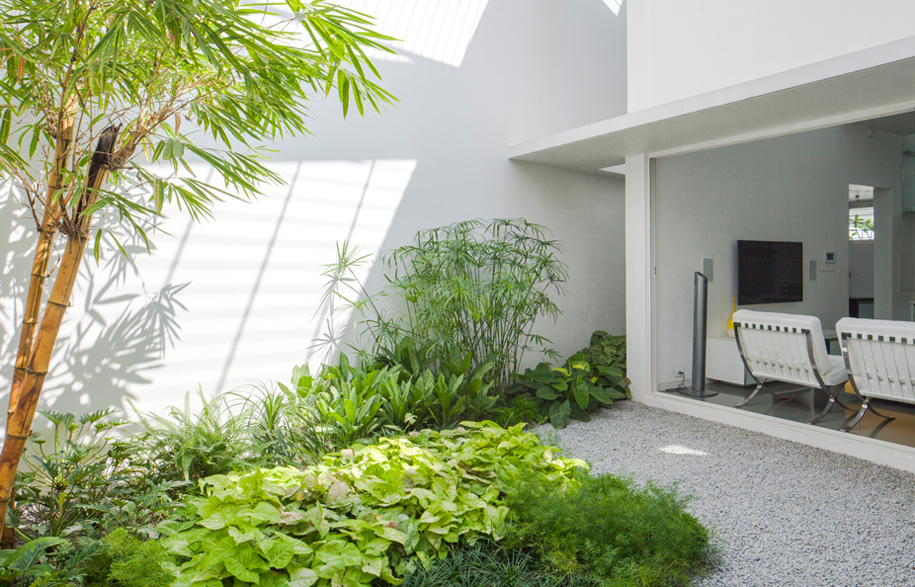
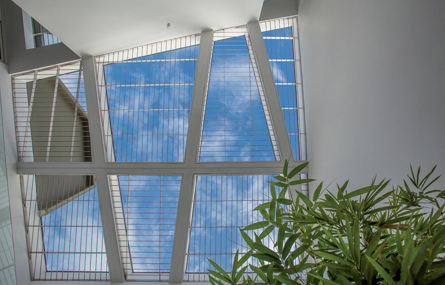
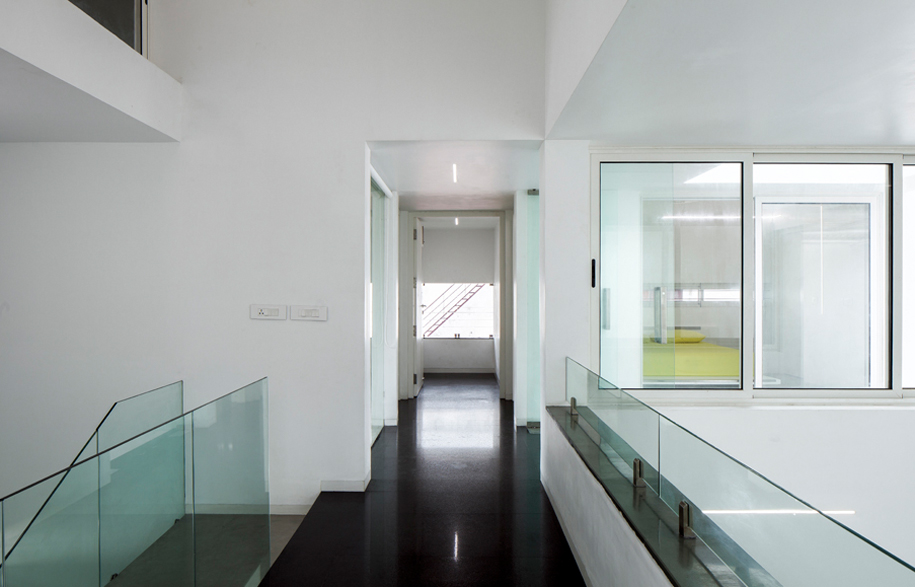
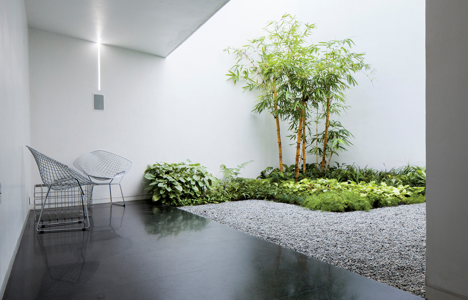
In order to ensure a constant movement of air through the home all year round, the house is split into three principal spaces or bays that are organised around a central open to sky court. Each private zones in the house opens out onto differently scaled internal courtyards.
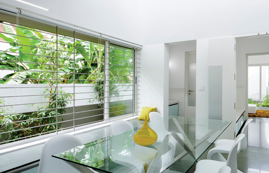
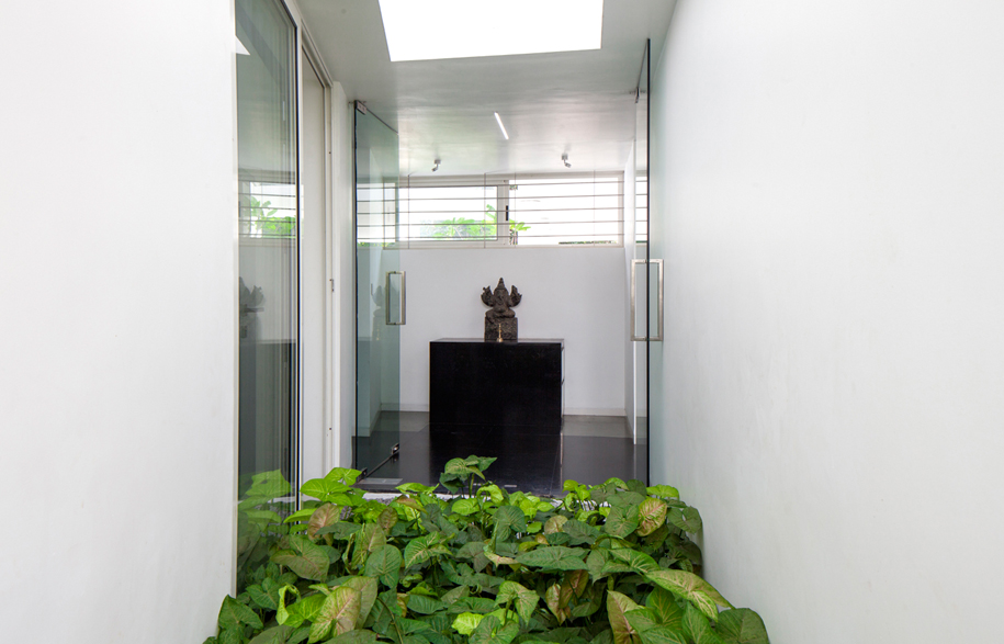
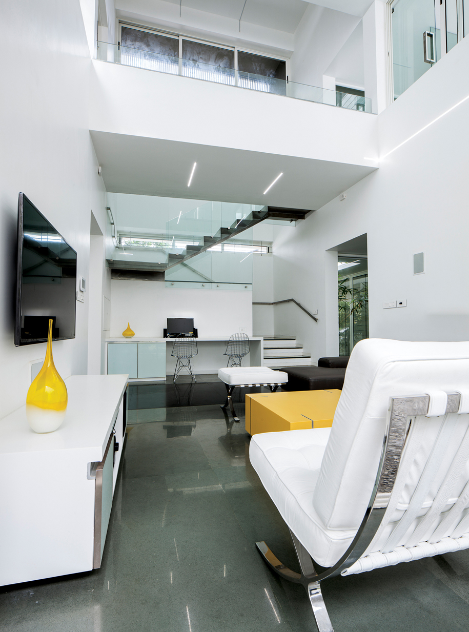
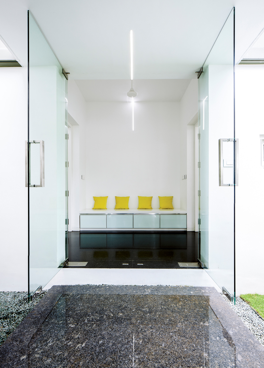
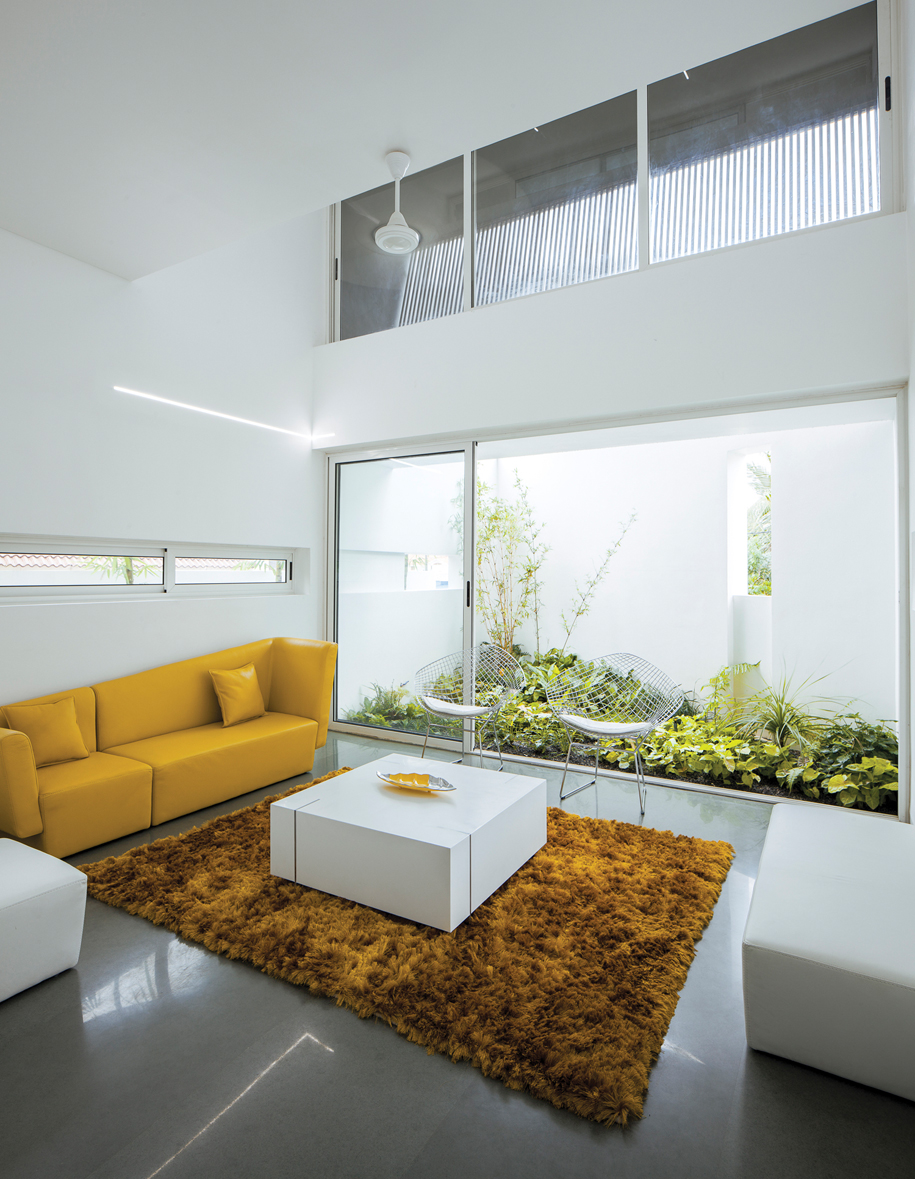
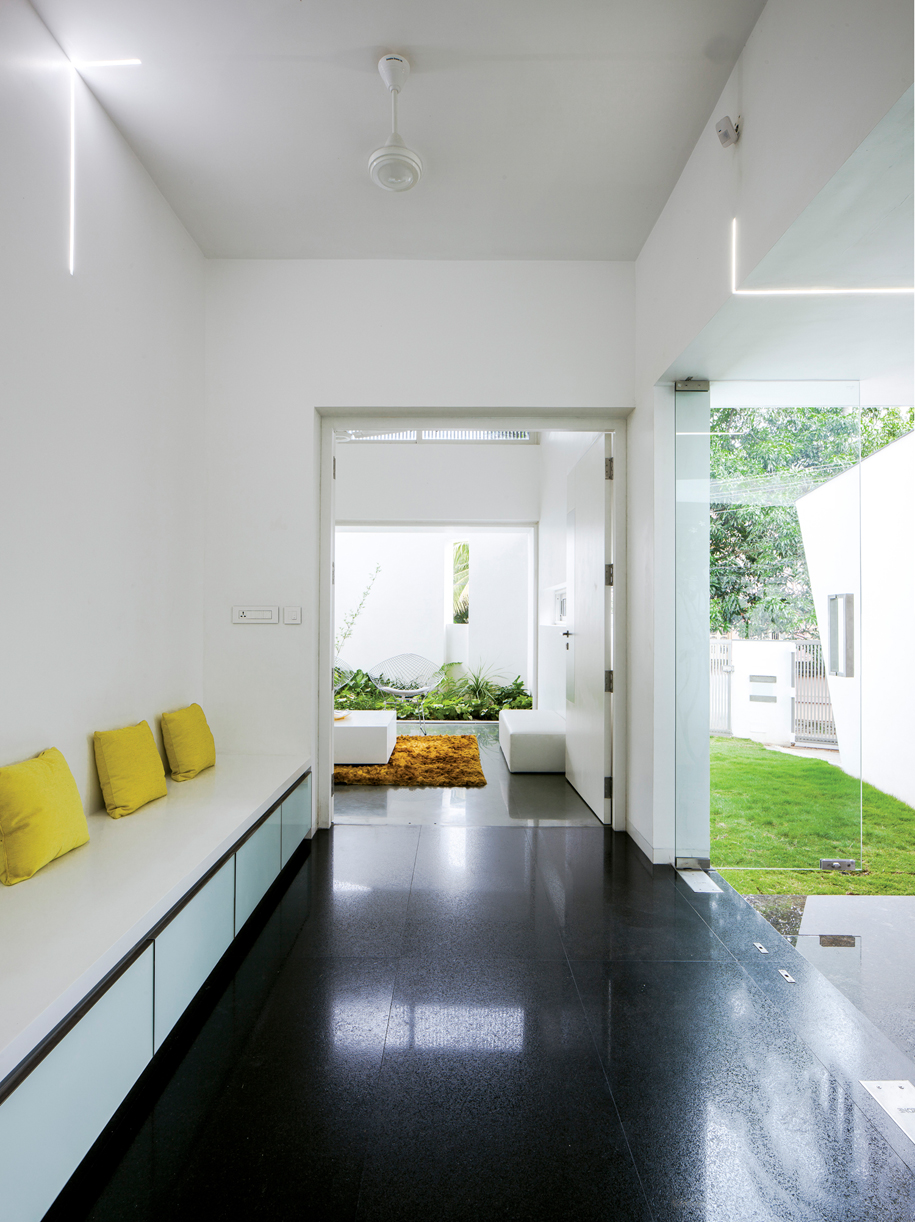
The entry to the Skewed House is informal, and features a small court with a frangipani tree and a simplistic glass door enclosed foyer. Then you arrive at the formal living area, a semi-public zone. Natural light and leafy greenery cascades through a large window that contrasts against a stark white formal living space. This space features a split level ceiling with a large opening to the east, and is carefully enclosed with an aluminium screen that welcomes the morning light.
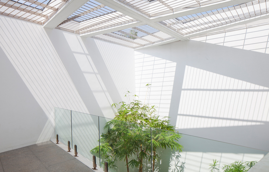
Light is carefully orchestrated, creating spaces where at times the light filters in indirectly along a wall, or an explosion of natural light focuses directly onto a wall that forms a stage for a magnificent choreography of light and movement.
The dining space defines the entry to the private zones of the Skewed House. A large window with a built-in window seat – a comfortably proportioned platform looking out onto the dense greenery outside – takes pride of place. The northern bay houses this space as well as the foyer, the formal living area, powder room, kitchen and related functional spaces.
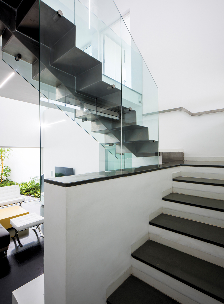
One of the main features of the Skewed House is the staircase, an interplay between the solidity of the Kota stone on the lower portion of the stair and the lightness of the suspended stainless steel on the upper flight of stairs.
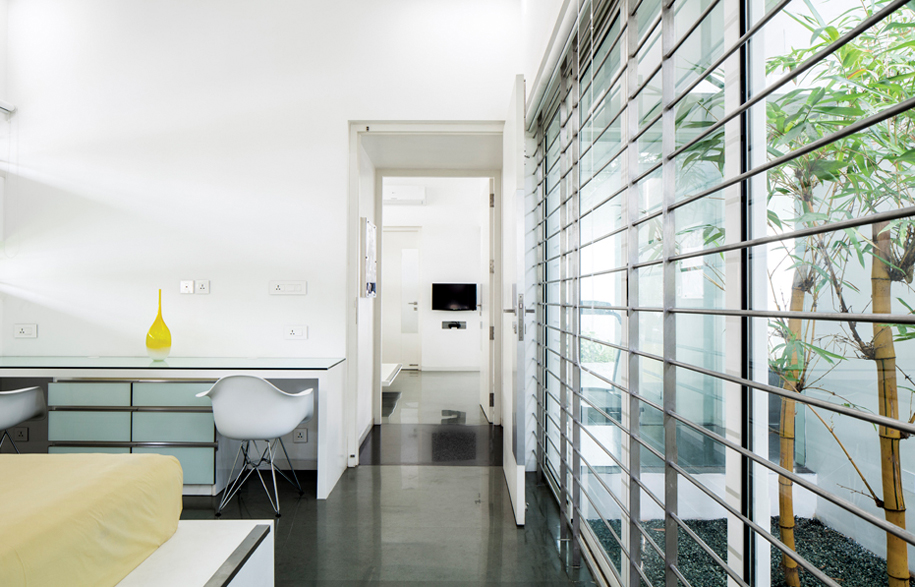
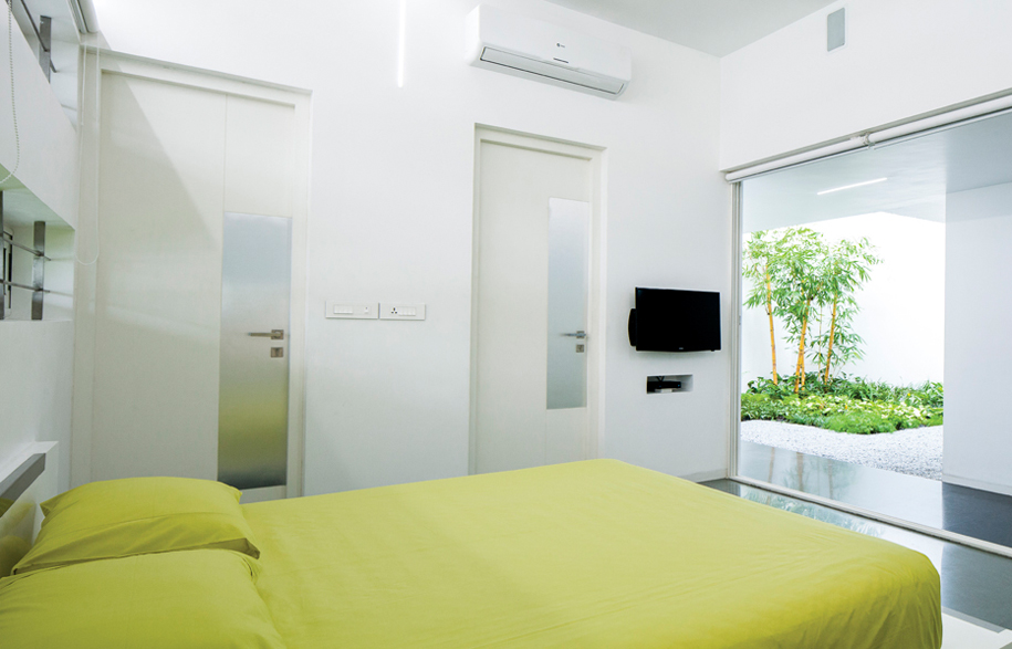
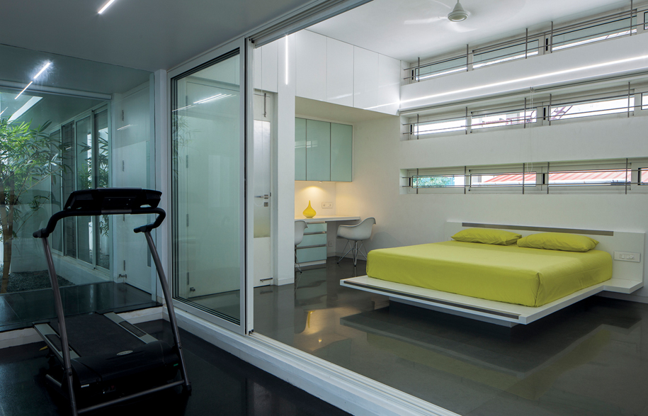
The bedrooms and toilets on both the floors are located in the southern bay, buffered from the central zone by a layer of covered open space. The masterbed on the ground floor features a set of sliding doors that open out onto the central court through an intimate private patio.
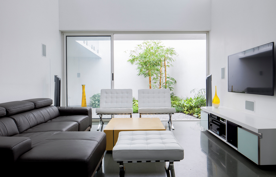
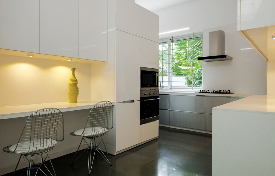
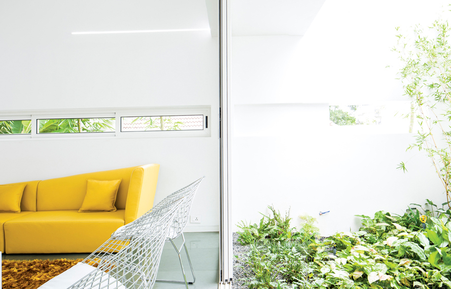
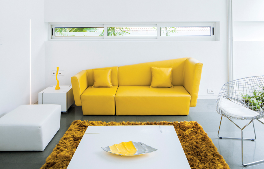
Minimalistic colour palettes are interspersed with interesting design elements including the light fixtures, concealed linear LED strips inserted into the walls and the ceilings, and highlights of yellow.
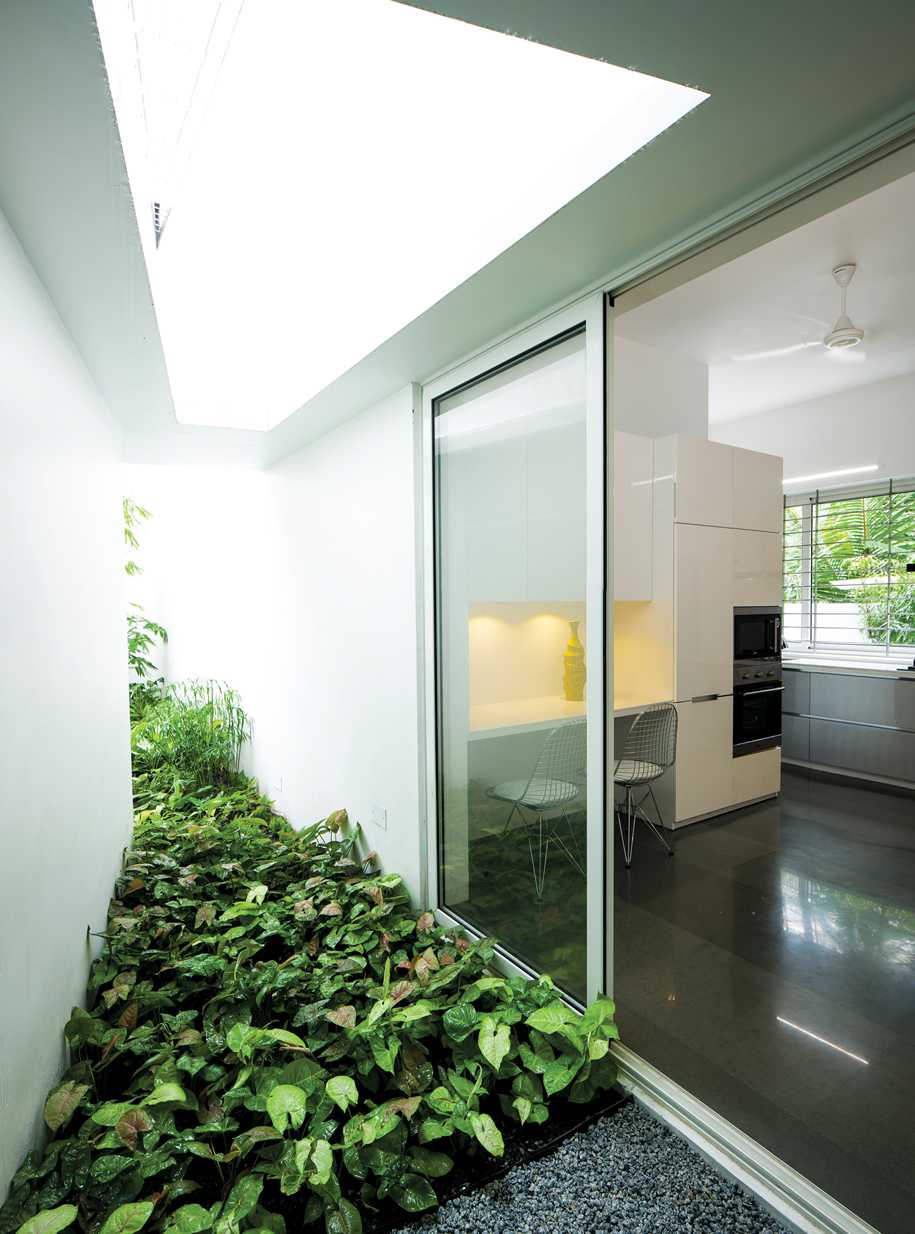
The spaces open out onto internal courtyards and allow a sense of continuity from the inside to the outside. These open spaces form the backdrop to the interior, with the landscaping connecting the space to nature and also aiding in the microclimatic control of the space.


LIJO.RENY.architects
lijoreny.wordpress.com
Photographs: Praveen Mohandas, courtesy LIJO.RENY.architects
