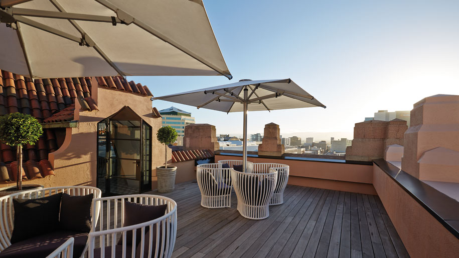
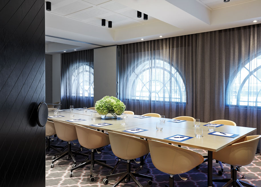
The brief for Adelaide’s new 170-room Mayfair Hotel called for an intimate interior that respected the character and quality of the existing structure. As the project’s interior designer (alongside the base building architect JPE Design Studio), Bates Smart delivered just that, taking their cue from ornamentation and detailing on the heritage-listed 1930s Colonial Mutual Life building’s elegant facade.
“We thought the notion of a Moderne-type style was what was appropriate for this project, so we picked up on a lot of the exterior’s key design elements and extended them internally,” explains Bates Smart’s Director of Interior Design Jeff Copolov. The 1930s as a golden era of travel was also a source of inspiration (a hotel, after all, is for travellers) and so early-era Art Deco sensibilities reverberate throughout the interior’s overall scheme.
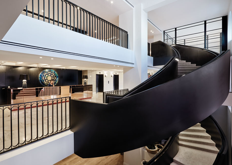
It was important for Copolov and his team, including Project Leader Erica Lienert and Principal Interior Designer Kendra Pinkus, to achieve a consistent design language across all areas of the hotel. “We wanted people to be able to walk in and not quite know which parts we’d touched,” he says. But while there is strong harmony between old and new, the black steel ribbon staircase connecting first floor through to lower ground floor gives no apology as a recognisable insertion.
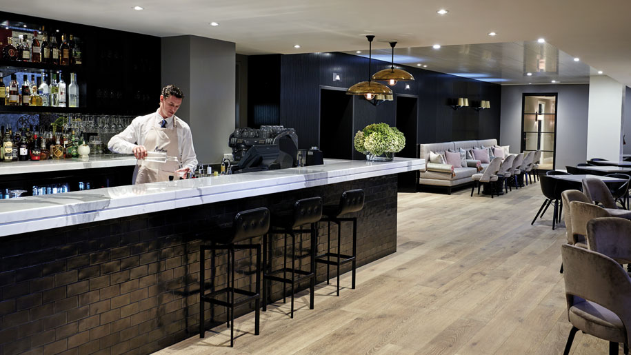
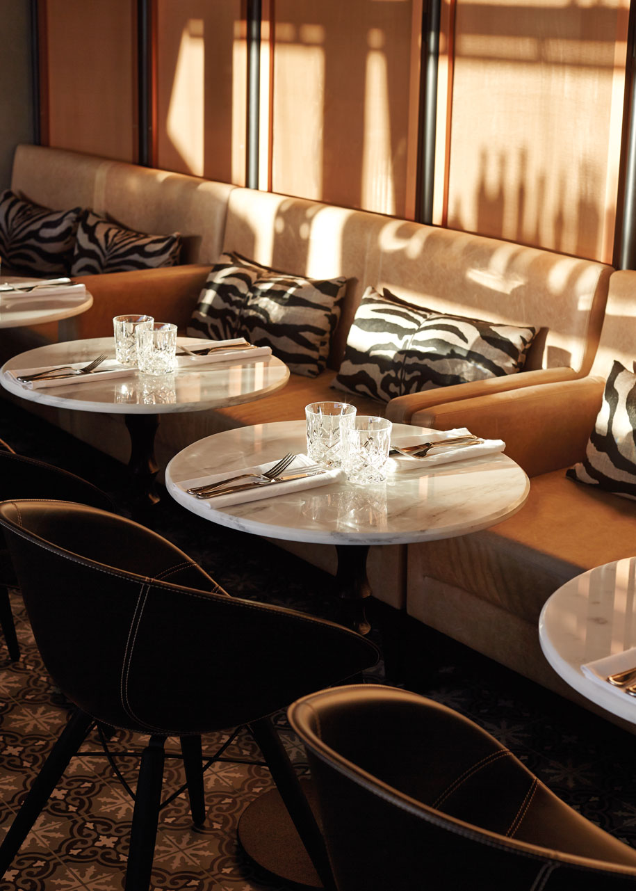
Adding a dramatic sculptural element to the pared-back lobby, it becomes the design’s unifying feature, together with black balustrades and dark timber panelling in the restaurant, which reference the exterior’s metal frame windows. The rest of Mayfair Hotel’s muted colour palette stands in stark contrast, with grey, taupe and putty hues functioning as a backdrop across all 14 floors.
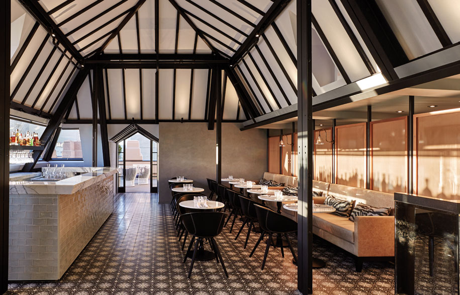
“Travelling can be stressful and for me, hotels are about creating sanctuaries in places you might not necessarily be familiar with,” says Copolov. “So we were keen to make the interior very neutral and calming.” It also allowed for stronger colour accents to be introduced throughout, including deep purple and pink in the lounge and dining areas and rich golden copper tones in the rooftop Hennessey Bar.
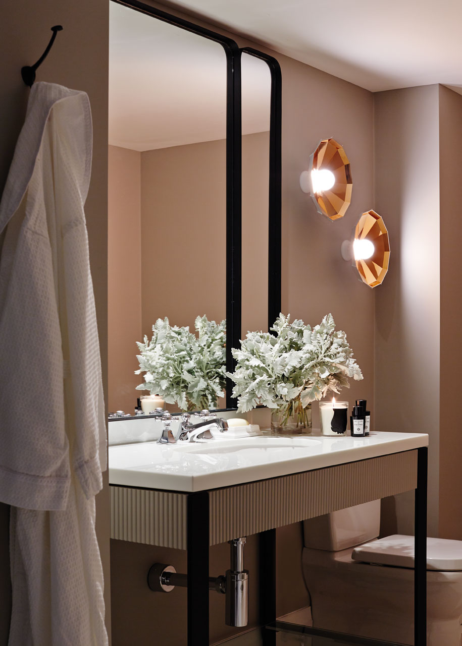
Decorative hardware in brass, bronze and steel compliment these colour finishes and reinforce Copolov’s fine attention to detail. The bathrooms are especially evocative of the Art Deco period with modular vanities finished in marble, mirrors with curved corners and patterned wall tiles oozing equal parts charm and glamour.
The design never resorts to mere pastiche. However (and this is where Copolov and his team have excelled), they have managed to capture that spirit of the golden era of travel while still remaining clearly contemporary in their conceptualisation. “It was all about bringing new life into an old building,” he reflects. “So the interior is a nod to the past, but at the same time, it’s forward-looking and I think it finds that balance very well.”
Photography by Sean Fennessy and Peter Barnes
Mayfair Hotel
mayfairhotel.com.au
