In Hong Kong, space is always at a premium. For a couple working in the creative industry, working from home is an everyday activity and the desire for a home to suit this as well as space to entertain presented a tricky design brief. For the resulting home within the Alto Residences complex, the solution was a considered separation between private and public space.
Located in East Hong Kong on the Tseung Kwan O waterfront promenade, the Alto Residences home renovation comes from Studio Adjective, and manages to suit the couple’s complicated design goals within the small space, without sacrificing style or comfort.
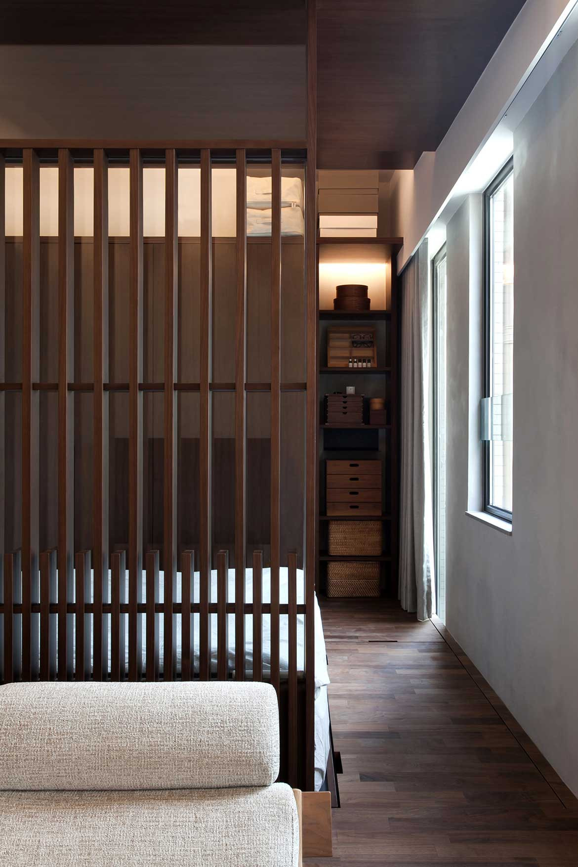
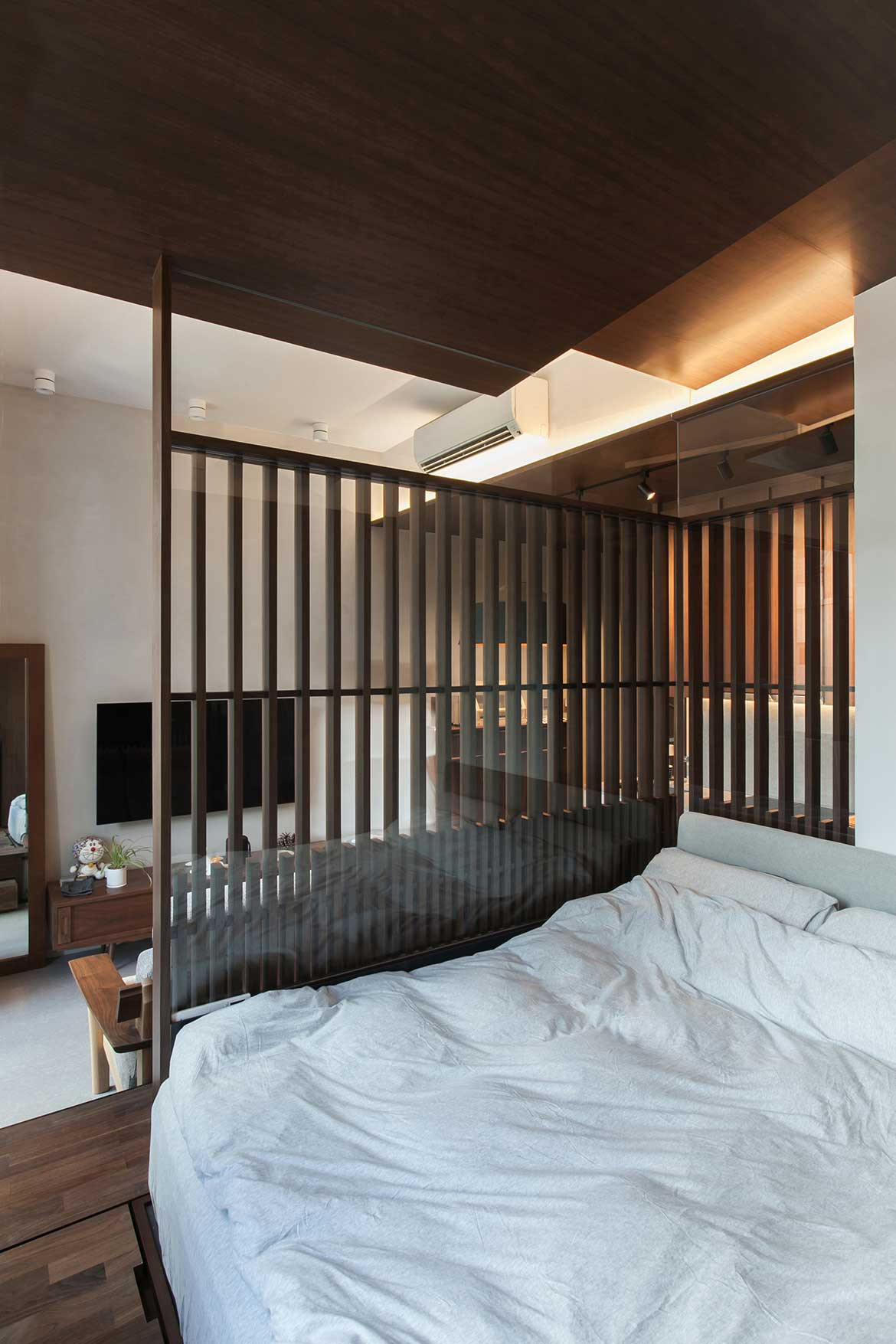
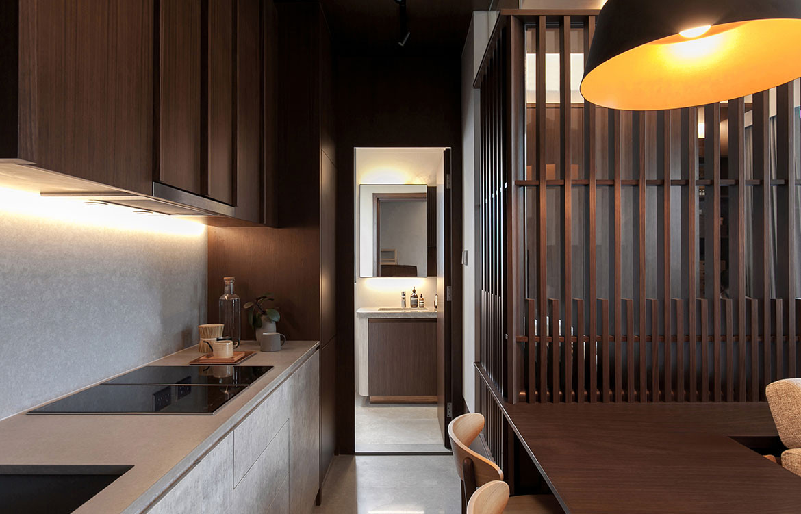
Prior to the renovation, the space took the form of a one-bedroom apartment with an open plan kitchen – lacking the division between private and public spaces the owners required. Studio Adjective designed a wooden and glass see-through L-shaped screen between the master bedroom at the home’s rear and the open space of the living area, successfully breaking up the spaces between public and personal, without sacrificing the space or flow of the home.
The bed itself is raised on a platform that extends through the space-dividing screen, to become a table and shelf at the living area and provide concealed storage underfoot. Two slanted walnut ceilings cover the sleeping area and also conceal supporting beam structures above.
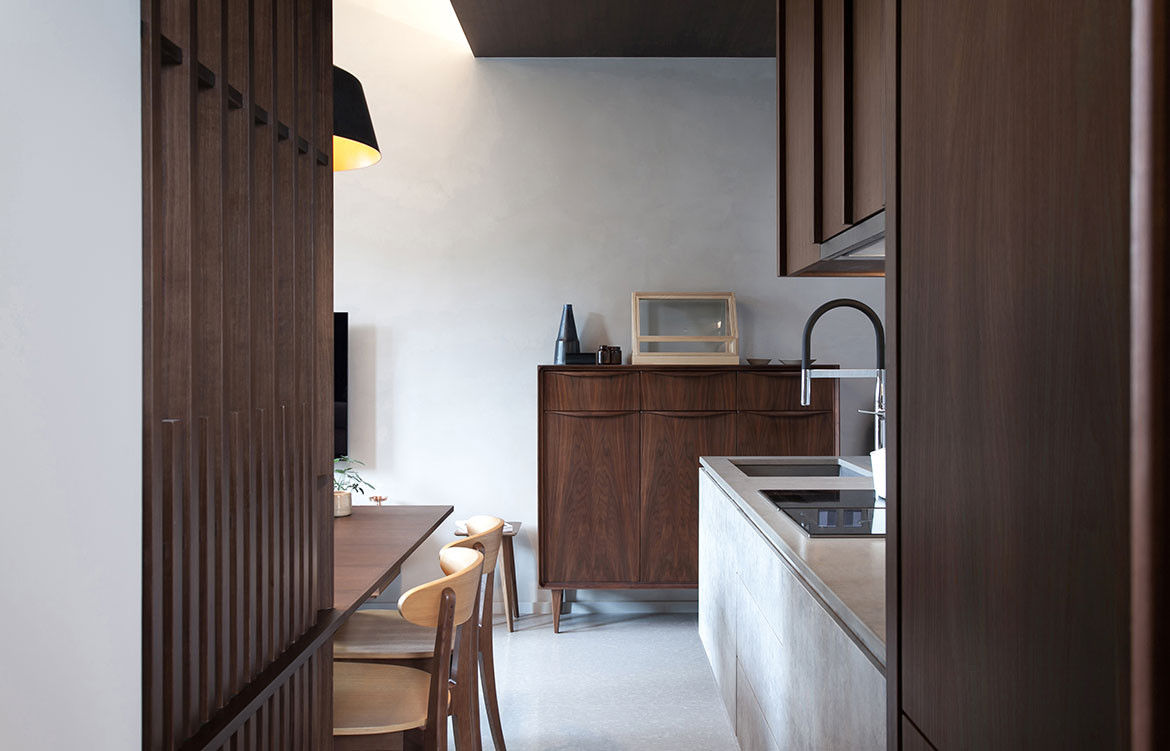
The cooking and kitchen area was altered minimally, retaining the open spaciousness of the existing build, but a smart resizing of the existing wall behind the kitchen creates a connection to the internal staircase to the roof, adding a natural sense of flow to the previously formless area.
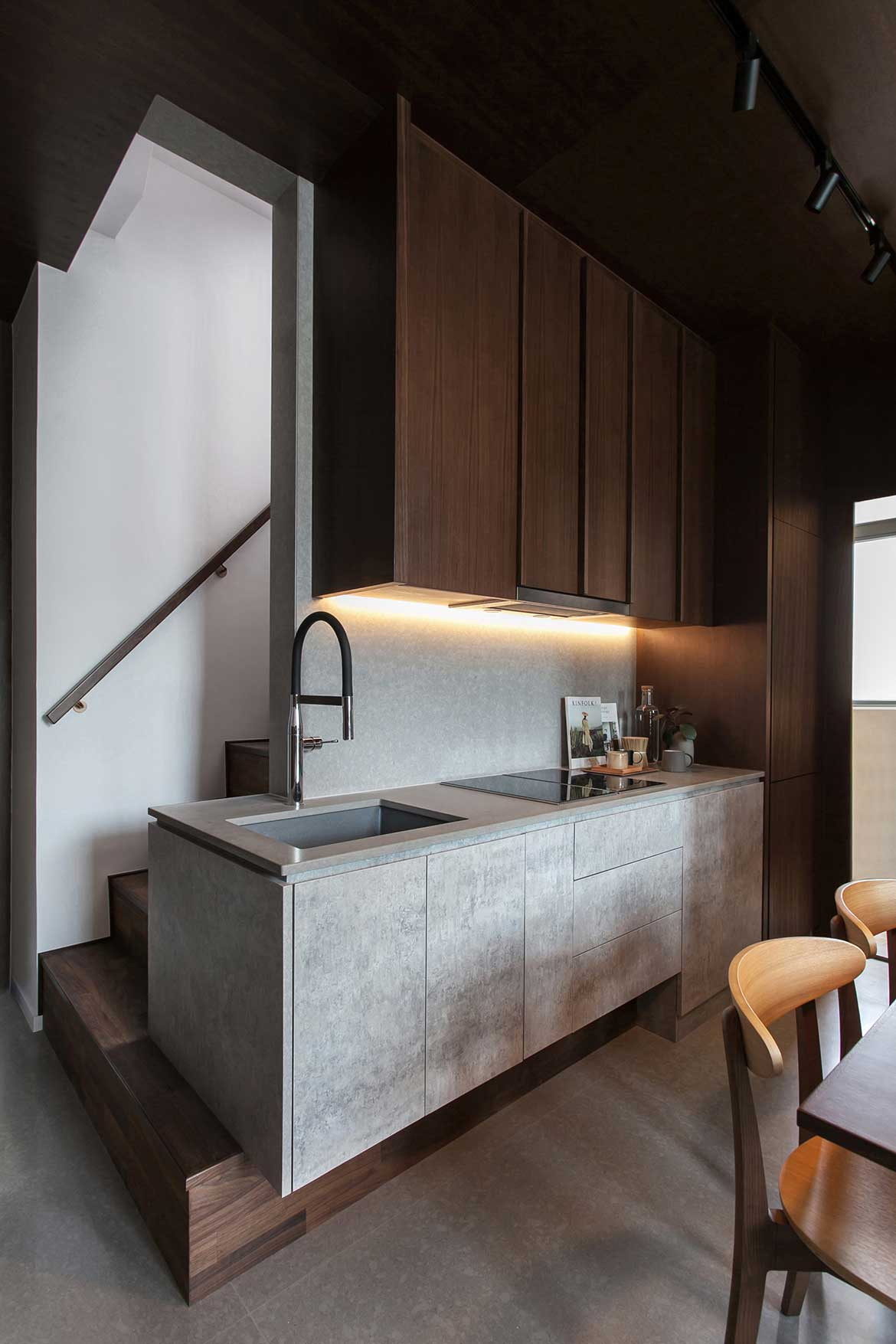
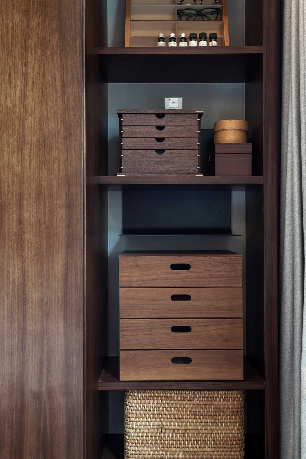
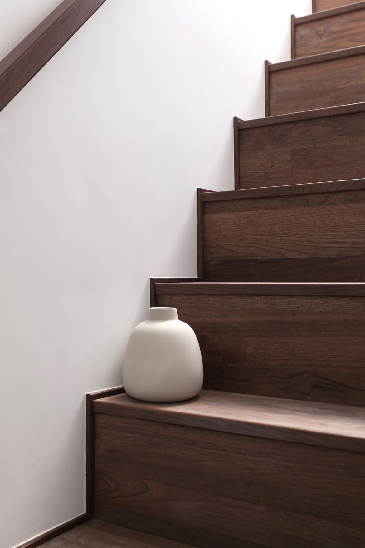
This flow leads the staircase to become an activity area itself, where friends can sit around with a glass of wine, chat, and gather around the open kitchen. The staircase also now serves a space for the owner’s to showcase art, nick-nacks and other collections.
The palette of the home is a sense of classic minimalism, allowing the shape and space of the unit to serve as the hero of the design. Walnut and light grey marble serve as the main colour gestures of the home, helping to create the open, flowing aesthetic of the overall space.
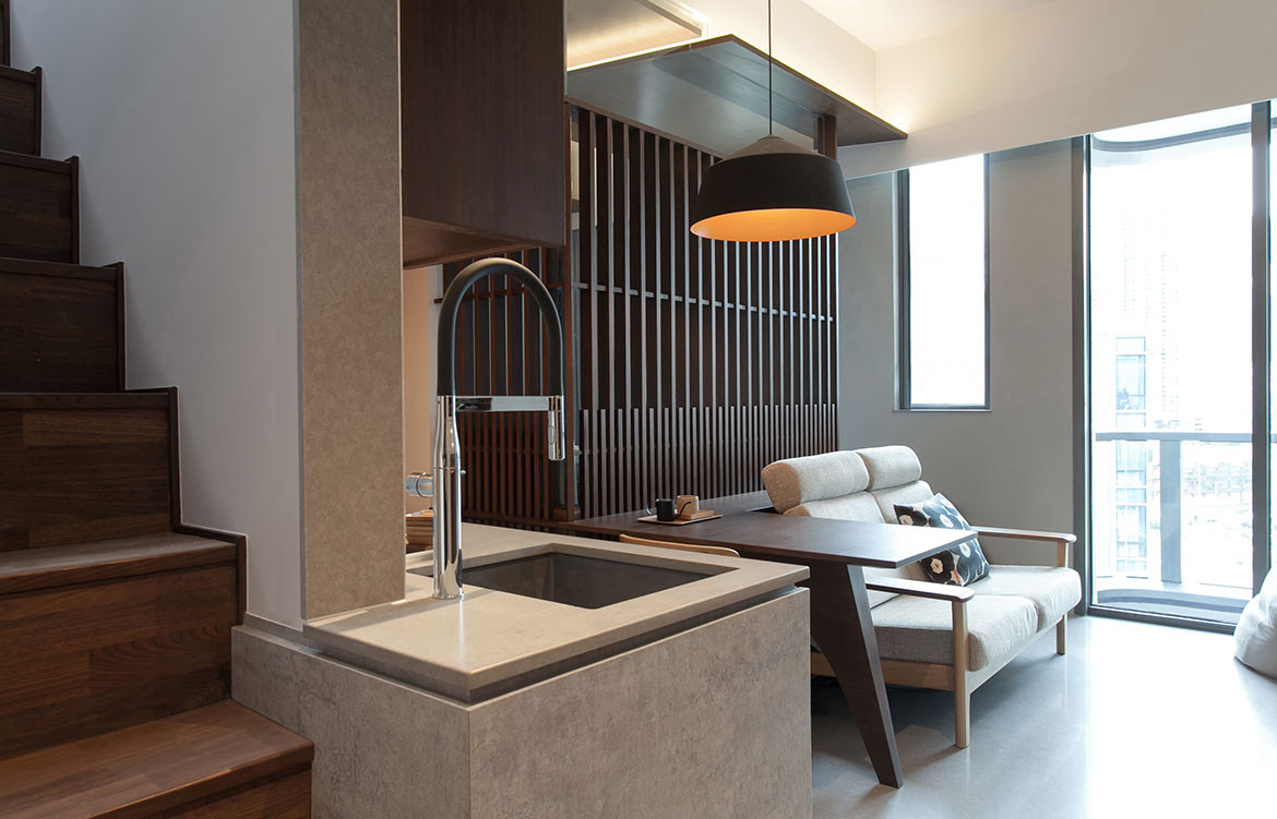
The final flourish on the home is the lighting design, which has been equally carefully arranged, to not overly-busy the space, simply being illumination to create tranquillity. For the couple, working from home in their private master bedroom, the lighting in the living area works with the L-shaped division; the break up the moods between work and relaxation.
“The strategy for this project was to focus on delivering a sensible space with thoughtful detail – making the apartment a space to experience every day,” say Studio Adjective’s co-founders Emily Ho and Wilson Lee. For a couple working an entertaining from home, this approach to the Alto Residences wisely offers the owners the space and freedom to do both.
Studio Adjective
adj.com.hk
Photography by Wilson Lee
