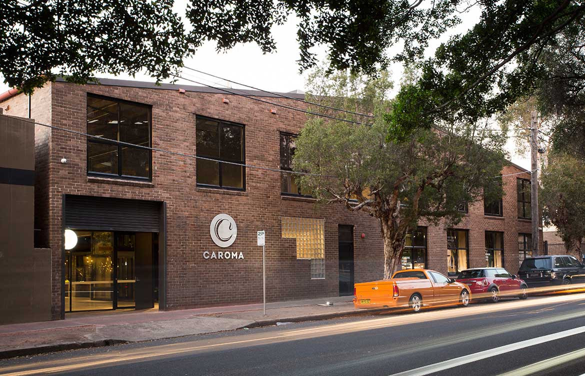
If you grew up in Australia, Caroma is a brand that – whether you know it or not – was a part of your childhood. It is very likely still part of your adult life. Even if your sink or tap or bathtub or cistern didn’t bear the iconic faded brown Caroma logo, it was the brand that helped introduce the half-flush water-saving system to the world. And after 75 years carving out an inimitable place for itself in the Australian interiors landscape, it has finally opened its first Sydney flagship store.
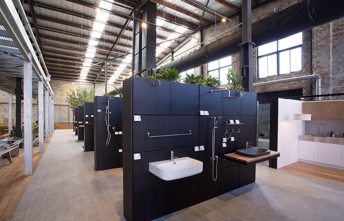
Across its sprawling 2,500 square metres, the Alexandria warehouse space pays homage to Australiana – from the symbols of the bush to city – across three narrative threads, conceived by designer Chris Gilbert and the team at Melbourne-based practice Archier. These narratives had to do with Caroma’s values as expressed through symbol and material; a consumer experience that is distinguished by “emotion” and “pace”; and the narrative of Archier itself, as a relatively new studio interested in producing instinct-driven spaces.
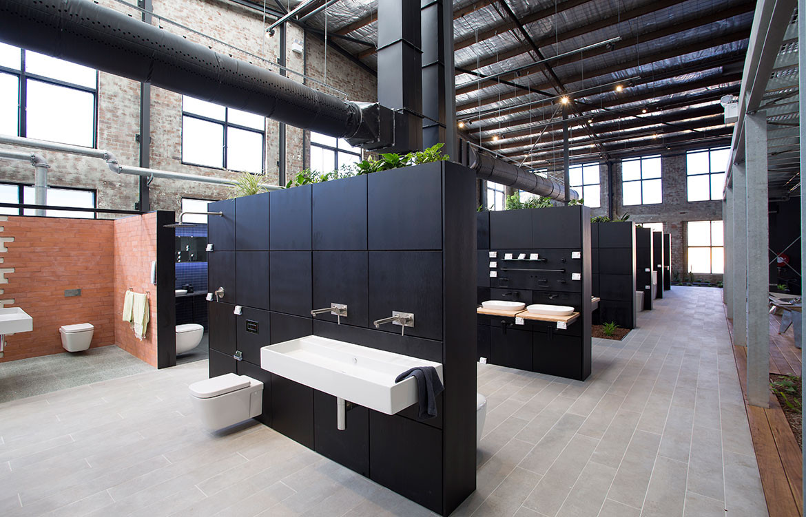
Considering the size of the space, material use and layout were both important so that Caroma on Collins felt welcoming rather than intimidating. Chris says the idea was to create an “anti-showroom, one which you did not regret giving up your Sunday to go to, a space that when you entered, you didn’t feel like you had to feign interest or act in a certain way, a space that allowed you to breathe and slow down, a space that was inviting and you would want to visit again”.
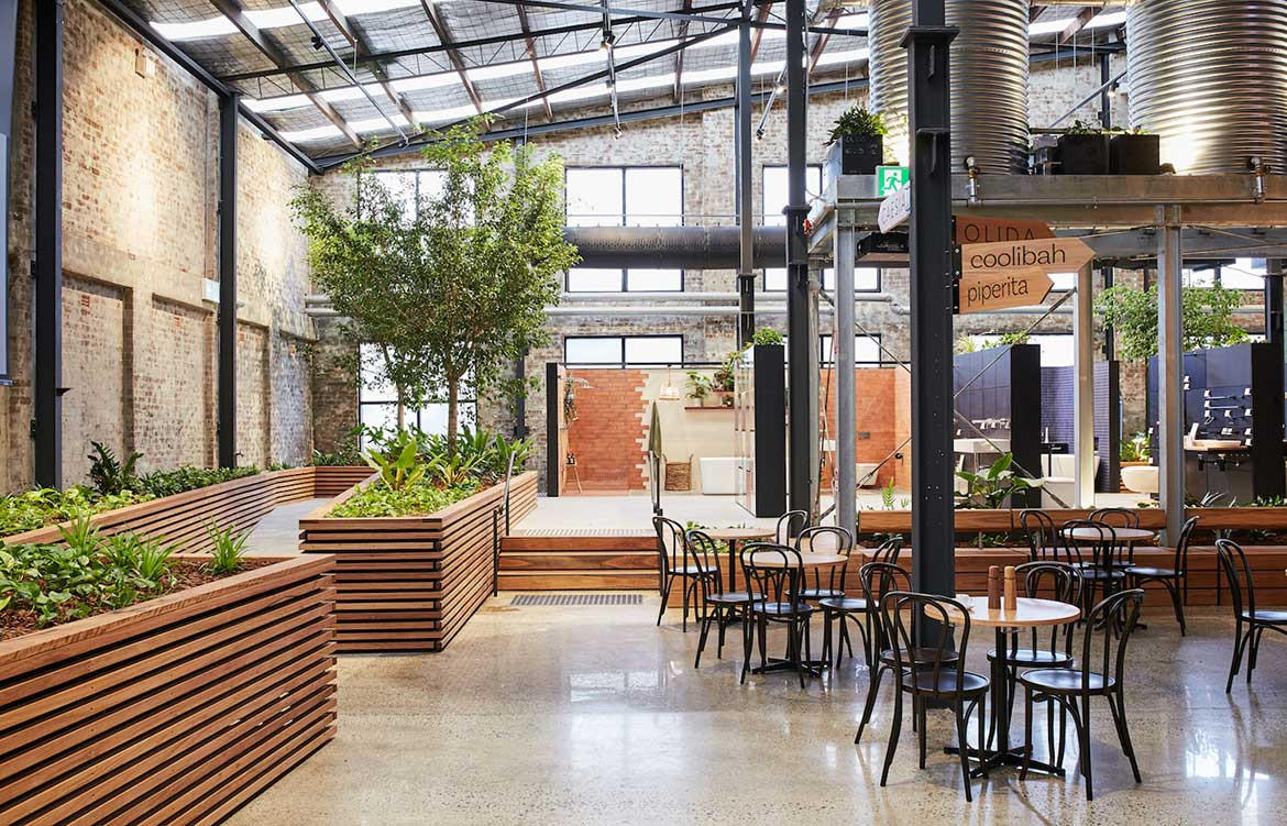
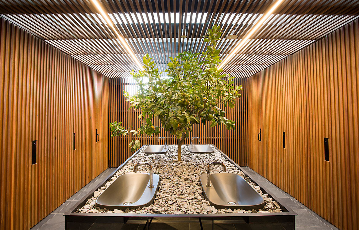
In this way, the symbols of Australiana were useful foils to vacuity on the ground-floor showroom. Rather than overwhelming visitors with a landscape of product, much of the flagship is taken up by indoor gardens of native flora. Upon entering, it feels like stepping into a beer garden under a tree canopy, filled with the resilient gums and galvanised water tanks of our dry outback setting. Even in the bathroom, a central lemon tree grounds the project in the wide Australian imagination. Materials such as steel and spotted gum are designed to get better with time and develop their own character through wear.
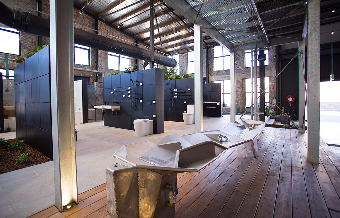
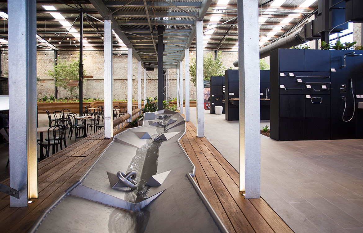
“The galvanised water tanks that sit at the heart of the project are a nod to the Australian pioneer, the recluse farmer who valued water above all else and who had to innovate and adapt to survive the Australian environment,” says Gilbert. “The softness and tactility of the ground floor is easy to relate to; the major goal here is to create a space that does not dictate to the user or place expectations on them. Instead, the space is there to support, providing moments of rest and opportunities to linger, so that thoughts can be slowly considered and decisions made.
“We wanted to enable consumers to have a tangible experience that they could take home regardless of whether they were in the research or selection phase of their renovation. Each product on display (in the market place or in a design capsule) comes with a product card with key information and a barcode on the back. This card can then be scanned at one of the design kiosks to create a product list with more extensive product information.”
Upstairs is a formal departure from the rugged textures and loose program of the ground floor. The former is more direct and deliberately sophisticated to reflect its floorplan of boardrooms, private meeting spaces and executive lounges. This is where the more brightly coloured Clark retail space is located, as well as corporate spaces whose luxe material palette of predominantly green velvet reflects a different audience.
Above and below, Caroma on Collins is highly sustainable, using very little power while capturing and re-using rainwater for its continued operation – important for a brand that has revolutionised the way we use water.
Caroma on Collins
caroma.com.au
Archier
archier.com.au
