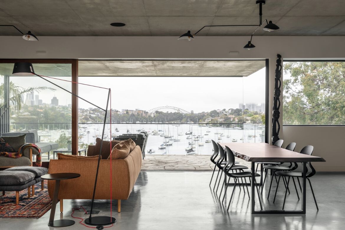
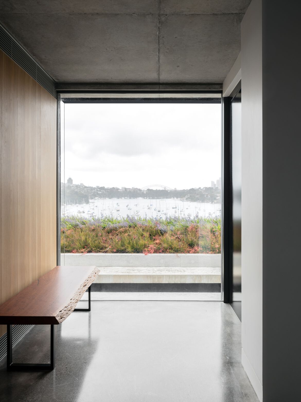
Bay House, located at the end of a narrow lane in the Sydney suburb of Longueville, offers stunning views of the city skyline and the Harbour Bridge. Seeing the potential and wanting to make the most of such stand-out surroundings, the owners appointed Castlepeake Architects to rework what was a poorly connected and inward-looking residence.
The brief was to revamp the structure to make it more efficient, with four main goals in mind: create full accessibility throughout the house; ensure a connection with the views, sunlight, and adjacent outdoor spaces; include the main living and sleeping area on one level for ease of use by the owners; and an accessible swimming pool at the lower level of the house.
The site’s steep terrain and limited available space presented several key challenges, such as how to maximise the views from the main living level, and connect to the outside with accessibility, but the solutions to these challenges are innovative and unique.
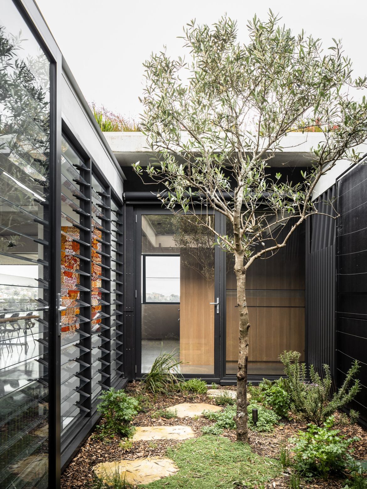
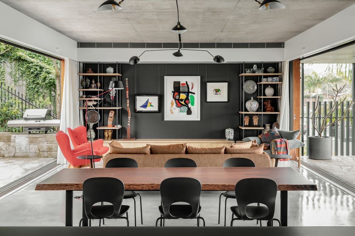
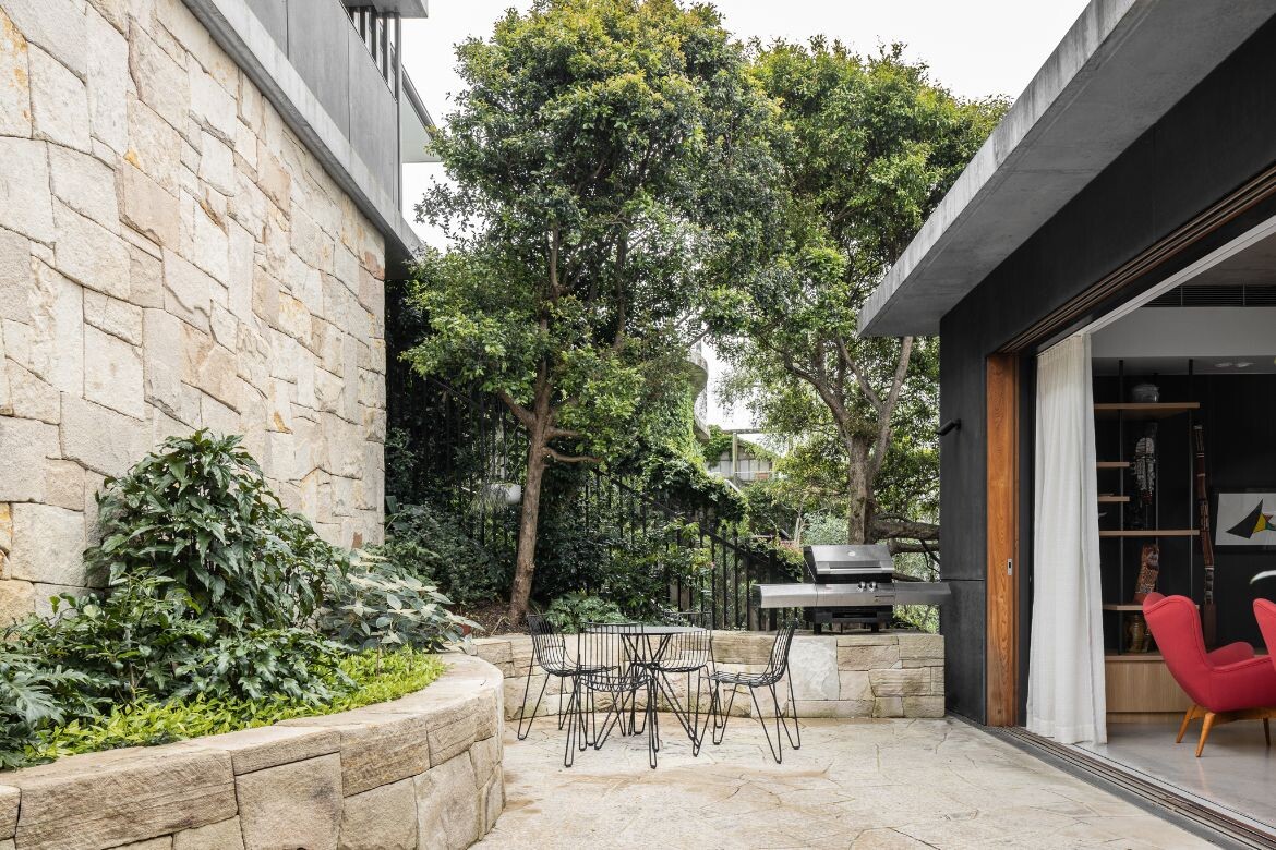
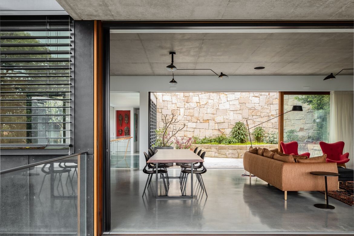
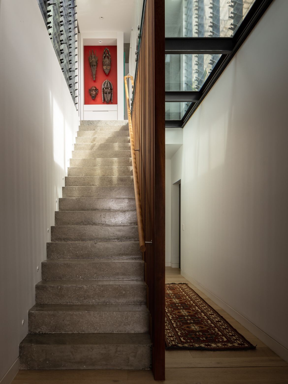
A compact stair and lift were added and the entry ceiling was reshaped, instilling a sensation of “compression” before “release” into the open living spaces. The main living level was elongated to maximise views and winter sun access, and a protected courtyard was created adjacent to the living space.
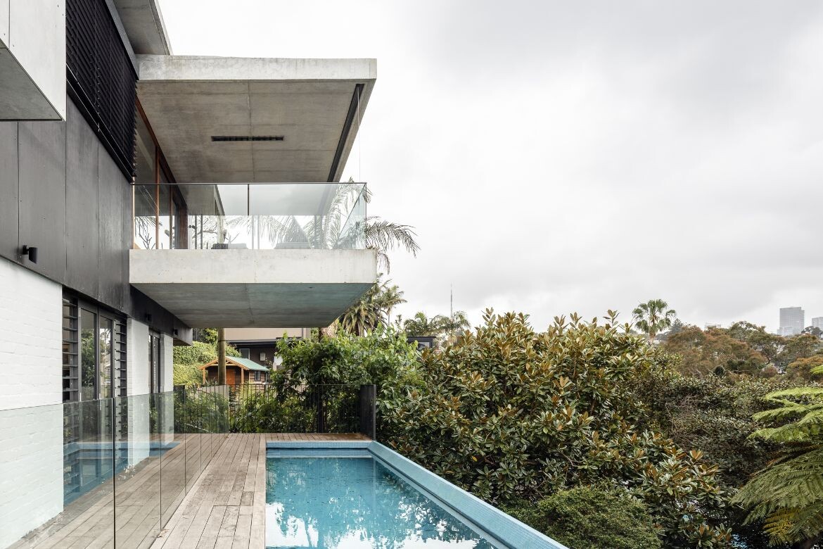
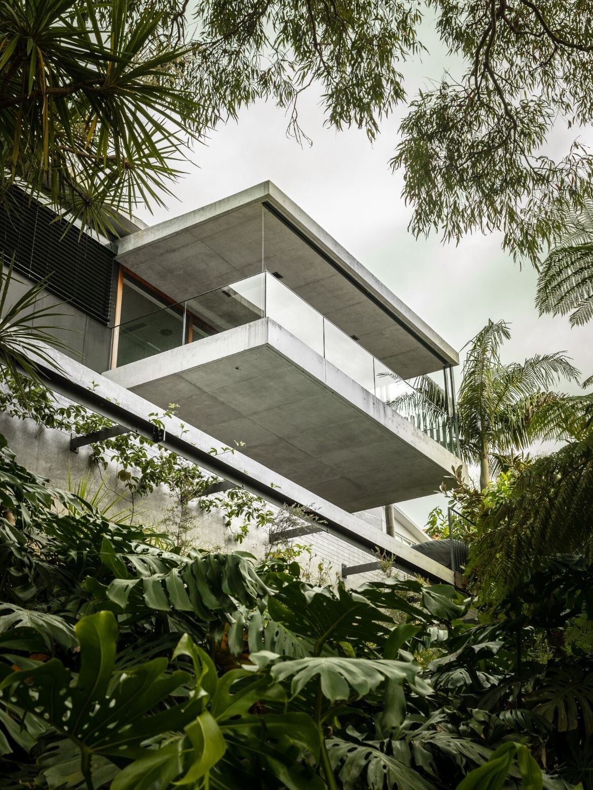
The residence stands out for its simple arrangement around a courtyard with integrated landscaping, resulting in a strategic play of enclosure and openness. The dwelling’s relationship with views, both inward and outward, is pushed further by a bold cantilevered form, where the balcony juts out above the bush expanding the useable interior space.
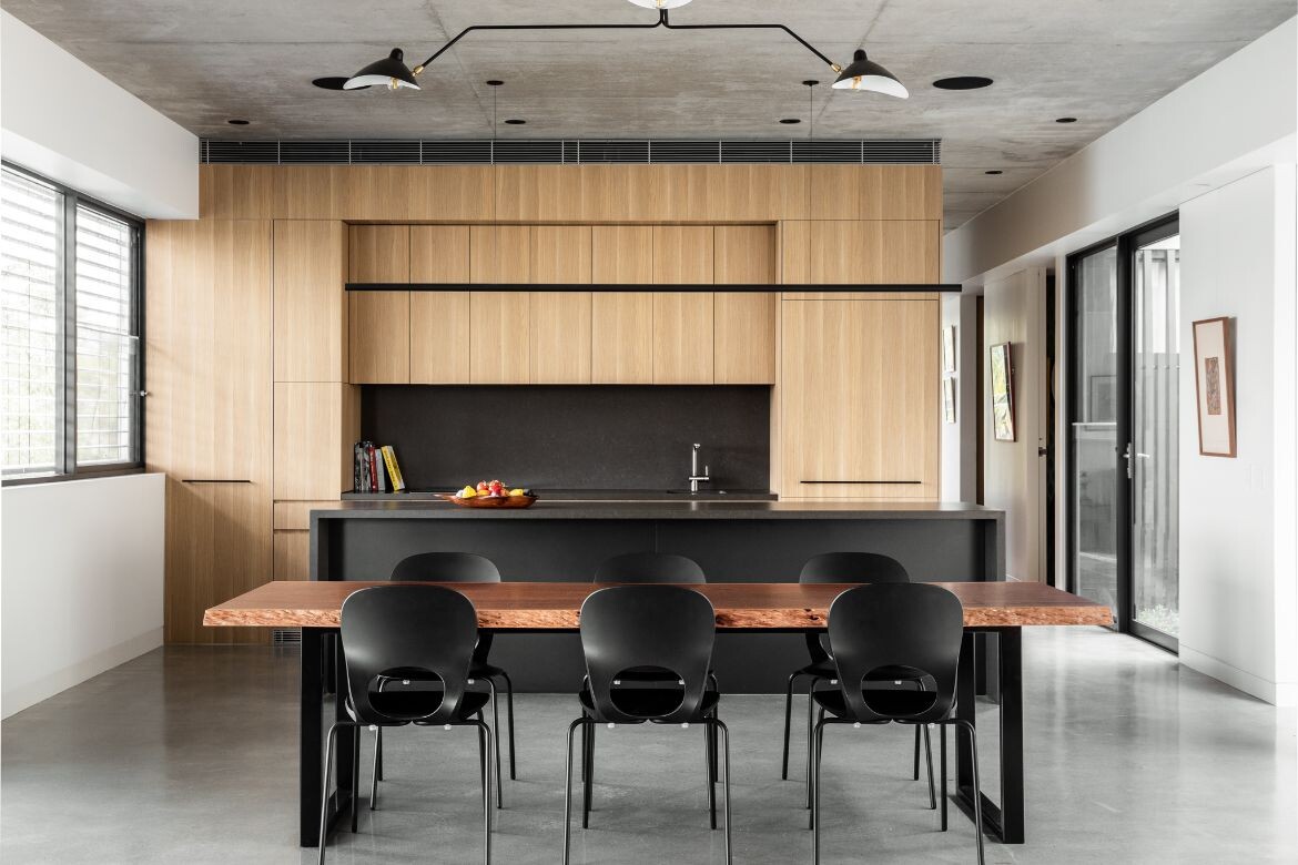
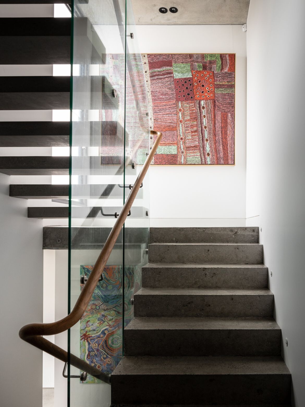
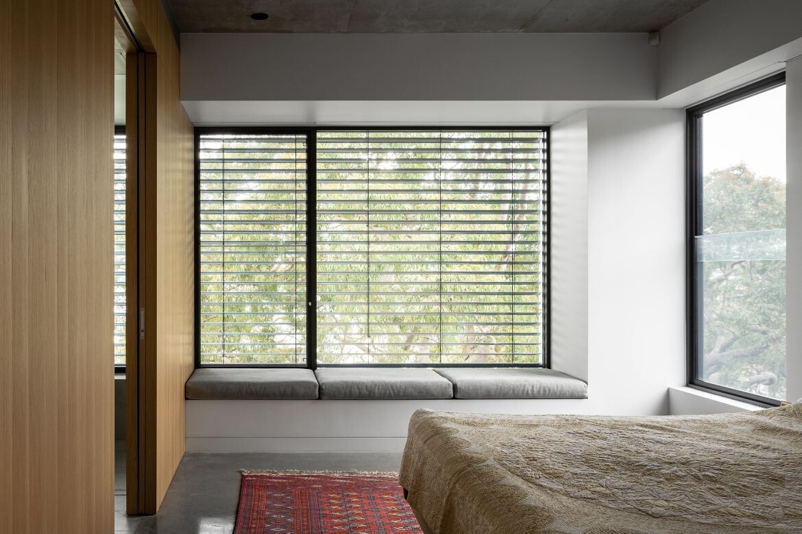
While materials are varied throughout – off-form concrete, raw fibre cement, limestone paving, polished concrete and timber floors – they remain raw and natural, coming together to create moments of awe and calm.
Sustainability features include solar power, adequate cross ventilation, adjustable sun shading devices, rainwater storage, and edible garden options.
“Bay House provides a unique and sophisticated living experience, blending functionality and sustainability with stunning views and a connection to the surrounding environment,” shares the architect. “We are proud of this project and the solutions it provides for the owners’ needs.”
Bay House is a stunning example of how to create a functional and sustainable living space while taking full advantage of its surroundings.
The sophisticated solutions to the challenges posed by the steep terrain and limited space showcase the architects’ creativity and expertise, while the use of raw materials adds to the project’s unique character.
Project details
Architecture and interiors – Castlepeake Architects
Landscape – Somewhere Landscape Architects
Builder – F S Hough Builders
Photography – Felix Mooneeram
We think you’d love this home in Sydney by PopovBass.
