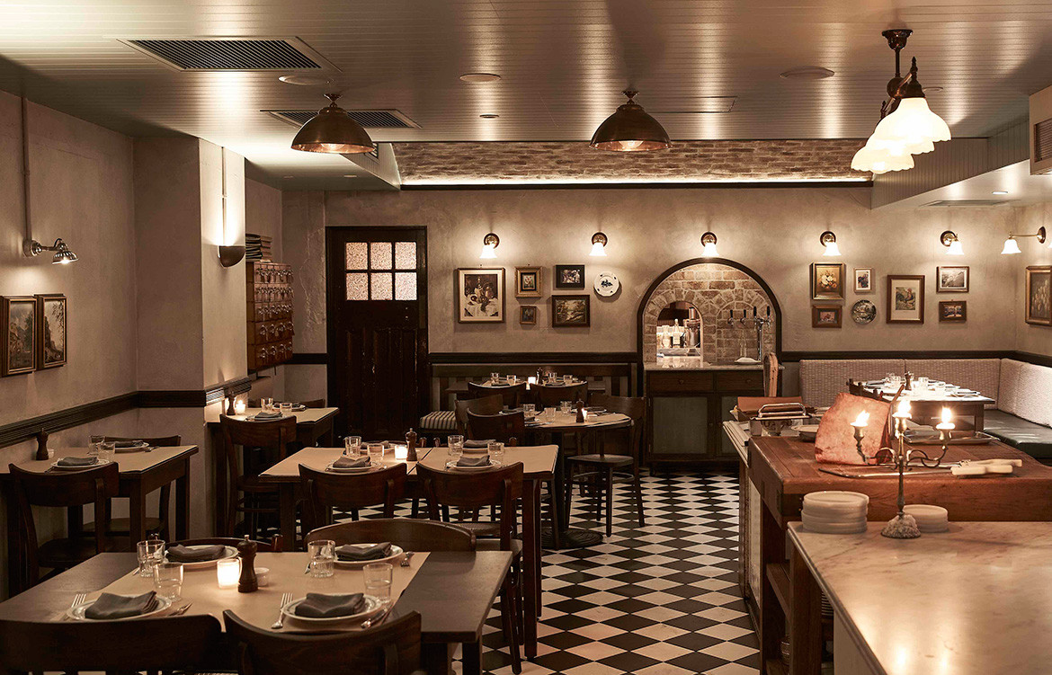
There are some spaces that remind you of where you are, and others that transport you somewhere else entirely. Although the latter is difficult to accomplish without falling into the trap of the cliché or the flat, Bistecca, the new Sydney restaurant designed by local design firm Tom Mark Henry, achieves that rare geographical sleight of hand: it takes you to Italy via thick lashings of warm, thoughtful and surprising design.
The client’s aim for the space was to make the restaurant feel like a genuine dining experience without all of the immediate and obvious fixes (read: grapevines and red chequered tablecloths) that ideas of Italy can so often translate to. Instead, the design team – led by Tom Mark Henry director, Cushla McFadden – relied on layers: of space, of materials, of history, and of a narrative.
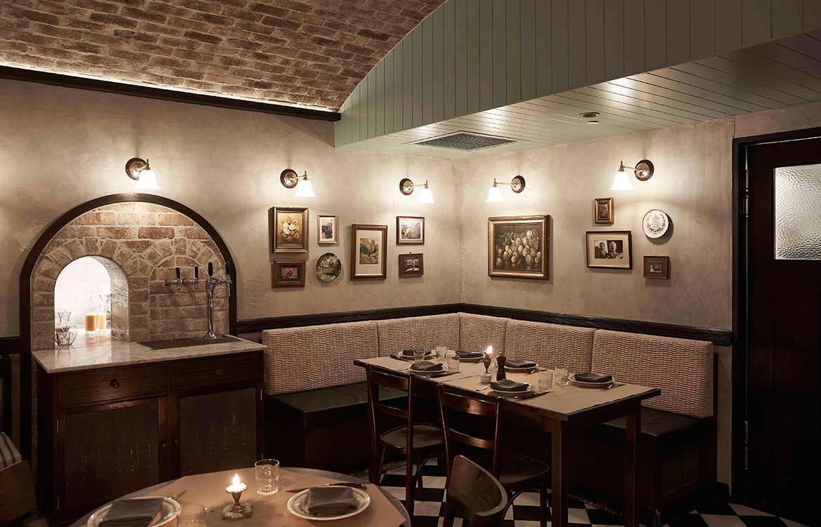
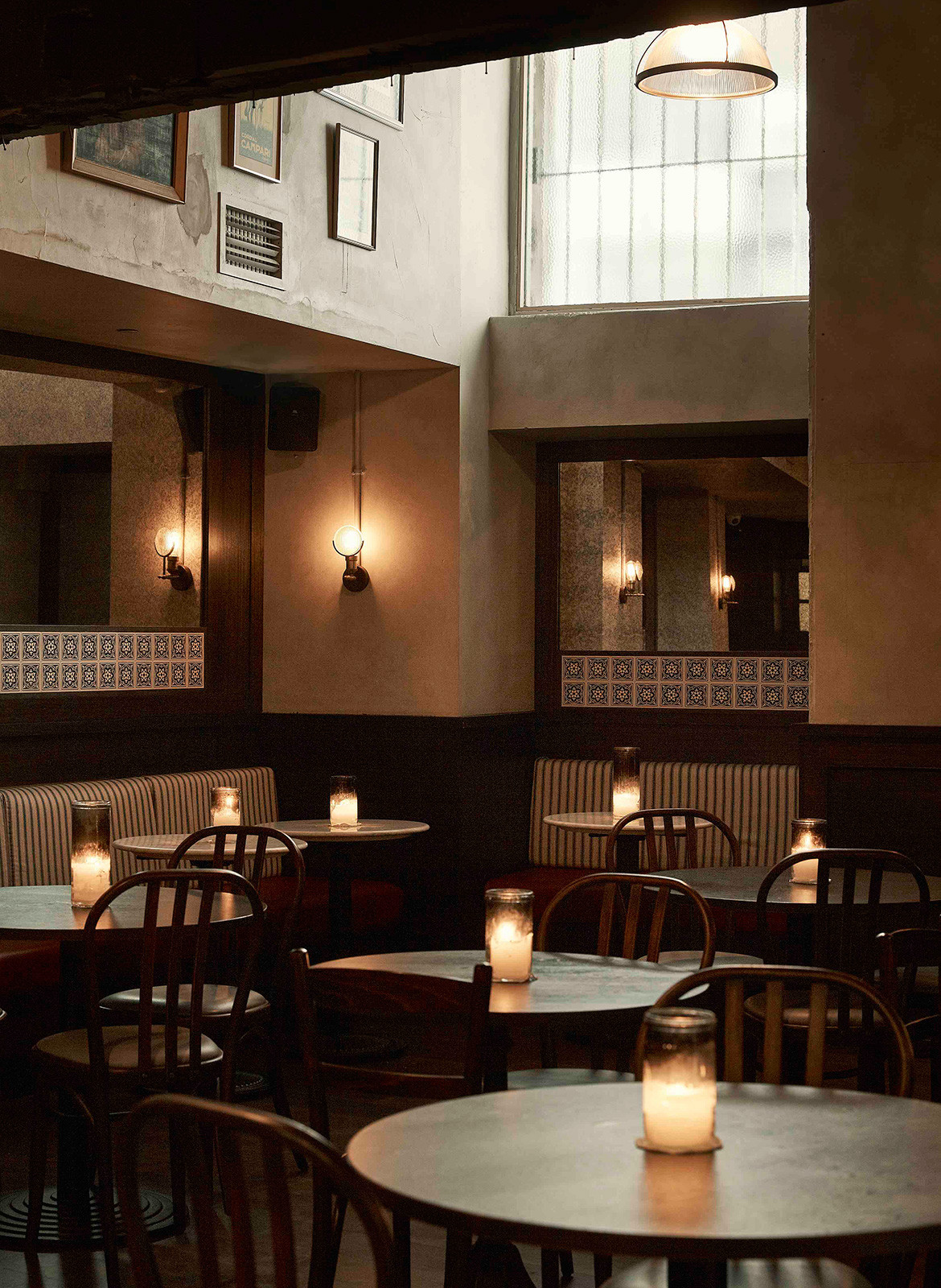
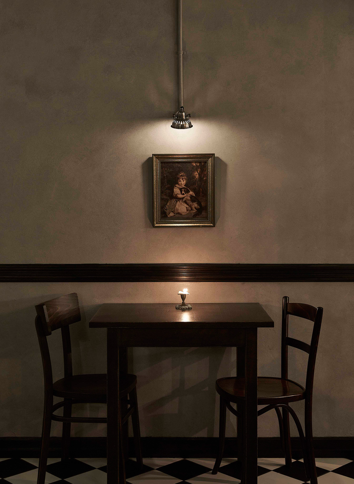
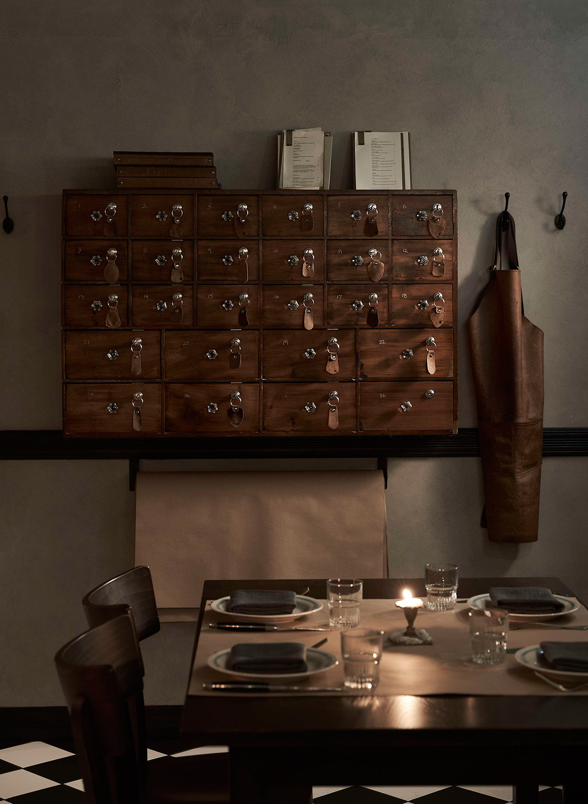
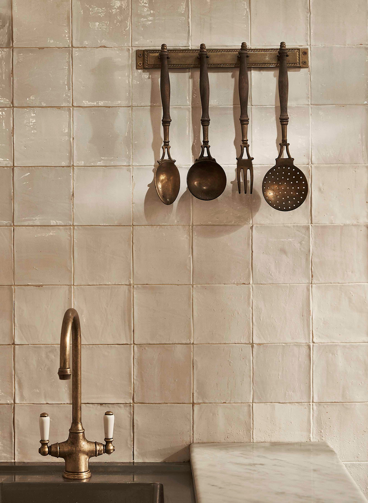
“In our research, we discovered that a lived-in feeling was typical of Italian restaurants, so although they wanted the environment to be stripped back it also had to be layered,” says Cushla. “We balanced these elements by using raw materiality such as brick, timber and rendered walls, layering them with old photographs and paintings reminiscent of time spent in Italy.”
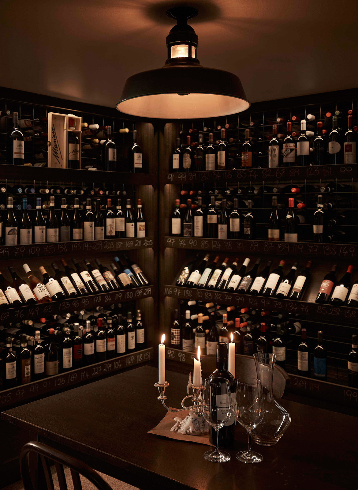
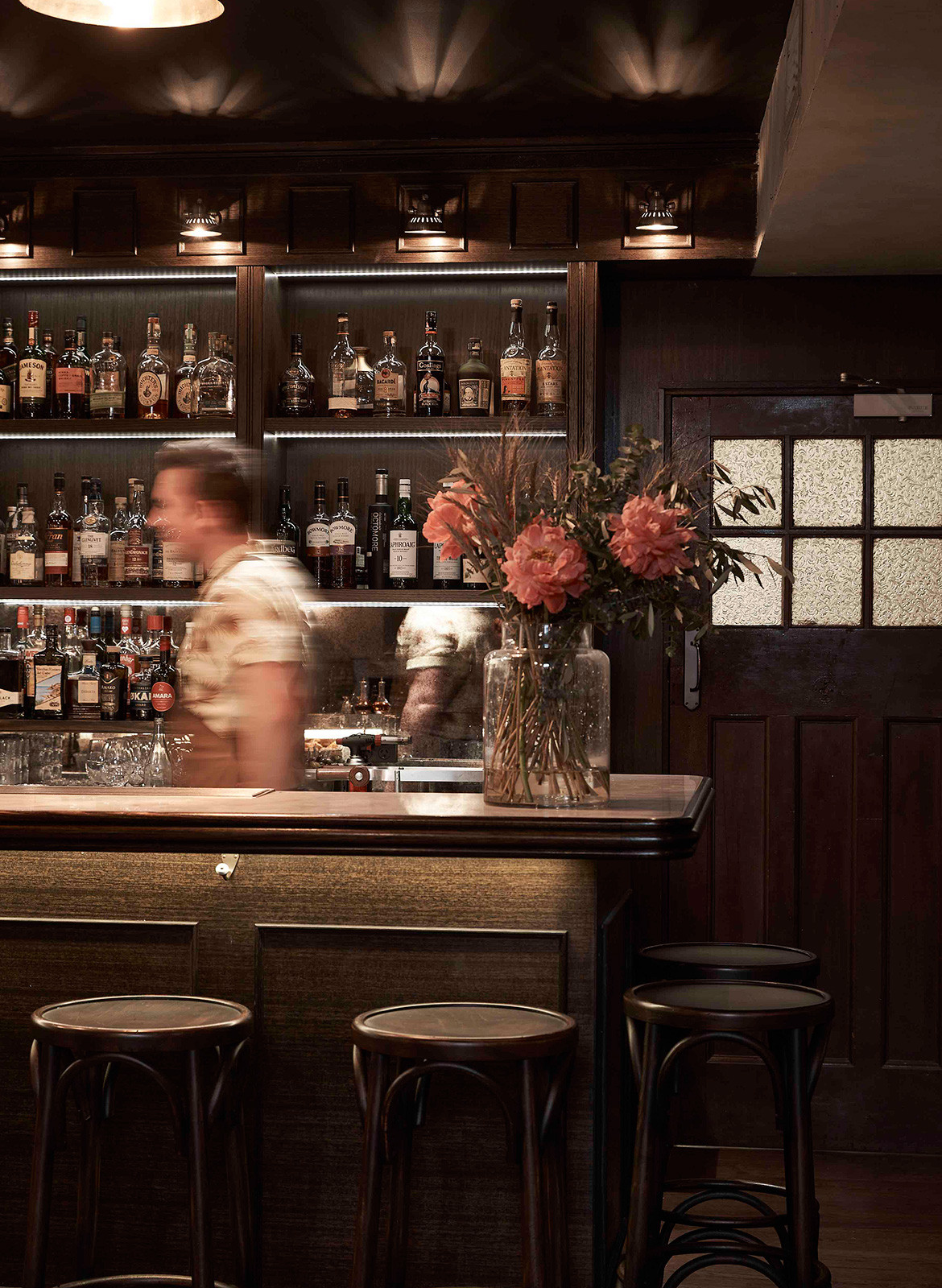
The layout itself is designed to be experiential. Three separate spaces were conceived to map out visitors’ experience from beginning to end, like a soft bell curve culminating in reflection on the full journey. Guests enter through an unassuming rear lane entrance into an intimate bar area, featuring a curved marble and timber bar where they can decompress over an aperitif. After they have settled into the experience, they are ushered into the restaurant, a dramatic space with domed ceilings and a central hearth. This is where the full theatricality of Bistecca plays out. Finally, after the bustle of the dining experience, they are led through to the wine room, another smaller space primed for reflection over fine Italian wine.
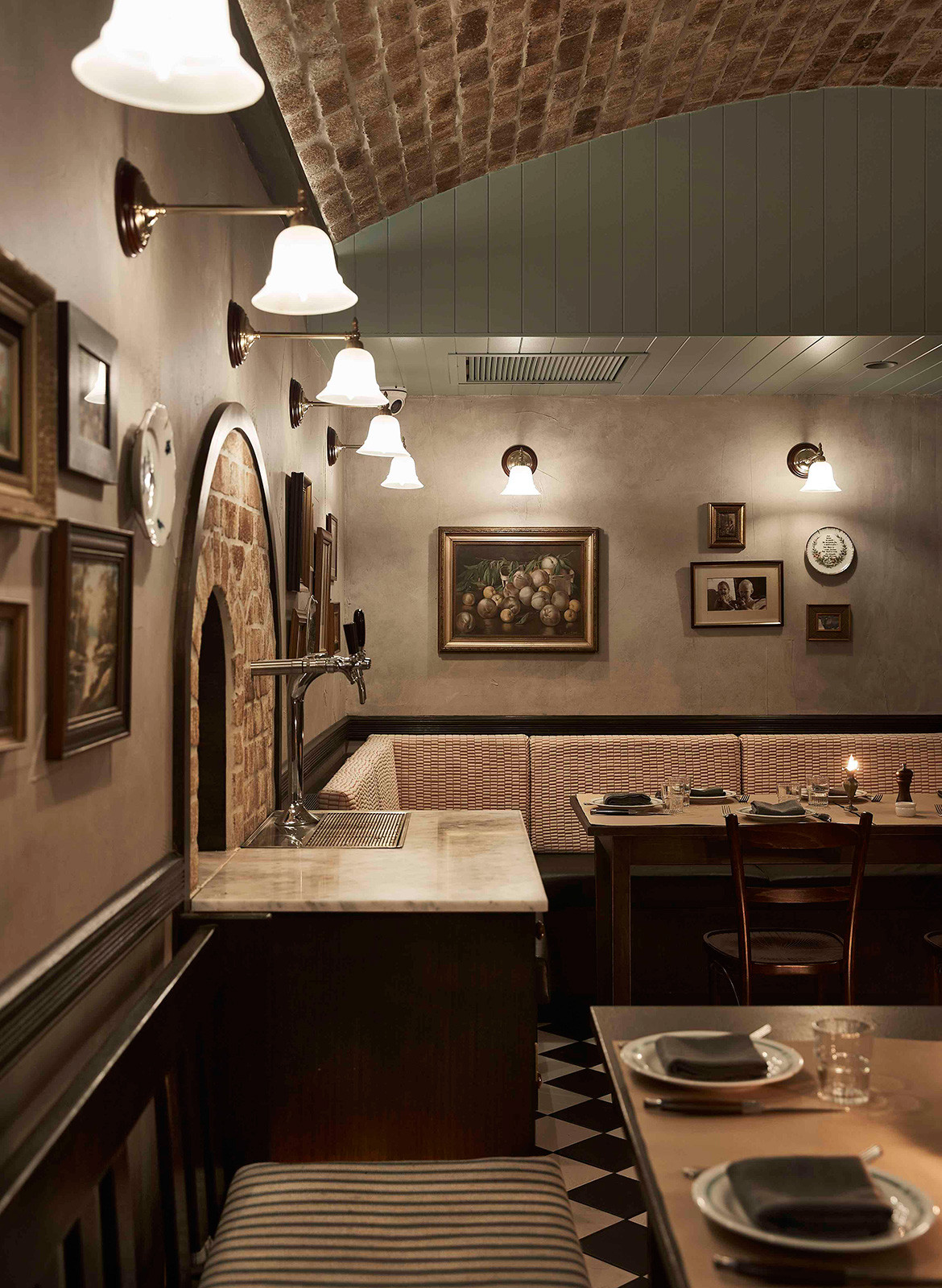
“Connecting these three spaces while still offering a unique experience in each was key to the spatial planning,” explains Cushla. “Materiality and lighting connect the three spaces, all being slightly different takes on the theme. The dining room is the liveliest – with a slightly chaotic vibe – while the bar and wine room start and end the experience; the bar builds anticipation and the wine room offers a moment for reflection with a good glass of wine in hand.”
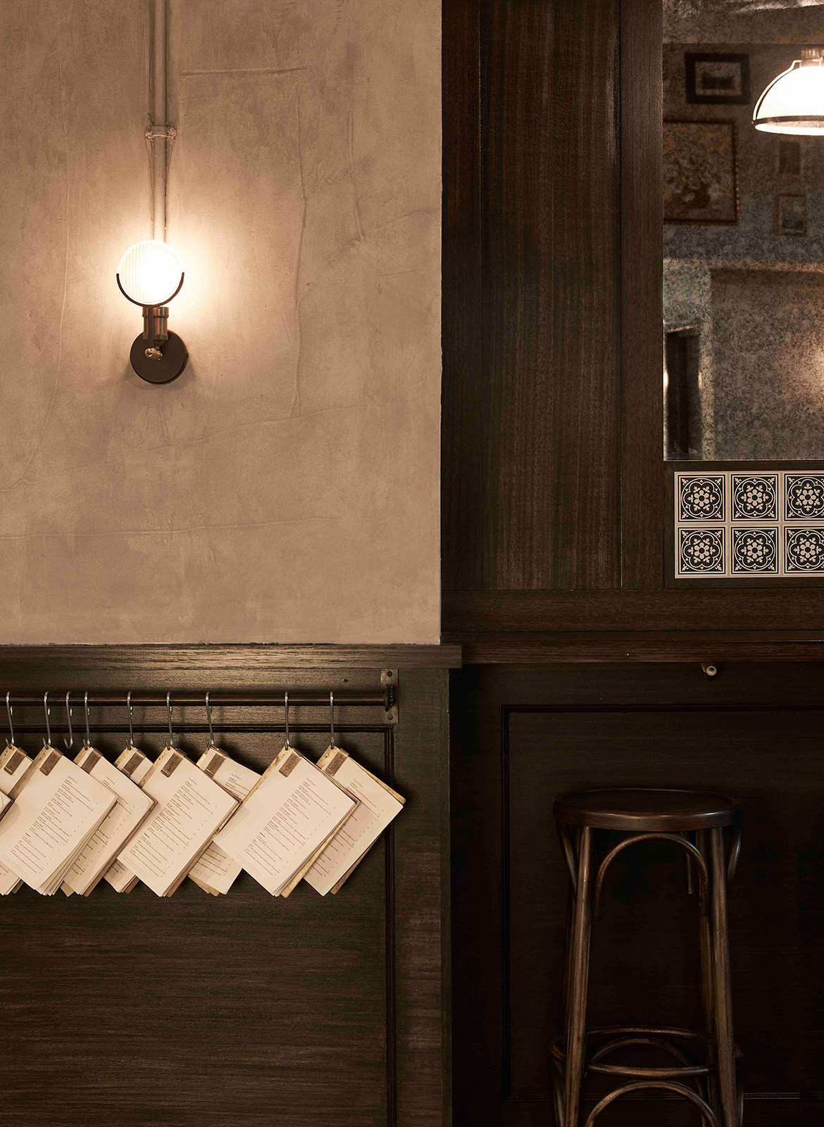
There is a sense of organised chaos to this transitory concept, which matches the abrupt service style experienced in Italy while softening it to put the visitor experience at the fore. Although different in their purposes and scales, these three spaces – central to the concept for the restaurant as a whole – are all tied back into the narrative through a material palette that is designed to enhance the atmosphere without detracting from the main event. Dark timber panelling, antique mirrors and archways offering discreet views of other rooms all add to the ambience, working quietly in the background to create a compelling and comprehensive narrative of Italian dining.
Tom Mark Henry
tommarkhenry.studio
Photography by Damian Bennett
We think you might also like Pentolina by Biasol
