Contrary to popular belief, it isn’t always the client who dictates the brief to an architect. Oftentimes, it’s the site and space. A large site may afford the client any amount of bedrooms, multiple living zones, a study space and perhaps formal and informal dining areas. A steep or slanted site would encourage multiple levels; a rural site might suggest making a feature of the surrounding environment; while a coastal site would heavily influence material choices and site orientation. For small-scale projects, however, “the brief is often just to make it liveable”. So says architect Brad Swartz. Under the guise of his eponymous architecture and interior design studio, Brad and his team at Brad Swartz Architects, have recently completed the reconfiguration of Boneca Apartment, a 24-square-metre studio apartment in the inner Sydney suburb of Rushcutters Bay.
The resident and client bought the apartment with the idea of engaging an architect to design a make-over. But there was no strict brief per se – simply to take the shell of the apartment and site orientation as the [only] two absolutes and go from there: nothing was off the table.
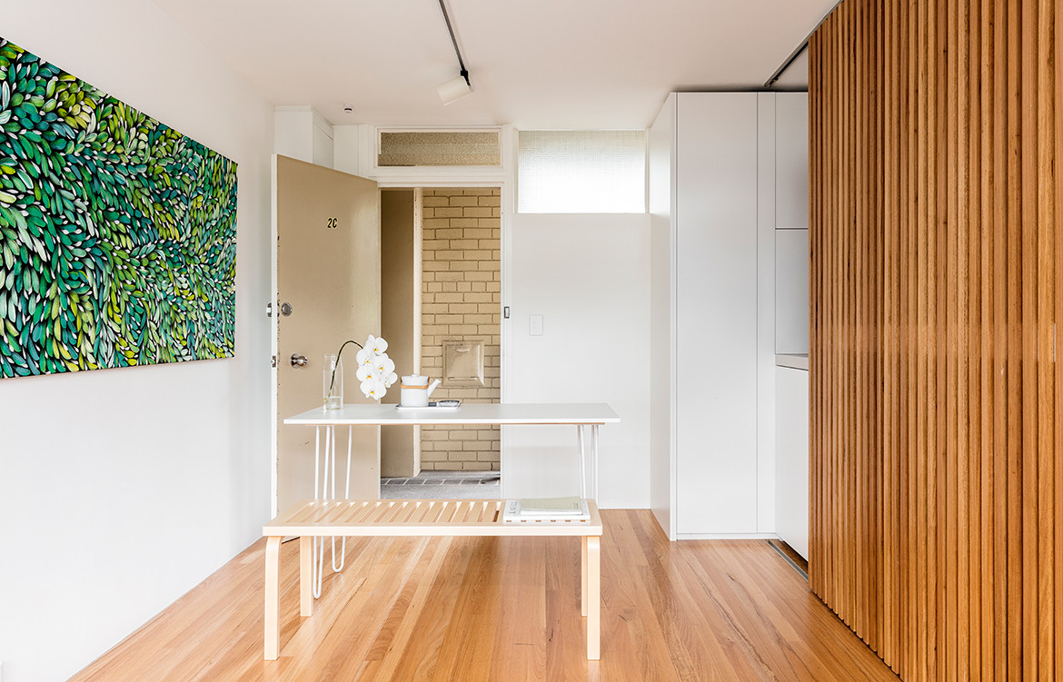
Previously, to enter the apartment was to enter the kitchen, which had been separated from the rest of the studio by a dividing wall. Through the kitchen was a bedroom that doubled as the living room and the bathroom. No space was dedicated to dining.
What stands out now about this apartment is how the considered assessment of layout and a resulting relocation of interior walls – all of them, in fact – and plumbing has reinvigorated an apartment that was well designed for its time (the middle of last century) but which had since dated.
Brad has propelled the apartment into the 21st century. “There has been a shift in thinking,” he says. “Going home you want the bedroom to be separate now, and the kitchen to be part of your living space so you can entertain.”
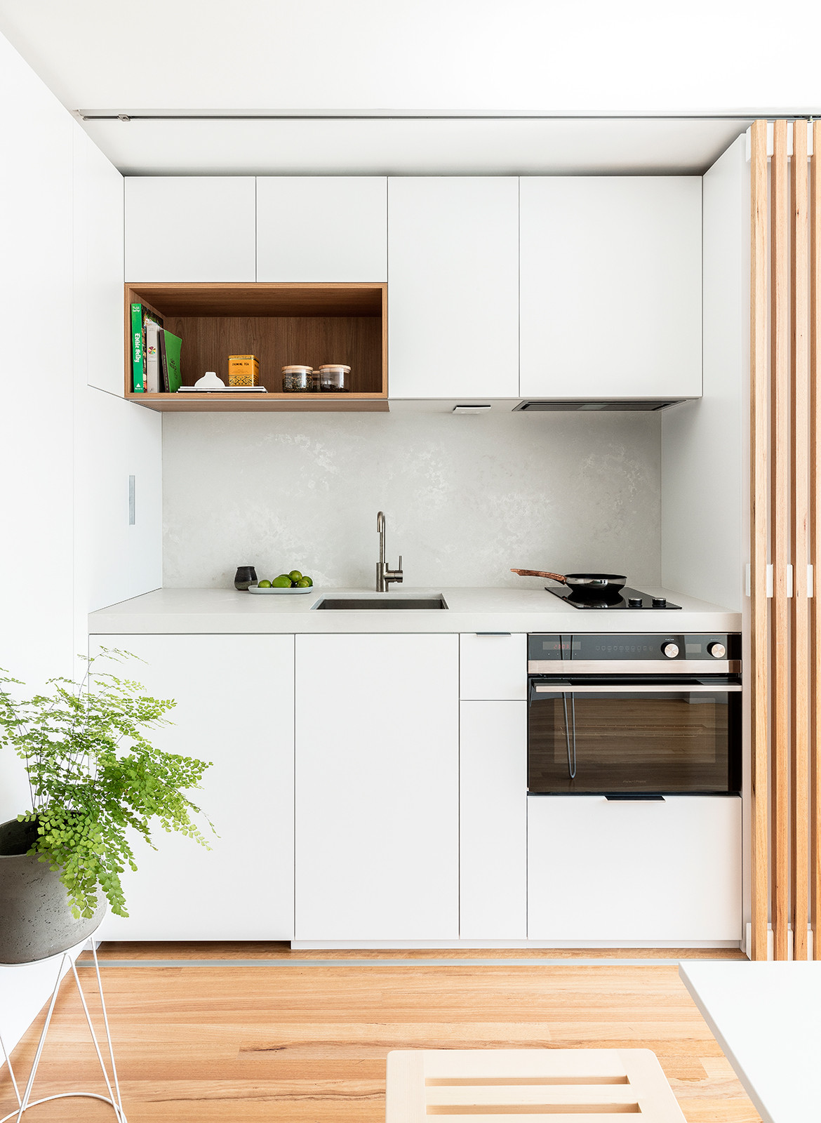
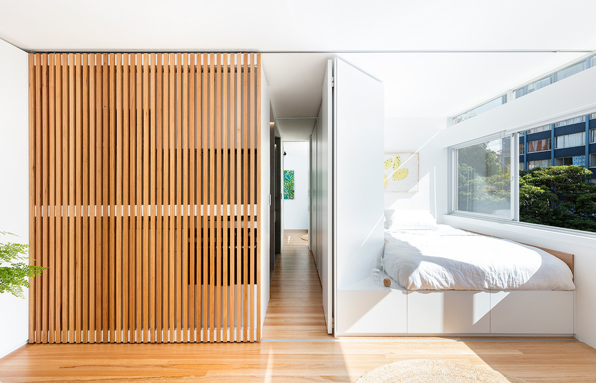
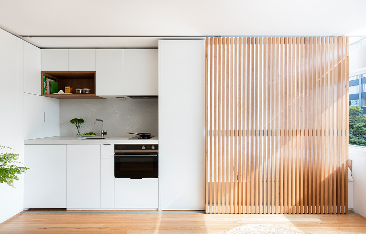
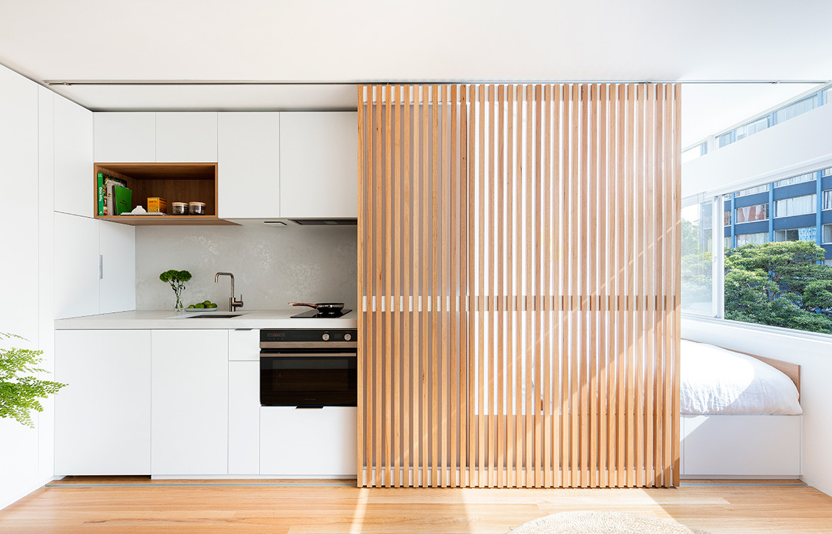
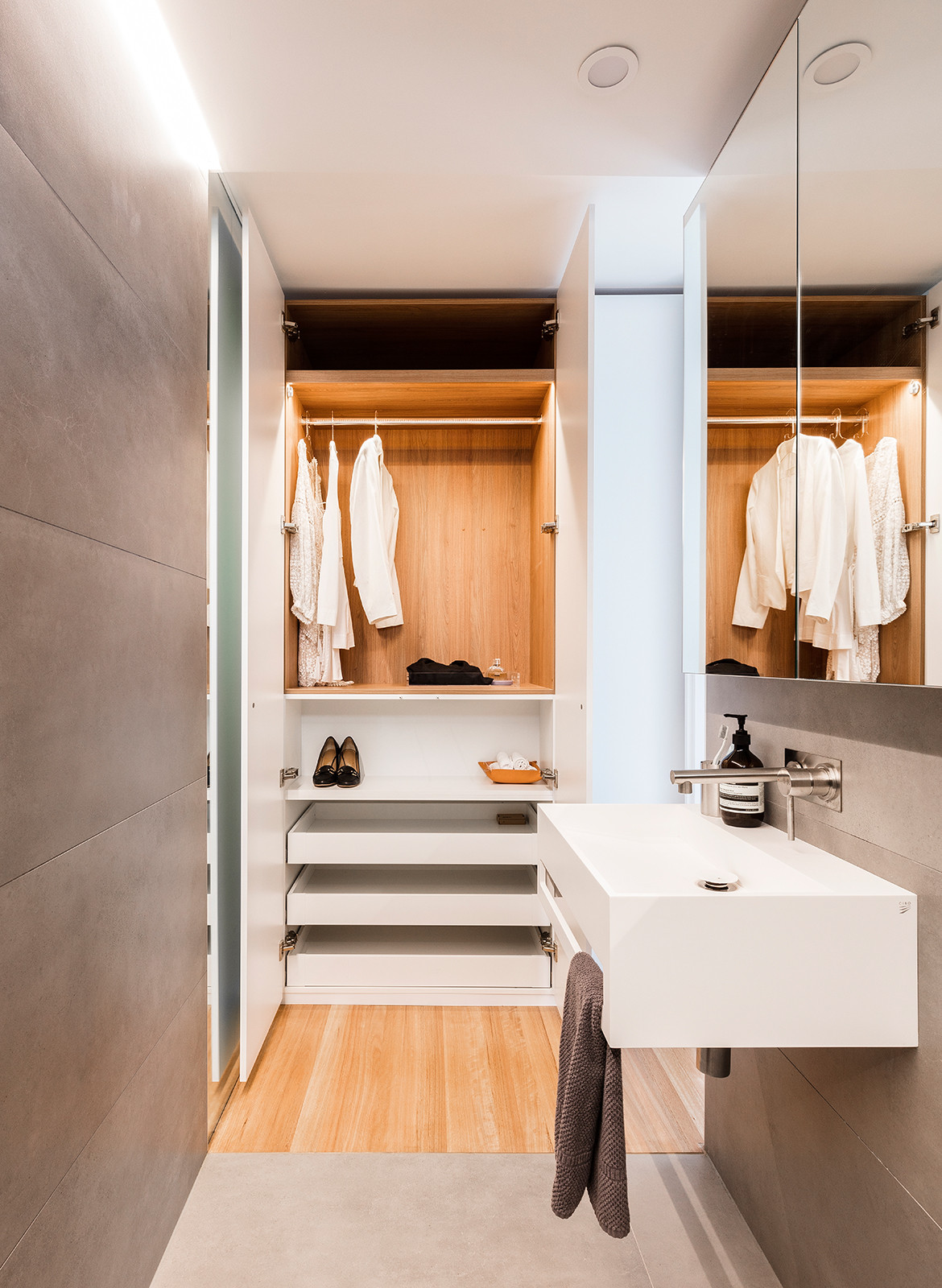
The new space is more or less split in two. As you enter, the kitchen lines the left wall before the inbuilt double bed featuring hidden storage care of custom joinery. Between the kitchen and bed is a short corridor leading to the bathroom, in a new, subtler location. A table for dining, studying or socialising sits in front of the door behind a two-seater sofa and the windows that line the facing wall.
The key to the interior layout is a bespoke sliding screen. While the final iteration is slatted timber custom designed by Brad and built by feather edge – a fabrication company that habitually works on art projects and run by Brad’s brother, Mark Swartz – many other designs were explored first. It began as two sliding doors that then morphed into glass panels, followed by a completely solid timber version.
More than creating visual interest, the final version also provides solutions to a number of different design constraints. One of which is the filtration of light: due to the window-to-depth ratio, the apartment can get quite bright in the middle of the day, sliding the door to cover the bed filters the lighting streaming in.
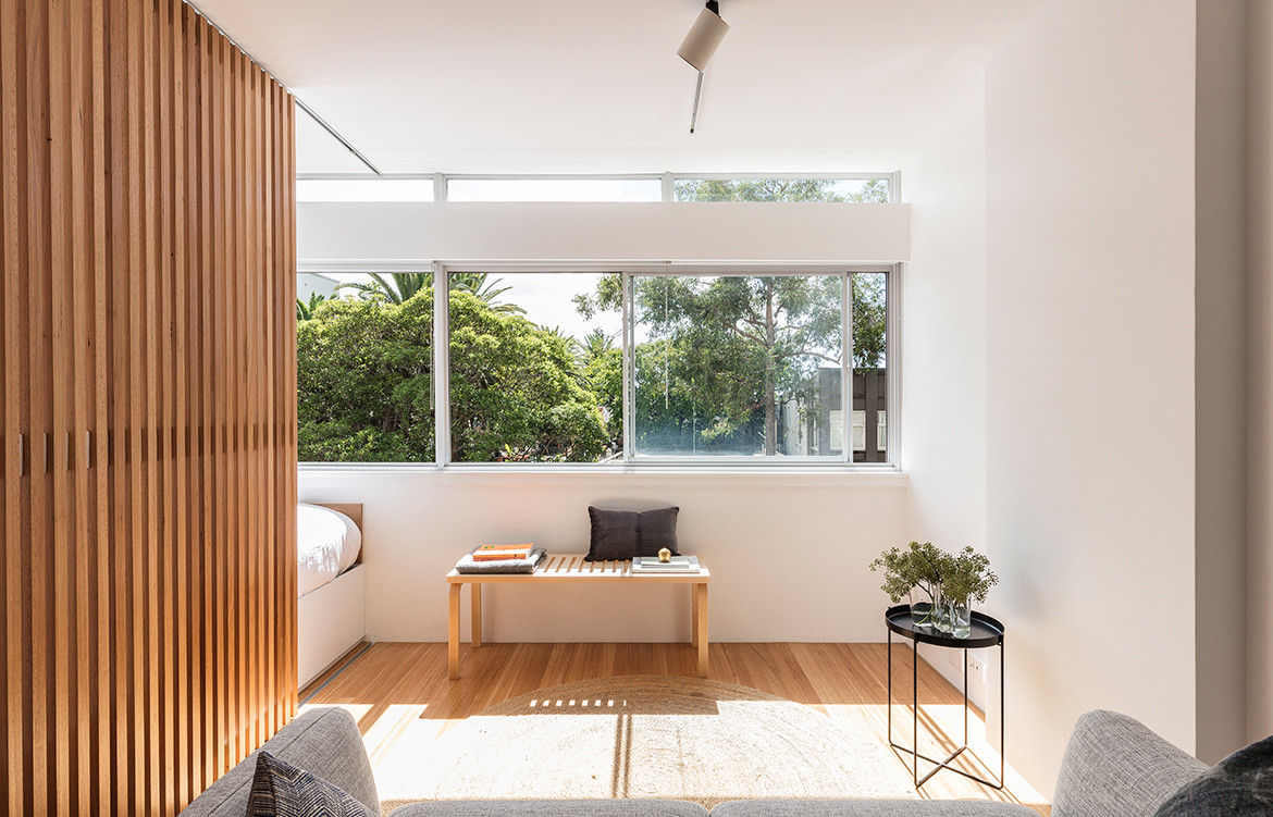
The sliding slatted timber screen not only filters light but also helps to retain a sense of openness; it defines the room without dividing the space; and allows ventilation.
The screen, depending on which side it rests, determines the feel of the space. Concealing the bed affords the resident a space conducive to entertaining: complete with kitchen, dining and living zones. Alternatively, sliding the screen to hide the kitchen affords a bedroom atmosphere, meaning the resident is able to enjoy two large rooms in a studio apartment of just 24-square-metres.
“You still get a sense of openness because it’s not a solid piece, but you can’t really see what is beyond,” notes Brad.
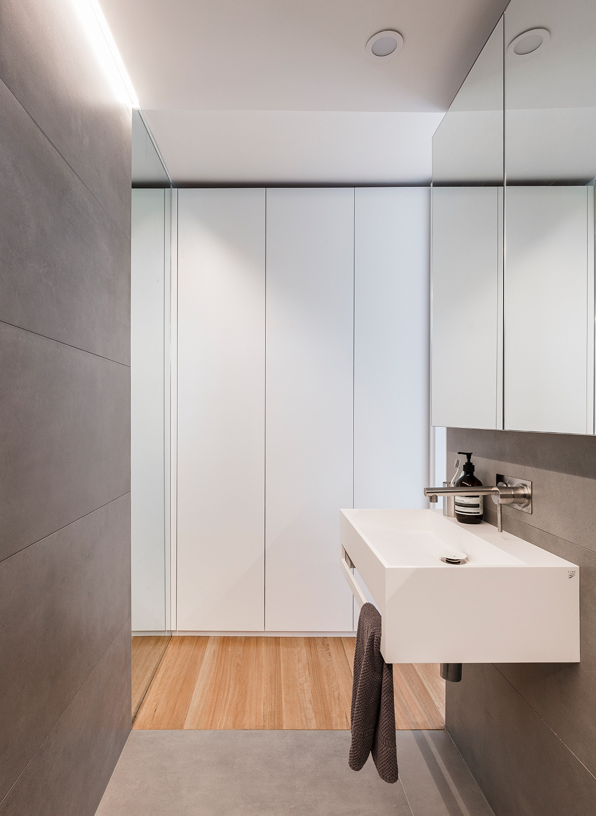
The seamless and hidden nature of lighting likewise characterises the project. There is recessed lighting and backlighting in the living spaces while strip lighting lines the edges within the bathroom and along the kitchen wall. “We like to hide a lot of the lighting, so you don’t have a busyness of downlights on the ceiling,” says Brad. This aligned perfectly with the client’s sensibilities as she had been staying in nice hotels for work and was quite taken with the concept of hidden lighting. “It ends up with really beautiful results, there are all these little light boxes that are almost light features in themselves,” he adds.
There might be a perception in the wider community that architecture is unaffordable and is a luxury rather than necessity – and perhaps in some [read: many] cases that are well-founded. Boneca Apartment, however, makes a strong case for an alternative opinion.
Given the vast improvement of this space and the liveability for its occupant – and knowing that there were numerous conceptual layouts explored architecturally before the final concept was arrived at – there is no denying the value of an architect. “Using a designer or an architect to really go through the design process can add a lot,” says Brad. It will be an added expense, but the value one gets out of using an architect will far outweigh the cost.
Brad Swartz Architects
bradswartz.com.au
Photography by Tom Ferguson
Dissection Information
Vivid White paint from Dulux
White laminate from Laminex
Cloud burst concrete Caesarstone bench top
Dark grey porcelain tiles from Bettertiles
CM05 Habibi Tray Table by E15 from Living Edge
Zinnia Rug from Armadillo & Co
Bench 153 by Artek from Anibou
T900 H Curve ceiling track lights from Brightgreen
Pure 600 Solid Surface basin from Cibo
Titan Range tapware from Caroma
We think you might also like Whiting Architects: The Beauty Of Small Footprint Living
