“The project is about making simple moves to improve the functionality for the family that lives there, whilst maintaining and celebrating the original character,” explains Breathe Architecture project architect Madeline Sewall, when asked about the studio’s renovation of a heritage listed terrace house in Port Melbourne. “A dilapidated 1980’s extension was demolished and replaced to bring in more natural light, better building performance, more amenity, landscaped courtyards, and warm honest internal materials.”
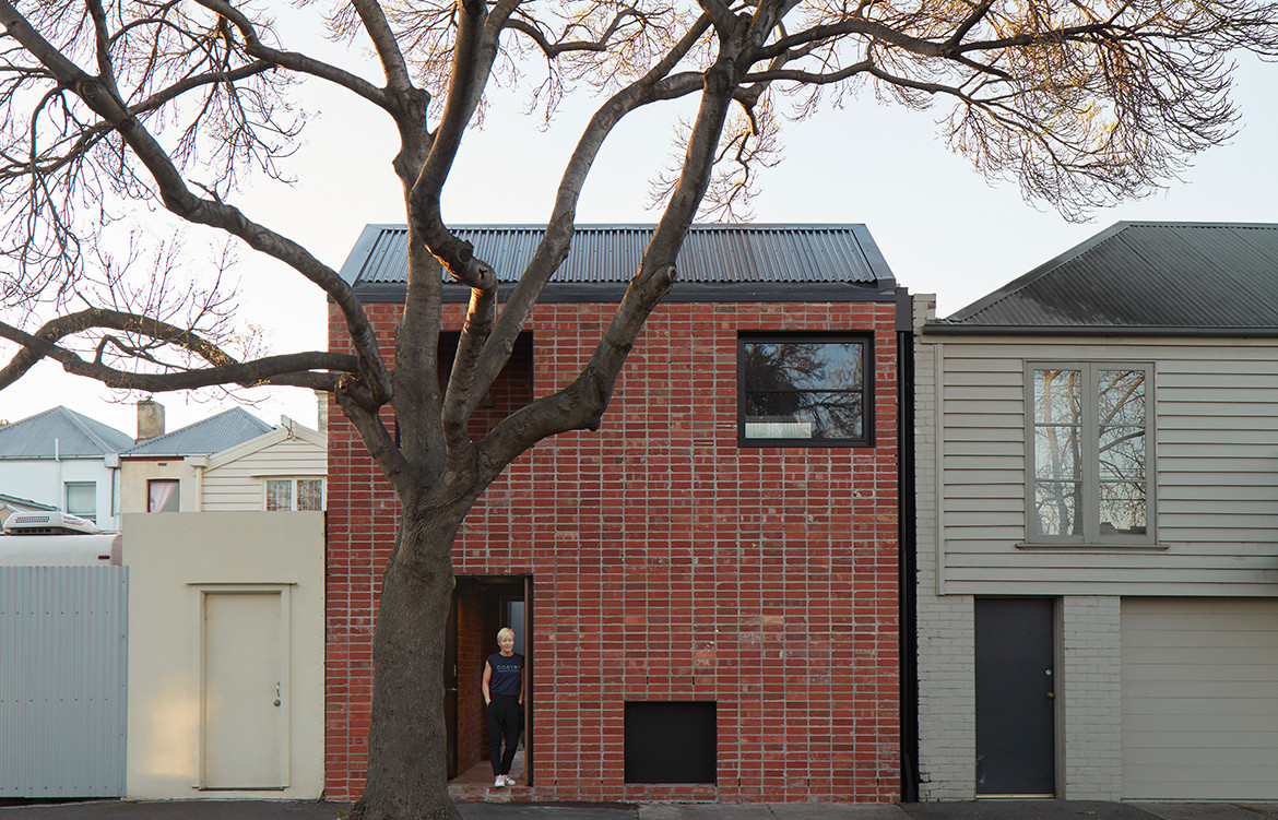
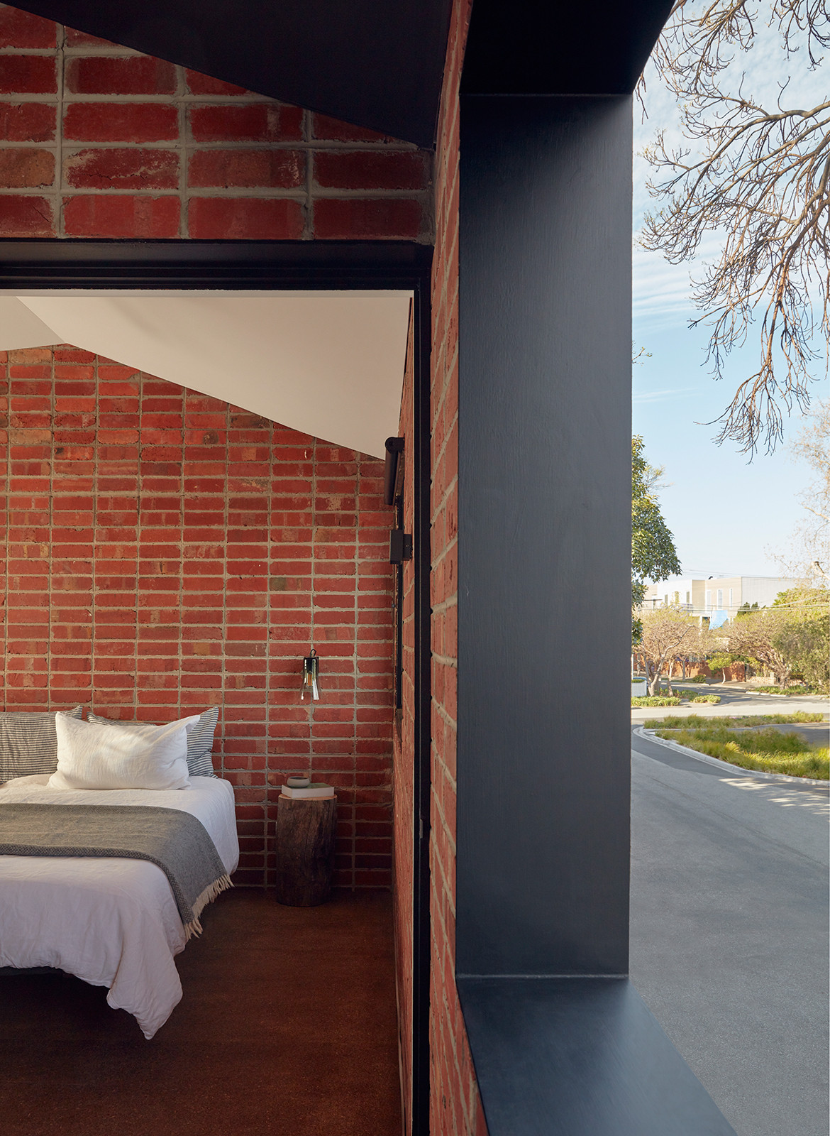
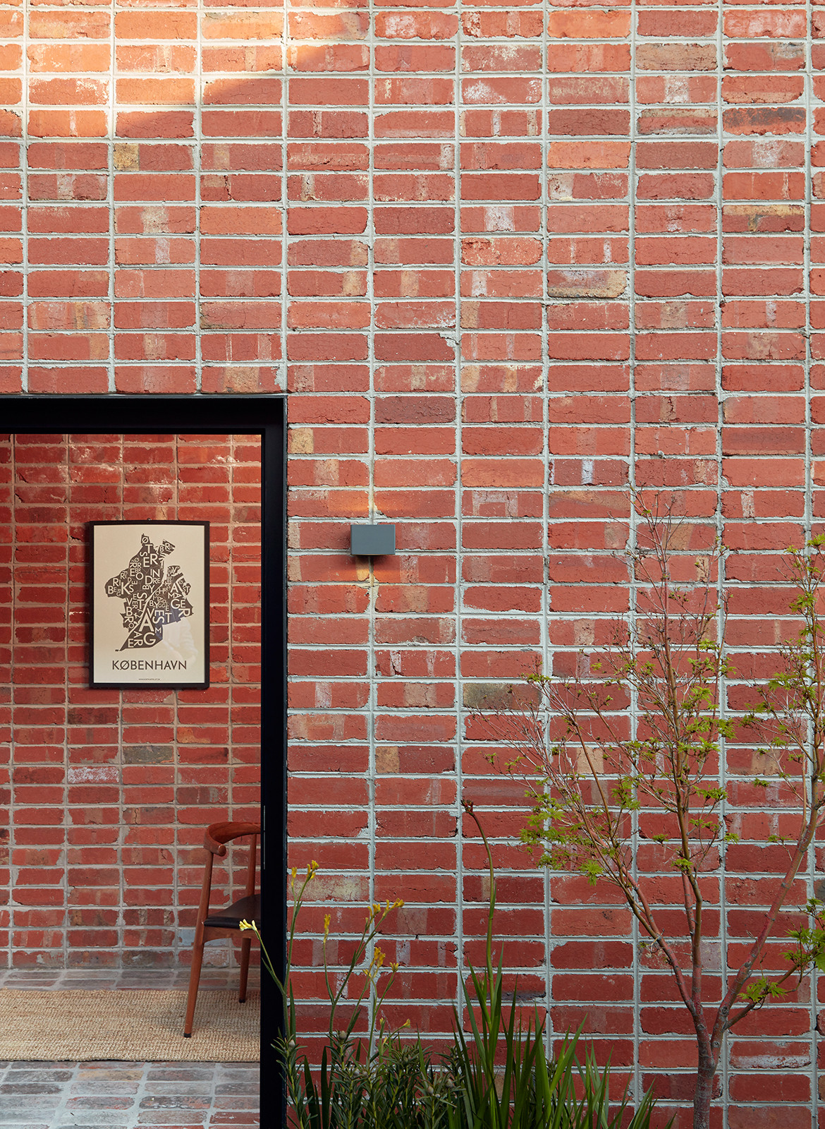
Given its heritage status, the front façade of the house has been left in situ, while a new freestanding brick studio (housing a guest room, painting studio, workshop and laundry), addresses a quiet street to the rear of the property. It’s the extension that provides all the clues as to the strategic thinking and visual language employed by the architects. Informed by the street’s interface of roller doors and outbuildings, the addition is a utilitarian structure, rendered in stack bond brickwork, which gives the house an undeniably contemporary aesthetic. “We wanted to create a robust, informal structure that would tie in with this context while having an architectural language that would relate to the extension of the main house,” says Madeline. The team selected recycled red bricks for its sustainable, utilitarian nature to underscore this intent, with the studio parapet tying in with the parapet of the existing neighbouring structure.
The team’s manipulation of space is evident in their strategic approach to the brief. Whilst the clients initially approached Breathe with the aim of a large family home, this desire was muted after the clients spent a year renting a small, urban apartment in Copenhagen. “They returned to Melbourne with a renewed perspective on how much space they actually need, and what their priorities are,” says Madeline. “We respected this decision tremendously, and we started schematic design over, with brief and budget cut in half. We prioritised updating the kitchen, living and dining and left the front portion of the terrace house and upstairs as is, with the original Victorian character intact.”
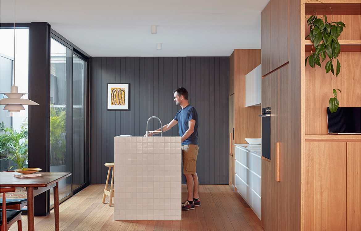
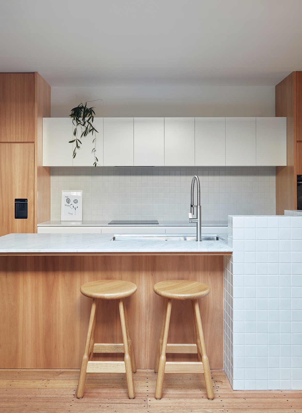
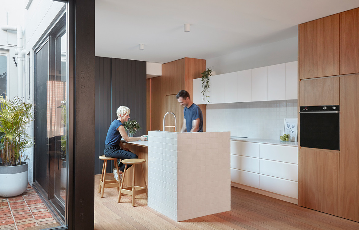
The configuration and dynamics of the internal (and external) flow support the clients’ hospitable nature and love for casual entertaining. The kitchen features an oversized, functional island with a higher servery ledge, where family and guests gather while cooking or preparation is underway. Given their love of gardening, the clients landscaped the two courtyards themselves, one of which is shared by the main house and studio, providing a valuable external amenity to both.
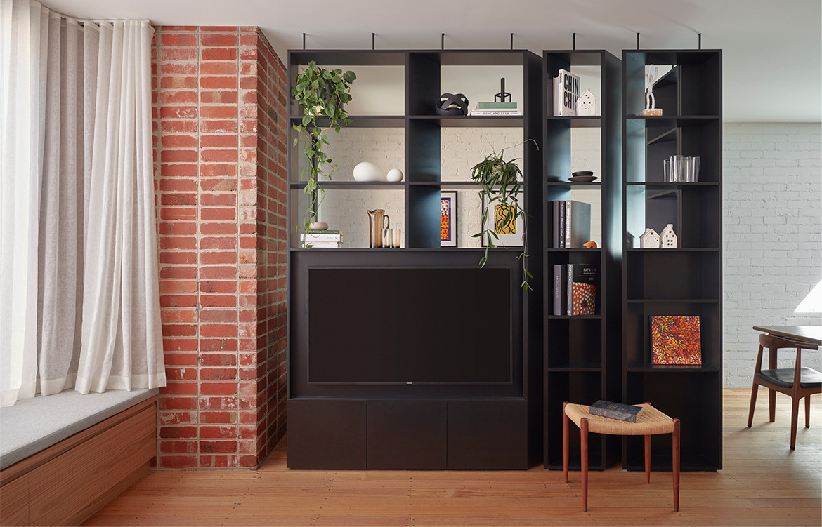
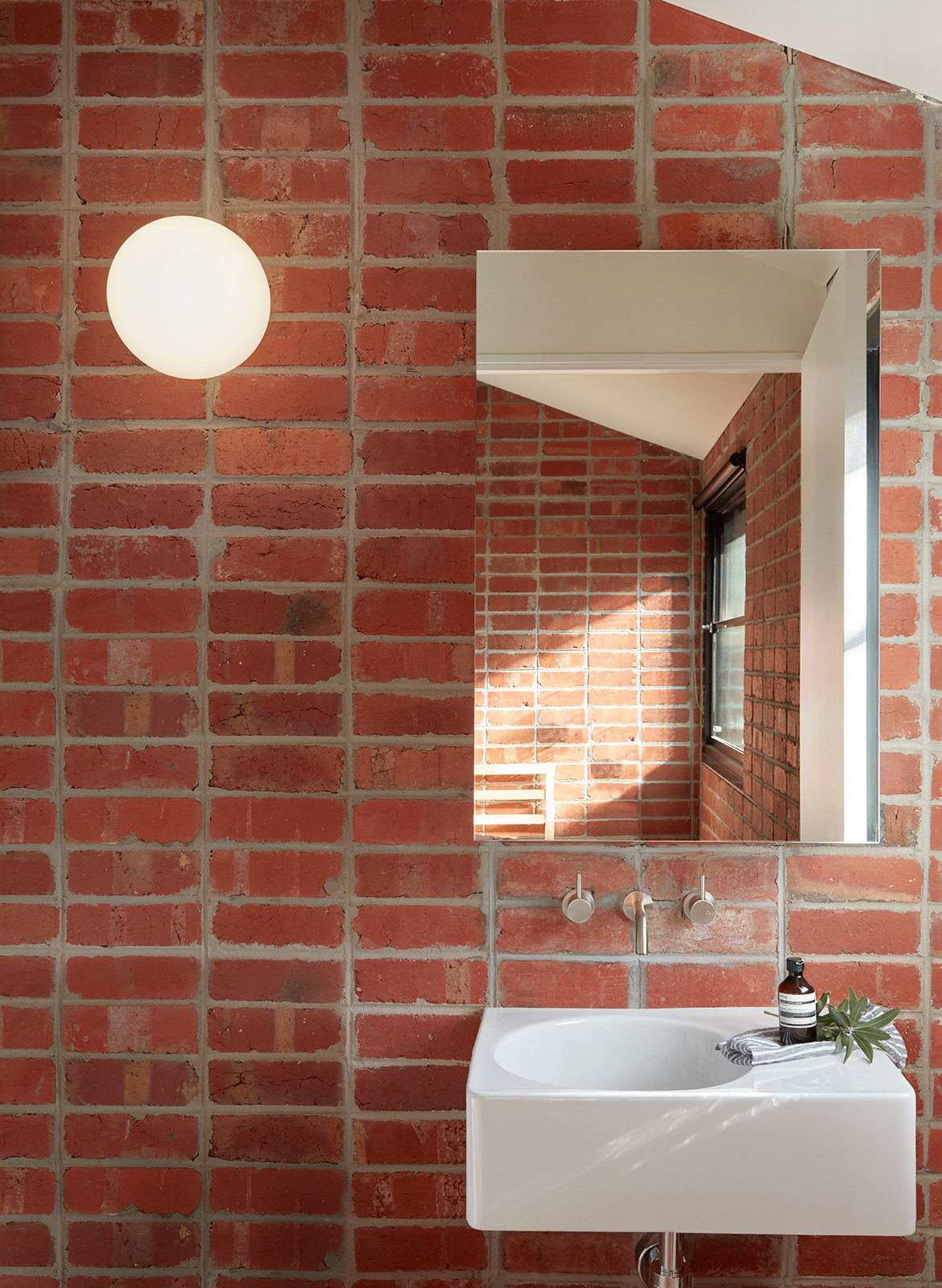
Materially, the manipulation of brick used both internally and externally, blurs the boundaries between inside and out. Inside, the effect is more intentional. Whilst some of the existing brick walls have been painted white, to reflect light, all the new brickwork has been left unpainted. The double brick walls also reduce the need for applied finishes. Australian Blackbutt timber veneer joinery and recycled Tasmanian Oak flooring bring additional warmth into the palette.
Overall, this is a terrace house that underpins Breathe’s philosophy of ‘build less, give more’. “We also consider it our professional responsibility to help clients understand that they often need less than they may originally think – smaller footprints, less applied finishes, more robust materials and more efficient construction. These are the conversations we are constantly having with our clients through the design process.”
Breathe Architecture
breathe.com.au
Photography by Tom Ross
Dissection Information
PH5 pendant light from Louis Poulsen
VL45 Radiohus pendant light from Louis Poulsen
Flare wall light in Black Glass from Ross Gardam
Dioscuri 25 wall lights by Artemide
Pitella 6820 door levers in Satin Chrome from Pitella
Bathroom and sanitaryware from Reece
Appliances from Fisher & Paykel
Silverdare seat upholstery from Camira and Blazer
Tiles from Academy Tiles and Defazio TopCer
We think you might also like Shadow House by Nic Owen Architects.
