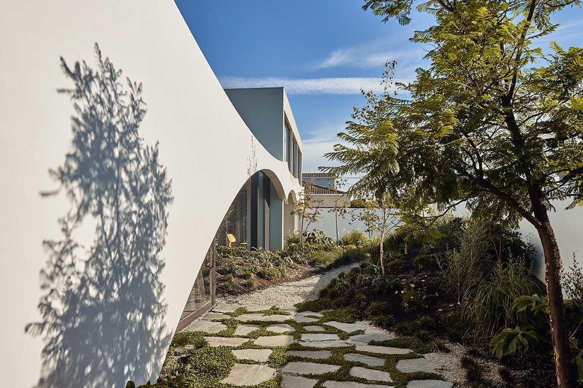
Loving the seventies house but not the house next door, Ilana Kister’s clients opted to buy both, but remove the house with no personality and extend the one they prized. However, as Kister points out, “It was on the wrong side. So we had to do some inventive planning.”
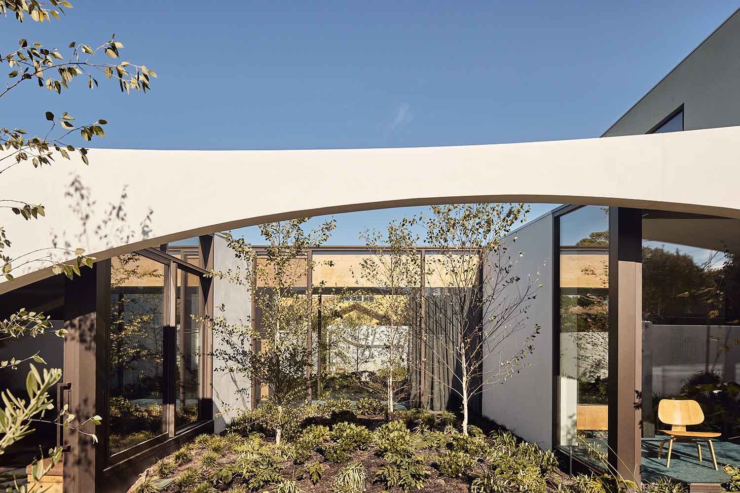
As such, the home has been expanded via an internal bridge of glass that gives the house its name. In doing so the new volumes are able to be positioned to take in the light. This clever solution is paired with a flattening of the original home’s footprint to make it continuous to the landscape with the new pool reading as welcoming and simpatico to the design: “When we walked in, there was four steps up, and six steps down. It was propped up over the landscape with a pool much lower, and you would never be enticed to go outside,” says Kister
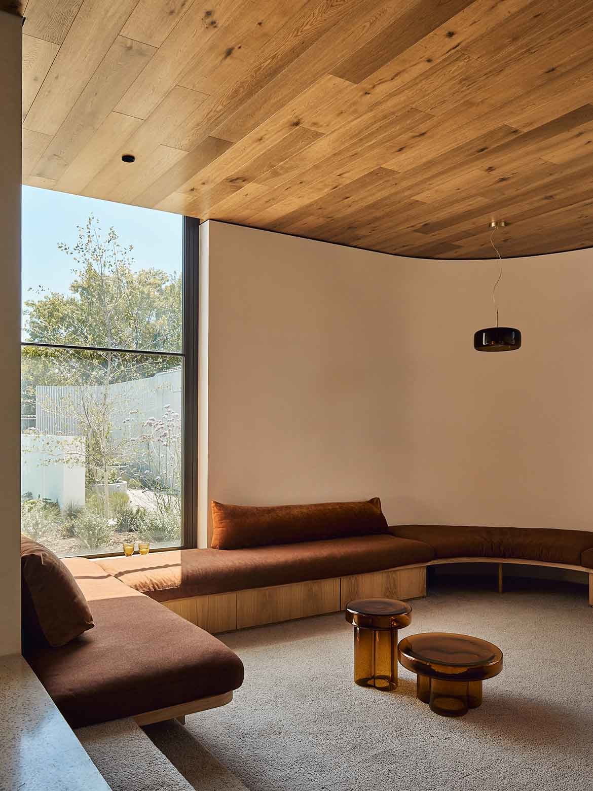
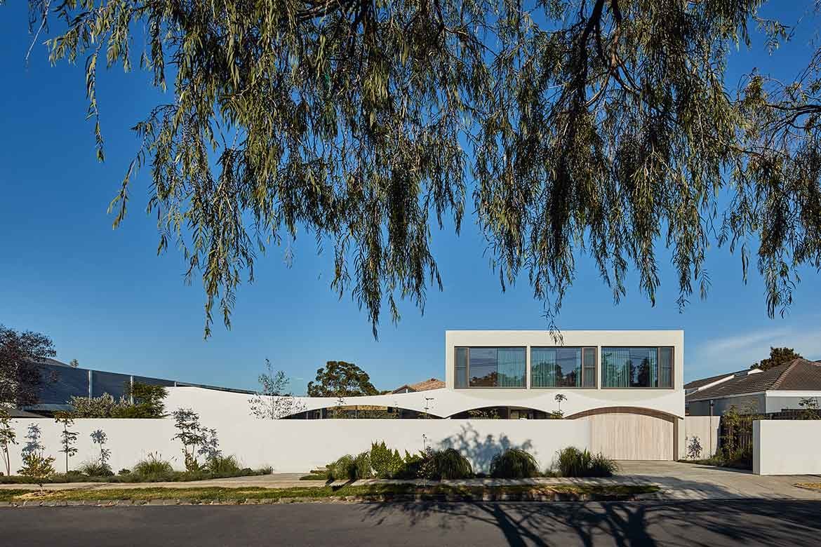
Kister’s inventive streak, however, is more clearly realised in the way she has manipulated the seventies genre. The arches, which were fairly minimal in the original house, for example, have been repeated to form a colonnade, with angles exaggerated and manipulated to provide privacy on one hand and maximum dialogue with the landscape on the other: “The glazed bridge and separated retreat, sunken living room and glazed dining area breaks the home into spaces that address the many varied aspects of the landscape,” says Kister.
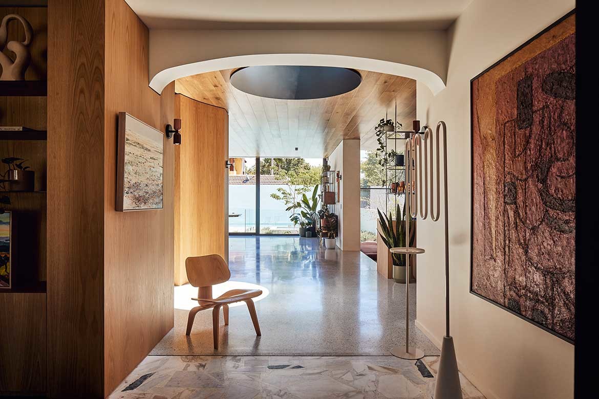
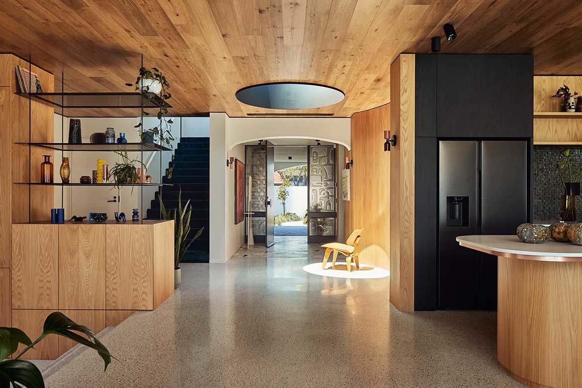
Crazy paving and a vermiculite ceilinged demi porte cochere lead to an original seventies door with seventies style contemporary glazing by Toucan Forged Glass to each side. This opens to the original marble terrazzo floor. Aesthetically it is a fabulous arrival point, but also a remarkable introduction to the home’s mixture of cohesive design and expressed materiality. Here, the large mixed terrazzo gives way to polished concrete, while floors and walls shift from plaster and timber, to timber and plaster.
Central to the junction is a large round skylight with a deep recess, which reads as a solid from the door. As the foyer is crossed its depth becomes apparent as it does when the sun pours through to create a steadily moving spot of light.
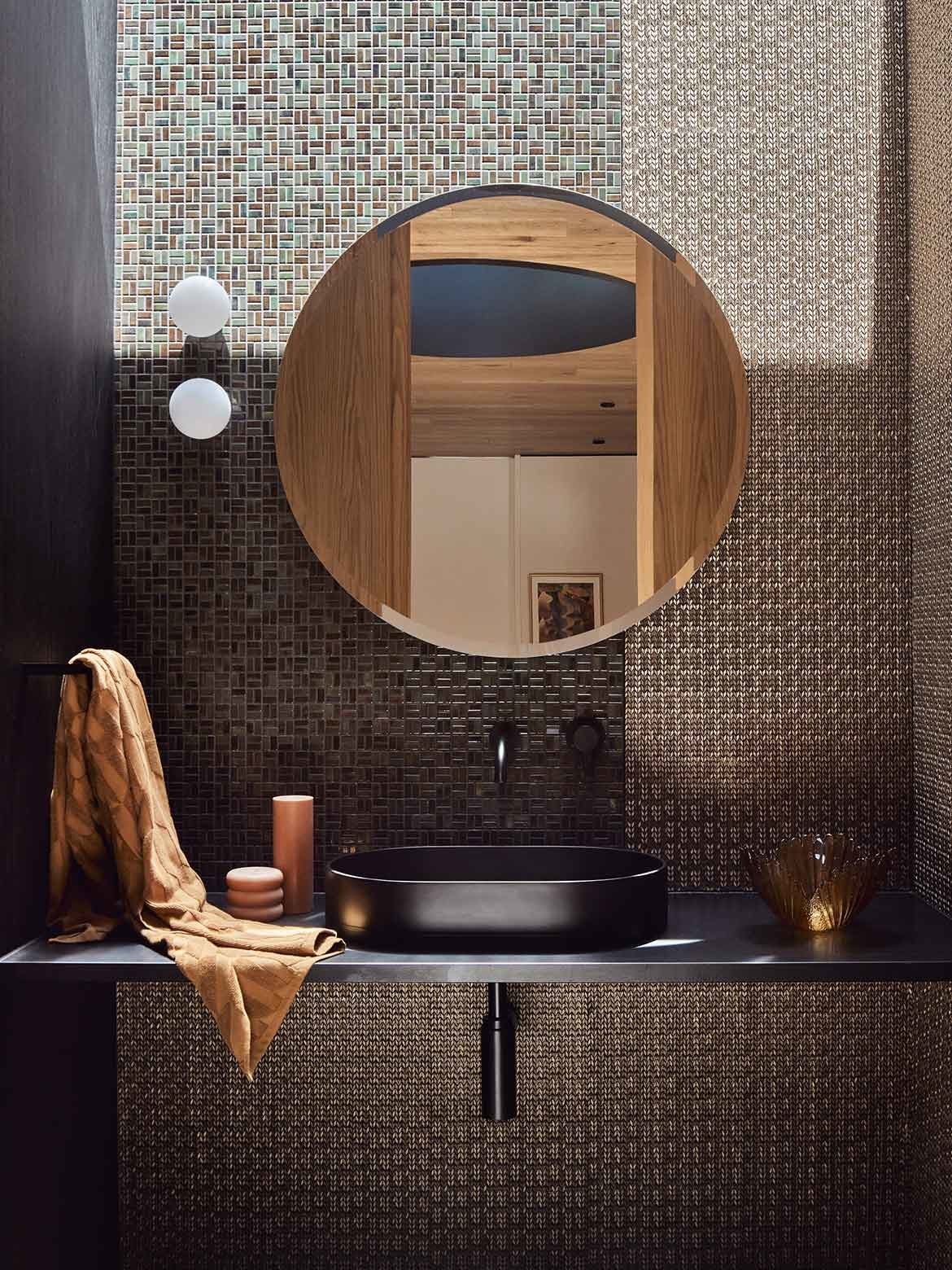
To the left, a wall of curved cabinetry, echoing the curve of the skylight, splits midway with a curved door sliding back to reveal a jewel like bathroom of bronze mosaic tiles. It is a lovely and surprising foyer inclusion, but makes sense in terms of the house layout, which moves immediately to the kitchen.
Kister’s sense of architectural scale is legible in her ability to balance horizontals and verticals. For the kitchen, this translates to large expanses reading as human when in use. It is a tricky equilibrium that many don’t get right, but Kister has managed with textural and tonal shifts between timber, tile and stone, that created portions within the whole.
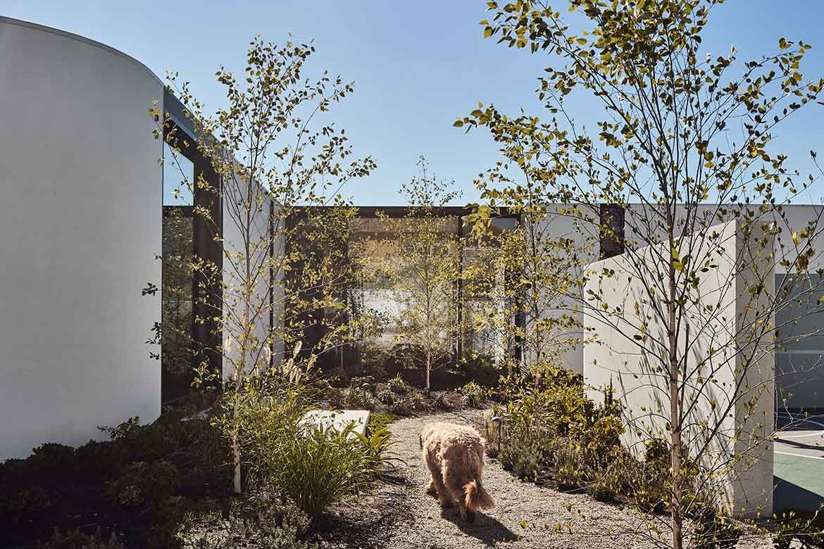
The new volumes are large and impressively positioned to take in the gardens, with internal courtyards furthering the connection to nature. Her combination of curves and straight lines, realised in a range of materials, however, steal the show. Kister’s use of internal courtyards is similarly impressive, with plantings paying homage to the modernist aesthetic.
“ACRE Landscape architects were engaged early in the sketch design phase of the project to ensure an integrated thoughtful holistic vision for the entire site,” says Kister.
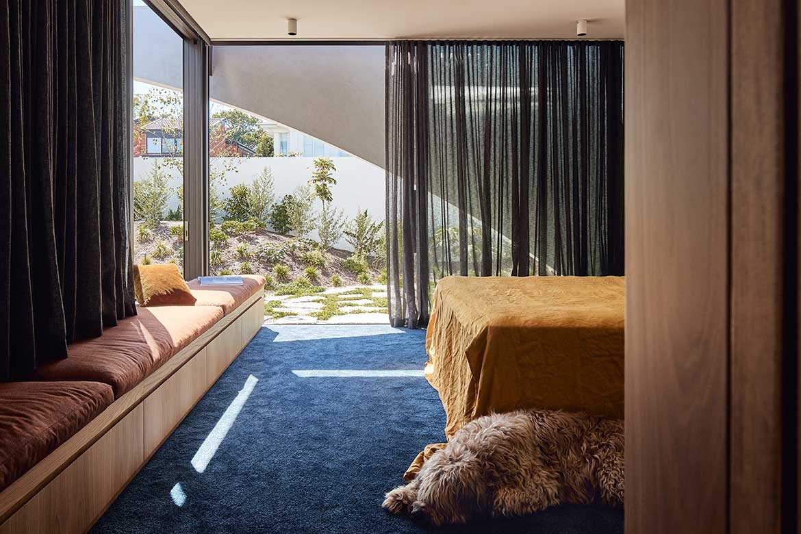
Art and objects make an impression with well selected pieces curated throughout. As does the use of coloured carpet in contemporary finishes that are just a bit seventies-ish. More velvety than shag, the colours too are tonally softer than their seventies counterparts: closer to ash-blue than sky.
Indeed, the colours throughout, while nodding to era are far more earthen, caramel rather than mission, mustard, rather than lemon… It is in fact a beautiful home with strong clean lines and an interior that, while fabulous right now, has plenty of nooks and surfaces for the owner’s collections to be changed and played with over the years.
Project details
Architecture – Kister Architects
Photography – Peter Bennetts
We think you might like this story on a home architecture project that reimagines a well-known and loved Woollahra landmark.
