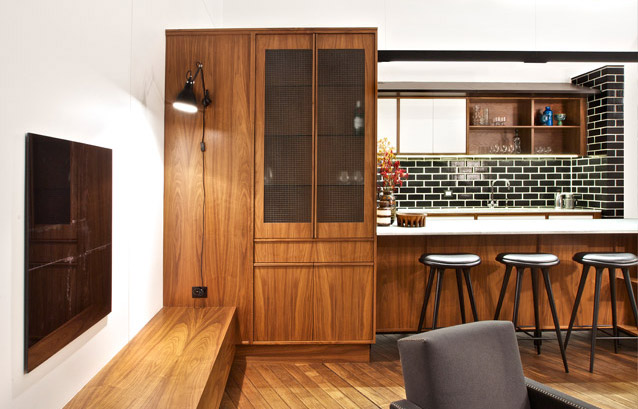
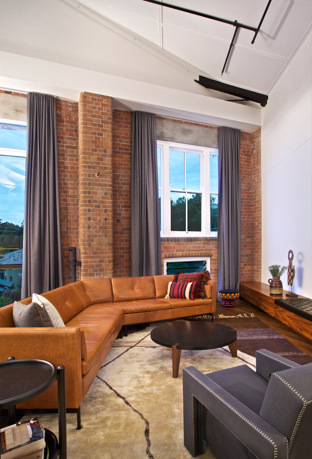
Applying a distinctly Australian slant to the industrial-chic formula, the Teneriffe warehouse was one of Brisbane’s original wool stores, complete with cement slab flooring, brown brick walls and stainless steel beams supporting a six-metre high ceiling.
The project arose through a casual encounter between the client, a busy executive who had bought the property but was unsure how to proceed with the renovation, and Interior Designer Ian Wrightson (of Wrightson Stewart Interior Design). “The client brief was fairly open”, comments Wrightson, “but it was important for the client to showcase the building’s original heritage.”
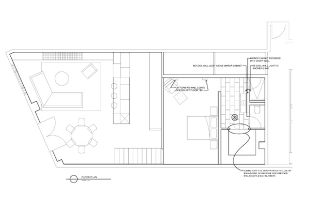
The practise carried out a comprehensive fit out, creating a beautifully finished modern interior that both highlights the building’s historic features and plays on them with retro flourishes.
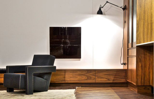
The coherent materiality of luxurious finishes including Carrara marble, American walnut, glazed brick and large black and white tiles creates a refined aesthetic and a simple but effective textural and chromatic contrast, and pleasantly counterbalances the grittier flavour of the pre-existing elements. As Wrightson says, “the original architectural detailing provided the opportunity to play with paint and bold colour – picking out beams and industrial elements.”
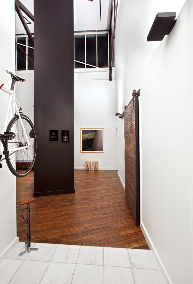
An abundance of white surfaces maintains the serenity of the space, which might otherwise risk becoming overpowered by the richness of the finishes and furniture. This also allows indirect lighting to infuse the volume with luminescence, and illumination is also admitted by a clerestory window running under the apex of the pitched roof.
Black and white tiles and glazed bricks are used to excellent effect in the bathroom and kitchen splash-back, where they create a crisp, deco feel, and long, dark curtains at the oversized windows accentuate the structure’s dramatic proportions.
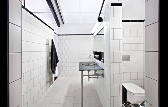
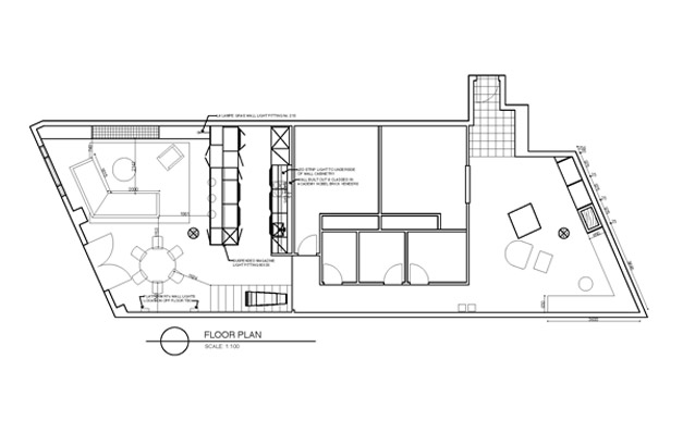
These proportions were a significant challenge for the architects; as Wrightson explains,“we had considerable access issues and of course the ceiling height posed numerous problems”. However the ensuing home is comfortable with its size, providing both the luxury of expansive spaces and the coziness of more intimate ones.
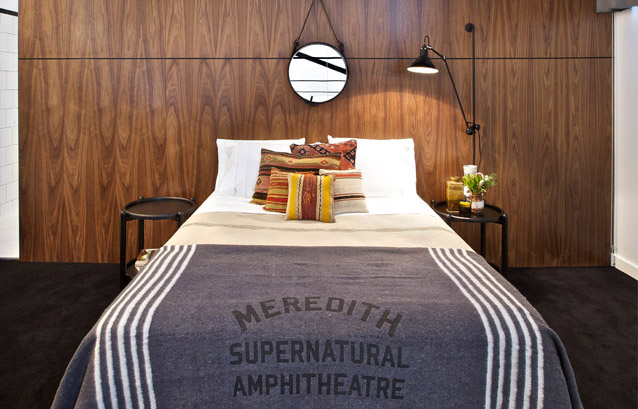
Overall the project is a highly successful application of the New York staple of warehouse-cum-modern-home, satisfying the client and demonstrating the ability and confidence of the interior designers.
Wrightson Stewart Interior Design
Photography: Kylie Hood
Feature floor tiles in the bathroom are from Popham Design, available through Onsite Supply and Design
Industrial-style door sliders are from Specialty Doors Inc in California USA
Academy ‘Nobel’ glazed bricks are from PGH Bricks & Pavers
