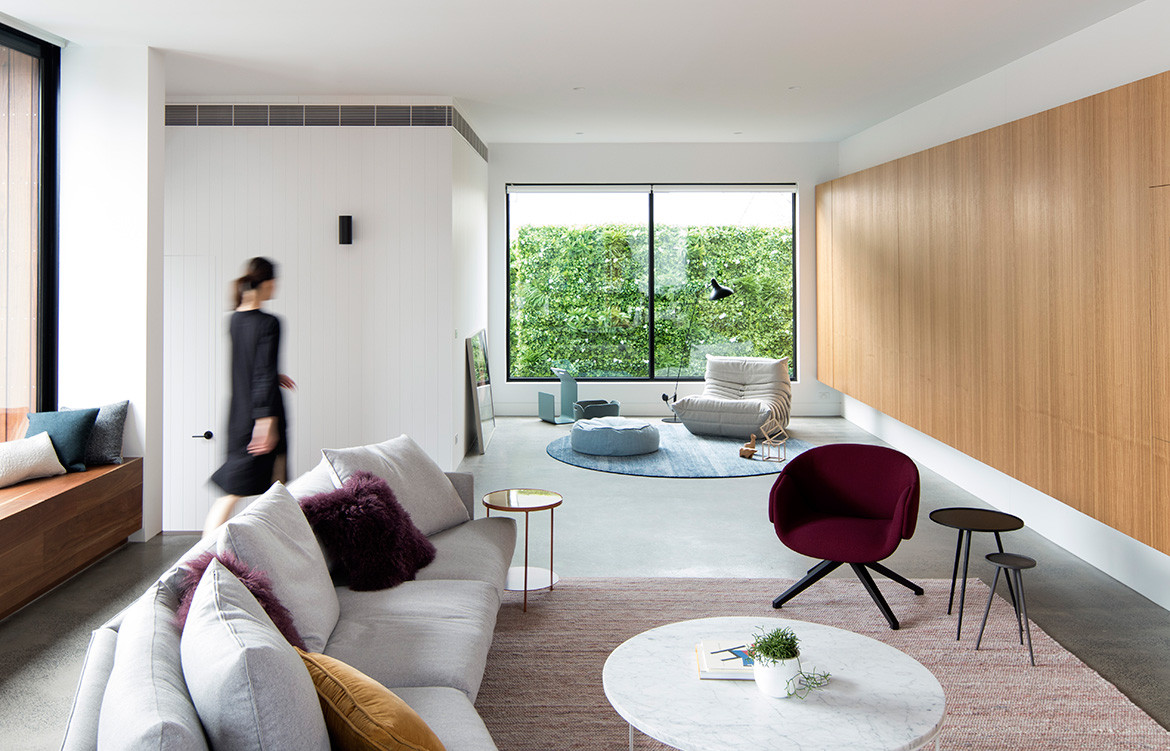
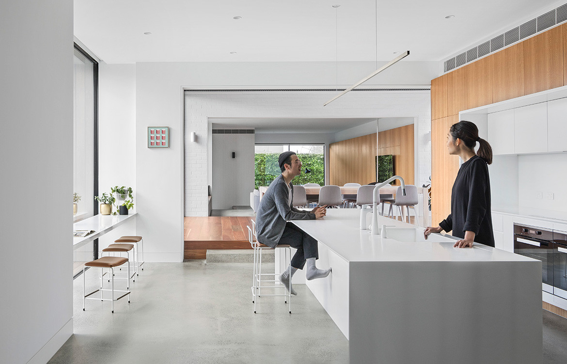
Open-plan spaces floor plans have been the way forward in residential design since the emergence of the ranch-style house in the post-war era. While the clients of Bulleen House in Melbourne wanted an open house, they didn’t want what architect Michael Ong, director of MODO, refers to as the “gymnasium effect,” with spaces feeling empty and boundless. “The clients explained their vision of an open floor plan with all living areas connected, however they felt it was important that spaces didn’t feel empty and vast,” Michael explains. “The question then became how we create spaces that feel open, yet defined and welcoming.” So instead of using walls and screens to create visual separations, Michael used volumes, levels and materials to signify transitions and define one space from another.
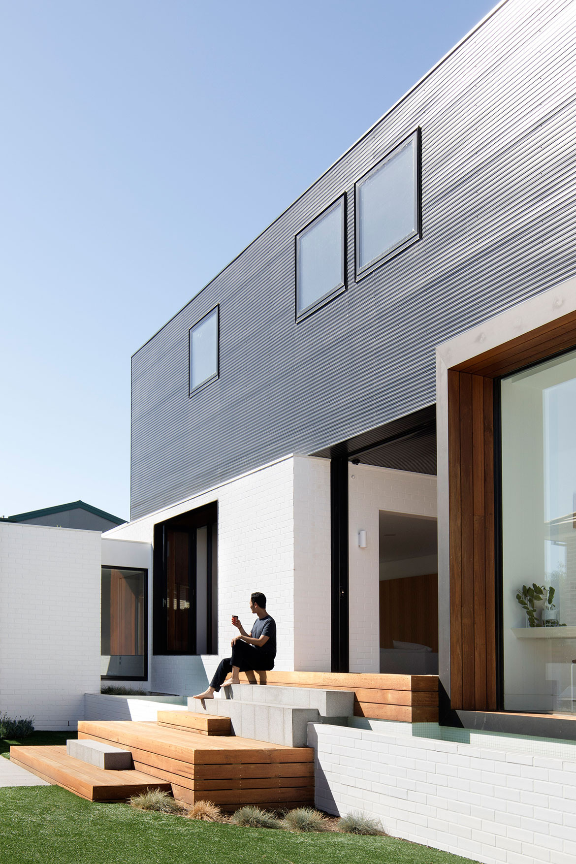
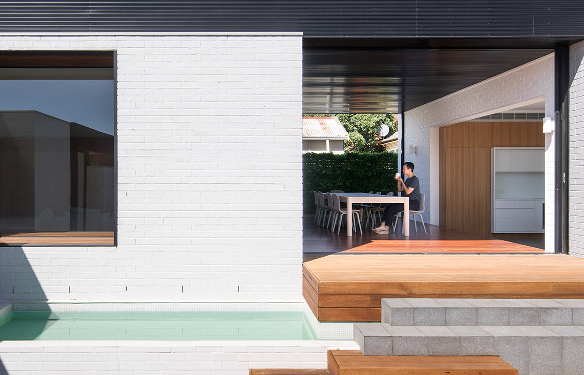
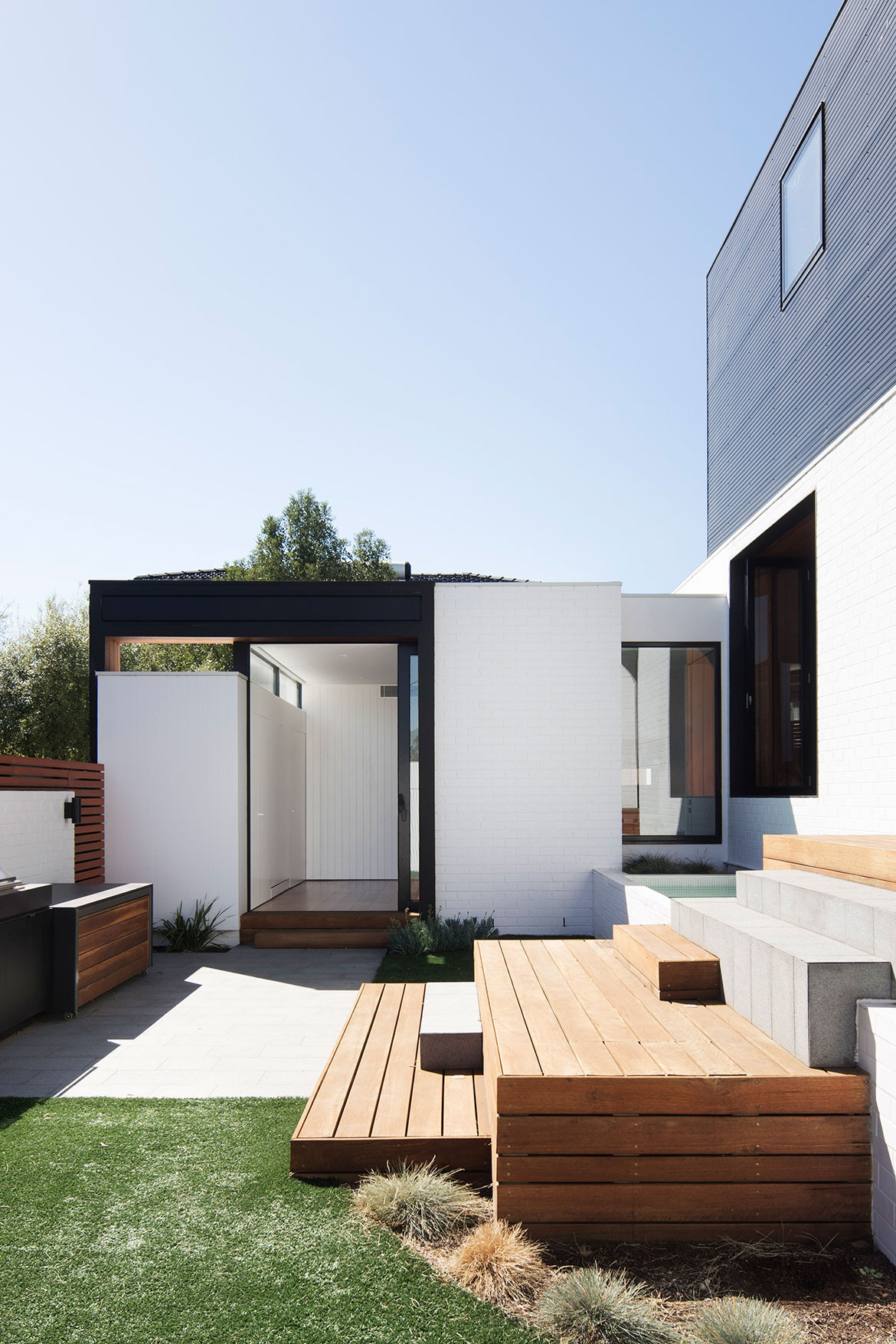
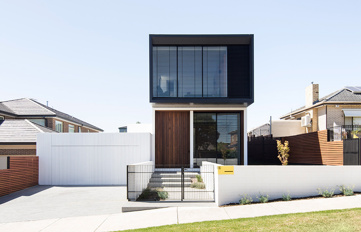
Located on an east-west site, the building is comprised of a series of brick volumes connected by glazed links on the ground floor, and a long black metal-clad volume sitting on top. The narrower façade at the front of the house is designed to be proportionate with the streetscape and to reduce the solar impact of western sun. To capture northern sun for natural light and thermal efficiency, the main house is positioned along the southern and eastern sides of the site, enclosing a courtyard and directing the view inwards.
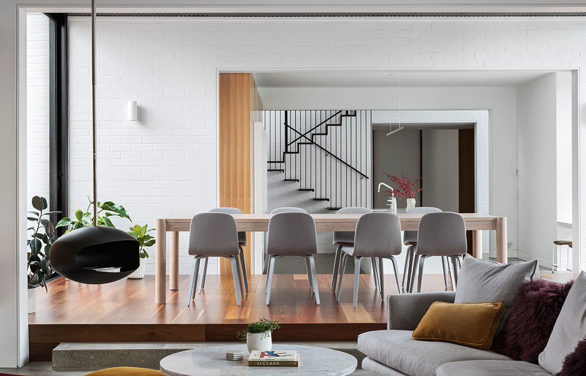
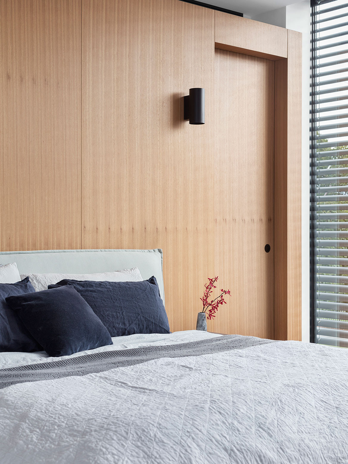
Throughout the house, volumes, levels and materials indicate the shift from one functional space to another. “You step into the ‘next’ space, [and] the walls are slightly lower or higher, and the floor, walls and ceiling materials change,” Michael explains. Thus, every room is connected but with a subtle distinction.
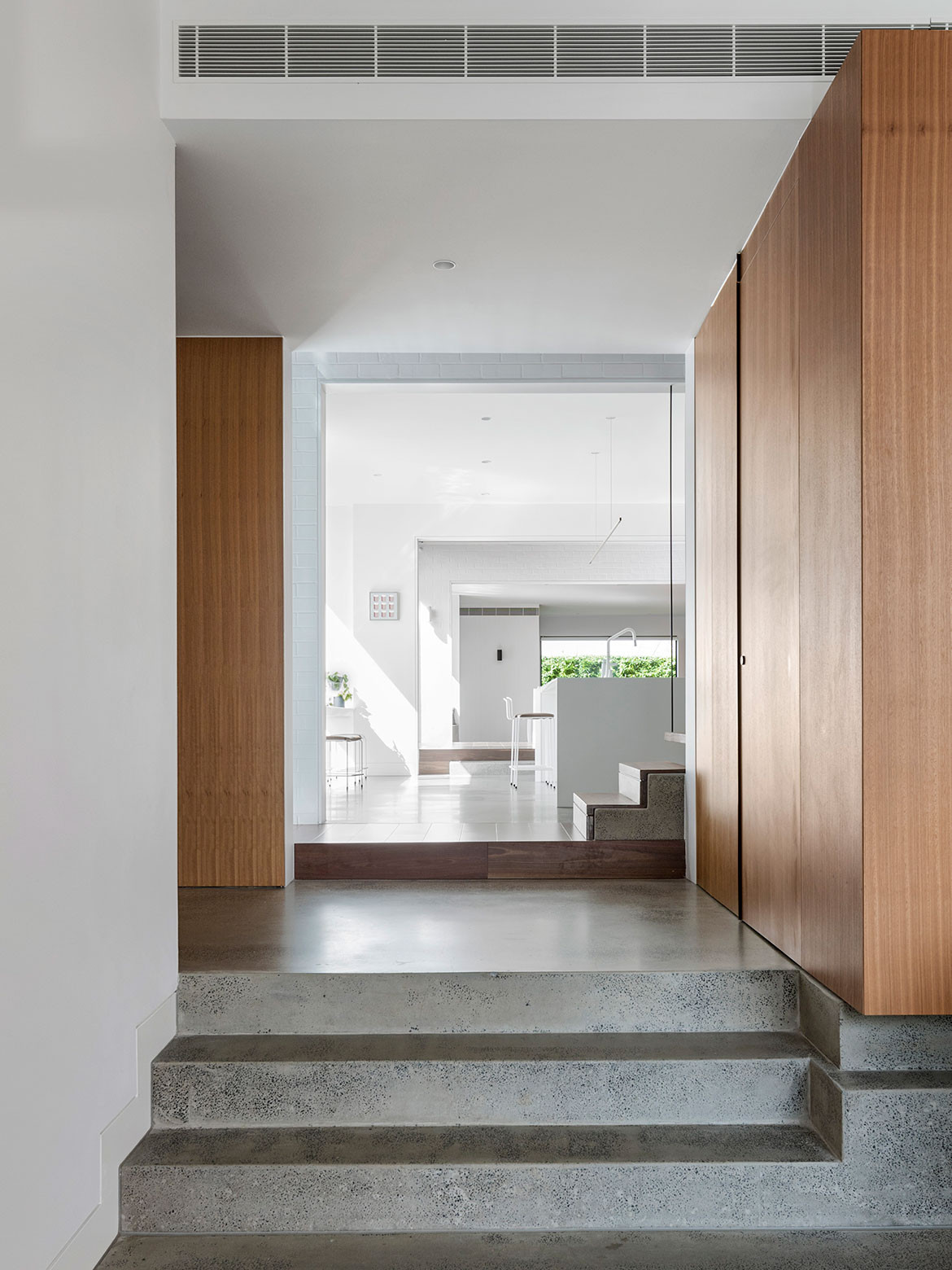
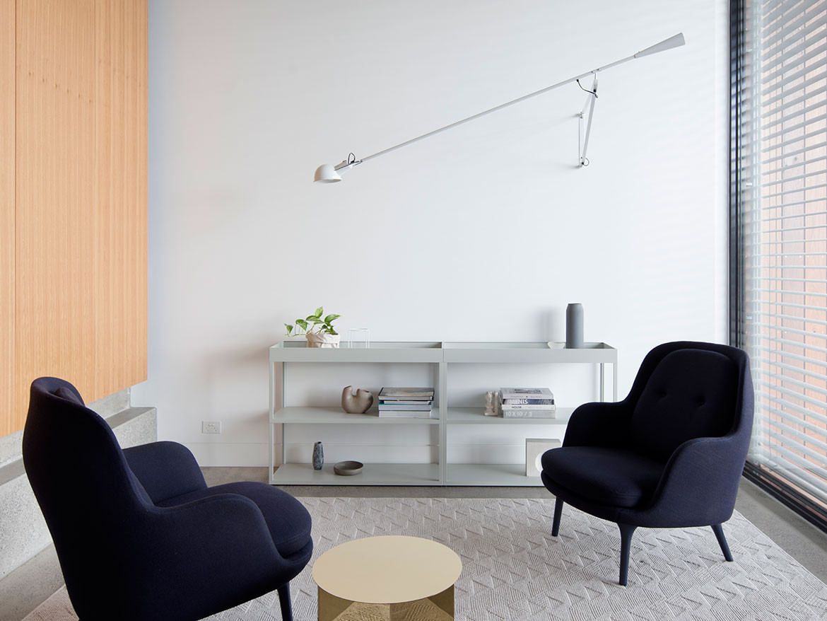
From the entrance of the house, concrete steps lead up to the garage entrance and exit, with a further step to the kitchen and staircase. Timber flooring indicates the threshold to the stairs and differentiates it from the polished-concrete kitchen floor is polished concrete. The dining room with brick walls and timber floor is a step up again, beyond which the living space with polished concrete floor and timber-joinery wall is a step down. Large sliding doors open the dining area to gardens on the north and south sides, and timber and concrete stairs cascade to the paved and grassy courtyard.
While the staircase is inherently composed of varying levels, materials are used to define the threshold. “This space is designed to feel light and transitional, as such we wanted the stairs to capture this concept,” Michael explains. The steel and timber treads almost float within the double-height void, and the first two steps are timber-clad concrete to anchor it to the floor and reinforce the transition to or from the ground level.
“As you move through the house, your body starts to develop an understanding of these multiple volumes and shifts in levels and materials,” Michael says. “It’s amazing how clearly and quickly you start to read and respond to these seemingly minor design details.”
MODO
mo-do.net
Furniture and styling by Nina Provan
Photography by Benjamin Hosking
Dissection Information
Glacier Ice benchtop from Corian
Blackbutt timber veneer
Spotted Gum Engineered Floor Boards from Ecotimber
Tiles from Sugie Series Hanten
Dita stools by Grazia & Co
Anita chair by SP01 from Space Furniture
Togo fireside chair by Ligne Roset from Domo
Restore basket by Muuto and magazine holder both from Luke Furniture
Fri chair by Fritz Hansen from Cult
New order shelves by HAY from Cult
Polar desk lamp by Ross Gardam
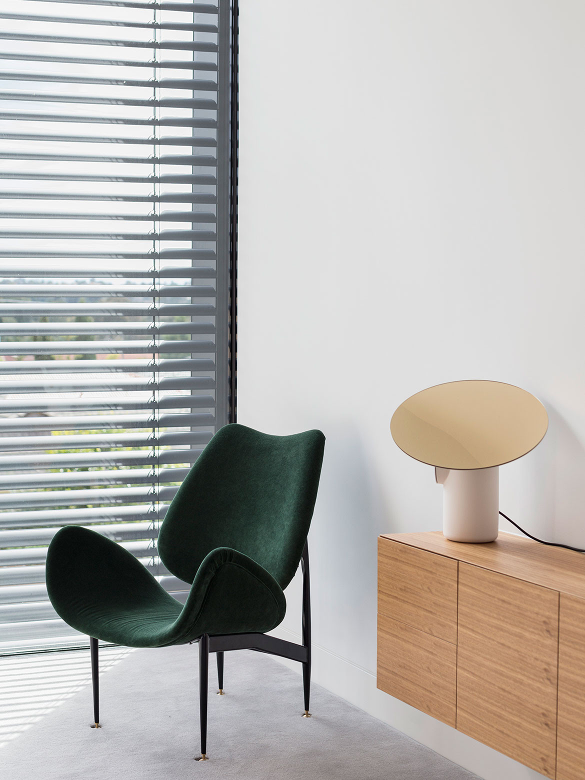
Featherston Scape chair from Grazia & Co
Flos 265 Wall-mounted light
Arq Kitchen Sink Mixer from Rogerseller
Mare hand shower & integrated wall union from Rogerseller
Alapte Metaphor Counter Basin
Integrated fridge from Liebherr
We think you might also like Headland House by Atelier Andy Carson
