Café’s, from the very first Ottoman coffee houses, have always occupied a unique stance within society. The design of such spaces is driven by the need to express and preserve individuality in the face of urban surroundings. In The Architecture Of Public Display by Christoph Grafe, it is stated that;
The café is many things: an object of nostalgia, a stage for inventing oneself, a place for creating relationships and a home, in the words of the Austrian critic, Alfred Polgar, “for all who wish to be alone but need sociability for this”.
Grounded by a similar understanding, the Labotory design team behind Café Oriente say a space of this kind needs not only to “deliver beautiful visuals but also offer a unique emotional experience”.
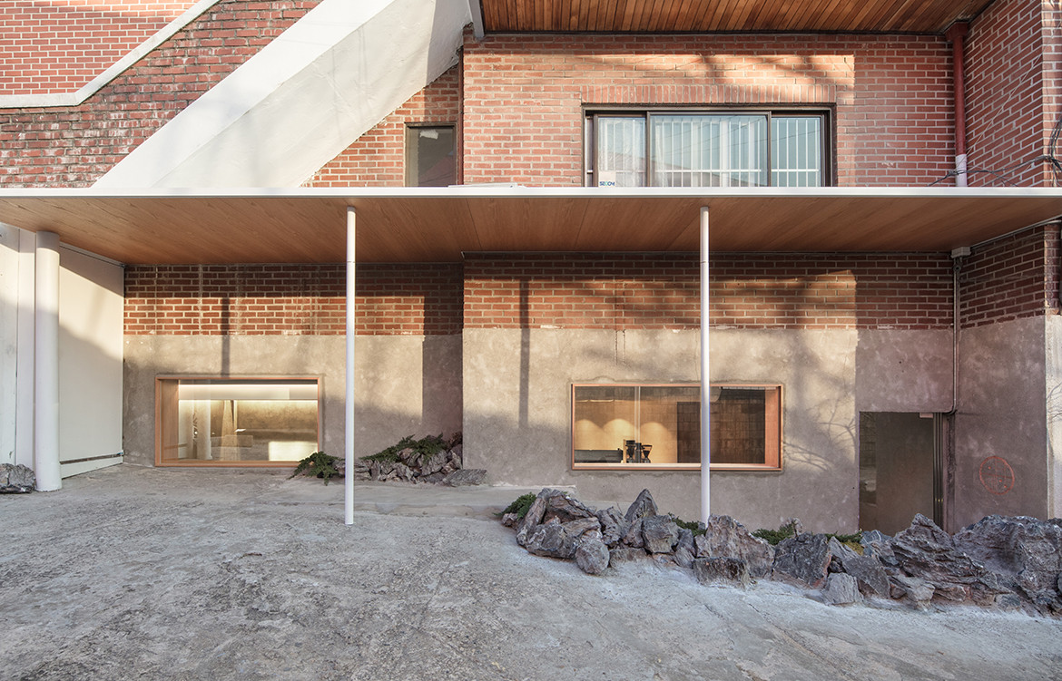
Café Oriente is located amidst Itaewon, Seoul, an area that was avoided for political reasons in the three decades prior. What used to be a United States Military Base has now revolutionised into one of the most vibrant parts of Seoul, grabbing the attention of tourists and university students alike. Found at the very end of Hannam-Dong’s narrow alley, the café is somewhat sunken into the ground.
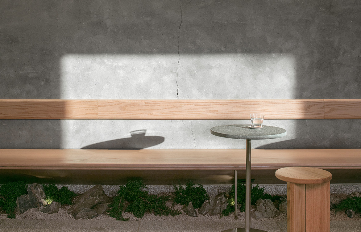
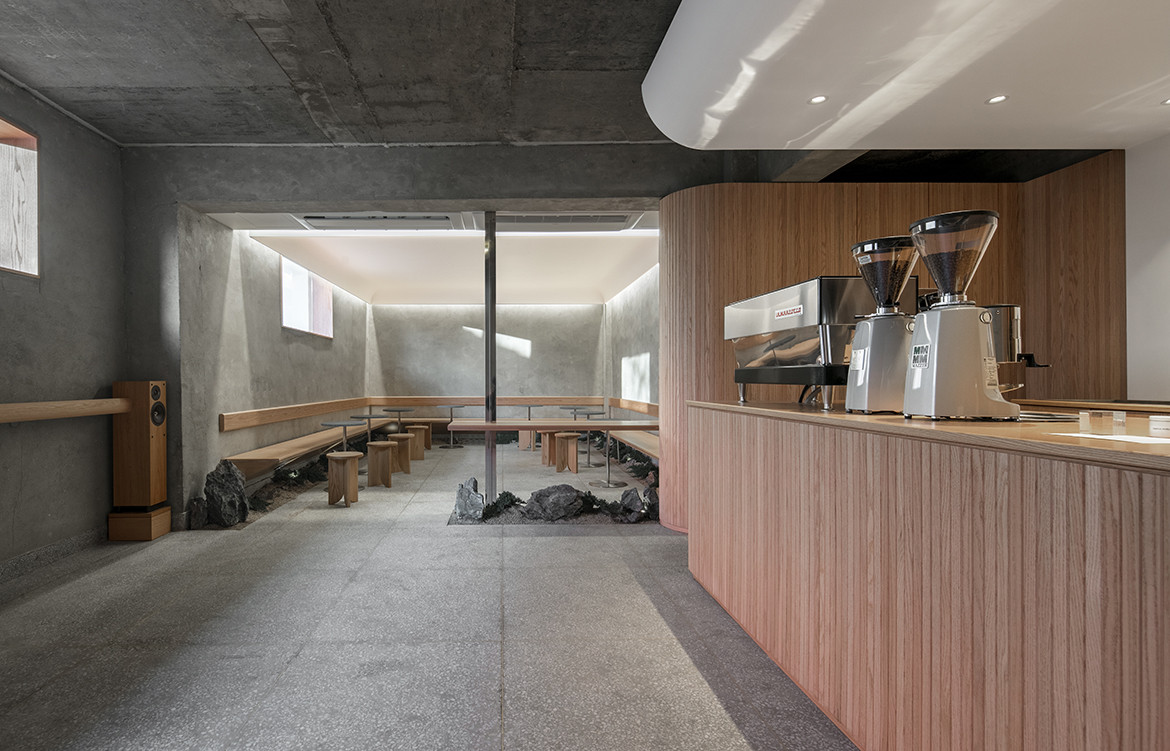
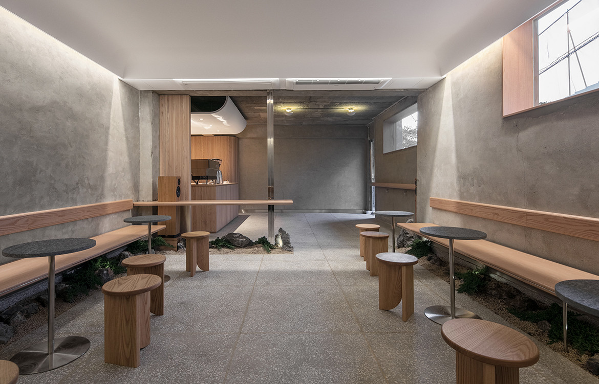
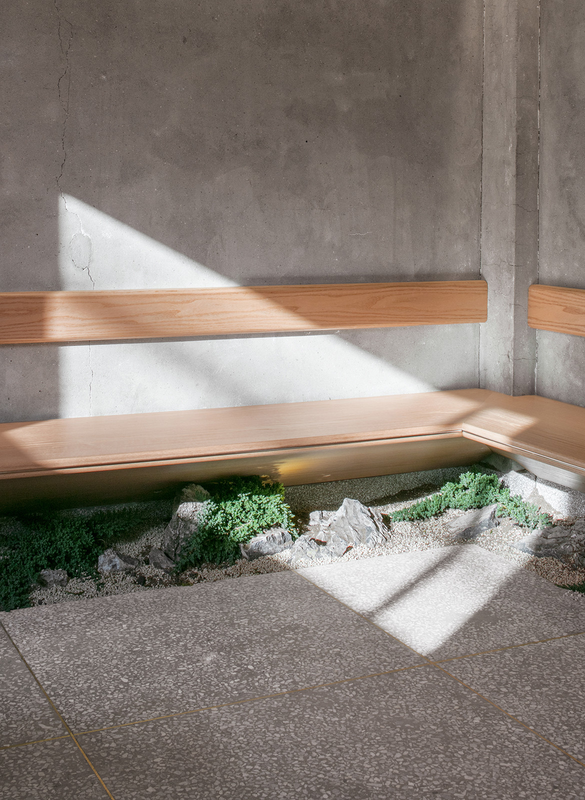
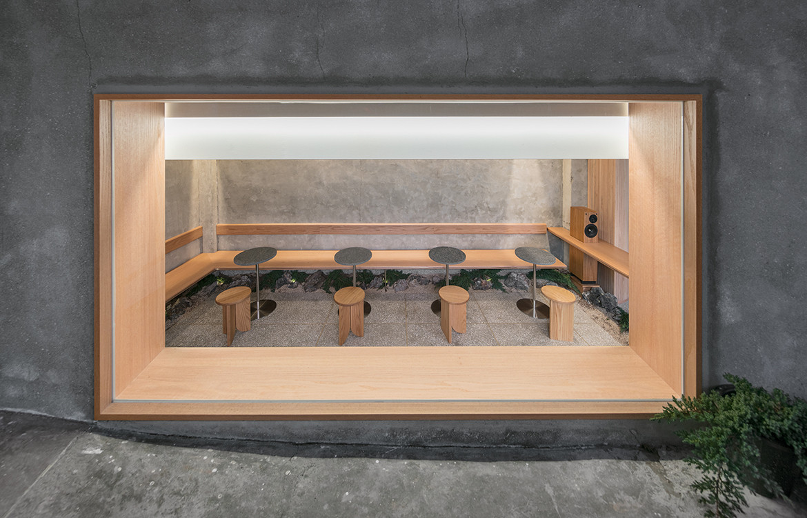
Informed by the client’s desire to have a space “where the oriental aesthetics are implied,” local interior design practice, Labotory, pairs the traditional Hanok (a Korean house) aesthetic with a contemporary minimalist design. Korean architecture places a lot of emphasis on positioning the house amongst the surroundings. In this case, synonymous with a Hanok, the café layout is designed around a front courtyard. The expandability of this space serves as a bridge between the interior and the exterior, decorated with a small garden that has been styled underneath customer café seats.
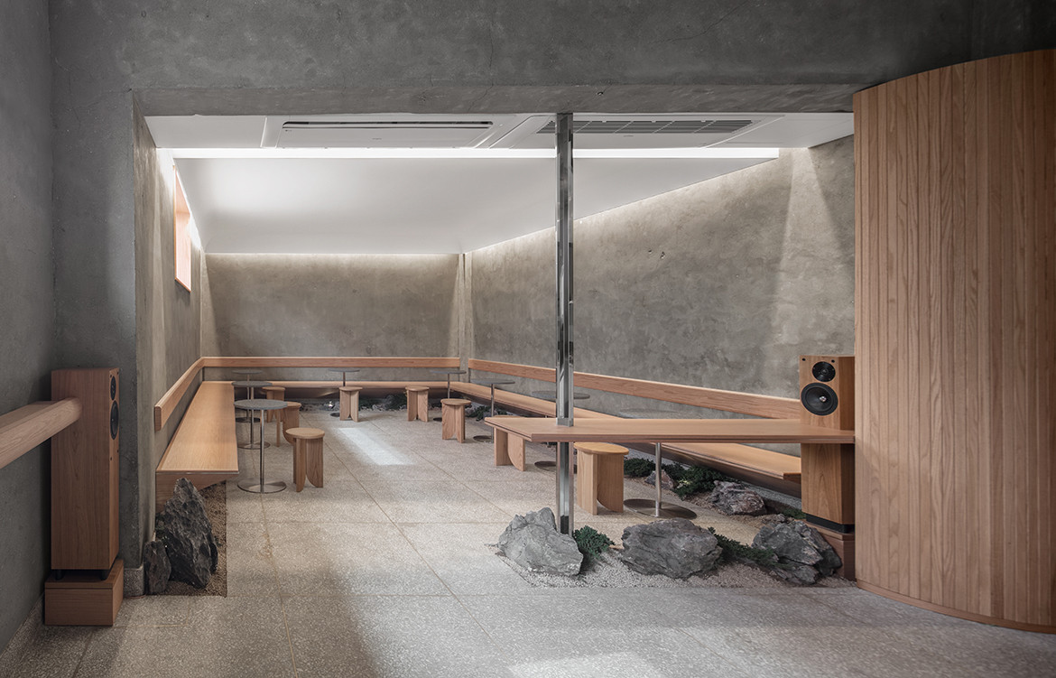
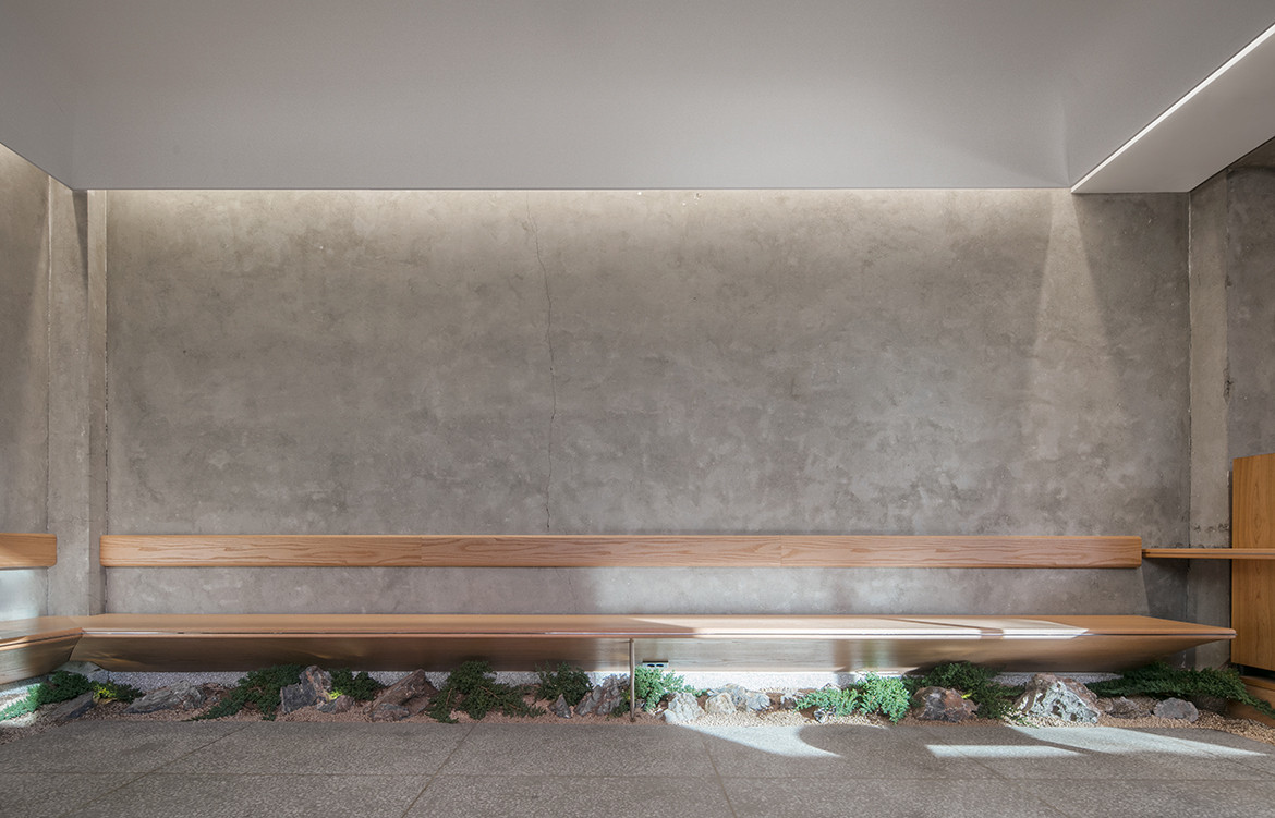
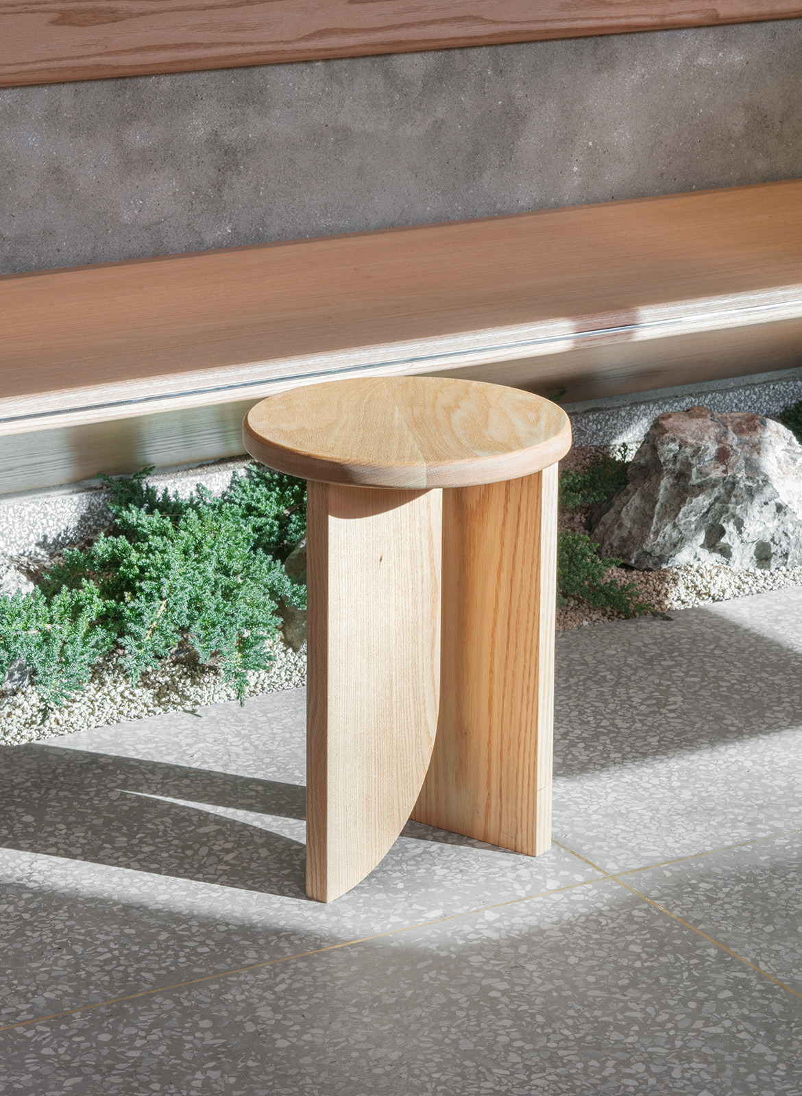
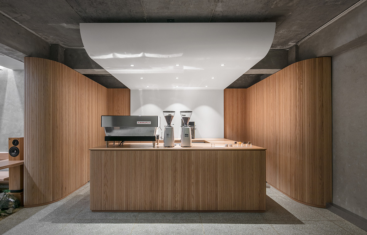
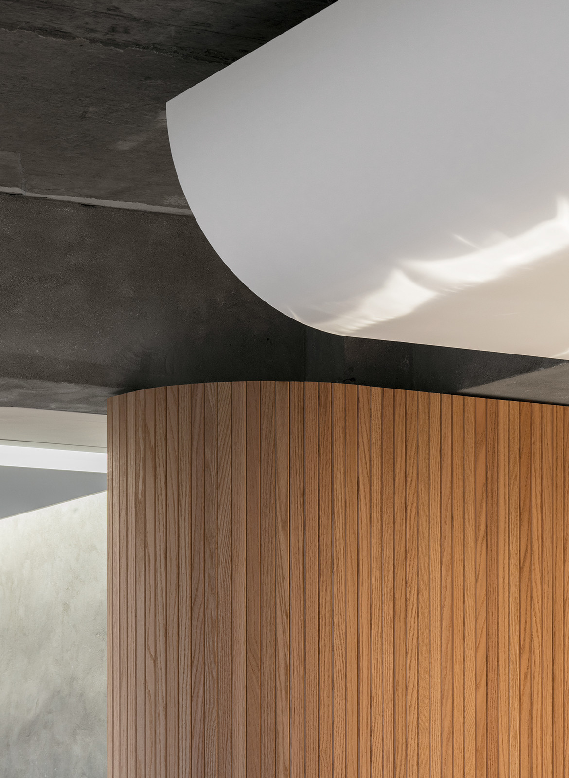
Cement plastered walls, terrazzo and stone tiles, and exposed concrete curved ceiling form the framework of textures evident in Hanoks around Korea. Where natural wood was used for the barista bar, it was also introduced as wall panels and furniture to add a sense of familiarity and warmth. The semi-subterranean space has a repeating motif of curves, seen once at the awning that meets the ceiling as guests move indoors and again as a seating arrangement. The curved ceiling adds depth and appears as though it is floating. The ceiling, which is backlit with a white hue, resembles the cream colour of traditional Korean paper and contrasts subtly with granite.
Providing a refined sense of nuance for all visitors, Café Oriente successfully shows respect to the country and to the architecture it resides in.
Labotory
labotory.com
Photography by Yongjun Choi
We think you might also like A Cultural Guide To Café Design
