When Melbourne-based Jean-Pierre Biasol recently travelled to Miami, he did what every Art Deco enthusiast would be crazy not to do – visit South Beach. The Miami Beach neighbourhood is a playground for the rich, famous and beautiful, known for its white-sand beaches and glamorous nightclubs. It also boasts one of the world’s highest concentrations of Art Deco and Streamline Moderne architecture, with over 800 historic buildings comprising the Miami Art Deco District.
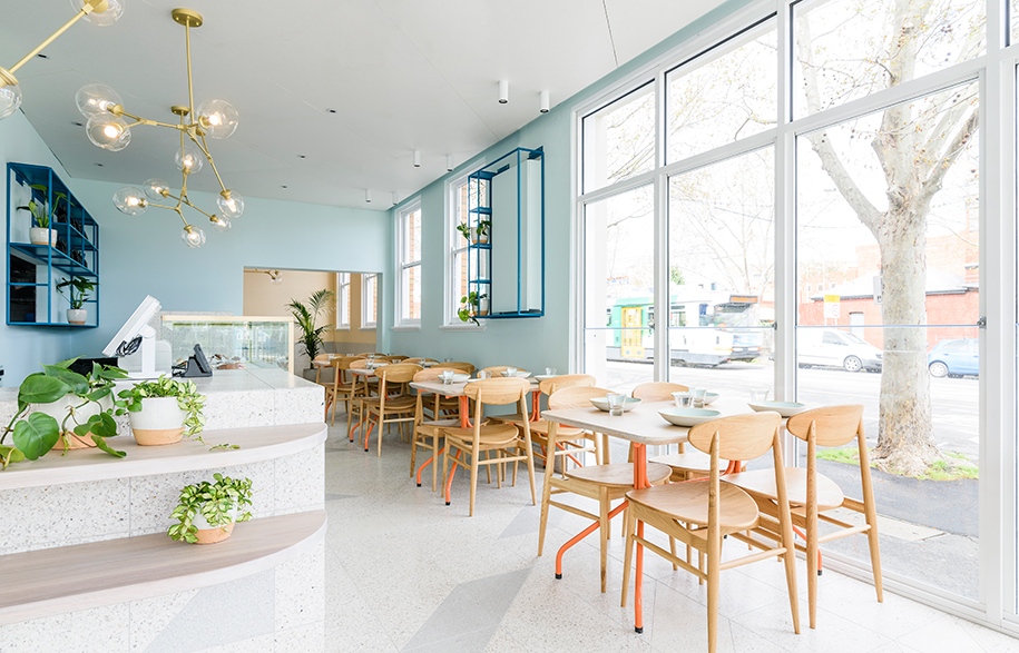
The area’s most distinct feature is undoubtedly the duo-tone pastel palettes of its heritage facades. And it is where Biasol (the Principal of Biasol: Design Studio) drew his inspiration when conceptualising the fit-out for newly opened Essendon eatery Captain Grey. As he explains, “The café’s building has an Art Deco heritage and this provided my design cue. I looked at the coloured facades of the Miami Art Deco District and reimagined them as a palette of burnt orange and pale indigo, which I then applied in the interior, along with sandy beige.”
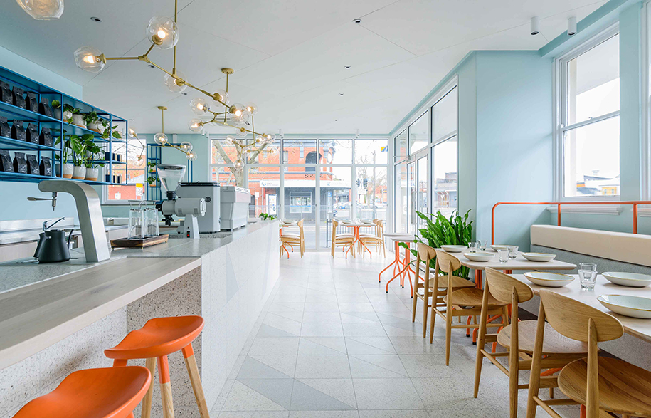
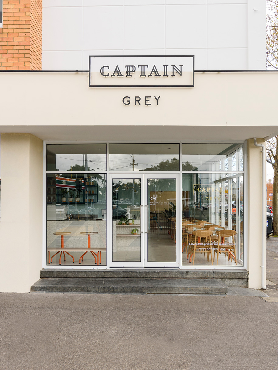
There’s something deliciously appealing about injecting a little Miami glam into the heart of Essendon. However, Biasol exercised restraint in his application so the result doesn’t resemble a themed restaurant, rather an airy retreat where patrons can relax comfortably. This bright, breezy atmosphere is also helped by the corner site’s original sash windows that generously flank both street elevations and let in an abundance of natural light throughout the day.
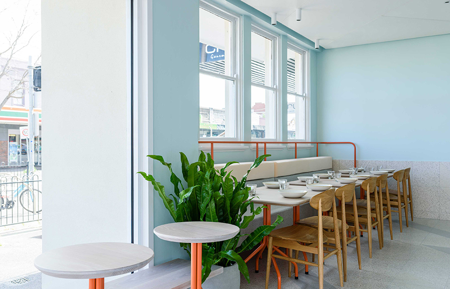
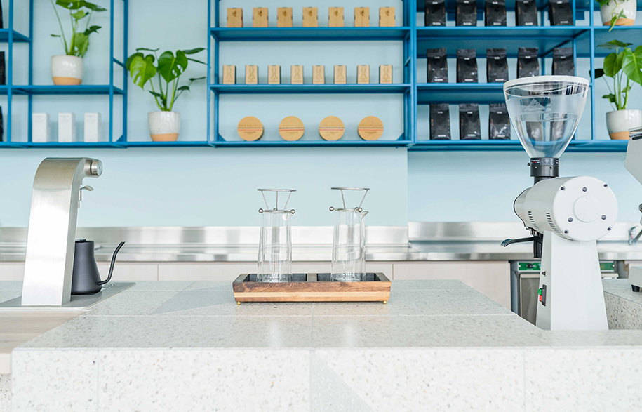
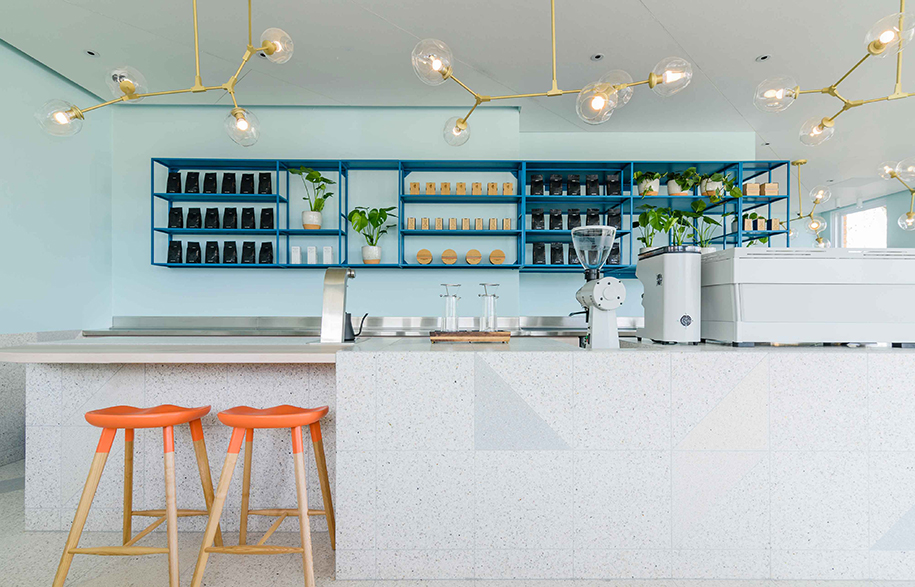
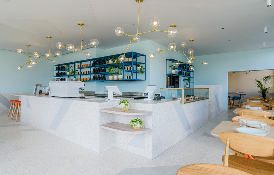
Captain Grey’s pale indigo walls deliver a subdued backdrop against which Biasol has introduced key colour and material accents for elegant flourish. The most striking finish is the burnt orange on the custom stools and tubular steel table legs; so rich it immediately attracts attention. Drawing the eye down serves to highlight the floor and counter’s luxe stone tiling, which is arranged in a simple pattern. This geometric motif of white, nougat and platinum is a subtle Art Deco reference too and further displays Biasol’s stylistic light touch.
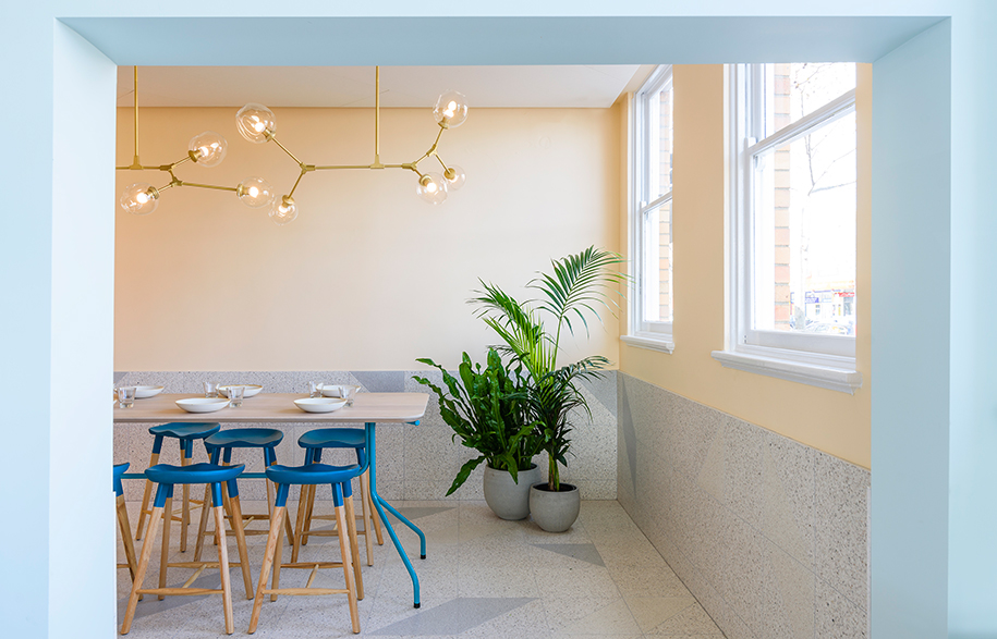
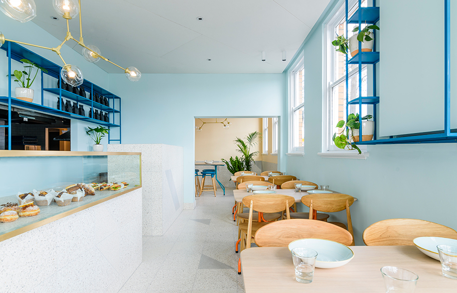
To add visual depth he finished the shelves, separate dining room table legs and stools in dark indigo, while brass light fittings above the counter are another discreet nod to the era’s high-end glamour. The tastefully understated scheme succeeds because Biasol’s minimalist interpretation of a much-loved architectural style feels completely at home in this suburban Australian setting.
Biasol: Design Studio
biasol.com.au
Words by Leanne Amodeo
Photography by Daniel Aulsebrook
