“Our clients wanted to transform a single storey cottage into a two storey home built with materials of honesty and integrity,” explains Shaun Carter, principal at Carter Williamson Architects. His clients’ house in Sydney’s Inner West suburb of Balmain, has undergone several changes over the years, resulting in an impractical internal layout and a lack of connection with the street.
“We responded by reinstating the verandah and timber fence, keeping in tune with the corrugated roof sheeting and weatherboard material palette, thereby connecting with the heritage origins of the area,” explains Shaun. “Beyond the facade, a taller, newer volume rises up to comfortably mediate the height of surrounding developments, melding in with the old front façade in the same colour tones.”
Beyond the humble facade, the site experiences a significant fall, which initially presented a number of design challenges. “The clients were blessed with a site generous in width – that is, relative to the average inner west house,” explains Shaun, “however this sense of space could not be experienced in the existing house due to a lack of light and constant change in levels causing a disconnect across the house.”
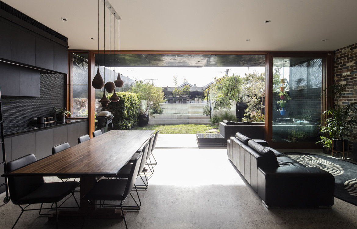
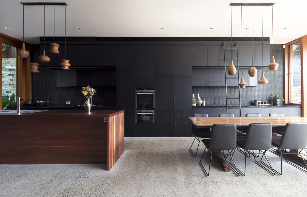
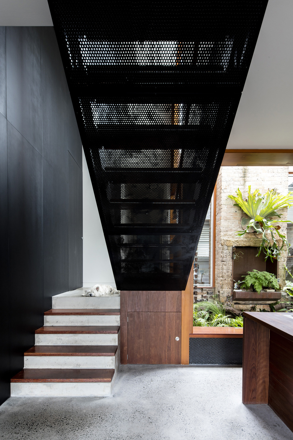
In response, the team created “a unified plane” by consolidating the living zone into an open plan that utilises the full width of the site, delineated from the existing cottage street front by a full change in level, with an added bathing room and a courtyard which features the existing fireplace. Shaun also repositioned the stairs to a more central location, which allows the family to seamlessly transition between spaces they use the most.
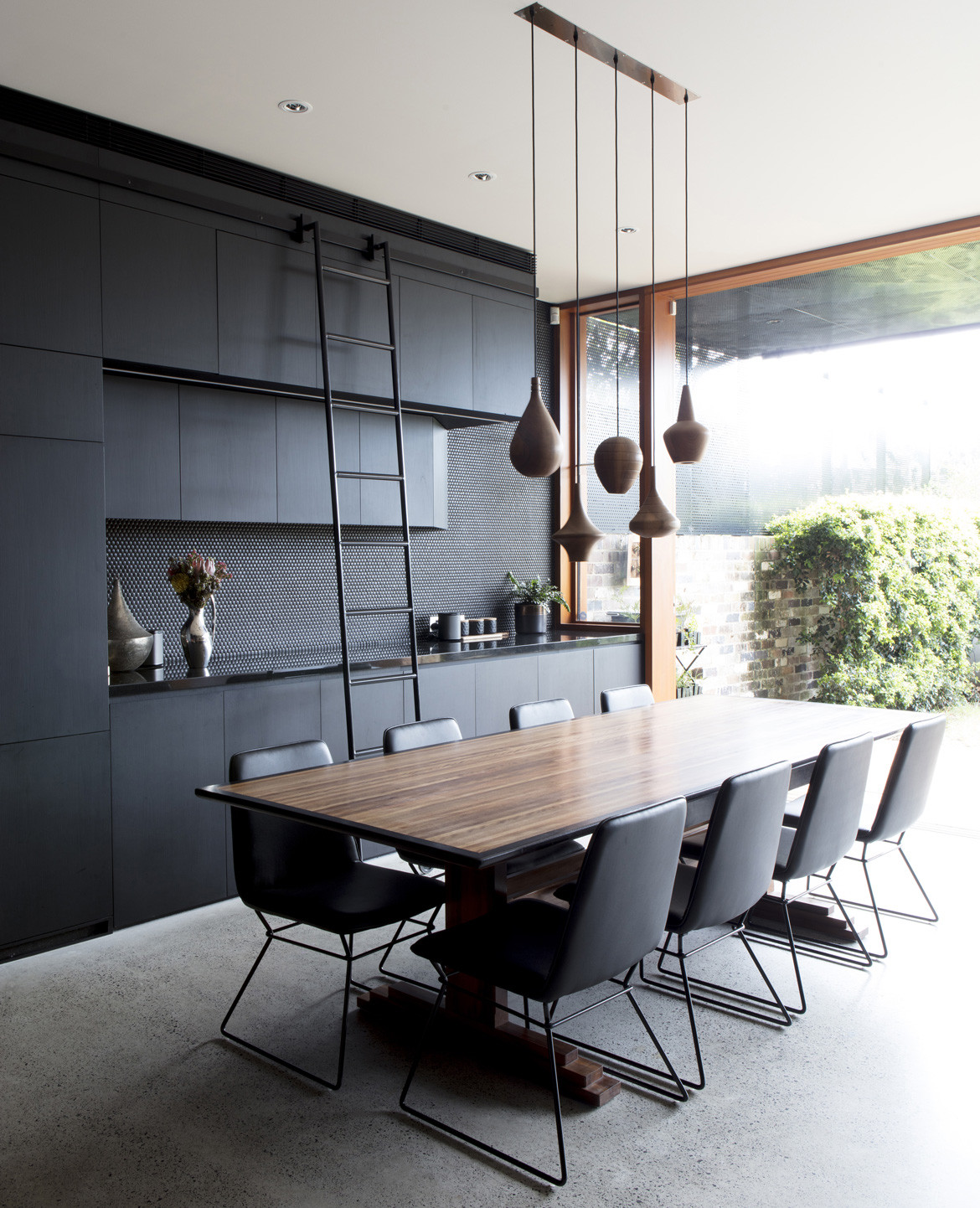
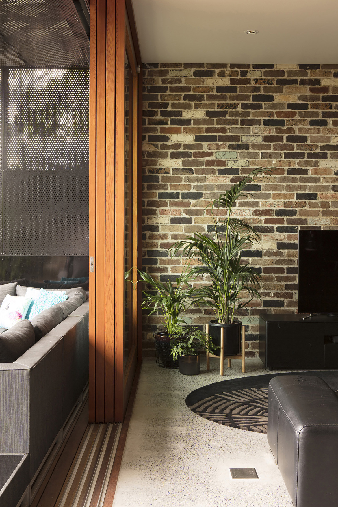
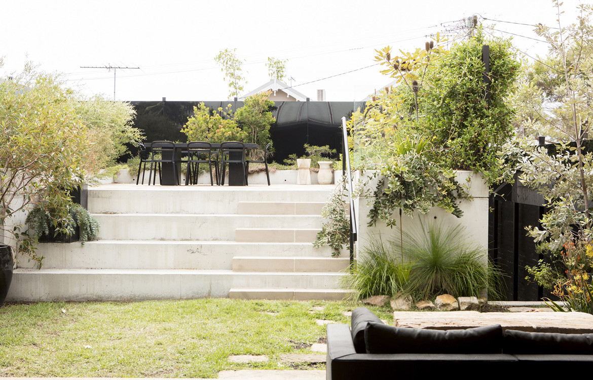
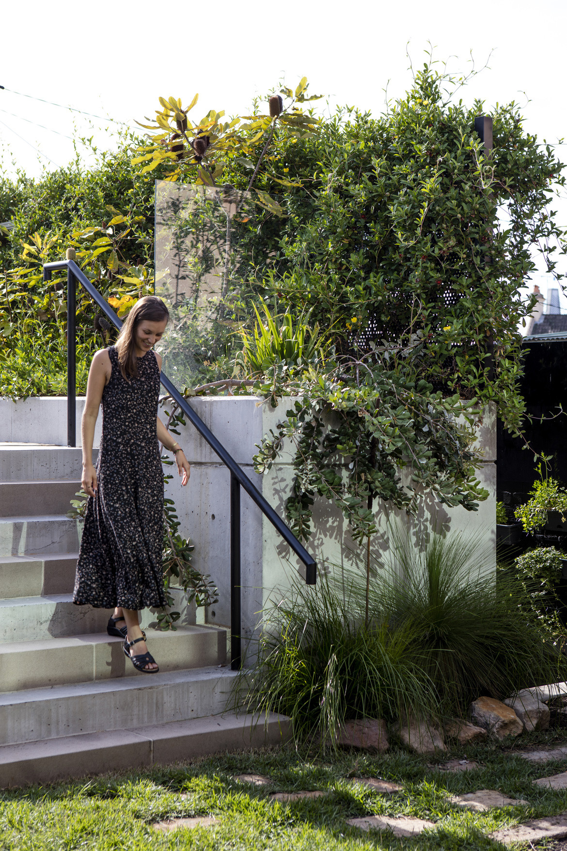
“Along with large, full-height sliding glass doors to mediate the threshold between garden and house, the living space is generously extended and opened to receive the outdoors,” adds Shaun. “The door and windows open generously to embrace the greenery so that equal amenity of light, access and views to the garden and courtyard is achieved.” The garden of Australian natives beyond the deck continues as a plateau above the lane-accessed garage whilst amphitheatre-like steps provide a safe stage for the children’s imagination.
Internally, the kitchen is the heart of the house, a space where people gather. “To nurture these interactions, the kitchen window opens out on to the light-well and courtyard, which serve as an enjoyable seat for those having a conversation as food is being prepared and acts as a light scoop to the first floor draws light into the centre of the plan.”
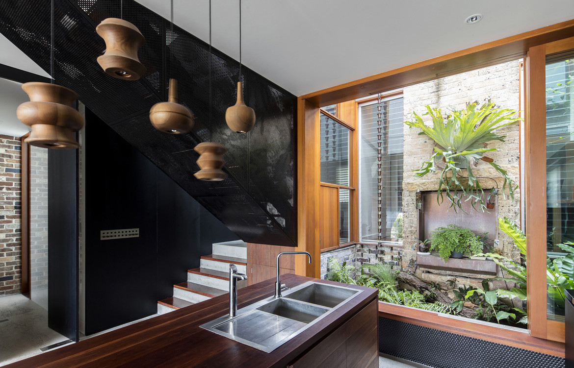
An important component of the client’s brief was for a sense of privacy and security. “Without compromising the need for light, the perforated screen was employed as a means of achieving both factors,” Shaun says. By using perforation, there is a level of transparency and the different sized holes create a texture on an otherwise flat plane. The heavily planted terrace above the garage, and the perforated screens along the boundary shield the house from its neighbours, without appearing austere due to their subtle transparency, textural qualities and attenuation of light.
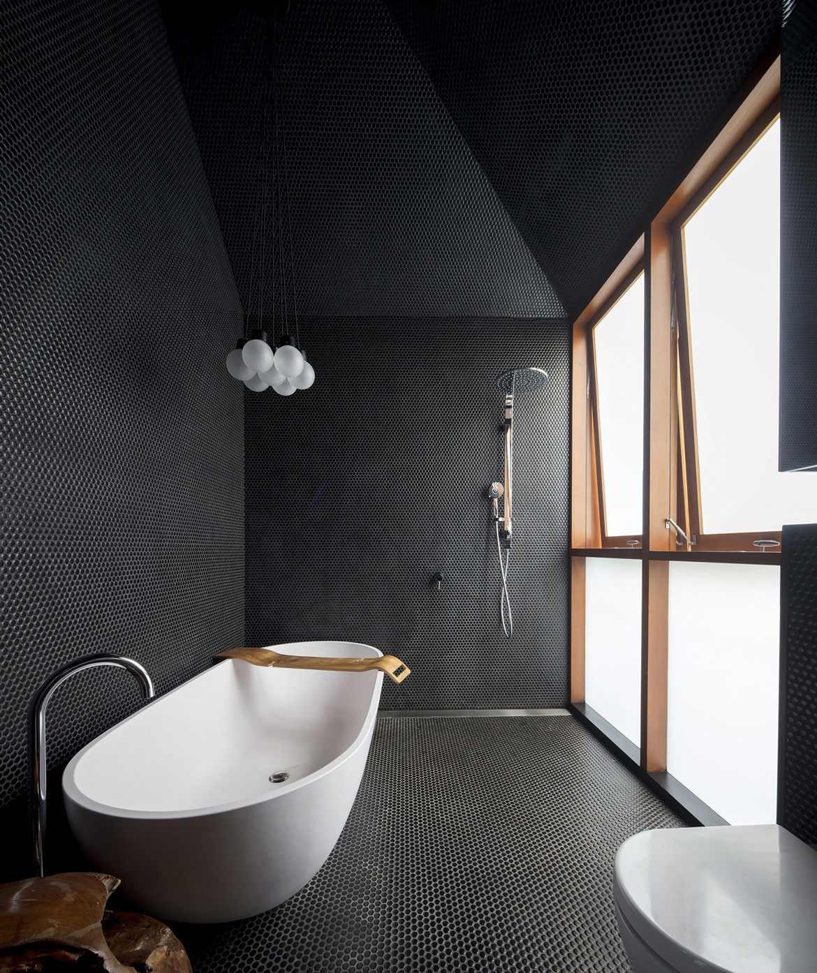
The extensive use of black in the house has filtered into the rest of the design aesthetic.“ It’s intriguingly counter-intuitive to how the use of matte black joinery in the living area increases the sense of space by dissolving into the sides of the building and drawing the eye to the greenery in the garden,” explains Shaun. “The use of black penny round tiles to clad the bathroom is a testimony of its ability to reflect and diffuse light to create a calming atmosphere. It accentuates the changing depth in the bathroom ceiling form that is moulded by the existing gabled roof.”
Carter Williamson Architects
www.carterwilliamson.com
Photography by Brett Boardman
Dissection Information
Graphite Bathroom fittings from Rogerseller
Sole Trader Pendant Lights from Volker Haug
Sussex Scala Kitchen Sink Mixer from Reece
White Square Bathroom Tiles and External Matt Black Rectangle Tiles from BetterTiles
We think you might also like Sycamore House by Branch Studio Architect
