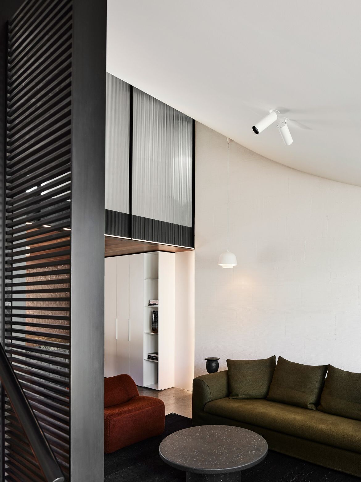
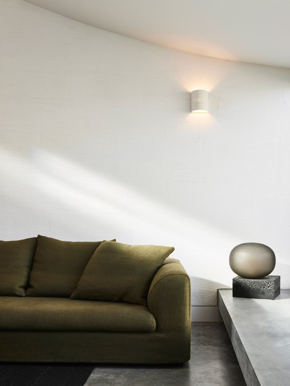
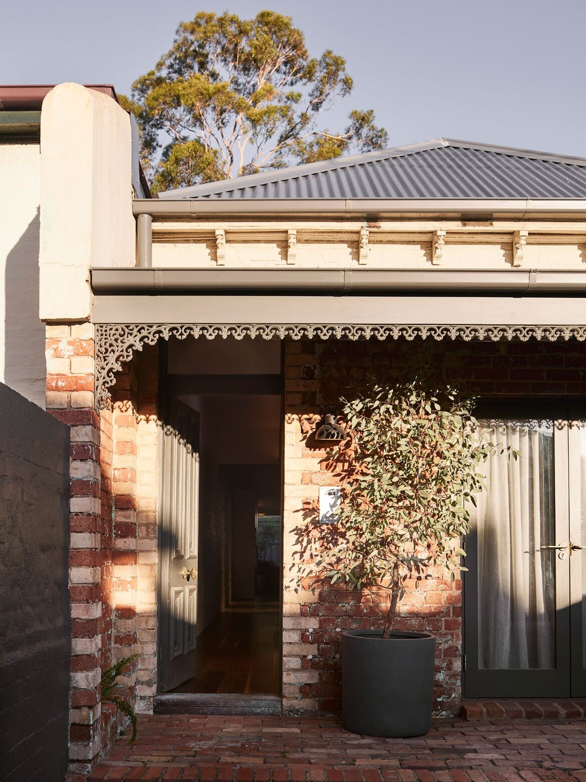
Located in leafy Richmond, Casa Victoria by Splinter Society has been renovated and restored to overlay a traditional Mexican courtyard home on an inner Melbourne Victorian worker’s cottage. The result is a home that features unique design detailing including a curving roofline, which is clearly articulated as an interior feature.
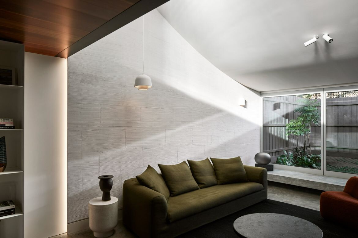
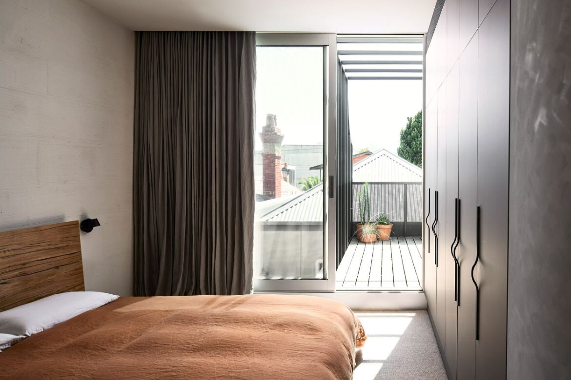
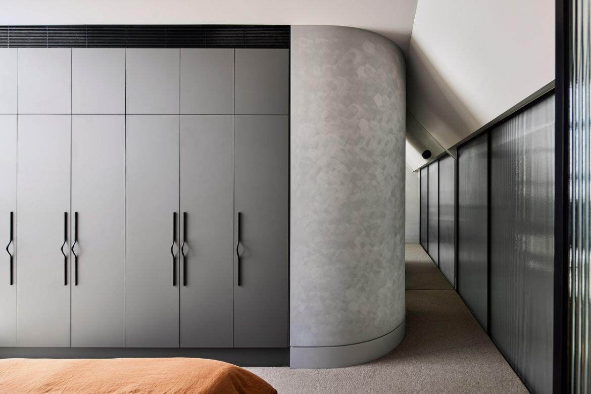
Typical to worker’s cottages, access to light was limited, while planning guidelines were focused on the street look rather than liveability. As such, the implementation of a new curving roofline allows north-westerly light to permeate the new addition. It also introduces a second-level mezzanine as a main bedroom and ensuite.
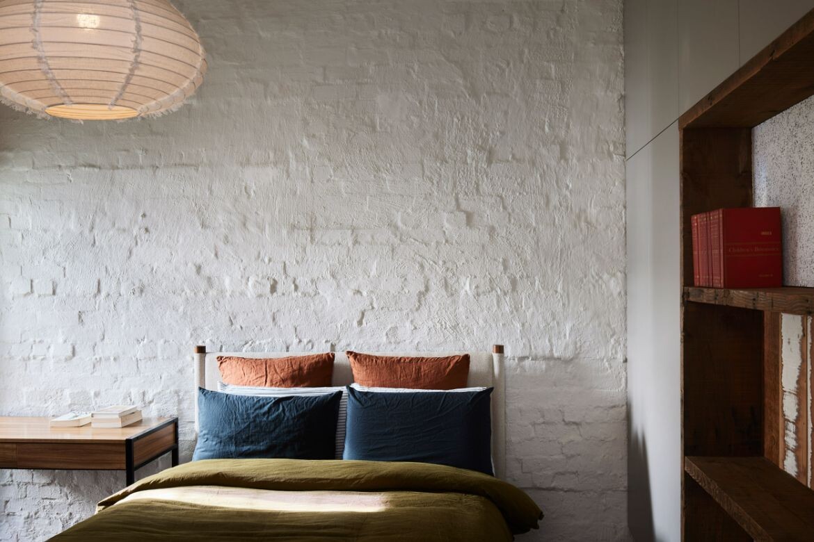
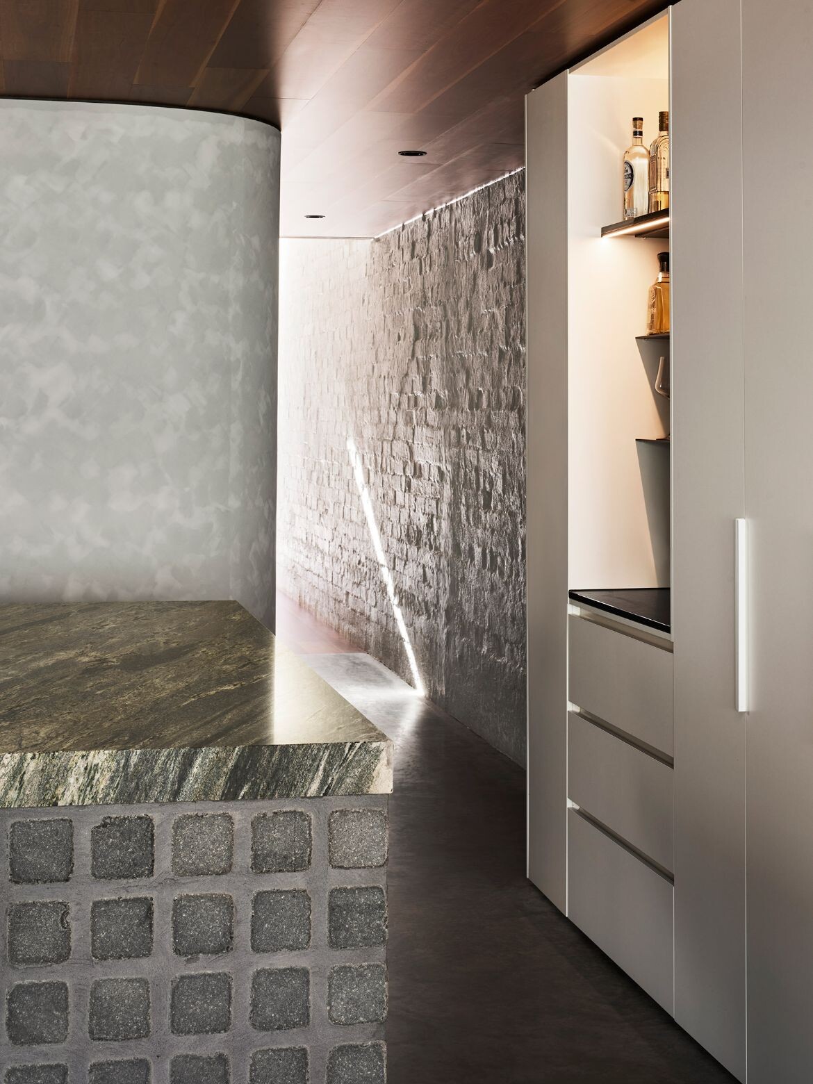
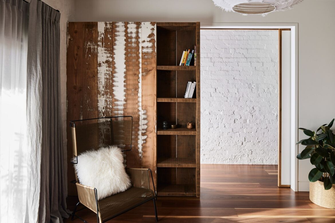
At 4.5 metres wide, a linear sequence of open plan spaces allows ceiling, top lighting and mirrors to define, connect and add spatial drama to the home’s original volumes towards the front of the house. Moreover, as the quality of the Victorian masonry was both stable and visually interesting, the texture, stone and imperfect hard plaster have been retained. Complemented by fine timber and steel elements, the raw finishes are juxtaposed to reinforce the home’s original qualities.
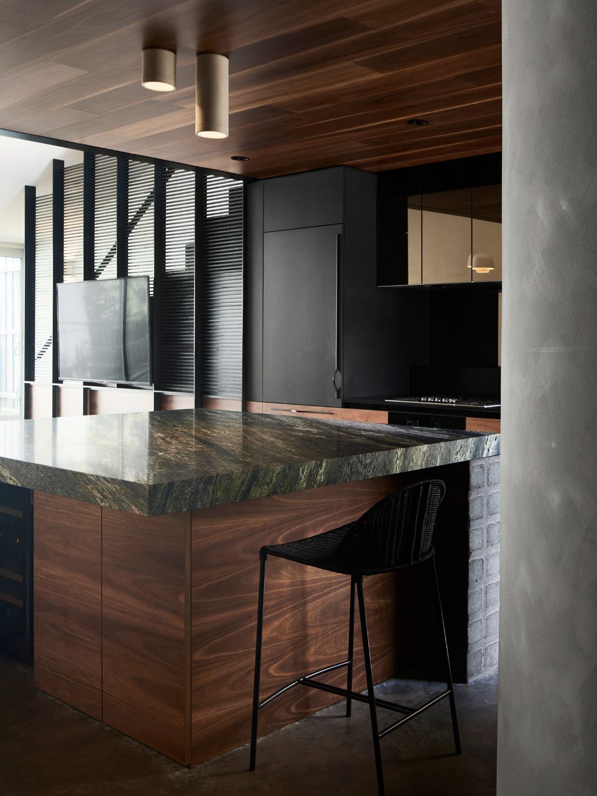
The increased ceiling height over the extension at the rear of the house is beautifully contained by the curving sweep of the roofline. The result is a sculptural, open-plan living space. Within this space, the kitchen is impressively crafted to be both invisible and wholly present.
In doing so, the working portion (sink, stove, cupboards) in black runs along the below stair wall, while the island is a monumental slab of green marble over a block pedestal of cement with the gridded look of cobble stones. It is dramatic, fabulous and feels hospitable and welcoming (the inner sides of timber are perhaps more forgiving for knees).
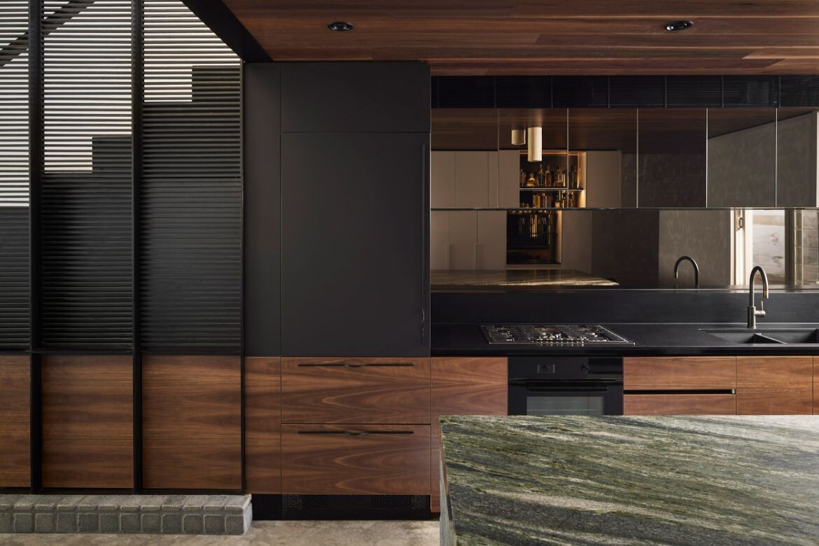
Hiding cupboards from the sight line is something more and more architects are adopting with open plan living. The result retains all the functionality of an open plan kitchen, without aesthetics being informed by practicality. It is a great move here, as the kitchen island is rightly the hero and sets the tone for the home’s robust materiality. Moreover, the nook the kitchen occupies has been visually extended to the whole staircase through a shared material palette, while the mirrored cabinets exponentially expand the space beautifully.
As the house block is completely enclosed, the back courtyard has been incorporated into the home via large sliding doors. Contained by first-floor height walls of grey timber and entirely paved around one small planting, the courtyard is effectively an extension of the living space. The new mezzanine main suite’s balcony features a privacy screen of black steel with the roof curve motif reiterated. Climbing plants are already softening the lines and will further connect the balcony to the courtyard with time.
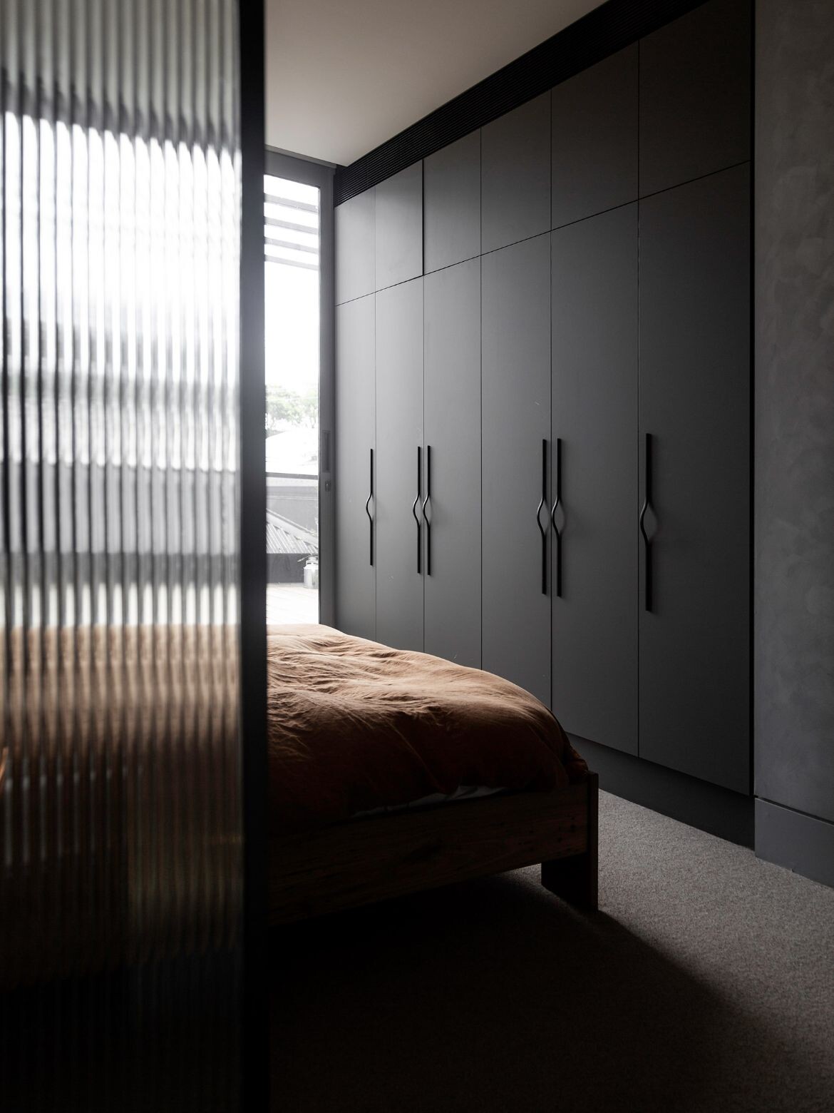
Raked plasters, recycled timbers, weathered stone and existing brick coalesce as a highly textured and hand worked aesthetic. Natural and artificial lighting dramatically increases texture and form so that rhythms and shifts in surface are clearly legible. These are countered by the elegance of a black steel screen enclosing the staircase that leads to the mezzanine. Continuing the curve of the new architecture, the wall of hand finished plaster creates a curving entrance along the wall of fluted glass overlooking the living area.
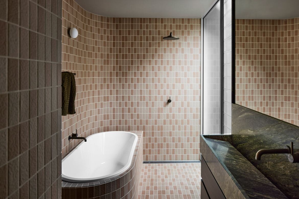
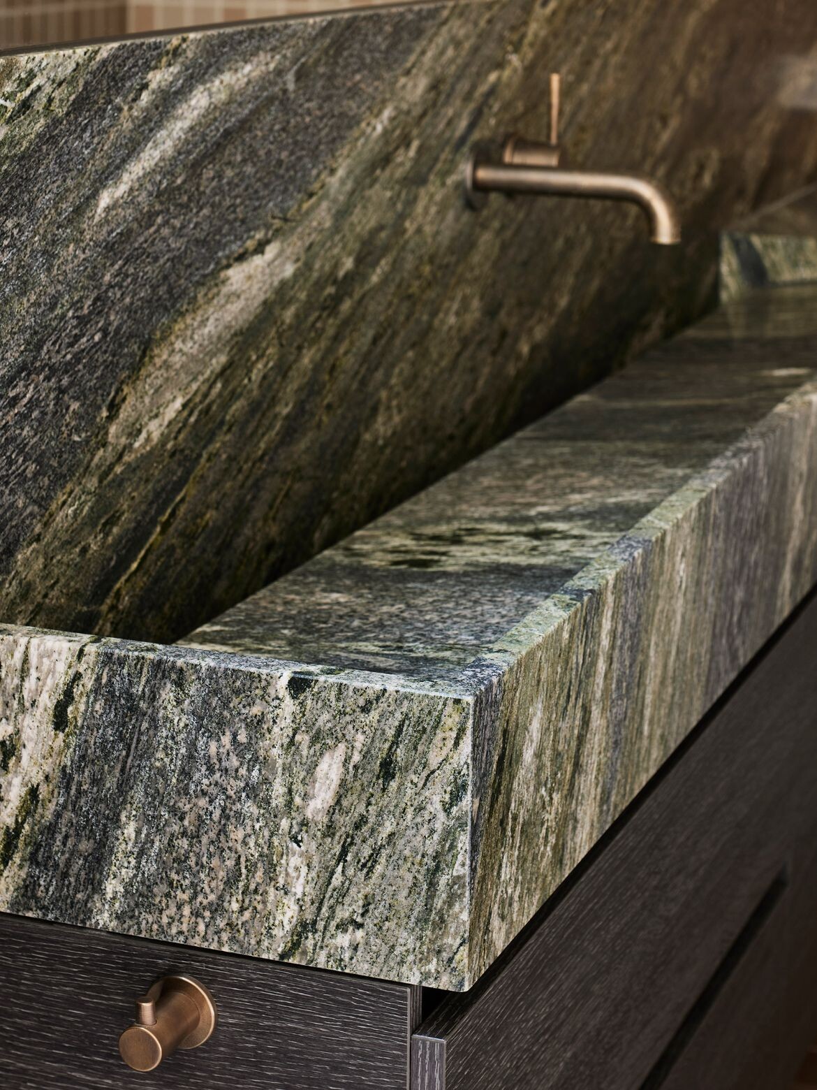
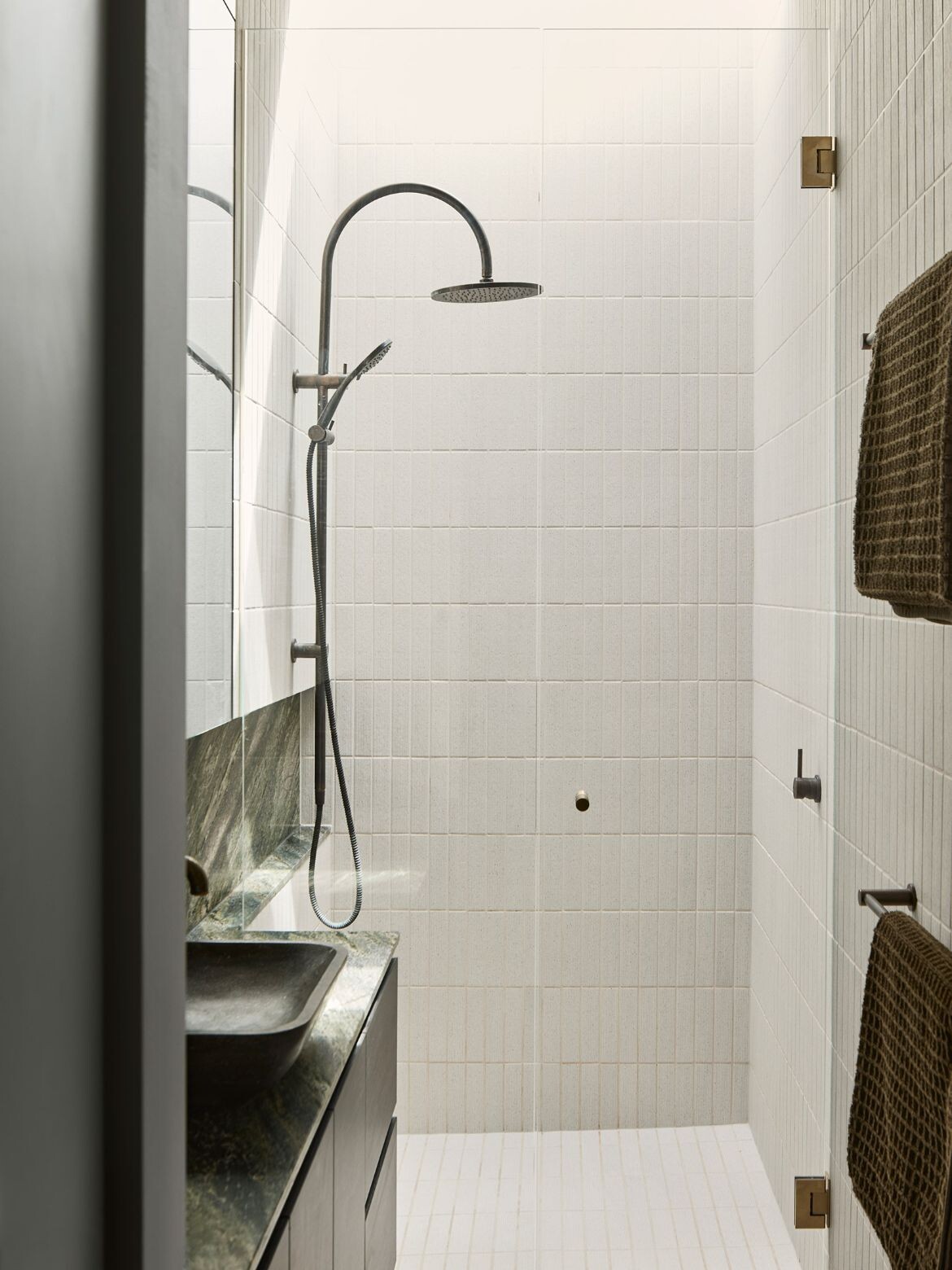
The ensuite bathroom is perhaps the most signatured to a Mexican aesthetic with delicious tiles in warm browns surrounding the bath and shower combination. The configuration here is exceptional, with no unnecessary division and a large wall of frosted glass ensuring ample light. The basin and vanity of dark green marble are simply extraordinary, and again a really clever solution for a narrow space.
Splinter Society’s touch is light and considered in this exceptional project. Moreover, there is a measured understanding and undertaking of what a building brings to its renovation. The result is a home that celebrates its history, while inviting a new perspective, aesthetic and way of living into its heart.
Project details
Architecture and interiors – Splinter Society
Photography – Sharyn Cairns

We think you might like to read this story on Splinter Society’s vision for Villa Italia.
