There appears to be two ways to build a house on the untouched landscape; one is for it to be a natural outgrowth of its surroundings and the other is to be fortified against the land it occupies. The binary is not absolute as there are social and intellectual considerations that differentiate a native hut or the rustic weekend houses from walled examples such as Roman villas or the Chinese courtyard houses. With the latter civilisations, it is an established view of the order and hierarchy of the cosmos that determined the erection and placements of walls. The Chinese word for wall, cheng, for instance, could also stand for a city. The Chinese house could be set amidst the most gorgeous landscape and yet be barricaded, confining its rooms to a single-storey spread over re-created gardens. Similarly, the Romans enriched the English language with spatial concepts distilled into words such as an atrium, portico, peristyle, colonnade, loggia and indeed, “cloister”, which is the term Formwerkz has chosen to name their latest house built in the Leisure Farm precinct of Johor Bahru, Malaysia.
Engaged by a Malaysian financier, Alan Tay of Formwerkz explained that the design had been prompted by the client who ranked privacy and security as the top requirements. “We also had to take into account the views of the feng-shui master,” says Alan, “who would sketch out on a 2D diagram what rooms should be placed next to each other according to the cardinal points of the compass.” This led to the strategy of keeping the house entirely to a single story which realised multiple benefits: it adheres to geomancy principles, keeps the building cost low, is elderly friendly, and sets it apart from the multi-storey houses in the neighbourhood where some have been swelled by facilities such as bowling alleys and indoor badminton halls.
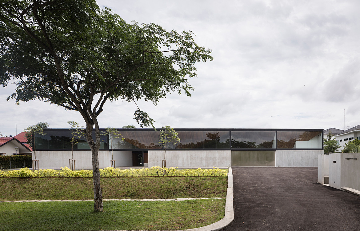
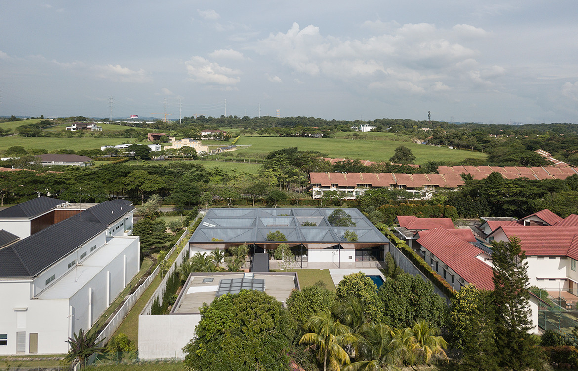
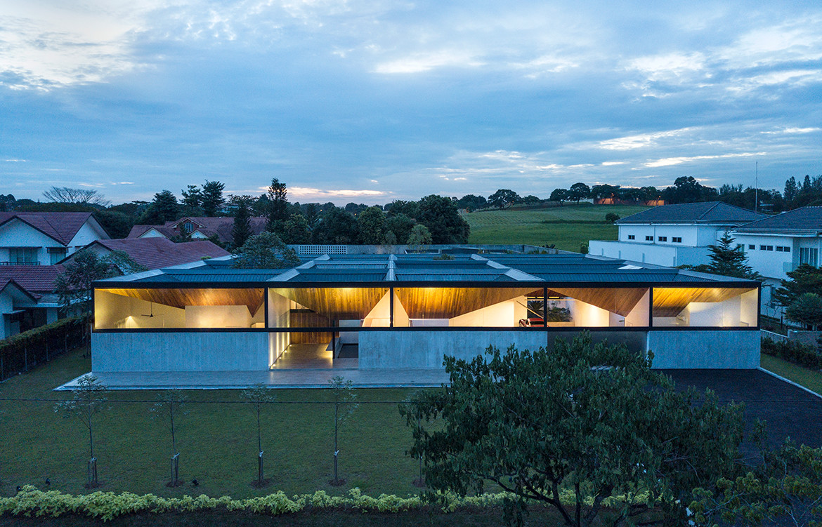
There is both discipline and purity to the architectural geometry. Five-metre-high concrete walls are set back approximately four metres from the property lines to the sides and back. The client also harboured a hunch that ring-fencing the compound with a five-metre high wall would be an effective deterrent against mosquitoes and as it turns out, it proved to be largely true.
The front façade is set back from the road to give the house a clean planar presence on approach, with no concession to transitional porches. A 2.4-metre high line dictates the heights of all external and internal walls, dividing like a seamline, the visual schema between white walls and wooden ceiling in equal halves. Space is pulled apart within the house, both vertically and horizontally, and this segregation allows a degree of autonomy to each room.
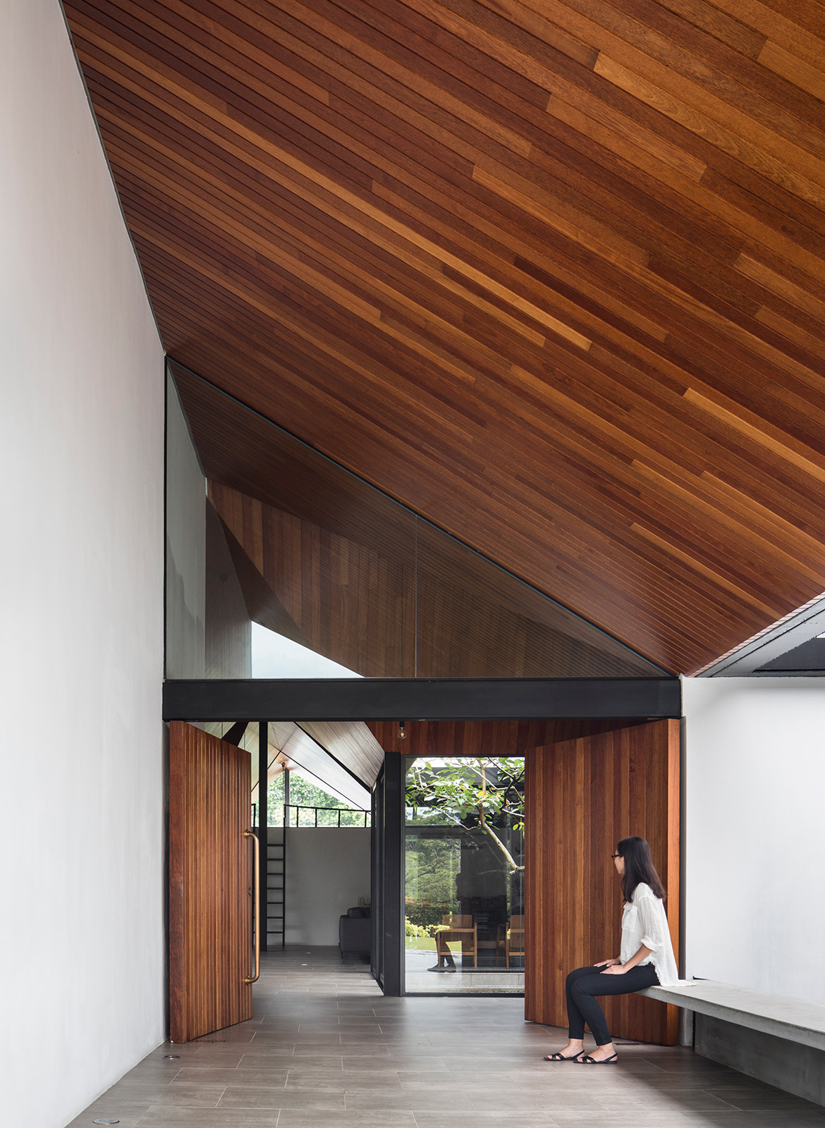
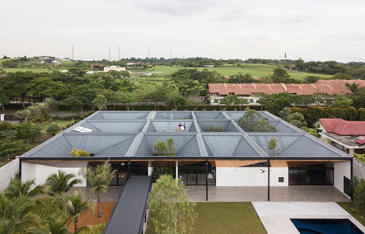
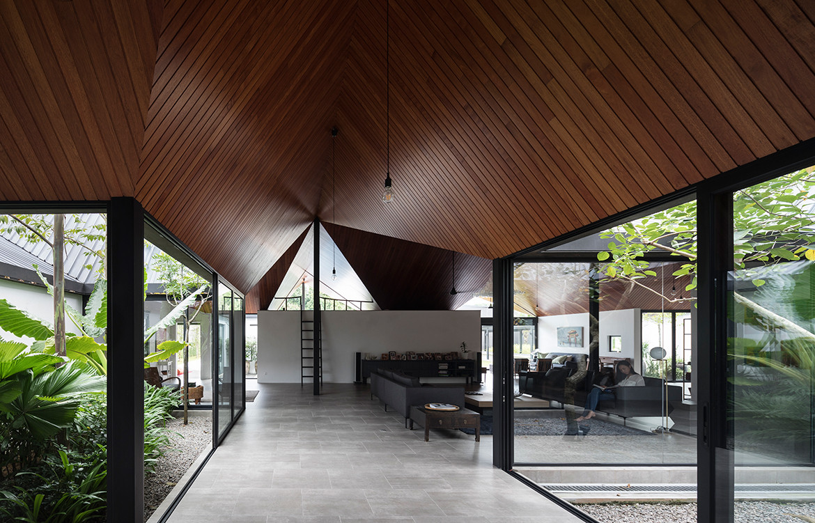
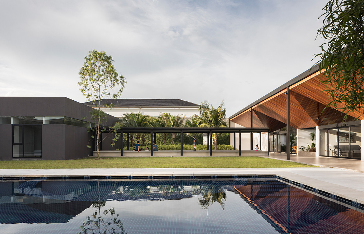
“The only way for such a deep plan to work in the tropics is if we had a series of courtyards,” Alan explains. For their initial design, Formwerkz built a model with the roofs assembled as pyramidal pavilions so that each peak was capped with a skylight. “But we then realised that we could flip the entire roof upside down and convert the skylights into open air-wells instead to facilitate natural ventilation.” Natural light would then stream in from the perimeter walls when their upper halves are sealed with glass clerestory. In the evening, the glow of light within the house is bounced off the inclined ceilings outward, showcasing the house with cheerful warmth.
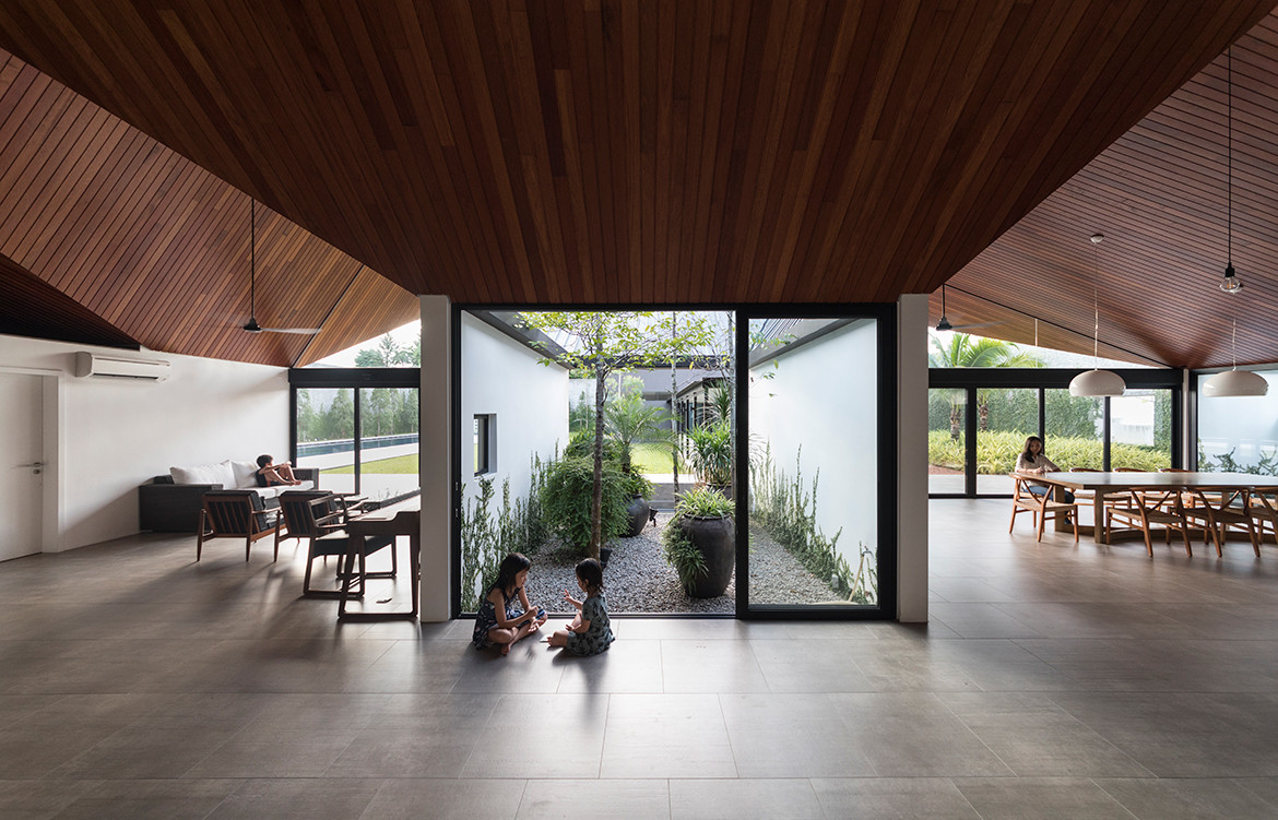
Each air-well is rectilinear yet acquires a different character based on its size and whether it houses a water pond or a gravelled garden with different plants at the base. Some are almost wholly enclosed with brick walls while others are screened with sliding glass panels. They were all planned to be closable for the possibility that the house will need to be air-conditioned, but having lived in the house for over a year, the owners report they rarely resort to switching on the installed system.
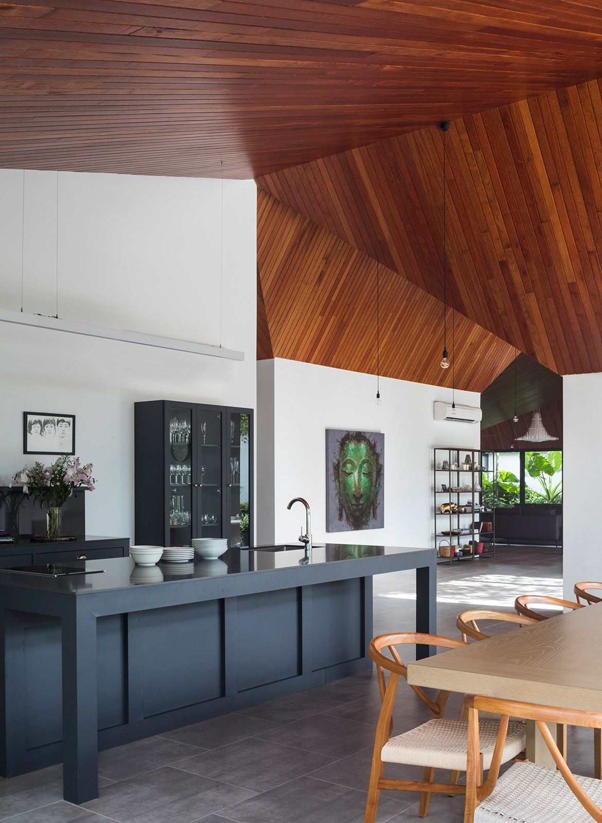
The matrix of the 12 rectangles through the main house imprints a strong sense of governance to the design – almost like the microcosm of a city within the house. And yet, monotony is avoided by distorting the grid based on where the courtyards are positioned.
In fact, an exception is built around the enclosed entertainment room where an accessible roof terrace is created instead of a grounded courtyard. Orientation is intuitive and suggested by ceiling ridges. The private rooms are flanked at the sides while the circulation along the central zone from entry to the rear garden is choreographed as a series of meandering detours that multiply the number of interesting viewpoints along the way.
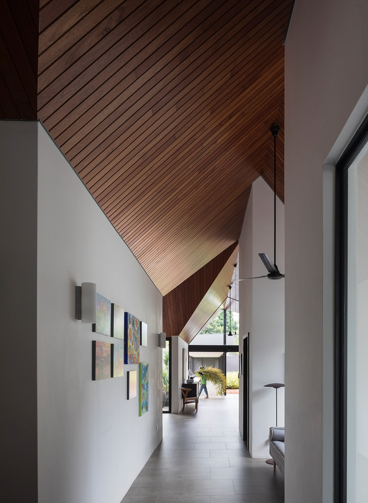
Compacting the bulk of the house over a third of the plot size also meant that the house could enjoy two frontages; a formal one to the outside world and a sociable one to its own back garden. The latter is crowned by an expansive sheltered loggia, delineated by a row of five slender columns. It is on this internal compound that another independent building is configured as an annex block, as distinct in its placement as that of an imperial palace within a walled city. This is the block for the client and his family. “As we entertain frequently for small groups of 10, and from time to time 40-50pax, the private family bedroom annex block is important to ensure we maintain family intimacy in a large plot,” he said. “It also ensures that the kids are not disturbed when the adults are entertaining.”
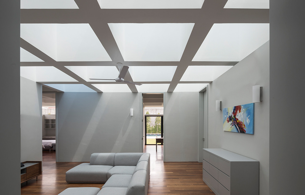
In contrast to the vaulted ceiling of the main house, the ceiling design in the annex block is gridded like upsized square coffer ceilings of an ancient Greek temple. And just like the Greeks etching the memory of timber beams onto the façade in the form of triglyphs on the entablature, Formwerkz has expressed the ceiling beams on the façades through glazed clerestory.
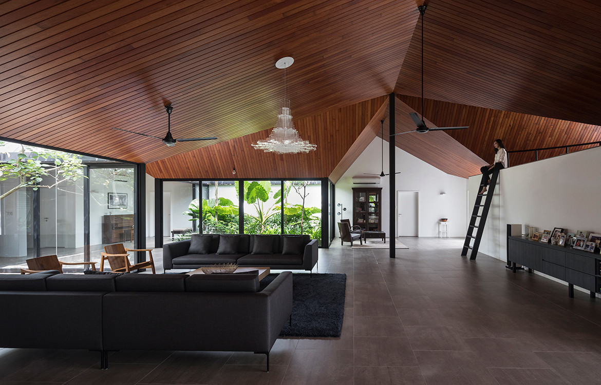
Which brings us back to the name of the project, Cloister House. The Latin root claustrum refers to a “locked, enclosed place”. It alludes to the world of a higher realm, a retreat from commercial cares to the seclusion and serenity of enclosed gardens framed over vaulted ceilings. In harking back to an older, protected world, the word could not have been more aptly chosen.
Formwerkz
formwerkz.com
Photography by Fabian Ong
Dissection Information
Furniture from Crate & Barrel, Oriental Living, Quattro Design, Innovation Living, Castlery, CMYK, Tropical Living Asia, Commune, and Interline Design & Furnishing
Lighting from Nemo Lighting, Tom Dixon, Kartel, Marset, and Flos
Hardware and fittings from Hansgrove, Arto, Duravit and Geberit
We think you might also like Pavilion House by Robson Rak
