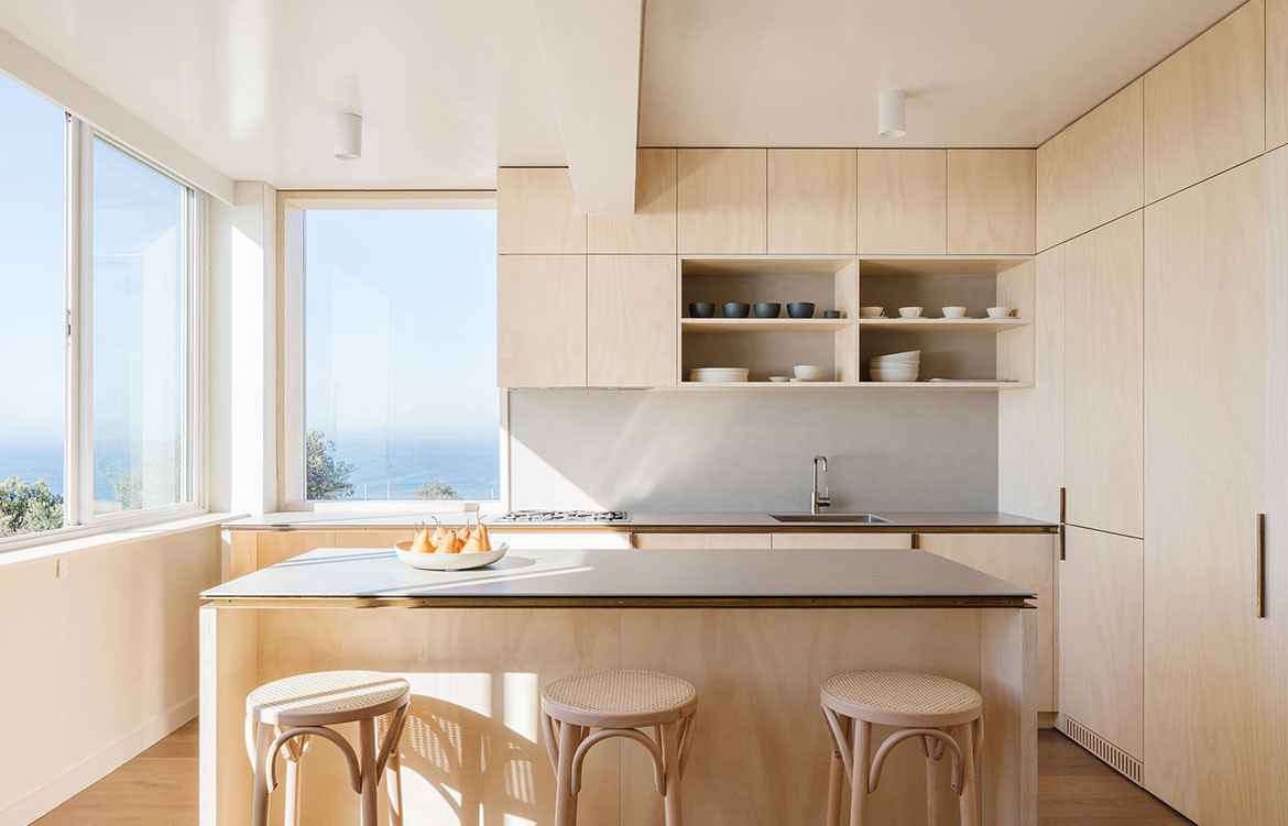
Doing less is easier than doing more, of course. But restraining oneself when you’re exploding with ideas and you are your own client so you essentially have carte blanche? That’s certainly something different altogether. Yet this was the challenge that architect James Garvan of James Garvan Architecture faced when he was designing Clovelly Apartment, he and his wife’s own apartment.
They had lived here for some time prior, in fact they were married in the front garden, making the best of a stunning location despite lacking visual connectivity to the views beyond. “My wife and I had been living in this 1960s apartment, perched on top of the clifftops at Clovelly, for a few years. We loved its intense connection to the ocean and landscape,” says James, yet programmatically it left much to be desired.
The project accounts for many firsts: it was the first time James and his wife had worked together in such an intense and personal – but also formal – capacity. It was also the first time James had experienced the process not as an architect but from the point of view of the client.
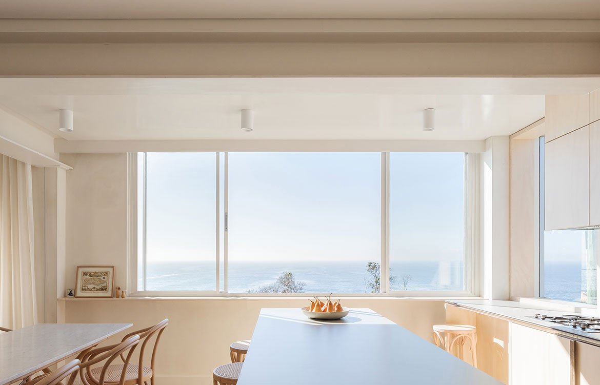
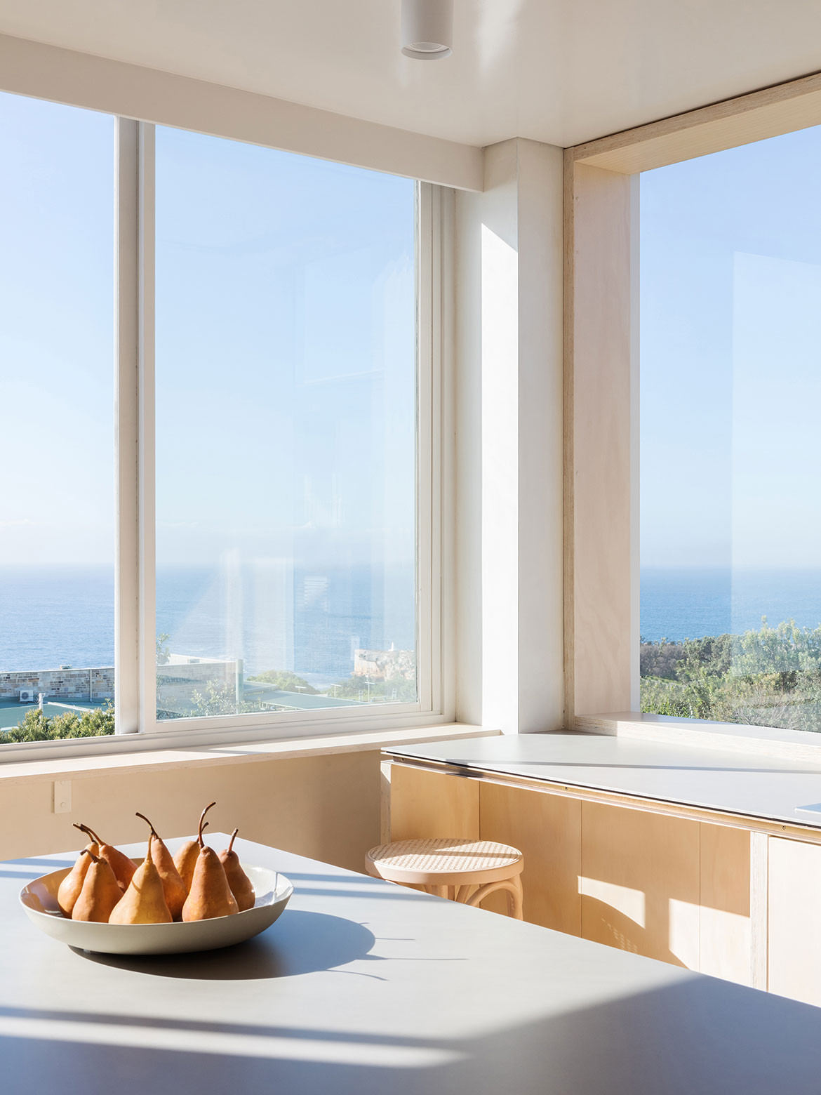
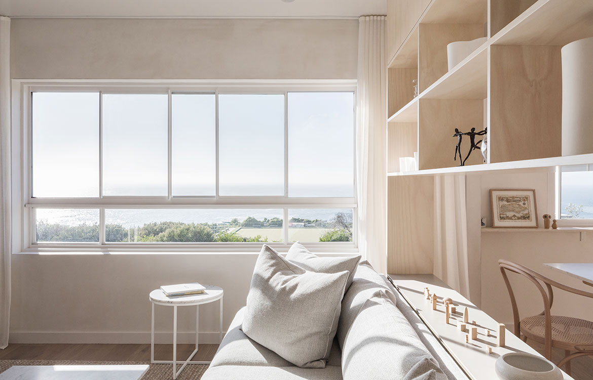
One of the key components in the brief was to resolve standard patterns and behaviours within the home from 1965, when the apartment was built, with how those behaviours have evolved and what they look like now, in 2019. Formerly, the kitchen was at the rear of the apartment and the rooms felt small and compartmentalised, not to mention there was little advantage taken of the ocean views. “The new floorplan prioritises the living spaces and connects them strongly with the view,” says James.
It was also necessary to maximise the space available. The 62 square metres it was allocated as a single-bedroom apartment is generous by today’s standards, but redistributing that metreage to add an extra room (to accommodate their growing family) meant it was a touch smaller than the average 75-square-metre, two-bedroom apartments of today. Ultimately it resulted in a complete rework of the original floor plan.
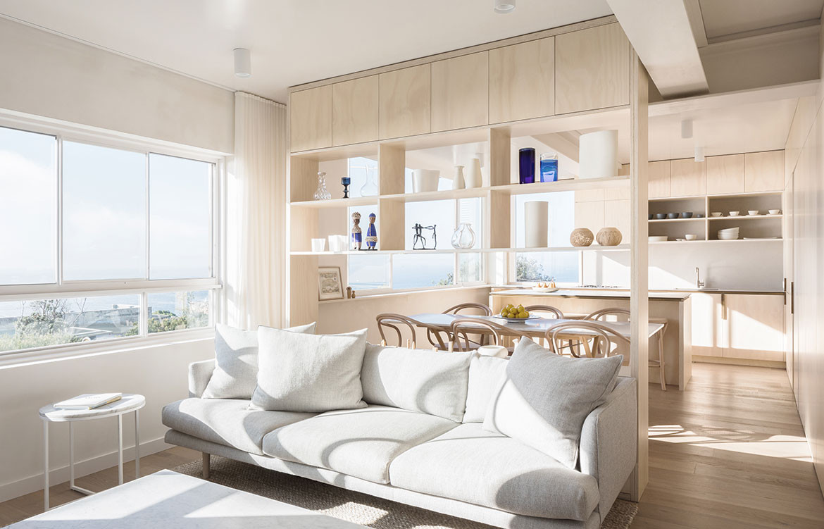
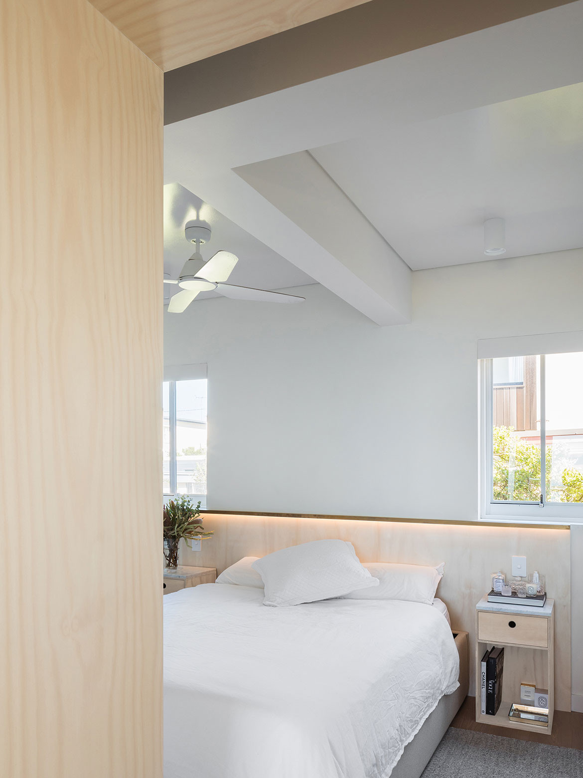
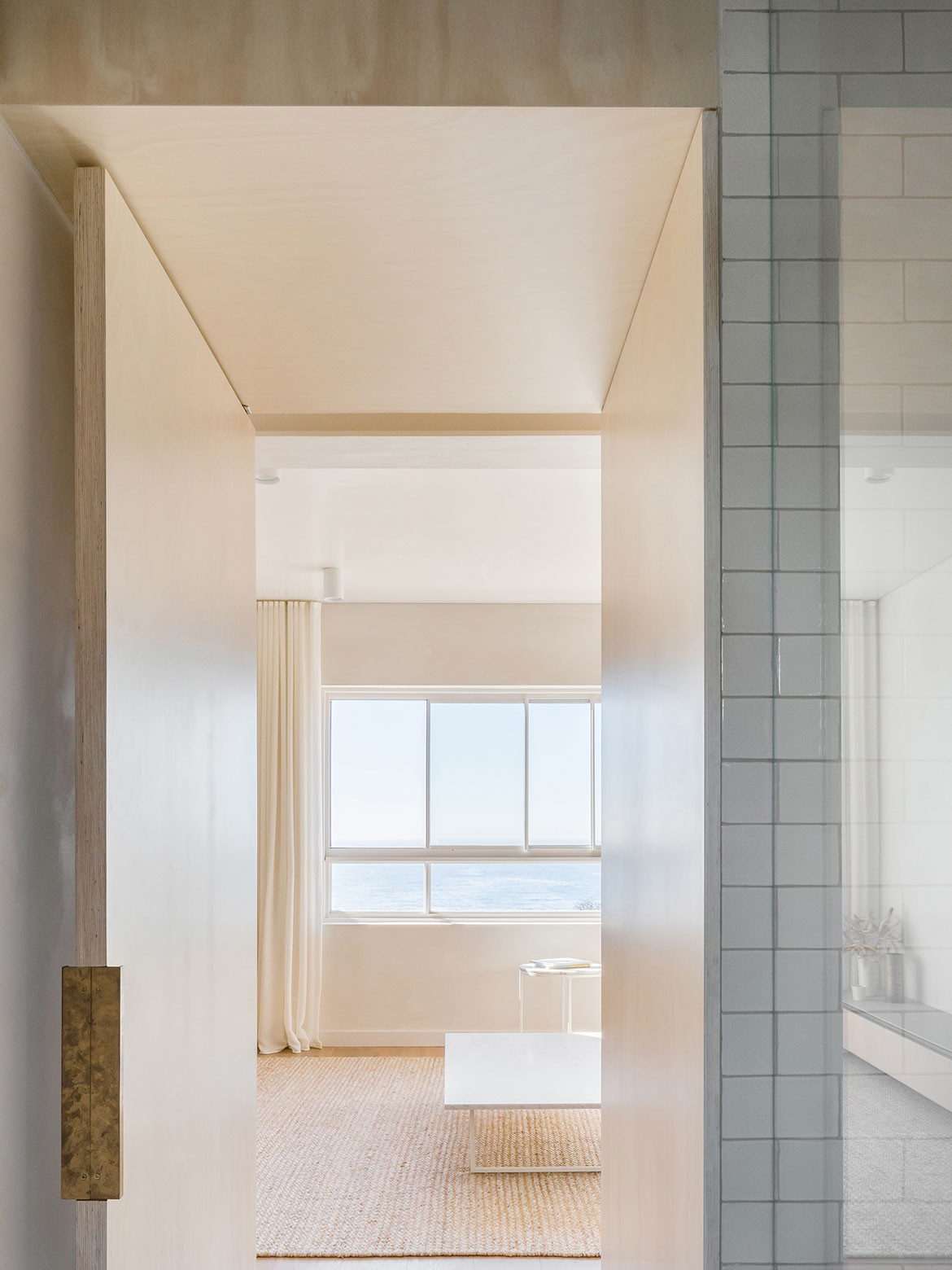
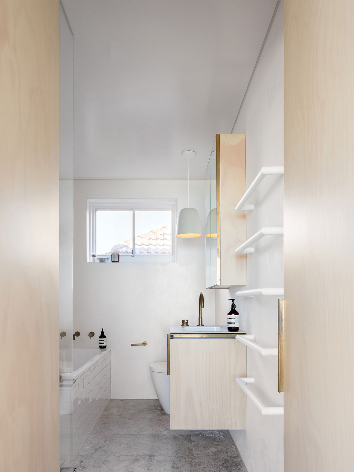
Another requirement within the brief that James and his wife felt strongly about was to clearly demarcate the public and privates spaces within whilst ensuring all spaces actively engaged with, and benefited from, natural light, ocean views, and the landscape. This is expressed in the ‘secret’ pivoting panel walls down the centre line of the apartment that divide the kitchen/living/dining from the private sleeping quarters.
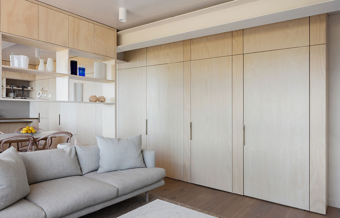
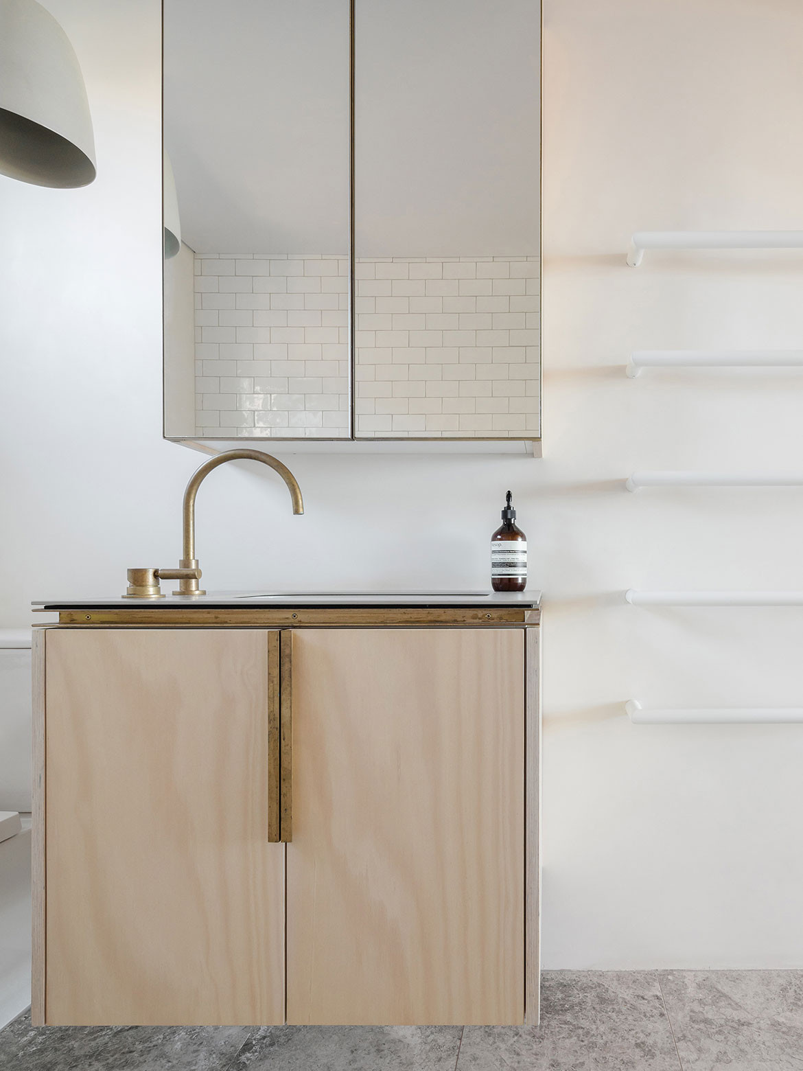
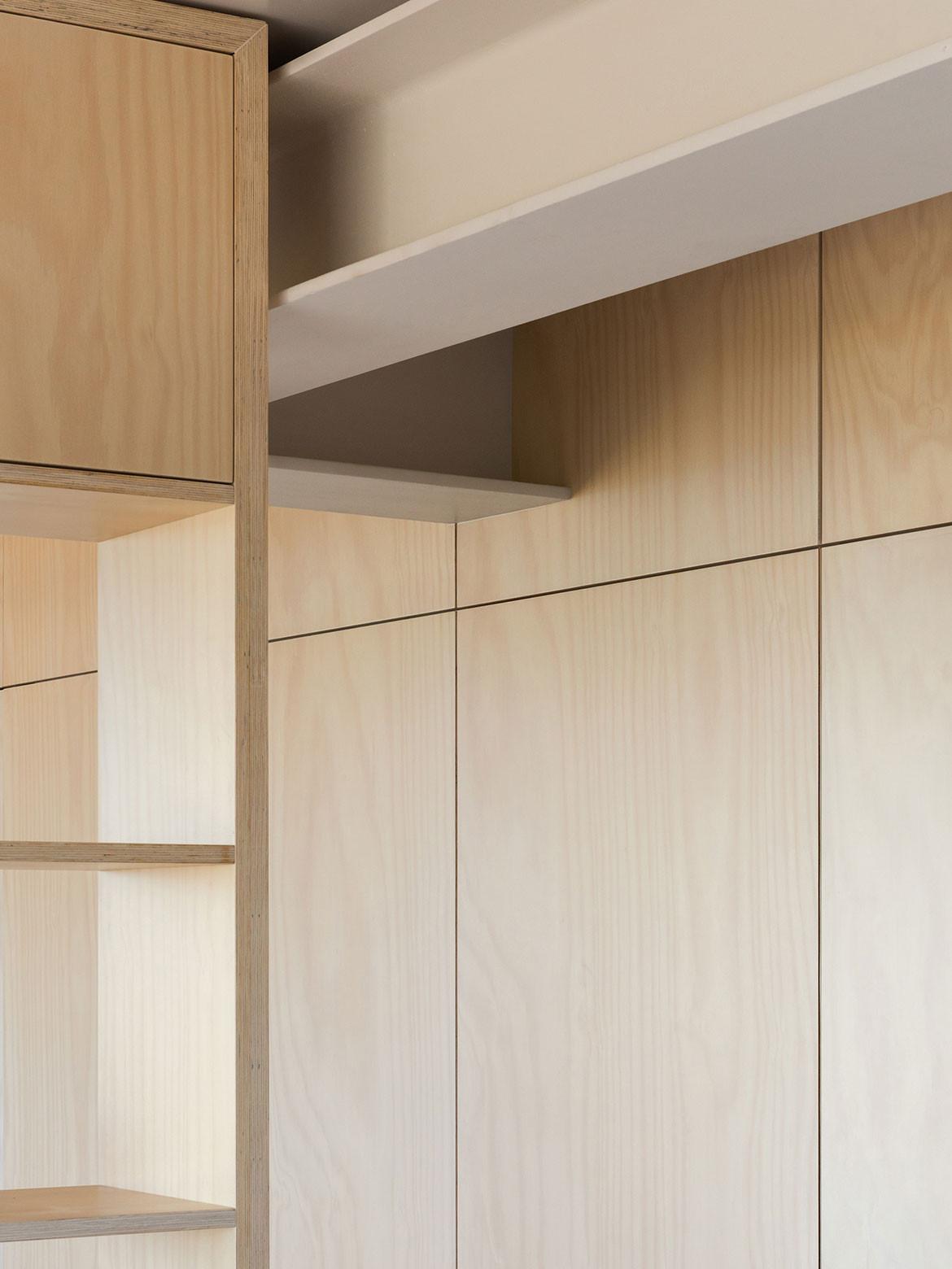
“Although the bedrooms and bathroom are immediately adjacent to the living spaces, you don’t have a sense that they are there,” says James. “It is only the bespoke brass finger-pulls that bely the fact that there are rooms beyond the panelled joinery wall.”
In contrast to the openness of the kitchen/living/dining space the two bedrooms have been designed to feel intimate. “It has taken some of our visitors some time to learn which ‘secret’ door goes to which room, but that is all part of the fun,” adds James.
Given the east-west orientation of the apartment, dividing it down the centre allows both public and private spaces to benefit from the views and access natural light, as per the brief. It also has the added benefit of negating the need for mechanical ventilation: each room enjoys natural cross-ventilation. Furthermore, heavy automated window coverings protect the apartment from direct sunlight in the warmer months and retain heat when the weather is cool.
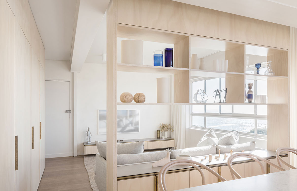
The solution to storage in the Clovelly Apartment is just as clever and innovative as the new programme. Joinery units, both open and closed, are used in place of walls to separate the series of spaces within. For example, the open unit between the dining and lounge spaces subtly delineates these spaces without disconnecting them.
Finally, and poignantly, James adds, “This project might be looked at as an effective development model for units in other 1950s/60s apartment blocks. The ordeal of undertaking major structural, plumbing and electrical modifications has been vastly outweighed by the upside of additional amenity, increased functionality and the improved light, space, views and quality of life for the inhabitants.”
James Garvan Architecture
jamesgarvan.com
Photography by Katherine Lu
We think you might also like Challis Avenue Apartment by Retallack Thompson Architects
