For more than ten years the residents of Clovelly House lived in this Federation bungalow situated on a headland offering views down to Clovelly Beach and the uninterrupted blue beyond. The couple first bought the residence, adorned by an 80s-era second storey addition, in the knowledge that some things would need to change. However, with two young children priorities were elsewhere. It wasn’t until more recently that they engaged Smart Design Studio to bring the house into the modern era.
Neither husband nor wife knew especially where to look to find an architect, but it was the latter who recalled passing a fascinating corner building in Surry Hills every day on her way to work. She admired how respectfully old and new had been integrated. This was [at the time] the home and studio of William Smart, director of Smart Design Studio. They had found their architect.
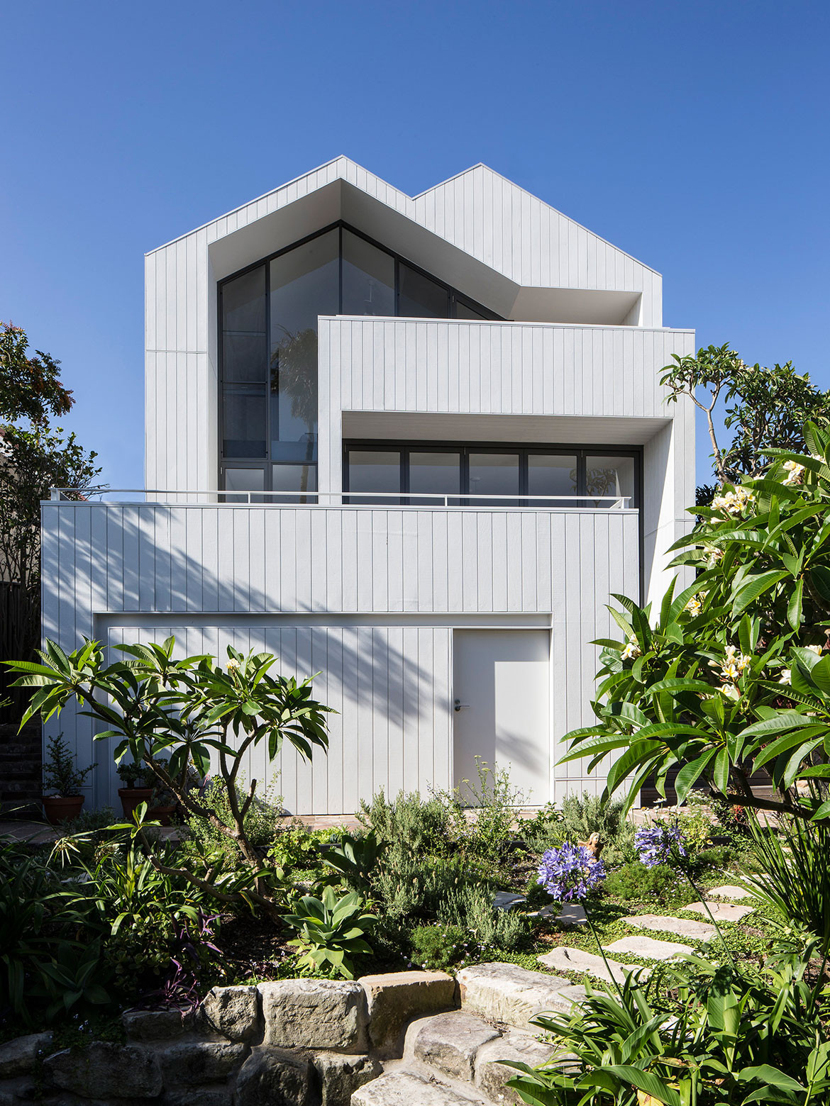
The brief was simple, in line with the clients’ tastes. They wanted the common spaces of their home to be open and warm; to encourage natural light and ventilation through the house; to make the most of a modest, but by no means small site; and most importantly, to live in a house that would not date. Sustainability was paramount in the way that materials, finishes and furniture should be location and use appropriate, and anything that could be restored and retained would be. “Preserve what you can, change what you have to,” recalls William.
In the early stages of the project, time was spent considering which step was the best foot forward. The original architecture was lost behind a tall wall at the front and dominating addition at the back. The bungalow wasn’t protected by council or heritage restrictions, so a knock down/rebuild was entirely possible, but not completely necessary. And although the addition had its faults, the clients liked the extra floor space it offered and did not want to give that up. Likewise, the tall brick fence at the front offered rare privacy to the front yard.
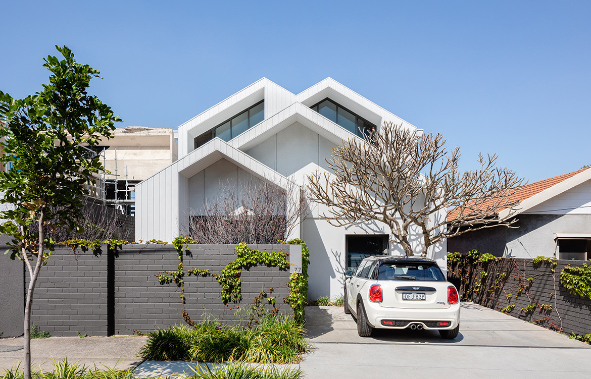
It was agreed that the original structure would remain but the rear addition would be rebuilt and reconfigured. And although the façade at the front wasn’t initially part oft he brief, William suggested that for visual consistency “it would be very nice to do that as well”. The clients agreed. One of the biggest considerations then became how to reconcile the new work with the existing bungalow and surrounding streetscape without one element dominating all others.
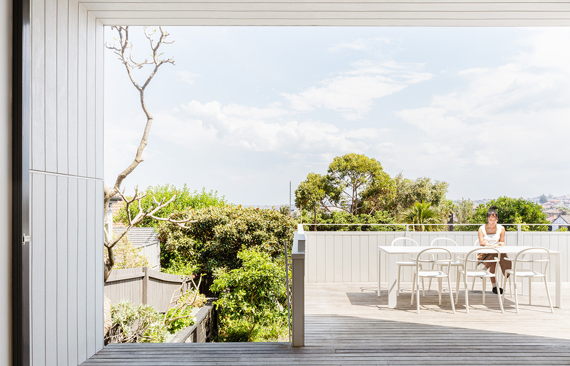
Shadowclad was used on the front and rear façades, painted white with Dulux Weathershield. Both materials are purpose designed for a seaside location. “We felt that really gave it the coastal feeling. The idea was a crisp modern house sitting in a green landscape,” says William. And although solar panels weren’t possible at the time of the project, the roof has been designed with the capacity to take them in future.
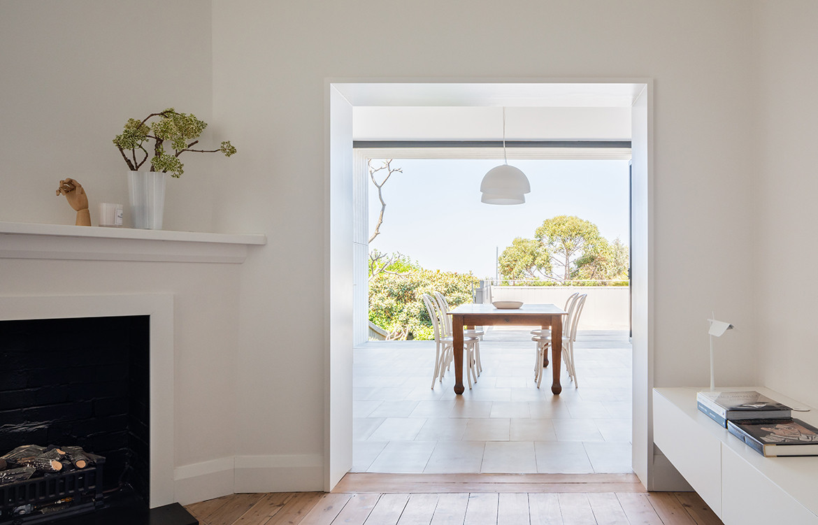
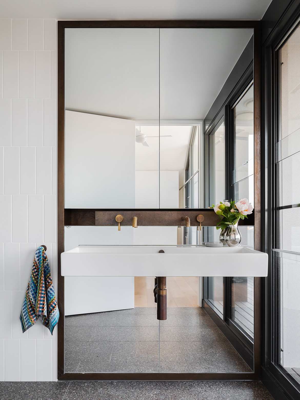
The positioning of the entry – along the length of the site via a side passage that extends all the way to the rear garden – was reviewed but ultimately retained. “We were able to split the house in that way and a key move was to [keep] the entrance halfway down,” says William. The interiors of the extension have the distinct hallmarks of modernity – minimal, clean, white – and yet they exist in harmony with elements of the original building that have been retained: the floorboards, stained-glass features, and some hardware and furniture the clients wanted to keep.
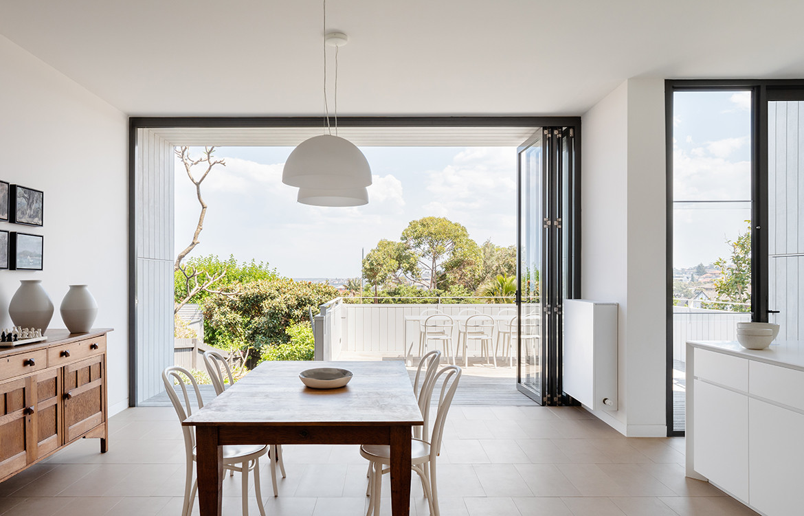
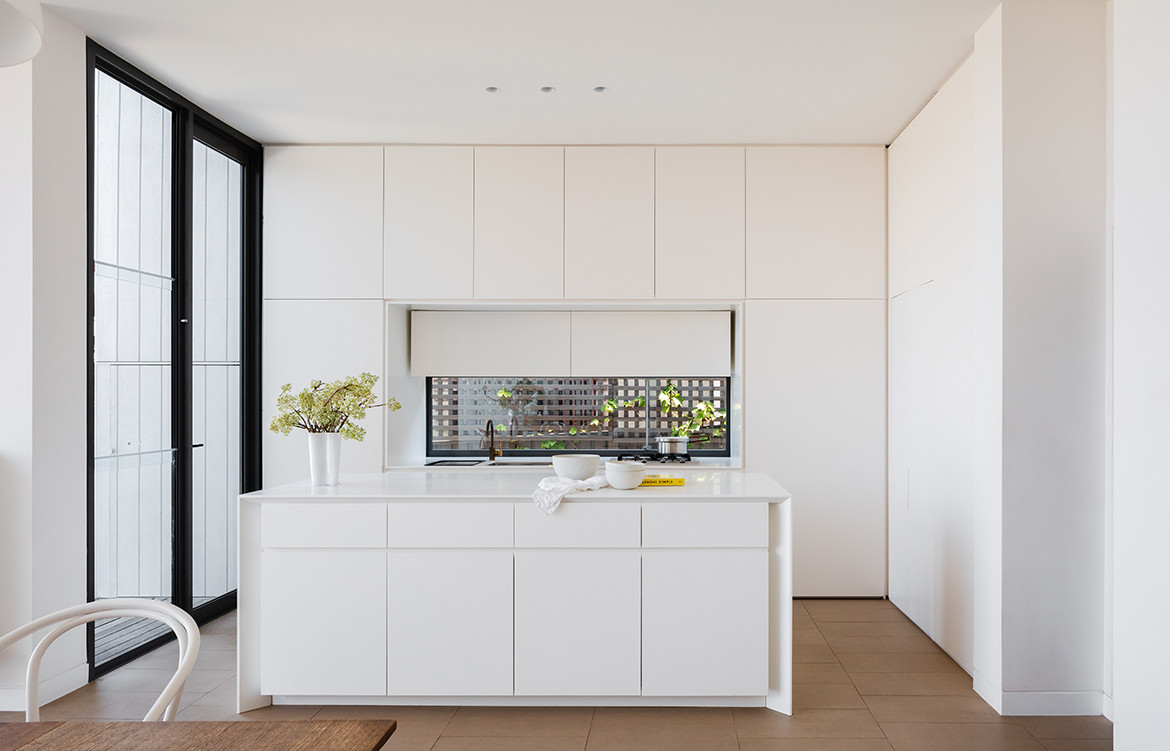
The natural progression through the residence is to turn right down the hallway past a walled in living room and staircase up to the three bedrooms (including a main bedroom). This path leads to the new extension comprising an open kitchen, dining room and seamless transition to an exterior deck and garden below. Open yet subtly segmented, the common living area allows the family to engage in different activities yet remain together; and enjoy the south-facing rear with water views.
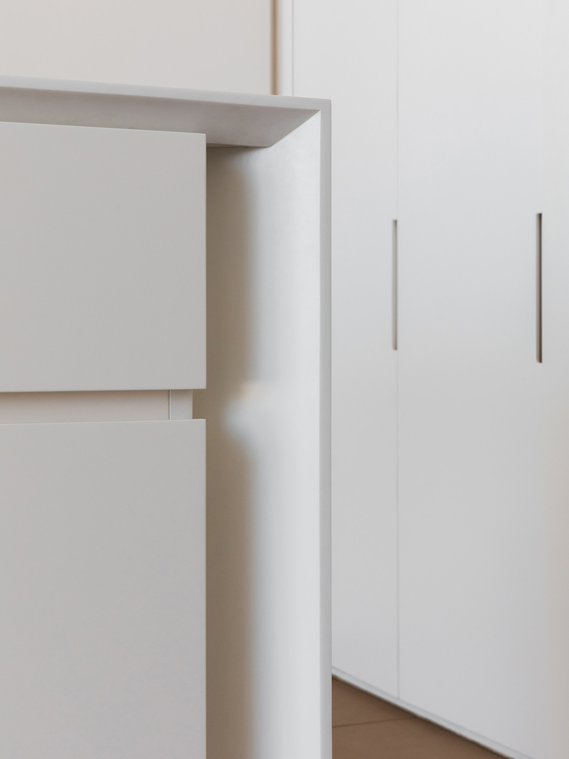
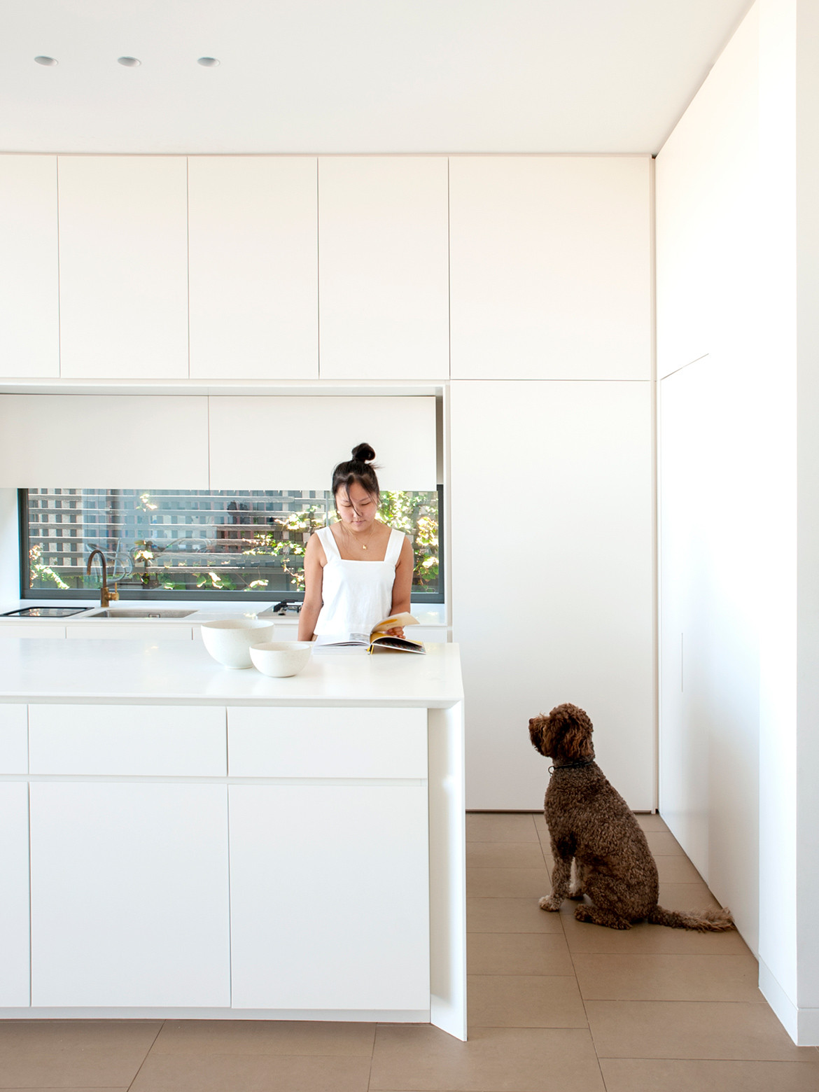
The all-white kitchen is carried through by white Thonet dining chairs surrounding a timber dining table (a piece of furniture the clients chose to hold on to), plain white vitrified tiles, and a white Kartell exterior dining setting. The joinery is simple but effective – Corian surfaces and polyurethane joinery, all in crisp white and without handles or pulls – which can be quick to date. “We were looking to create something quite disciplined in the space. This is my love really, inexpensive materials detailed in a really crisp way,” says William.
Interestingly, the island bench has no surrounding stools. The residents, who “like a bench to be a bench and a table to be a table” have instead opted for storage on both sides. The inside length caters to food preparation while the outer holds pieces that service the table such as placemats, napkins, platters, vases and so on. The sink and stovetop are located on the bench lining the west wall.
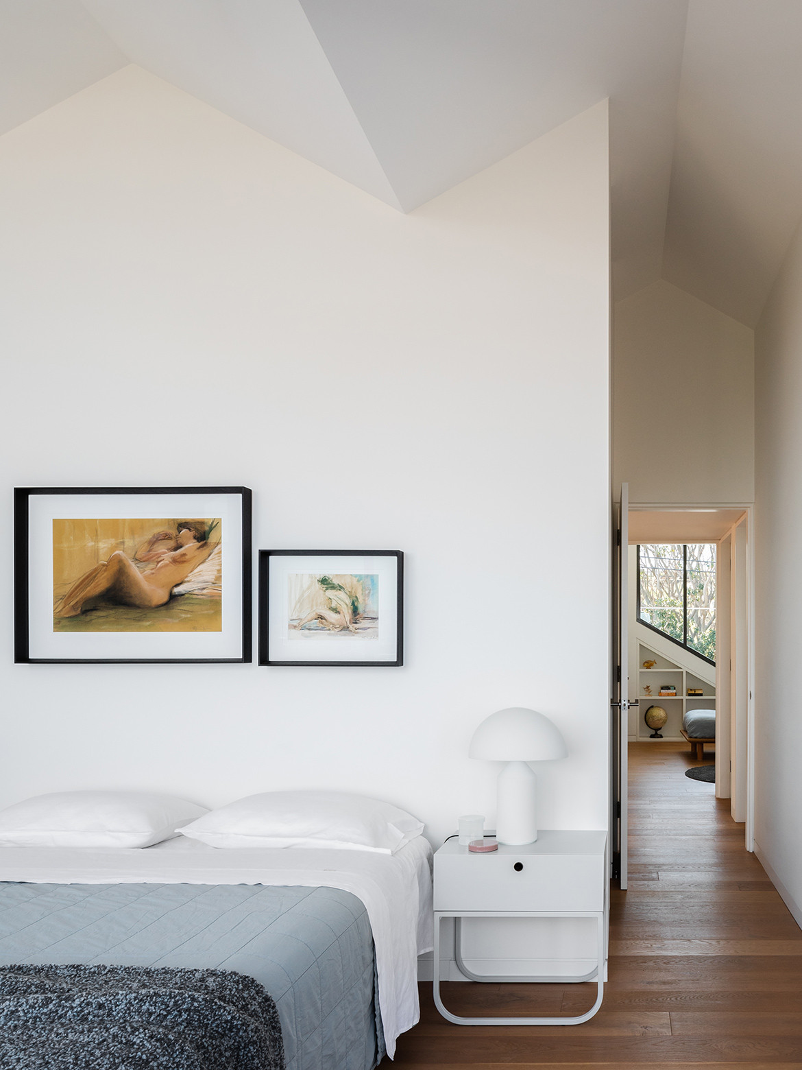
Upstairs in the private domain the kids’ bedrooms sit side-by-side on the north wall, exact duplicates of each other, designed to be ageless and gender neutral. The distinctive peaks from the street view let northern sun into their bedrooms and offer beautiful sightlines to the street. “In my view, that’s a better use of north than a master bedroom,” says William, “because the kids are more likely to be playing in their rooms during the day.” This is no skin off the clients’ teeth, who, from their main bedroom and small balcony, enjoy prized, unobstructed views of Clovelly Beach.
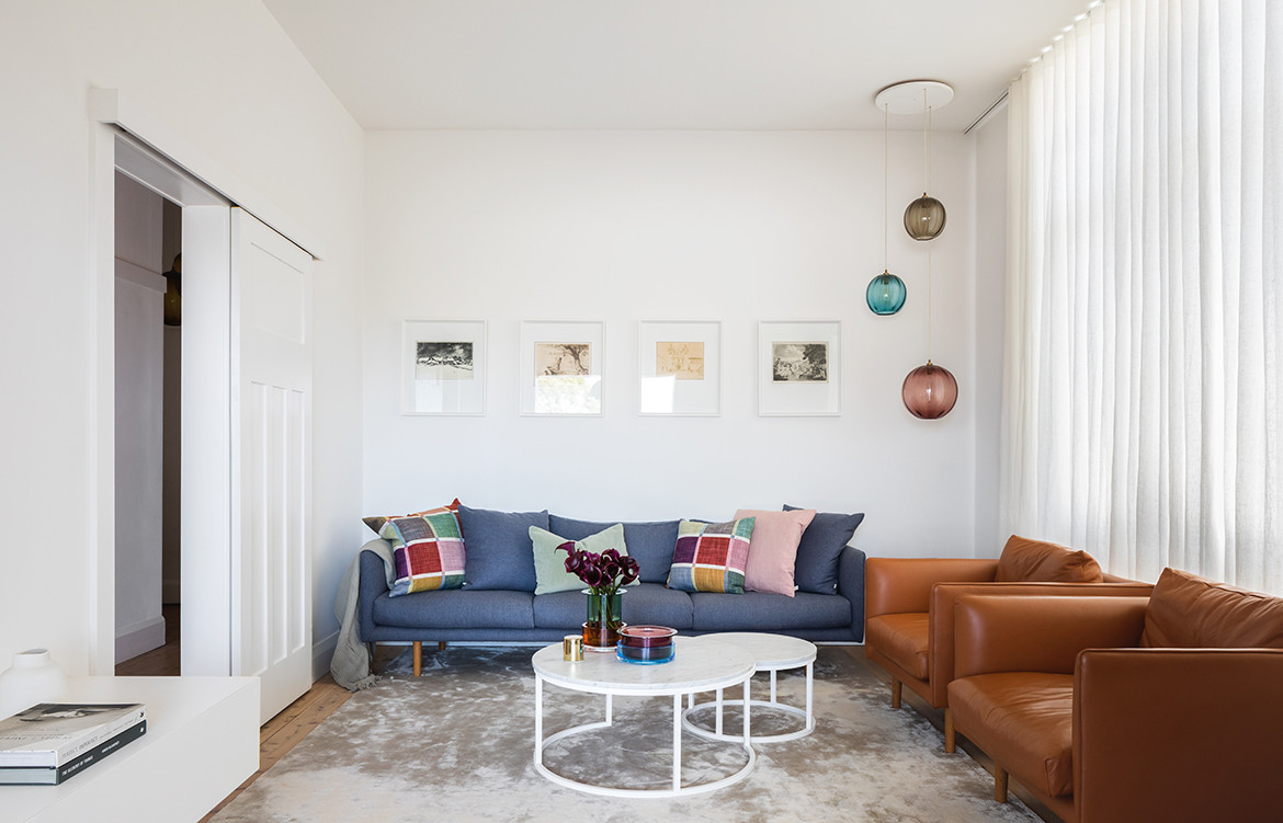
Returning downstairs, and alternatively turning left upon entry towards the front of the house one finds the kids’ living room and study (or guest room as needed). Here, children playing and parents working are offered privacy and minimal disturbance as family and guests enter or exit. There was little architectural intervention in these rooms from the original bungalow, a simple case of aligning them with the new extension without changing what didn’t need to be changed.
“I feel as though the big success of the project is the transformation,” says William. Neither residents nor architect feel like it could have been better as knock down/rebuild.“We gave the house a new contemporary form, but wanted it to express itself as one language throughout,” he elaborates. A poetic comment that reminds me of the residents’ first impressions of the Smart studio, housed in a building that – now like their own – artfully integrates old and new.
Smart Design Studio
smartdesignstudio.com
Photography by Katherine Lu
We think you might also like Hole in the Roof House by Neeson Murcutt
