The best homes are restful spaces that invite you to relax and recharge, away from the hectic bustle of everyday life. In this three-bedroom condominium apartment, design studio Parenthesis achieved this with a curated palette and thoughtful design elements that cater specifically to the homeowners’ needs.
The family of four staying in this 120-square-metre apartment are voracious book readers. They also regularly entertain friends and relatives and as such, it is important that the home is designed as a social space. The designers addressed this by keeping the floor plan as open as possible, capitalising on the large balcony and the deluge of natural light it brings into the home.
When it comes to this home’s material palette, the designers defaulted to the homeowners’ personal preference. Light-toned natural timber is used throughout the apartment, with accents of metallic gold, and clean, rectilinear designs for a restful vibe.
This is best seen in the clean and clutter-free living room. Here, low-slung furniture keeps the space kid-friendly and doesn’t block the light filtering in from the open balcony. The designers also customised plenty of storage and display shelves along the television wall, together with a mirror backing that visually enhances the space. Additionally, the parents have a huge collection of books, so the designers incorporated a bookshelf with clear glass doors.
In the adjoining dining room, the designers fitted the wall with more cabinets, essentially carving out an informal pantry space. The homeowners have collected plenty of unique tableware on their travels, so this area becomes the perfect place to display their collection. Instead of clear glass fronts, the designers applied a fluted glass finish that’s more forgiving when it comes to hiding clutter.

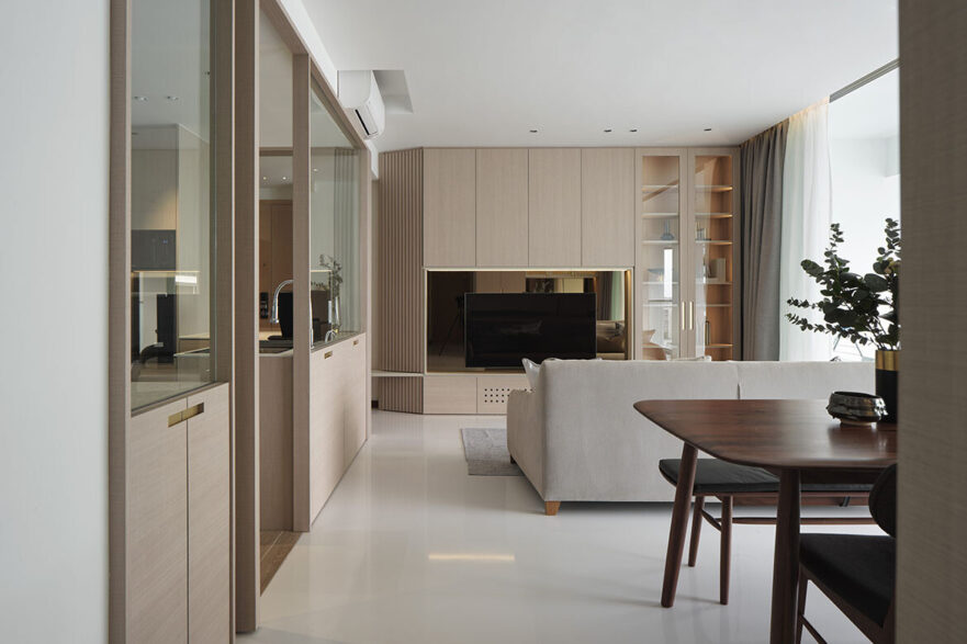
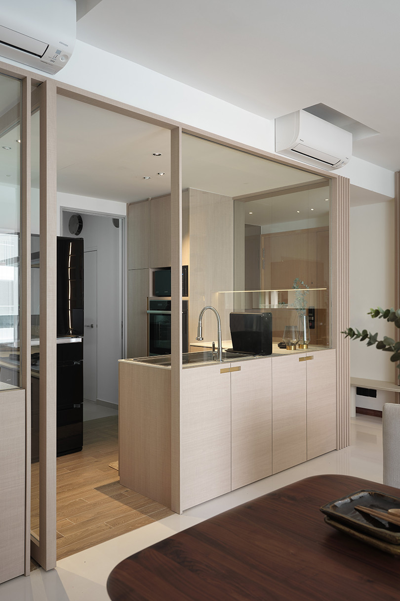
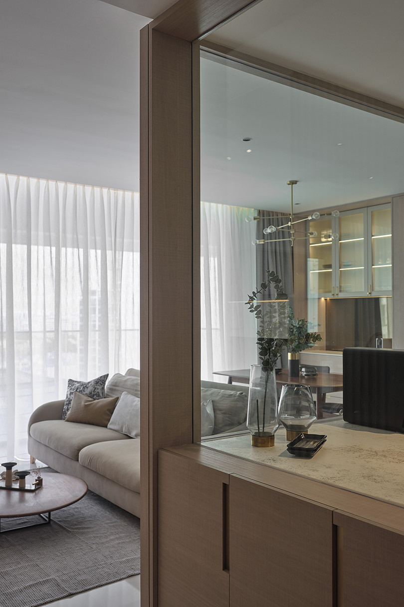
Since the family does heavy cooking, it was necessary to keep the kitchen fully enclosed. However, the designers used half-height glass windows to keep the space bright and well lit. The glass pivot door gives the family the option of keeping the space opened or closed. Interestingly, the lower cabinets can be accessed from both the kitchen and the living room. One side stores cooking utensils while the other holds the rest of the homeowner’s literary collection.
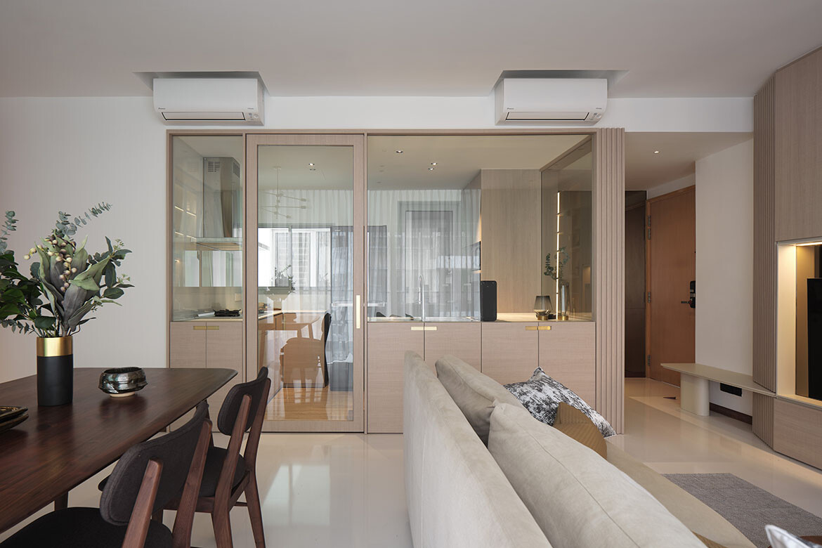
For the bedroom, the designers took the family’s daily habits into consideration. The parents were used to having a bed with a lower height so their young kids can jump into bed with them, so the designers strived to follow through. To that end, they customised a platform bed, complete with storage compartments. They also built additional storage into the bay windows to maximise the usable space.
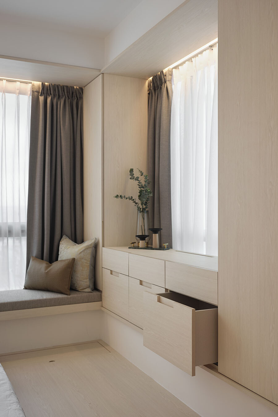
Thoughtful details like this are what makes this interior design such a success. And when paired with its natural palette, this home is a restful one wherein its owners can relax and thrive in.
Project details
Interior design – parenthesis.studio
