The true skill of an architect often comes to light in the layering of spaces to harness every possible opportunity. This was certainly the case at Heliotropian House where Eva-Marie Prineas of Studio Prineas has reconfigured a 1980s terrace house in Sydney’s north with adept precision.
The home balances planning constraints and build time alongside the client’s functional requirements, all while capitalising on the breathtaking views – no easy feat when dealing with a tight building shell.
“Due to the limitations of the original layout, from the outset we wanted to create a home for the family that embraced all the site had to offer,” says Prineas.
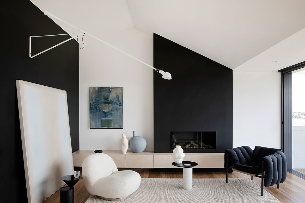
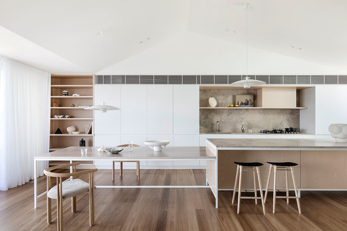
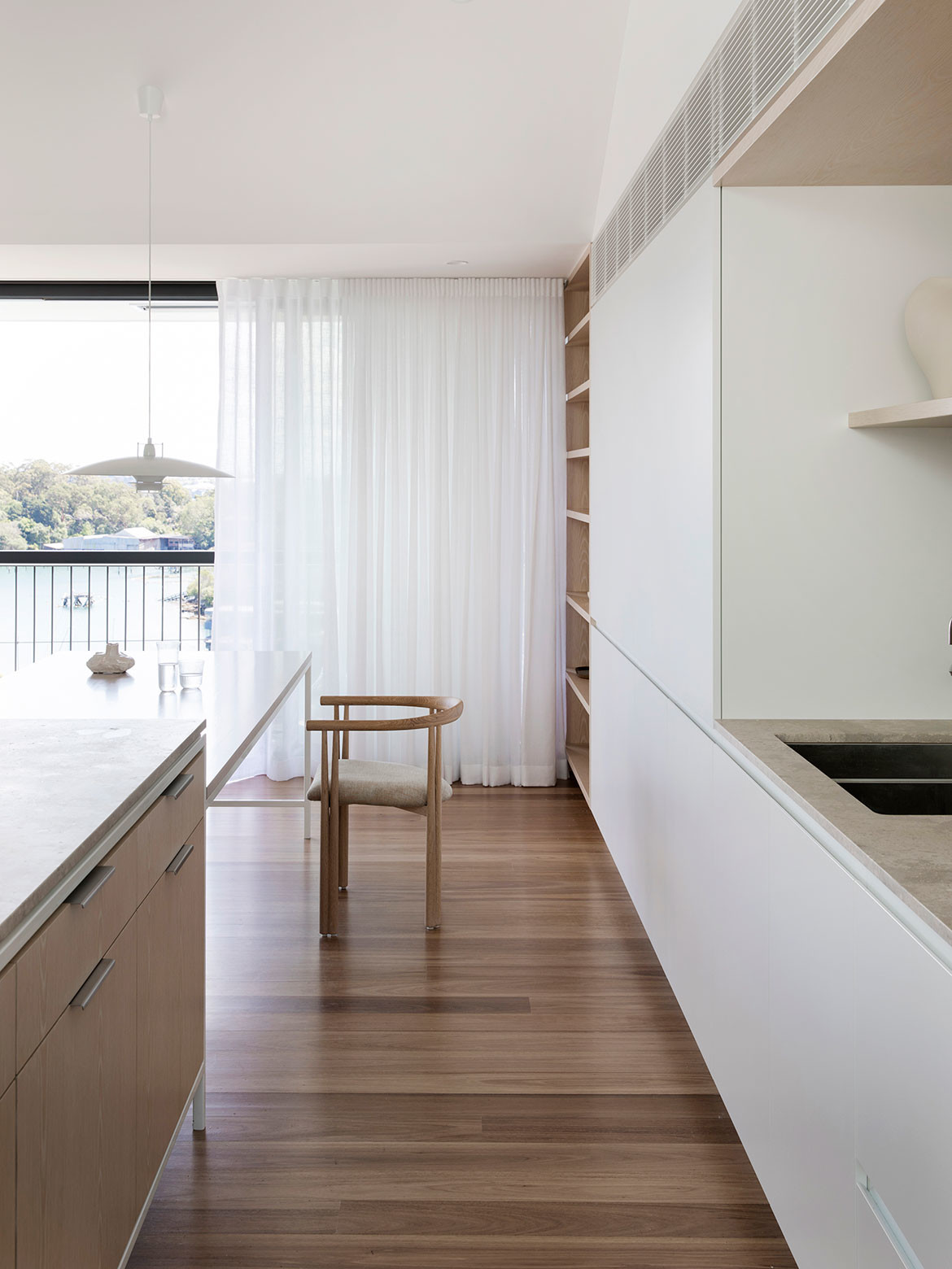
In undoubtedly the boldest move, the main living area has been relocated to the top floor, which now comprises a galley-style kitchen, fireplace and captivating views of Sydney Harbour. In an architectural sleight-of-hand, the expansive raked ceiling pushes into the roof space to capture as much light as possible, while maintaining the external envelope.
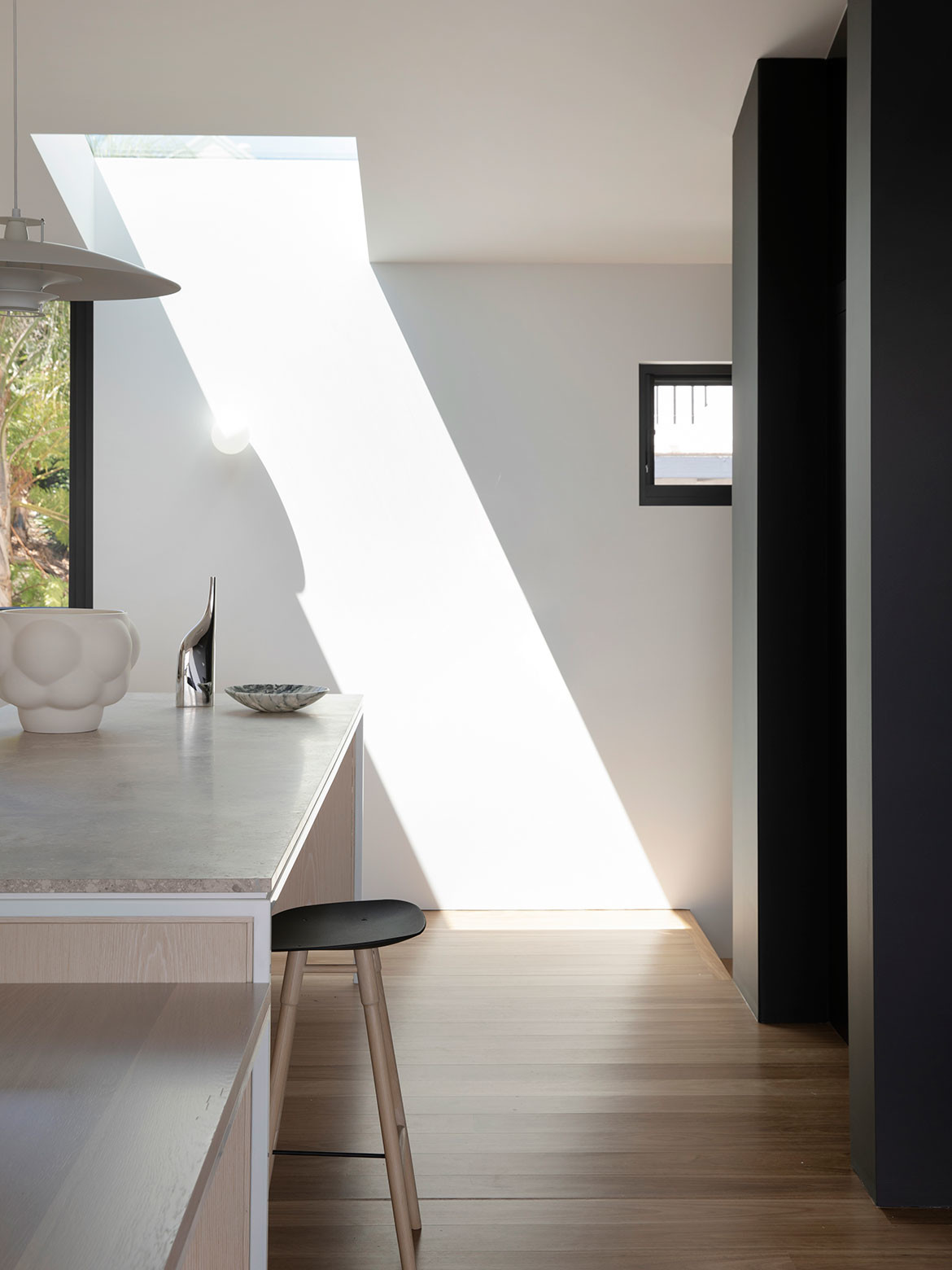
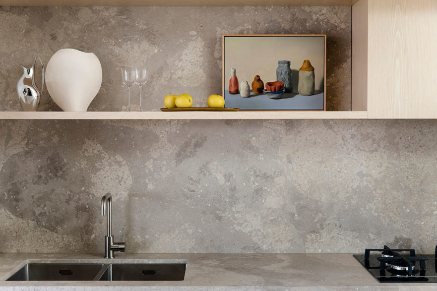
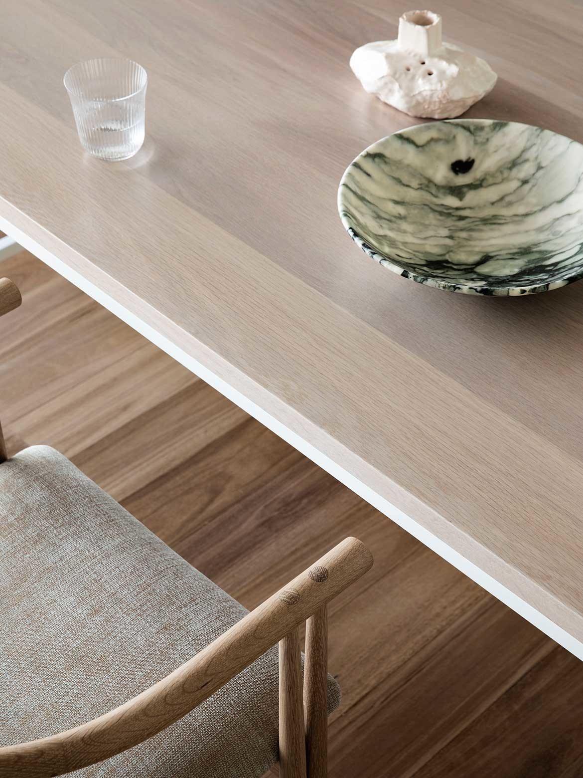
It’s this space from which the home’s name derives: Heliotropian – a Greek phrase meaning ‘turning towards the sun’. Light and lofty, the living area feels all the more spacious thanks to a series of design devices: well-placed skylights, an outdoor terrace, high ceilings, and bright white finishes of limed oak and shimmering Aran Bianco natural stone. The three-dimensional Tetris achieved at Heliotropian House plays out on every level.
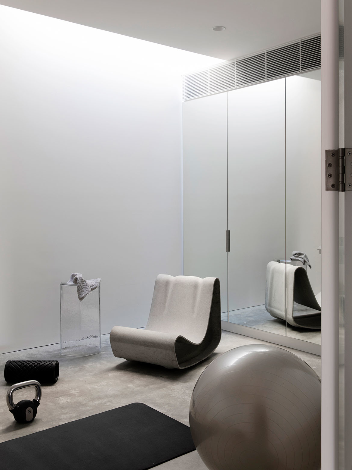
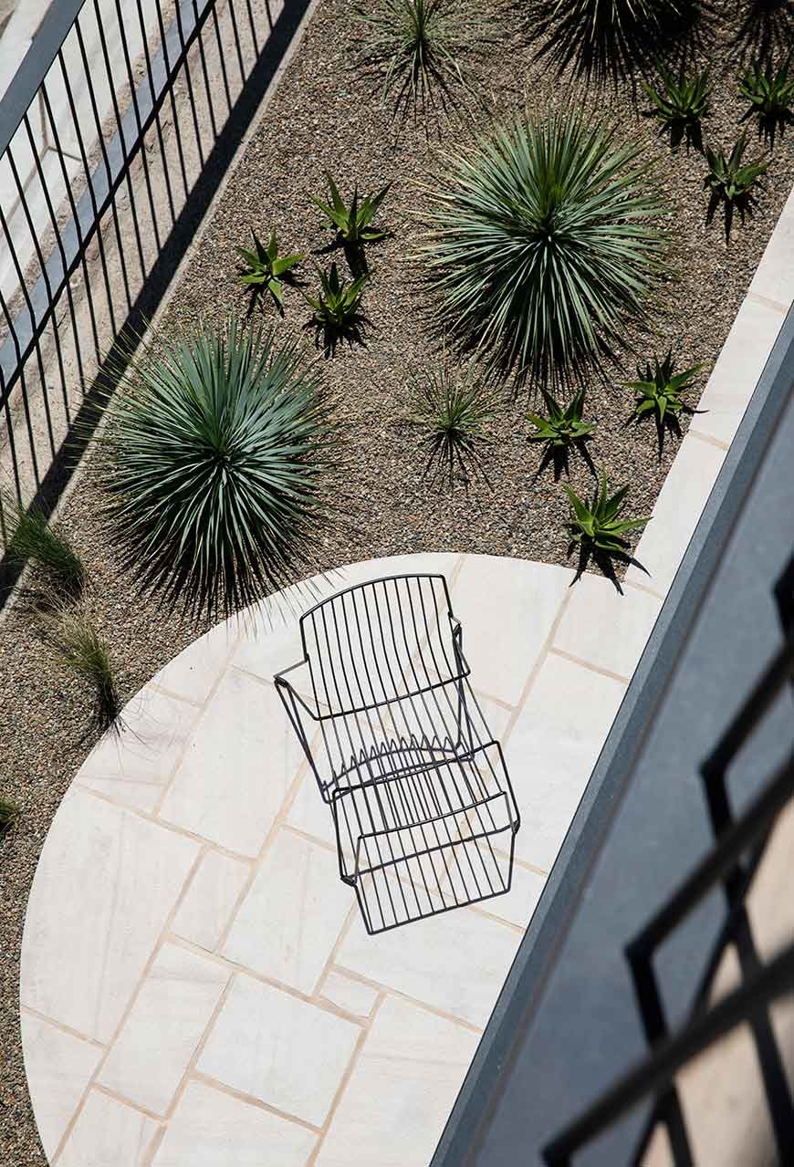
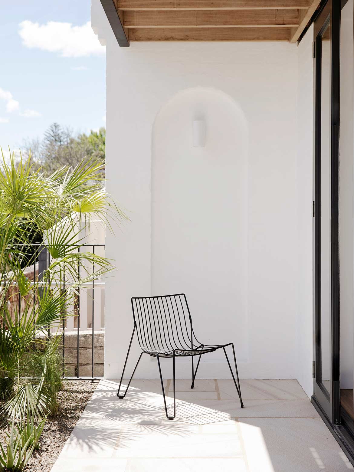
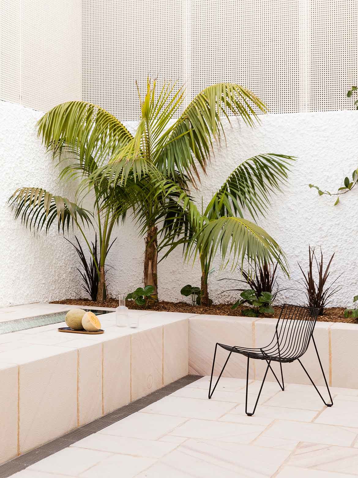
A once-underutilised basement garage, for example, now accommodates a laundry and a skylit gym thanks to excavation work that extends the square-meterage deep below. Moving up to the ground floor, there are two double bedroom suites flanked by an east and west courtyard.
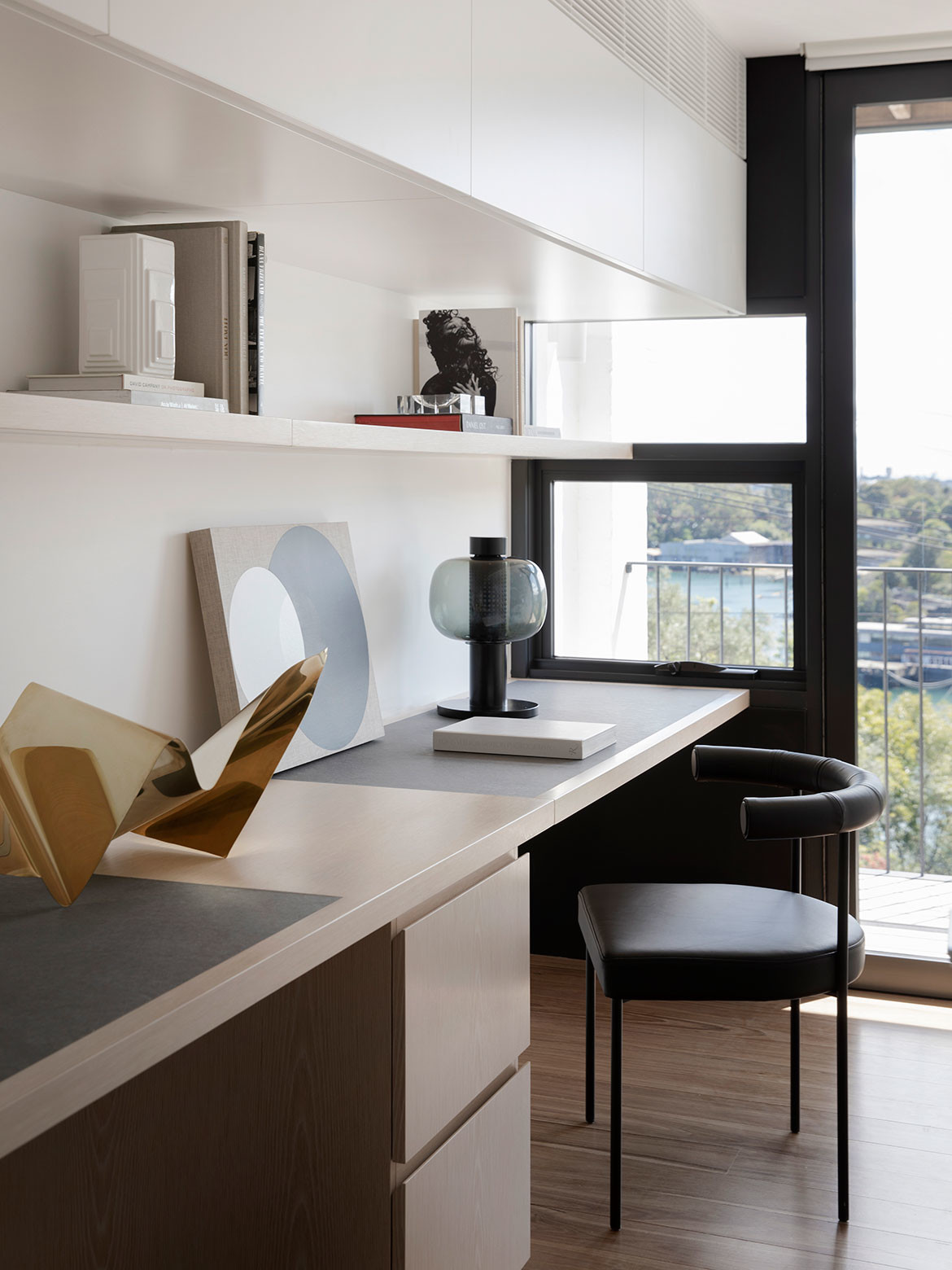
A parents’ retreat spreads out over the first floor, replete with a study nook, Studio Prineas once again proving that not a single square inch need be wasted. “With the limited space, every room had to bring in light and comfort, first by laying down the basics, and then finding freedom within each area,” says Prineas.
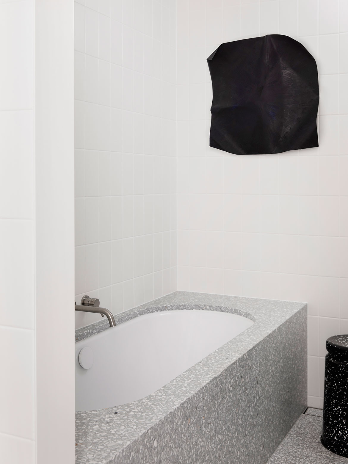
Elements of ritual are elevated in this main ensuite – for example, swathes of terrazzo wrap the bathtub, and the walk-in robe connects out to views.
Related: A family home by Eva-Marie Prineas and Peter Titmuss
“The house is rationalised to address the essential qualities of living and celebrate the ritual of each space,” muses Prineas.
While many would consider the expansive top-floor living area the heart of the home, for Prineas the key to unlocking the home’s potential resides in the central core and lift.
It’s a single point of circulation from top to bottom that anchors the home and plays into its verticality.
The stair wraps around the lift, adding landings and moments of circulation for pause and respite at each level. Unexpected views and outlooks in all directions occur on the rotating journey ascending the centre of the house. The effect is the feeling of spaciousness as each layer slowly unfolds.
“Care was taken to design circulation as a journey,” says Prineas, adding: “In a small home over four levels, the stair and lift take up a large portion of the floor area, so it was important for this circulation to offer more than just functionality. The experience needed to be uncomplicated, joyful and completely seamless, with a sense of connection to the outdoors, natural light and breezes.”
Not only does the architect’s skill and clever planning shine abundantly in the execution of this home, but it was made possible by the immense trust that developed between the clients and Prineas.
Stuck overseas during the planning and design phases, Prineas established open communication through video conferencing – something many are now familiar with – which allowed the process to flourish.
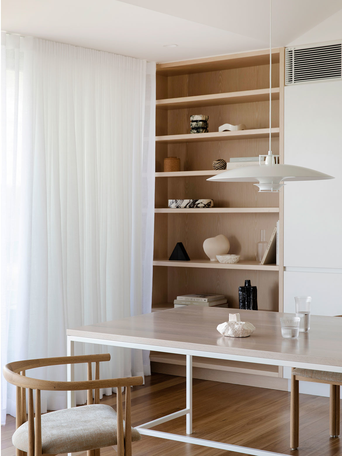
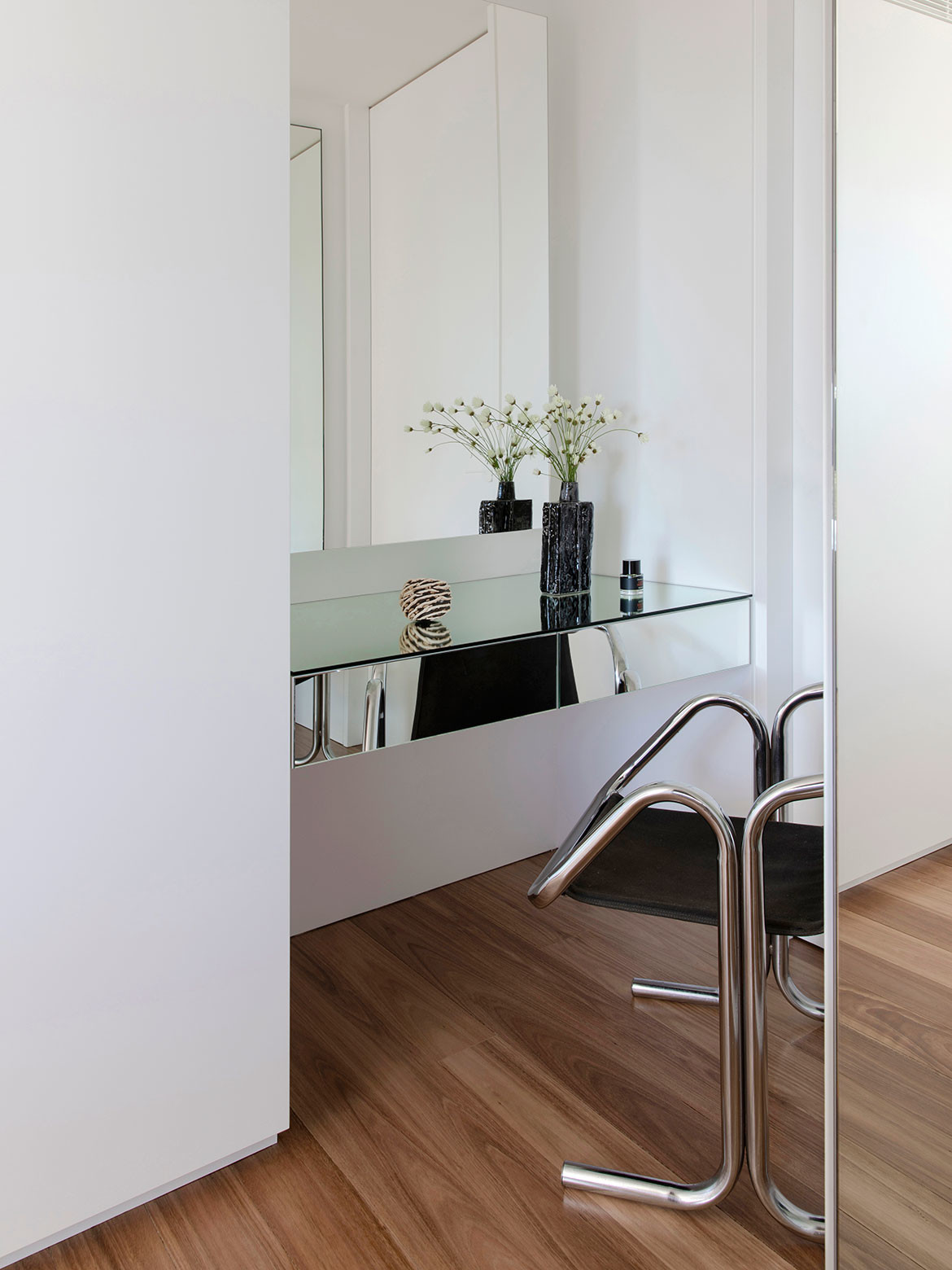
“By the time we reached the construction process, our clients felt they could trust us every step of the way,” reflects Prineas. “This enabled some last-minute design decisions that they are thrilled with.” For example, mirrors were added to the wall in the main bedroom to reflect the view and give an added sense of depth.
“Persuading our clients to change the front balustrading from glass to a fine black steel was a pivotal moment in our client’s confidence in our convictions,” shares Prineas.
In addition to the meticulous spatial planning, Heliotropian House is visually defined by its refined monochrome palette. Unafraid of the strong contrasts, selected black elements play against the softer neutral tones throughout.
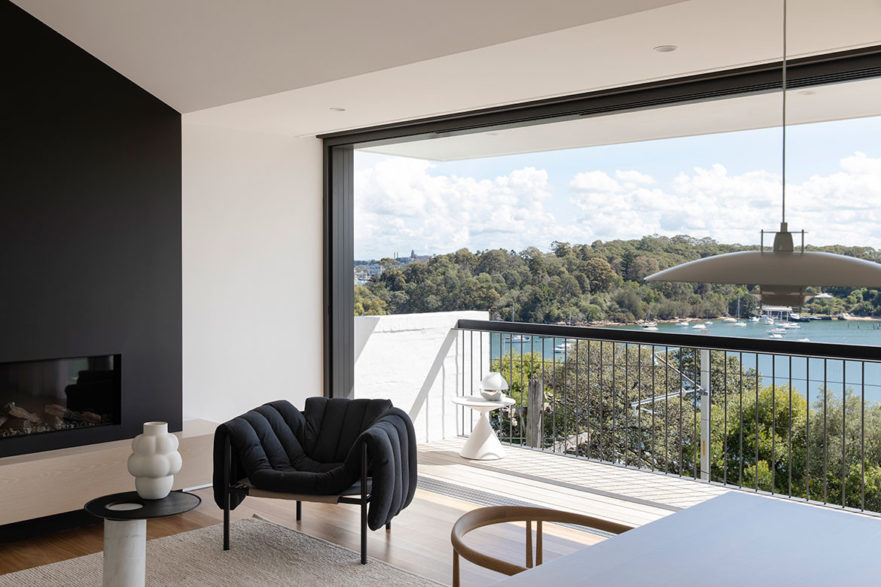
Rising in solid black, the lift grounds every floor of the home, appearing as a totemic connector. The fireplace has been given the same achromic treatment, drawing the eye into the living space without overpowering.
Heliotropian House is a masterful adaptation and now meets the needs of a modern family, all while unifying every space with a gentle ambience.
Project details
Architecture & interiors – Studio Prineas
Photography – Chris Warnes
We think you might like this story about 6 highly curated interiors.
