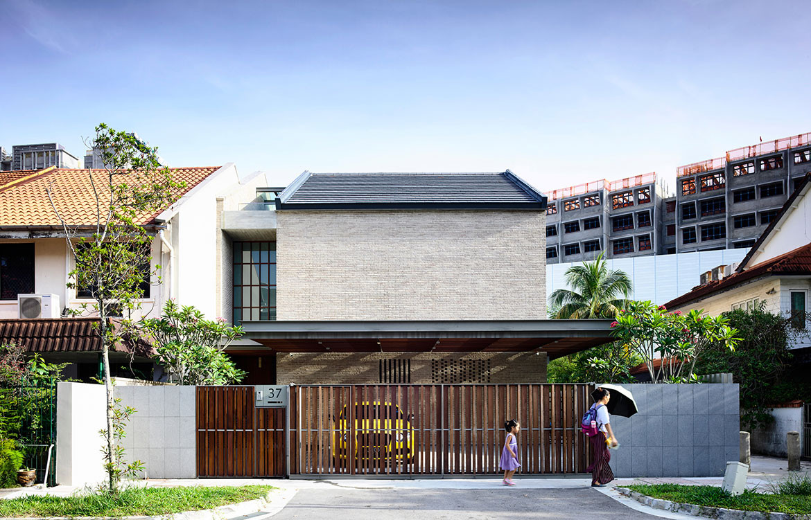
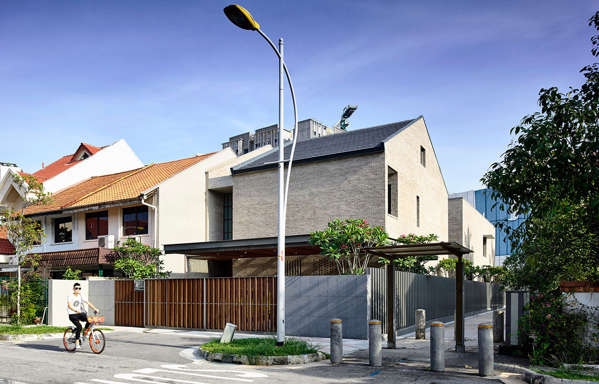
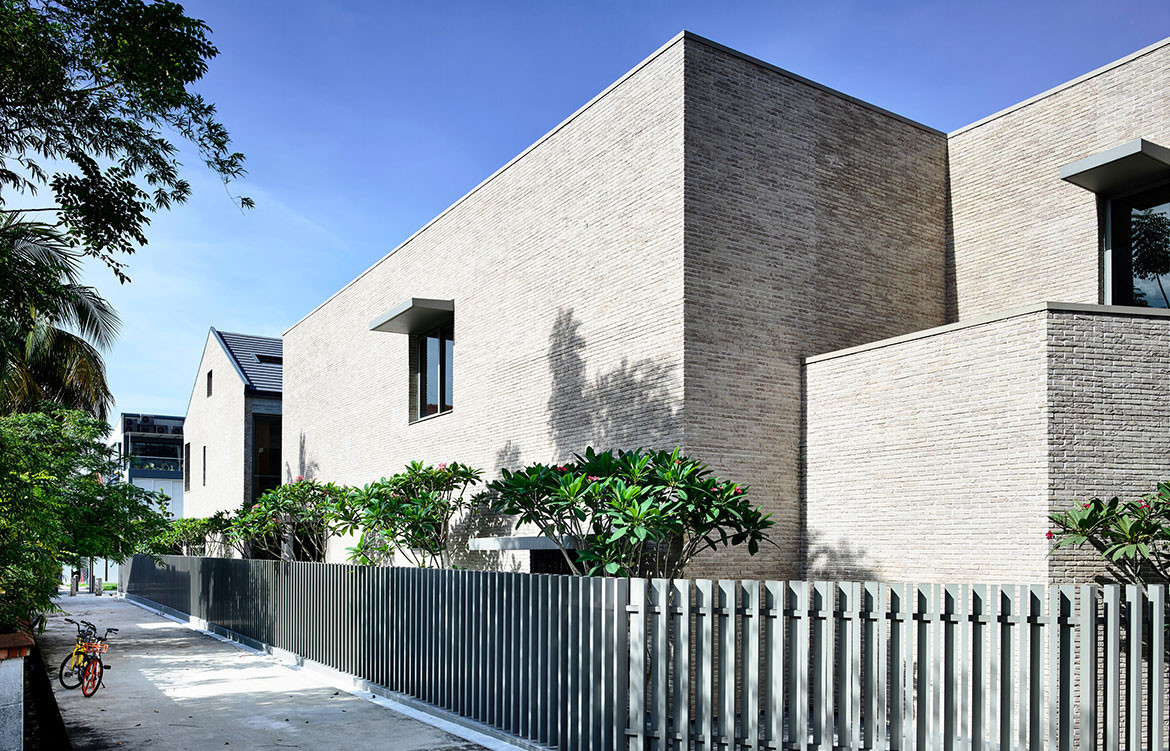
The recently completed Hyla Architects new residence in Singapore for a couple and their daughter occupies a long corner site with a public footpath on the side boundary. Add to this a large high-rise public housing development at its rear and this project was always going to have to contend with issues of privacy and security. In response, principal architect Han Loke Kwang configured an uncomplicated plan that is inward-facing.
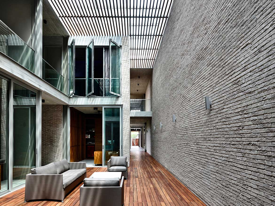
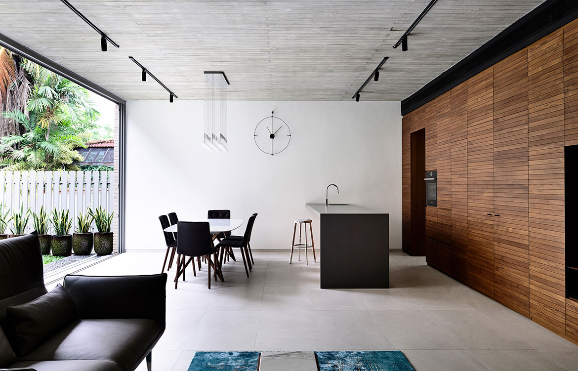
The resulting design is a masterful exploration in spatial awareness and material craftsmanship. Working with a very specific brief that called for each of the occupants to have their own study attached to their respective bedroom, with all three studies facing each other, Han arranged the two-storey home around two courtyards. The open courtyard has the living areas looking onto it and the closed courtyard is enclosed by the three study rooms and is covered by a timber pergola and glass roof.
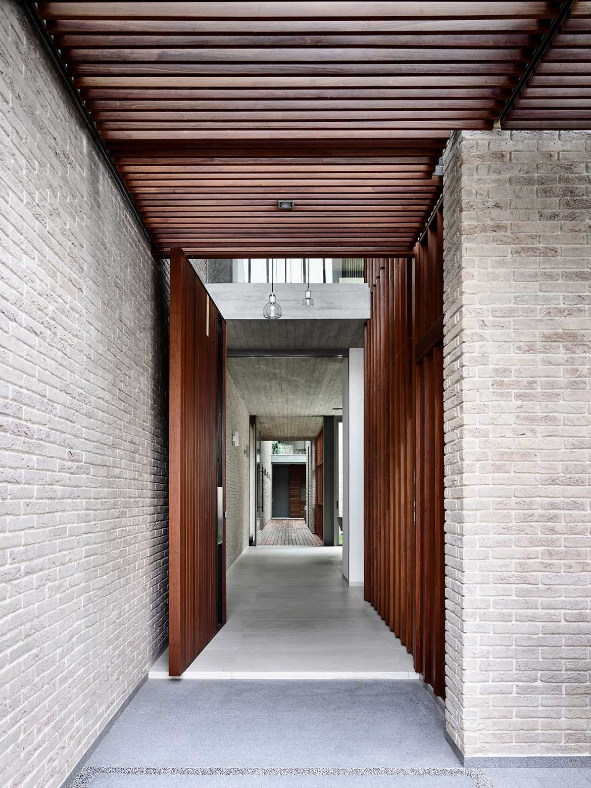
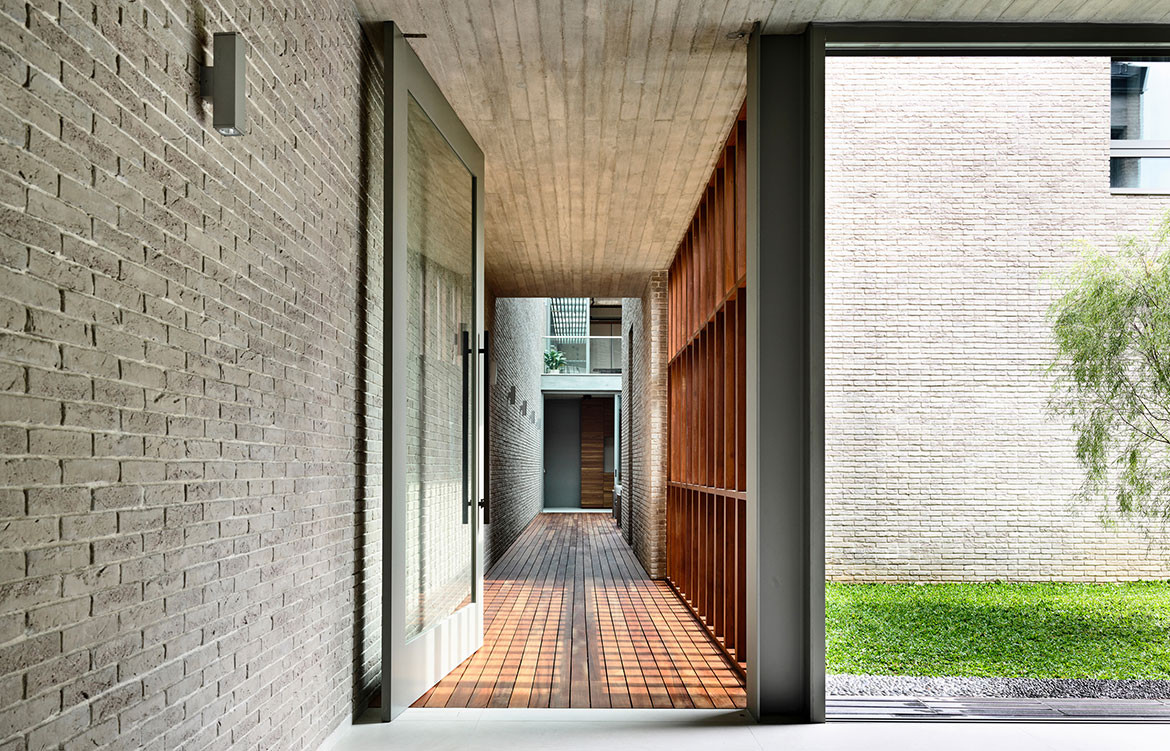
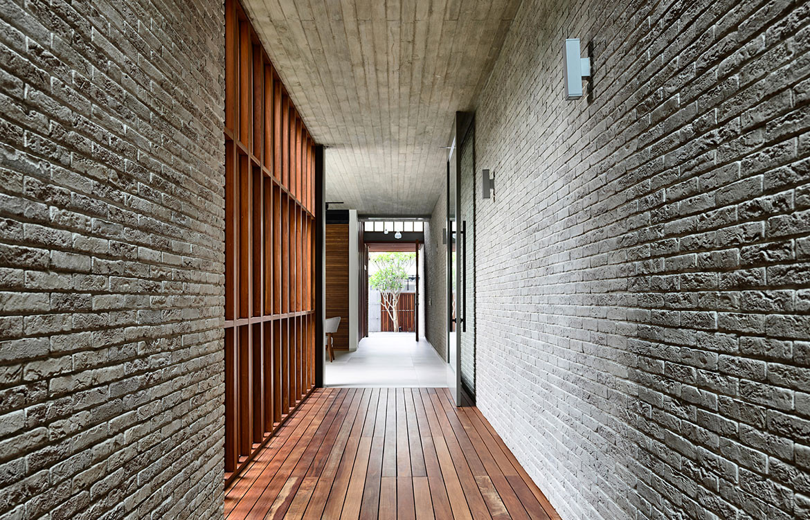
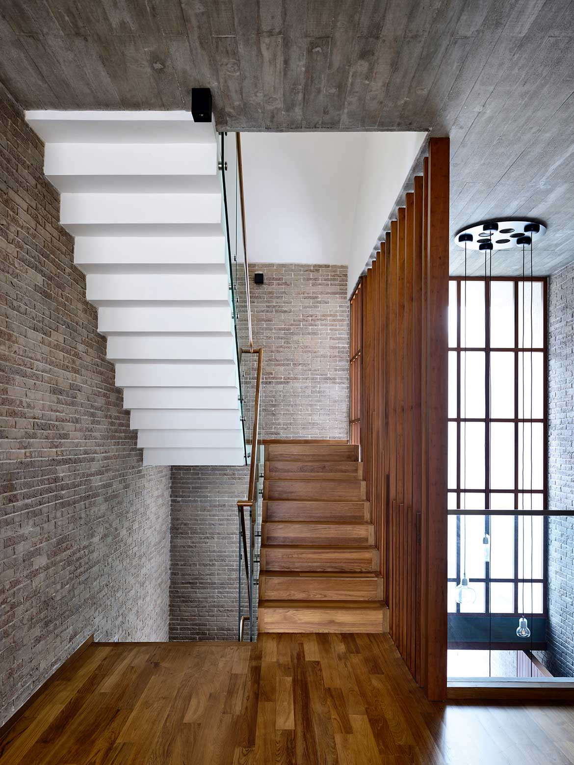
This private courtyard forms the inner sanctum of the home and is kept well ventilated by a large ceiling fan and a gap between the pergola and roof. Han erased the boundary between interior and both courtyards by utilising the same material palette inside and out. As he explains, “The courtyard spaces are such an integral part of the spatial composition, so we used face brick and timber-form concrete throughout to create a seamless transition between outdoor and indoor spaces. The colour of the brick was also selected to provide a visual intermediary between concrete and timber.”
The 794sqm house is undeniably monolithic in appearance. However, the timber flooring and detailing softens the interior and the brickwork and ceiling’s timber-form concrete add a handmade element. Textural imperfections and patterning on both these surfaces balance the building’s sharp lines and angles, while natural light floods the internal spaces, creating a bright, airy home that belies the severity of its materiality.
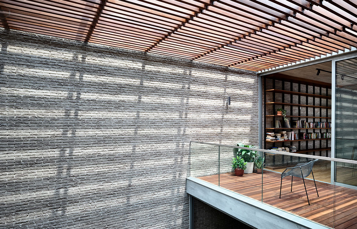
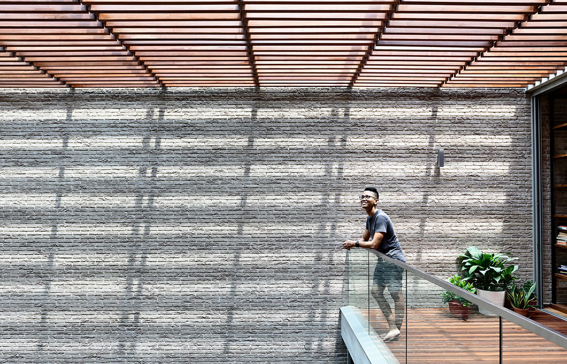
“Light is a key element in my design composition,” says Han. “And the plan is an unfolding drama of how spaces are illuminated by natural light.” The timber battens also add another textural layer by producing shadow play on all surfaces surrounding both courtyards. The courtyard house may be a traditional residential typology throughout Asia, but this project takes it to the next level with intelligent planning, uncompromised materiality and an exquisite attention to detail.
Hyla Architects
hyla.com.sg
Photography by Derek Swalwell
Dissection information
Alma Light Drop pendant
Bulb pendant by Sofie Refer for &Tradition
Muse bathroom tiles from Imola Ceramica
Clay stoneware porcelain tile from Cotto D’este’s Limestone series
