The following is an extract from the introduction to Atlas of Mid-Century Modern Houses by Domenic Bradbury published by Phaidon.
The mid-century period was, without doubt, a golden age of architecture and design. It was a time of optimism and imagination, full of ideas and ingenuity, which still resonates with us today. A whole series of powerful influences and currents converged, catalyzed by a post-war consumer boom, encouraging architects and designers worldwide to experiment and innovate as never before. House and home were radically reinvented and remade during the Fifties and Sixties, as modern lifestyles evolved to embrace more informal, playful and open-plan living patterns.
It is no exaggeration to say that the way we live today is grounded in the ideas formulated and refined during the mid-century era. Many of the key themes that we associate with ‘contemporary living’ were explored and perfected during the post-war period – including inside-outside connectivity; multipurpose living spaces; the rise of the kitchen as a family hub; outdoor rooms; and the adoption of fluid, interconnected rooms rather than ‘landlocked’ dedicated circulation routes.
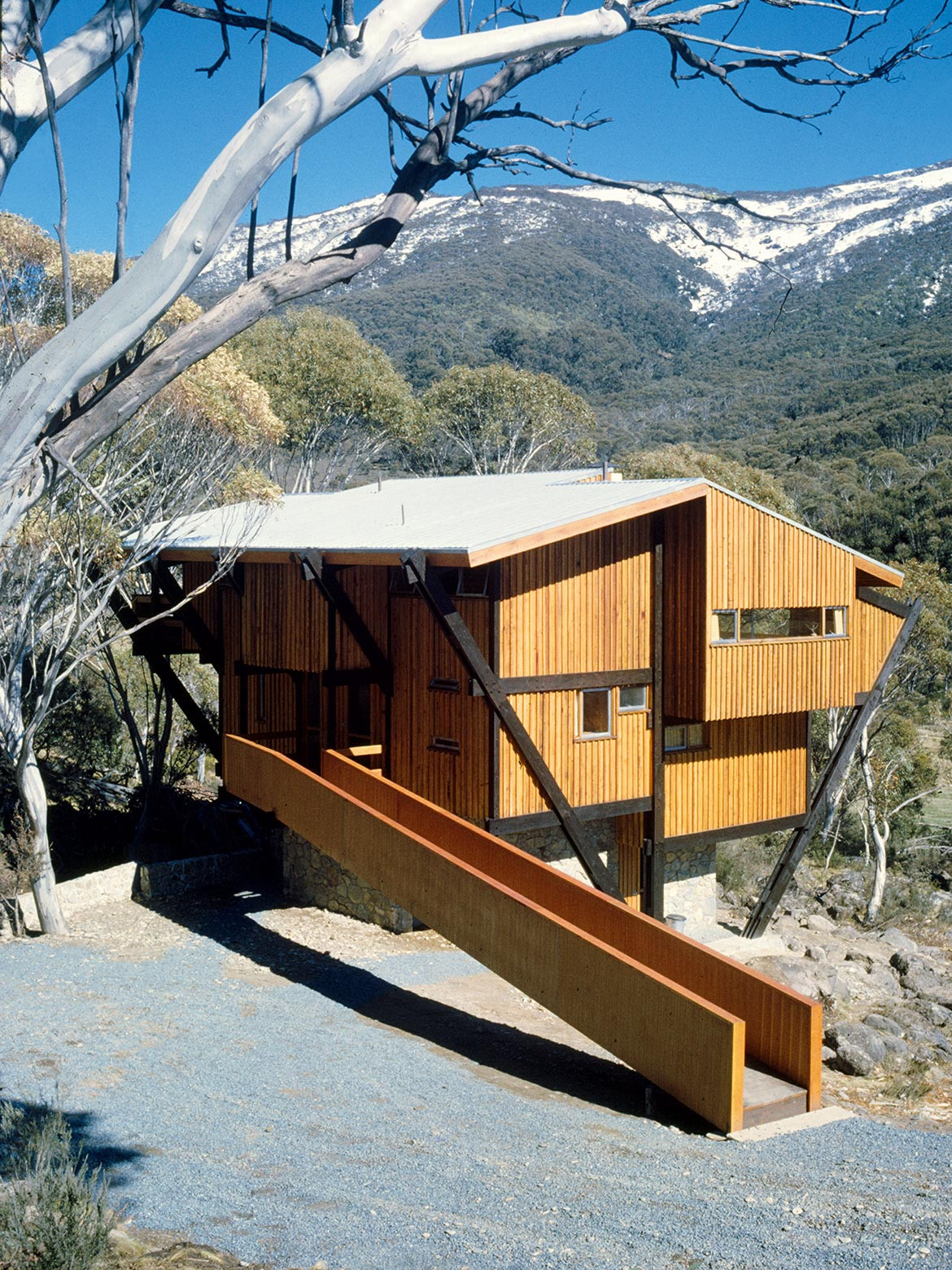
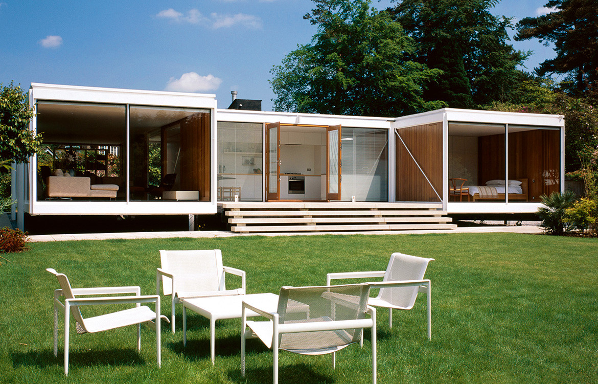
Schuchard House, Stan Symonds, Seaforth, Sydney, New South Wales (AU), 1963. Picture credit: Brett Boardman (page 400, top)
A whole series of architectural and structural innovations associated with the Fifties and Sixties have had lasting importance for residential architecture. Steel- and concrete-framed structures obviated the need for load-bearing brick and masonry walls, allowing for more fluid layouts within the home, and the use of ‘curtain walls’ offered a greater sense of transparency than ever before. Within these more open and flexible floor plans, architects made increasing use of ‘service cores’ holding bathrooms and utilities. Increasingly, the borders between inside and outside space were eroded, creating a more vibrant sense of connection with the surroundings and encouraging the growth of porches, verandas and terraces.
With advances in structural engineering, houses were increasingly raised up on piloti to maximize the light and the views or – alternatively – traditional living patterns were inverted, with bedrooms on the ground floor and a living space above. Tectonic innovations allowed architects to create dramatic cantilevers that pushed out into the landscape, while others explored increasingly complex, sculptural and dynamic forms. Some sought to break the house down into a series of modest, interrelated pavilions rather than building one dominant mansion residence – while the courtyard dwelling offered another way of integrating inside and outside space.
Yet such exemplary mid-century houses were not only about structural and spatial innovation. One of the reasons they still resonate so deeply is that the great residences of the Fifties and Sixties are also infused with the aesthetics of the age and enriched by warm, playful and characterful interiors. They are populated with the furniture and lighting of the time – in its own way, highly inventive and original. Many of the period’s great architects – Gio Ponti, Alvar Aalto, Charles Eames, Eero Saarinen, Antonio Bonet Castellana, Carlo Mollino, etc. – were also gifted furniture designers. There is a particularly close relationship between architecture, interiors, furniture and lighting that pervades the period. Many familiar and friendly pieces of iconic mid-century furniture evolved from specific architectural commissions, which carried through into a full design concept embracing almost every detail.
It’s so rare to fix on a time when architectural ingenuity and engaging aesthetics combine so completely and expressively. Factor in the richness of the era’s textiles, its glassware and ceramics – as well as the revolutionary quality of mid-century industrial and product design – and one has a synergy that it is unique in the history of design. This was truly a golden age.
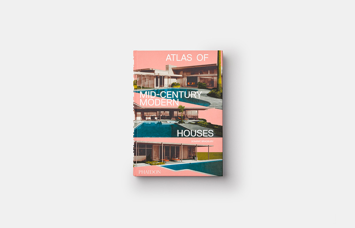
Atlas of Mid-Century Modern Houses, published by Phaidon, is out now.
Phaidon
au.phaidon.com
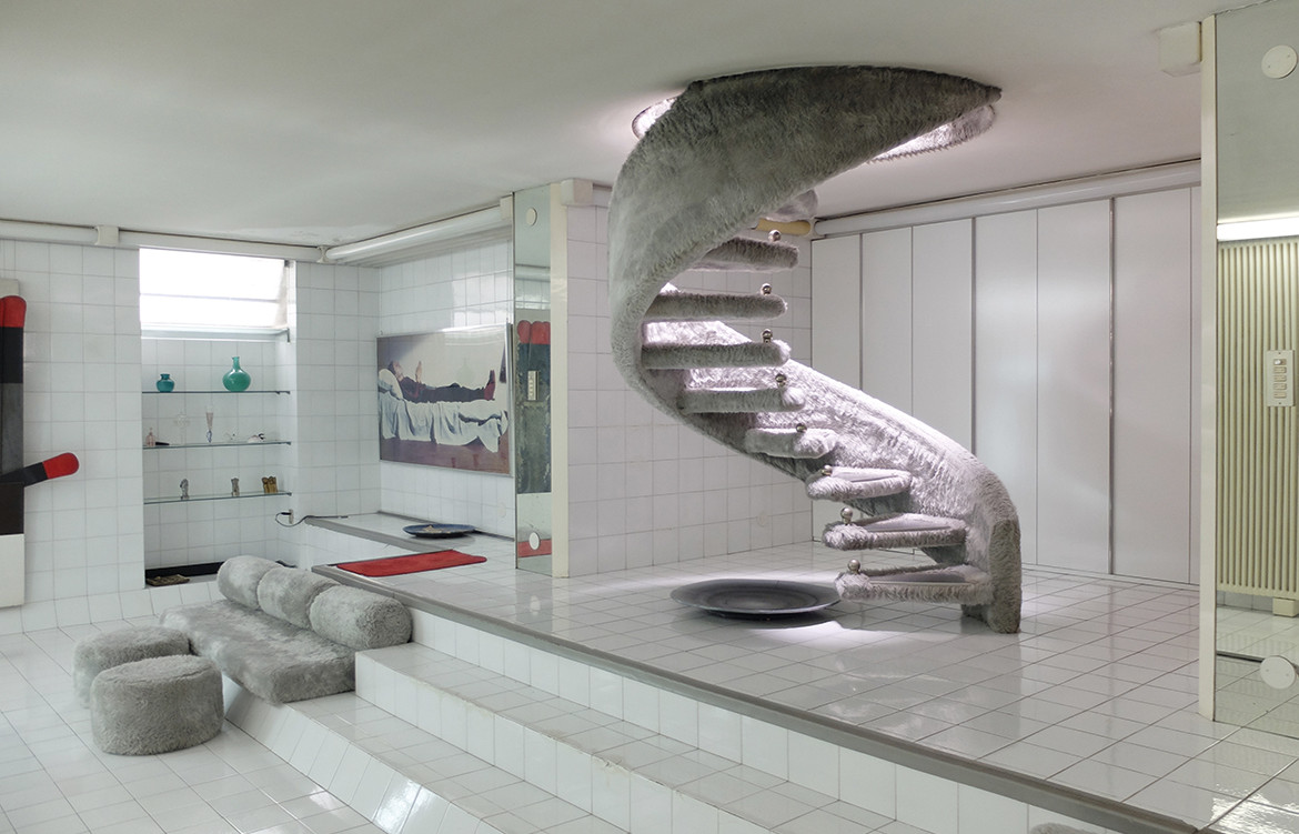 Casa Sotto Una Foglia, Gio Ponti and Nanda Vigo, Malo, Vicenza, Veneto (IT), 1969 (page 342)
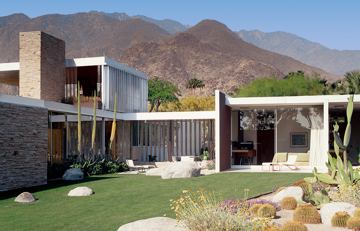
 Kaufmann House, Richard Neutra, Palm Springs, California (US), 1947. Picture credit: Julius Shulman / © J. Paul Getty Trust. Getty Research Institute, Los Angeles (2004.R.10) (pages 96-97)
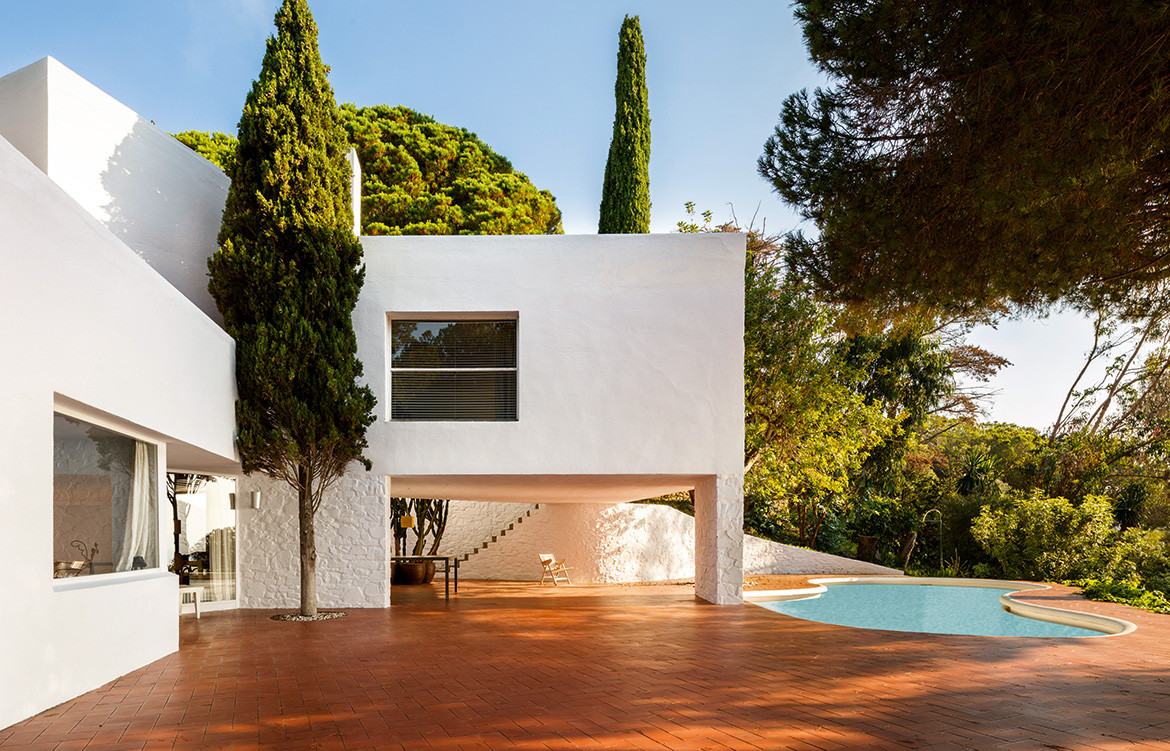 Casa Ugalde, José Antonio Coderch, Caldes D’estrac, Barcelona, Catalonia (ES), 1952. Picture credit: Lluís Casals (pages 304-5)
We think you might also like Auchenflower House by Kelder Architects
