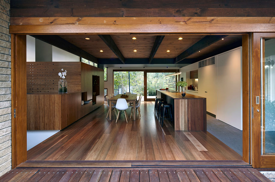
The project was to refurbish a significant 1980s residence with rustic finishes and exposed timbers, which suffered from congested split-levels creating cluttered and inefficient spaces.
“It was very much of its time and a very large house. But providing further additions would have been a waste of resources and consumption,” director of Wilson Architecture, Andrew Wilson said.
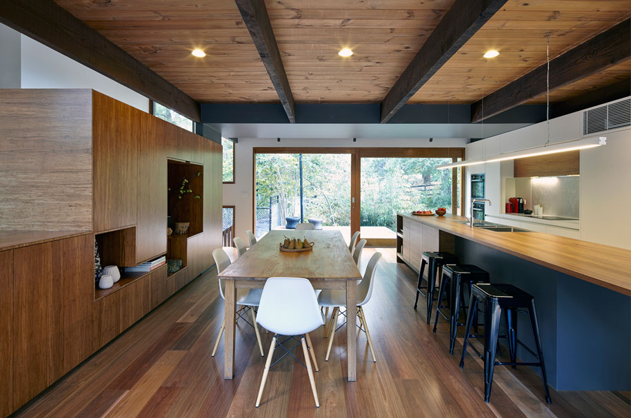
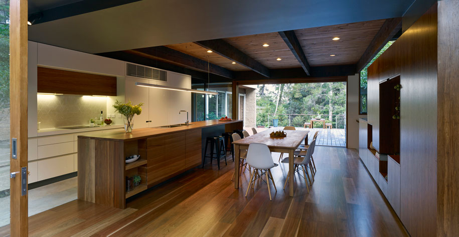
The plan was to open up the split-levels and create a connection with the gardens on either side of the house. Wilson focused on reworking the kitchen and dining area, provided a new stair as well as a landing to the adjoining upper and lower floors, with a clever use of sustainable spotted gum and bamboo to complement the existing exposed timber throughout.
“We love to integrate interiors and exteriors as well as taking an existing form and reinventing it,” Wilson says.
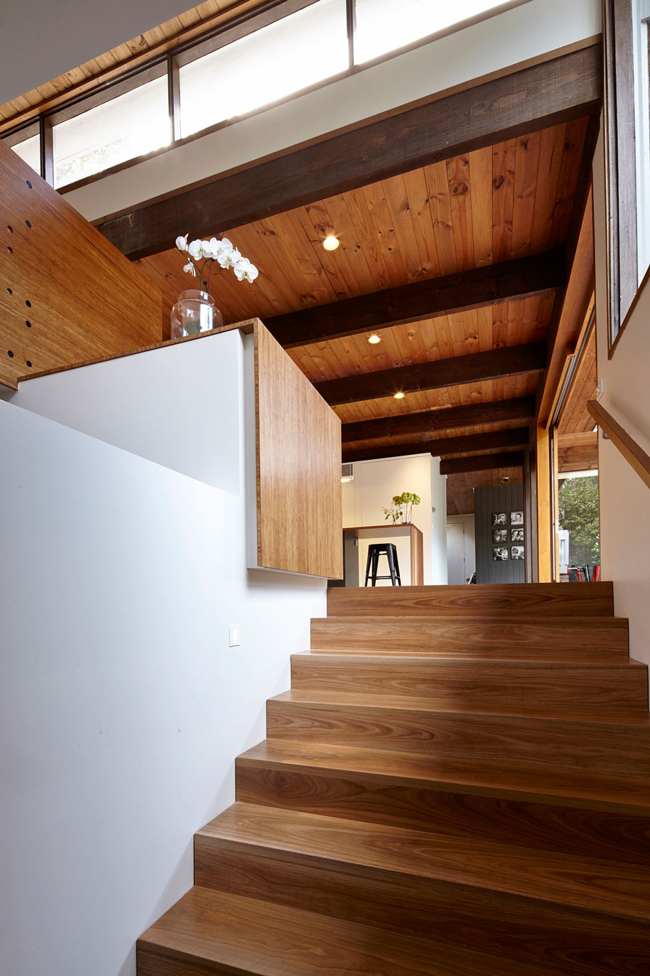
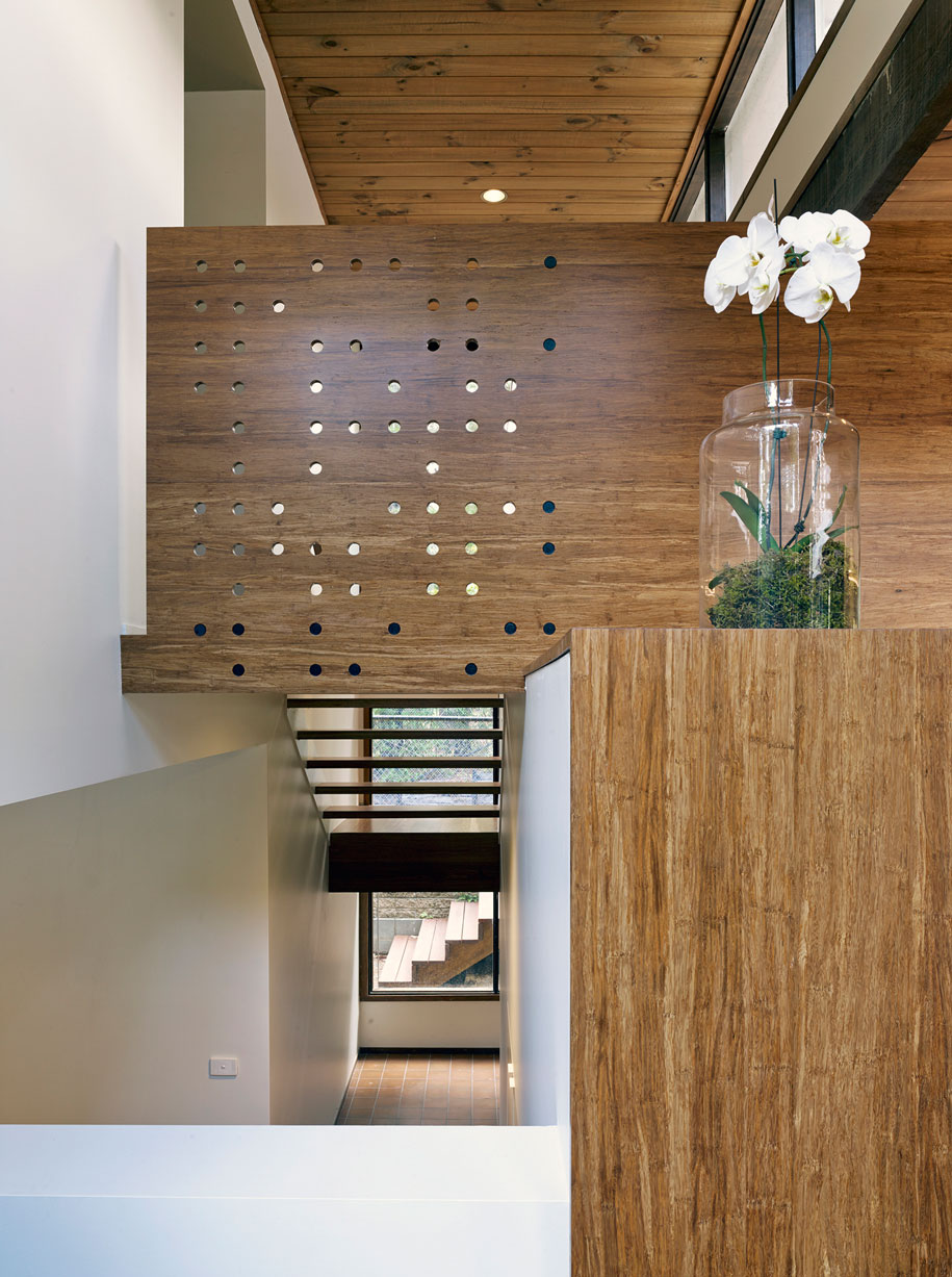
The existing residence contained some highly unusual structural solutions, and considerable effort was required to open up the existing space while complementing the existing exposed roof structure. An example is the bulkhead, which aligns with the adjoining cabinetry and integrates with the lighting.
“We tried to play with the timber but also offer some respite as well,” Wilson says.
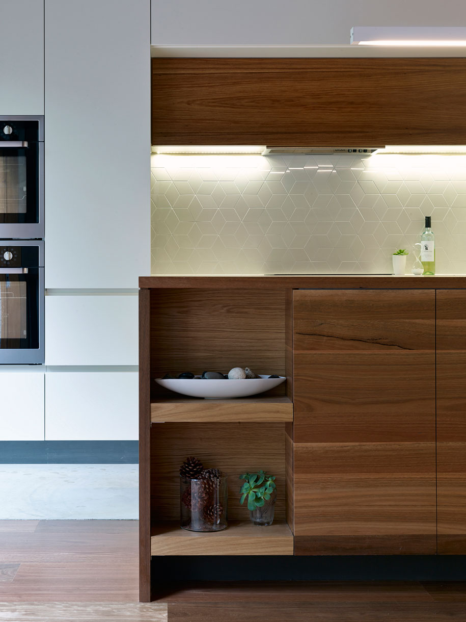
Now complete, the kitchen and dining area is the ‘glue’ interconnecting spaces that previously resembled a rabbit warren. The interior has been dramatically opened to both sides of the property, with single and double panel sliding doors along with new designs that connect the interior to exterior spaces.
There are whimsical solutions too, including the dining room cabinet, which doubles as a storage unit, balustrade, seat and structural display unit all in one. A hidden door also reveals a kitchen pantry just beyond.
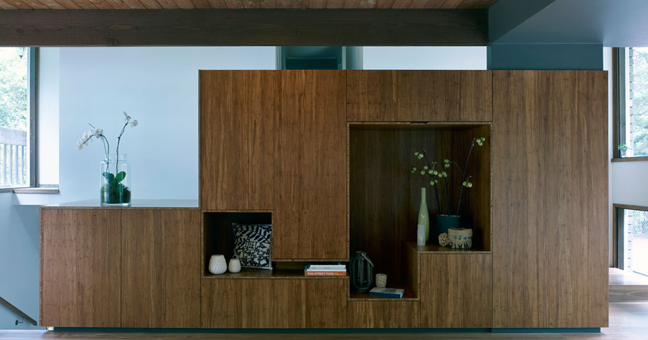
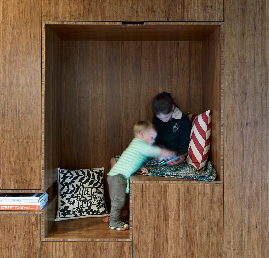
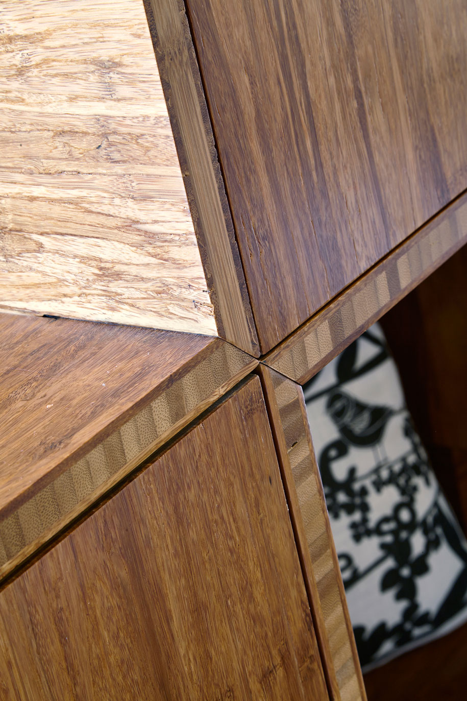
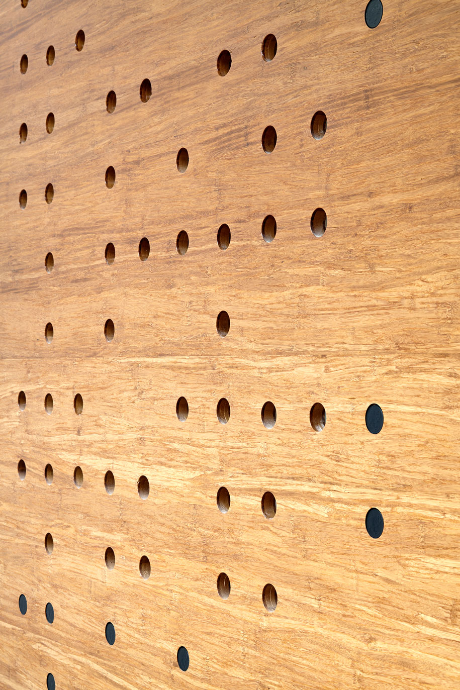
The material palette comprises feature grade spotted gum, carbonised, reconstituted bamboo, and factory painted cabinetry. Standouts include a 4.5m spotted gum island bench in the kitchen, and new polished concrete topping that replaces existing terracotta tiles.
“The owners now have a house that functions and is beautiful to live in,” Wilson says. “And they love it.”
Photography courtesy of Wilson Architecture
DROPBOX
Architect: Wilson Architecture
Architect team: Andrew Wilson, Wesley Baigent
Kind of project: Residential
Awards: Winner: 2014 Timber Design Awards – Residential Class 1 Best Renovation, Shortlisted: 2014 Houses Awards – House Alteration & Addition under 200sqm
Location: Donvale, Victoria
Date of project completion: February 2014
Wilson Architecture
warc.com.au
