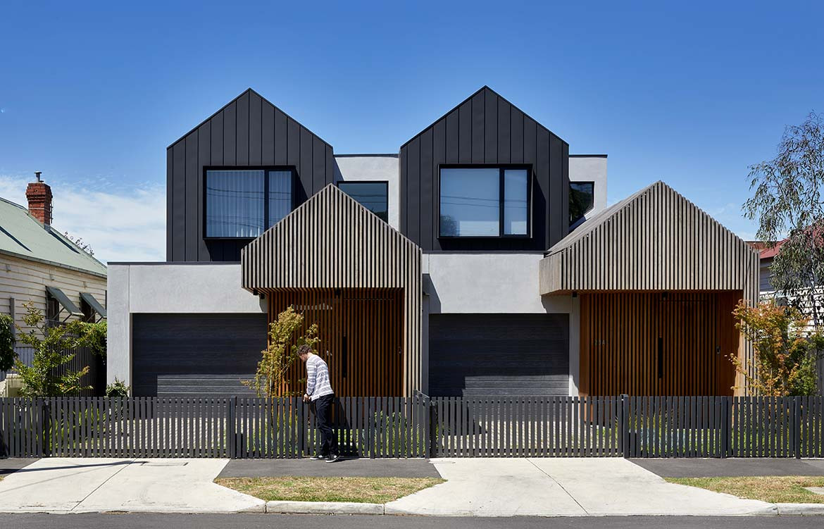
Designer and client were one and the same for Dover Townhouses. Adam Stapleton of Dood Studio developed the neighbouring residences so that he and his brother could raise their young families in proximity. The brief for the two four-bedroom townhouses stipulated warm, well-lit spaces to accommodate entertaining, juxtaposed with focus space to allow working from home.
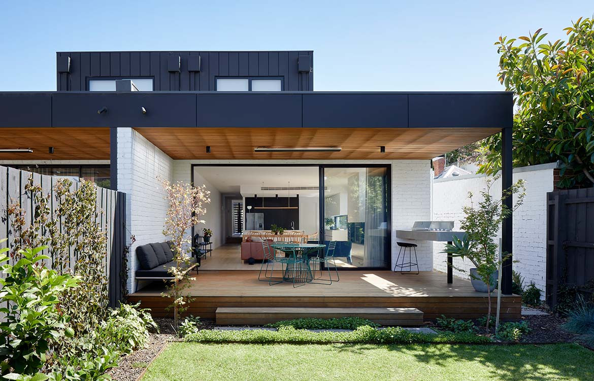
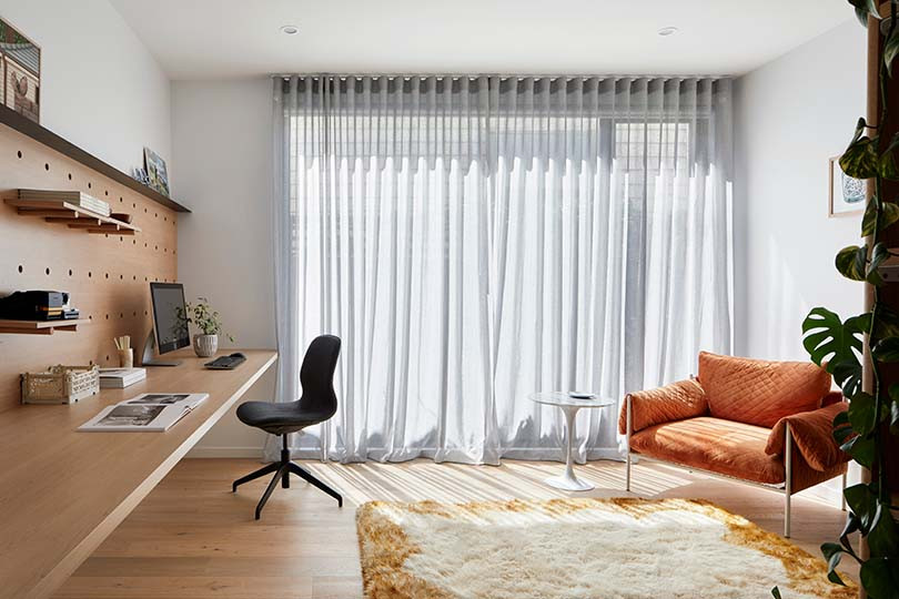
The layout distinguishes the busier areas of the home downstairs from the peaceful sleeping zone upstairs. Similarly, the rear of the home is open plan and connected, conducive to family time, while the study is positioned away from the hustle and bustle towards the front where natural light streams in via the double-glazed window.
Dover Townhouses is nestled into a heritage zone and Dood Studio responded to the streetscape specifically through adopting the silhouette of a classic single fronted Victorian dwelling, complementing the surrounding buildings. The spacing of the gables between the two homes replicates the architectural rhythm of the setting.
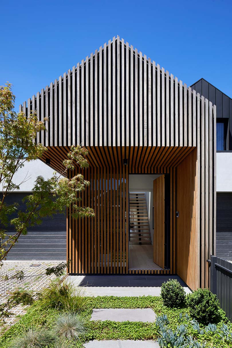
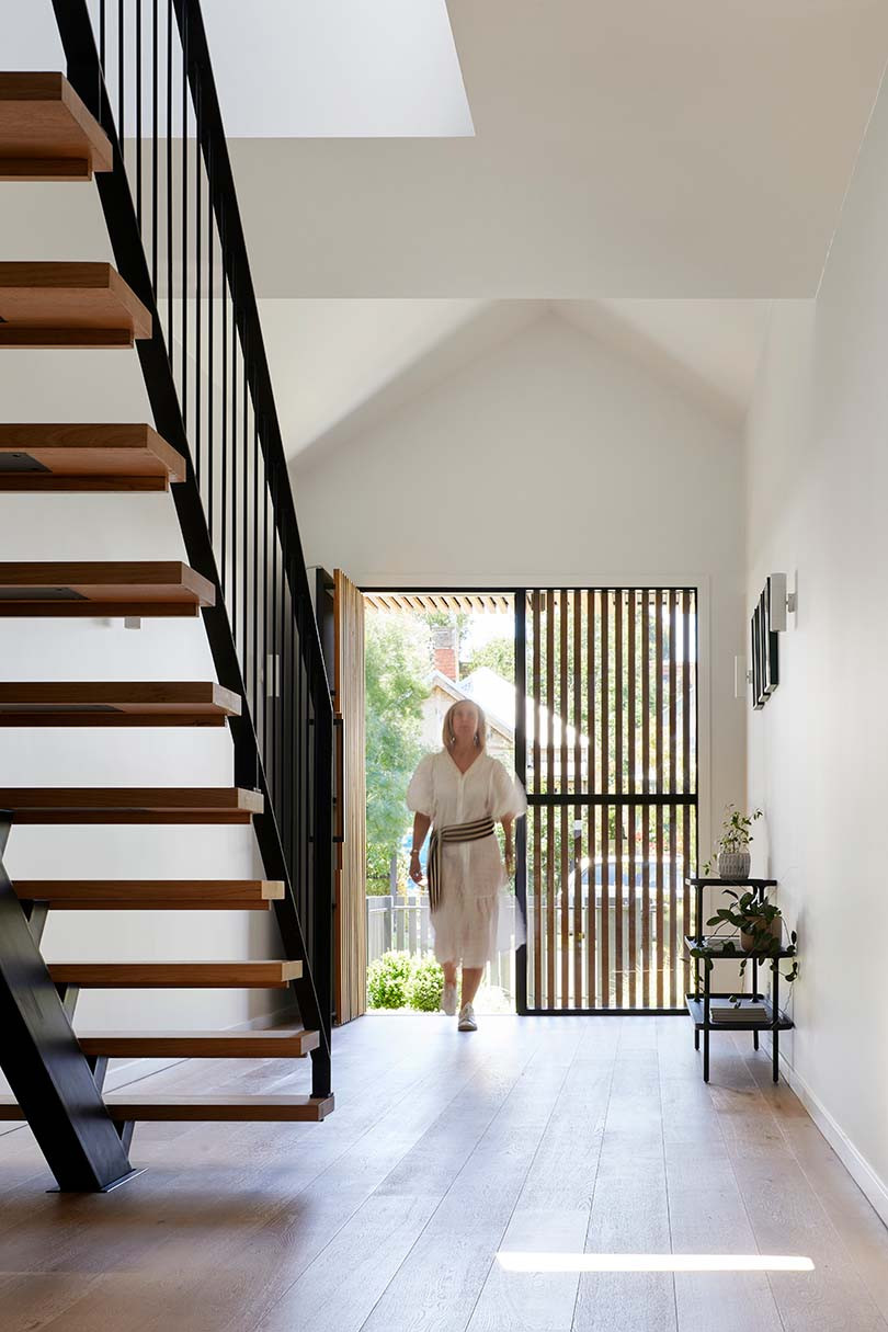
Though its form is in keeping with its neighbours, the façades on the two homes have a contemporary character. A darker chestnut cladding around the entry contrasts with the bleached battens floating above, creating a sense of depth. Hours of persistent detailing with respect to spacing, joins and fixing of the battens has achieved a monolithic quality. Upon entry, guests are warmly welcomed into the home by a light spaciousness prompted by the raked ceiling.
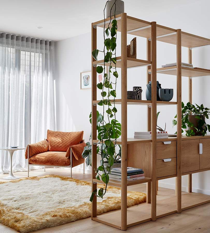
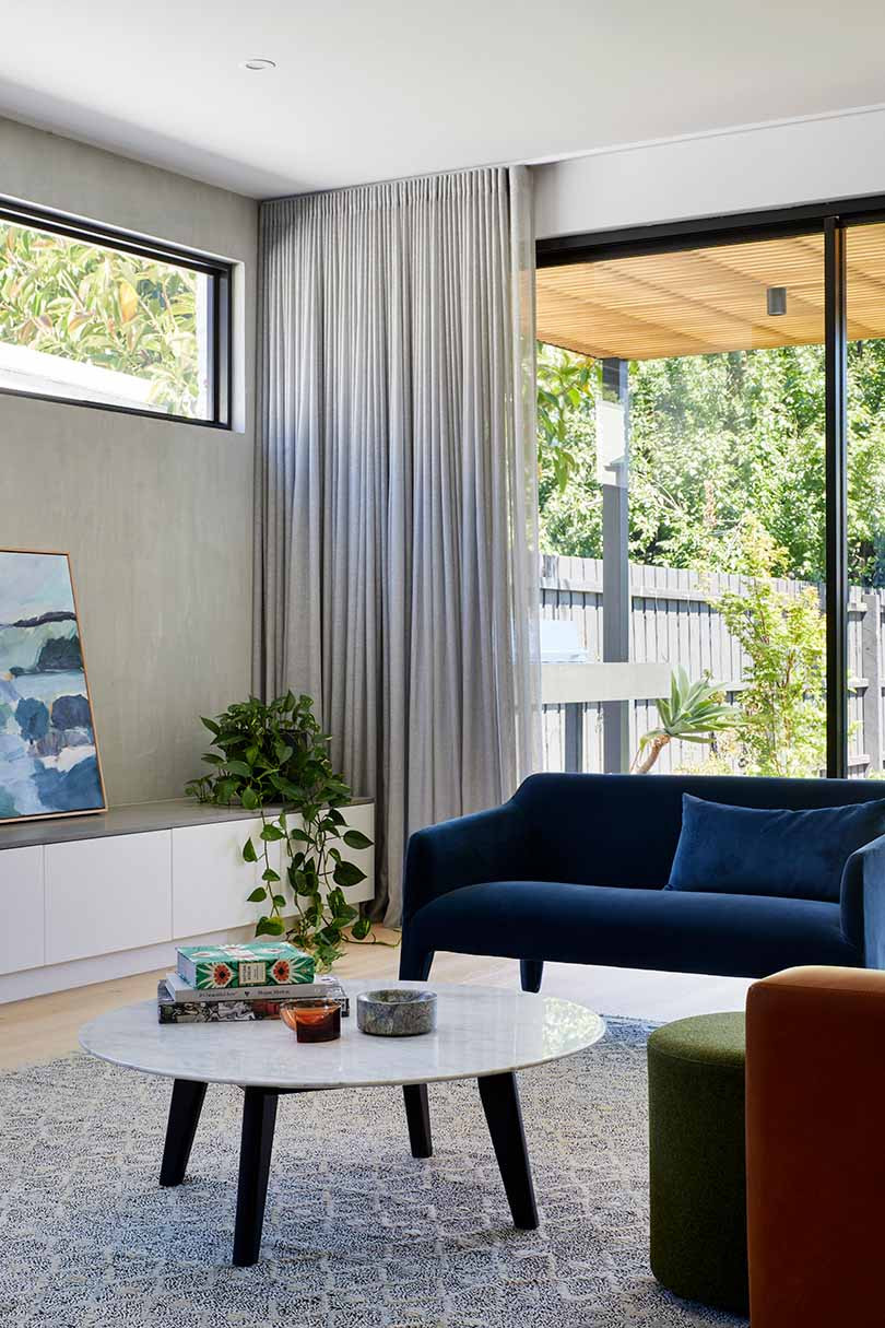
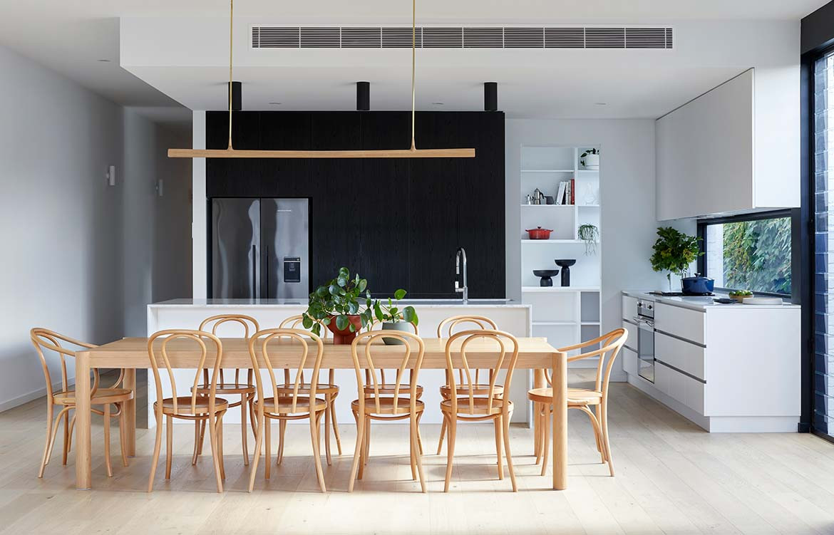
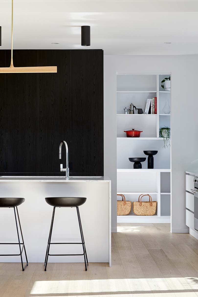
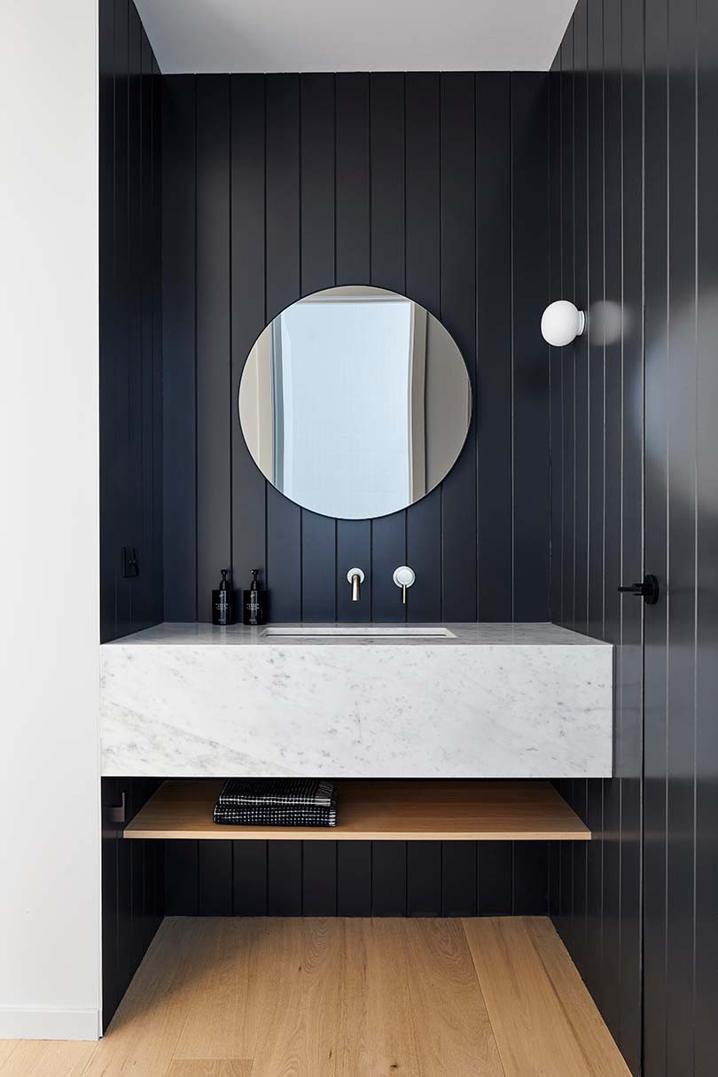
The materials selected lend a soft cohesiveness that connects zones of the home. While timber cladding punctuates the exterior façade, it also informs the interior experience through oak flooring, timber light fittings, a tailored desk and bedheads. Natural light interacts with marble, tiling and the lush textures of handpicked furnishings to produce reflective nebulous qualities that shimmer throughout.
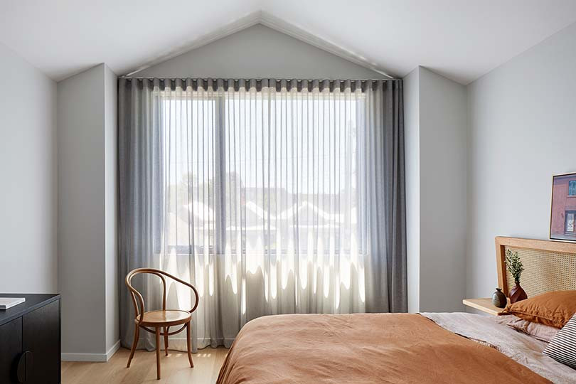
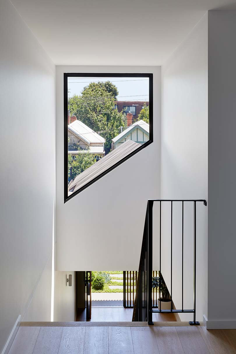
Lines guide the eye around the home, setting the rhythm of these dwellings. The stable crisp lines of flooring, cladding and cabinetry partner with ephemeral lines created by shadows that bounce off curtains and furniture twitching gently as natural light transitions, like a conductor’s wand. Angled windows frame interspersed glimpses of greenery whether travelling from up to downstairs, or gazing out the kitchen’s glass splashback.
Dover Townhouses does not use lines to visually or physically delineate space from space, or dwelling from dwelling. Rather this project forms a tapestry of woven lines that harmonise, achieving a relationship between the dwellings that celebrates living in proximity to others – delightfully blurring lines between family, friend, neighbour, mine and yours.
Project Details
Architecture – Dood Studio
Photography – Tatjana Plitt
