No matter how subconsciously, the spaces we live and move in have a profound influence on the ways in which we think and behave. If these spaces are compartmentalised, we can become less social and our activities more rigidly defined. This is the framework of control that many older housing typologies – in which the functions of individual rooms are set in stone, locked in by walls and utilities – maintain over us. But when this physical framework is shifted and opened up, our mental frameworks also have the capacity to become more creative – Sibling Architecture proves this in Family Framework House.
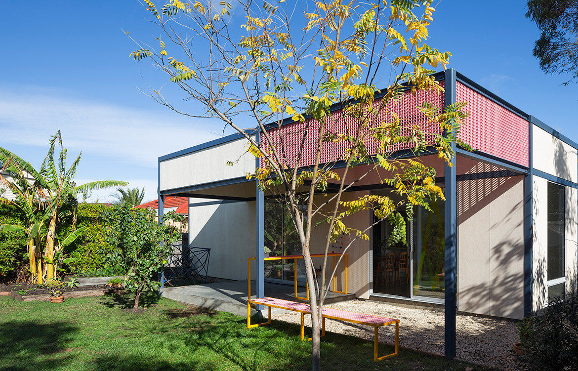
When Sibling Architecture was commissioned to rebuild the home of Melbourne-based artist couple Nadine Christensen and James Lynch (and their three children), it was exactly this combination of creativity and experimental frame-working that was built into the project’s core. Aptly named Family Framework House, the project rethought the compartmentalised grid of the old home, adding more space that can be reimagined and reconfigured by the family according to their needs throughout the day, and over the years.
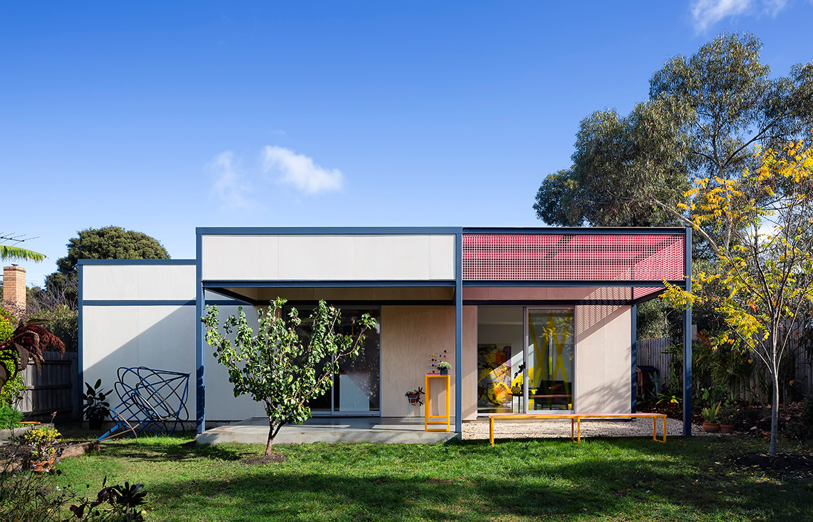
The original structure was a suburban brick home that was traditional right down to the wallpaper. Although James and Nadine had nurtured a garden around the house, after almost a decade of their ownership and several additions to their family, it was time to nurture the home itself.
The front of the home – sitting behind a handsome brick façade – had a more formal arrangement of rooms, with a secluded sitting room and bedrooms coming off the hallway. Sibling Architecture decided to leave this half as it was, focusing instead on the back of the house with a vision to transform it into a more useable, flexible and communal area for the family of five.
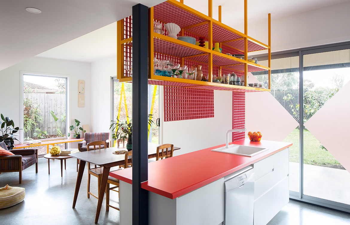
A simple yet effective gesture, the main design coup was the relocation of the bathroom, which originally sat in the entrance corridor and blocked the flow from the front to the back of the house. By doing this, the architects invited sunlight into the house, which is now permeated by a morning glow each day.
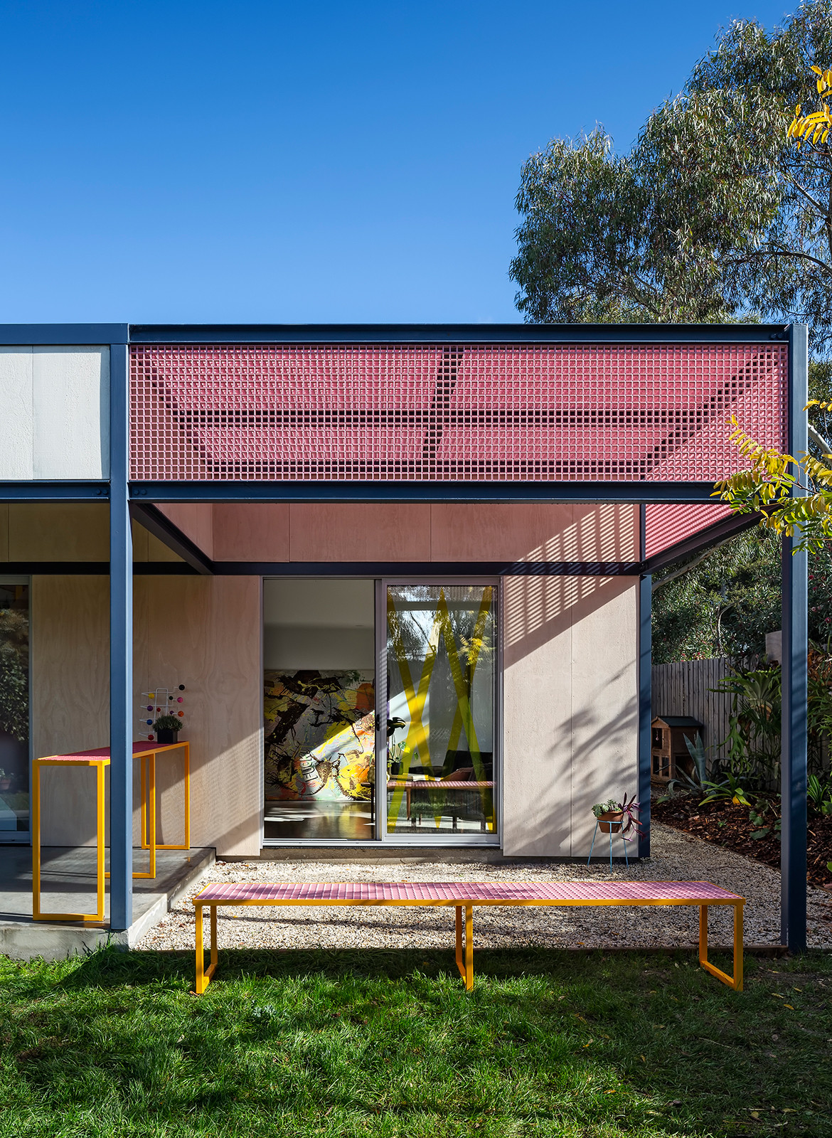
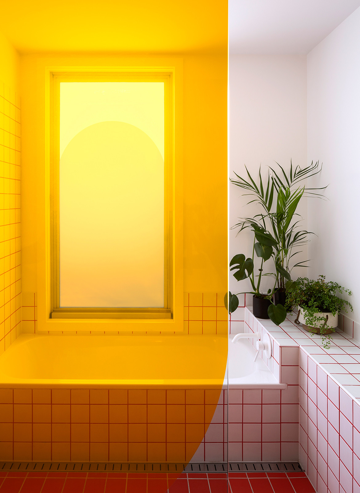
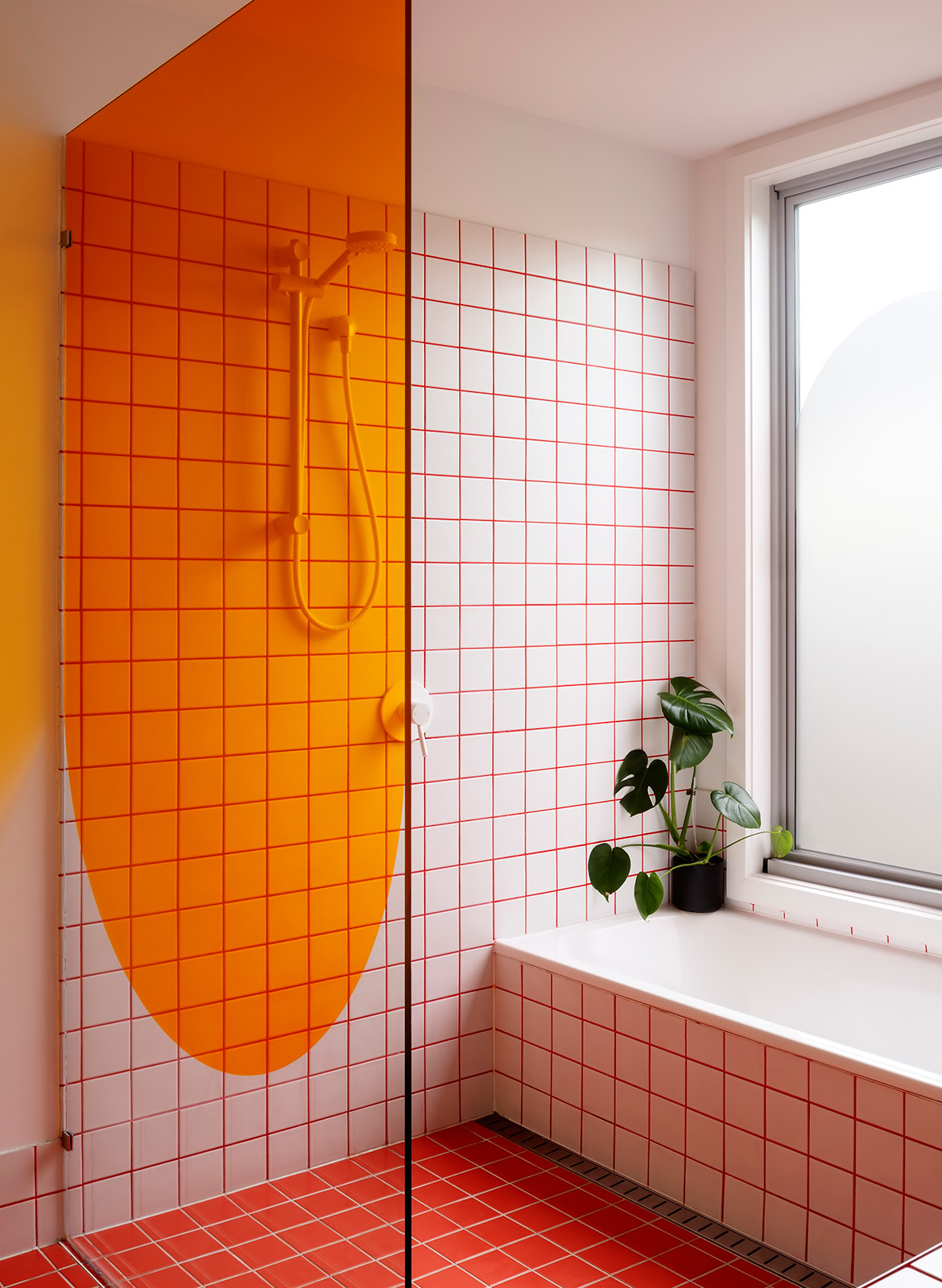
Eschewing exotic materials in favour of functional ones, Sibling Architecture opted for a utilitarian palette of standardised plywood panel and fibre-reinforced plastic (FRP) – the latter a lightweight, low-cost and colourful material that provides privacy screening for the occupants. Although durable in nature, the choice of FRP also allowed playfulness into the house through its pop-colour potential. In the bathroom, for instance, the palette flips between white and watermelon and, throughout the home, layered meshes and transparent films come together in blocks of blue and watermelon.
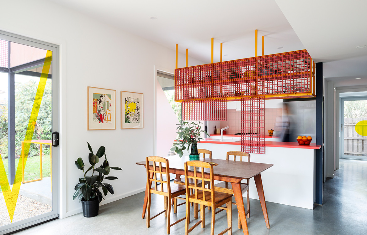
Not only does the material palette allow for an unpretentious sense of retro playfulness, but its durability also opens up the opportunity for constant rearrangement. It also pays homage to the vernacular of modernism and mid-century design as it was manifested in Melbourne – an era that James was particularly interested in, having used its references for his own work previously.
“The brief asked for this condition – the ability for the spatial configuration to nurture family connection whilst maintaining individual sanity,” says Jane Caught, director and co-founder of Sibling Architecture. “The person making dinner can still parlay with the homework undertaken on the dining room table, and the person enjoying a glass of wine and the view to the garden on the couch. If the dinner becomes all-absorbing, or the homework and wine drinking gets rowdy, they can create an illusion of peace by manipulating a series of gridded pink screens along the kitchen joinery.
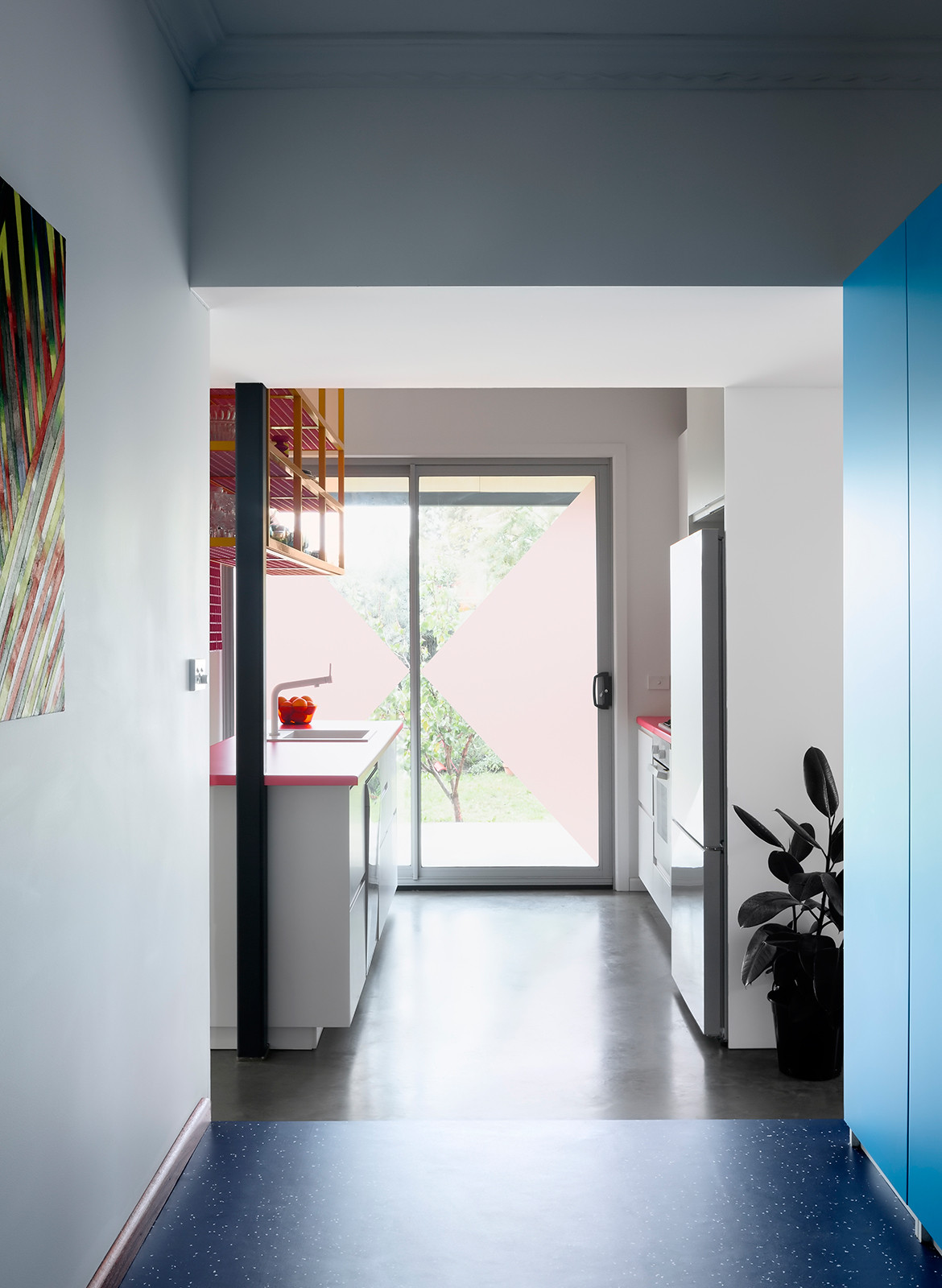
“The coloured films on the layers of glazing not only bring a strong yet intangible wash of colour into the rooms, but their graphic outlines allowed us to reference some tropes of mid-century architecture – the butterfly roof, the dome, the diagonal gestures. Layered on the sliding doors, these also provide a sense of movement.”
Sibling Architecture
siblingarchitecture.com
Photography by Christine Francis
Dissection Information
Cladding in ‘Shadowclad’ from Carter Holt Harvey
Feta stain to cladding from Aqua Oil
Persimmon benchtop by Laminex
Voga ‘Rosa’ tiles by Classic Ceramics
Sphera Evolution in Lapis vinyl flooring by Forbo
Bathroom tiles in White and Dark Salmon supplied by Cerdomus
Bathroom fixtures in white Mizu Drift collection from Reece
We think you might also like The Spirit Of Place According To Palinda Kannangara
