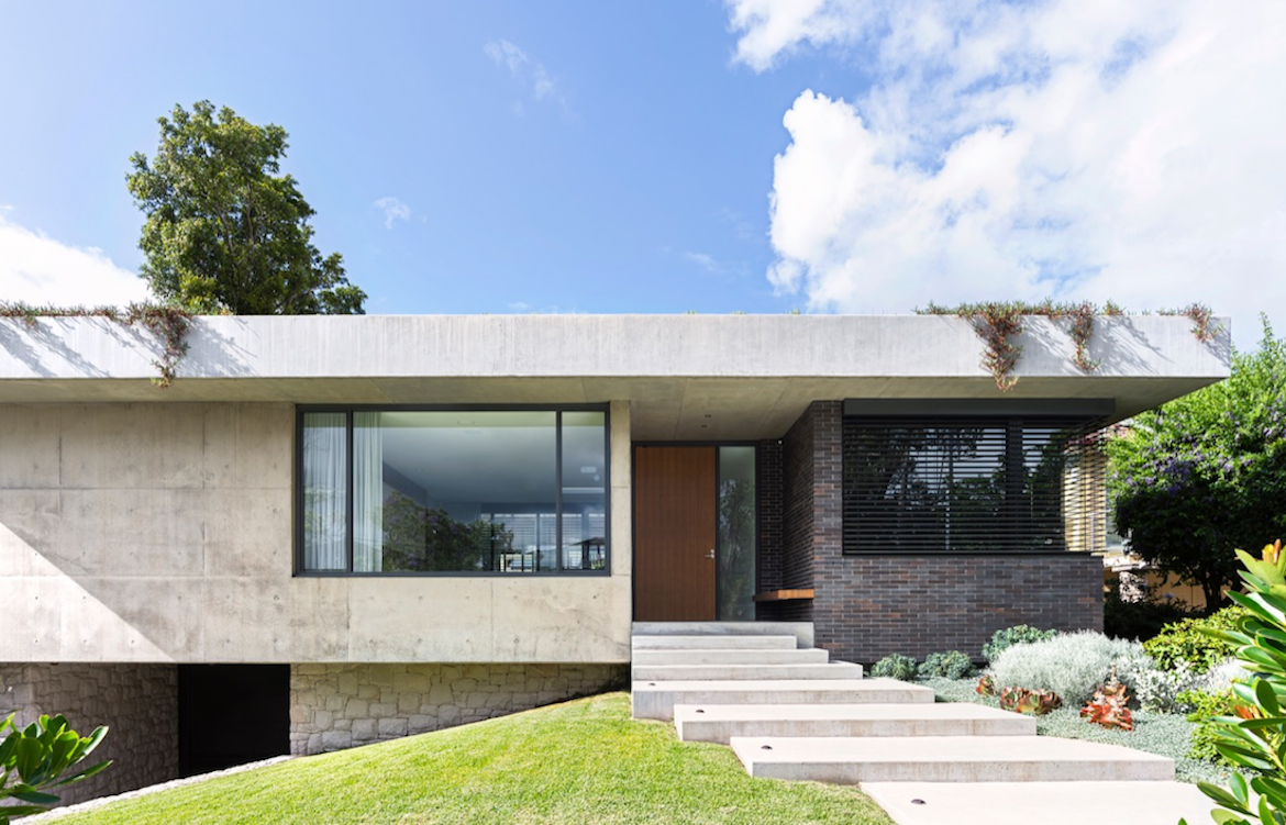
Taking inspiration from the 1968 film ‘The Party’ and works of prominent modernist architect Richard Neutra, Mid-Century House prioritises sleek lines and functionality with a contemporary twist.
The project’s interior designer, Alexandra Kidd was challenged with honouring the classic mid-century modern style, rather than imitating it. In doing so, she created “a minimal tailored interior where form follows function”.
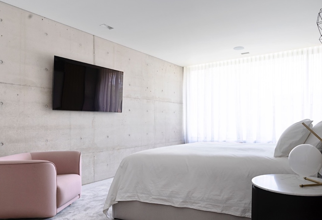
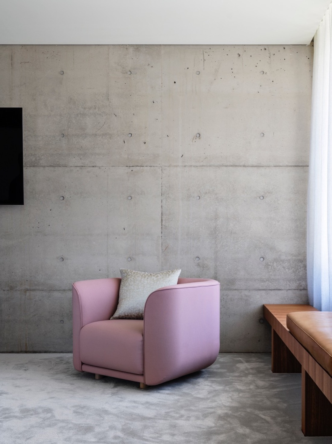
“It was all about finding that balance between softening the home, so it was comfortable and liveable while still allowing the architecture to be the hero of the home,” says Kidd.
Organic materials are used throughout the house, bringing a softness to what would otherwise have been somewhat cold. Fifty different types of terrazzo were sampled before Alexandra Kidd found the one that felt right for the home’s floor.
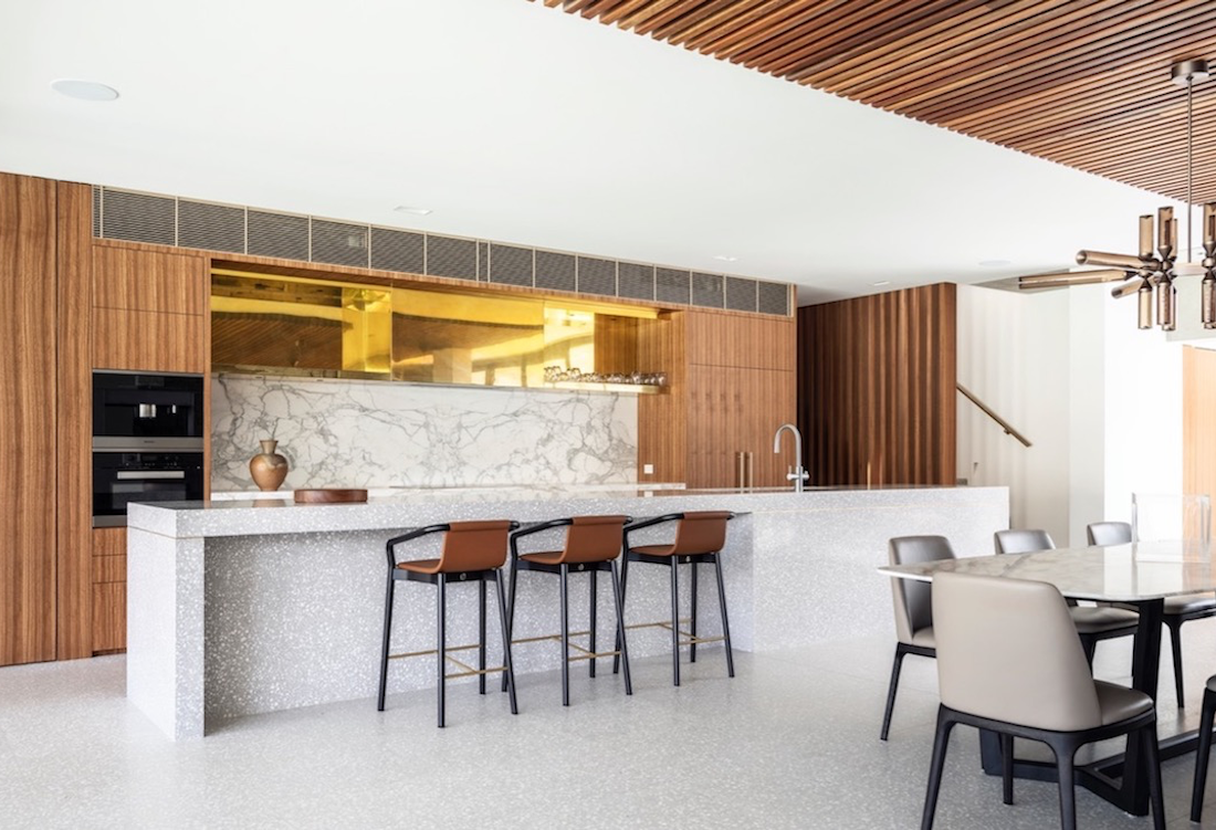
The terrazzo acts not only as a homage to the mid-century era, “but also spoke to the client’s Italian heritage,” says Kidd, making it an ideal base for the home.
The same terrazzo used for the floor was poured to create a bespoke kitchen island and along each step of the terrazzo staircase is subtle brass inlay detailing.
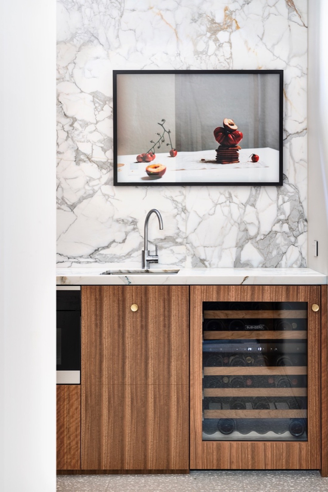
Sustainably sourced Australian timber veneer lines the kitchen cabinets and “provides the perfect contrast” according to Kidd; being a warm touch against the concrete and terrazzo floor.
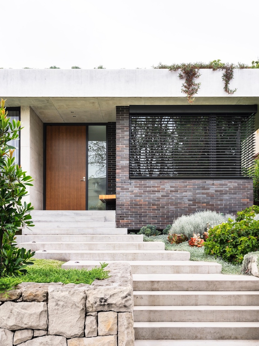
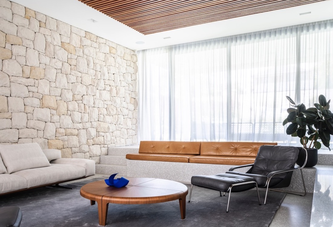
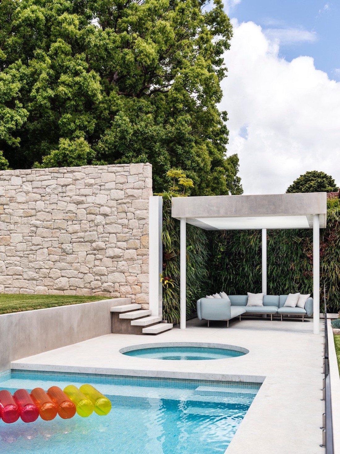
The façade of the house is a minimalist cement structure. A flat cement eave extends out above the façade and plant tendrils hanging from above trickle down to bring an element of nature. A low stone wall forms the property boundary and the stone motif is repeated at the entrance to the garage and internally by the living room.
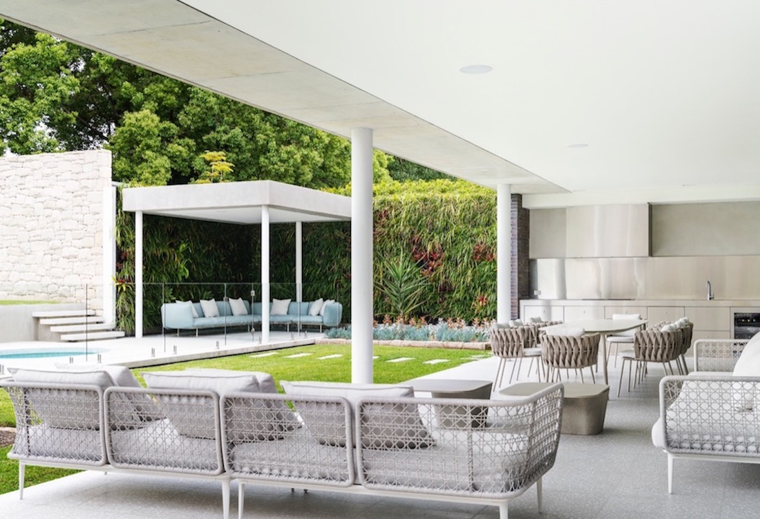
Bringing elements from the exterior to the interior is a theme through the house, reflecting the typical mid-century modern emphasis on bringing the outdoors in. As such, the courtyard is a centrepiece of this property, with the house built around it.
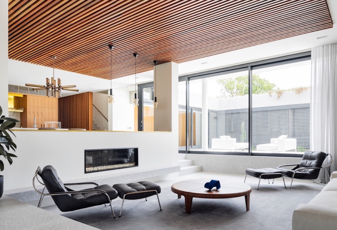
For Kidd, the focus was to “incorporate some of the external finishes of the house into the interior space, blurring the lines of interior and exterior, particularly with the inbuilt courtyard”.
The courtyard, which forms the central hub, is encased by full-height sliding doors, and can be accessed from multiple rooms. The main ensuite, for example, opens to the internal courtyard, allowing the home owners to feel as if they are showering outside.
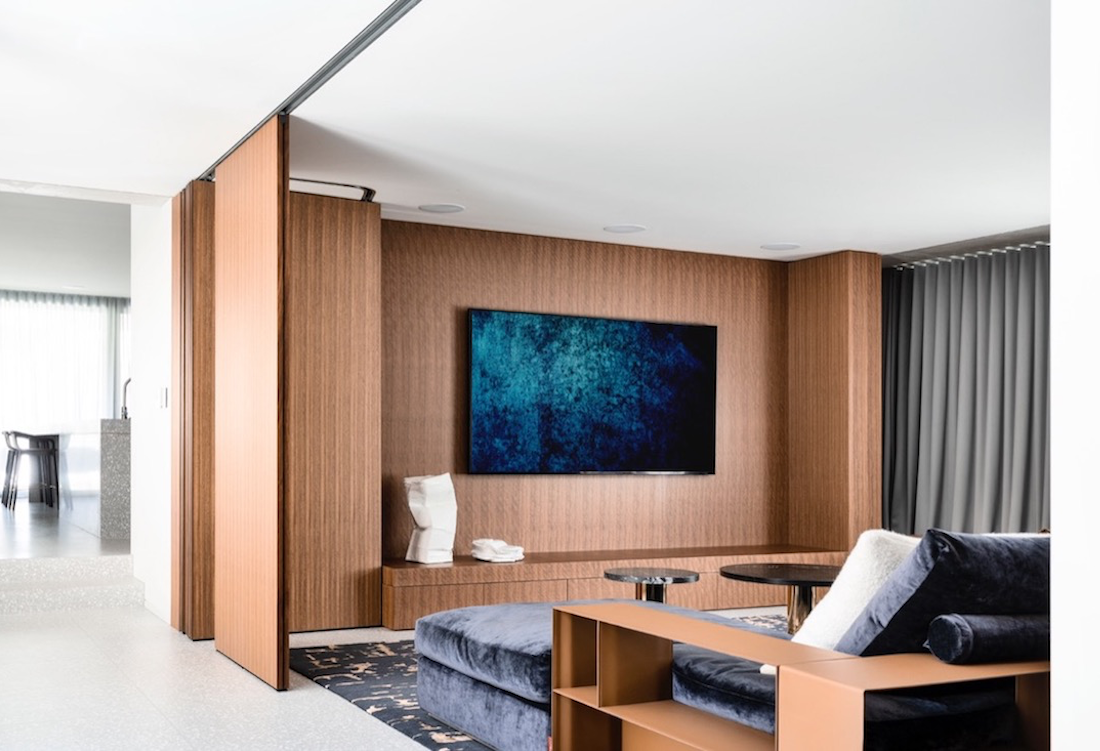
The TV room also has large operable doors disguised to allow it to be opened and used as an entertainment area, or closed off to become a quiet, intimate cinema.
The living room is subtly sunken, a reference to the mid-century sunken conversation pits popularised around the time of the 1952 Miller House. The delineation of the living spaces means that although there are no walls, the space is open yet feels grounded and defined.
“It is my duty as a designer to understand who my client is, what they are looking for, and how they want to live, so I can create unique spaces that reflect their lifestyle in every way,” says Kidd.
Project Details
Design: Alexandra Kidd
Architecture: SRAI – Scortis Rajaratnam Architecture & Interiors
Photography: Justin Alexander
Did you enjoy this story? You might be interested in the Eames Lounge: A 1950s design icon.
