So what happens when an architect is given free reign to design their own home from scratch? Joanne Goh speaks to Architect Theodore Chan, Director of CIAP Architects, on his experience.
Joanne Goh (JG): What were your considerations when it came to planning the house?
Theodore Chan (TC): The terrace house typology is such that you only have the front and the back elevation – so the main design challenge is how you bring in light and ventilation through these limited openings.
JG: Did you know what you wanted to do from the beginning?
TC: Yes I definitely wanted to do something different – this is a landed house, so I really wanted to design something that has the feel of a landed house, not a condominium. Many landed houses get broken up into smaller components internally and in the end, they lose the feel of a landed property.
“Very few architects in Singapore have the opportunity to build their own house. It is the holy-grail for an architect… I decided that I just had to do it.”
JG: What is different in this house?
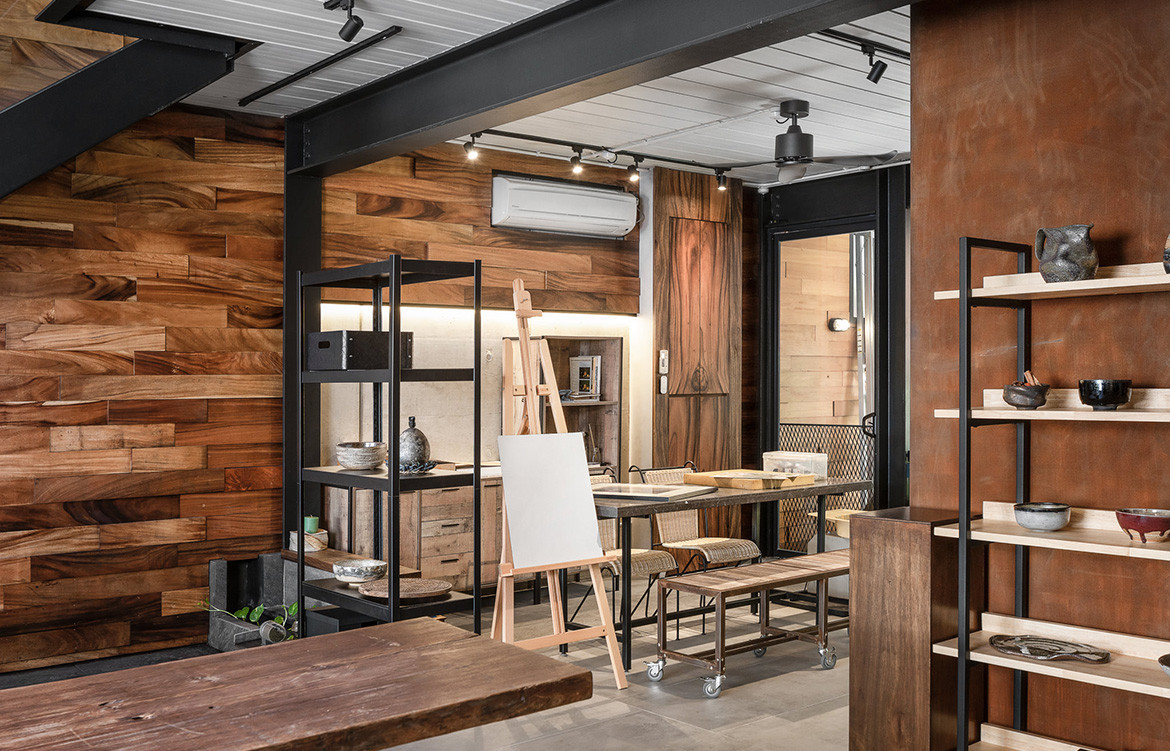
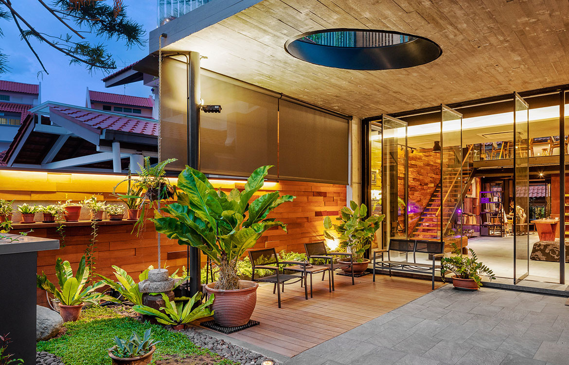
TC: The program was quite different as my better half, Delphine Sng, is a potter and ceramic artist, so we planned the whole ground floor to be her atelier cum gallery/exhibition space.
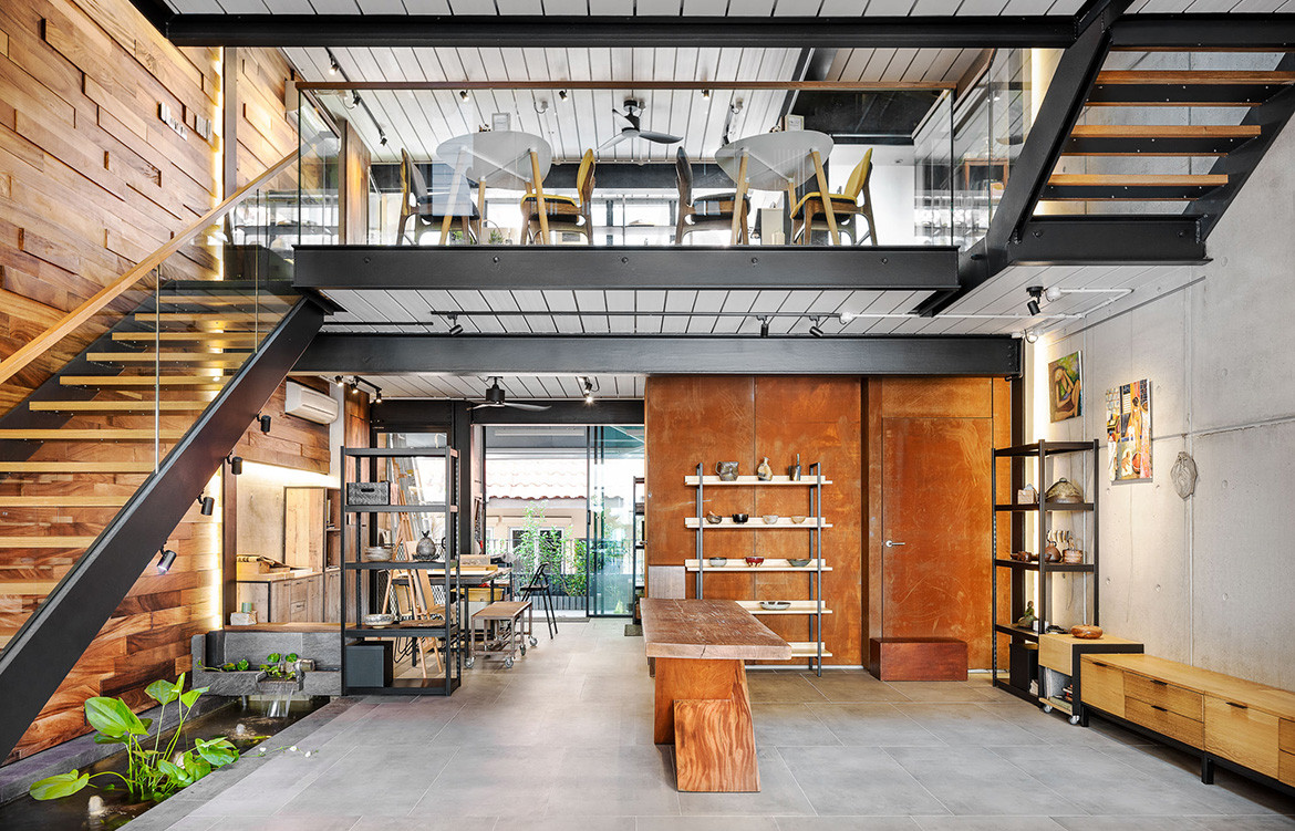
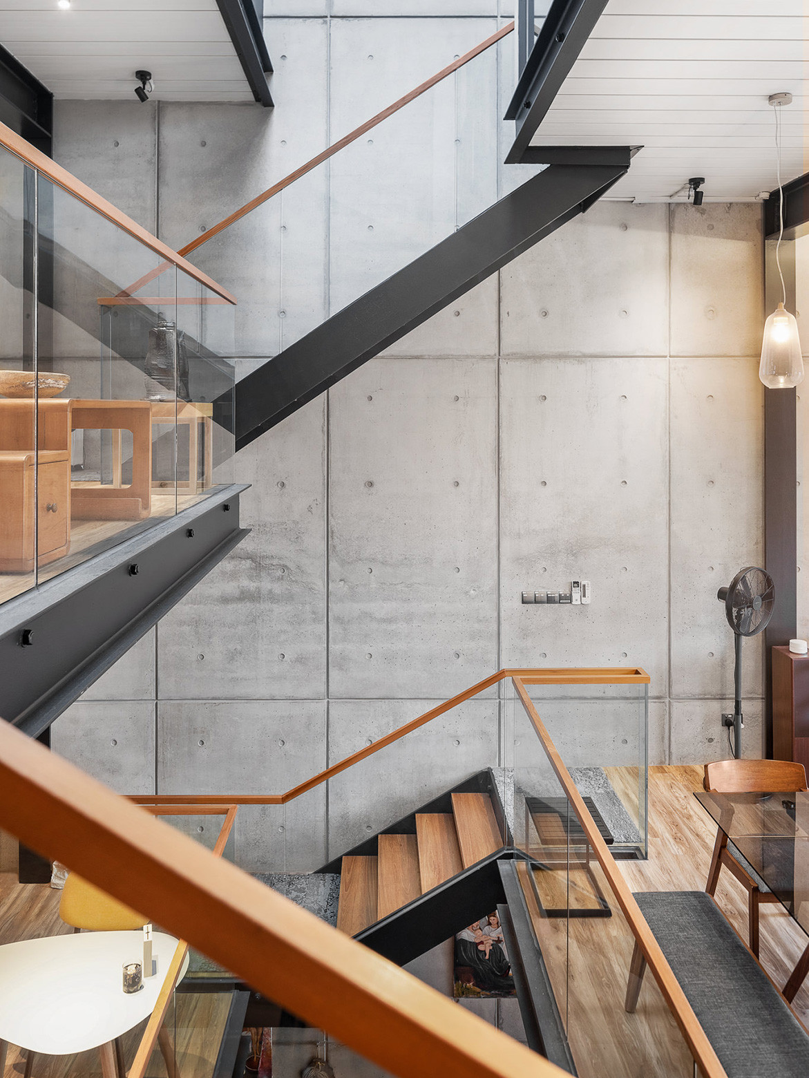
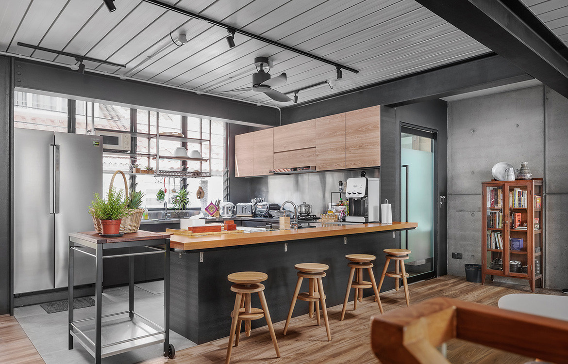
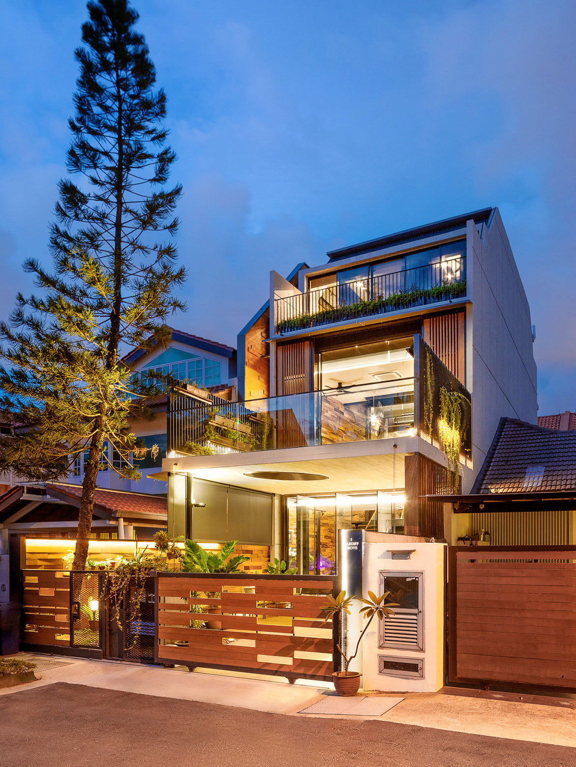
Following a relatively new planning guideline called ‘Envelope Control’, where a building’s perimeter is regulated by a volumetric approach, I created a series of split levels, negating the need for a stair core, which would cut the visual width of the house. The ‘stair landing’ is thrown back into the program, instead of being sacrificed as part of the circulation. Each short flight of stairs ends at a functional space like the open kitchen ‘cafe’ and the living room.
I also used steel structures, which helped do away with ceiling space, enabling me to achieve three lofty levels in front and four lower-height levels at the back. Although it is not a new approach, it is still not the predominant construction method due to its slightly higher cost. However, I do feel that the time and space saved is worth it. Furthermore, the exposed steel decking lends a ‘workshop’ ambience that is fitting with the type of spaces that have been designed.
There is also a water feature in the house that acts as a drainage element. Instead of the usual underground drain running beneath the house, I designed a water feature that also serves as a rainwater management device, which could then overflow out to the public drain.
JG: Tell us a little more about some of the strategies you used to maximise light and ventilation into the house.
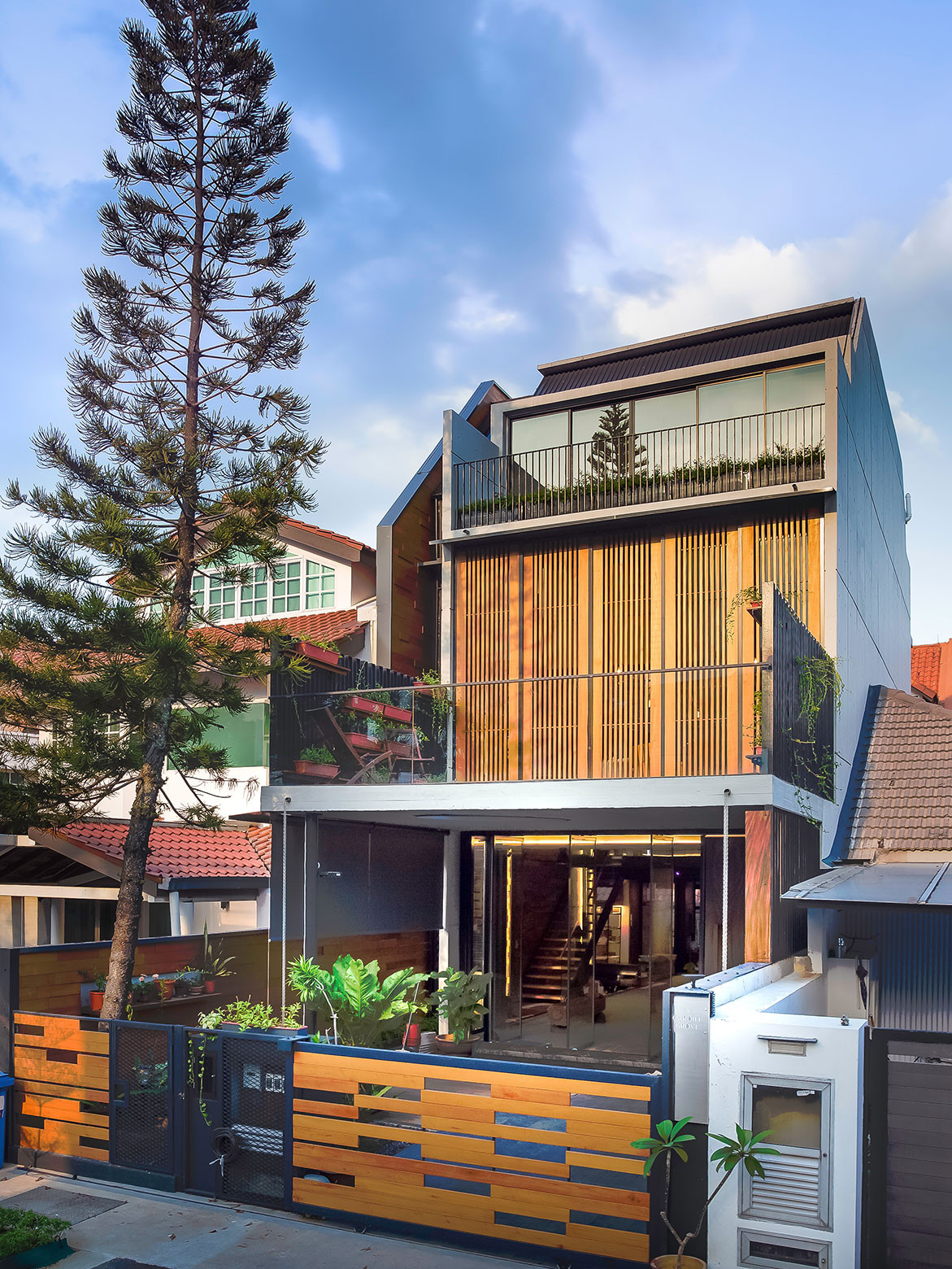
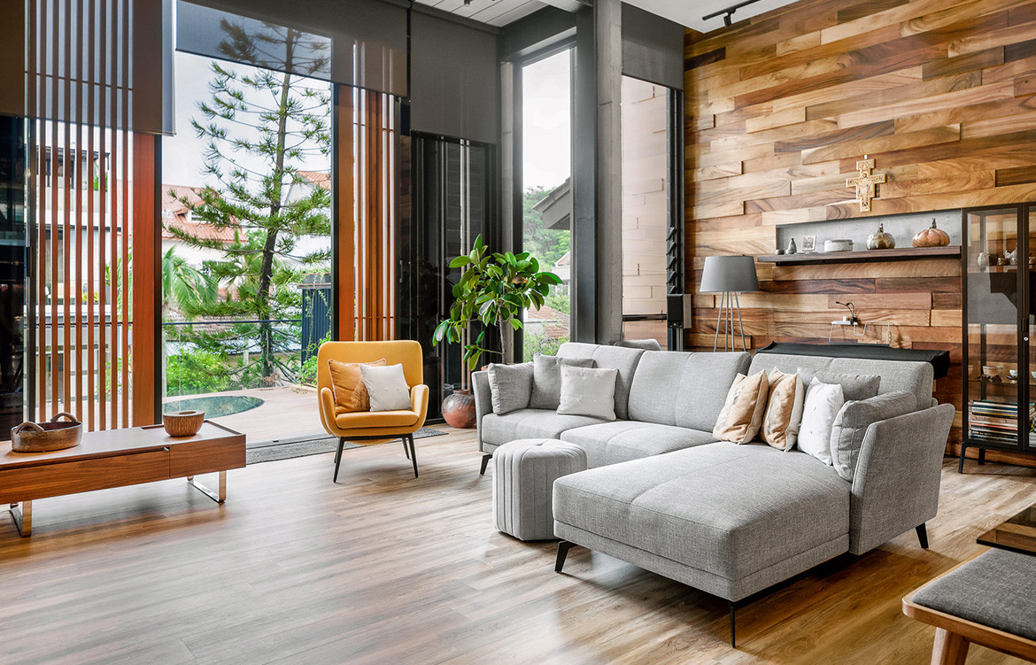
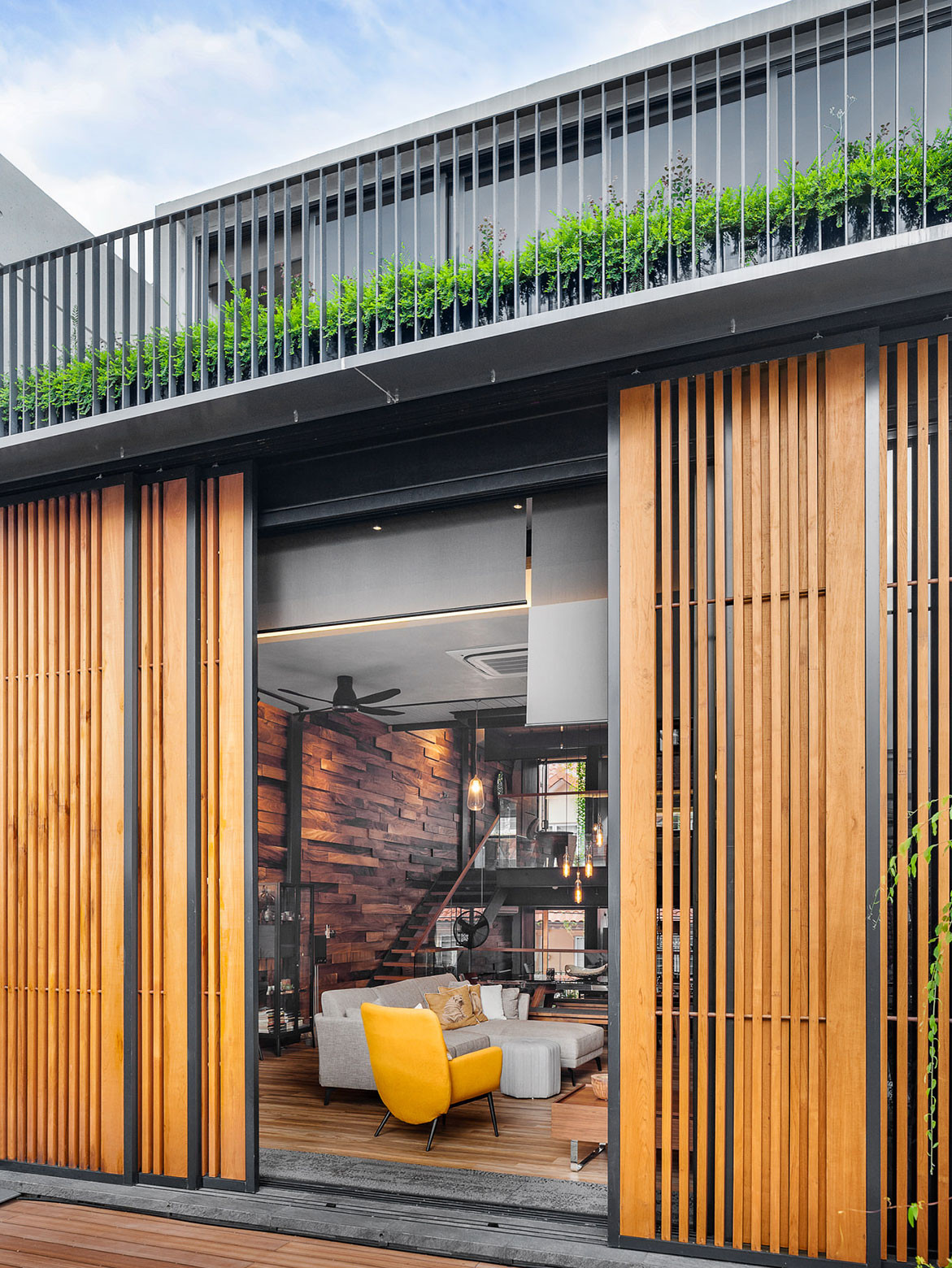
TC: The front facade is west facing, so I used a multi-pronged approach in mitigating the heat from the sun. The first layer is the timber trellis that forms the main facade, followed by coated glass, and finally glare-reducing blinds. I can configure it in different ways depending on the weather situation.
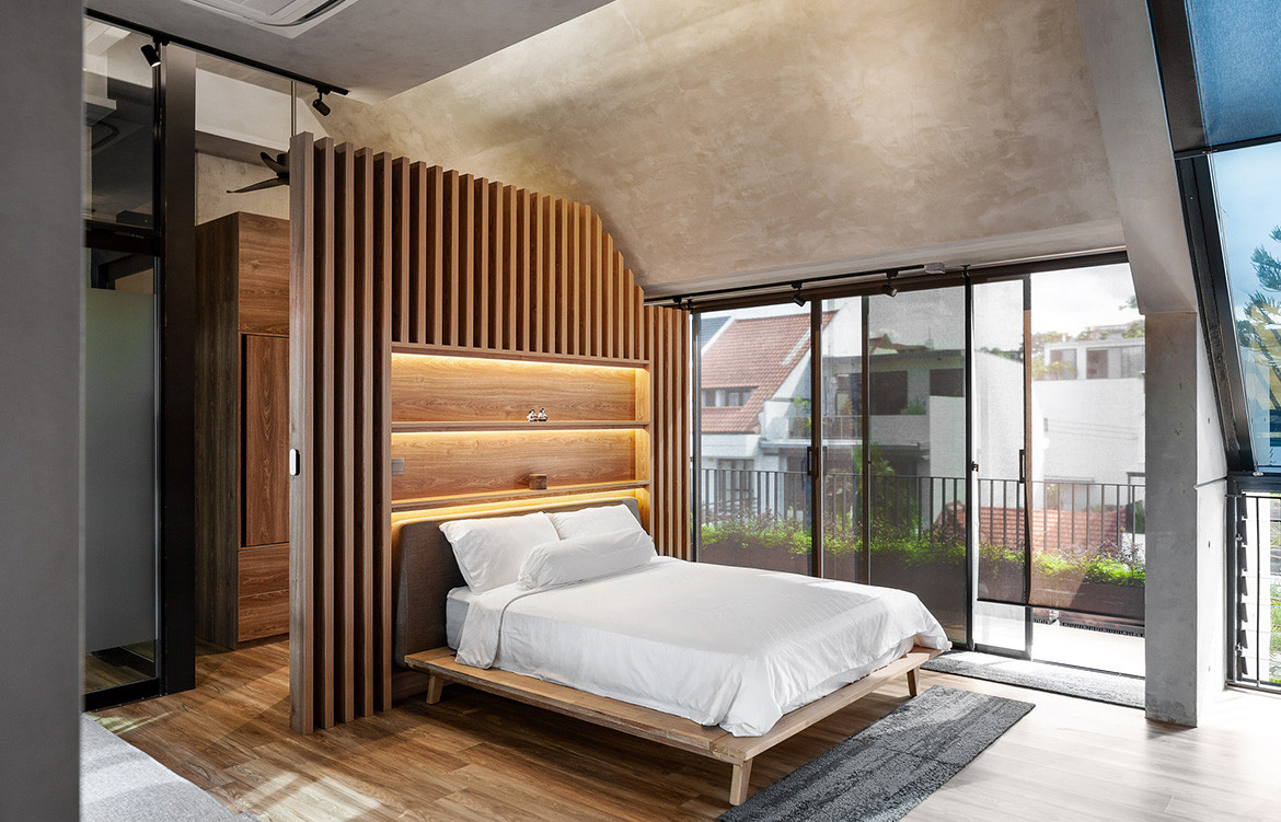
In our kind of environment, the most important element is actually the roof. Thus I used a concrete roof that provides good insulation and protection from the elements. Whatever fenestrations I subsequently designed in were for the purpose of bringing in light and ventilation.
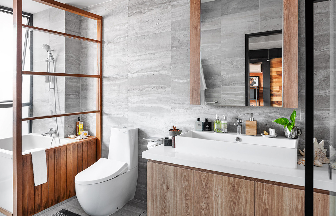
The skylight at the top uses thermochromic glass, which acts like transition lens; when the sun is brighter, the glass turns darker. The skylight is also operable for heat escape via a stack-ventilation effect. Furthermore, there are hardly any walls in this house; the only areas with walls are the bathrooms, which are neatly stacked at one corner of the house.
One downside of the openness is that there is not as much privacy, but I was also fortunate that I was designing a house primarily for only two people.
JG: What was different about the process this time round? Was this house somewhat of an ‘experimental’ house or was it more a combination of everything you wished you could have done but could not do because of client requirements?
TC: In the end, it is a simple house that embodies, where practicable, all that I have learnt and experienced. It was also about how to incorporate ‘low-tech but high-gain’ commonsensical and efficient strategies as much as possible, and to achieve thermal comfort through passive measures.
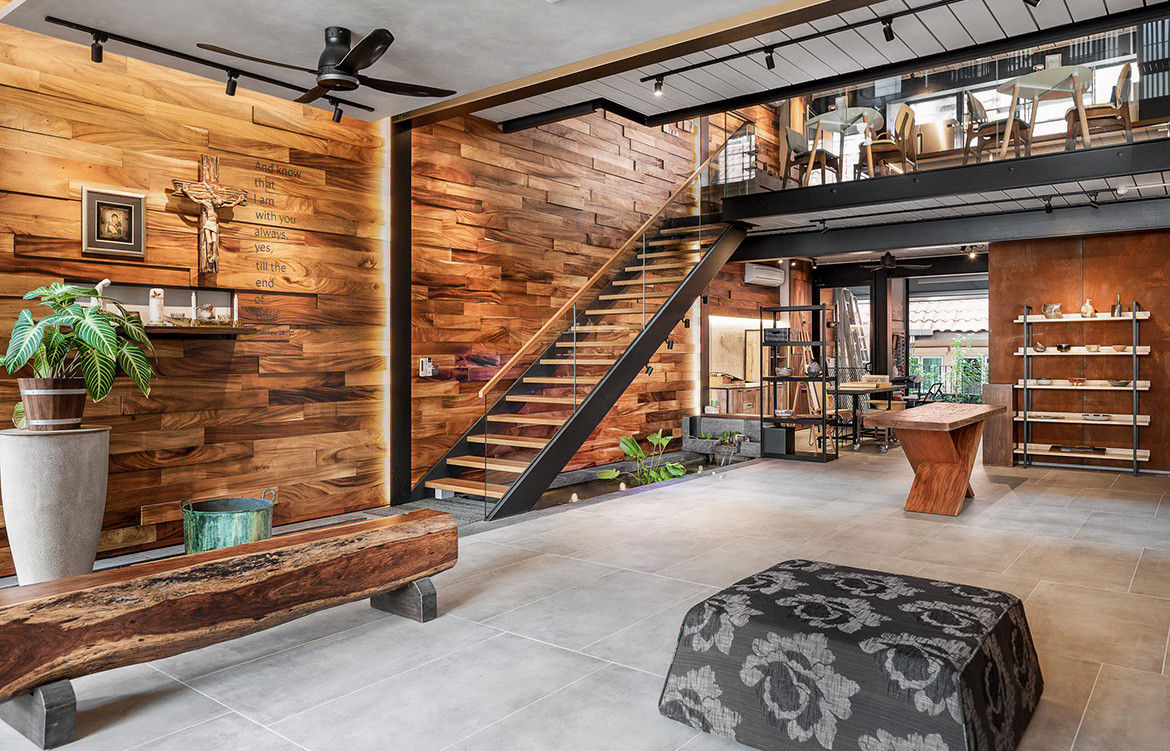
One of the main differences in designing for myself is that I was more daring, as I could pre-empt the outcomes of my ‘experiments’ based on my previous experiences. I also enjoyed great design freedom – down to customising my own door handle using Corten steel and timber. Having said that, Delphine, being an artist, was instrumental in some of the key features of the house. She proposed the use of recycled rain tree wood to fully clad one of the main interior walls. This provided a warm humanistic touch as well as acoustic reverberation control inside the house.
JG: Favourite part of the house?
TC: It would have to be the ‘cafe’ space on the first mezzanine level. As it is at the voluminous intersection between the split levels, it is bright and breezy, and allows for an overall appreciation of the house. That’s where I spend a lot of my time.
CIAP Architects
ciap.sg
Photography by Zee and Marina, courtesy of Theodore Chan
“I visited the house in the middle of the afternoon, and was pleasantly surprised at how cool it was at the top floor, even without any air-conditioning.”
We think you might also like Bathrooms Connected To The Outdoors
