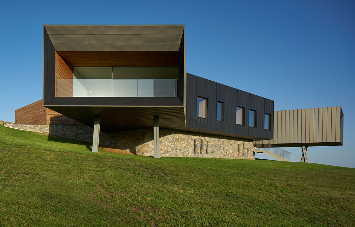
“Our clients are involved in the design and art scene, and had a good knowledge of how they lived and what the house had to achieve,” says architect and designer Andy Carson. “They provided a program of accommodation to be met, which was further developed. For example, besides the number and type of rooms, the house had to provide safety and containment for their young children and dogs and heighten the sense of connection to the landscape – one of the most interesting requests here was a ‘storm-viewing room’ to watch the drama of approaching southerly storm fronts from the over the ocean.”
Given the precarious and somewhat dangerous nature of the site, Andy and team went through rigorous testing with physical and computer models and large drawing sheets all used to ensure the safety of the residents, as well as guaranteeing exact views, passive solar energy systems and architectural geometry hit the mark bang on. Andy explains: “Our clients would often challenge particular qualities of rooms, for example the they requested that each bathroom offer a different experience and different function in the house, so we spent much time collaborating on various configurations and ideas and testing them in a number of different ways. In fact, in terms of detailing, I wouldn’t say we stopped designing until the last moment of construction.”
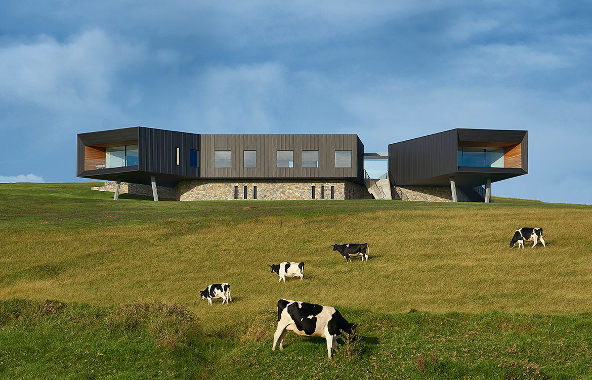
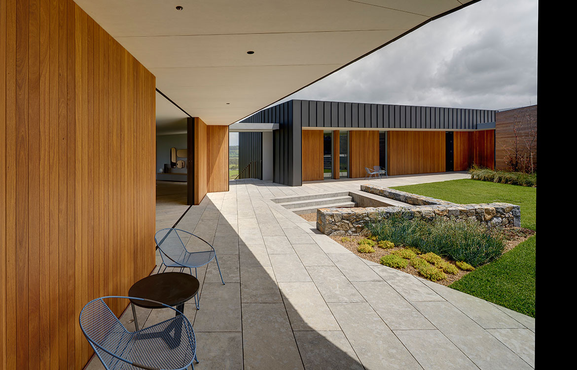
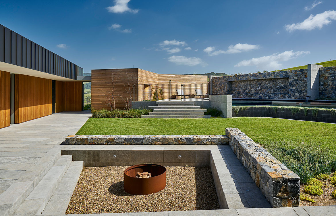
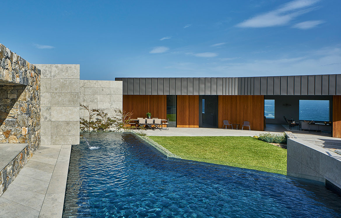
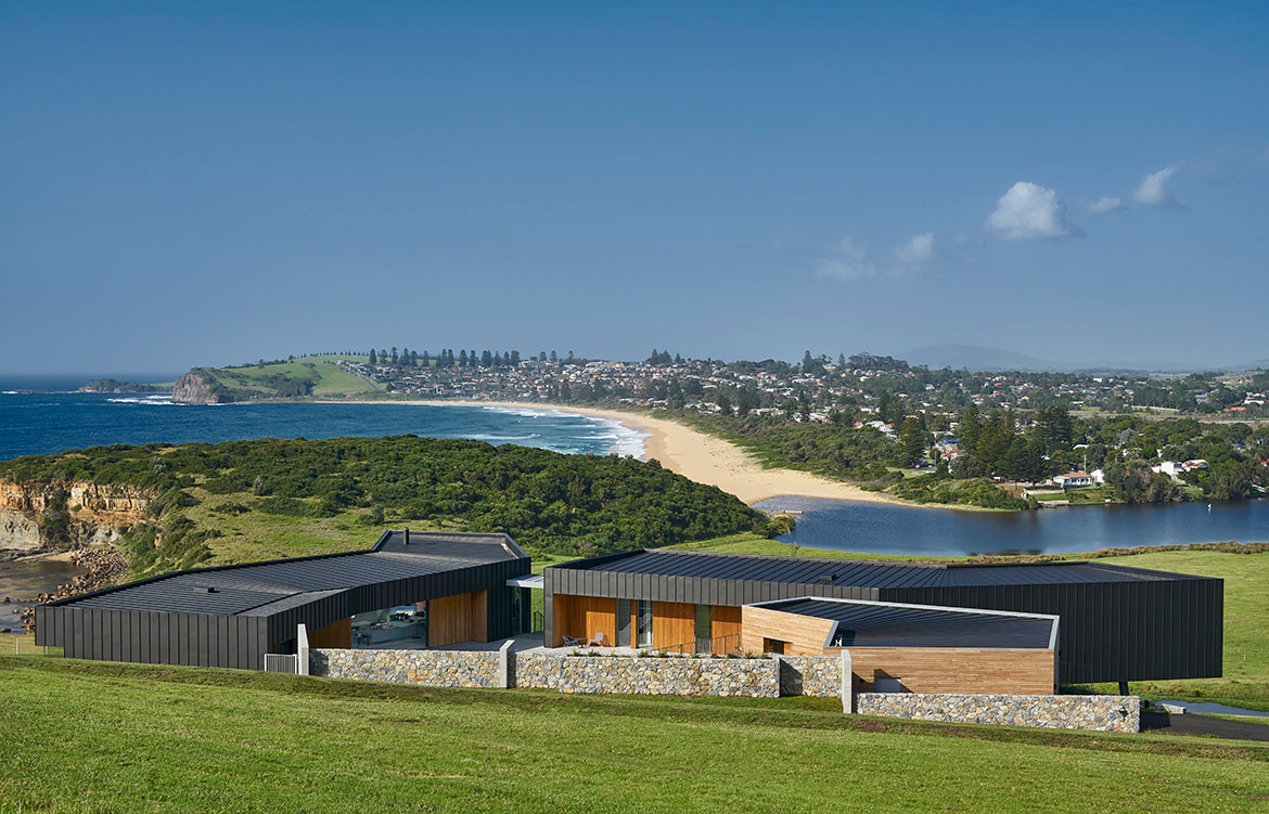
Andy’s primary goal was to create a protected courtyard house, forming an open ‘U’ shape to capitalise on the northern sun. This provides refuge from the bitter southern winds and storm fronts typical of the area. Large retractable sliding doors allow fine tuning dependent on weather conditions. The pavilions are heavily articulated, morphing and twisting whole volumes toward view, sun and protective opportunities. With such vast views the idea was to create very specific alignments to create powerful and memorable images in the mind of the occupants.
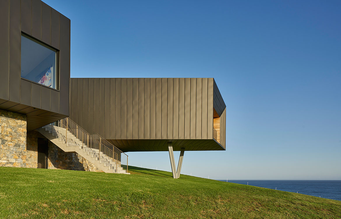
Often when a building has wall to wall glass and only faces one direction, it can become tiresome and leaves the observer feeling disconnected. According to Andy, much time was spent carefully aligning every window to very specific framed views and their precise composition. “We took compass headings, aligned satellite images with detailed surveys to ensure the various points of interest were captured,” he says. “The extreme ends of the two main pavilions focus like telescopes on the ocean and the farmlands respectively, while the bedrooms offer built in window seats and other personal moments for reflection.”
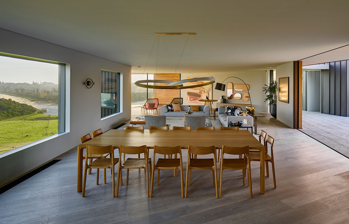
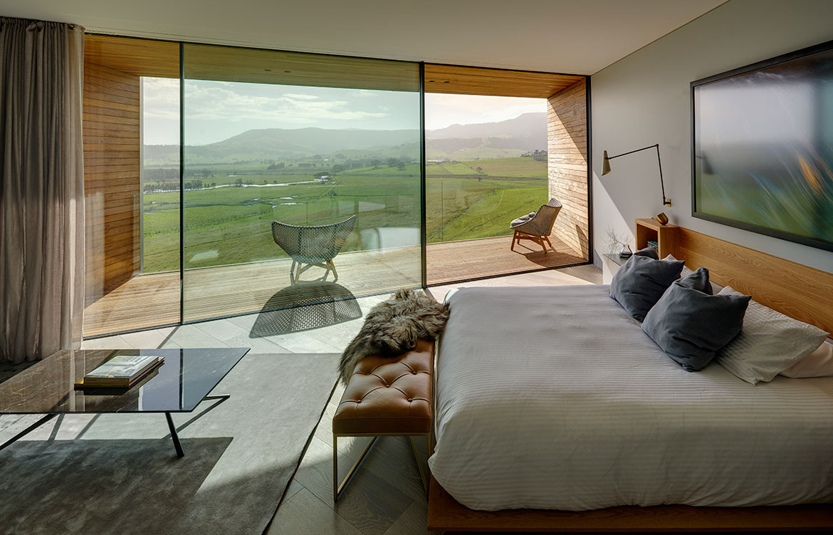
The detailing is “painstakingly minimal,” says Andy, to give a calming uncluttered feeling. “We were interested in the house being a very dynamic place for occupants to move through and but be quite dynamic when viewed as an object in the landscape. For example there are many optical refinements in the house such as the tapered ‘forced perspective’ hallway and the out of parallel walls of the main living area all subtly playing with how the users perceive the landscape.”
Externally the whole building shape constantly changes as one moves around it and elements like the angled columns – sometimes looking like they form a wishbone ‘V’, at other angles like an ‘X’ and yet at other like two separate parallel columns. The house can be viewed from above and below, so every surface is on show and had to be highly detailed. The black metal skin wraps the roof, walls and underbelly with geometric precision. Andy notes that: “The house was very much designed for the user-experience from the inside out, however the resulting negative space between the pavilions also had to work and provide inviting outdoor spaces.” Here, converging walls create canyon like spaces that lead inhabitants into specific pinch points that then open out again into private outdoor space.
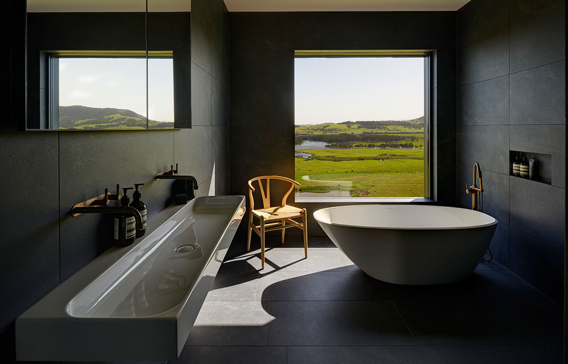
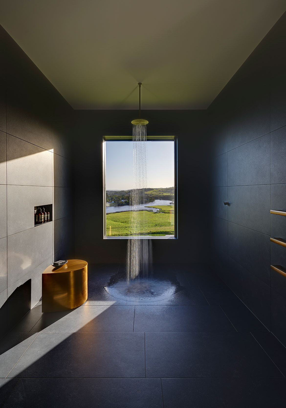
Being such an unusual site, Andy’s design had to be 100 per cent site responsive, to the most extreme extent. Andy himself notes that: “Landscape is king!” and how the whole design was governed by the site conditions with its problems and opportunities. Throughout the process, Andy continuously asked himself “How best to provide protection and still maintain a strong sense of connection to the landscape,” and “How to strengthen and heighten the sense of place and enhance the experience of being in this unique farm meets the ocean setting”. Fully exposed on an elevated position facing south, the idea of creating a courtyard space came fairly quickly providing a protected and private inner sanctum with huge prospect across the 150-acre property and to the greater landscape beyond.
The result of Andy’s intensive research and development is a home that allows an an art-and-design-loving family who love a bit of danger and excitement to live their best residential life.
Atelier Andy Carson
atelier-andycarson.com
Photography by Michael Nicholson
Dissection Information
Oak floorboards from Royal Oak Floors.
Chalford Limestone paving (in courtyard) and Wamberal free form natural stone (in courtyard and podium) from Eco outdoor.
Bisazza mosaic pool tiles from Academy Tiles.
Solid American Oak joinery in living areas and bedroom window seats from Britton Timbers.
Prefa ‘Prefalz’ Aluminium standing seam (for external cladding) from Craft Metals /
The Copper and Zinc Roofing Company.
Double glazed sliding doors, windows and pivot doors from Vitrocsa Australia.
Fritsjurgens door hardware from Bellevue Architectural.
Stone benchtops from Caeserstone.
Door hardware throughout from Halliday + Bailie.
Malloy table and chairs designed by Adam Goodrum for NAU from Cult.
Delphi Modular sofa designed by Hannes Wettstein for Erik Jorgensen from Cult.
Slow Chair designed Ronan and Erwan Bouroullec for Vitra.
Volley Chairs designed by Adam Goodrum for Tait.
Delta Light and Christopher Boots light (over dining table) from INLITE.
NJP Table lamp designed by Nendo for Louis Poulsen from Cult.
Brodware plumbing fittings throughout from Yokato Tapware.
Basins from Studio Bagno.
Victoria & Albert freestanding baths from Candana.
Miele ovens, cooktops and microwave from Winning Appliances.
Zip tap from Winning Appliances.
Ergo Focus fireplace from Oblica Fireplaces.
We think you might also like 5 Architect-Designed Homes You Can Stay in Now
