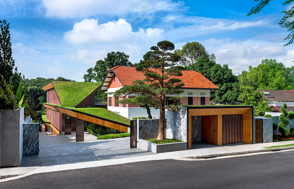
An aerial view of this Hidden House in Singapore reveals green lawns that blend into the forest along its southern perimeter. But from the street, its sprawling 28,000-square-foot premises are curiously hidden from view. Pan Yi Cheng of Produce and Tay Yanling of TA.LE Architects meet us at the gate and show us around the house that they designed in close collaboration. “Some asked us, ‘Why did you design a house that is hidden and cannot be seen?’” Pan recalls. “But one day the client told us the house reminded him of a Chinese idiom – nei you qian kun (内有乾坤). It means there is more than meets the eye, more to be discovered, which he appreciated.”
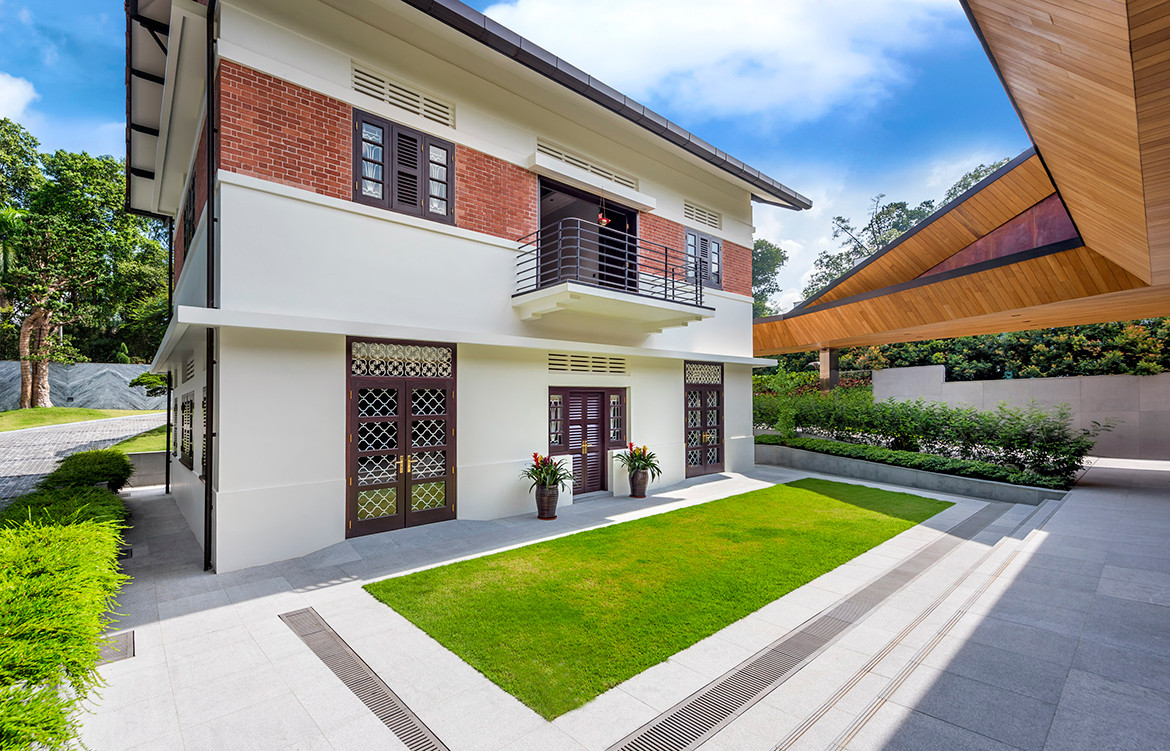
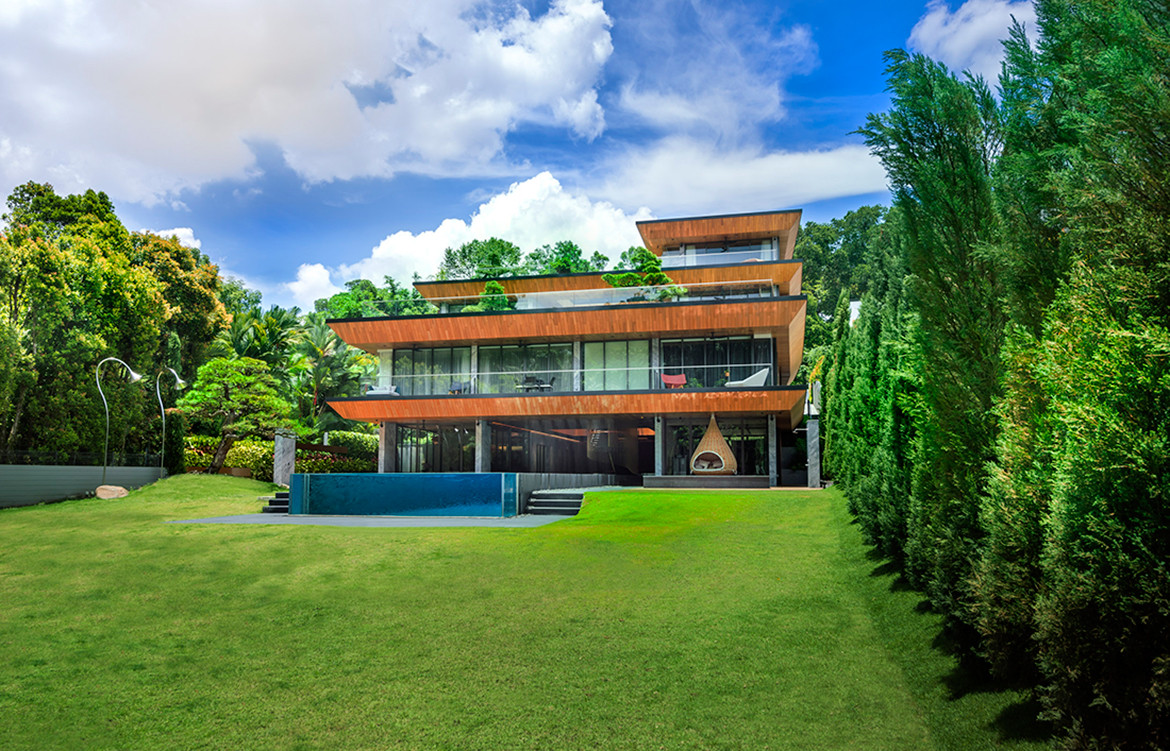
Indeed, a sense of aesthetic restraint and modesty is perceptible here – uncommonly so for luxurious good-class bungalows of this scale. The main gate slides open to reveal a faceted ribbon of green grass wrapping around a conserved bungalow. The ribbon unfolds as a new timber and copper volume that houses the main living spaces.
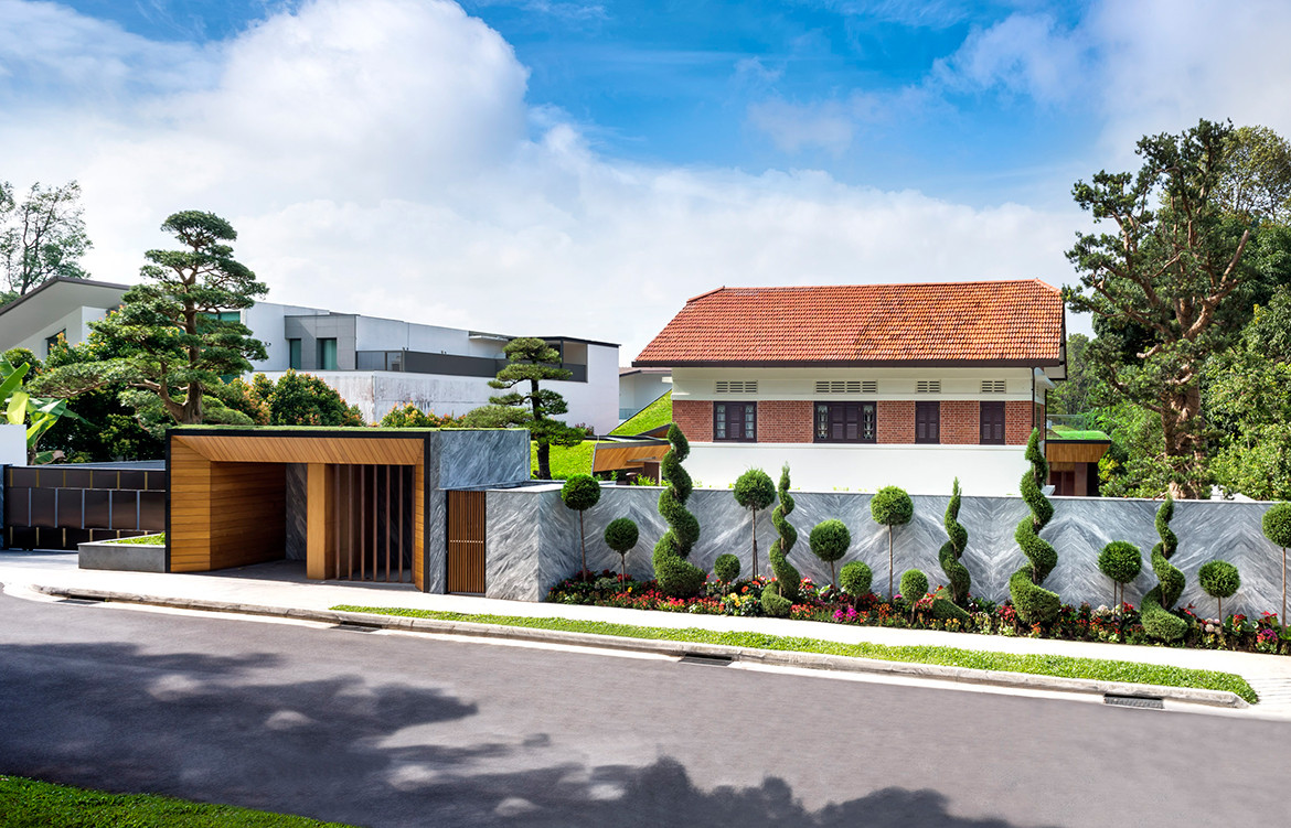
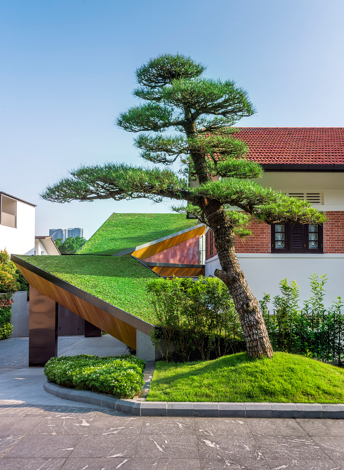
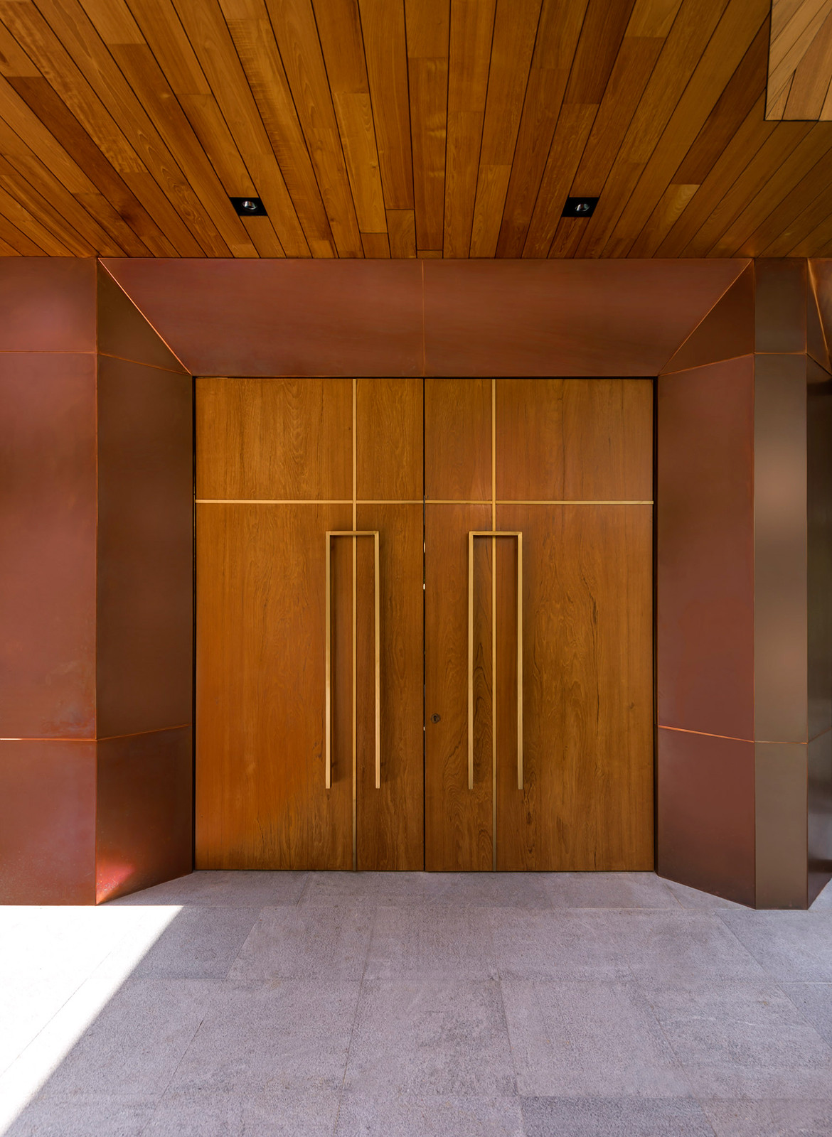
Produce and TA.LE Architects were invited to a closed competition, and within eight days presented a scheme with a model and plans (but no perspectives) that won them the commission. Their proposal offered a conversation between the conserved bungalow, built around 1943, and their addition – an unfolding volume punctured by courtyards that convey natural light deep within. Materials were chosen that pay homage to the palette of the conserved bungalow; auburn copper panels reference the reclaimed terracotta roof tiles, for example.
“For residences, what’s important is that we’re not Rem Koolhaas living in a Zaha Hadid house,” says Pan, emphasising that the personality of the owner matters. “This Hidden House has many straight lines, and is actually a lot like a Chinese quadrangle house, or si he yuan (四合院). The owner is rather structured as a person – not so flamboyant – and the building suits him. It’s quiet, subtle, very grounded. Everything unearthed is expressed.” He muses that the unusual zig-zag timber panels on a basement wall recall excavation markings.
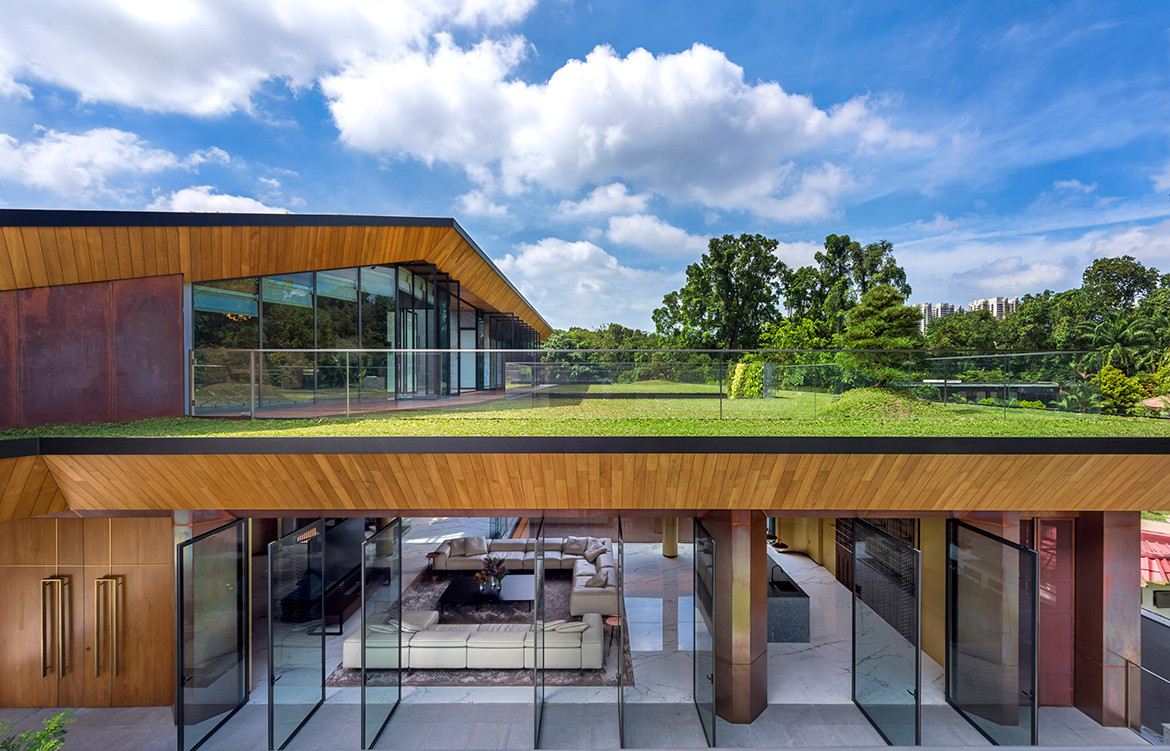
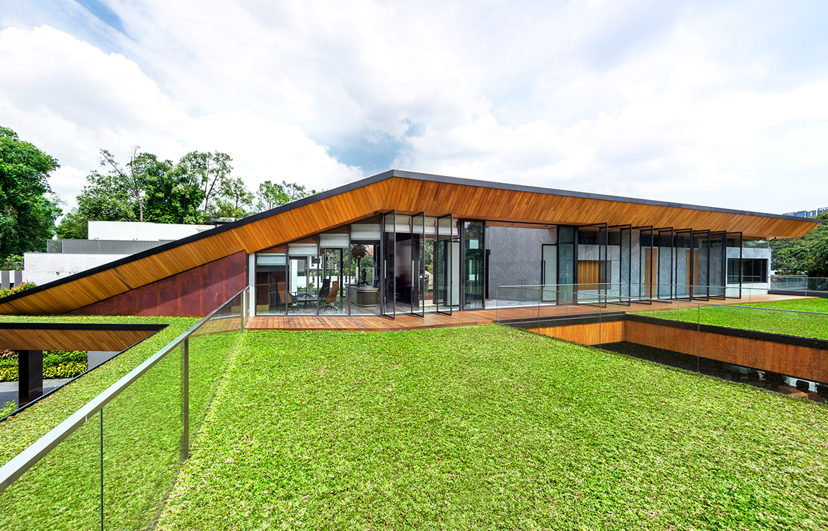
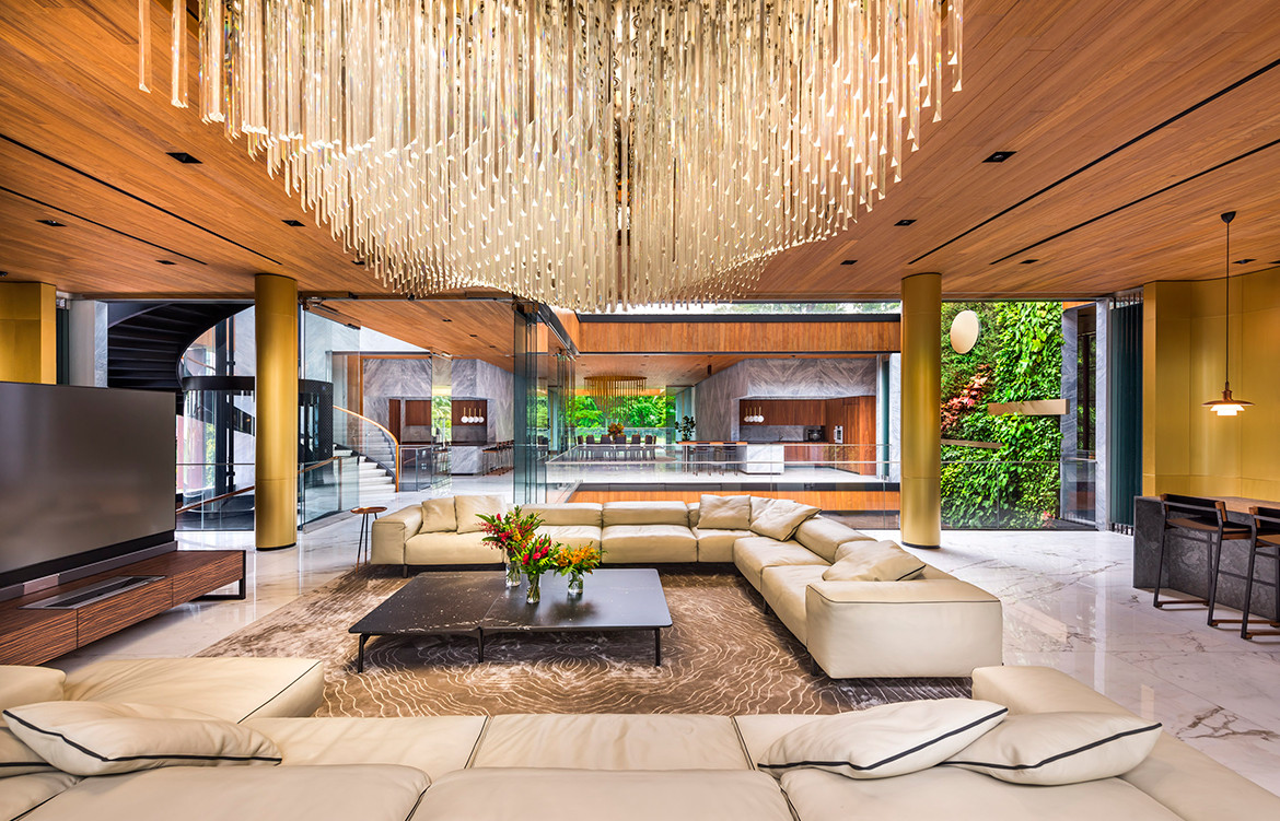
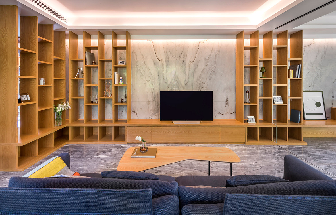
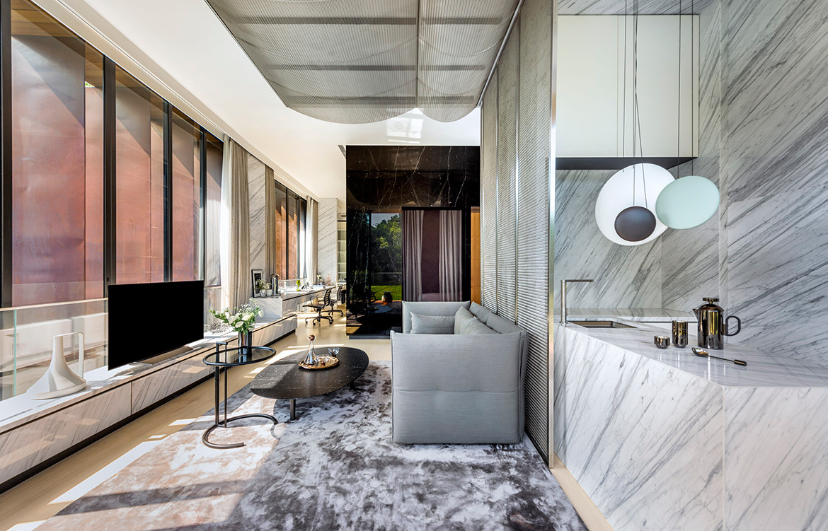
With Hidden House, the client took a risk and specifically wanted to work with a young team that would be willing to test new ideas with him. In turn, Pan and Tay were open in sharing their ideas, including their understanding of true luxury. “In most good-class bungalows you see opulence creeping in. But we spent a lot of time trying to reduce things. It’s the natural expression of things that is actually the most luxurious – a 2 by 1.7-metre slab of marble book matched very well in the living room is actually harder to achieve than the addition of embellishments. Gradually, the client was convinced and trusted us.”
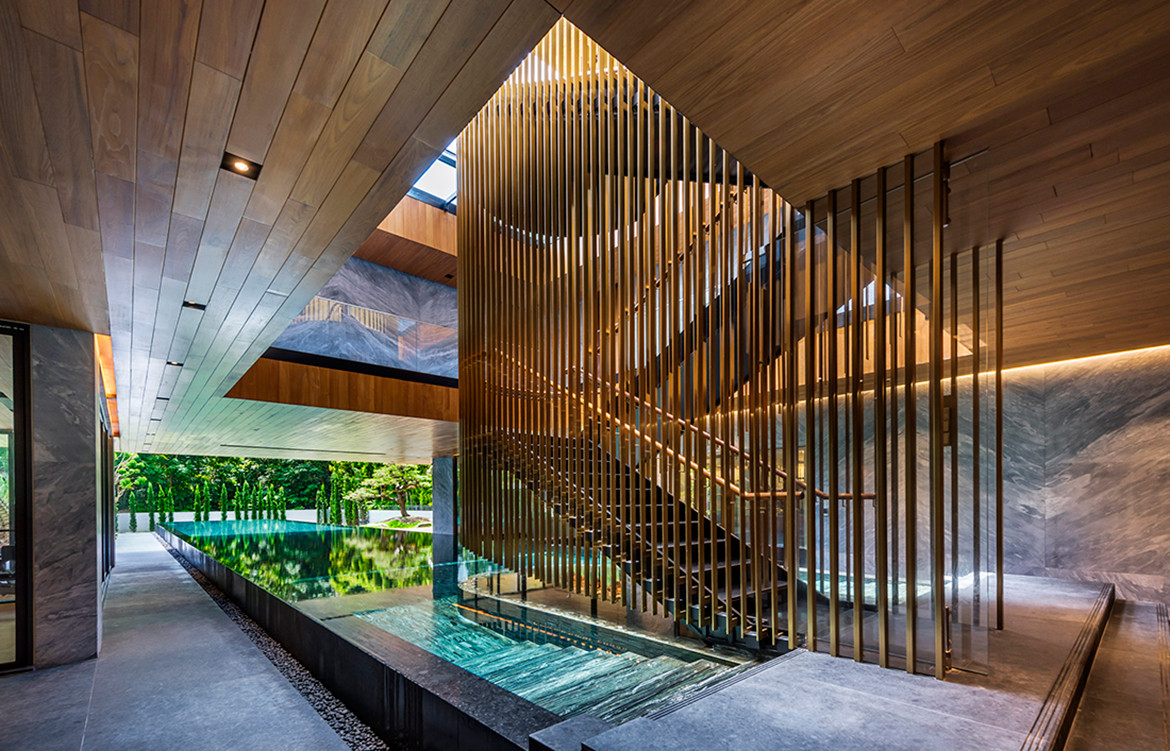
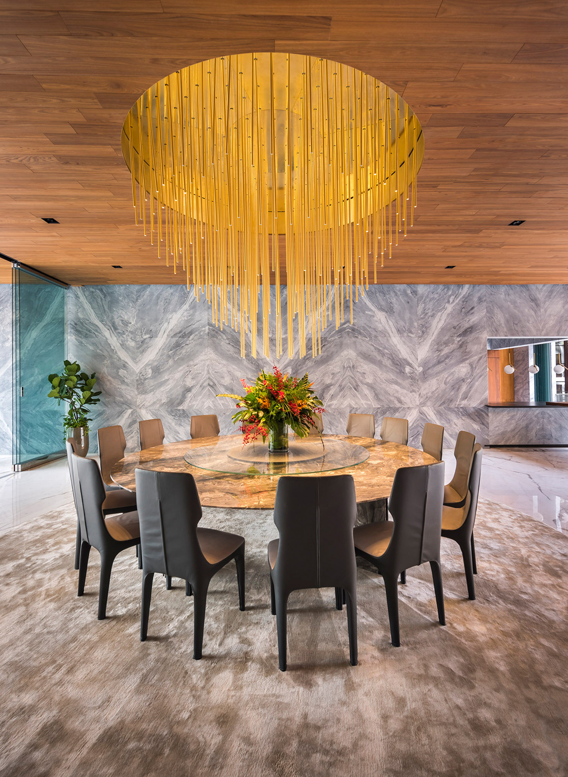
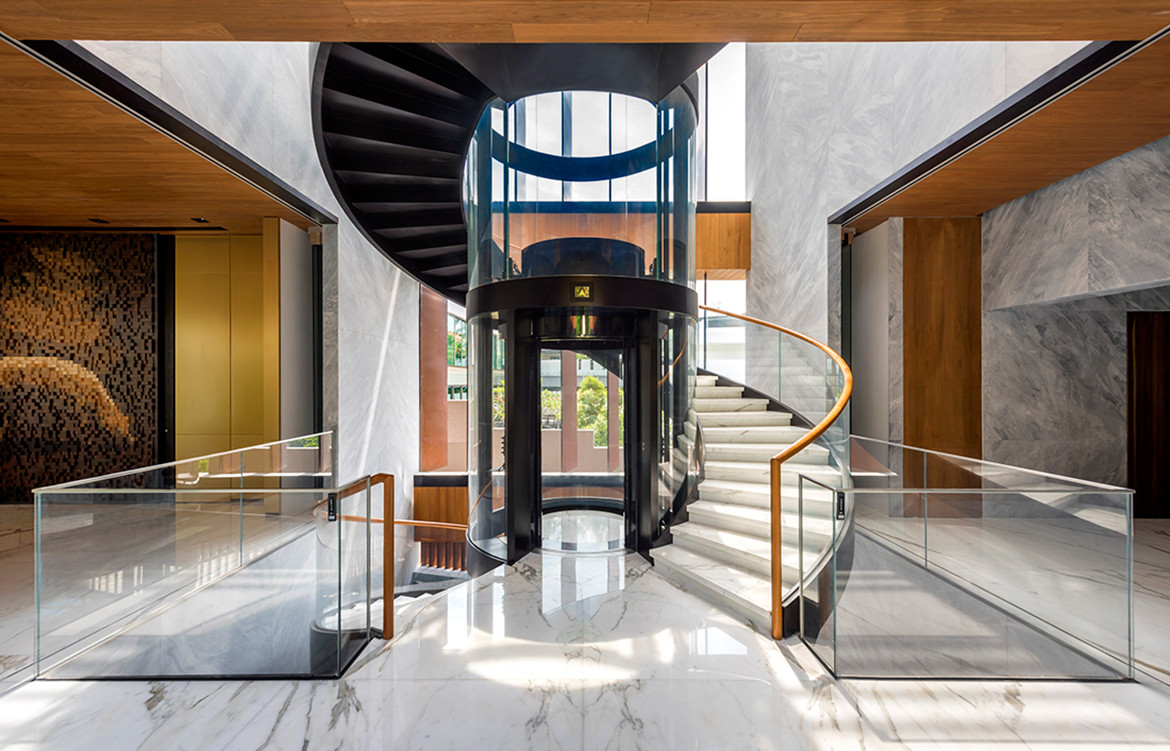
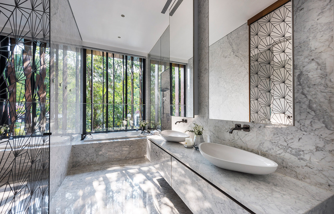
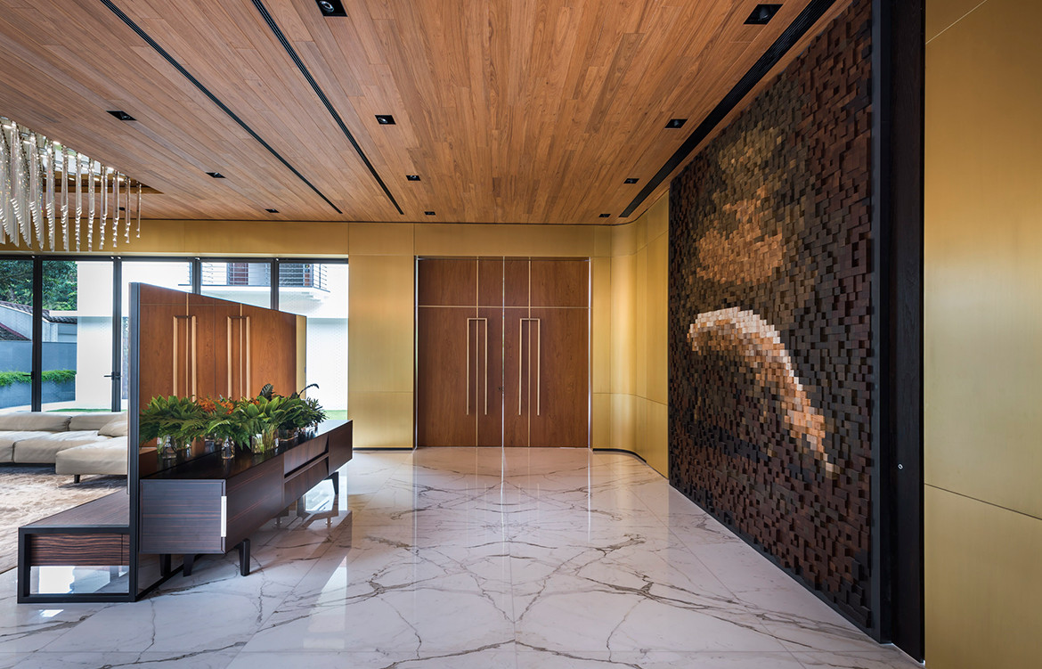
The open communication paid off. The consistency in the finishes used throughout the house eloquently ties the experience of many spaces into a seamless whole. A leathery ocean-grey marble tastefully clads the walls of the dining hall, along with cool slabs of book-matched Calacatta marble flooring underfoot. The dark tones of grey granite on the floor contrast with warm teak ceilings.
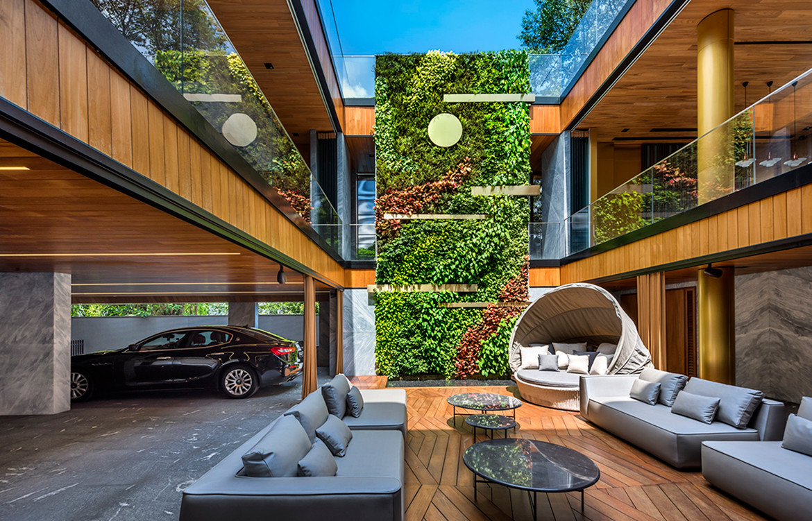
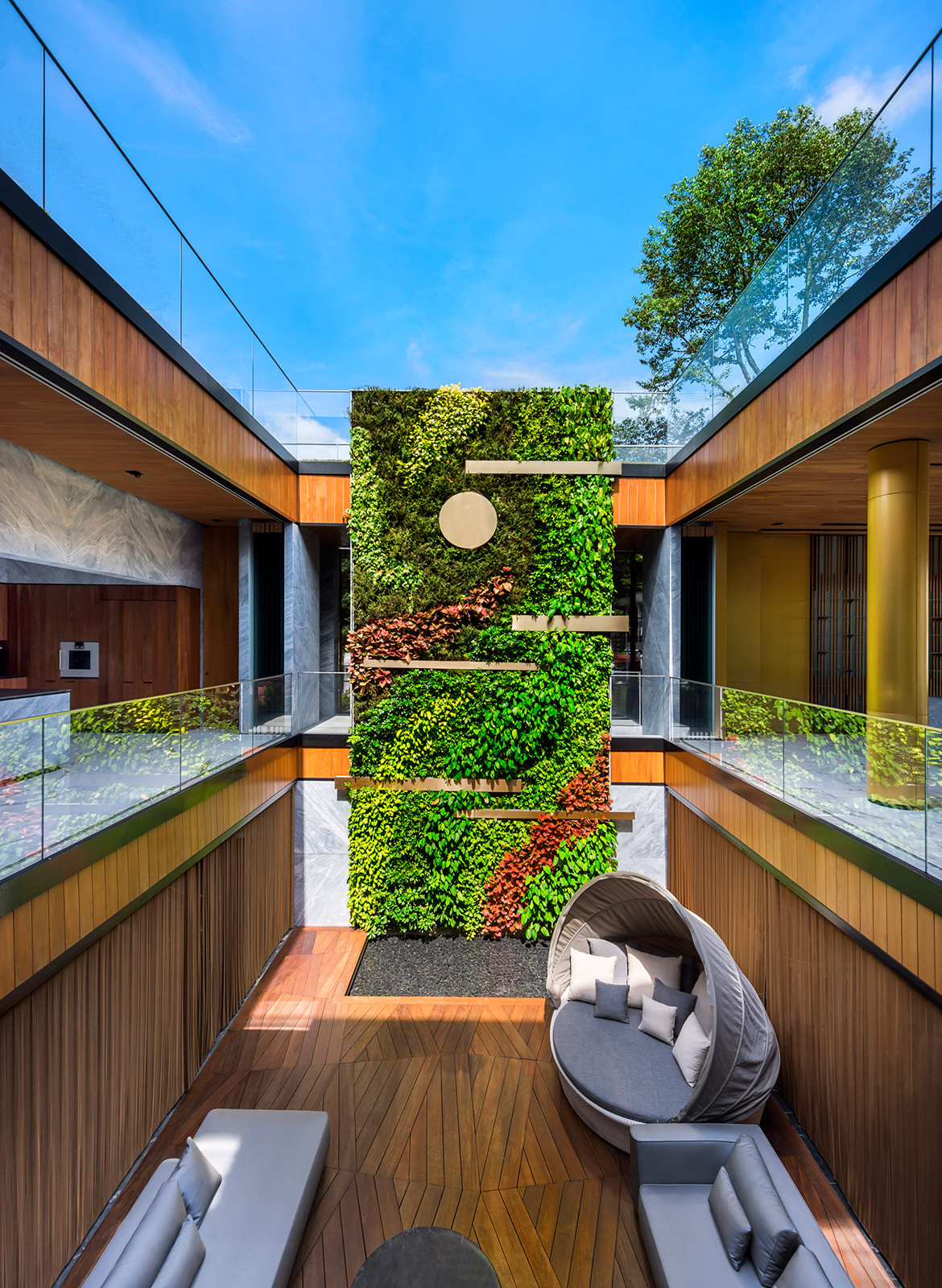
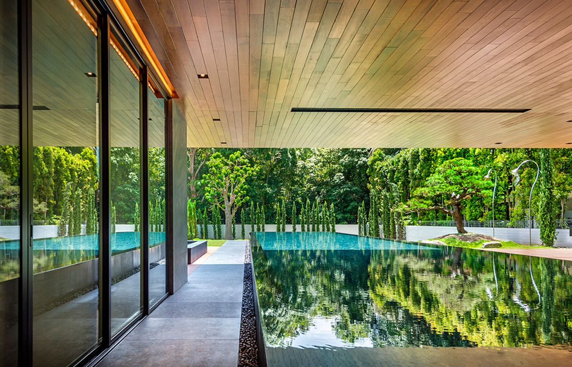
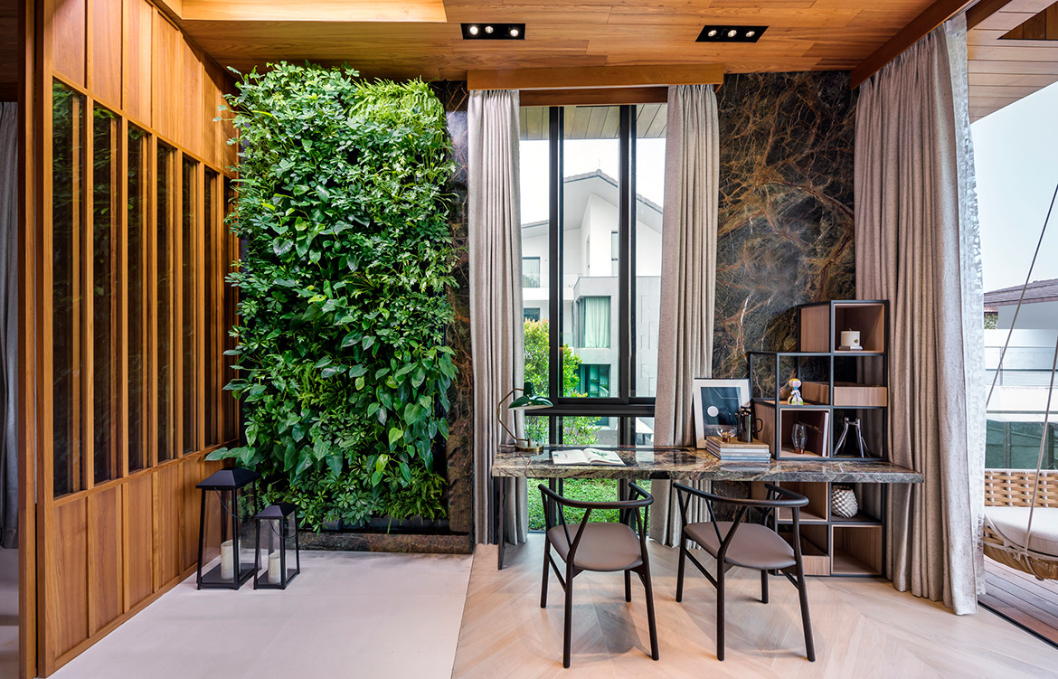
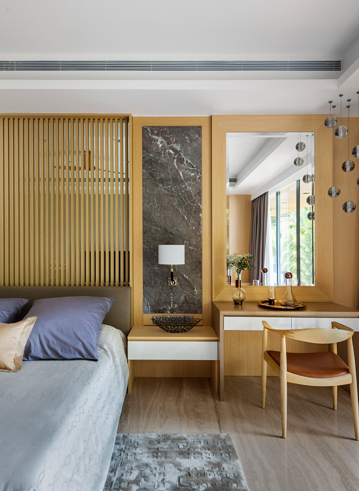
Every bedroom enjoys an unblocked view of the forest. Although the site is a generous 30 metres in width and 100 metres in length, the house is compressed toward the main entrance, leaving a spacious garden to the south. To visually reduce the built mass, Pan and Tay purposefully employed the site’s 12-metre slope to hunker the first storey and basement below grade. These, however, read as well-lit ground spaces due to the terrain and cleverly created courtyards, which visually unpack the compact volume with light and natural ventilation. A courtyard with a green wall and timber decking offers a relaxing respite. In the water courtyard, the sound of droplets falling from the animated water curtain into the saltwater pool percolates through the home’s many spaces.
A large house like this is many things at once. Yet, its complexity is aptly reduced to a hidden stroke of genius that reveals its secrets only through time and curious exploration.
Produce
produce.com.sg
TA.LE Architects
talearchitects.com.sg
Photography by Edward Hendricks and CI&A Photography
Dissection Information
Acoustic veneer wall panels from Oberflex in Eucalyptus
Calacatta and Ocean Grey marble from KStone
Bathware from Carera Bathroom
Tapware by Kohler supplied by KHK Asia
Gold, glass and copper PH Artichoke pendant lights from Louis Poulsen
Da Ma Sospensione, Suspension 60, Candela Di Vals from Viabuzzuno
Chandeliers from Space Furniture and Synergraphic Design
Sofas from B&B Italia
Mariposa sofa from Vitra
Bristol sofa by Poliform
Maxwell dining table with arabescato marble by Space Furniture
LCW Eames lounge chair from Herman Miller
This article first appeared in Cubes issue #94 ‘We Dwell’
We think you might also like Five Story House by stmpj
