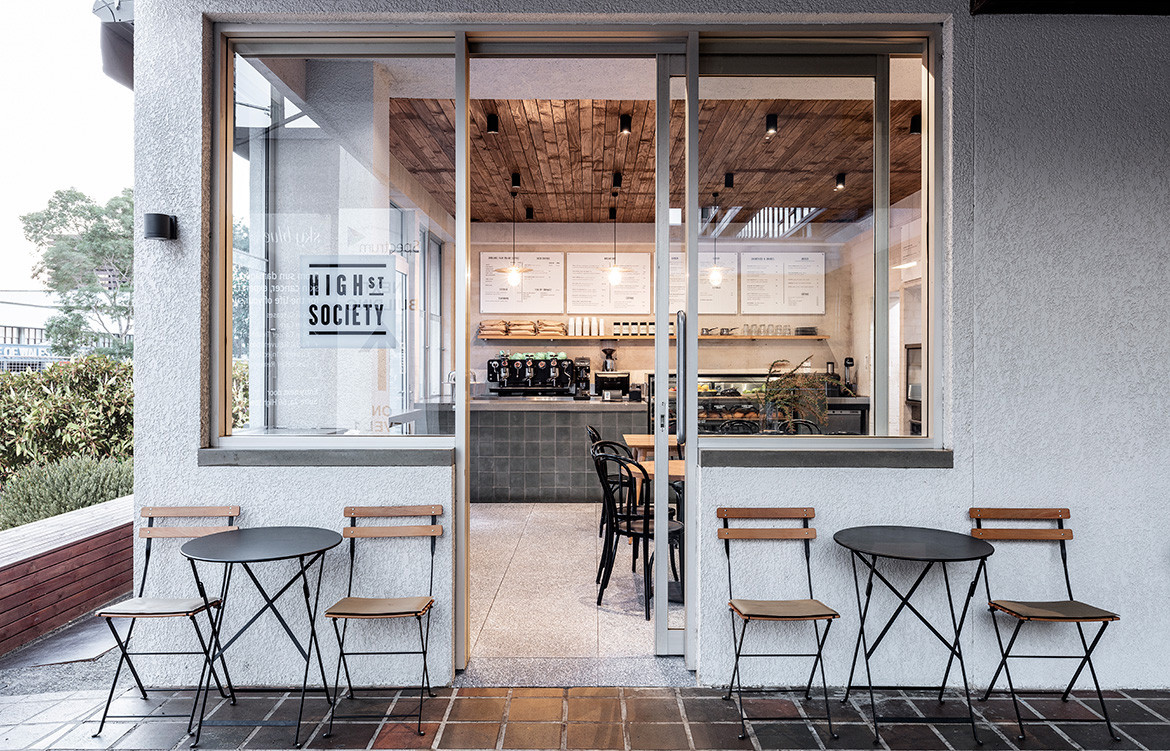
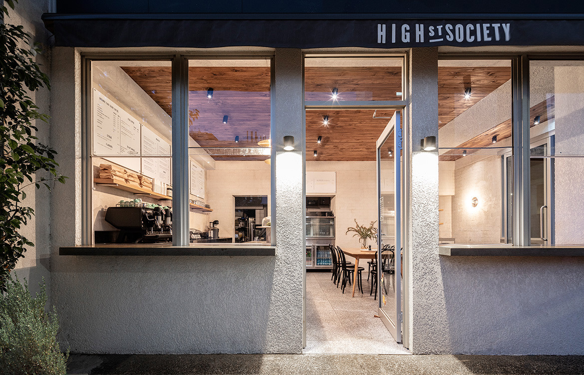
Ricci Bloch Architecture + Interiors’ recent renovation for High St Society has to be the hardest working fit-out in Randwick. The popular café is situated across the road from the Randwick Public Hospital and so receives an extraordinarily high volume of breakfast and lunchtime traffic. It’s a big ask for this tiny 60sqm corner shop in a 1970s building, but architect Ricci Bloch has made the most of a compact space by delivering an effortlessly good looking, modern interior that’s as functional as it is effective.
“Because of the large number of takeaway and eat-in patrons, the design had to be spatially efficient for both customers and those working behind the counter, as well as being resilient in its finishes,” says Ricci, who established her eponymous practice in 2016. Redesigning the shopfront to incorporate sliding sashless windows ensures the main entry is as neat as possible, allowing a clean threshold between inside and out.
And while the addition of a side entry assists with accessibility and circulation, it also created the opportunity for an external concrete standing bar, freeing up more room internally for seating. This affords the space flexibility and the owners have taken advantage of this, utilising a phone app to let time-poor doctors and nurses pay online and then collect their order from the bar, avoiding congestion at the service counter.
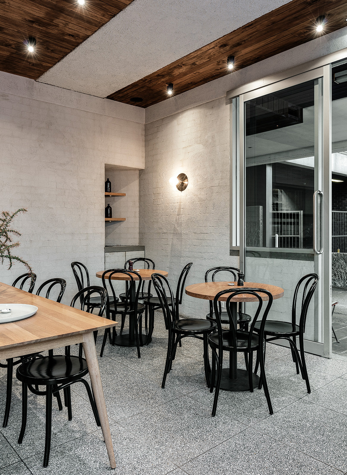
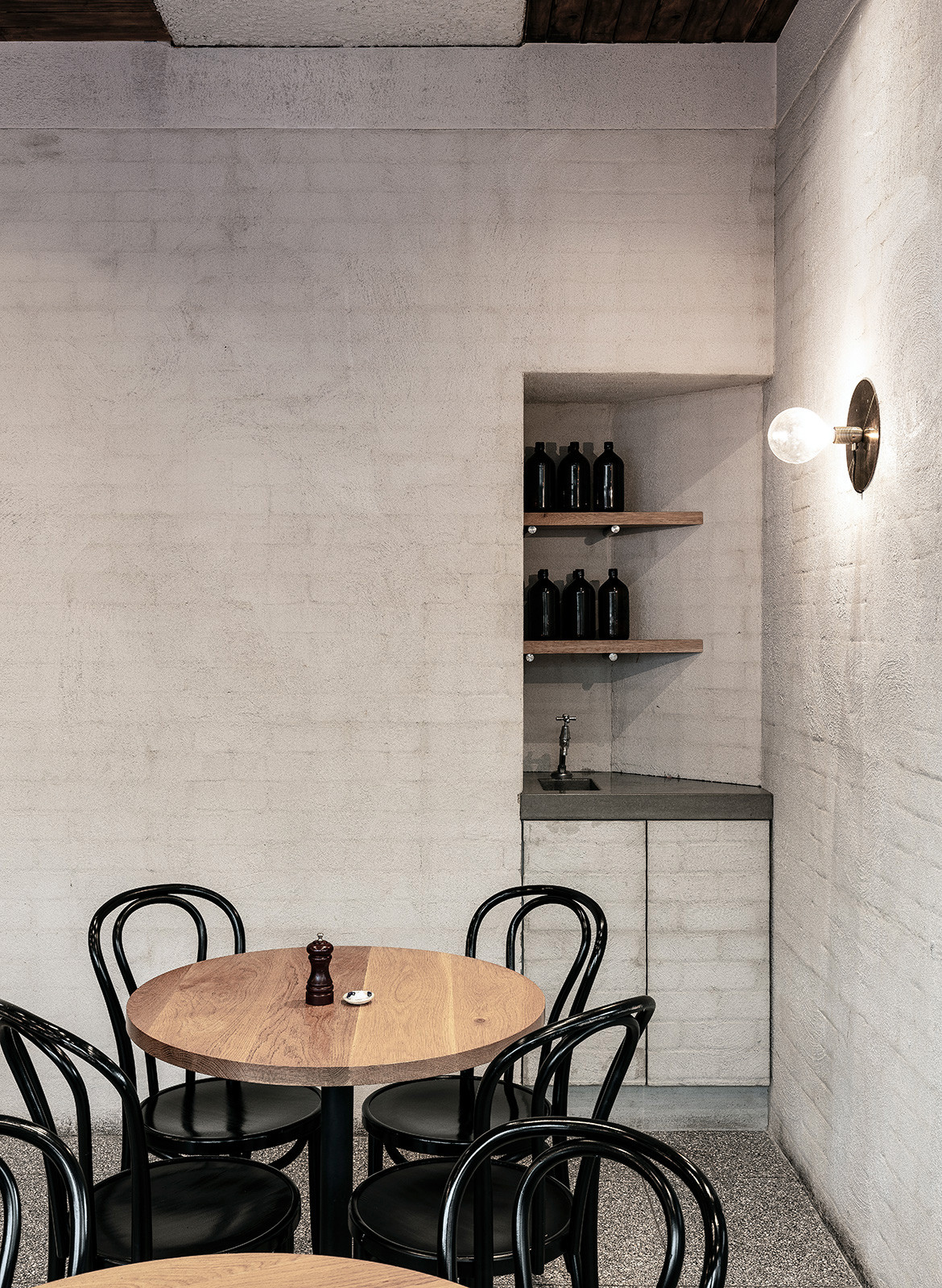
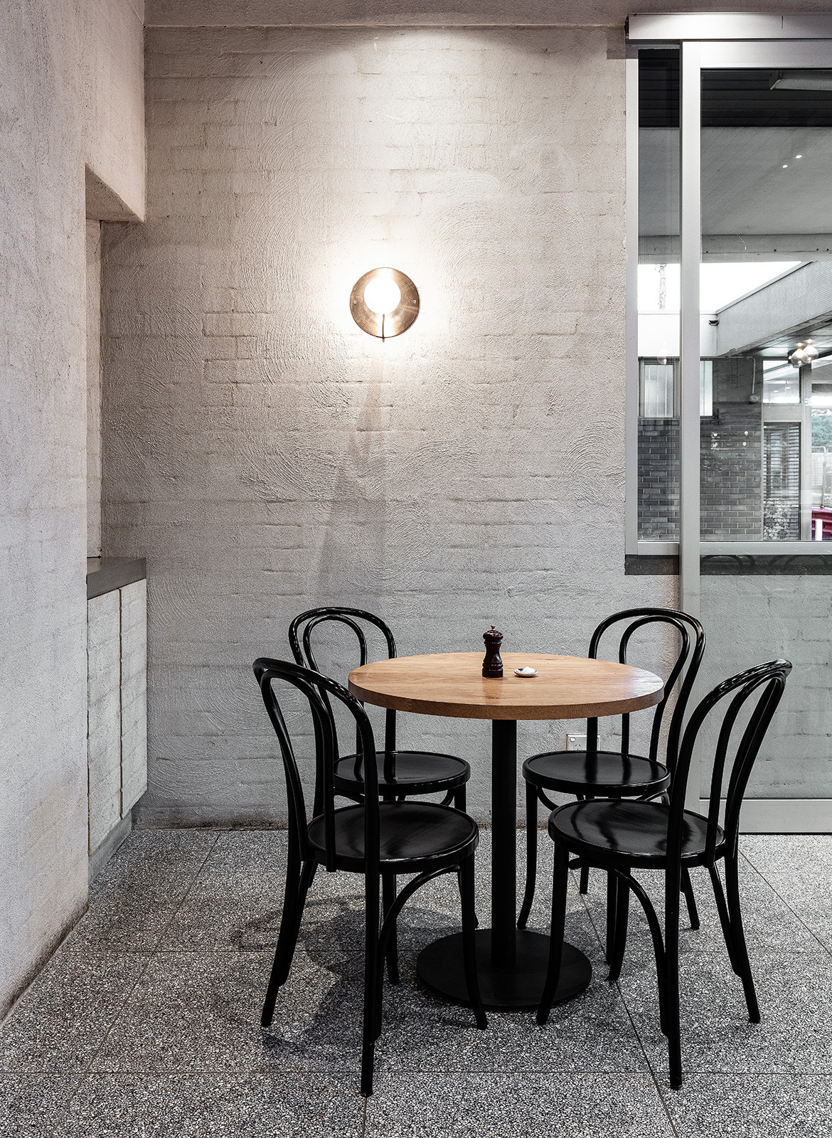
For the interior’s materiality, Ricci took inspiration from the building’s 1970s heritage. “I came on board after the builder had already stripped out the previous fit-out,” she explains. “So I derived my palette from what was there and I like that the robust materials and furniture choices are a nod to both the 1970s strata building and European cafés in general”.
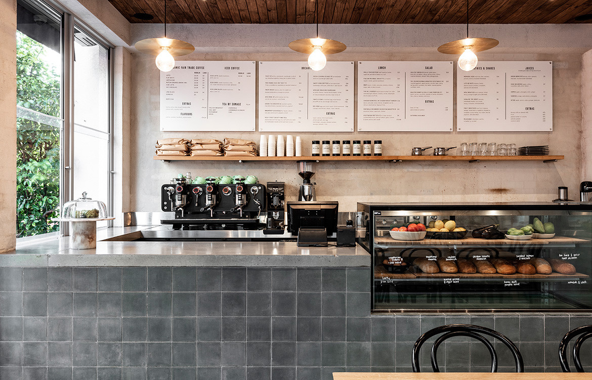
The resulting scheme features terrazzo flooring, brick walls that are original in some places and dark timber ceiling panels. A service counter clad in encaustic cement tiles with a polished concrete benchtop very much anchors the design, drawing people past the dining area and into the heart of the space.
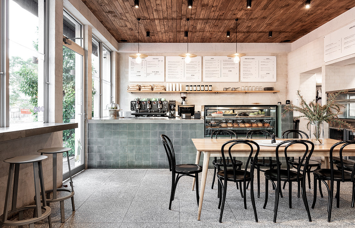
It makes for a highly tactile interior that feels all the more finely detailed because of the patina and finish of each material. Yet despite the richness of the palette, the space still feels pared back because of Ricci’s necessarily judicious application and elegantly minimalist styling. She has a masterful approach to materials and an intelligent command of spatiality, all of which makes this tiny café a delight to visit.
Ricci Bloch Architecture + Interiors
riccibloch.com.au
High St. Society
highstsociety.com.au
Photography by Tom Ferguson
We also think you might like Full Circle Café by X+O
