“Improving connections” is a common client request for residential alterations and additions; between old and new and inside and out and between family members occupying the house. Kuzman Architecture’s renovation of Lucky House improved these connections, as well as establishing a great connection between the architect and client, and even the clients’ dog, Lucky, for whom the house is named.
The clients, Mick and Felicity, engaged Kuzman Architecture to refresh and modernise their double-fronted Victorian home where they live with their teenage daughters, Stella and Louisa, and Lucky. They wanted the house to meet the family’s changing needs and better reflect their lifestyle. Communal spaces needed to be more liveable and better connected and to complement Mick and Felicity’s collection of mid-century furniture and art. “With a love of design, they had very clear ideas about their dream home, and wanted to be involved in the design process and to enjoy it,” says Sandi Kuzman.
The rectangular form was developed to connect and blur the boundaries between old and new and inside and outside.
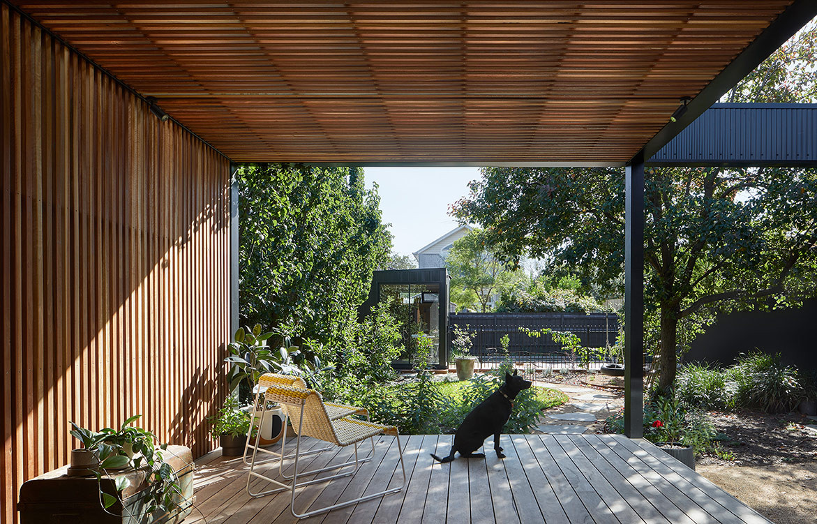
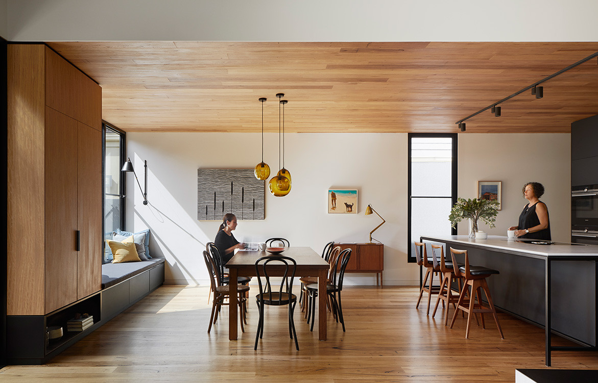
Sandi designed a new rear addition to accommodate the kitchen, dining, lounge, TV den and deck. The flat roof, open-plan interior and built-in furniture are a nod to mid-century architecture. The material palette of timber, black cabinetry and ceramic tiles has the warmth and craftsmanship associated with mid-century design.
The flat roof, open-plan interior and built-in furniture are a nod to mid-century architecture.
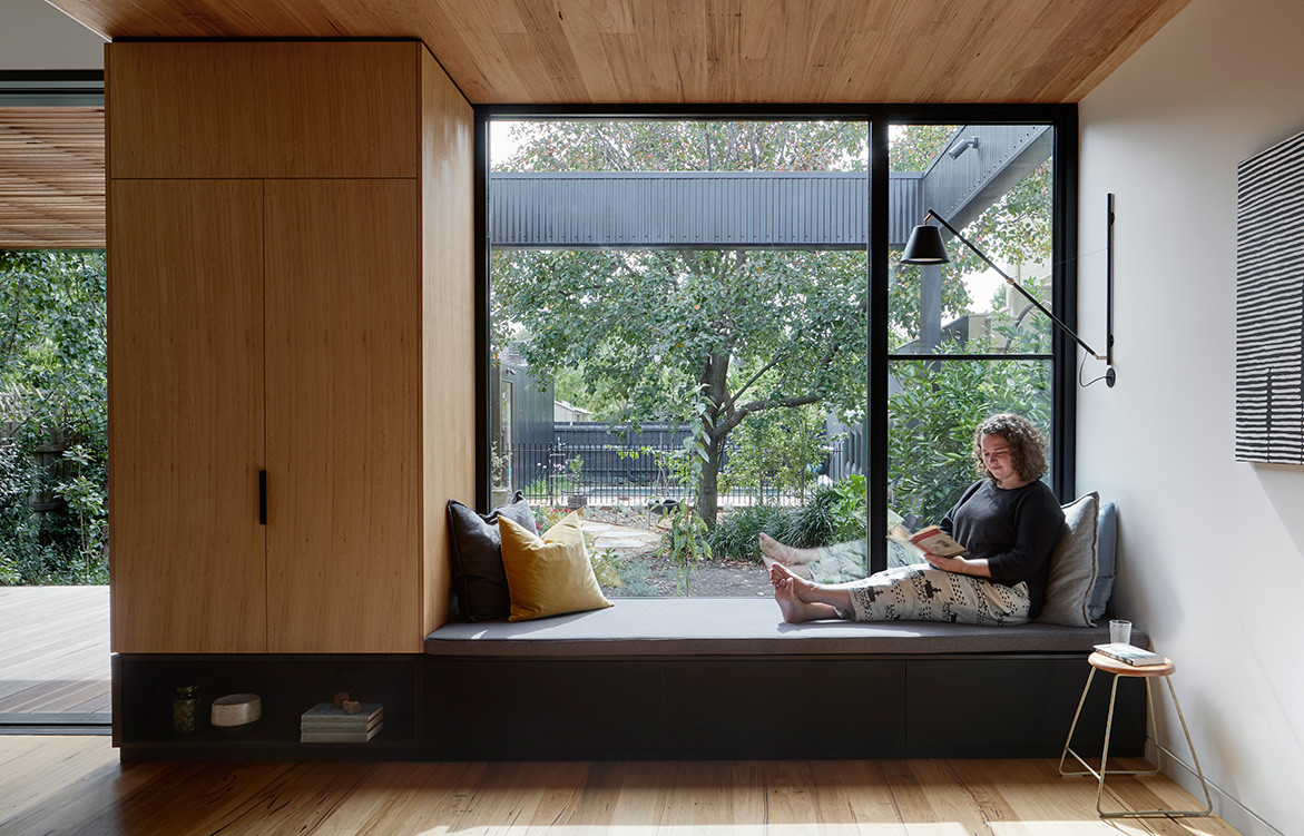
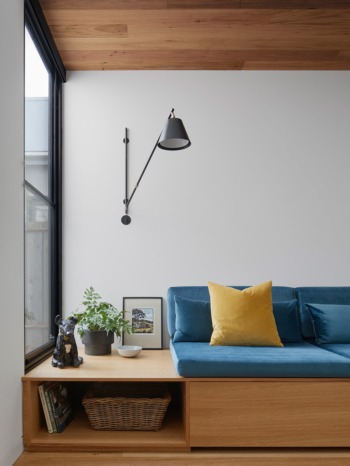
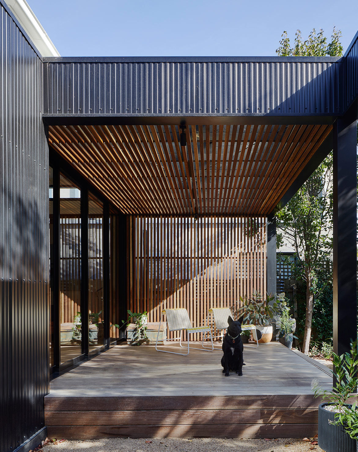
The rectangular form was developed to connect and blur the boundaries between old and new and inside and outside. “These framed transitional spaces invite the inhabitants to rest between domains, enjoying the best of both worlds,” says Sandi. Timber battens fold over the covered deck, and a built-in window seat has prime aspect of the much-loved pear tree and is used for multiple purposes: “As a quiet reading nook, a spill-out space at parties, a platform to catch the morning sun, a stage for their daughters’ performances, a debriefing station at the end of the day, and also a handy storage space,” Sandi says.
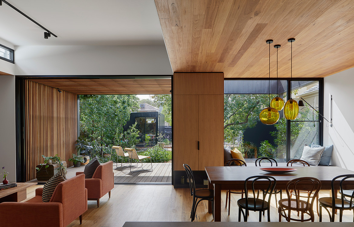
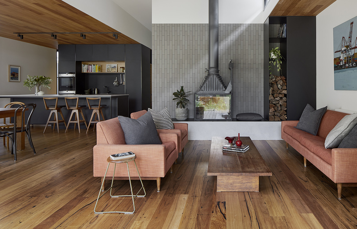
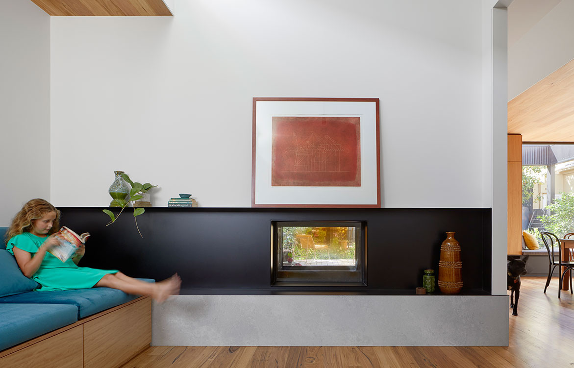
Ceiling heights and materials define different functional spaces within the interior. A lofty white ceiling with high-level windows over the lounge to bring in shafts of light throughout the day. Lowered timber ceilings create a cosier sense of space over the kitchen, dining table and den. A double-sided fireplace separates the lounge and den where a built-in daybed and pull-out trundle bed cater for family movie nights and kids’ slumber parties. The fireplace provides heat to both spaces and allows for a visual connection to the backyard and swimming pool.
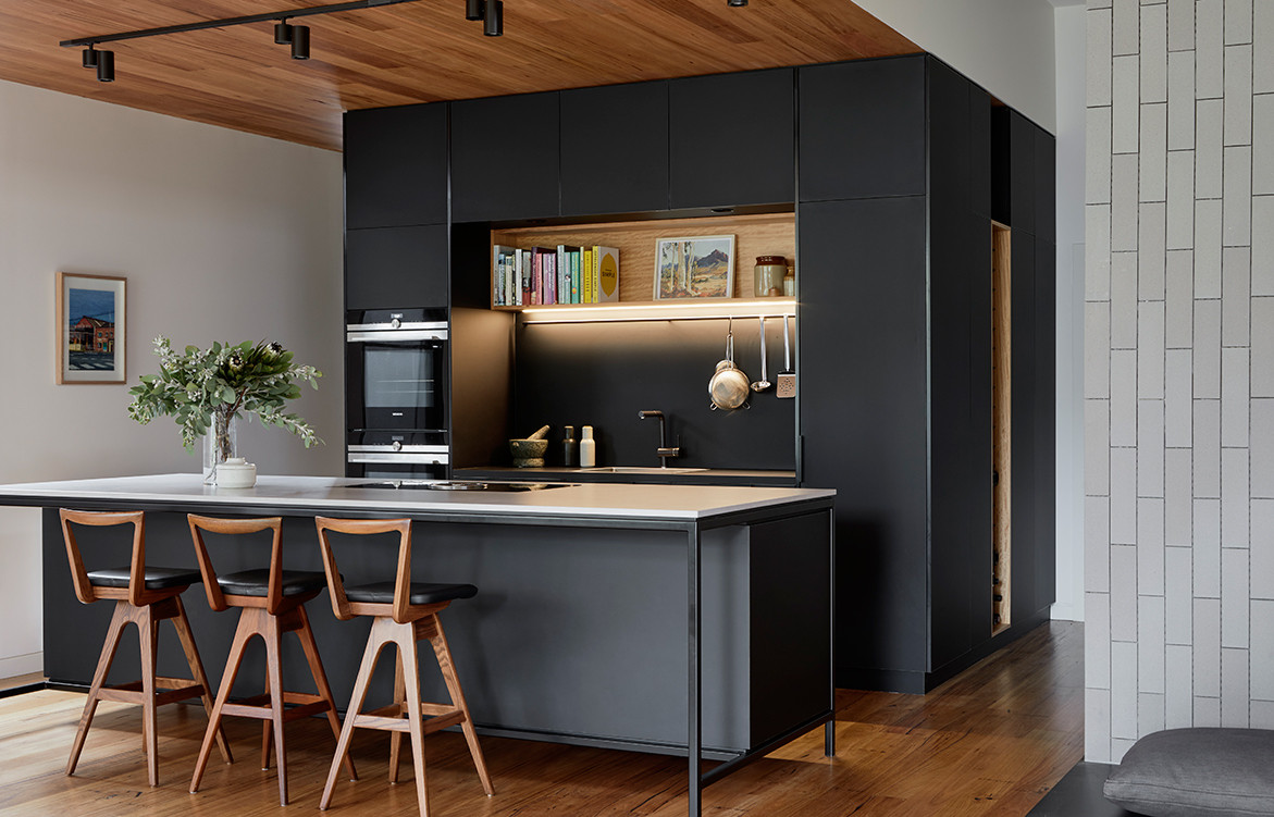
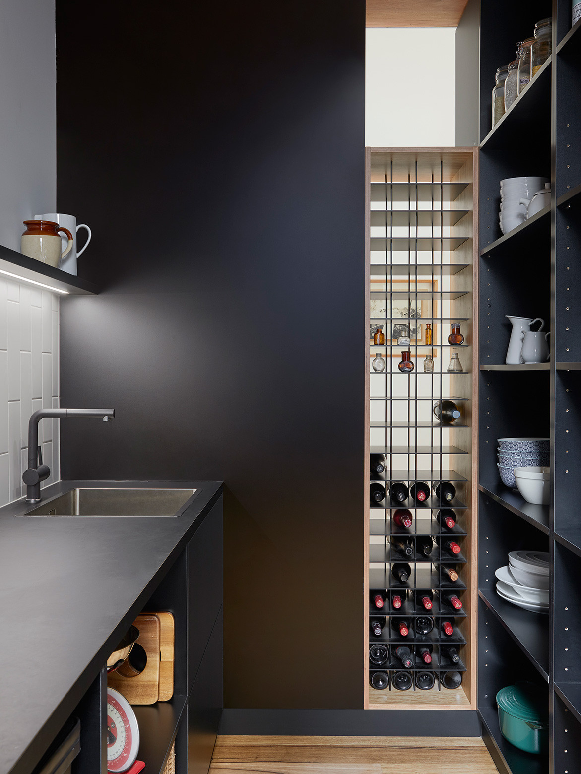
Sandi conceived the black kitchen with butler pantry as an object or pod inserted into the room. “Felicity loves to cook and enjoys the girls getting involved around the island bench, so the cooktop is front and centre and with a view to their garden,” she says. “We are proud of these personal connections this house has created: between family members and friends, and between architect and client – and dog too! It was a pleasure working on this project with this family and we still share a glass of wine from time to time.”
Kuzman Architecture
kuzman.com
Photography by Tatjana Plitt
Dissection Information
Lysaght panel rib cladding in Night Sky
Blackbutt timber battens
Stringy bark strip timber flooring
Stringy bark strip timber ceiling lining
Blackbutt timber veneer joinery
Matte black laminate joinery
Inax wall tiles from Artedomus
Custom architectural steelwork in matte black
Cheminees Philippe double-sided fireplace
White subway tiles
Faucet Strommen tapware
AWS glazed stacking doors and retractable insect screens
ISM Objects wall lighting
Mark Douglass Design pendant light
We think you might also like Auchenflower House by Kelder Architects
