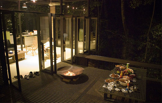
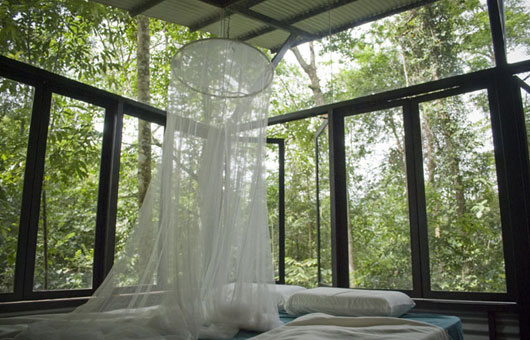
Malayasian landscape architect, Ng Sek San’s collective works straddle the hard, tactile world of architecture and the soft pliable world of landscape architecture seamlessly. He trained in civil engineering before studying landscape architecture in New Zealand, and has practiced solely as the latter for the past 21 years, of which the last 13 years have been on his own in partnership with Caroline Lau.
While he is naturally sought after to complement an architect’s conception of the outdoor spaces, he is not without some strong ideas about the craft of building himself. Indeed in the houses that he has been able to build for himself – three in Kuala Lumpur’s Bangsar area and one in the jungle near
Serendah – he has grasped the chance to concretise a larger personal vision of all he considers to be harmonious between man and his environment.
This vision is a self-effacing one, characterized by a profound respect for nature and her materials, a disbelief for anything that smacks of monumentalism or elitism, a disdain for opulence and a belief in ecologically sustainable architecture where materials are recycled and the utility bills kept to the minimum.
He speaks fondly, for example of temporal aboriginal huts and how communal and joyous the very act of building amongst them.
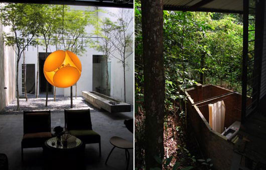
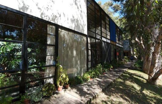
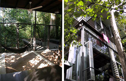
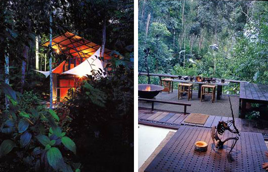
One visits his houses and winds up photographing dense vegetation instead of man-made structures. While at it, one would have wished for a camcorder instead, as isolated framed views would not do justice to the sounds of the jungle, the flutter of wings, the trickle of water and the total environment one senses.
In his work one senses the influence of practitioners like Geoffrey Bawa, Peter Walker, Luis Barragán, and even Maya Lin. And if Barragán often composed with the clear blue sky as his fifth façade, Sek San’s fifth façade would be the forest canopy, as instanced in his own house in Jalan Tempinis 1, where he stimulated fast-growing plants to compete for sunlight in his garden with selective tree-pruning.
There is also a strong hint of modern art in his work stemming from his close ties to and support of visual artists, many of whom exhibit their work at his gallery on a regular basis. But perhaps his greatest source of inspiration is the island of Bali, which he visits annually. Much of his philosophy, idealizing craft-based utopia and the taming of rampant commercialism, is fermented on its soil. Unusually for a designer, he refused to be photographed, opting instead to populate photos of his spaces with the end inhabitants of those spaces, thus allowing them to speak on his behalf.
Chu Lik Ren spoke to Seksan about his design approach.
LR: The Garden of Eden was there before architecture…
S: They also say that the mother of all arts this century is landscape architecture! It used to be architecture… something has changed. I like that shift. Like everything else, things are trying to get back to basics. Music is unplugged, architecture is moving back into the garden. I think, it is alive and growing. Architecture is man trying to be god. Not too long ago architecture was built for the gods, nowadays it is built for rich Dubai Arabs. This is when some of us realized we have to return to basics. Groovy reflective architecture, gravity defying buildings, man-made palm islands – it’s only entertaining for a while. In Eden, Adam tried to be a god for a while by eating the apple; his genes have passed down to some of us. We will entertain ourselves for a while building things, but in the long run we will year to return to that original garden.
LR: Ever since Le Corbusier detached the building from the land with Villa Savoye, and in fact detaching the landscape from the attention of the architect, architecture has floundered and landscape architecture flourished. You think?
S: I’ve only seen pictures of Villa Savoye. Visited his Ronchamp a couple of years ago. Absolutely beautiful architecture, but the relationship to the land and wider landscape is not so hot. Fast forward to today: we have a lot of architects who see architecture as detached from the landscape. The thinking is compartmentalised. Buildings are designed as ubiquitous sculptures that can be placed anywhere on earth. This can be very problematic. The works of Frank Lloyd Wright, Luis Barrgán and Geoffrey Bawa take a more holistic approach. The gardens and the wider landscape are totally locked into their buildings. It is not really about the competition between architecture and landscape architecture; it’s more about the two coming together to form something that is greater than the two.
LR: You try to visit Bali as often as you can. I guess that’s as close as an ideal for living with nature we have. But the model of everyone owning and cultivating his or her plot of land is surely not sustainable, especially with rampant urbanisation.
We stack homes upwards so we can free more land for greenery in between them. But how do you ‘lock’ the landscape between these high rise, so that they are not left over spaces to be beautified by landscape architects? Are you happy with the inter-disciplinary approach you advocate in your work?
S: It is a common complaint that landscape architects are not brought in early enough early enough and are left with left-over spaces between the buildings. But sometimes it is just a good excuse for doing a lousy job. I am not a big advocate of coming in early. Some of our best works are done when we came in late. The reason being the gestation time is a lot of shorter and the design ideas are a lot of fresher. In our industry the lapse of time between ideas and implementation is 3-5 years. That is a long time. While I believe that design ideas are not meant to be fashionable, over five years I find myself doing and appreciating things differently, most of the time making things a lot simpler.

I have no problem with left-over space, especially when it is a precondition for that negotiation that to have total freedom to do what I like. I usually have more problems with interference by third parties; get in early where options are too many, designs are then done by committee. We have a term for that in Malaysia, the rojak (mixed salad) scheme, where everyone’s images are considered, and ending up with the lowest common denominator.
Lately, my preference is to work with a set of preferred clients and architects. We have got to a level where there is a lot of trust; we can second-guess each other.
To read the full article By Chuk Lik Ren please back-order Habitus issue 1.
All images courtesy of Ng Sek San. All architecture and landscape photography by Ng Sek San and taken at Sekeping Serendah private retreat located one hour’s drive north of Kuala Lumpur.
