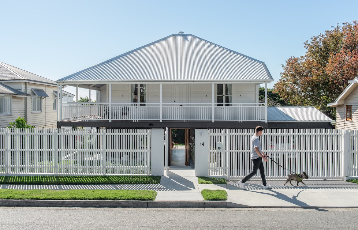
With its wrap-around verandah and corrugated roof, the front of this Northgate Queenslander is typical of the quintessential homes of the region. But once inside, it’s a different story.
Purchased by a young family who needed the space to grow into, the charming character of the home had its drawbacks. The traditional typology of the Queenslander meant the home originally didn’t have a grounded connection to the backyard. Instead, it had a large, north-facing and uncovered balcony that was unbearably hot in the summer. For the family – who wanted to spend more time in the backyard – better accessibility and usability was crucial.
The clients contacted Jessica White from Room by Room to help with their interior design needs, however as White realised their needs would include adding significant architectural demands, she suggested they bring on Bones Studio to help with the extension of the home.
“It needed careful and functional consideration to ensure the new extension complemented the beautiful character elements of the existing home’s architecture,” says White.
Once Bones Studio’s Chris Brandon was on board, the project took off.
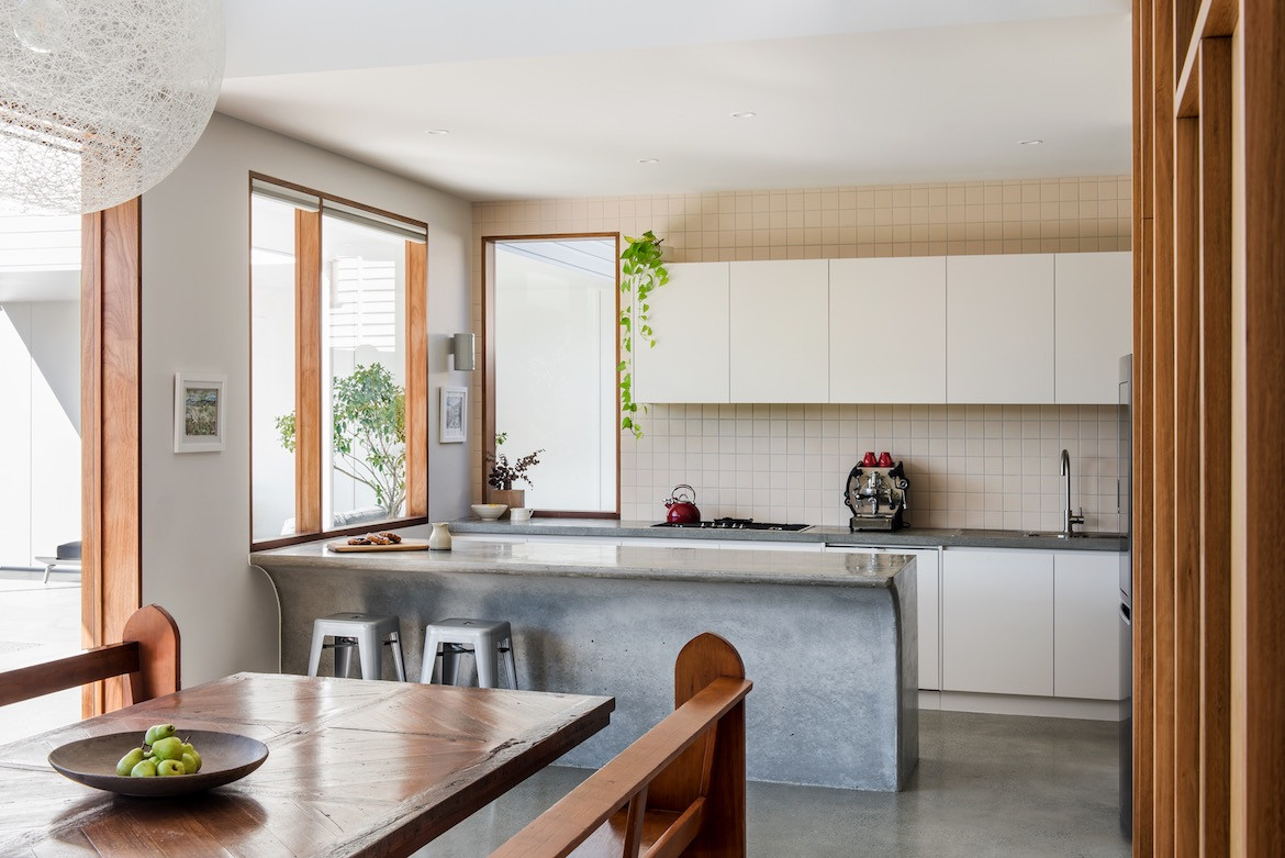
“The brief was very open for interpretation, but included an additional living wing including an open plan kitchen, living and dining room,” says Brandon. “The clients requested the inclusion of a large pool and pool house, a new master bedroom wing and also a library slash entertainment room for the children.”
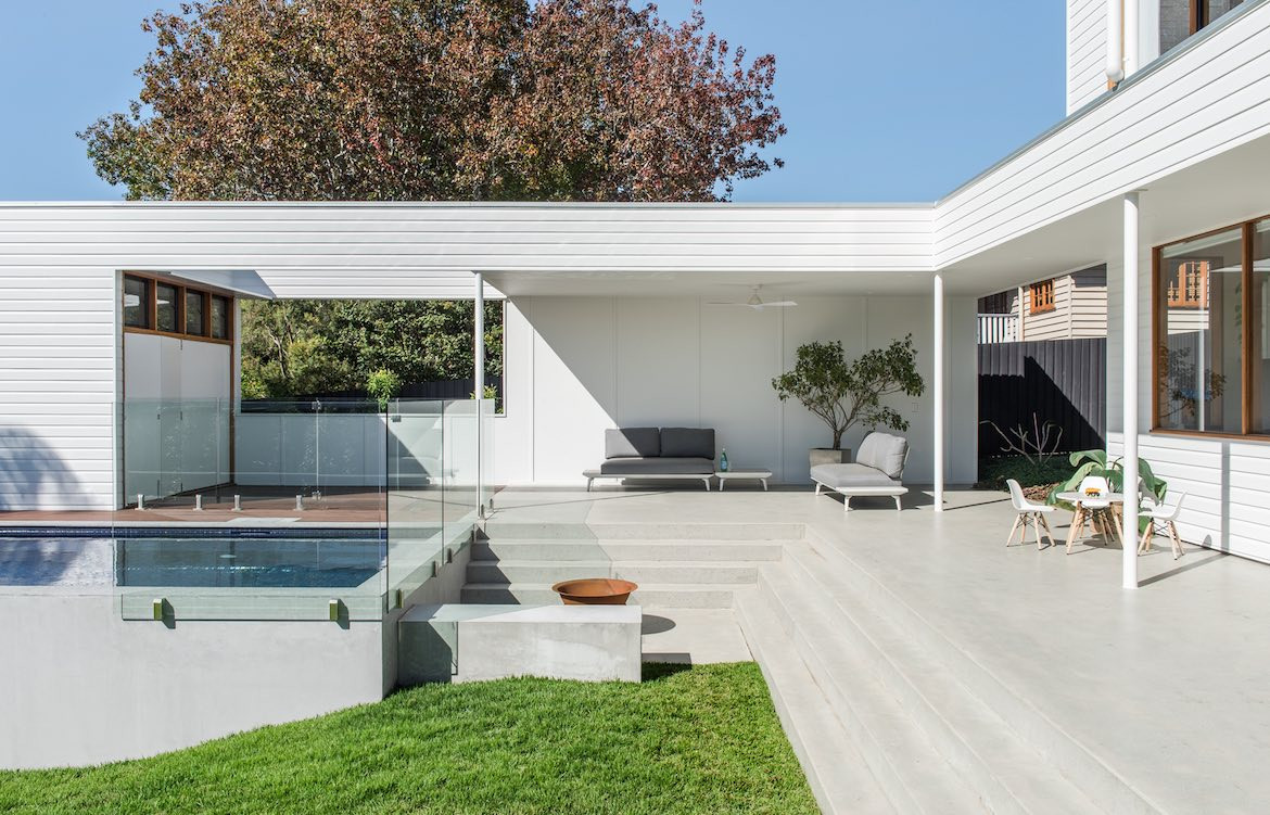
Mainly, Brandon and White tell me, the clients were looking for a comfortable and private residence that had the space to entertain regularly.
“Our proposal included raising and shifting the existing house to allow for an additional level on the ground floor,” White and Brandon share. “Utilising the block’s natural fall from front to back was key to the initial master planning of the site.”
“This strategy also minimised the need for, and expense of, excessive earthworks and retaining,” they add.
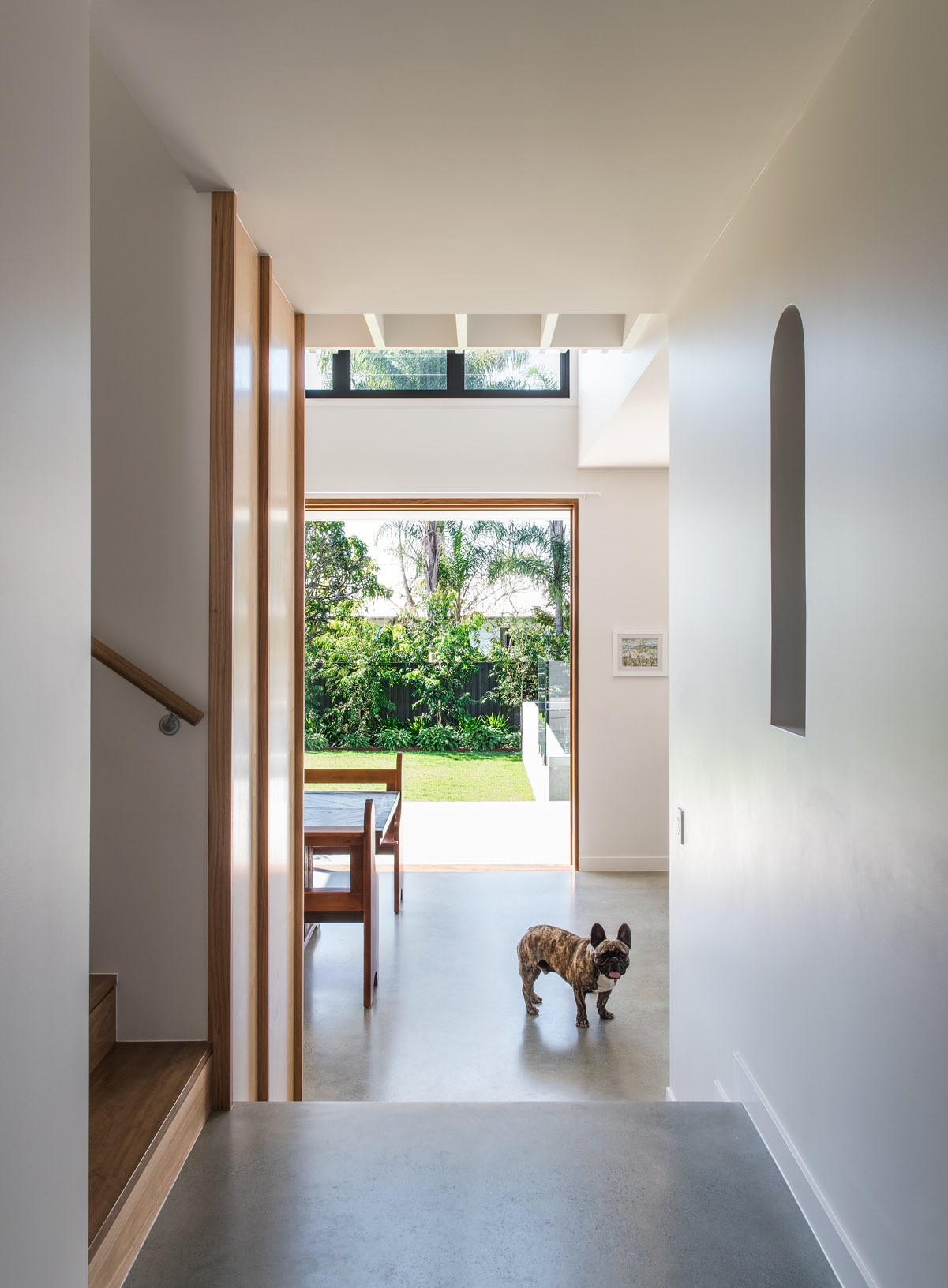
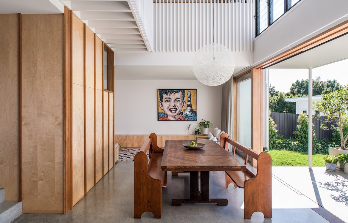
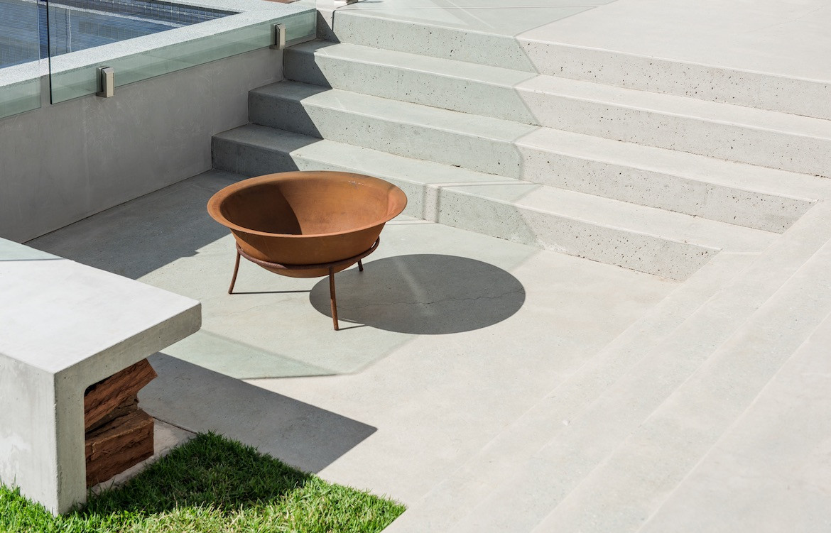
The original street level was maintained, but by following the site’s contours, a split-level ground floor was conceived. Polished concrete floors flow throughout and steps lead down into an open-plan living area at the back of the house, which reveals a dramatic double-height space. The concrete also forms the kitchen bench, where it contributes an organic, curved shape. Large doors open into the garden, where the concrete surface continues, creating a far more seamless indoor-outdoor living area than the original home allowed for.
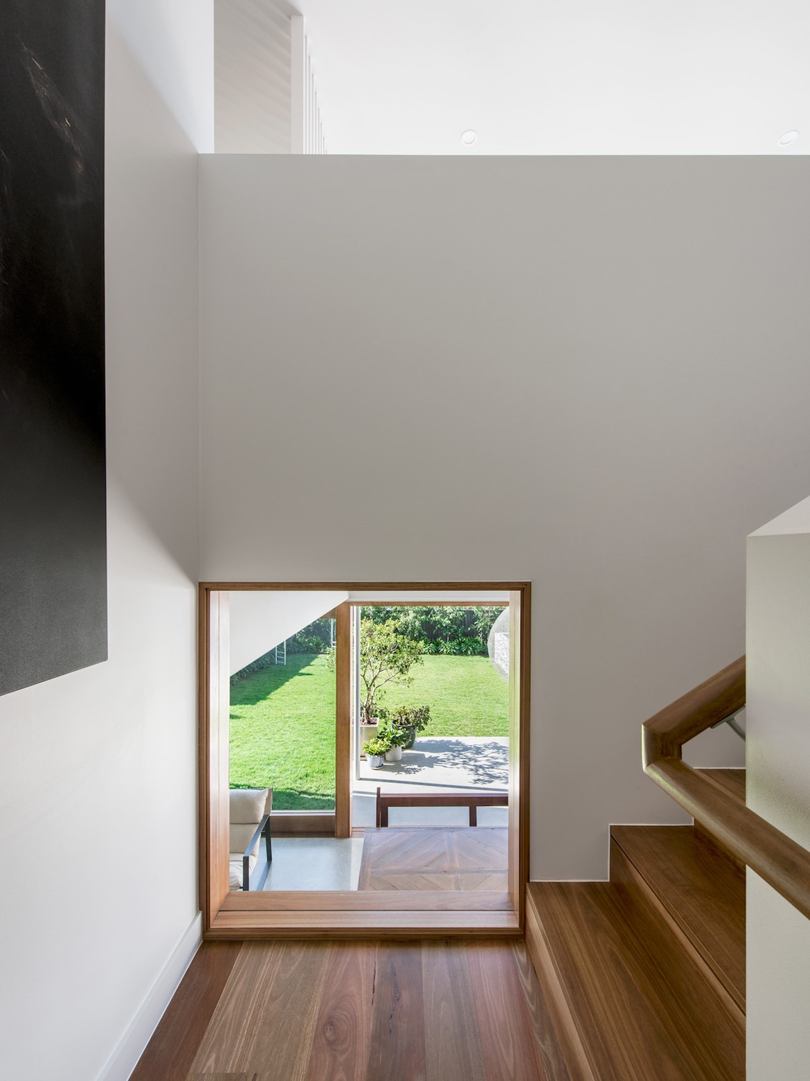
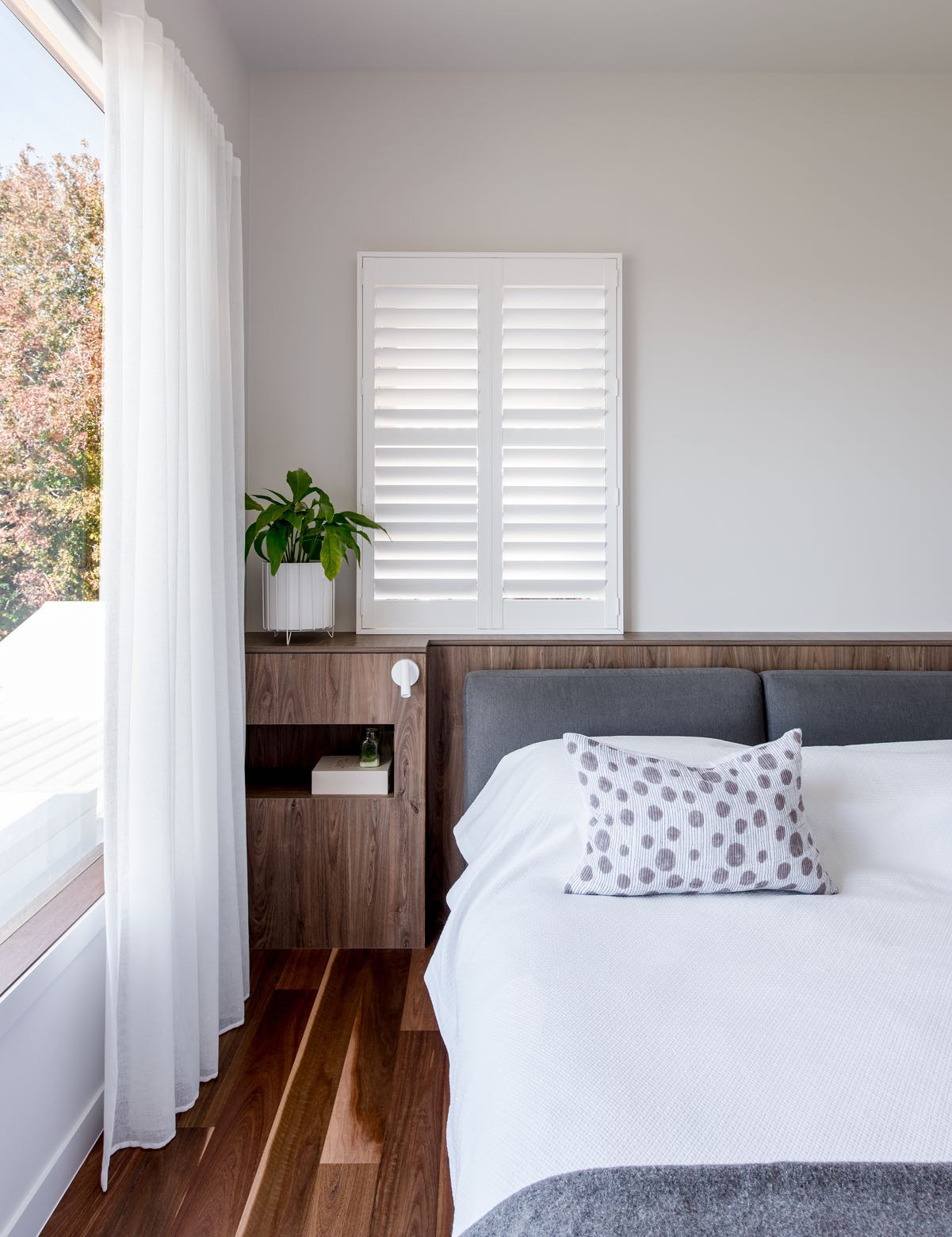
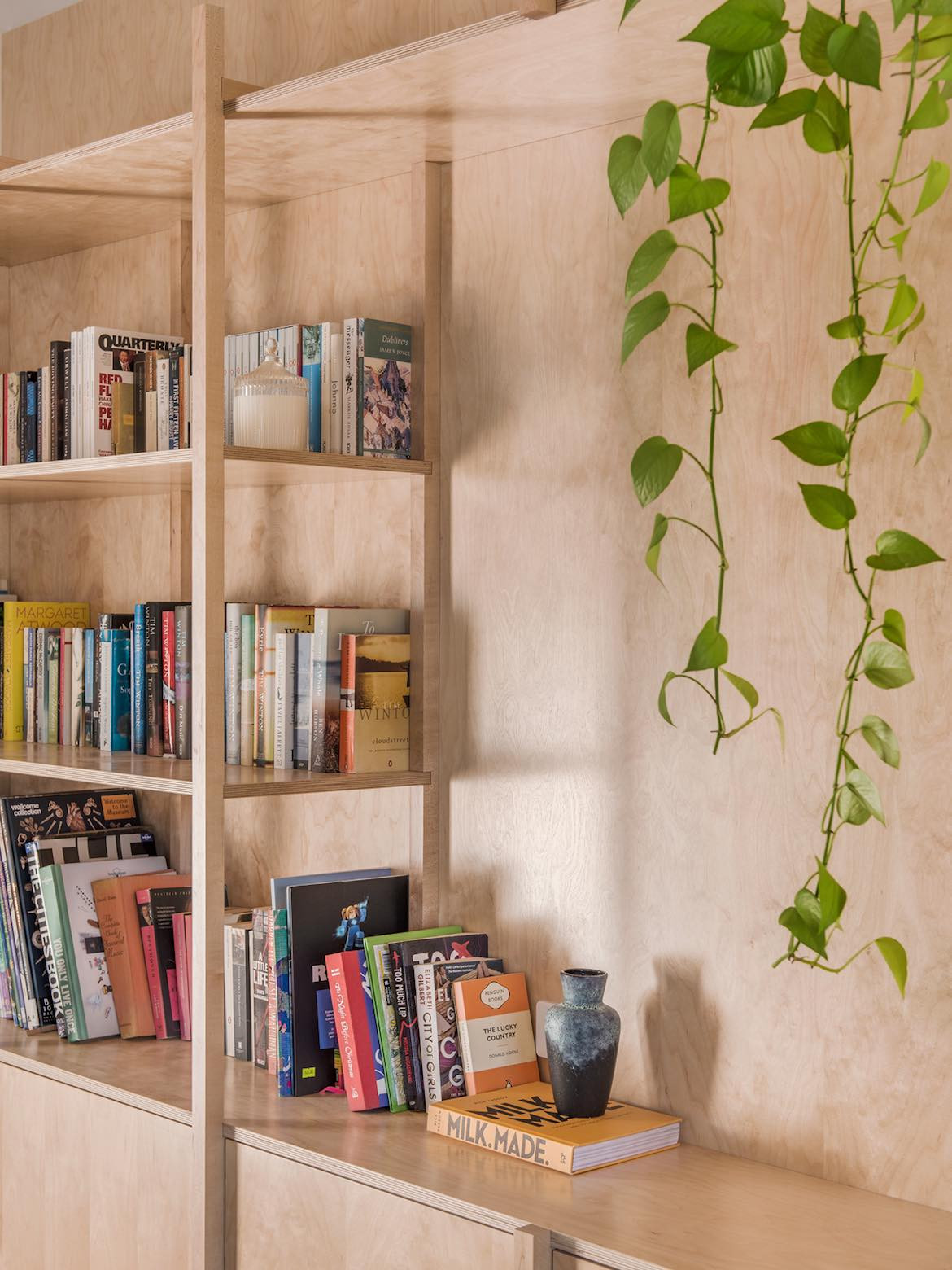
The distinction between the old and new sections of the house have been deliberately contrasted with materiality and scale. The new section places emphasis on plywood, walnut timber, tile and cement, and the transition between the two spaces is defined by a perforated metal bridge that connects the rear façade to the original dwelling.
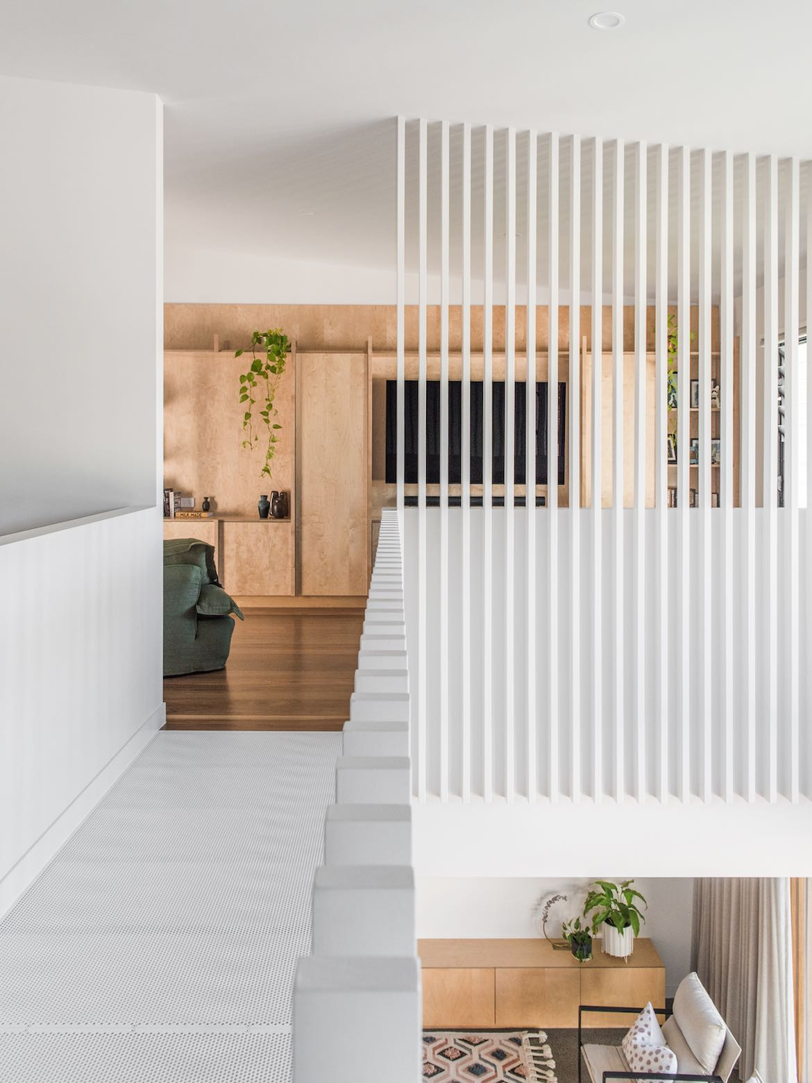
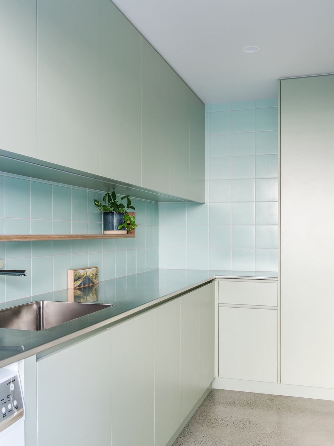
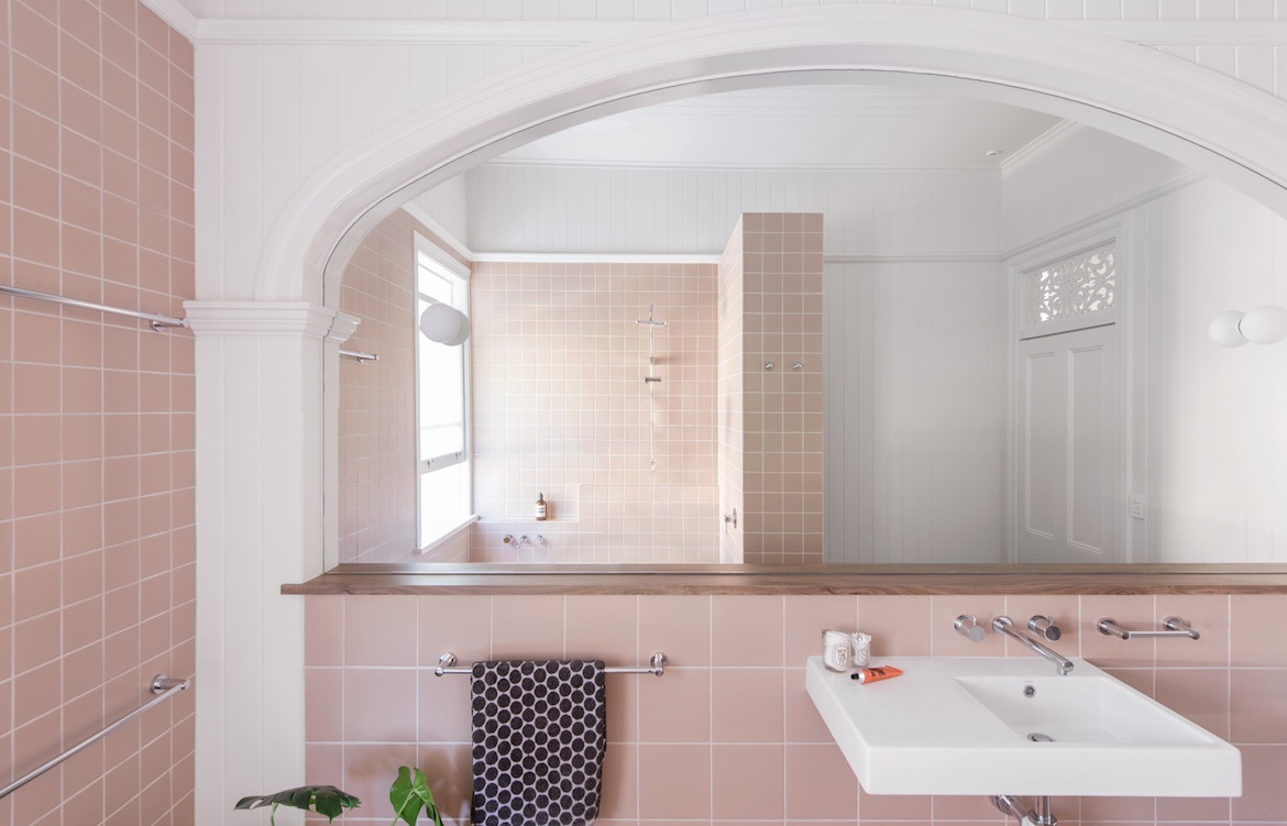
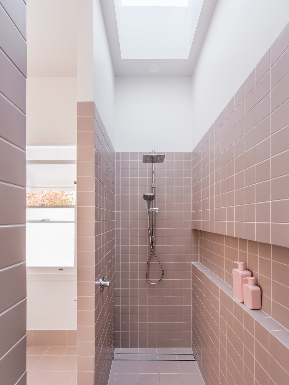
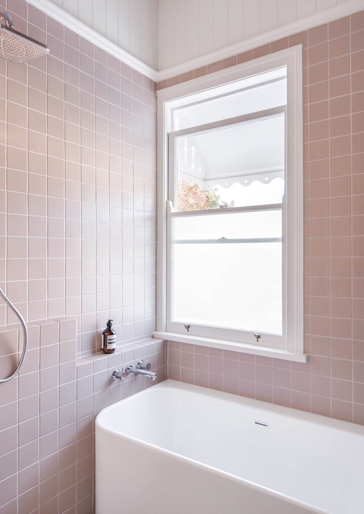
Playful notes have been made throughout, including the incorporation of the client’s own art and furniture pieces like the striking church pews in the living area. Paying homage to the original design features, the pale pink bathroom highlights a typical Queenslander archway that has been repurposed to frame the vast mirror, while the laundry is freshened with a contrasting pale green.
“The residents have now been in the space for a little over a year, they absolutely love the new environment and the vast space both inside and out,” White and Brandon tell me.
Project Details
Architecture – Bones Studio
Design – Room by Room
Construction – Muller Constructions
Photography – Cathy Schusler
Enjoy this article? Check out more homes in Brisbane.
