Living in a landed home in Singapore is mostly seen as a privilege, with the majority of the population residing in public housing flats. But in that privilege often lies the irony that privacy is not always a given. Houses sit side by side, separated only by a low boundary wall, one dwelling only a few metres away from the next – neighbours can sometimes be disconcertingly privy to what happens next door. The owners of this house, however, were adamant on claiming their privacy.
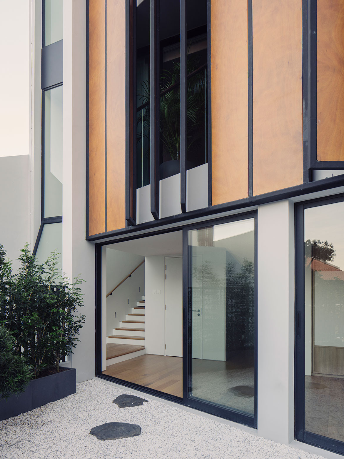
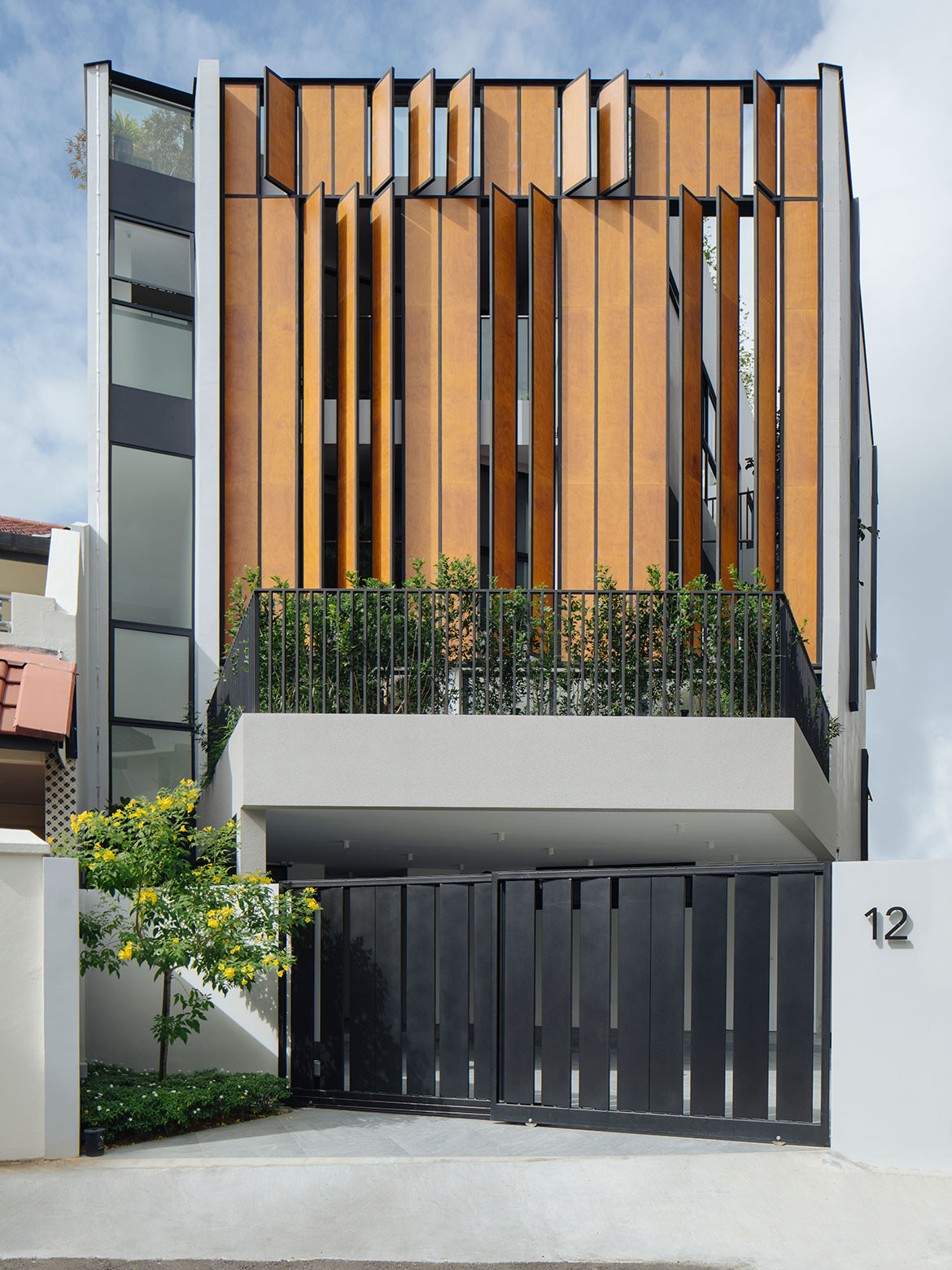
Tightly wedged between neighbours at the end of a quiet cul-de-sac, the residence consists of three full storeys as well as a mezzanine and attic floor. All this rests behind a guarded screen of steel-framed wood panels, with little revealed of the 455-square-metre plot.
What was originally a modest semi-detached dwelling with a large garden had been on the current owners’ property wishlist for years. Not least because it is adjacent to the house where the husband’s parents live. When the house was finally put up for sale, the owners, a couple with three school-going children, swooped in.
They turned to FARM Architects to design their home and offered a succinct but seemingly contradictory brief for privacy, and bright and airy spaces – in that order. Implicitly embedded in the brief was also the call to negotiate what appeared to be an inefficient triangular site.
Tiah Nan Chyuan, Director at FARM Architects, shares that the design genesis came in the form of a trapezoidal block abutting a parti-wall. Two other edges of the massing were extended out, protectively enveloping as much of the site as reasonably possible. From there, the sculpturing work began.
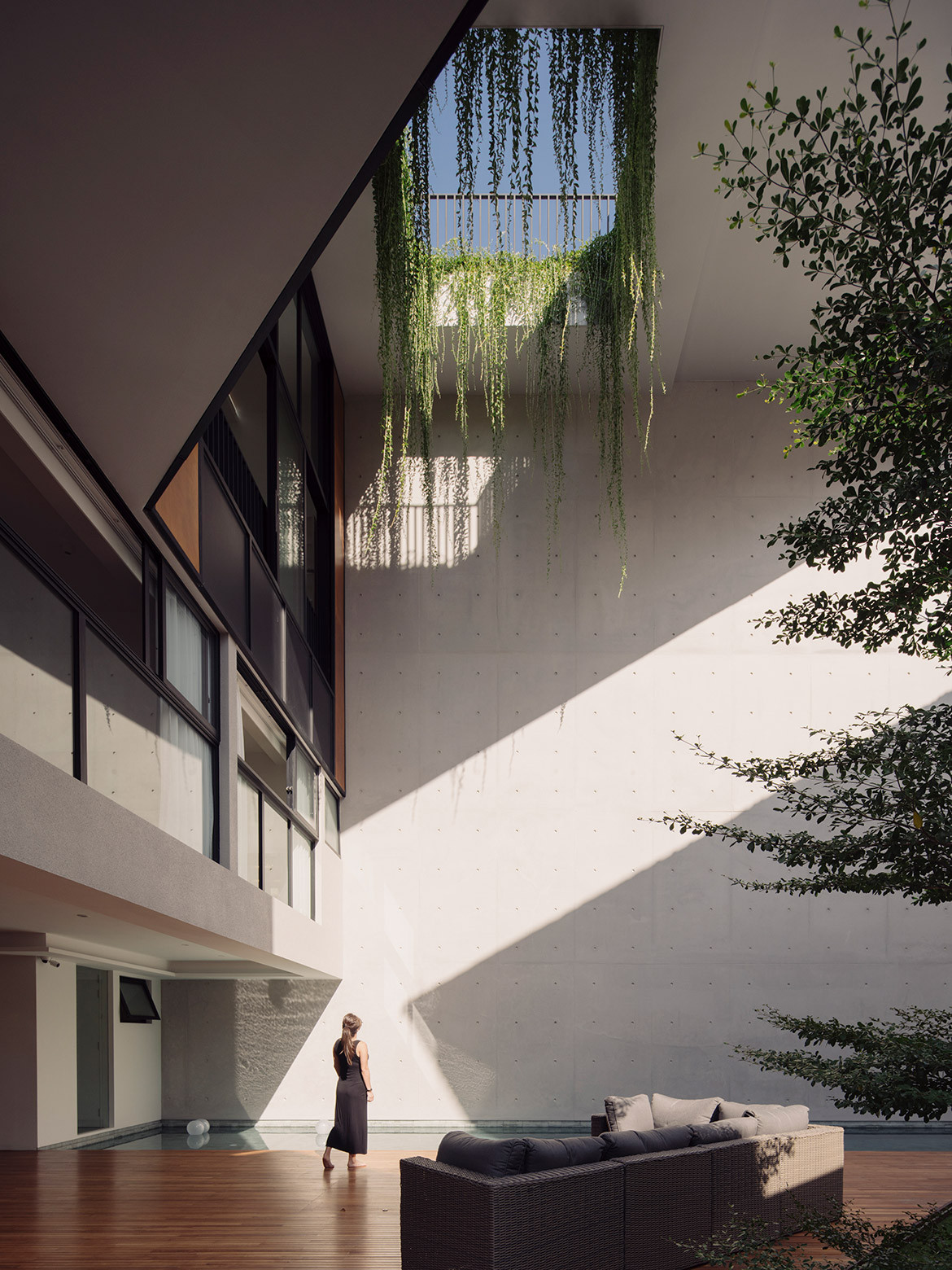
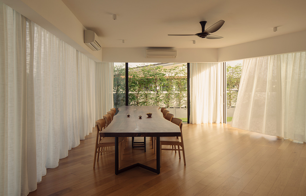
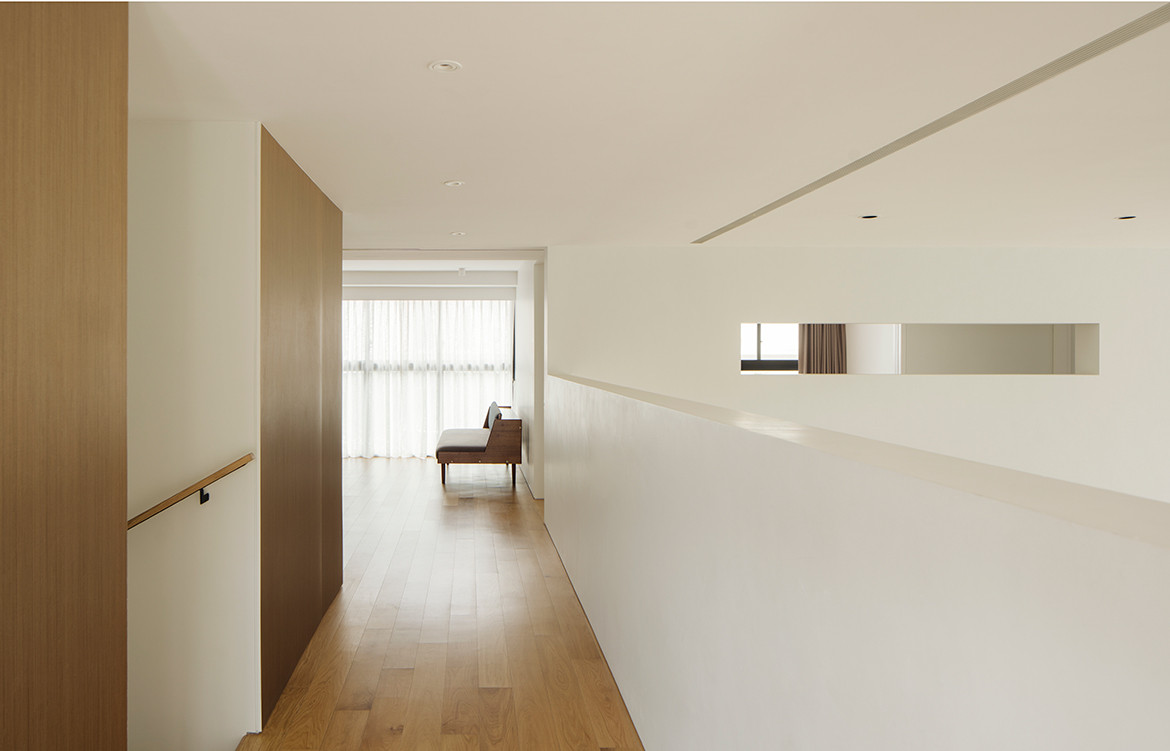
A generous carving of space here for family and friends to gather. A precise slit there in the envelope to catch a long sightline between neighbouring houses. A void in an internal wall to allow conversations, both literal and figurative, to happen between rooms. And a more judicious hollowing out of spaces to bring in light. Each gesture scrupulously avoids unwanted prying eyes from the exterior.
“Theoretically, we could have squeezed everything into a very tall building and kept the original garden, but [the owners] probably wouldn’t use the garden because all the neighbours would be looking into it,” says Tiah.
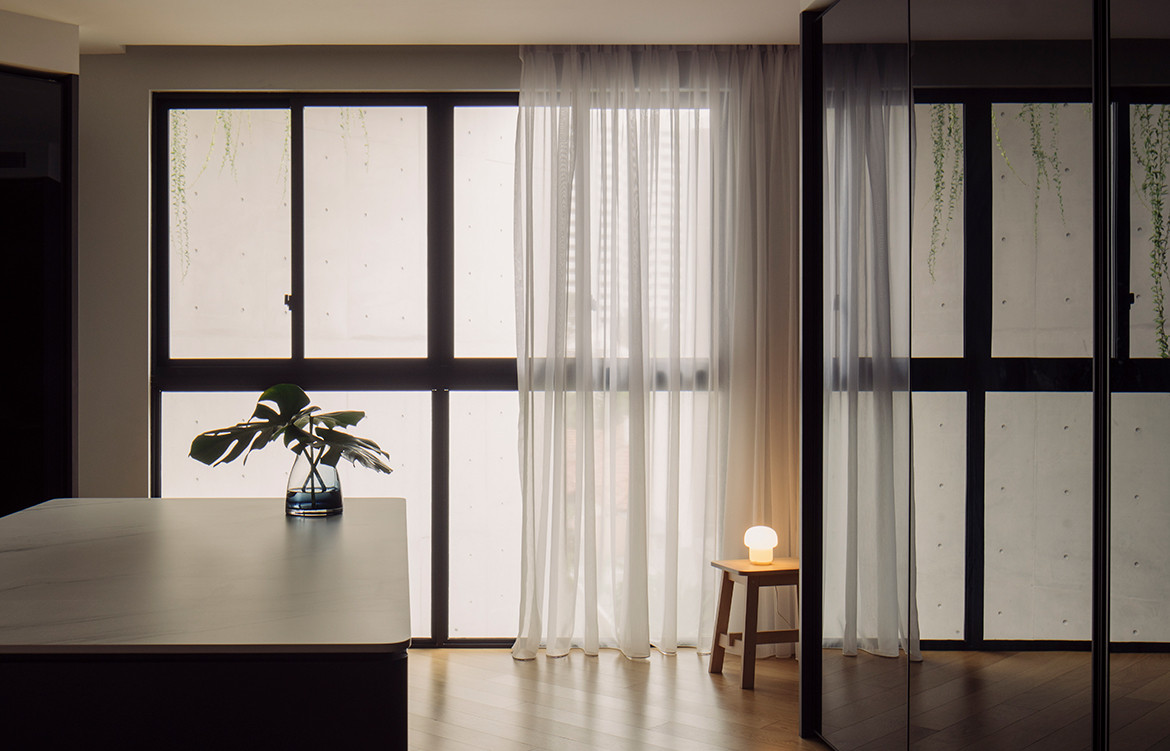
“So we made the house bigger and internalised the gardens within the envelope.” Sheltered behind the building skin, these intimate gardens not only offer private views for most of the bedrooms, but also modulate light to gently illuminate them.
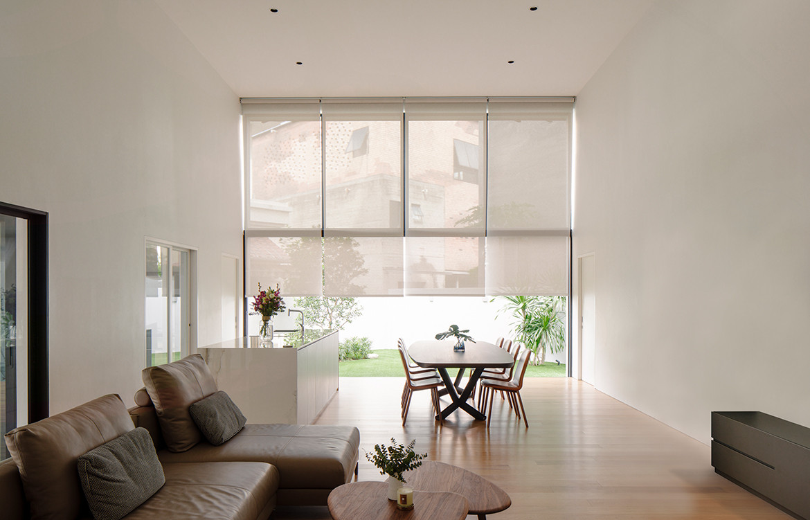
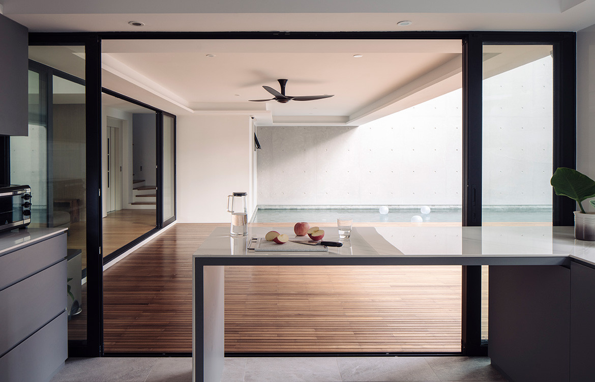
Spaces open up to the outdoors with uncharacteristic abandonment at the back of the house. Here, a cavernous volume of air and light sets the tone for carefree outdoor living.
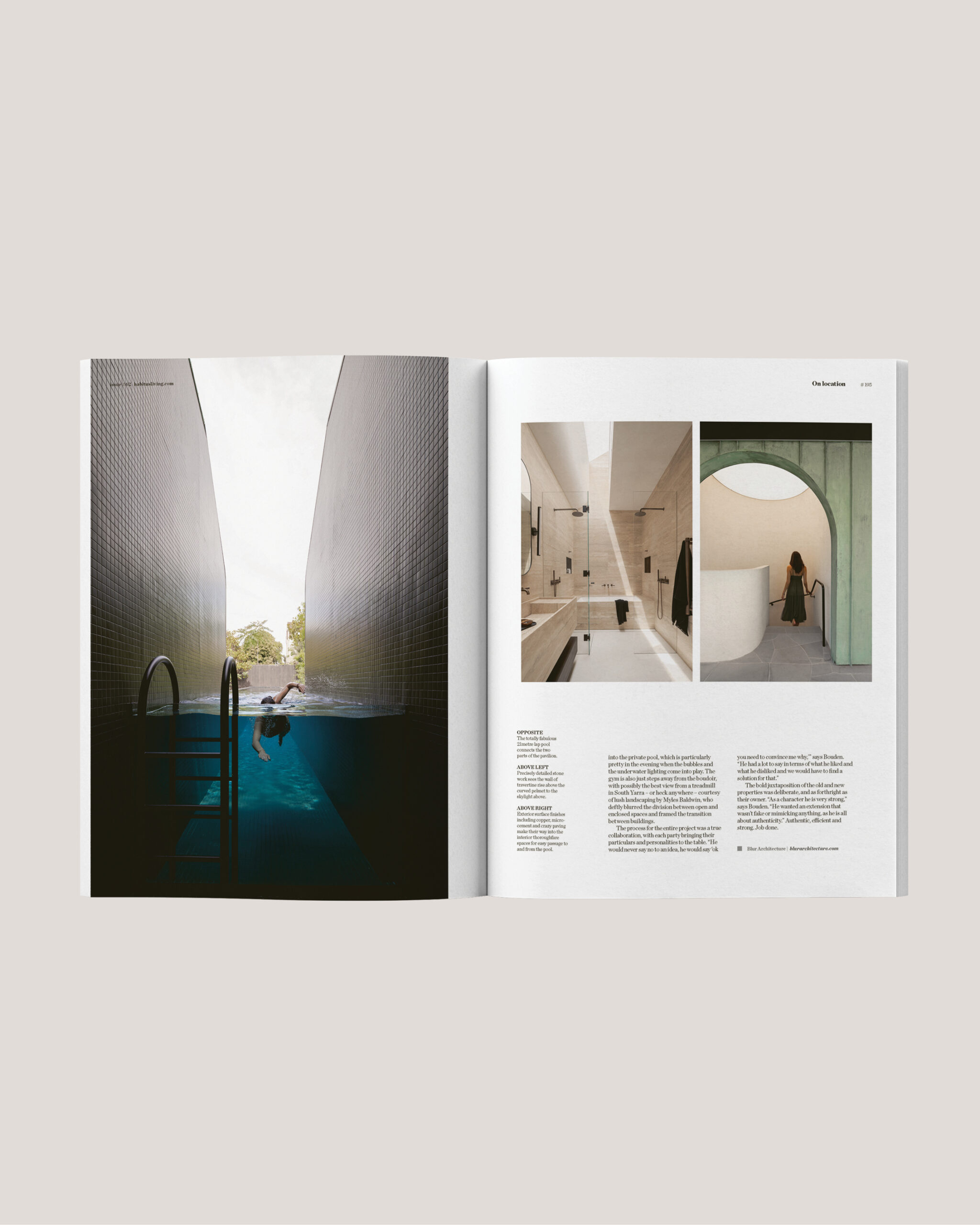
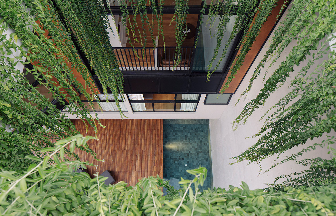
A lap pool underlines a dramatic 12-metre- high, fair-faced concrete wall, which the owner delightedly shares, doubles as a projection screen on movie nights. Ushering both sunlight and languid locks of greenery down into the pool area is a cut-out in the soaring roof deck, where the dangling creepers sometimes play the unwitting host to a nest or two of birds.
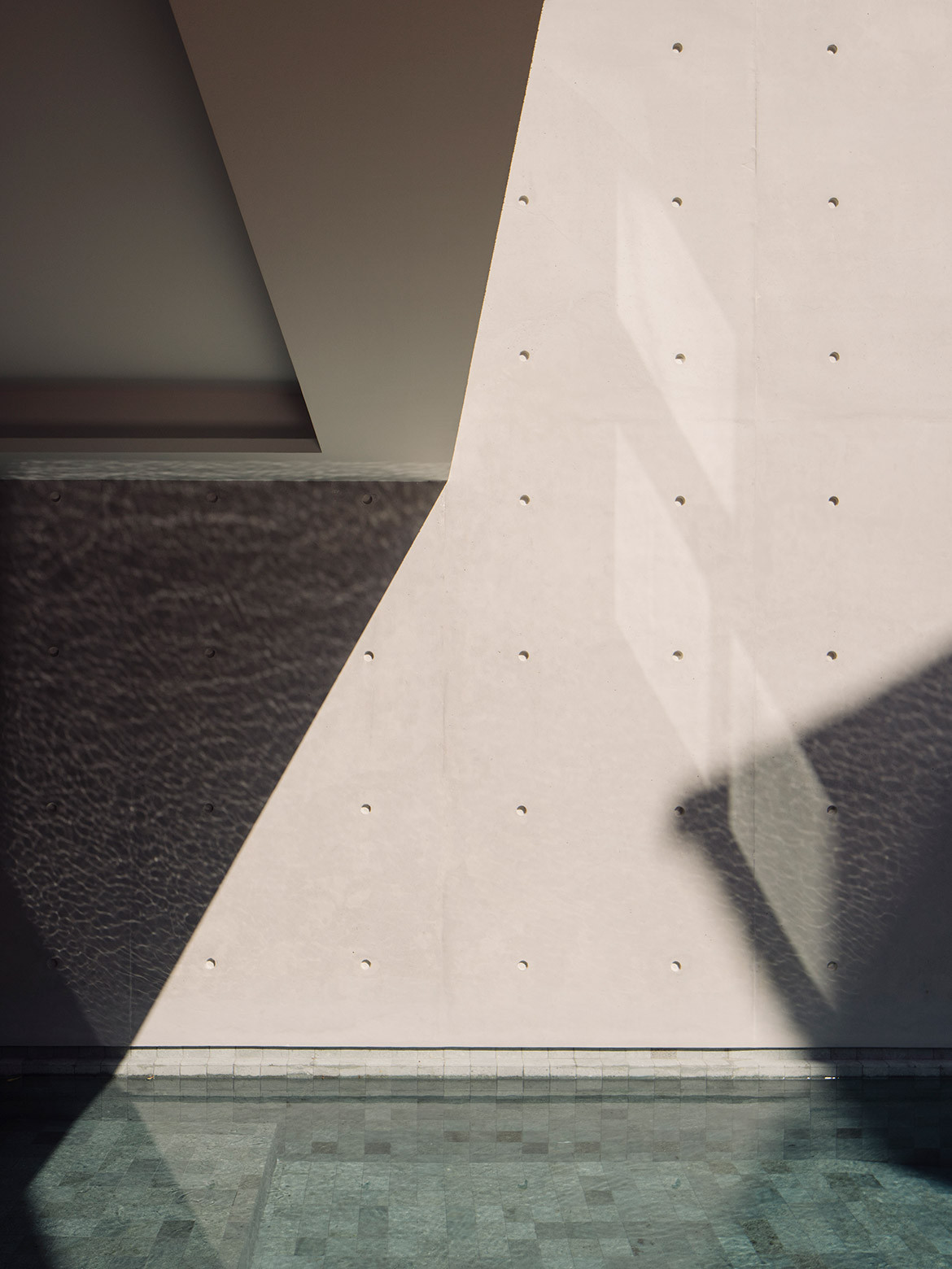
“The only reason we could open up the back is because it directly faces their parents’ home,” Tiah reveals, adding that the owners wanted the outdoor area to be a space that could serve both houses. A gap in the boundary wall between the two neighbours facilitates – indeed, encourages – visits both ways almost on a daily basis.
The owner shares, “Sometimes you see one of my parents carrying their dinner plates over to eat with us, or we find out that one of our children has gone over to their grandparents’ home on their own.”
When seen from the parents’ house, the back façade brings to mind a Rubik’s cube in motion – some spaces neatly locked in place, others frozen mid-twist – and offers clues to the organisation of spaces within. “With every floor, we introduced a shift in direction so spaces don’t become repetitive and the whole house feels much bigger,” says Tiah.
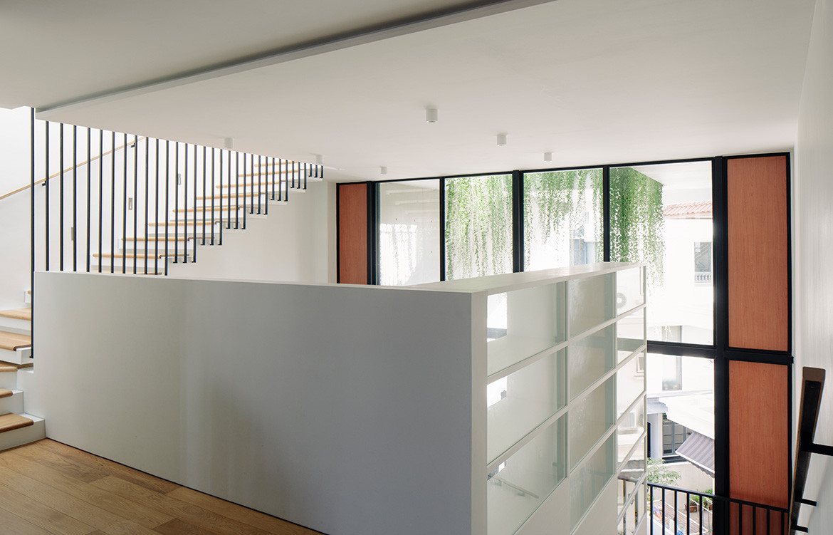
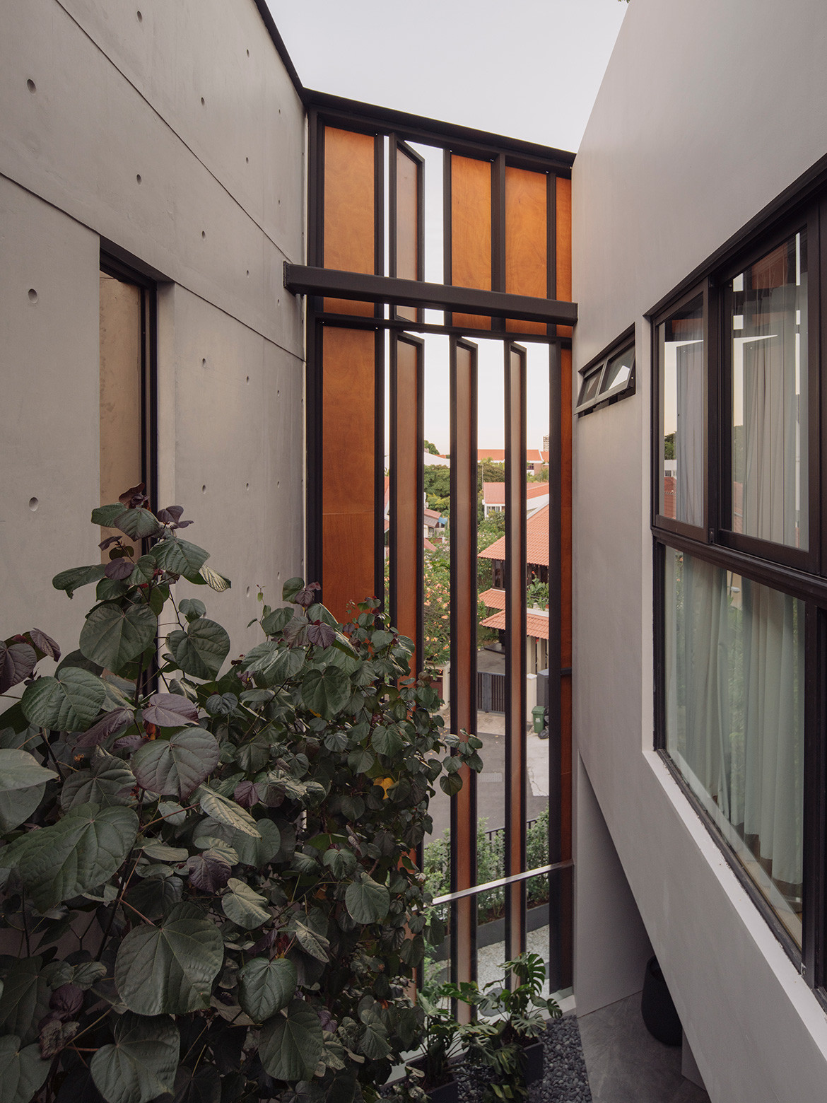
Alongside this, the employment of staggered double and single volumes provides a variety of tableaux.
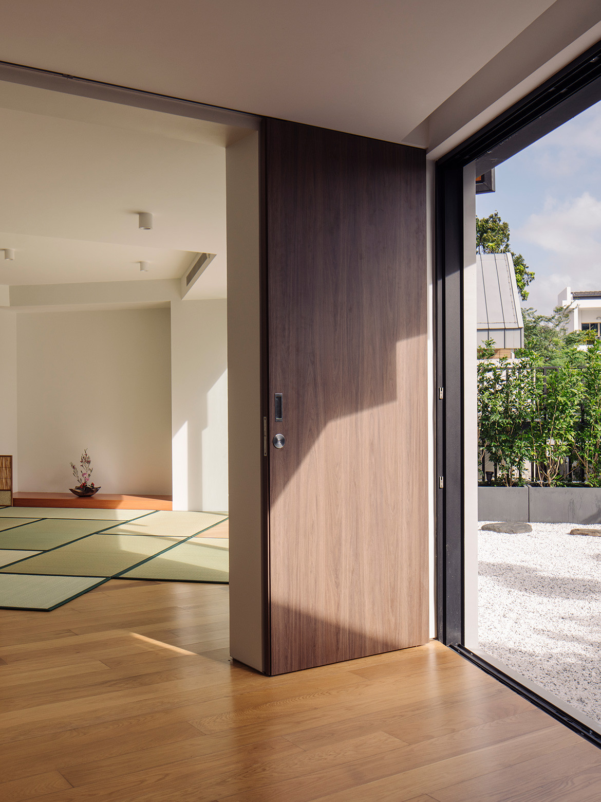
The living and dining area on the ground floor looks into a small plot of greenery at the deepest end of the site. In the left wing of the mezzanine level, guest quarters are afforded views of the pool area. On the opposite end of the same floor, the pebbled Zen garden faces the front of the house and is a suitable complement to the adjacent kimono room where kimono- wearing classes and tea ceremonies are held.
On the next level, a double-volume library rises to greet all who come up the stairs. One’s gaze is drawn out towards the back of the house and over into the pool area again, this time, the view delightfully embellished by hanging foliage. And on it goes until one reaches the attic and roof deck where a panorama of the neighbourhood serves as a reward.
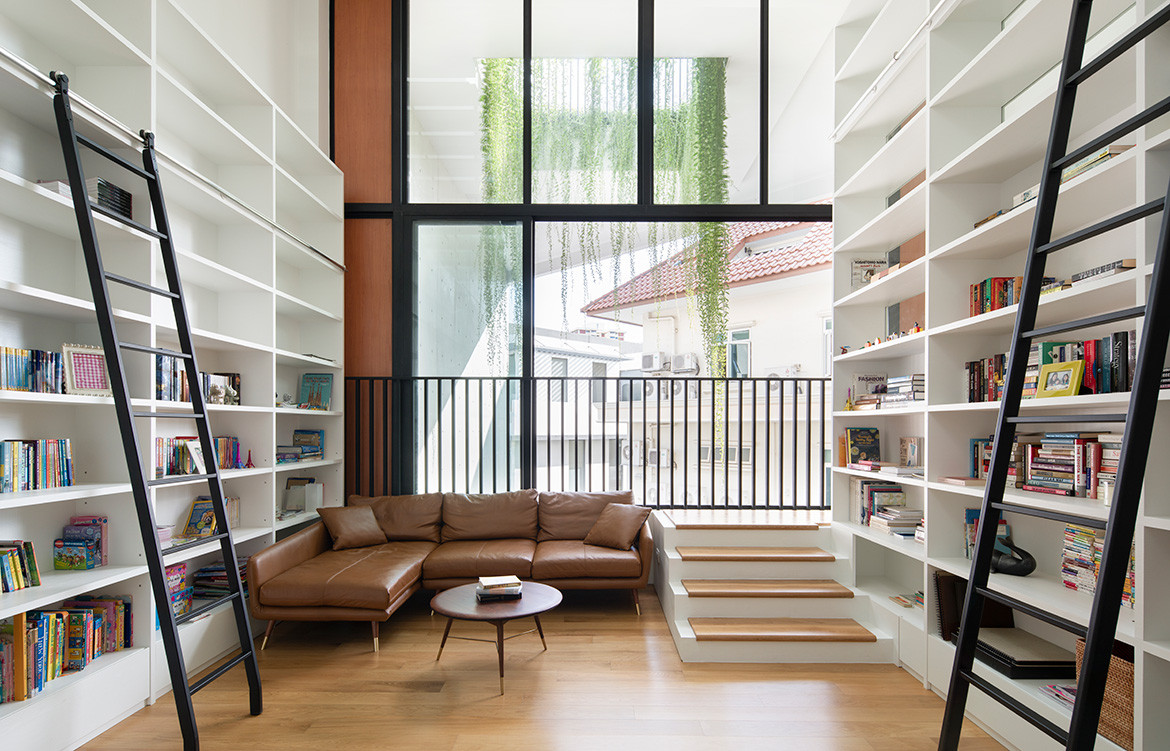
The climb up to the attic is surprisingly easy, with none of the tedium one might expect from moving up four floors. To this end, the staircase is segmented and punctuated by extended transitions at various landings.
The rise for each step is shorter than usual and its tread broadened ever-so-slightly to encourage a slow, restful rhythm up the stairs. Nuances like these are present throughout the house and testify to a thoughtful regard for everyday living.
Beyond formal and spatial readings, the house is perhaps most accurately understood as a vertical landscape of experiences that range from the dramatic to the intimate within mere steps of one another. And while life plays out in the house easily and casually, it does so only because of a highly calculated design approach that negotiates the tensions between privacy and openness with exacting precision.
FARM Architects
farm.sg
Photography by Khoo Guo Jie
