Reimagining the original white cottage as an interior gesture, Splinter Society has elongated and emphasised a pitched roof detail to create beautifully-scaled rooms for a young family on Host House. Housing the open plan living space, and one of the bedrooms, the cottage’s gable form extends outwards to create a pergola in the backyard.
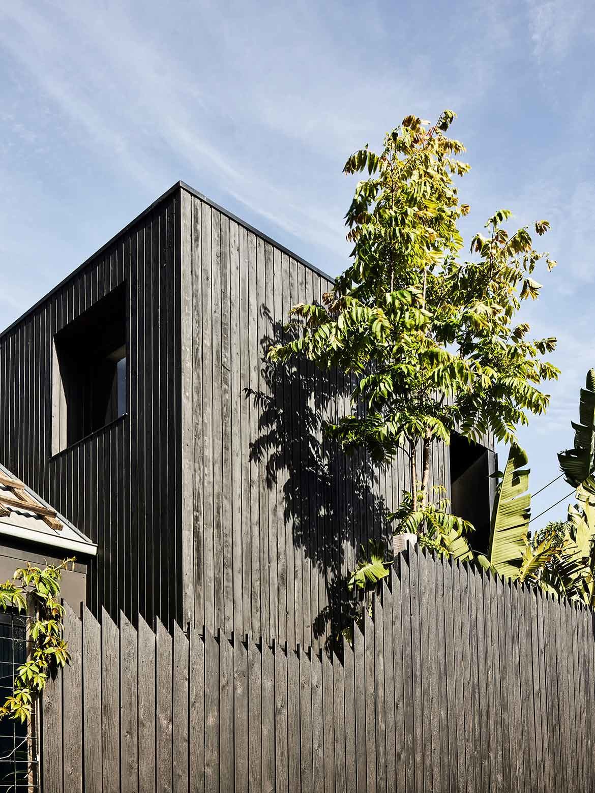
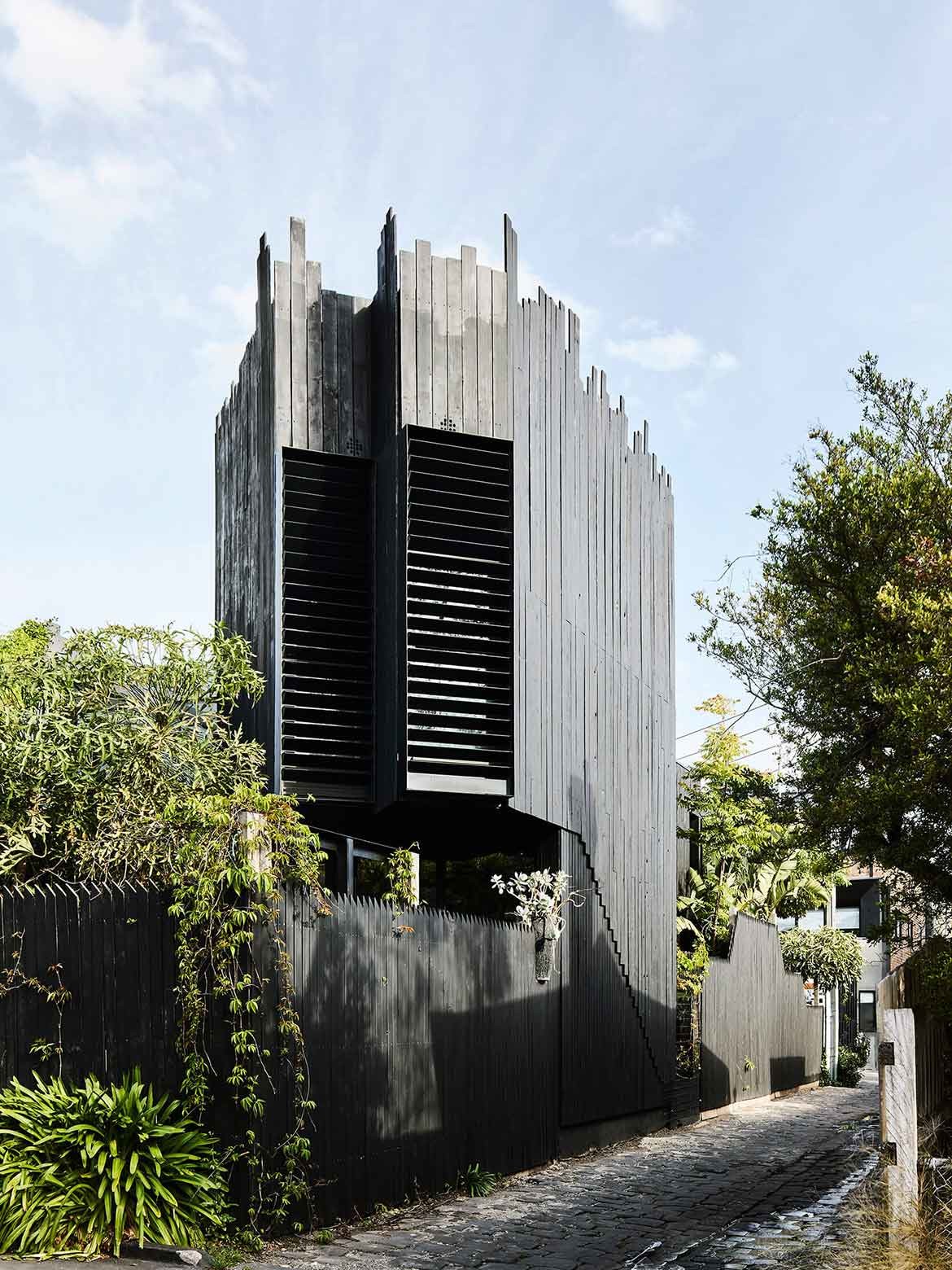
The real drama however, resides in the addition of new rooms, which as architectural volumes are expressed in black timber: “There are these overlapping patterns and rhythms which are all reconciled in black. It feels almost like the building is wrapping down and the fence is wrapping up creating these layers and volumes with gradients of solidity and transparency the whole way through,” says Chris Stanley, Splinter Society Director.
Effectively this creates a contrast of black and white, new and old, which the architects have further emphasised with repeated expanses of vertically placed black timber.
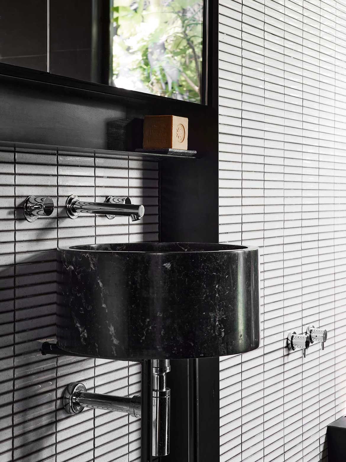
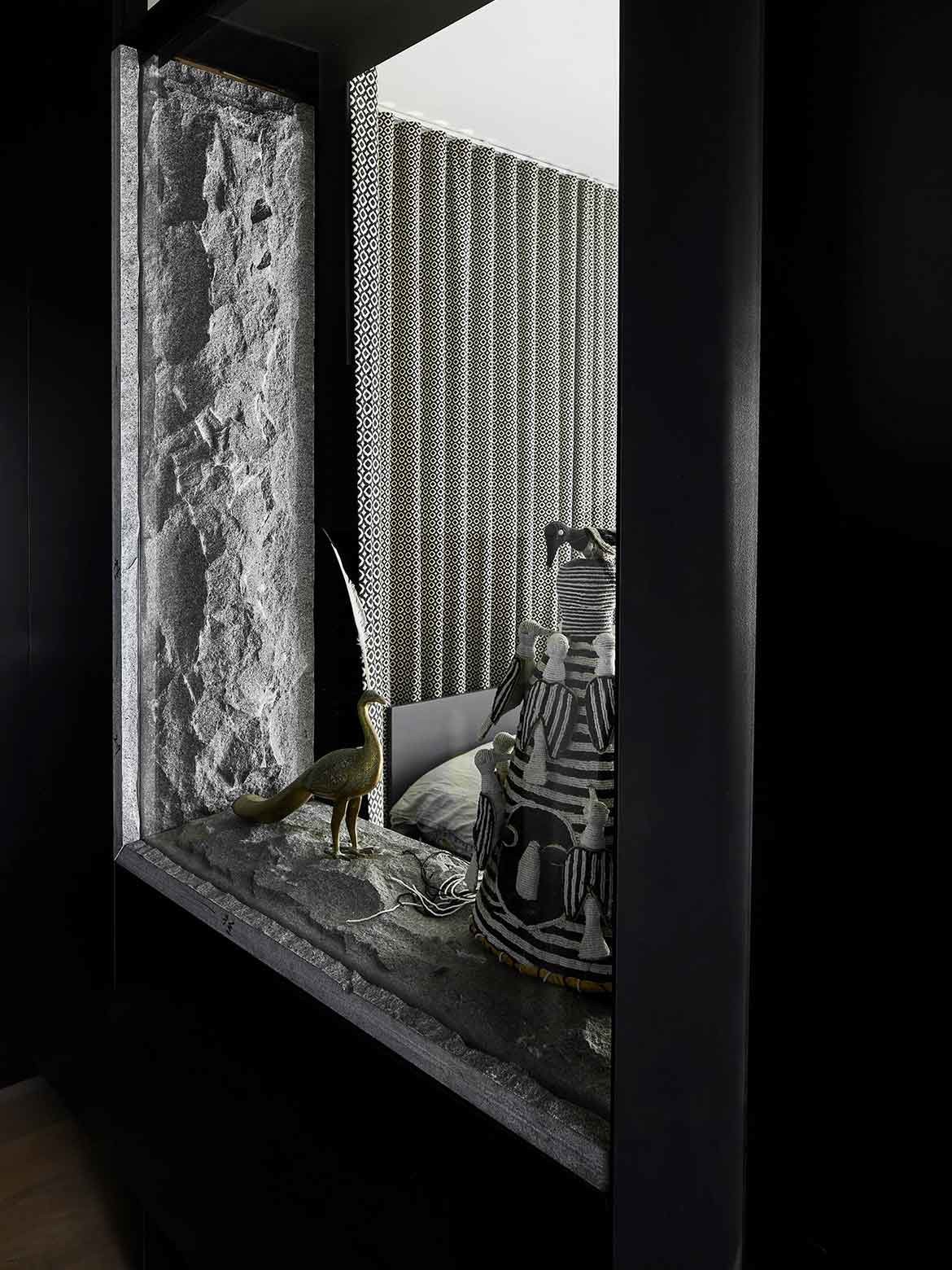
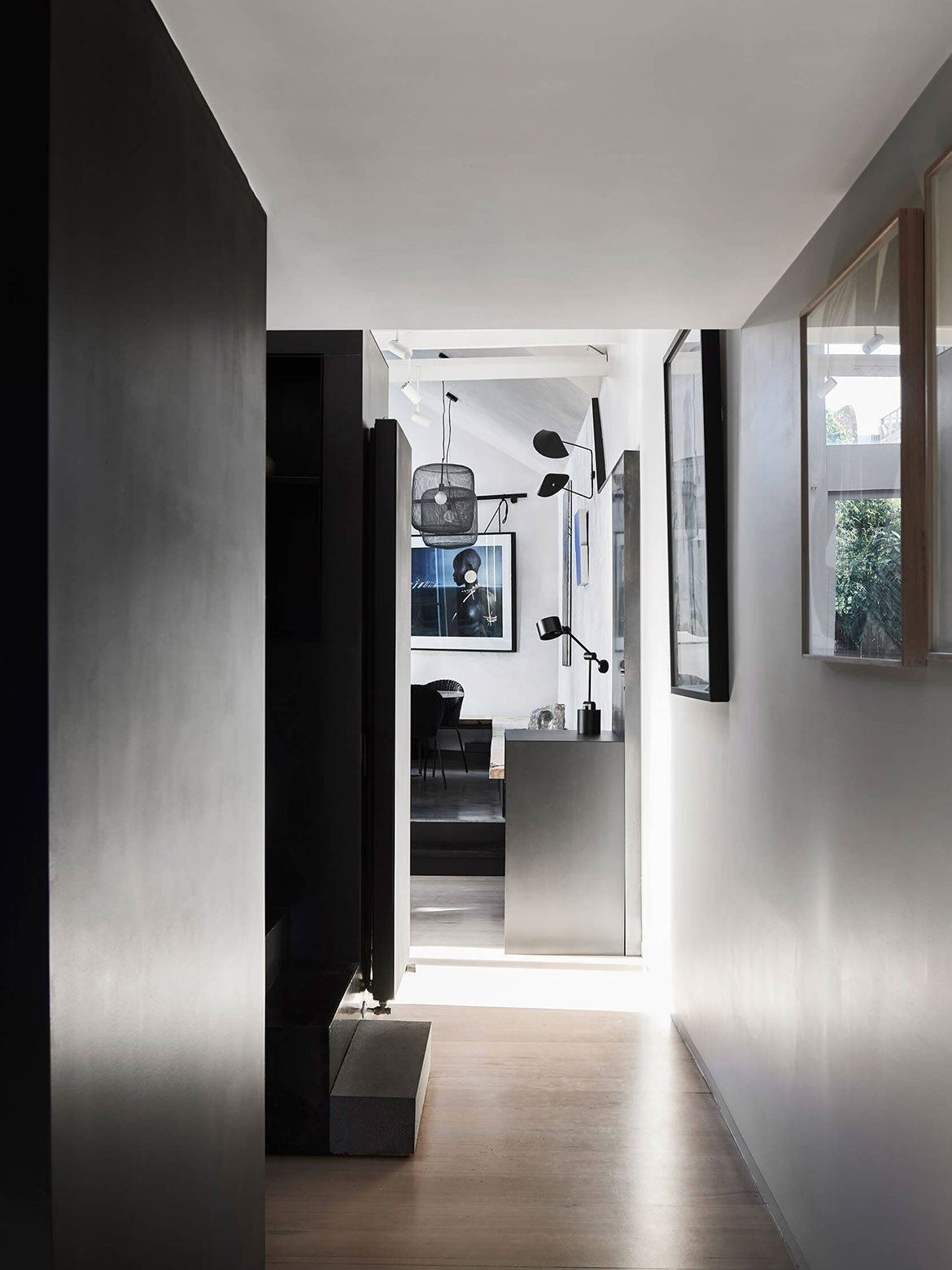
Appearing both externally and within the home, the blackened elements are executed in sustainable rough sawn timbers. These are paired with textured plaster, formed concrete and rough-hewn stone, with the latter being used in an internal window feature.
Imbuing the whole is an abundance of natural light that shifts the reading of smooth and rough surfaces as it changes direction and strength in the course of the day.
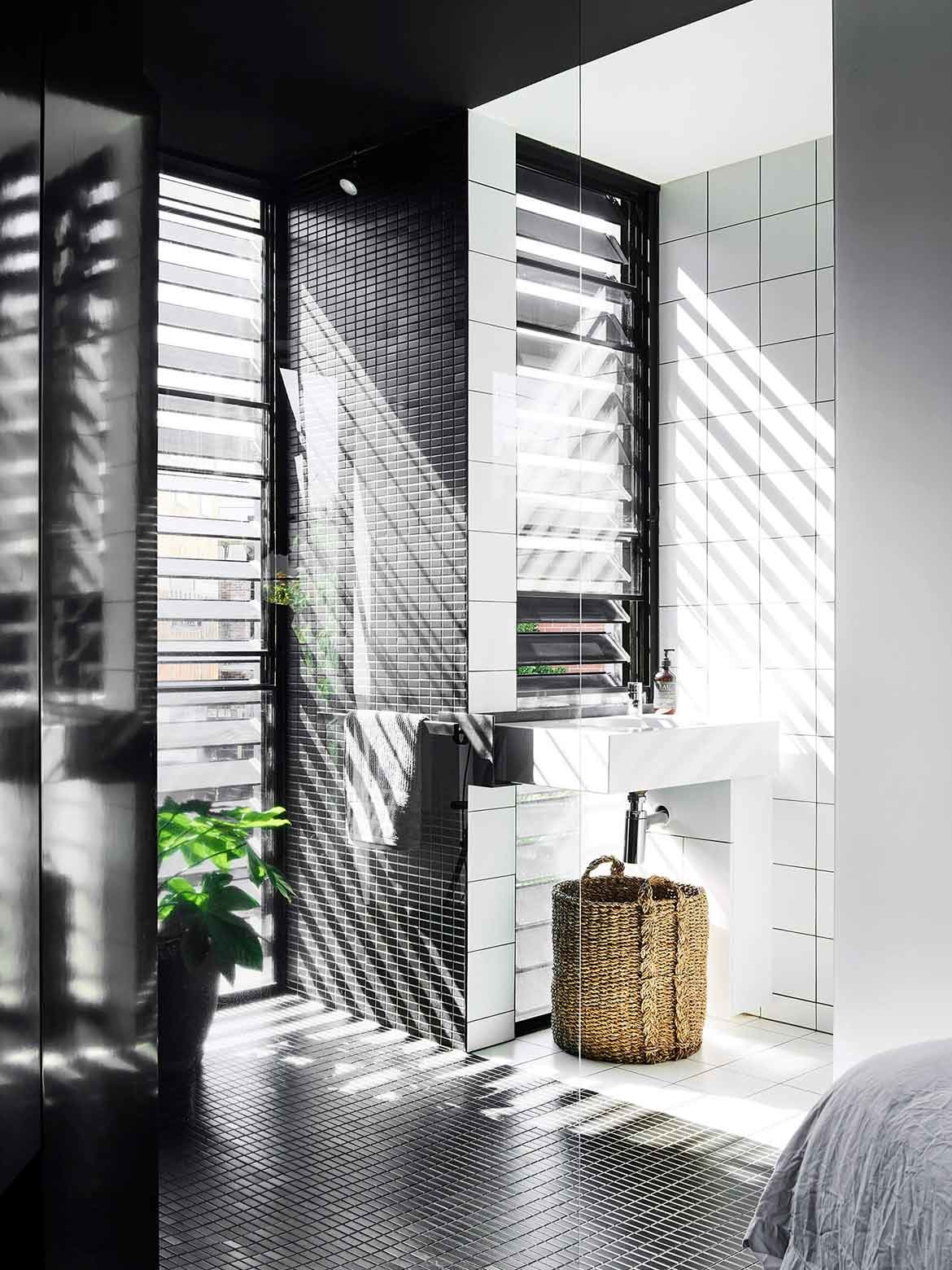
“There is an emphasis on natural light and the play of light across materials and textures. It’s not just one big window but intentional interactions between light and space across the day,” says Asha Nicholas, Splinter Society Director. Cut into the house’s façade to read as folded lines, the windows are incredibly deceptive. From the outside, they appear as shifts in materiality rather than as windows perse.
From within, however, a long row of skylights catches the eye, which allows for a constant play of light. Gardens are similarly inconspicuous until viewed from within. “Soft edges are something we always talk about in terms of materials and form. It doesn’t fight with the softness of the natural world, the more organic finish of the timber slats blends together more. We wanted to create the building to sit in the context gently rather than abruptly,” says Stanley.
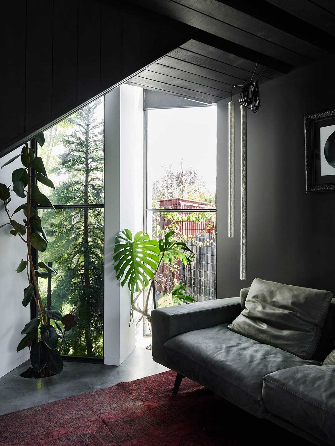
Indeed, the design extrapolates the small garden exponentially with floor-to-ceiling windows inviting the garden into the home. This is arguably most striking beside the sunken bath where a veritable jungle is compressed in a narrow side margin.
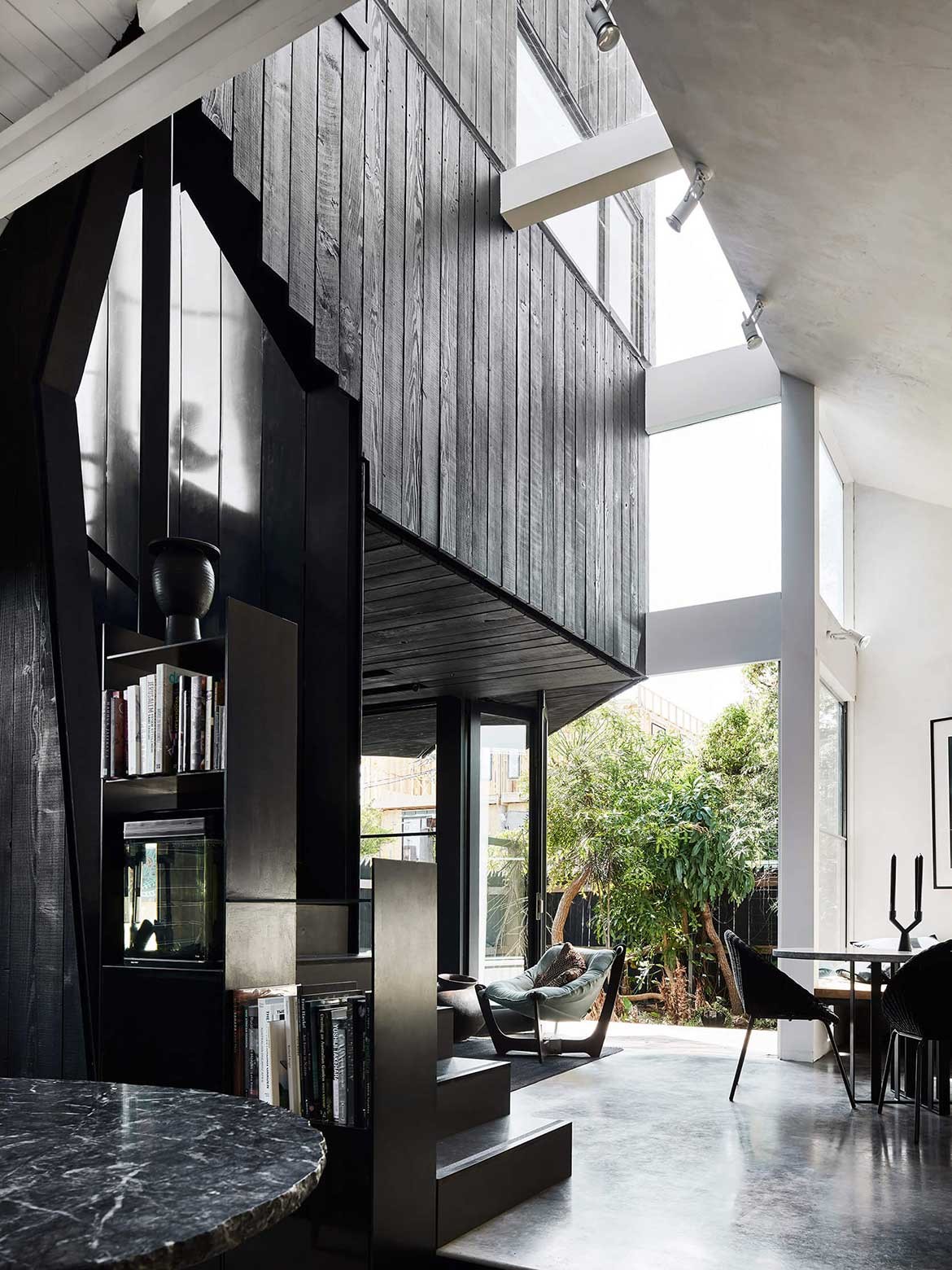
Designed specifically to accommodate the client’s desire to entertain, the large kitchen has a restaurant aesthetic. Large and welcoming, the proportions of the black and white stone bench are those found in boutique accommodation where cooking and dining are seamlessly integrated.
An illuminated bar and expanses of shining finishes compound the restaurant references, while furniture, cabinetry and flow create a counterbalance that places the whole within the domestic. It is an interesting balance as it allows the homeowners to entertain on a large scale without negatively impacting the home experience.
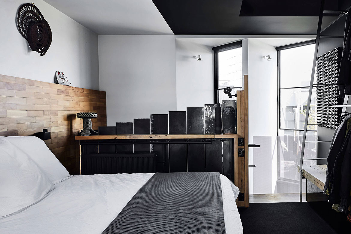
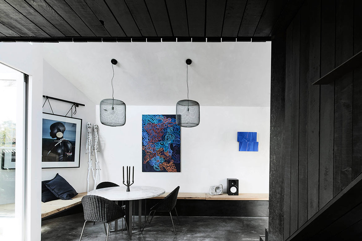
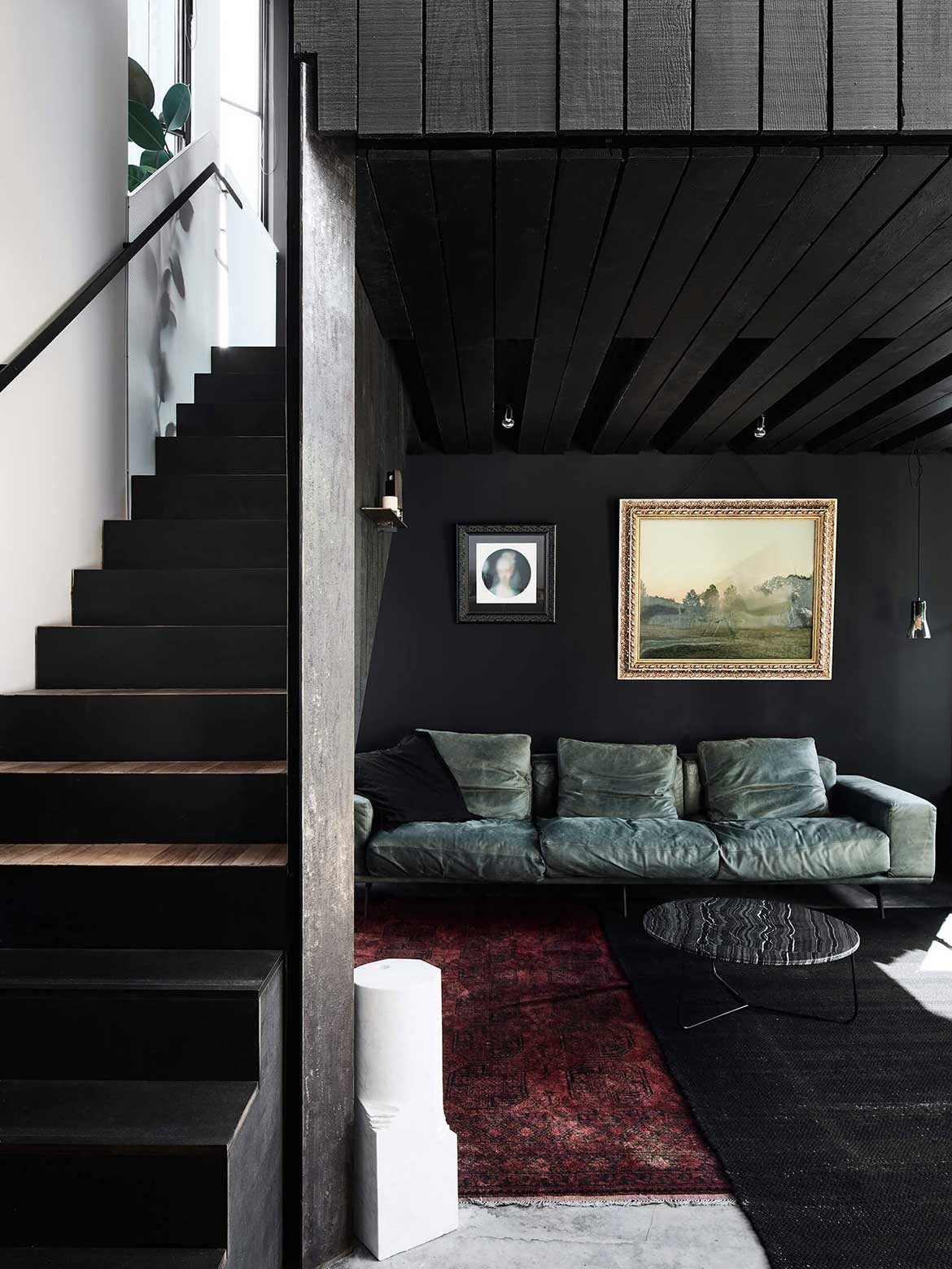
The interior of black and white is broken by the occasional moment of grey as with the rough sawn stone window, lounges and natural timber detailing. A sizeable tribal rug in red and brown adds further interest.
These moments aside, the monochrome interior is purposefully dramatic with tribal art and photography a central motif. Black feature lighting and furnishings take on a sculptural presence, as do the details of the black bannister and ladder.
It is however, Splinter Society’s use of black and white to convey shifts in architecture that makes this project a stand out.
Project details
Architecture and interiors – Splinter Society
Photography – Sharyn Cairns
We think you might like this home in Elwood that also features a timber-wrapped façade, Music Box
