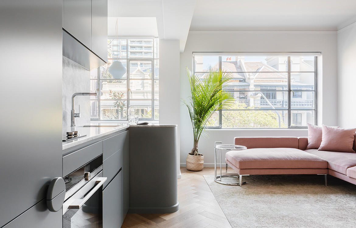
Challis Avenue from Retallack Thompson architects is a one-bedroom apartment in the heart of Potts Point, Sydney. However, through careful planning and examination of its cultural surroundings, the little weekender becomes a space for a family of five — while acting as a memoir to art deco and inner-city living.
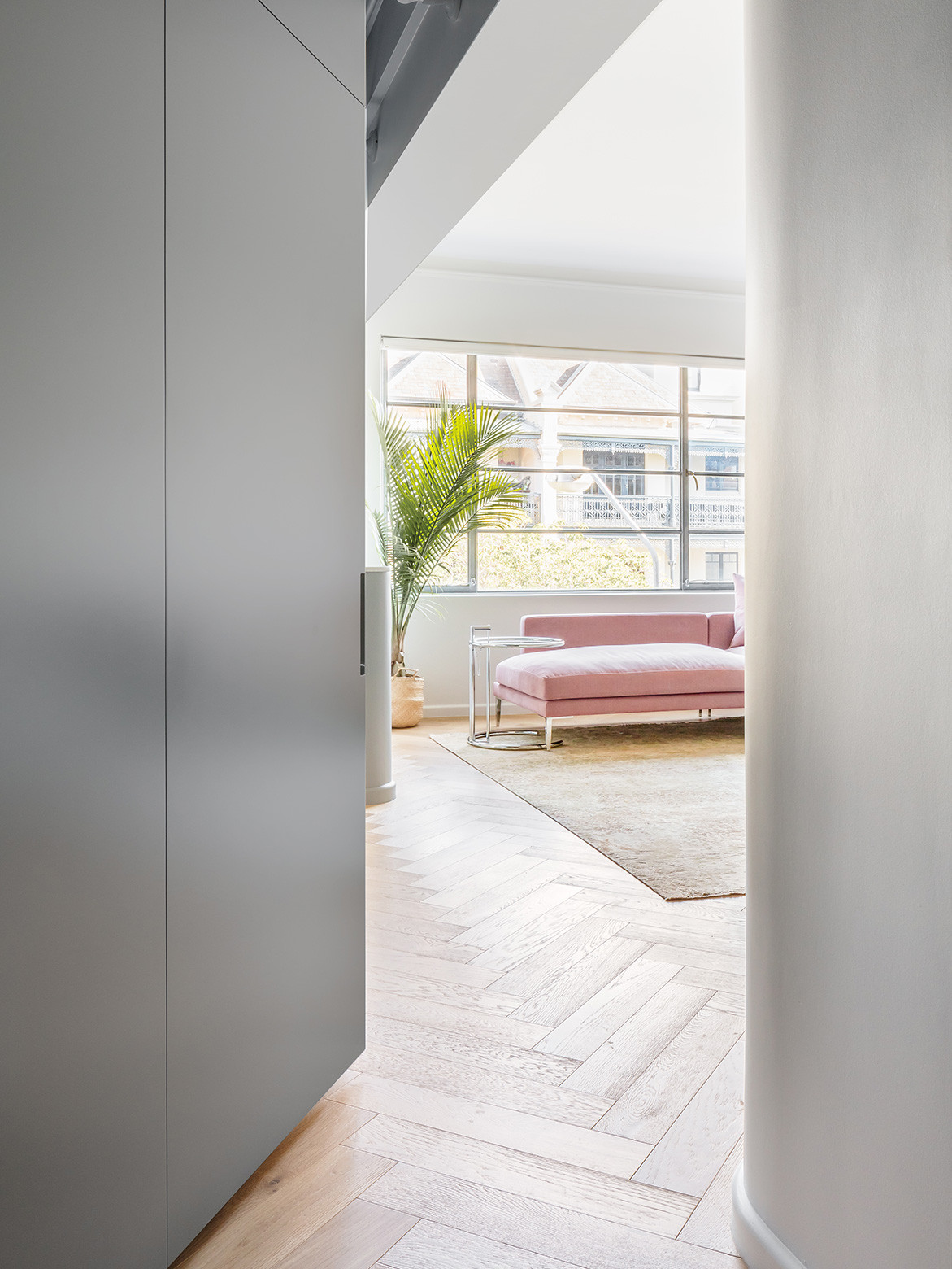
The compact space begins as you enter through the dark hallway, where the kitchen joinery plays into the configuration of the different living zones. Jemima Retallack and Mitchell Thompson explain, “We like, in this age of building, that they always have a separate hallway, which in a relatively small space, still gives you the sense of separation from the common area and then into the apartment.”
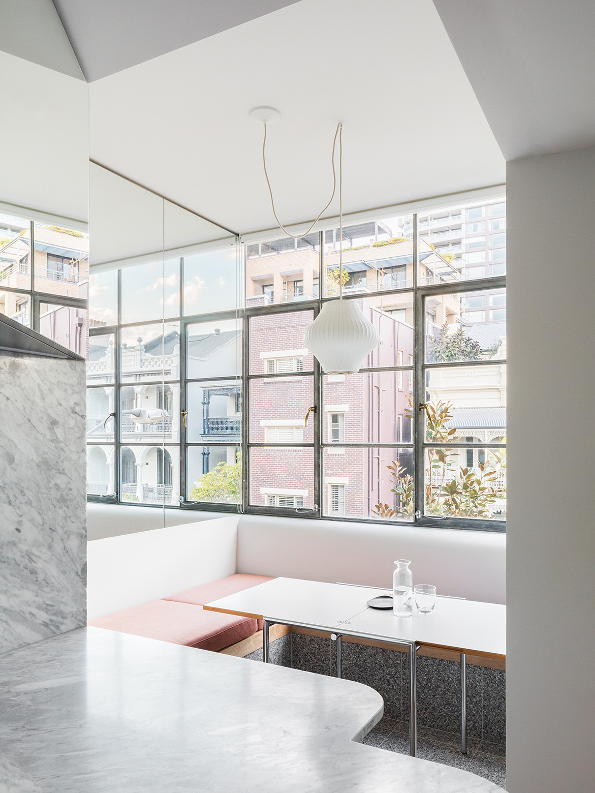
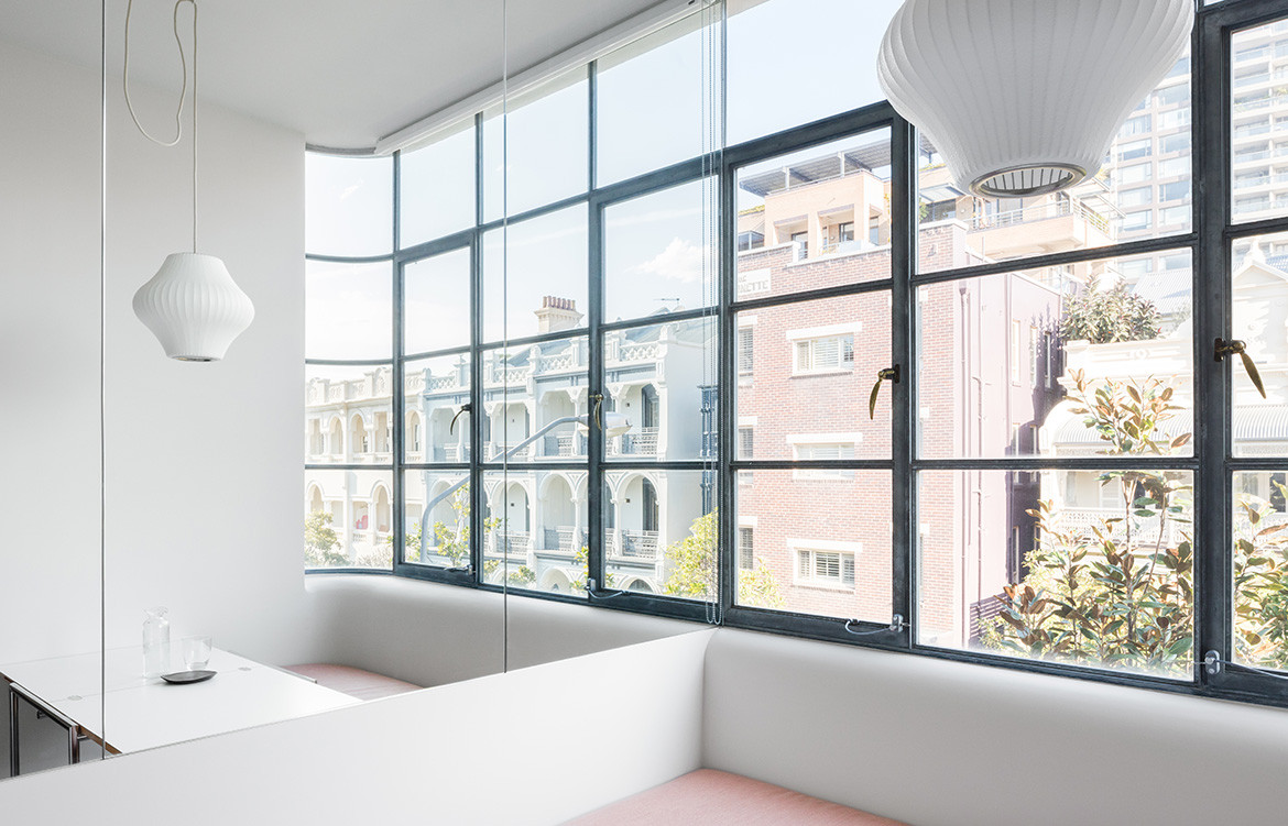
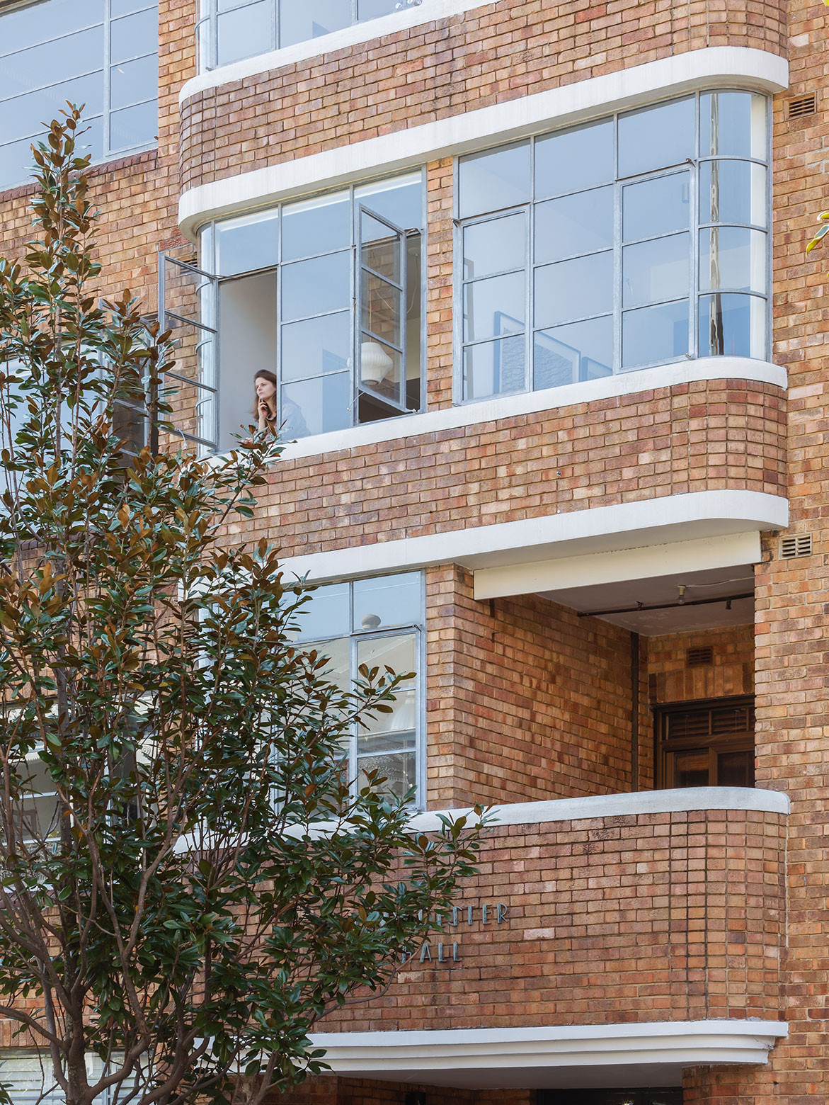
The kitchen sets the apartment into multi-use areas that flow into the main living space – the rooms can be used separately or as one, thanks to the physical lines that divide the weekender. From the main living room, the apartment naturally flows into the sunroom that became the dining nook area; with the original steel windows still intact to let in ample light and district views across Sydney to the Art Gallery of New South Wales. The nook doubles as a sleeping room for two when all the family are in town. Mirrors cover the wall in the tiny niche: “We amplified the substance of the outdoors by using mirrors to bring the view in,” say Jemima and Mitchell.
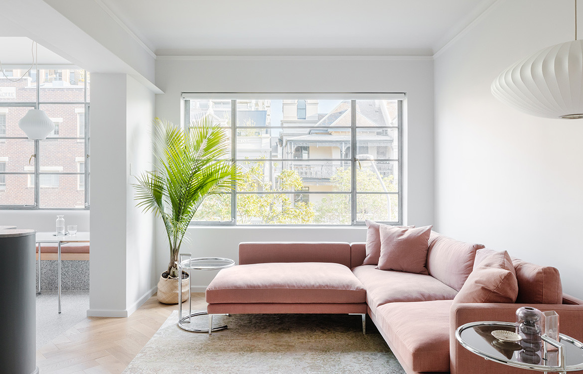
The architects removed three walls to open up the kitchen, living, and dining spaces.
The architects removed three walls to open up the kitchen, living, and dining spaces. The multitude of areas had to accommodate the family of five, and at other times, guests of the family. This fed into the brief: maximising space yet respecting the art deco building’s character.
“The original details were repeated and amplified throughout the build with a modern connection to an open plan living,” add Jemima and Mitchell. They wanted to keep the quality of distinctive rooms, in such a small space, the division of space was necessary so the clients didn’t feel as though they were sitting in the kitchen.
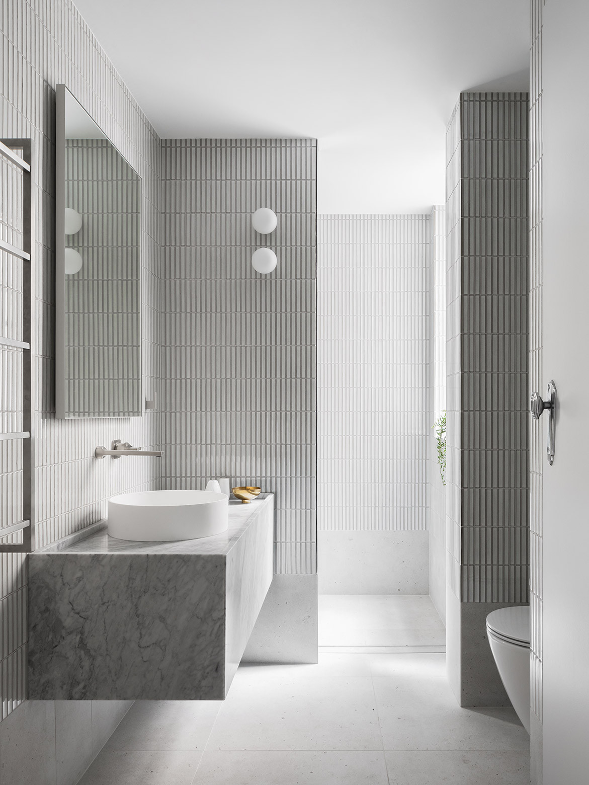
The curved ceilings add to the separate zones, and the material selection was closely linked to the art deco style of the building, such as the intricate tiling in the bathroom. The architects also paid attention throughout the apartment, to the art deco style of softening of edges. They also looked at original features, sharing, “the original doors had these beautiful delicate design, so we mirrored this throughout the kitchen and in the living room.”
From the main living room, the apartment naturally flows into the sunroom that became the dining nook area.
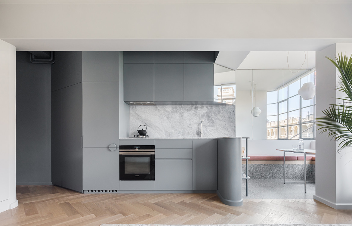
All of the plumbing was hidden away in the new curved kitchen counter, expanding on the physical and manual changes to apartments overtimes – they found most technical elements from the original building have been designed or engineered out in modern houses. “The biggest hurdle is the nature of the actual apartment building in terms of plumbing and moving around kitchen and bathrooms,” they say.
However, Jemima and Mitchell’s design philosophy lives within finding solace in the constraints: “We are often operating within inner-city terraces or apartments with constricting floor plans… We always try to embrace most of the constraints and then very judiciously choose which ones to challenge.”
Retallack Thompson
retallackthompson.com
Photography by Katherine Lu
Dissection Information
Rogerseller pinch tapware & flow shower
Fjord White Floor Tiles and Inax Yuki Wall tiles from Artedomus (bathroom)
Flos mini Glo-Ball (bathroom)
CDK Stone Saint Leon Marble (bathroom & kitchen)
Oven from Siemens
Fisher Paykel Integrated refrigerator & cooktop (kitchen)
Surface Gallery Italian Honed Terrazzo Tiles (Dining)
Hermann Miller Nelson Pendant lights from Living Edge
Eileen Grey Jean fold-out table & Classicon E1027 Side Tables from Anibou
Lennon Sofa from Project 82
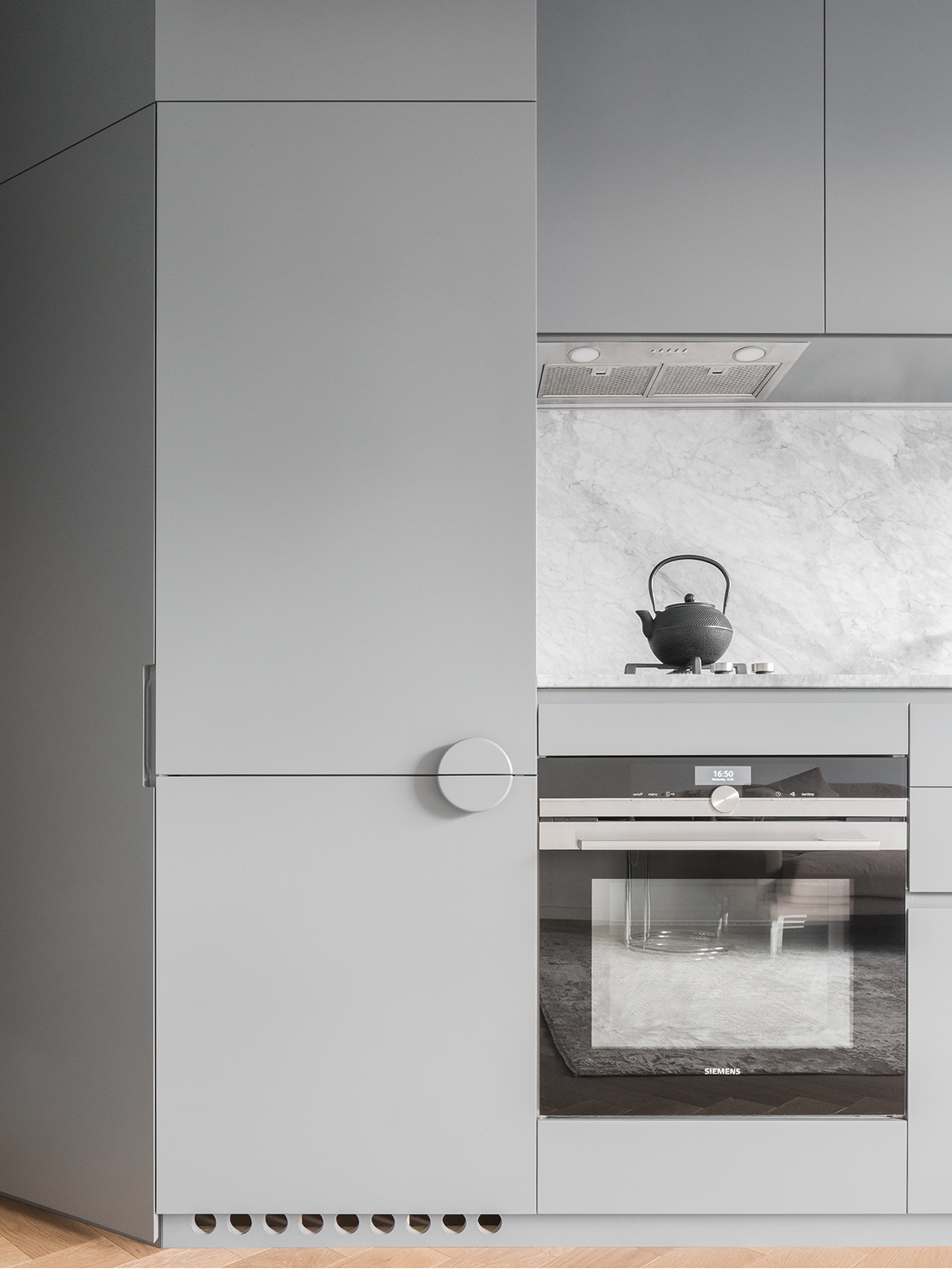
“The original details were repeated and amplified throughout the build with a modern connection to an open plan living.”
We think you might also like Plaster Fun House by Sans Arc Studio
