Mies van der Rohe’s Barcelona Pavilion (1929) may have been short lived but its influence is long standing. Mies believed in the concept of fluid space; of diminishing the boundaries between the interior and exterior by using simple and transparent forms, as he later did at Farnsworth House (1945–51). These pavilion-style buildings with expansive glass walls and open-plan interiors continue to be influential, their elegant simplicity inspiring the design of contemporary homes such as MH House by Architects Ink.
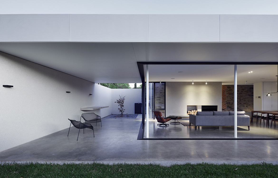
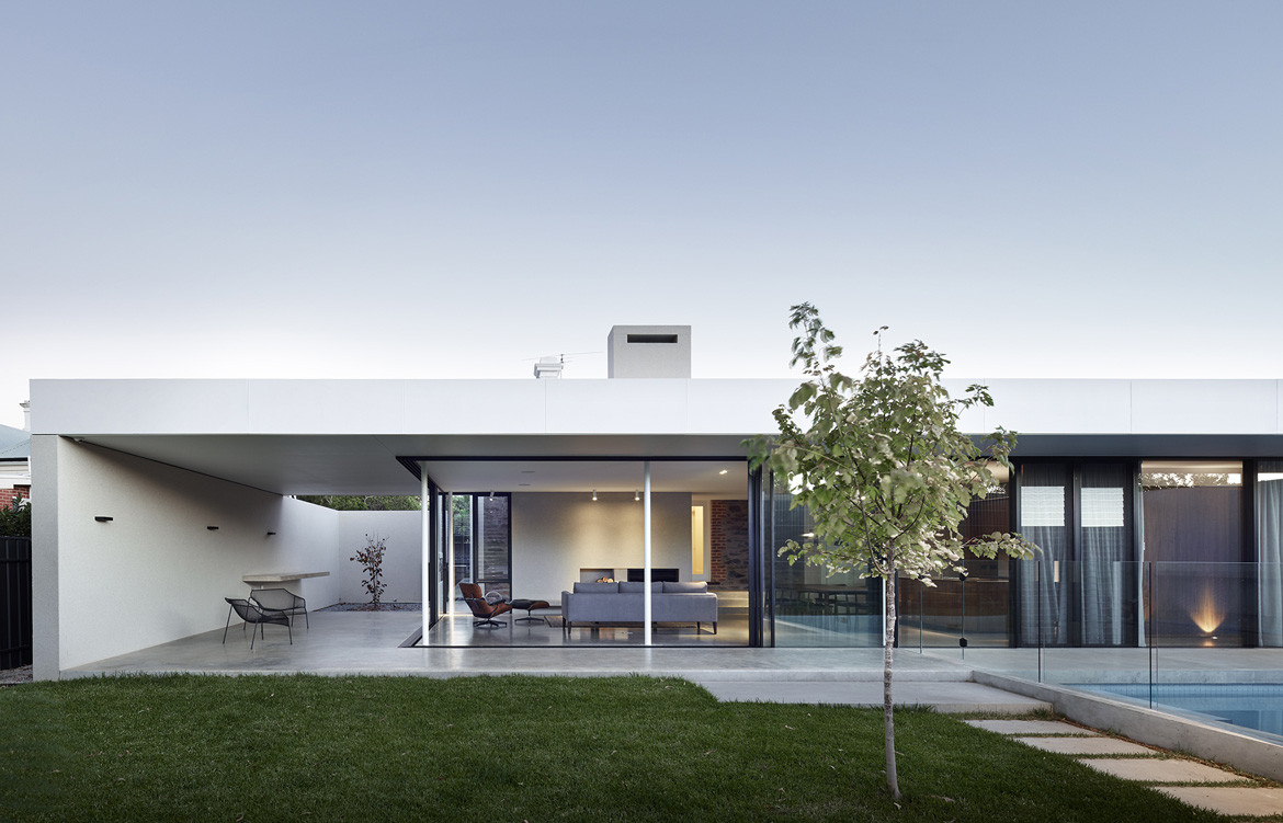
MH House has a single, rectangular volume in which form and materials are used to create an open, light-filled space. “Strong horizontal lines, planning to a grid, minimal material palette and integration of indoor and outdoor spaces are synonymous with the pavilion and common elements in our approach to many residential additions,” says Marco Spinelli, architect and director at Architects Ink.
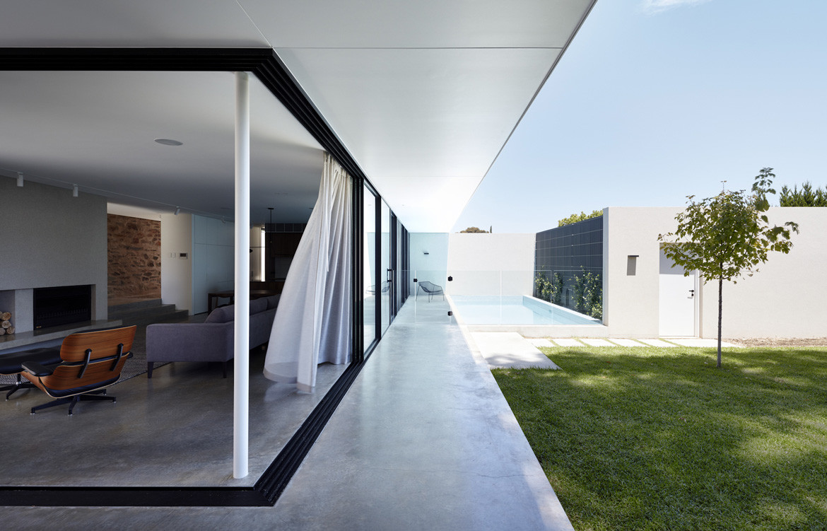
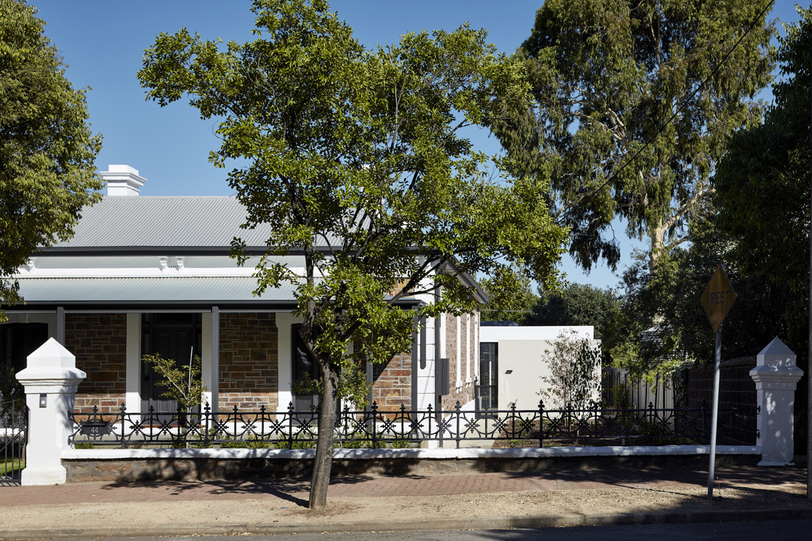
The rear extension to the client’s bluestone villa accommodates a new family living space. With a low, flat roof, the volume is barely visible from the street despite large existing side setbacks to the villa. The pavilion extends the full width of the site to minimise impact on the backyard area and maximise outlook from the living spaces.
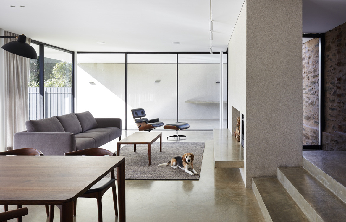
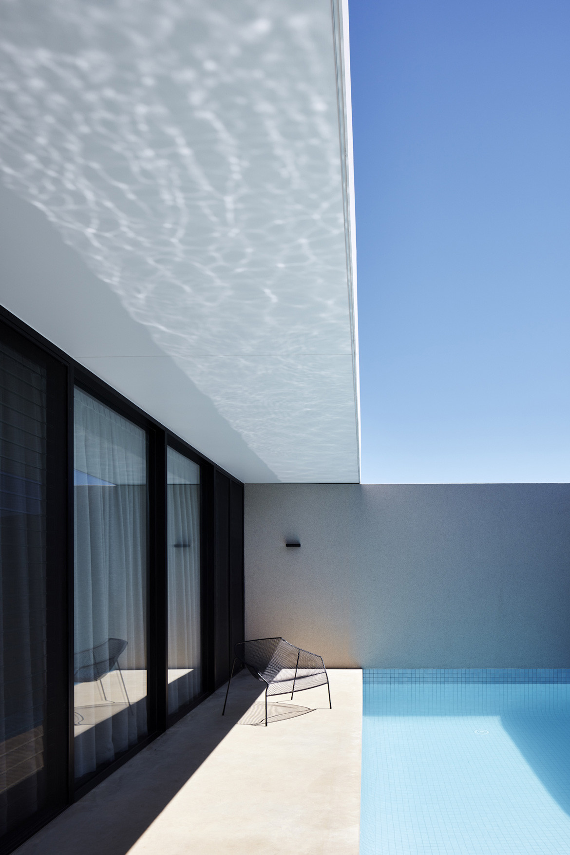
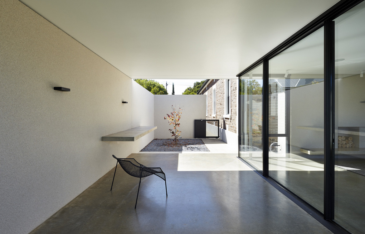
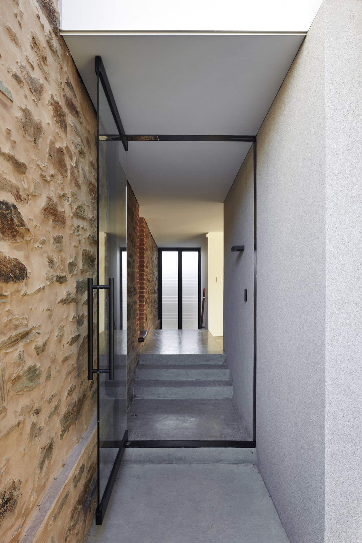
At the new side entry, an oversized custom glass pivot door is a link between the existing house and new marble-chipped rendered wall. Steps lead up to the villa or down to the open-plan space with kitchen and butler’s pantry, dining area, living area and a covered outdoor space. Floor-to-ceiling glass accentuates the horizontal profile and large sliding doors wholly open the lounge to the garden and external area. “We managed a tight budget to allow for the inclusion of premium German-engineered, highly insulated sliding glass doors. They create a seamless transition between indoor and outdoor environments, which was very important to the client and in keeping with the ethos of the pavilion typology,” Marco explains.
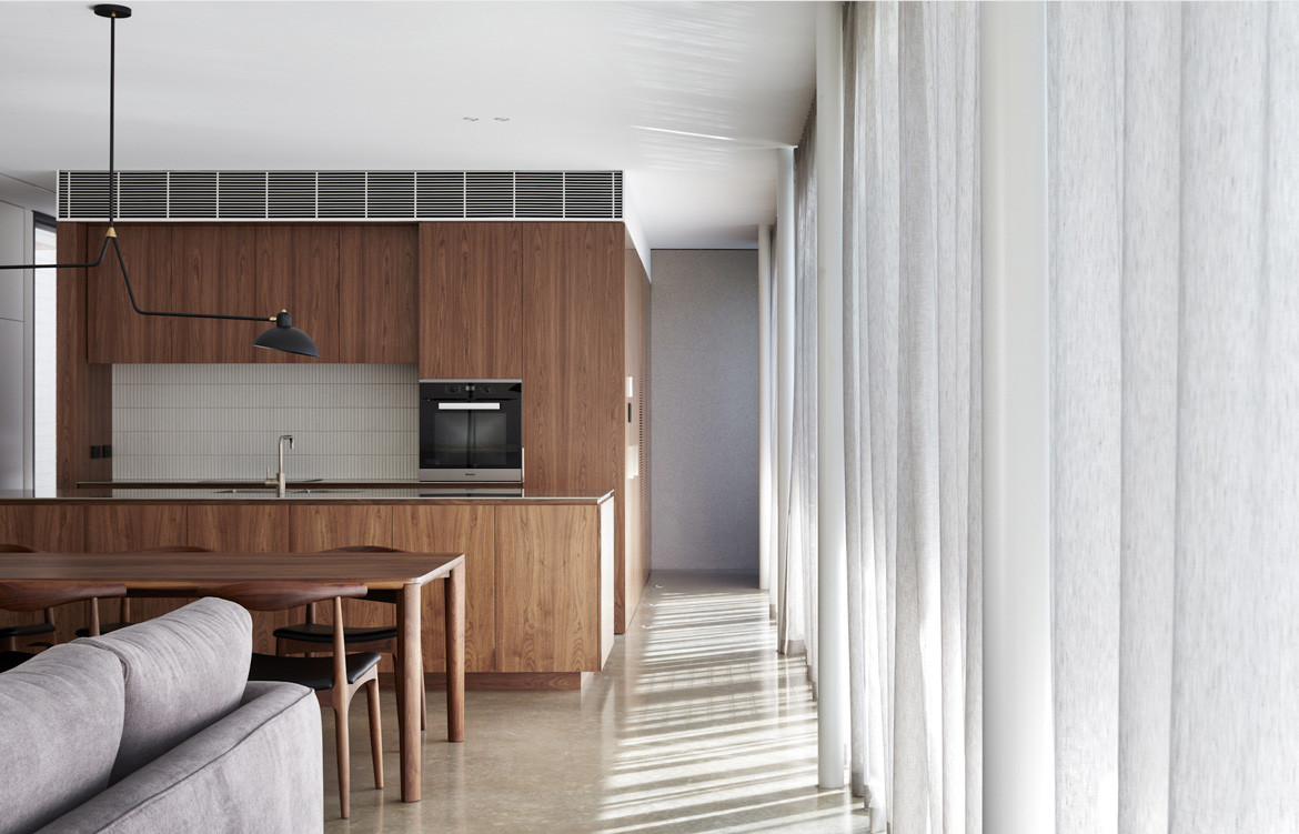
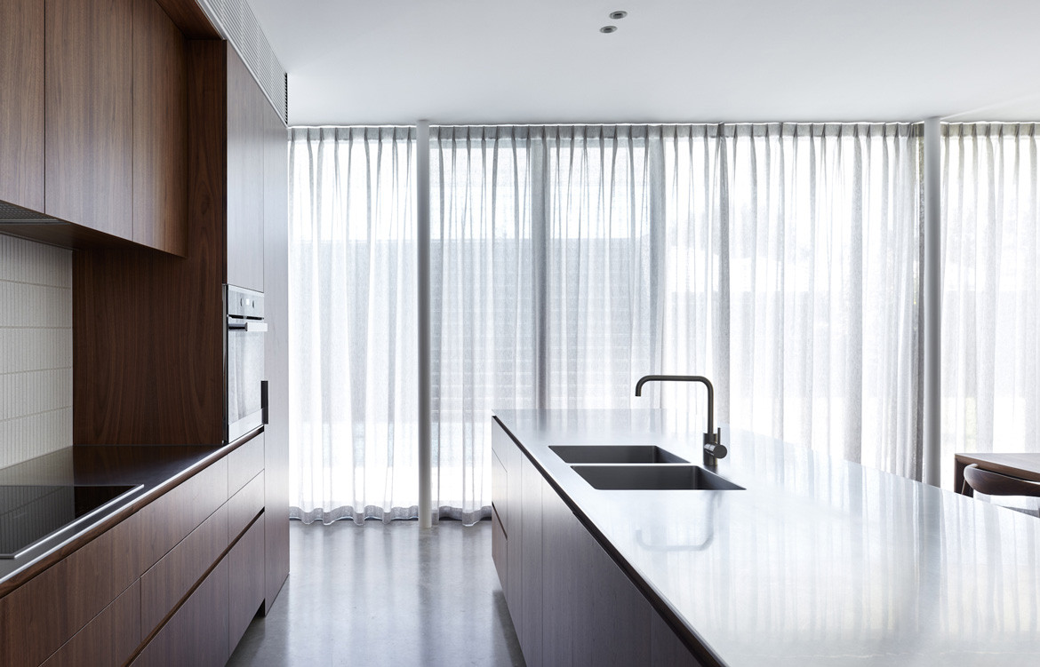
Interior detailing is crisp and clean. A compact joinery ‘pod’ clad in American walnut timber contains the kitchen, pantry and laundry with no structural walls. Centrally located, it allows natural light to penetrate the ‘working’ zone from both sides and an uninterrupted view of the pool and garden. The burnished concrete floor and rendered walls extend externally to enhance the outdoor connection. The rear bluestone wall of the villa is exposed in the entry passageway, providing texture, colour and a connection between old and new. Like the Barcelona Pavilion and Farnsworth House, MH House meshes the manmade and natural to reinforce the concept of fluid space, bringing the inside and outside together as one.
Architect’s Ink
architectsink.com.au
Photography by Sam Noonan
