The first thing to note is the fact that this is not a knockdown and rebuild as most ex-govies are treated. Instead, Mulford has rethought the existing layout and reworked the interior to make it suit a contemporary family.
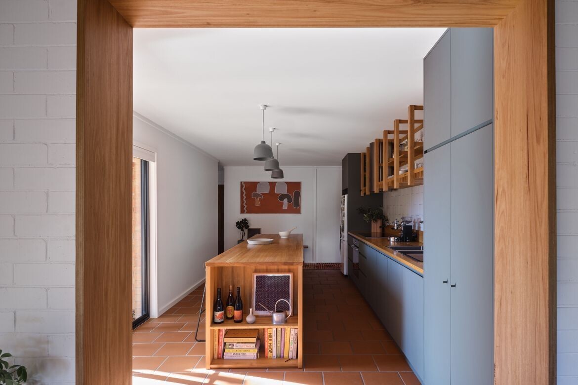
At the heart of the transformation is the shift of the kitchen and dining room from their prime position in the right wing to the centre and rear of the home. “It felt like an obvious move to bring the kitchen into the central space, which was essentially a large thoroughfare, make it useful and functional, and the beating heart of the house. And that freed up the vacated space to become the main bedroom, ensuite and parents retreat,” says Josh Mulford, JMA Principal.
In doing so the strange configuration has been made contemporary. Moreover, while working within a tight budget, the move changed a three-bedroom + one-bathroom house into a four-bedroom + two-bathroom house without extending the building footprint in any way.
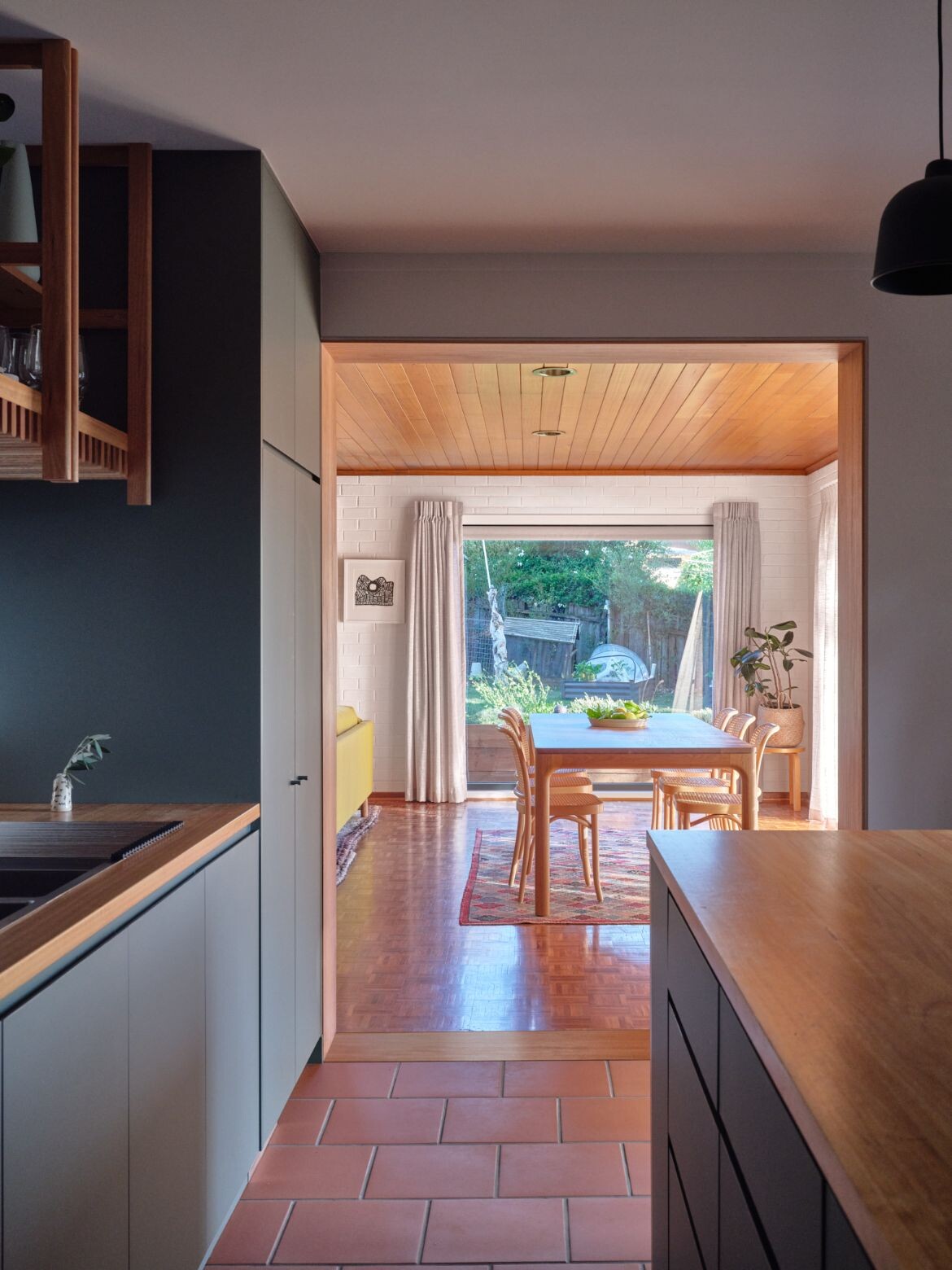
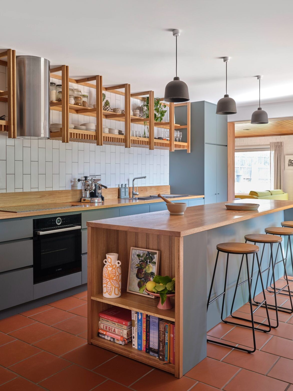
The kitchen, now occupying what was a significant central connecting passage, is elegantly proportioned and engaged with the living spaces. Centred by a natural timber island the tones are Australian bush with painted cabinetry in eucalyptus green complemented by blackbutt timber benchtops and detailing.
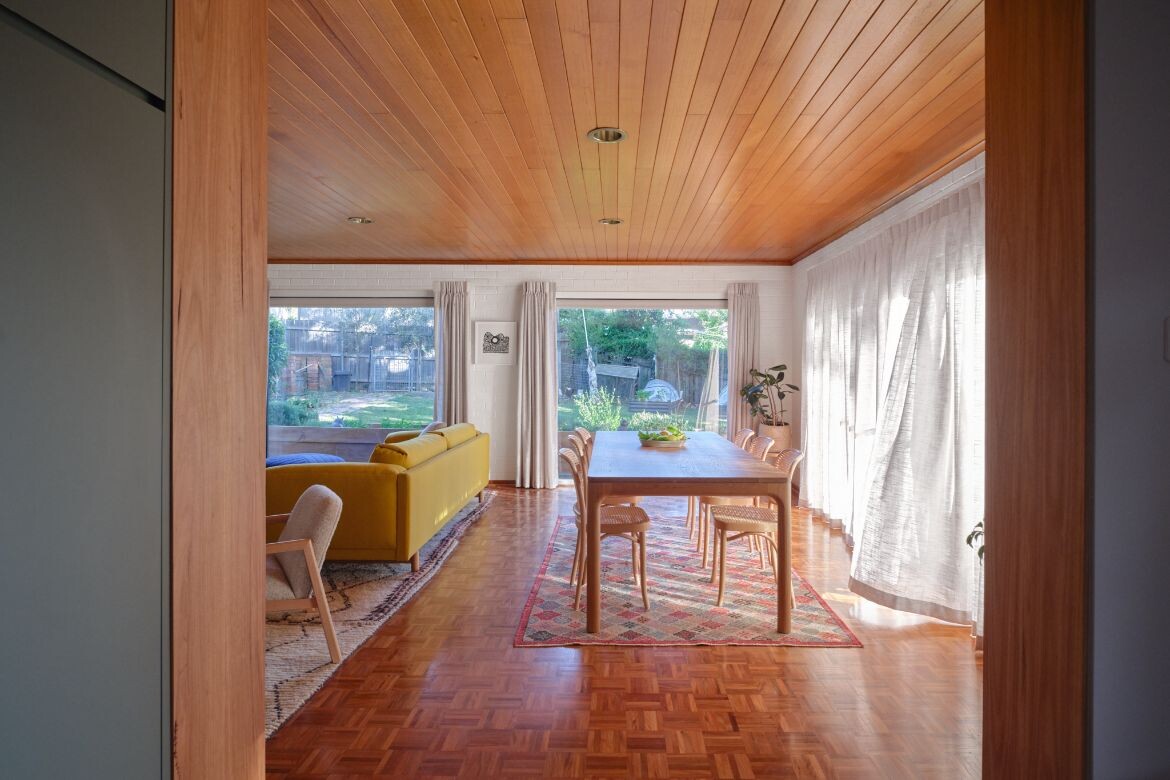
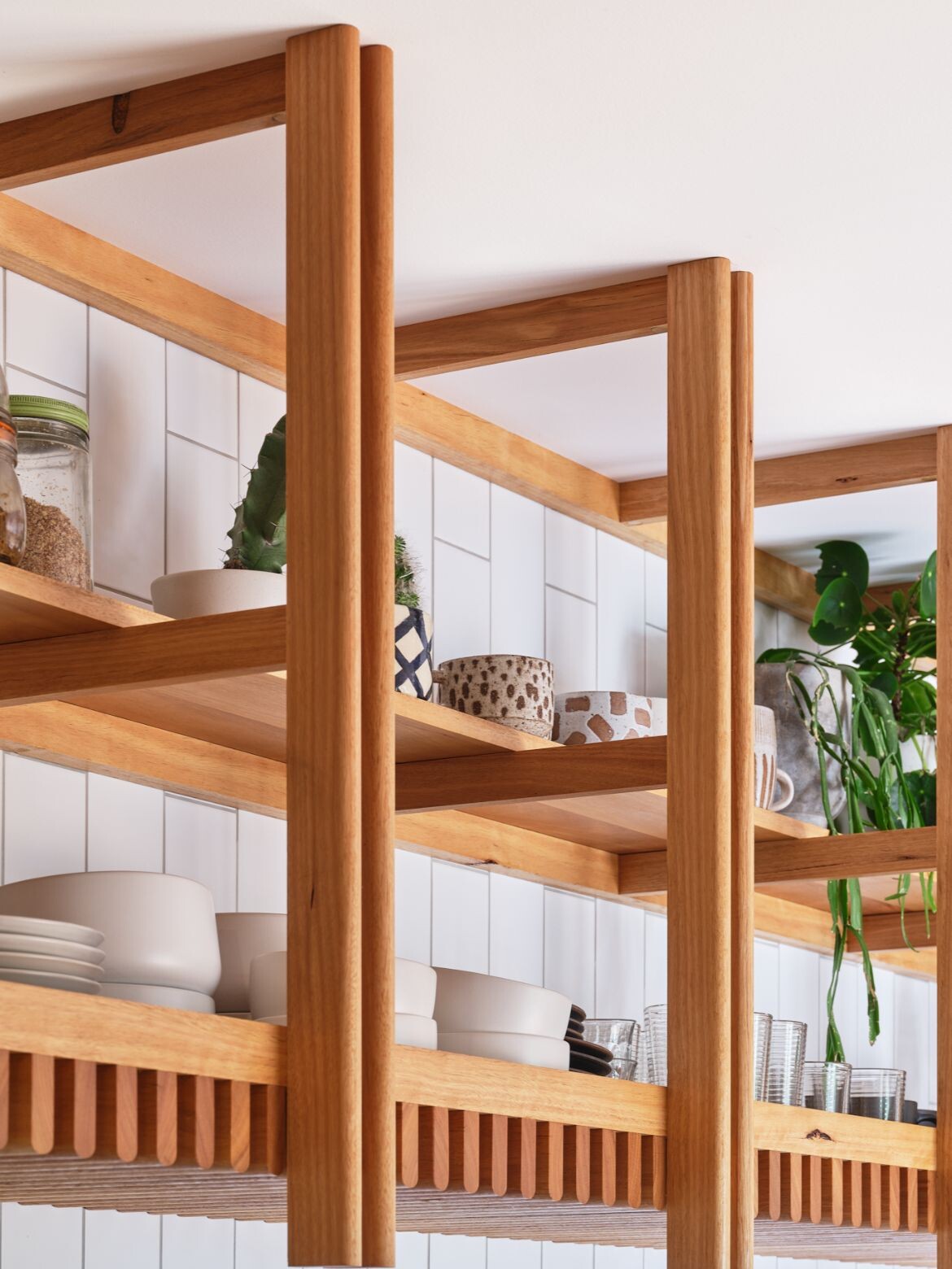
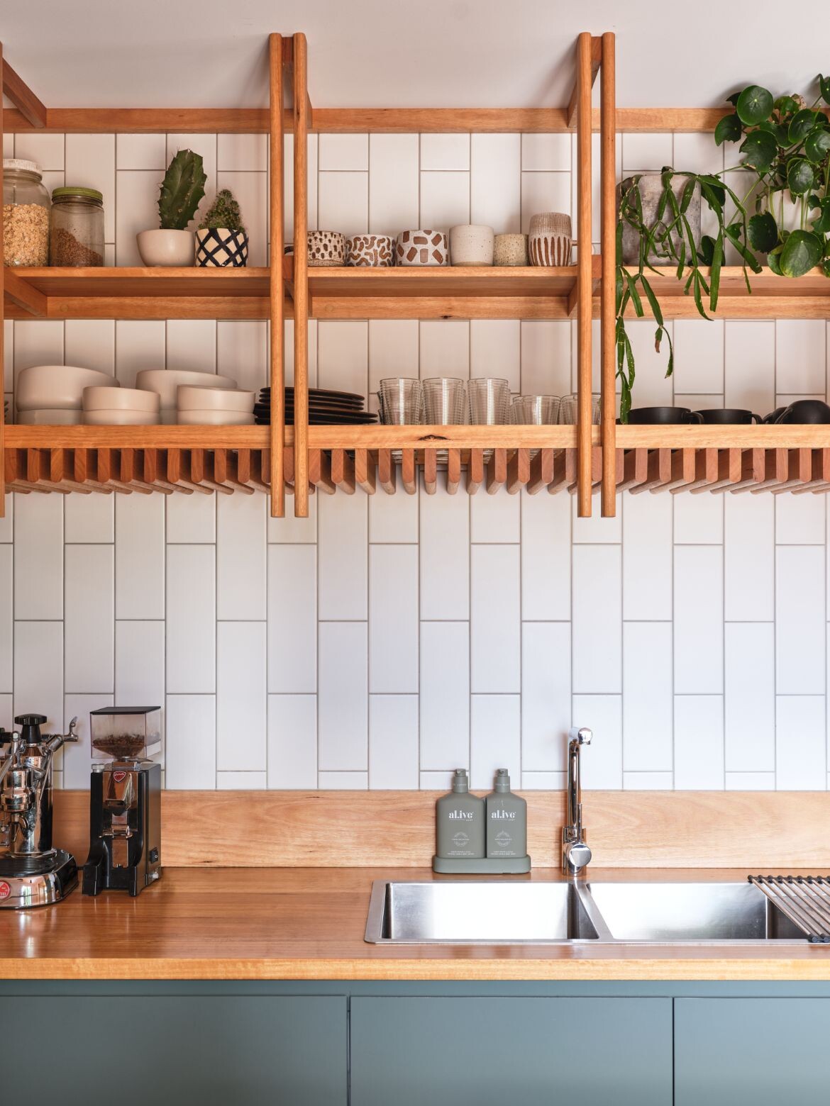
A floor of terracotta tiles and timber-lined architraves visually links to the warm parquetry of the living space, while beautifully crafted cabinetry is made unique with a semi-rounded dowel rail feature that creates a visual rhythm.
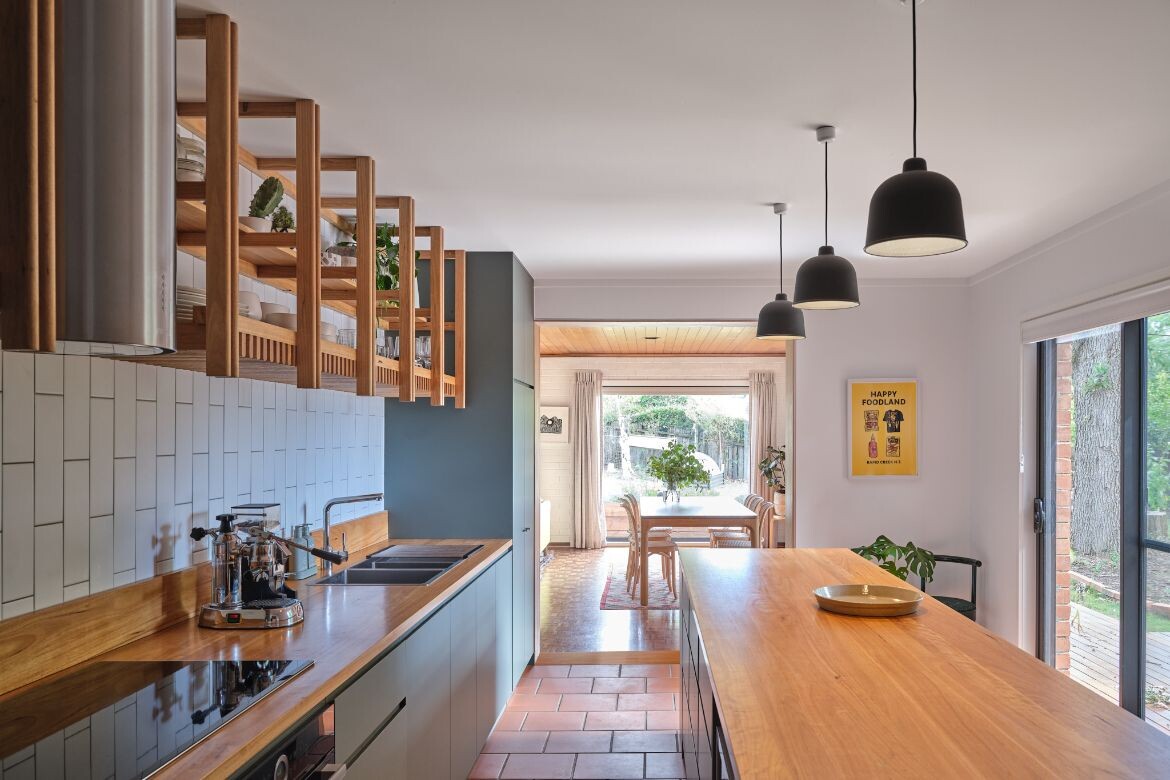
“It was quite a long space. I think the proportions, patterning, lightness and showing a level of craft was really important. So picking up on the timber, but giving it a level of detail and care that is celebrated by expressing its assembly,” says Mulford.
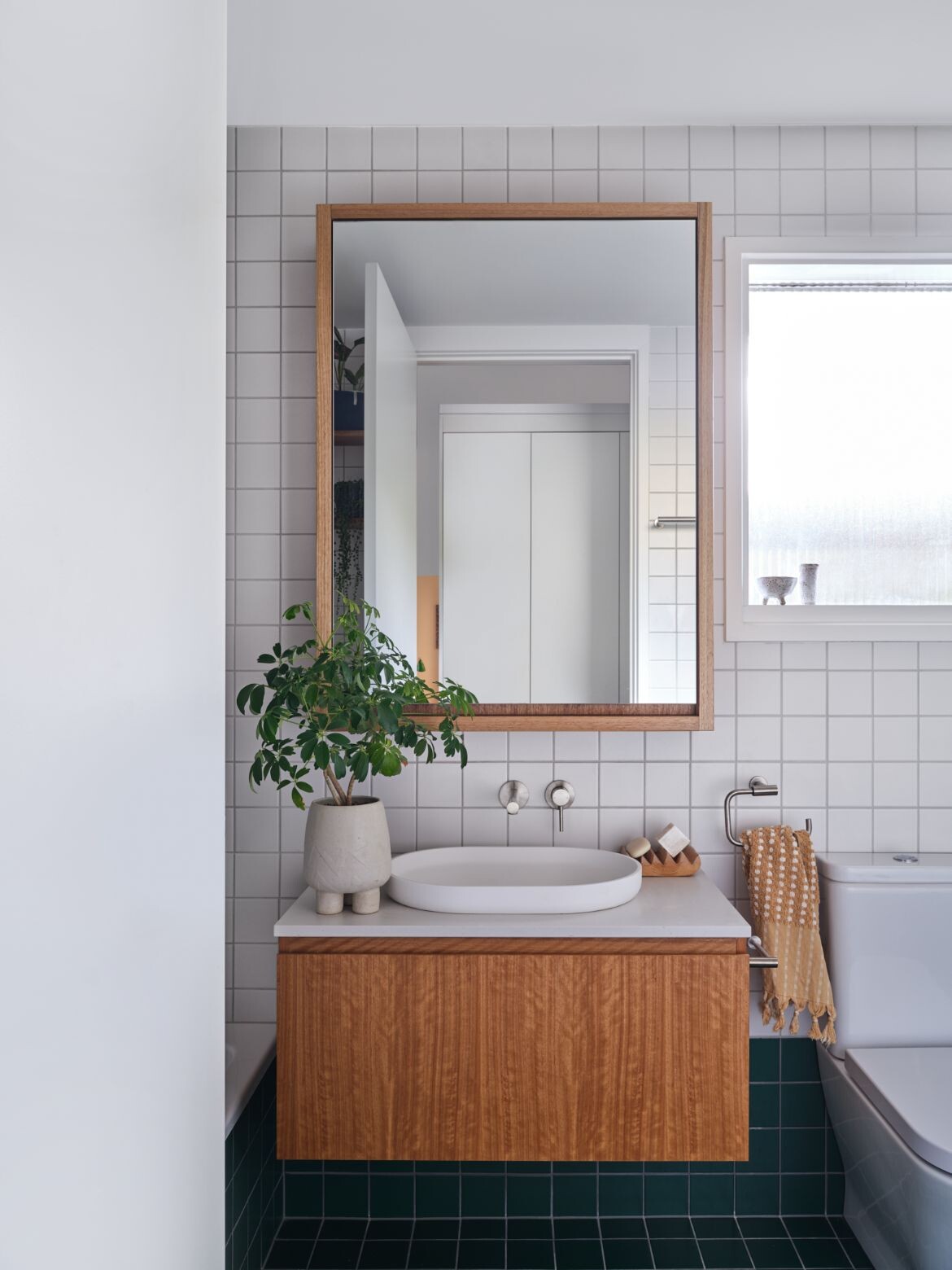
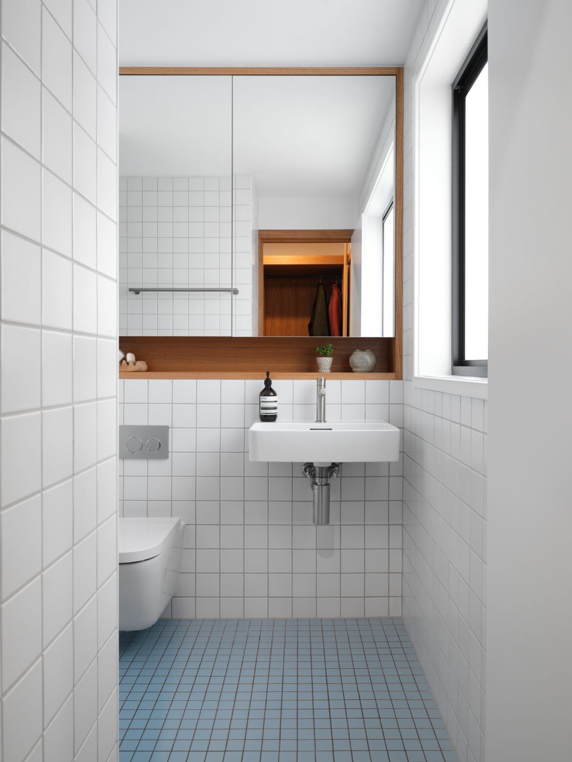
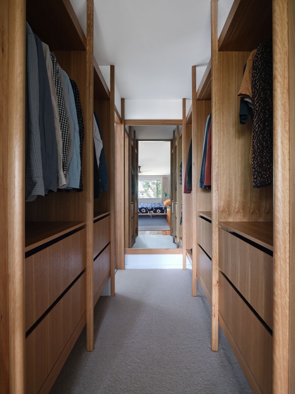
This same timber detailing has been carried through to the master walk-in robe, where the cabinetry is effectively a large piece of bespoke fine furniture. With the elongated form, the geometric rhythm is even more pronounced, as is the curve that fits nicely within the hand. Befitting Canberra’s climate the robe is fully carpeted, while the parquetry floor of the bedroom proper is only partially covered by a rug. The timber detailing appears again in bathrooms as cabinetry, shelving and mirror surrounds, to add a touch of natural luxury.
.
“I didn’t want to create a saturation of timber. So, it’s used fairly sparingly, and often used to stitch spaces together.”
.
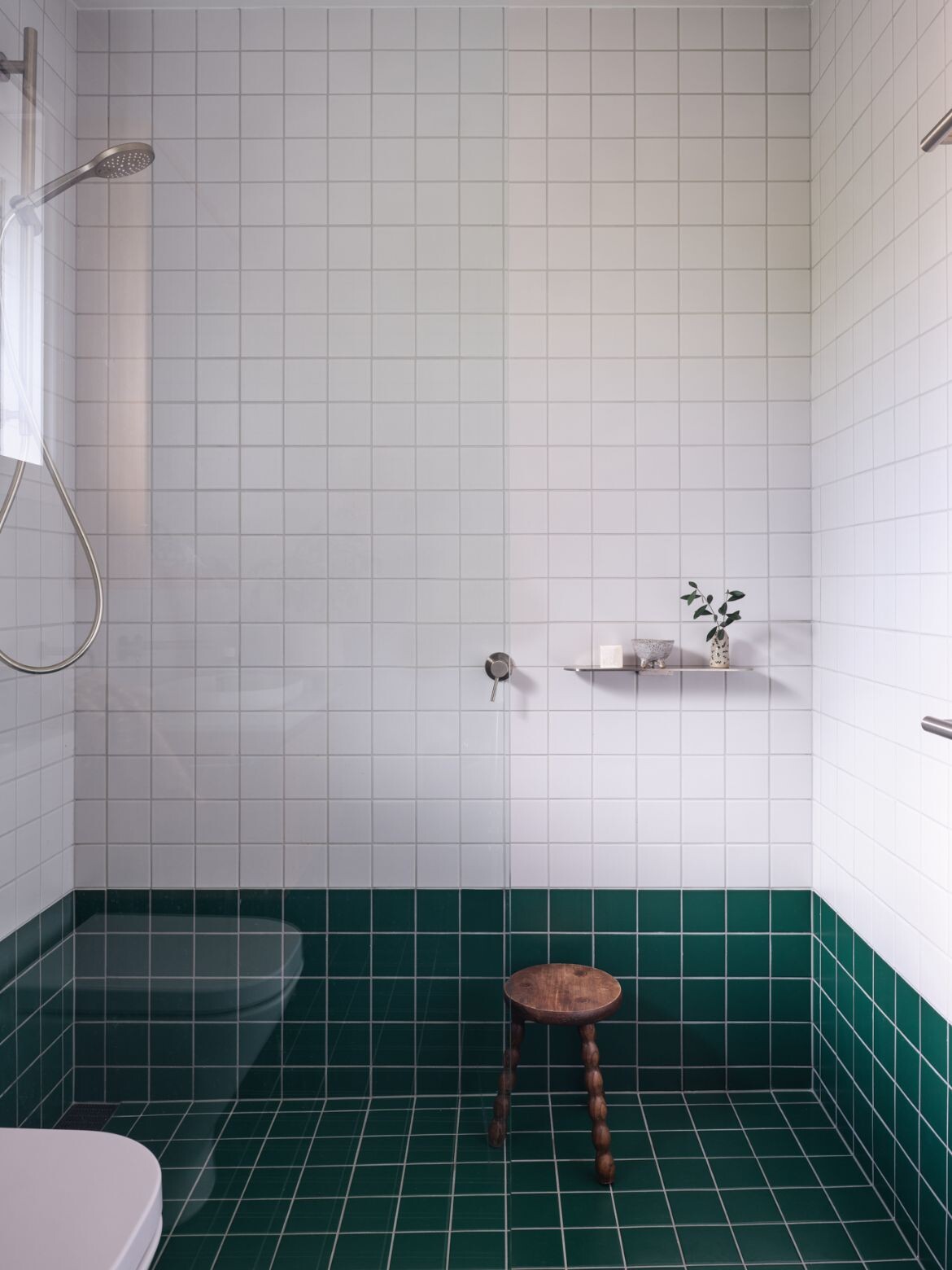
Economical tiles are used throughout with vertically run subway tiles used in the kitchen and simple square tiles used for the bathrooms. In the shared bathroom, a low datum line is established with the top of the bath to create a base of forest green and make the space feel larger.
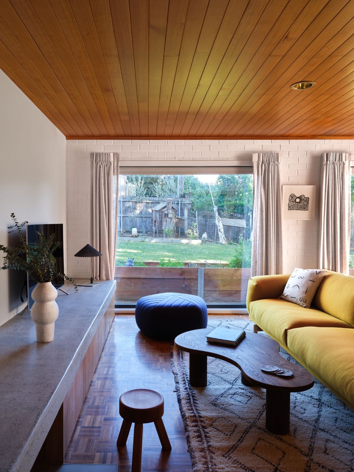
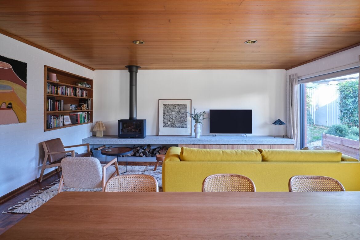
Rethinking the large living space to the rear as a lounge and dining area, Mulford has added a long off-form site-poured concrete bench with a fireplace to one side: “It was poured with quite a heavy aggregate and then sanded back to express a terrazzo texture to the concrete,” says Mulford.
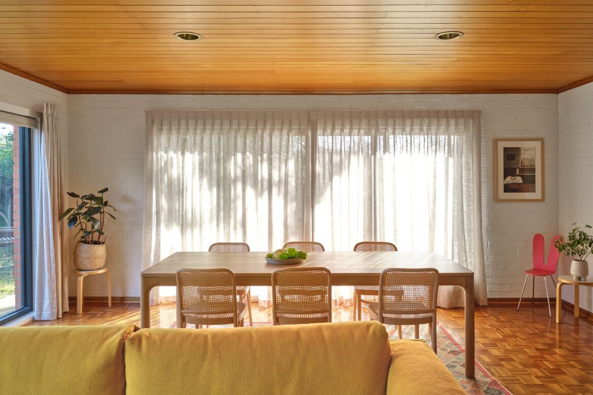
Closed at the outer end with timber cabinetry, the near end is light and open with racked timber creating a material rhythm. The design has also inserted a timber-lined bookcase into what was once an internal window and significantly shifted the aesthetic from the timber-lined ceiling, brown brick walls and parquetry floor that Mulford describes as a “sea of brown.”
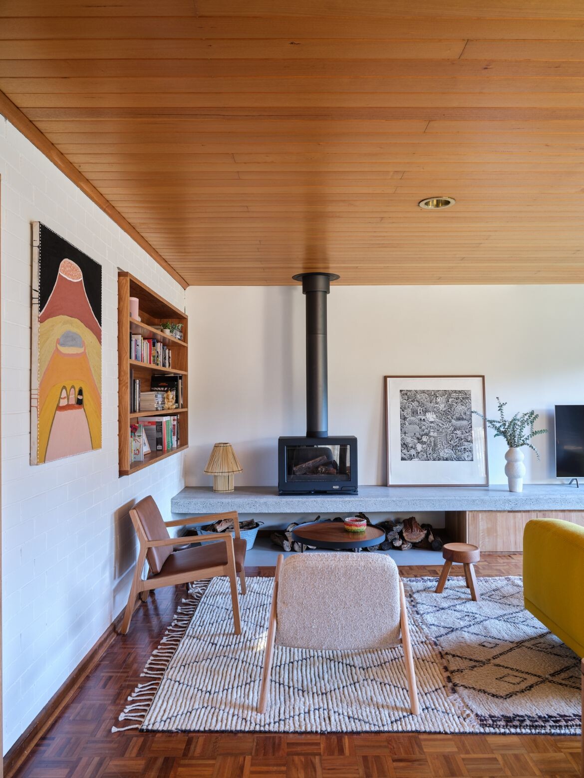
To this end, the main visual shift is the painting of the brick to a bright uniform white. In doing so the tones and light of the exterior garden are brought into the room, while the timber detailing becomes clearly defined and resolved: “I did want to use timber, I think that was a natural starting point. But I didn’t want to create a saturation of timber. So, it’s used fairly sparingly, and often used to stitch spaces together – this wasn’t a project about creating maximum contrast between the ‘new’ and ‘old’, but the ‘new’ subtly blending into the existing, almost as though it’s always been there.” says Mulford.
In 1963, the Department of Defence moved its operations to Canberra prompting the construction of affordable homes. Located in the leafy suburb of Curtin, Canberra, the modest original 1965 build had suffered piecemeal additions in the 1970s at the front and rear of the house, that were formal in nature and lacked connectivity between social spaces.
JMA’s thoughtful consideration and spatial acumen have given this home the potential, scale and usability of a contemporary home, while retaining the excellent built bones. It is lovely to see one of these remarkable homes given a new life.
Project details
Architecture and interiors – Josh Mulford Architects
Traditional custodians – Ngunnawal (Ngunawal) and Ngambri lands, Canberra
Photography – Anne Stroud Photography
Furniture – Miko Designs
