Spas are paradoxical spaces, at once public and private, extroverted yet intimate. Me, I find it kind of humiliating hanging around in my smalls (or less) being whisked by some frantic chappy with a birch switch as they do at the Grande Mosquée in Paris. Nor do I see the joy of being wrapped up like sushi in seaweed for an hour, all alone in a monastic cell on Mykonos with only the tiniest view out to sea, as I was duped into doing a few years ago. The French have an absolute obsession with what they call thalassothérapie (it’s free on the National Health scheme) and so the Atlantic coast from Mont Saint-Michel all the way down to Biarritz is awash with resorts vaunting the restorative value of H2O. But no matter how many times I’m asked to – quite literally – test the waters,
I always come up gasping for dry land.
It seems I’m in the minority. Increasingly, I’m hearing architects mention clients clamoring for private spa-like facilities in their homes. A steam room, an immersive bubble tub, hot and cold plunge pools. Hammam Sweet Hammam is all the rage. William Smart of Smart Design Studio is working on this kind of lavish facility for a private client as we speak. “In a sense it’s just Phase 2 of the bathing experience,” he says, “cranking it up a notch. That said, I do find it pretty freaky, this desire to bathe en masse.” Kerry Phelan of KPDO says, “yes, they’re being asked for quite a lot now,” and puts the spa frenzy down to the frequency of client contact with luxury facilities as they travel the world.

“I’ve just had a client come back from a European ski vacation with photos they’d taken of the spas and saunas and flotation tanks, you name it,” says Nick Tobias, Principal of Tobias Partners. “Clients are always inspired by luxury hotels, in a sense they set the trends.”
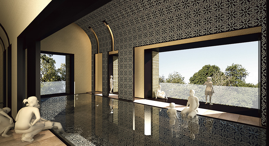
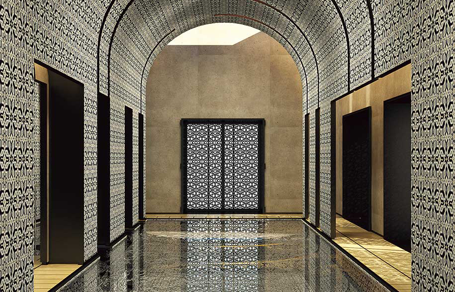
Rome-based Australian architect Carl Pickering recently delivered a 1700 square metre spa as part of the refurbishment of Beirut’s most prestigious hotel, the family-owned Al Bustan. “The Bustanis would often go to thalasso therapy in the Luberon region of France,” Carl explains by Skype from Rome, “so when it came time to design the Al Bustan spa, Mrs Bustani was very involved.” Carl’s design puts several heritage Arabic motifs into play in a streamlined, contemporary way. The traditional mashrabiya, or open-grill woodwork, is reinterpreted as aluminium screens and window shades. Exuberant turquoise, red and green Tunisian ceramic tiling descends in a continuous arc from vaulted ceiling to the floor of the swimming pool, at once anchoring and sublimating the space. It’s a seamless sculptural melding of tradition and modernity. The Bustani family live in the hotel, “so at times it felt like Mrs Bustani was designing her own personal spa,” says Carl. “1700 metres felt just about the right size to her!”
When I spoke to Nick he had only recently returned from something of a pilgrimage – a visit to the Therme Vals in the Swiss canton of Graubünden, completed by Pritzker prize-winning architect Peter Zumthor in 1996. Renowned for its sensuous austerity (again, when it comes to spas it’s about paradox), the monastic structure is like an archeological dig yet to happen. “Mate, I’ve seen lots of spas and lots of good ones, but this is the Grand Poobah of spas!” he says.

“I spent a whole day there last winter, it was amazing, better than even I could have imagined, and you know what a mad fan I am of Zumthor. It’s all about a procession of volumes that you slowly progress through. It’s a sequence of spaces, each one on its own like a beautiful note in a symphony but when you put them together, the smell, the touch, the sound, the taste of it is just spectacular. Mind-blowing. The architecture does quieten you, settle you down, put you in another frame of mind. The scale of the complex plays a large part in its power, but you could scale certain of the ideas down to a domestic iteration quite successfully. For instance, there is one chamber that you enter through a very small doorway in a very large stone wall and then proceed down very long, generous steps that you descend until you’re submerged up to your chin. You’re literally immersed not just in water but in the essence of the slatey stone itself, like you’re at one with the earth, elemental. Then there’s another room, it’s 43 degrees in the water and in the air, the room is flooded with hot pink lighting, you feel like you’re being cooked. The way it speaks to you aurally, the way sound vibrates around and inside you, that’s a quality worth exploring in residential bathrooms. And then there is an incredibly beautiful water drinking room around a natural spring. The basin is brass as are the cups, it’s communal, sharing, a caring space. That’s something that could certainly inform bathroom design at Tobias Partners.”
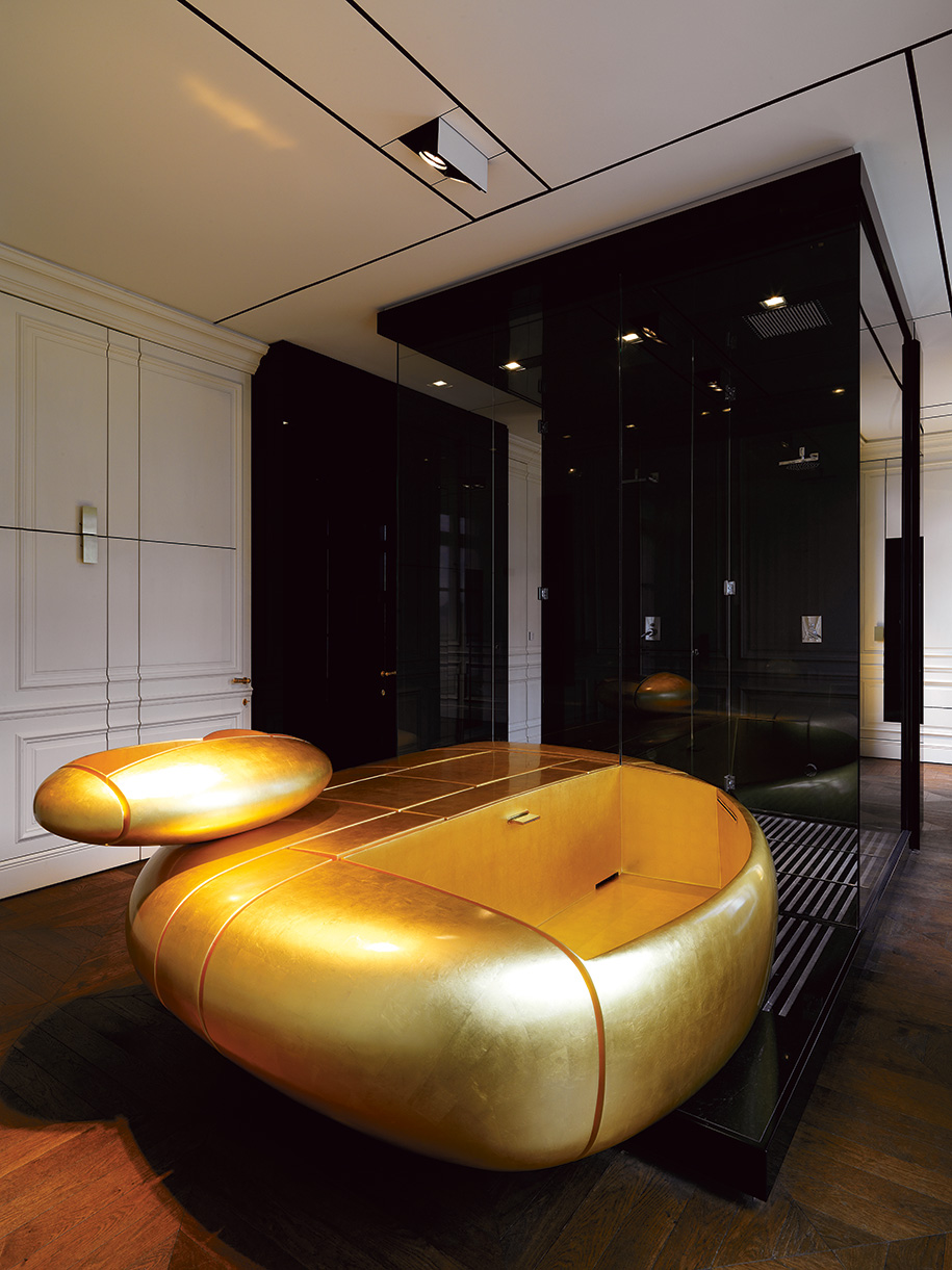
Nick points to the kind of totemic, goose-neck hoses as a means of giving a home spa an industrial allure. “And the pump is going to be the big spend – if you’re going to have a home stream room you really must invest in a massively powered pump otherwise it’s just a jazzed up bird bath.” Slatted wood benches? “Ah, no,” groans William Smart. “Tiled, or perhaps Corian. For a really sleek bathroom fit out, as seamless as possible. There are some really quite nifty shower units being imported now, either for pleasure or pretty dirty people.” (He recommends Porcelanosa, which does sound rather piggy.)
More often than not, it’s the bathroom that eats up the biggest share of the budget of a new build, so it’s essential to get it right. “We’ve not yet done a colonic room,” laughs Nick Tobias. “Maybe that’s something I need to be pitching to my clients.”
Words by Stephen Todd
This story was originally published in Habitus #36, the Nourish issue.


