Once a dark and separated series of spaces, Kingswood Residence carefully binds the past with the present, allowing each to be celebrated in their own respective ways.
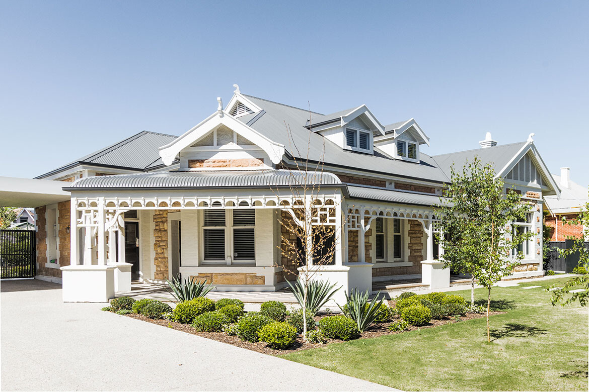
Located in the eastern inner suburbs of Adelaide, the heritage home sits comfortably at the front of a large and generous allotment, with neighbours of similar vintage and proportion to either side.
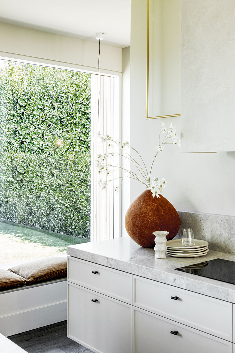
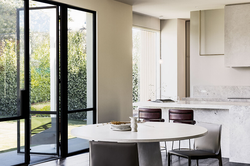
The extent of the home and how its owners engage with the various elements were an important part of crafting the next chapter. Williams Burton Leopardi has reconfigured the planning to connect the various stages of the home, culminating in an open and light-filled living, dining and kitchen convening area to the rear.
Similar to any heritage home, the inherited formality and separation reflects how people lived and interacted within the home environment in another time. Bridging those interesting nuances and highly considered details with a contemporary sensibility then poses its own series of challenges, finding the right balance between old and new is key in a project such as this.
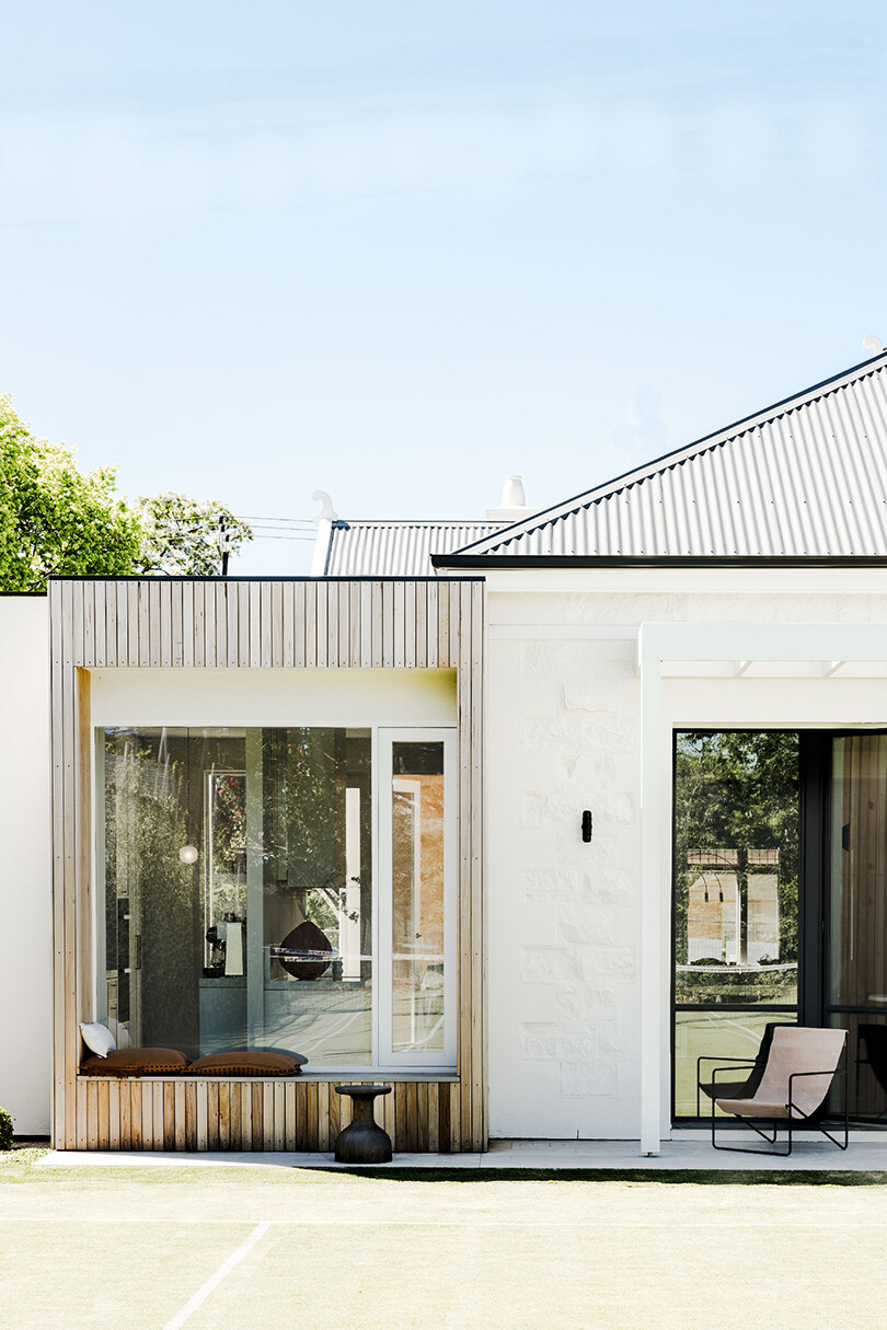
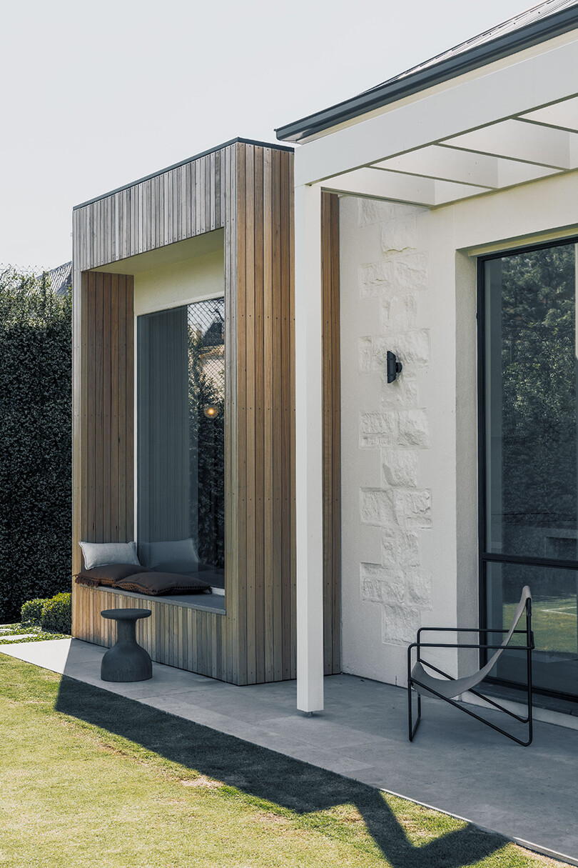
Working with an existing extension, the team initially reconfigured the interior spaces to create a clear delineation of function, only adding as necessary.
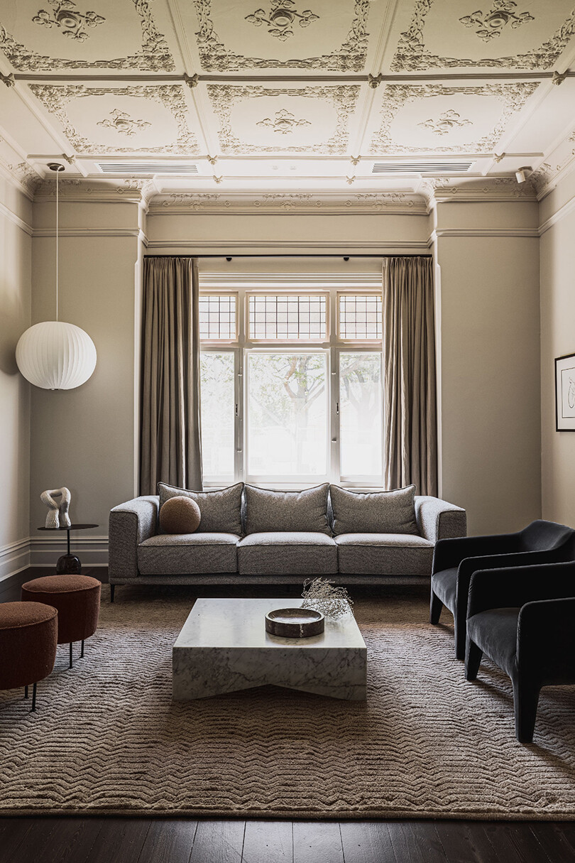
To the right, the more formal dining and living areas have been opened up where a natural sense of flow leads toward the new living areas, ensuring both visual connections and an effortless ease of movement.
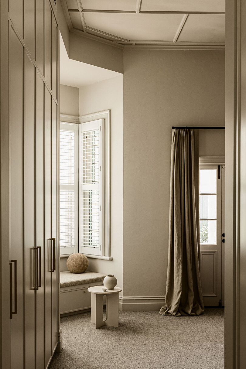
Then to the left, the recalibrating of the main bedroom suite sees its previous position extend and take over further rooms, and in the process create a consolidated suite.
The clear separation from the rest of the home offers a welcomed sense of privacy and a fitting sanctuary space. The intentional openness between all living areas then instils an understanding of how families live today, while allowing the heritage elements to remain. It also maintains the ability to seek solitude as desired.
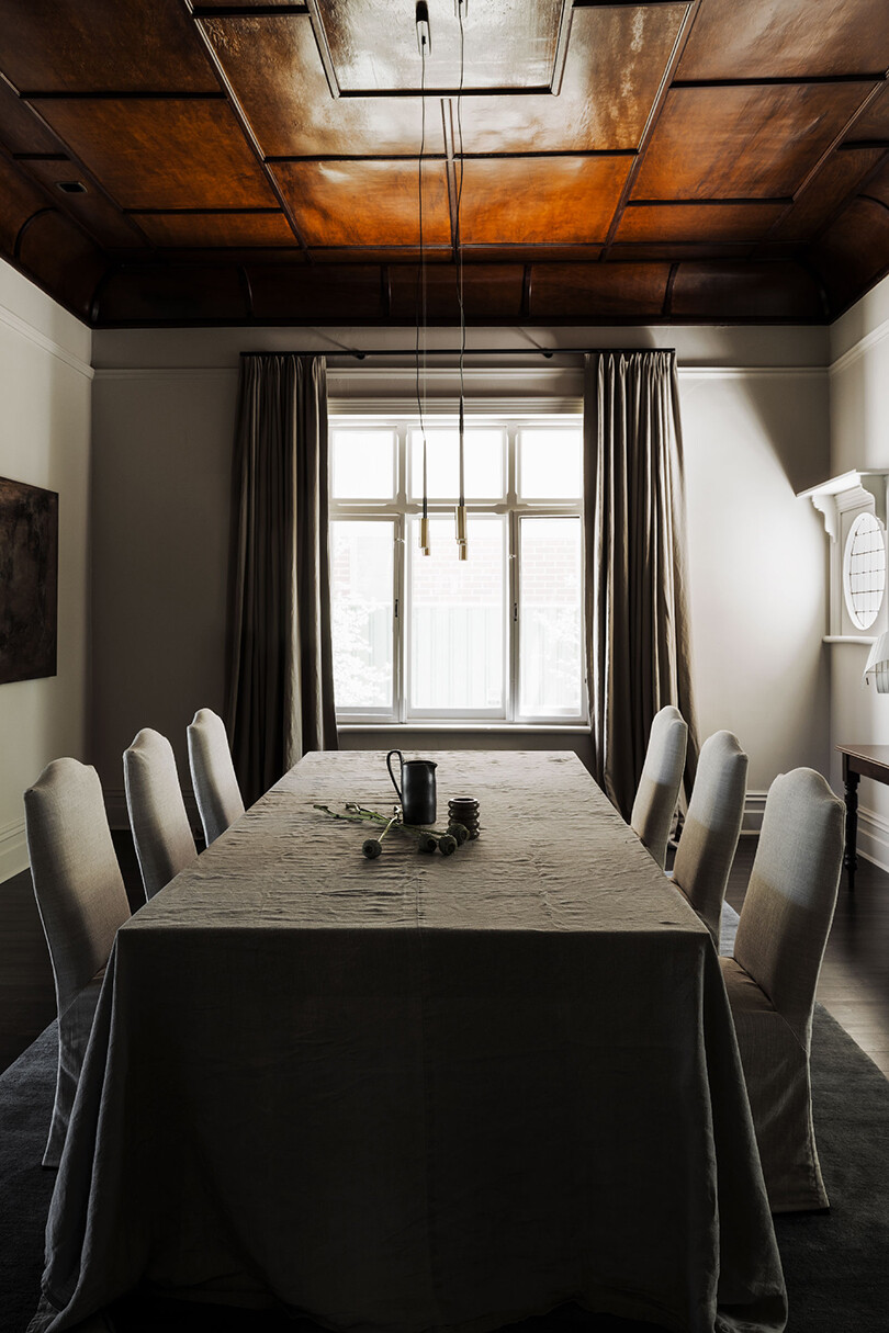
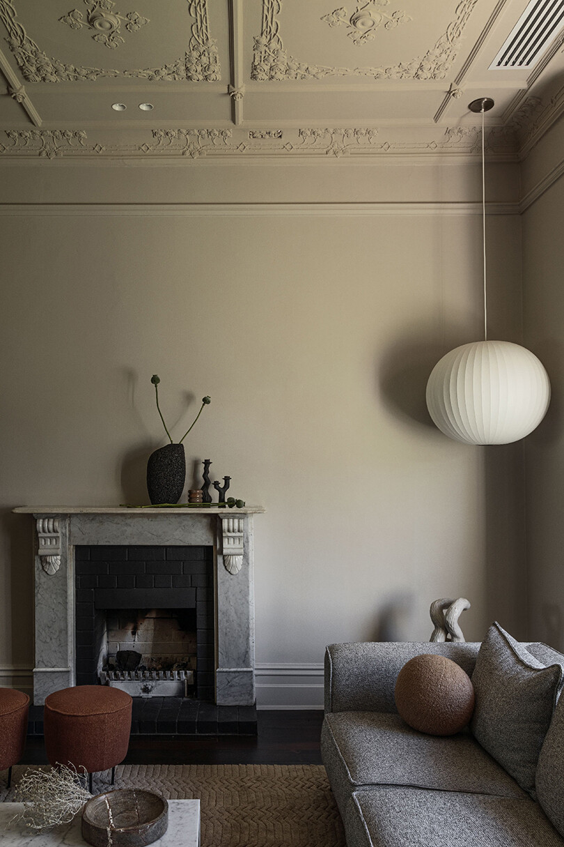
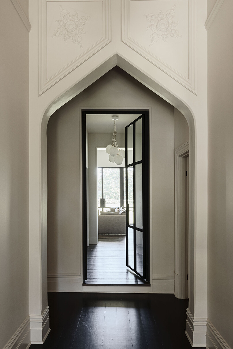
By retaining the existing dining ceiling in its ornate and unexpected darkness, an unusual point of difference is created from the light and muted palette of the new living spaces. The two approaches act to counter one another, as both opposing yet balancing gestures.
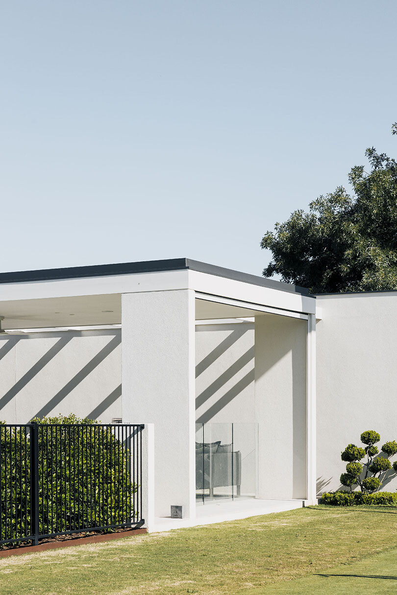
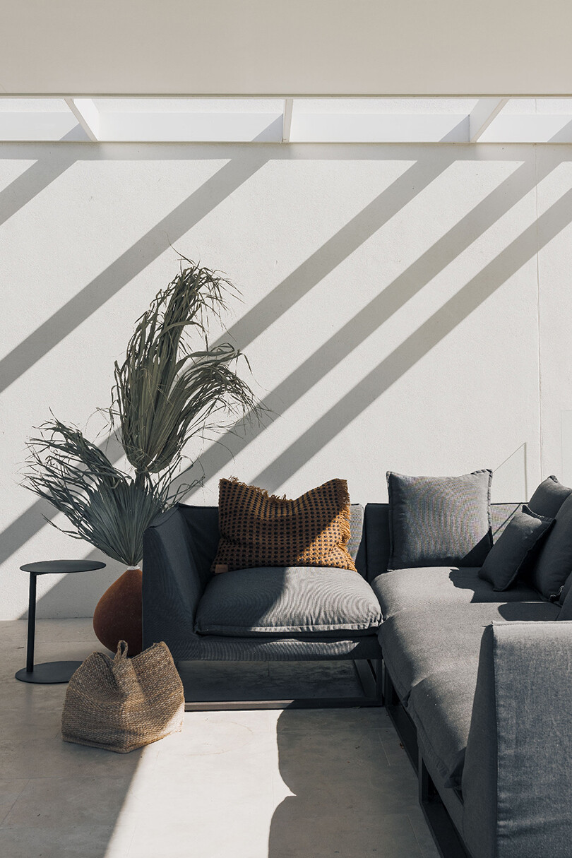
Within the curated landscape, a pool and tennis court are accompanied by an additional pavilion as a means to anchor the outer area. Acting as its own pull of sorts, drawing occupants away from the main house, the structure allows for a place of reflection at the same time.
Through an overarching creation of clarity, Kingswood Residence manages to retain its original essence, allowing Williams Burton Leopardi to extend on the previous narrative through considered interventions, completely reshaping the resulting home.
Williams Burton Leopardi
designbywbl.com.au

