Luchetti Krelle’s hospitality fit-outs are easily some of the most memorable in the country. The Sydney-based practice (co-founded by Rachel Luchetti and Stuart Krelle) is as prodigious as it is versatile, with a portfolio ranging from the techno-candy loveliness of Hello Kitty Diner to the austere elegance of Acme. For their recent interior design of Chef Chase Kojima’s Japanese restaurant Kiyomi on the Gold Coast, they utilised a pared-back material palette to sensually evoke the stylistic traditions and visual culture of Japan.
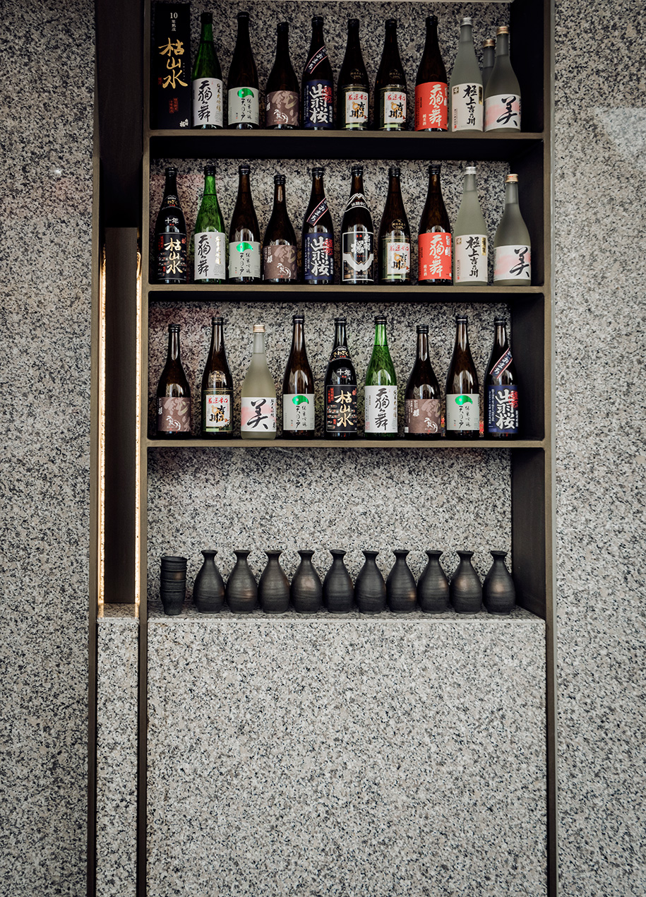
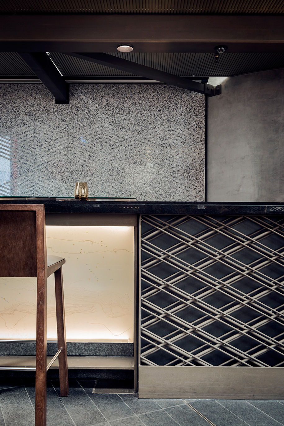
“Our focus was on the well considered and detailed principles of Japanese design,” says Krelle. “Sharp lines, ordered space and an identifiably Japanese palette of steel, timber and granite.” The scheme’s overall materiality is particularly successful in communicating the restaurant’s hospitality offering. More importantly, it creates a strong sense of intimacy that was much needed in a space devoid of any clearly defined boundaries.
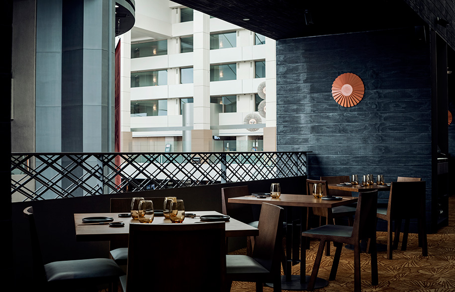
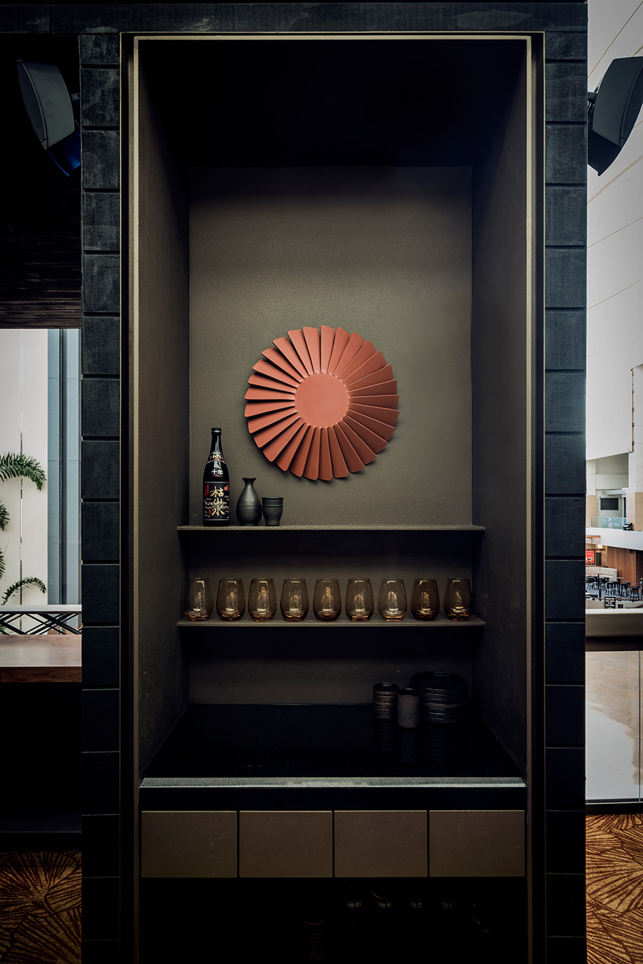
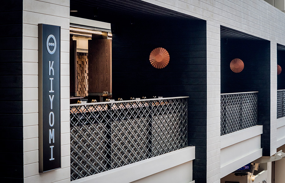
Kiyomi’s long, narrow site is located in the lobby of Jupiters Casino and was originally open to the corridors leading to the complex’s hotel rooms. Minimising this exposure involved inserting partitions into the dining area, which serves to distinguish it from the public circulation areas. Luchetti and Krelle also installed ceiling structures to further contain the restaurant and heighten its ambience. The predominantly black and brown colour palette adds to the warm atmosphere and is complemented by bronze and copper accents. These amber tones are introduced judiciously in the wall sconces and carpet, which instantly appeals for its highly detailed custom gingo leaf motif.
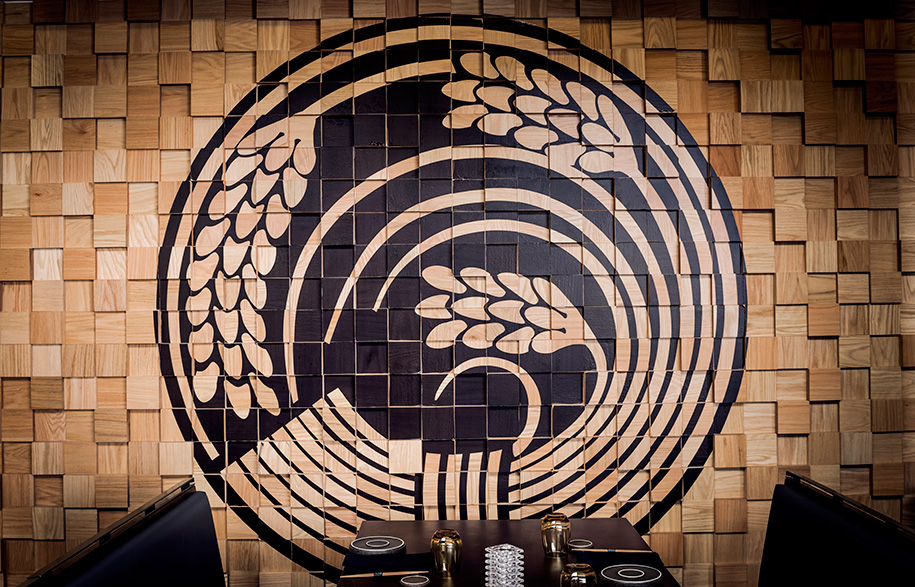
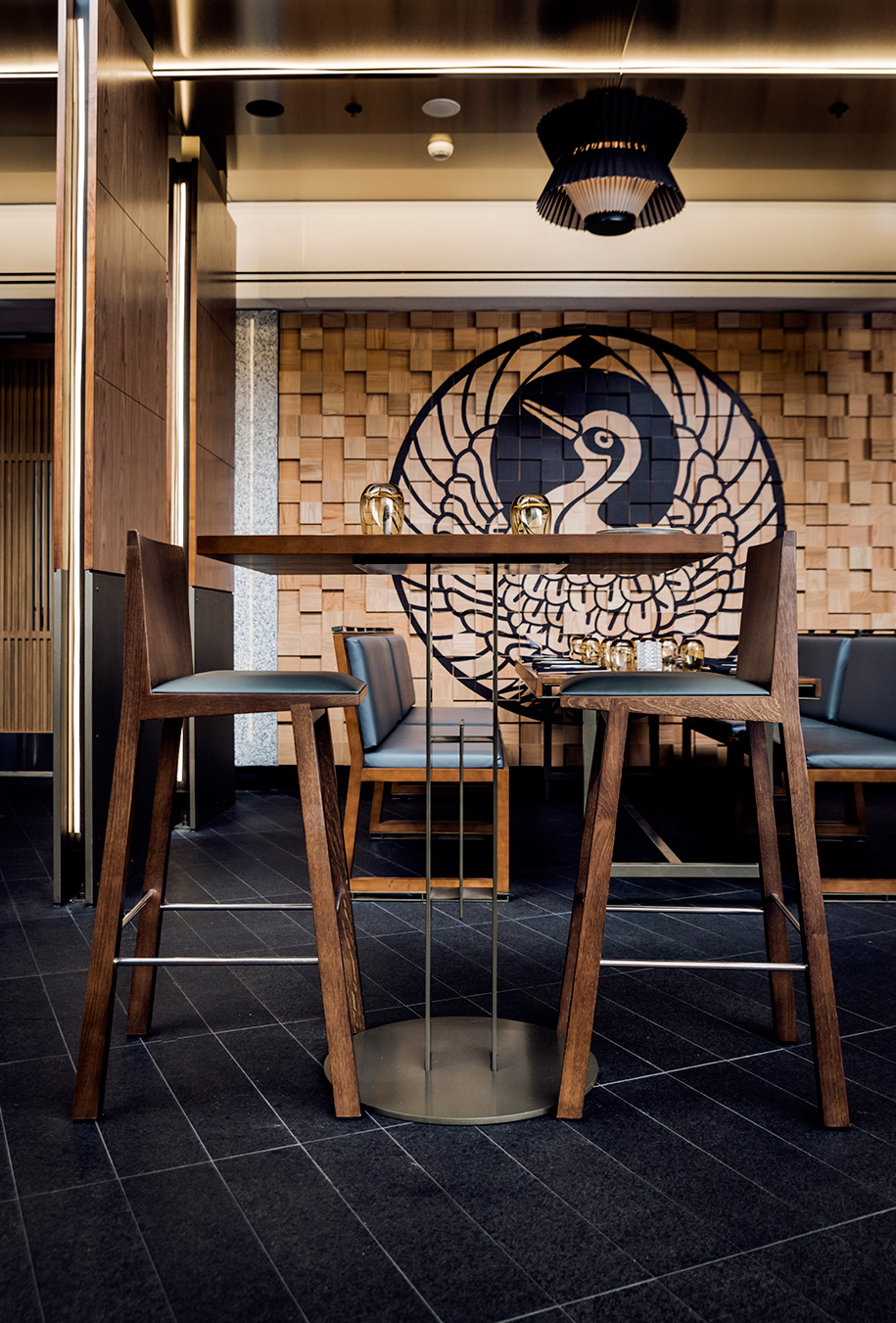
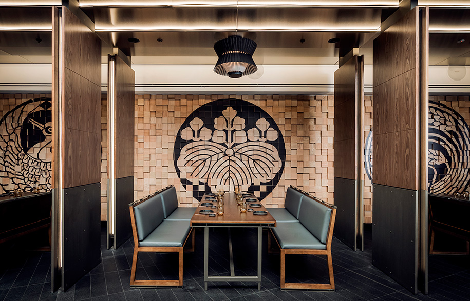
This patterning contrasts with the monochromatic granite and blackened steel and is reiterated in the dining area’s ‘jigsaw puzzle’ wall. While it features circular Japanese motifs representing family and the seasons, the wall’s dynamism rests in its painstaking construction from hundreds of solid timber blocks arranged at varying heights.
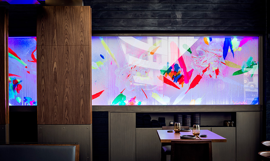
But the interior’s most unexpected feature is a specially commissioned fluorescent mural by Japanese artist Que Houxo. As Krelle explains, “We had the idea to include his work in the fit-out because we wanted to incorporate a burst of colour that would draw people’s attention down the narrow site.” The painting’s installation at the rear of the restaurant effectively creates visual intrigue, as its luminous composition is hard to ignore.
While Luchetti Krelle’s concept respectively embraces the principles of Japanese design, it does so with a contemporary twist. Their use of texture, colour and pattern also reflects Chef Kojima’s culinary stylings, making Kiyomi’s dining experience truly holistic.
Kiyomi
jupitersgoldcoast.com.au/restaurants/kiyomi
Luchetti Krelle
luchettikrelle.com
Photography by Michael Wee.
