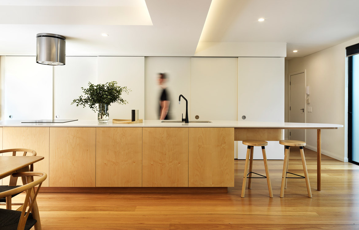
A thoughtful, considered design can simply and efficiently transform a space and the lives of the people who live there. That’s certainly the case at what Downie North has affectionately dubbed Kondo Condo. Named for tidying-up guru Marie Kondo, it radiates the sense of calm and beauty that comes from a well-organised space.
Kondo Condo is home to a couple who love entertaining but were restricted by their space. They live in a two-storey townhouse developed in the early 1990s, and despite an adequate footprint, it was poorly laid out with constricted or excessive spaces that were dysfunctional and uncomfortable either way. The couple approached Downie North to redesign their kitchen, however, it quickly became clear that a broader scope was needed as the clients discussed their daily routines and use of the space. “Architecture should elevate the every day, and one’s life should be enabled by the space you occupy, not inhibited,” says Daniel North.
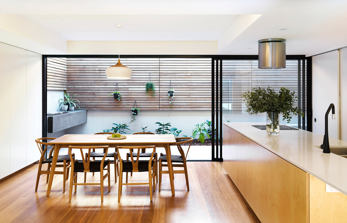
While the project had size constraints and budget limitations, Downie North took an economical, minimal and efficient approach with emphasis placed on maximising functionality and the perceived sense of space.
Downie North spent time analysing the elements the clients needed to be accommodated; identifying their ideal functions and modes of habitation; and devising the most efficient way to accommodate this. “In creating a place for everything, there is a clear expression and celebration of the every day,” says Catherine Downie. “However, the experience is one of beauty and peace borne from an appreciation of a well-ordered space.”
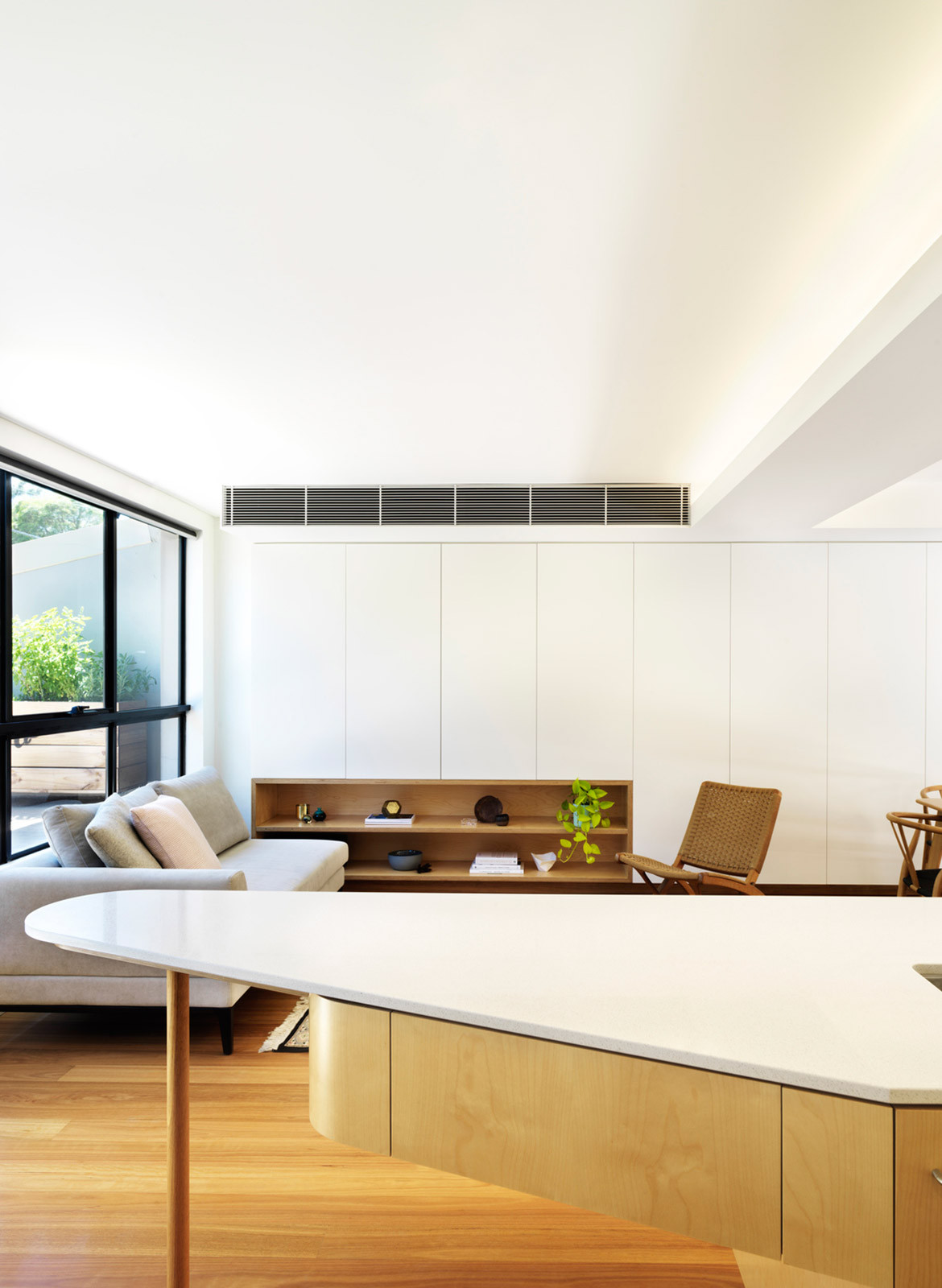
This consideration of the clients’ daily habits led to the redesign of the kitchen, dining and living spaces. Downie North removed a central wall that divided the floor plan and reoriented the kitchen across the width of the room. A new sculptural kitchen island fronts the dining table and lounge and has a tapered end propped on a slim column. This open-plan space now connects to courtyards on both sides of the house for light, views and cross ventilation, and helping the 50-square-metre space feel larger than it is.
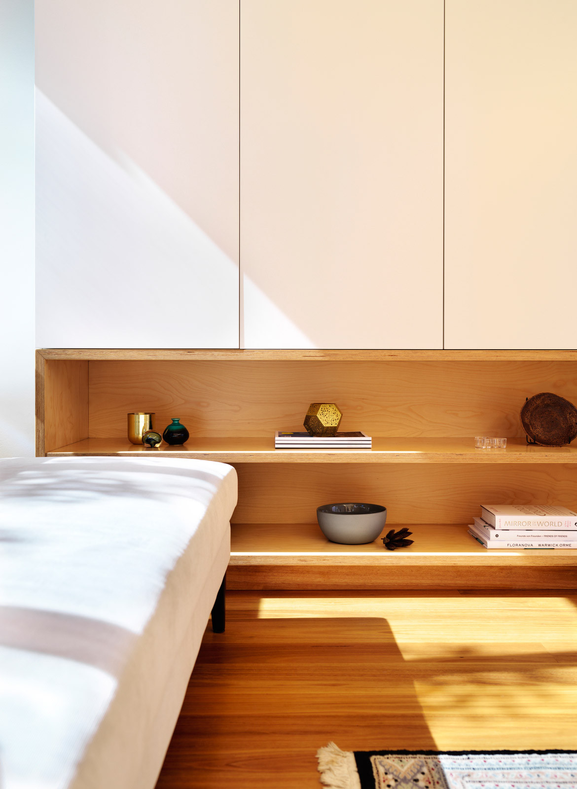
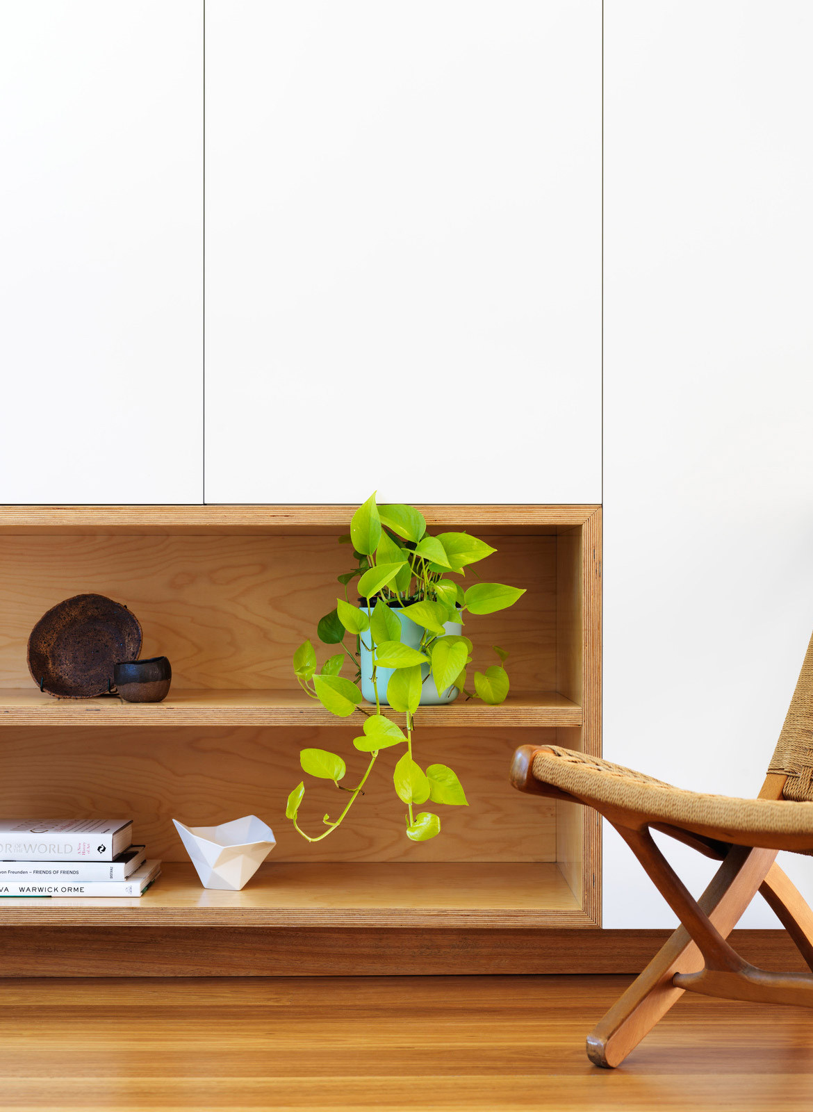
The simplicity and warmth of the palette – birch plywood and white-lacquered joinery – allows the everyday objects and daily activities of cooking, eating and conversing to become the focal point of the space. Sliding joinery doors conceal a walk-in pantry, toilet and new larger laundry behind the kitchen. The television and storage are likewise concealed behind white polyurethane panels along the opposite wall next to the dining and living areas.
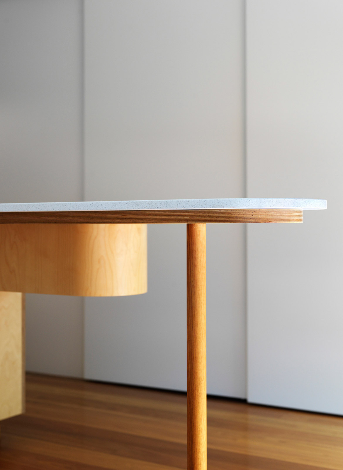
“The project is an excellent example of how a poorly designed developer box can be transformed into a home that will last for generations,” says Daniel. And into a home that sparks joy. “We were really chuffed to hear from our clients that they no longer wanted to go out, but really enjoyed just being at home, entertaining,” Catherine says.
Downie North
downienorth.com
Photography by Felipe Neves
Dissection Information
Circular island stainless steel rangehood from Smeg
TinkB Sink Mixer in Matte Black pullout from Abey
Ice Snow benchtop from Caesarstone
Coco Pendant in White Matte from CocoFlip
Partridge bar stools from DesignByThem
We think you might also like Boneca Apartment by Brad Swartz Architects
